Back in May, we threw down a challenge to our design community to submit their best builds for the design battle of the year. Our goal was to celebrate the talented designers and developers that create customized themes for the Shopify platform, and to showcase ecommerce sites that display exceptional design, creativity, and usability.
Over the past four months, we’ve been collecting thousands of jaw-dropping submissions from designers all over the globe. And together with an expert panel of judges that included Vitaly Friedman, Veerle Pieters, and Daniel Weinand, we’ve gone through the submissions and picked the best from the best. Now the time has finally come to crown the one true champion of design.
Five months and thousands of submissions later, we are proud to announce the winners of the 2014-2015 Ecommerce Design Awards!
And the winners are...
First place
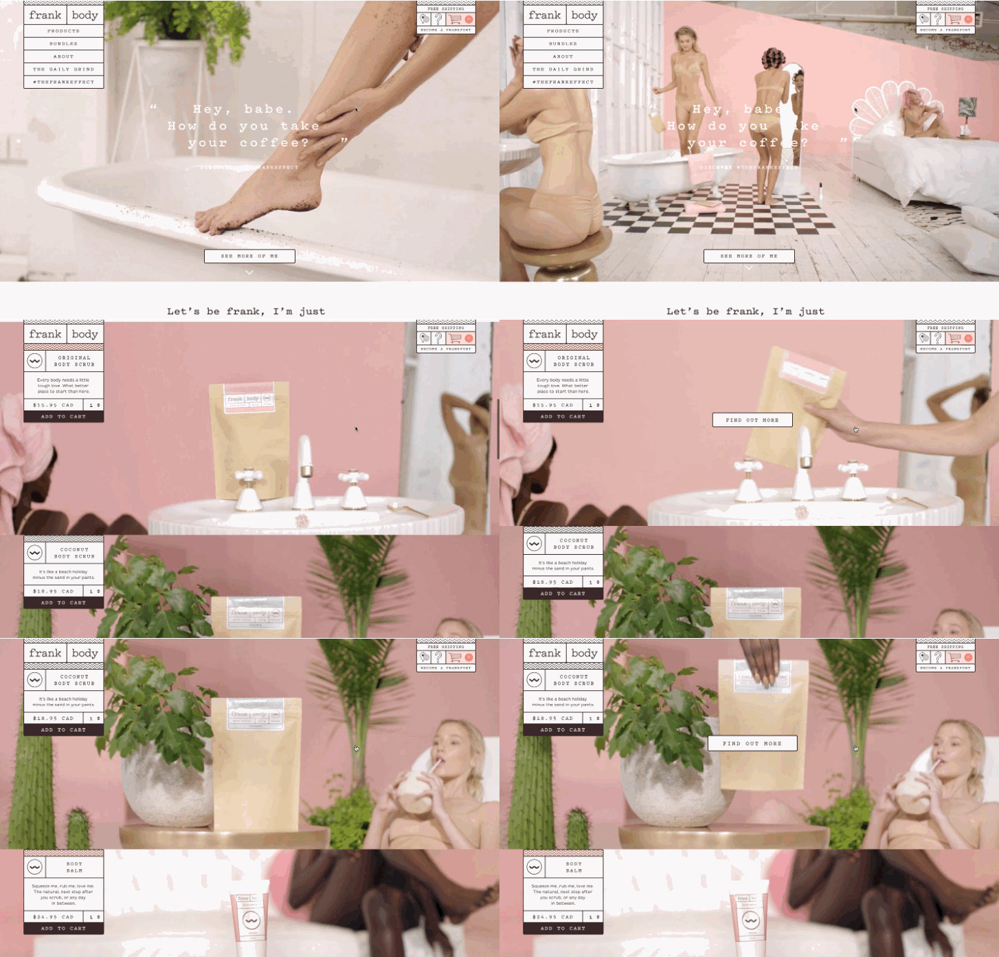
Designer: Love + Money
Store: Frank Body
An unusual, striking design which gets UX right. Frank Body is easy-to-use, compelling, and attractive.
— Vitaly Friedman, Smashing Magazine.

Second place
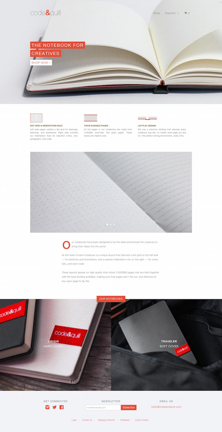
Designer: Bambri
Store: Code Quill
Not only is Code and Quill elegantly clean, it presents a great product. Oh and it's a pleasure exploring it using a mobile phone.
— Daniel Weinand, Chief Design Officer.
Third place
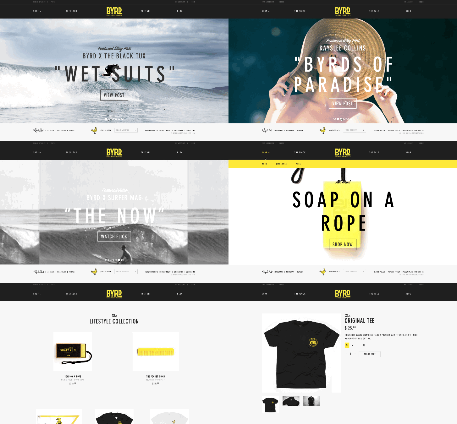
Designer: Shotwell Digital
Store: Byrd Hair
There is something about Byrd Hair that suggests the designer had an eye for details. The products are well presented and categorized in a clear and logical way.
— Veerle Pieters, Duoh!
Honourable mentions
As much as our winners raised the roof on what ecommerce design can accomplish, we received so many amazing submissions that it was impossible for us not to showcase some of them. Here are 10 honourable mentions that we think deserve a little time in the spotlight.
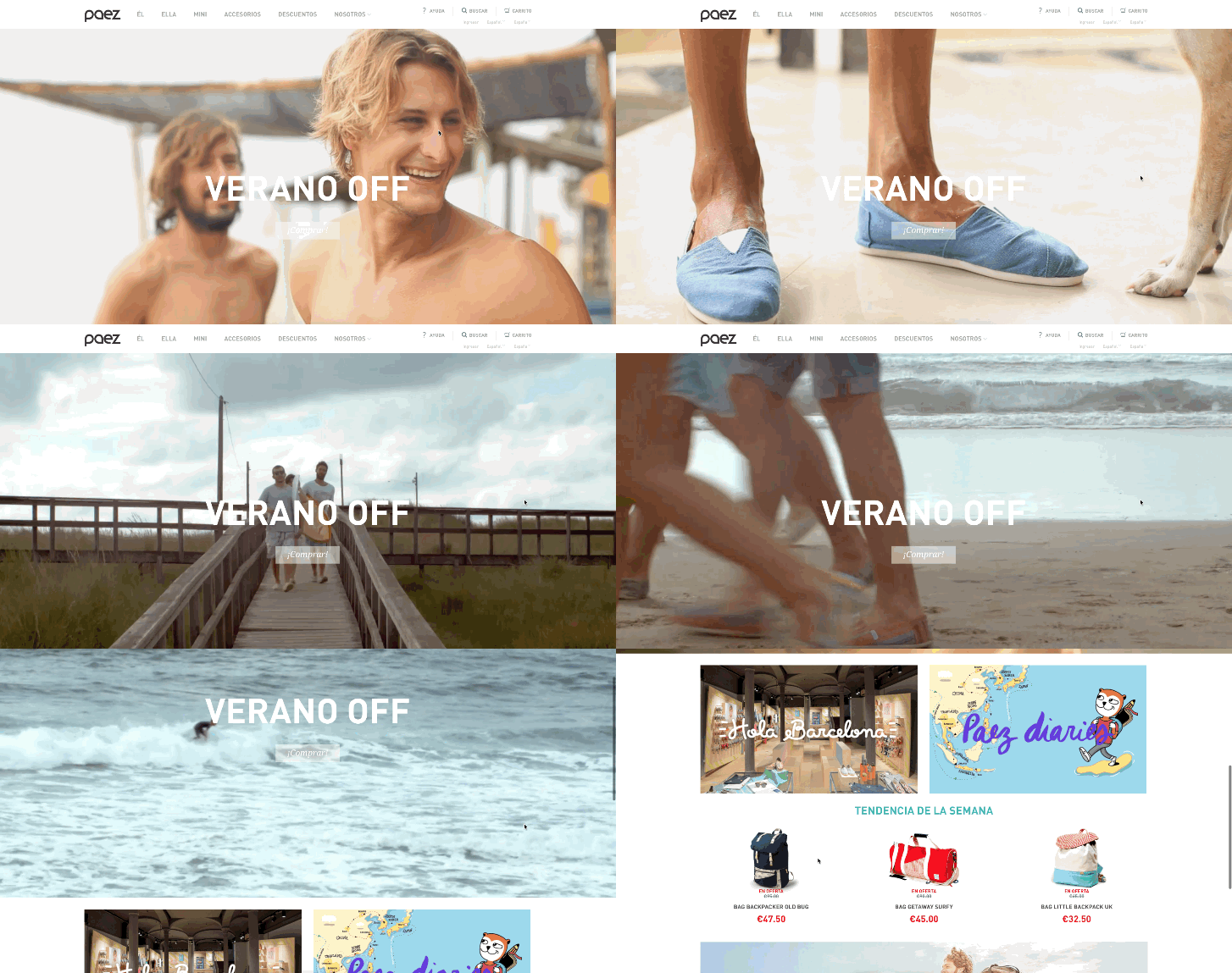
Softlimit for Paez
We loved that the experience of adding a product to the shopping cart was specifically tailored for shoes.
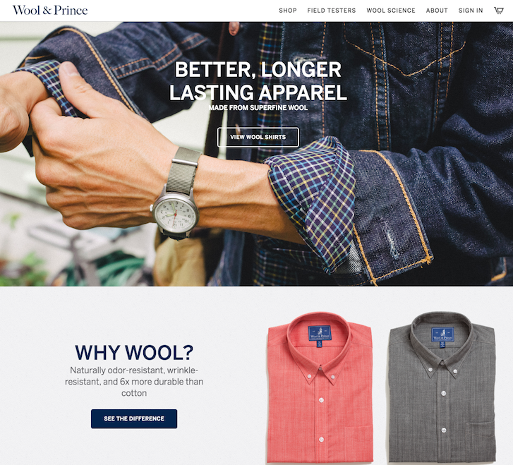
PixelCabin and Matt Hallock for Wool and Prince
This store had a clean, smart design that also made for a great mobile experience.
Brent Freaney for Sixty-Nine
Even though this playful design was very different than what we're accustomed to seeing in online stores, the browsing experience was still natural and intuitive.

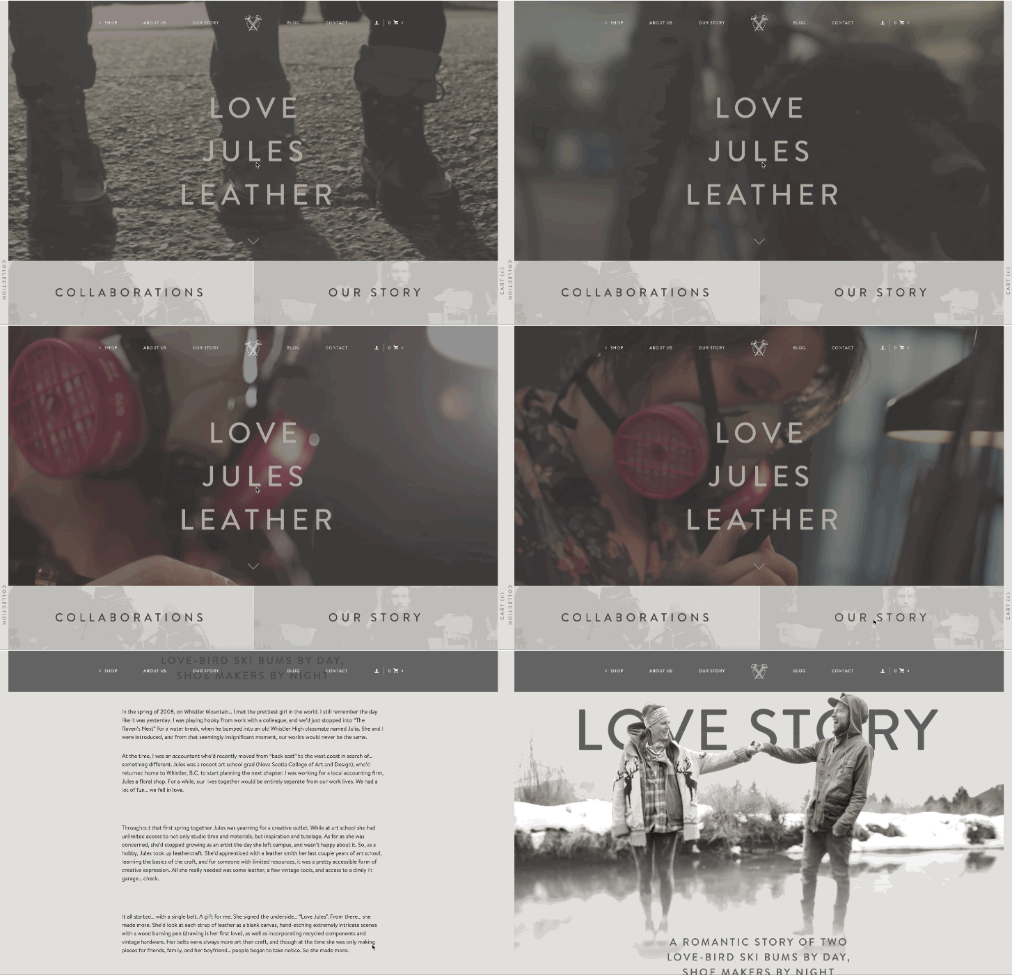
port80webdesign for Jules Leather
The typography used for this site was beautiful and well-suited to the brand. The contrasting sections also helped to keep the design fresh and interesting while you shopped. Plus, the product photography was superb!
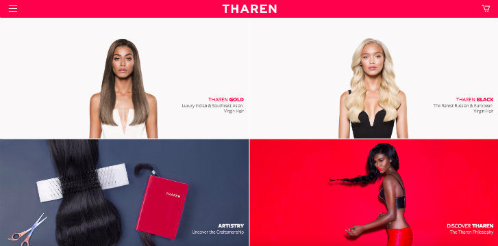
Rehash for Tharen
This store has great typography and photography. In addition, we loved how each product line tells a little story, keeping the customer engaged and encouraging the buyer to convert.
Q&A Creative for Again
The editorial style layout of this design is extremely trendy right now. We also loved how the designer took a new fresh spin on a classically minimalist design.

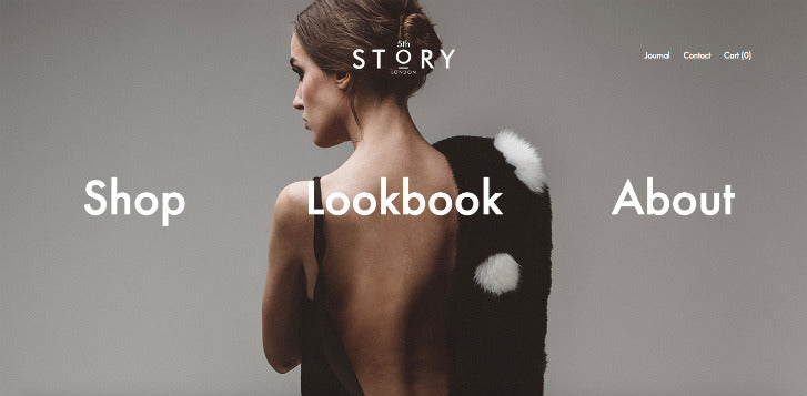
The Big Webowski for 5th Story
We really enjoyed the interesting use of Parallax scrolling on the homepage. The mobile browsing experience was also engaging, simple, and clean.
Radiator for Callina
The gutterless grid was very well executed in this design, and the different segment widths created a great layout flow. Hover states (on the product grid) were simple but impactful.

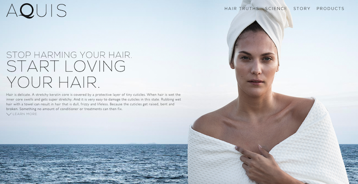
Lexi Ehrman for Aquis
This design's focus on typography was a refreshing departure from what we normally see on many ecommerce sites.
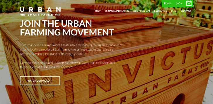
Full Frame Marketing for Invictus Urban Farms
This site has great product photography and clean typography. The design and placement of the call-to-action buttons invite the visitor to continue discovery which is a great way to educate on the product and help with conversion.
