While juggling landing page images, typography, lines, and other elements horizontally and vertically for the desktop is a relatively straightforward affair, doing the same for mobile platforms is a bit trickier. Tablets and mobile phones come in different screen sizes, and text and images can be easily thrown in haphazardly if you don’t heed modern design principles and the graphic design tools that go with them. Since your clients’ ecommerce success depends on the presentability of their pages, it could easily cost you potential revenue for your business.
Tablets, mobile phones, and desktop, however, commonly deal with one thing that is often taken for granted: white space. Often, it all comes down to unwittingly treating white space as a passive empty canvas that needs to be populated with all the content elements of texts, images, lines, and more.
"Yet contrary to being just a passive component of your landing page, white space could be the critical piece of your landing page puzzle."
Yet contrary to being just a passive component of your landing page, white space could be the critical piece of your landing page puzzle. It can actively tie together and connect everything on the page to create an eye-catching, compelling website that is aesthetically satisfying and appealing to your client’s customers, creating an experience that gives them good reason to come back to your client’s site for more. White space is as effective in a layout as the content itself, and helps to define the boundaries of positive space and bring balance to a layout.
In this article, we’ll look at the different types of white space on both desktop and mobile, and take a deep dive into the best practices of using white space on mobile devices.
What is white space in design?
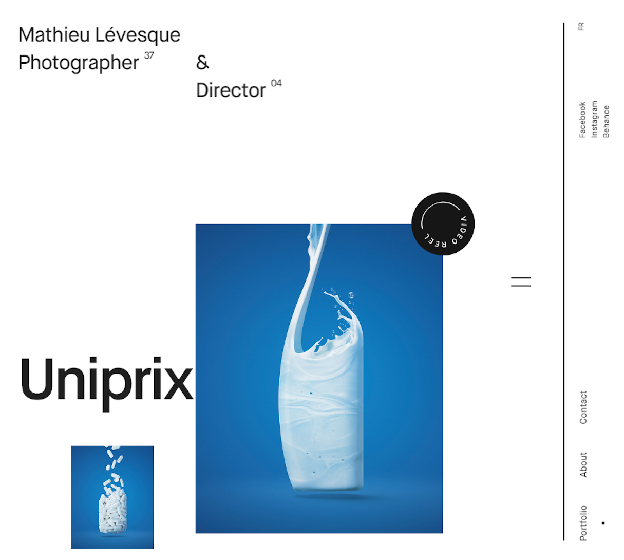
Your empty web page is your primary white space, the very canvas upon which all the other content and design elements come together: icons, full-color images, lines and geometrical shapes, and your text. Once those elements fill your canvas, you will be left with areas that are purposefully left empty: the gutter or alley (white space between columns), line height, space between sentences and paragraphs, top, bottom, left and right margins, padding—all are white space. Notice that they are either between design elements or within individual design elements, like the space between the glyphs of your choice of typography.
In technical terms, designers refer to white space as negative space. This technical definition does away with the usual misconception about white space: notwithstanding the term, white space need not be white. It can be black, brown, yellow, red—any color of your choosing—even any pattern or texture and background image that fills your requirement to add power to your web page.

Why white space is important
White space serves a variety of purposes within a design. It can be leveraged for:
- Aesthetics. White space is crucial when you consider how to design your landing page to beautifully display on mobile screens.
- Effective communication. White space is a vital tool to balance your need to showcase many items on your page and the need to place content with an effective visual communication experience in mind.
- Guiding the eye. Our visual capacity can only focus so much, until it is strained from too many elements bombarding our senses. White space is the calming factor, the secret to allowing readers to digest what you want to present to them.
You may also like: Everything You Need to Know About Whitespace.
Different types of white space
If you want to optimize your page’s visual effectivity through mobile screens, you need to understand the role white space plays in striking just the right balance with your content elements. You cannot sell if your reader is hesitant to pursue reading and leaves in a huff to find a more visually appealing site. You need to understand how micro or macro spaces and active or passive white spaces work together to make your reader decide to stick with your pages or move on.
Micro white space
Micro white space is the small space between your content elements: the space between lines and paragraphs as well as the space between grid images in order to separate menu links. Micro white space directly affects your content legibility, the user’s reading speed, and comprehension.
Macro white space
Macro white space is your big-picture white space, the canvas and container of all your page content elements. It’s the space surrounding your design layout. You can find it to the right and left of your website as well as between between content blocks.
"If you want to optimize your page’s visual effectivity through mobile screens, you need to understand the role white space plays in striking just the right balance with your content elements."
Most designers will point you to the lesson of Google in implementing macro white space. Its iconic homepage is vastly simple, ridding the user of any distraction so it’s easier to focus on why the user is there in the first place: to do some searching. Bereft of any large block of content, the webpage loads easily and blazingly fast—even in the remote past when internet speed was generally frustratingly slow to a crawl.

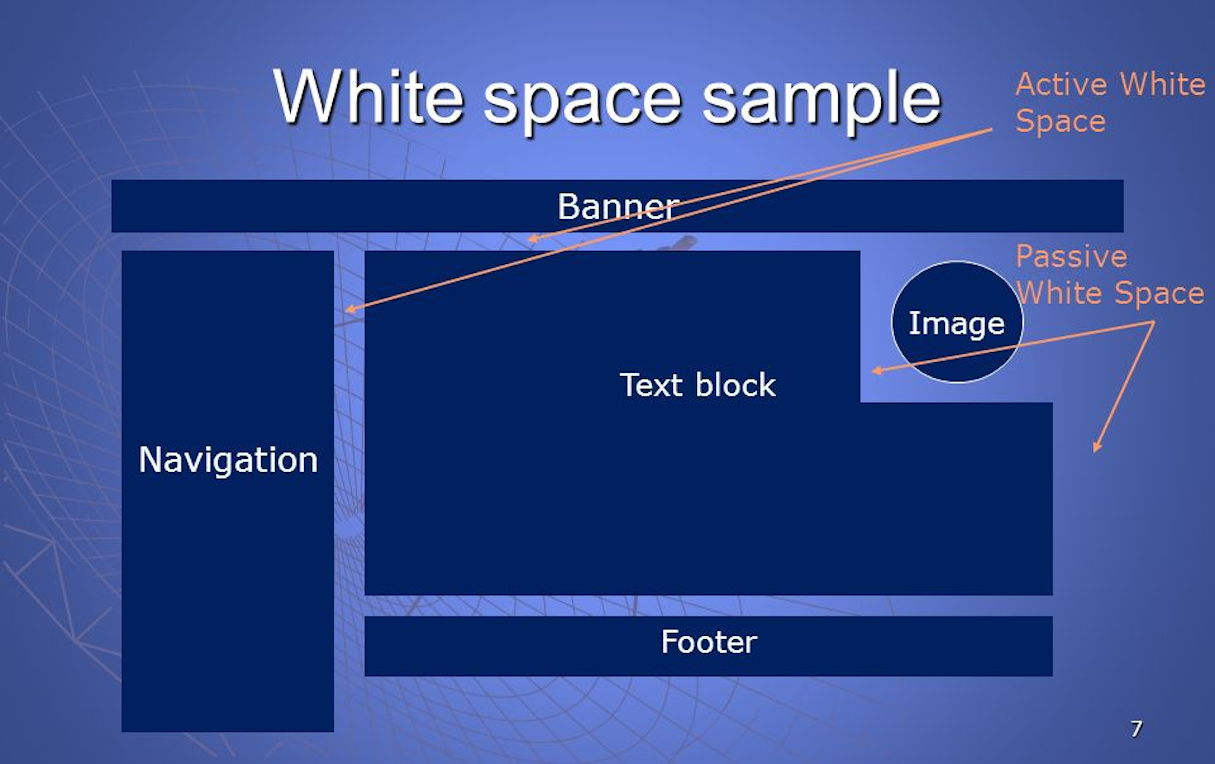
Designers also look at white space as either active or passive:
- Active white space: White space is applied to improve the layout of a page structure while guiding the user through the content.
- Passive white space: White space adds grace to the layout without guiding the reader.
7 Best practices in mobile white space design
Admittedly, the need to squeeze in so much content on a mobile display limits how much white space you can play with. Since lavish amount of white space is out of the way, an intelligent, balanced approach is the only way. Use white space while keeping in mind some best practices in the field.
1. Design for fingers
The first thing you need to consider when designing for optimized mobile viewing is to limit click targets to a minimum of 30 to 40 pixels, which is the ideal range of touch target size according to a study by MIT Touch Lab (PDF). Aside from the size, of course, you need to add white space between touch targets so users hit the targets they mean to.
2. Going technical: allocate ≤ 15 points of user attention
When you feel pressed to push more content on a page, designer Paul Boag suggests allocating yourself 15 points of user attention. Let each item you add to the pace cost 1 point.
If one screen is more important than another, you need to assign it additional points to make it stand out. With only limited points available at your disposal, it’s obvious you cannot push white space out of the equation.
3. Use white space creatively
You may consider playing with contrasting colors, shapes, typeface sizes, and asymmetrical negative space to lend more power to your layout. As an active design element, white space plays with the perception of surrounding elements.
4. Rearrange the navigation menu
When you are dealing with responsive design, you will want to set different breakpoints for your white space in order to come up with a persistently seamless experience for your customers.
If your site favors multiple links, you have no choice but go for a hidden menu using the three-bar hamburger icon. Don’t like the hamburger icon and feel that what’s out of sight is out of mind? Then go for a tab bar instead, as Facebook did, ridding itself of the hamburger in favor of the tab. Bear in mind that Facebook has more content than many sites out there, so you most likely won’t lose on that one too.
"Moving to smaller screen real estate, you must never lose touch with what makes compelling design: legibility, simplicity, design tone, and branding."
If you decide to stick with the hamburger icon, you will notice it popping back up once your browser hits a certain breakpoint, the hamburger carrying off your now missing links. When the hamburger takes over, mind the white space placed between each link: this is a good time to space out links so they are just right for finger taps on mobile.
If you are up to it, you could also have your navigation menus rearrange themselves before they settle on the hamburger icon. You could define a certain breakpoint, for example, and have your navigation panel reconfigure from being at the top to the side instead.
Your navigation may even move back to the top with a hamburger menu under a certain breakpoint. It’s a challenging approach but one that will earn you plaudits from your customers.
If you have your navigation small enough, then you don’t even need the three-bar icon.
5. Consider going vertical rather than horizontal
The desktop gives you the convenience of picking your vertical and horizontal elements. The confines of mobile devices, however, lend themselves to going down rather than across the page. Here again you need to diligently employ white space to break up multiple content elements even as they drop beneath each other. Always go for simplicity, clarity, and allow the readers to breathe.
Keep in mind, too, that if you follow good white space housekeeping in your web design, Shopify's responsive mobile tool transitions the same breathing space smoothly to your mobile interface, as these stunning Shopify themes show.
6. Think responsive typography
Always find the right balance between your headers and body paragraphs so they do not appear like misplaced Frankenstein body parts. Help yourself with some responsive typography and mind your line height, kerning, letter spacing, margins between blocks of text, even color of your typeface.
You may not have the lavish white space of your desktop version, but you could play with different combinations when dealing with typography that works best for mobile so white space remains an active factor in having your readers remaining focused on your page.
7. Mobile-responsive images?
Admittedly this is one tougher cookie to deal with, but if you can manage to have your images scale themselves to accommodate better vertical viewing with reasonable white space to spare, it could be your Holy Grail to achieving ecommerce success. You may even decide which parts of your design elements could be taken out completely without sacrificing what your readers expect from your website.
You may also like: The Power of the Dark Side: Dark User Interfaces.
White space for mobile clarity
White space is an integral part of your website design, more so perhaps when designing for mobile audience. Moving to smaller screen real estate, you must never lose touch with what makes compelling design: legibility, simplicity, design tone, and branding. If you have nothing to worry with what you do offer, what comes next should result in happy paying customers who will not hesitate to go back to your client’s site for more.
How do you use white space in your mobile designs? Share your experiences in the comments below!

