Some brands skimp on design and put all their efforts into product, marketing, and ads. An online store can have the best products and marketing in the industry, but if the design doesn’t build user trust, it will bleed revenue. A successful ecommerce website has the whole package, including great design. The right ecommerce website design will not only sustain customer interest, but it will keep them coming back to the site they trust.
Here are some basic elements of ecommerce website design to consider implementing for your next client project.
You might also like: The Profitable Ecommerce Designer
The key to success is great content
Website success takes work, and most of that work is in the content. 15 years ago, a static site with little content was sufficient. With fierce competition, it’s no longer an option. Site owners need authoritative content for search engines and users.
Brands, and the design agencies that work with them, should create content that conveys expertise and informs users. Authoritative content builds trust with browsers who could potentially become future customers. Content builds brand awareness, elicits social media shares, and improves search engine visibility. Content can be anything from breaking news or upcoming events to evergreen content that provides information about your product and services.
Don’t forget to include high-quality, attention-grabbing images or videos. The world runs on visuals, and you can interest users far more quickly with images rather than long blocks of text, especially if your product relies on it. For example, the ASOS shopping experience. Rather than show static images of a model wearing the apparel item, they’ve included a “catwalk” video to show their clothes in motion.

Keep a consistent, easy-to-use design
Once you choose a theme, stick to it throughout your entire site. Don’t mix and match designs, it confuses users. Your navigation, content, and design should all mesh well together to bring the right user experience.
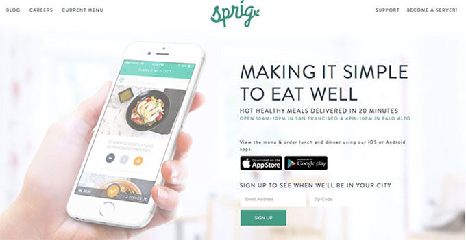
Colors play a big part on user moods. Choose a scheme that evokes your brand message (here's some great colour palette generators to help). Your theme and color coding can set your visitors' moods. Design colors should have the right tone, shade and tint. For example, pure colors are original, unmixed hues often used in youthful, vibrant, and cheerful designs. Pure colors are great for brands looking to make a bold statement. By contrast, tints are created when colors are mixed with white. Tints and more peaceful versions of pure colors and are typically used to complement brighter hues.
For example, Sprig’s web and mobile experience uses light greens and white hues. These colors typically evoke freshness and growth to a user — a great brand match for this organic meal delivery service.
You might also like: How to Design a Wholesale Solution for an Ecommerce Store
Your structure supports your design
Site structure is the foundation of good design. Your design can attract visitors, but it’s all for naught if they can’t find what they are looking for. You should decide early in the design process on the number of pages you want, how these pages will link together, and choose the right graphics and icons to support your infrastructure.
One of the most important aspects of structure is site navigation. It should be intuitive for users to find information. Remember that most users are looking for products to buy, and they want to be able find it instantly without searching endlessly on your site. Anticipate what users are looking for and give them a clear path to the answers. Never leave them at a dead end.
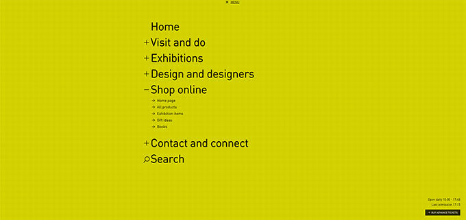
Design Museum has a modern, trendy design with a simple call to action.

They leave no stone unturned for the user, making navigation seamless and straight-forward.
The goal for your site structure is to make products easy to find as fast and as efficiently as possible. A playful touch can be a good addition, but make sure that usability is solid first.
The CTA message should be effortless
Look at any big brand ecommerce website design and the call to action (CTA) is obvious, but not pushy. Notice that the buy buttons are standout CTAs that tell the user exactly what must be done to buy the product. If a visitor has enough interest to search your store, they want to know what they need to do to get the product to their front door. “Add to Cart,” “Buy Now,” and “Get It Now” are three CTAs that tell the user exactly how to get what they want.
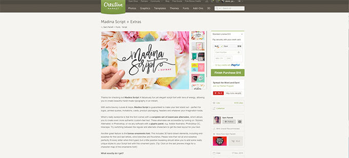
Creative Market’s checkout process allows users to purchase the asset without even leaving the page, reducing drop-off and cart abandonment rates.
Note: a CTA isn’t just for product pages. You can add them to funnel pages such as a landing page for an advertisement, subscription pages for a blog, or any other parts of a website.
Don’t forget to optimize your checkout process
It’s rare that a site owner gets the best optimized checkout process at the get-go. For this reason, you should always monitor the process and get as much feedback from users as possible. Use monitoring tools such as Google Analytics to find the checkout process page that loses the least customers.
Just like design, usability is key with the checkout process. Be as flexible as possible with personal information. Require the least amount of information from the user to get to the final checkout page. The page that asks for user payment information is usually the biggest drop-off section, so keep it as easy to use and secure as possible.
Make your site responsive
Mobile traffic now accounts for 50 percent of ecommerce traffic. Shoppers prefer the availability and mobility that tablets and smartphones provide. If your ecommerce design isn’t responsive or optimized for mobile, you eliminate thousands of potential sales and customers.
Responsive designs cater to any screen size or at least the most common ones. Even with the smaller screen size, your usability and experience should still be top-notch for all aspects including CTA, images, content, and the checkout process.
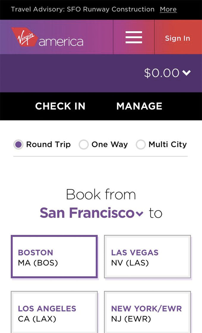
Virgin America does a stellar job at recreating their web experience for mobile users with a streamlined structure that facilitates easy purchasing.
Finally, always provide great support
No matter how meticulous you are with testing and deployment, you could still have issues. You need the right customer support to handle queries and feedback. Don’t just take feedback from your customers. Make sure you also engage them and integrate good suggestions into the next version of your site.
You can use live chat, social media support, or just a toll-free phone number. Sites with no support instantly lose trust from your customers.
By incorporating these basic elements of ecommerce website design you’ll increase user sign-ups, purchases, and retention while simultaneously building brand trust and reliability.
You might also like: 3 High-Impact Tips for Designing an Ecommerce Site That Converts


