Ah, it’s that time of year again. When ecommerce websites all over are rolling out sales, discounts, and special offers galore — all accompanied by interesting web design for better marketing purposes. The Christmas shopping season is when online retailers have their sites filled to the brim with festive designs. They often use tried, tested, and true sales tactics, like urgency and scarcity to the hilt, all in an effort to increase conversions, sales, and ultimately, profits.
Web designers who are paying attention to these unique web page layouts can learn several things about using design to make sales stand-out. This is a great skill to have when you’re designing ecommerce layouts for your clients.
Let’s take a look at some of the most memorable from around the ecommerce world.
Macy’s
To celebrate Christmas shopping, Macy’s has a splash page that first greets site visitors when they land on the retailer’s site. This splash page is an ingenious touch, because it grabs the visitor’s attention and directly shows them the store’s best sales.

The page features some intelligent design and marketing tactics to help Macy’s increase conversions. Some of them are:
1. The color red
Yes, red is a traditional color for Christmas, but when it comes to online marketing and conversions, the choice of red is particularly potent. According to Kissmetrics, for North American audiences,red is the color of urgency, energy, and increasing your heart rate. It’s ideal for use in clearance sales, which Macy’s makes use of to a great extent.
2. Big headlines
What’s the phrase that gets your attention when you land on this splash page first? It’s probably the “Take an Extra 20% Off” headline, along with the “Ends Wednesday! Cyber Week Specials” headline. That’s because these headlines stand out against the red background, with great color contrast, and a typeface that’s large and readable enough to be easily and quickly understood.
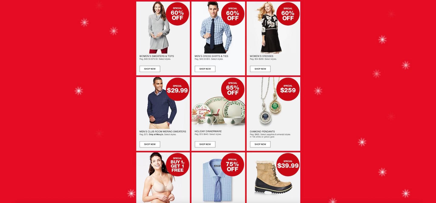
3. The use of discounts galore
Scroll down this long-scrolling page, and you’ll see specific numbers and percentages exclaiming 50% off, 60% off, 75% off, and so on. Incorporating specific numbers as part of discounts into the page’s design helps to entice shoppers to convert, whether that’s just clicking the next page to see the actual deal or going and making a purchase beyond the initial click-through.
Nordstrom
Nordstrom uses an entirely different design approach. For one thing, there’s no splash page. Shoppers are instead sent right to the homepage when they first land on Nordstrom’s site.
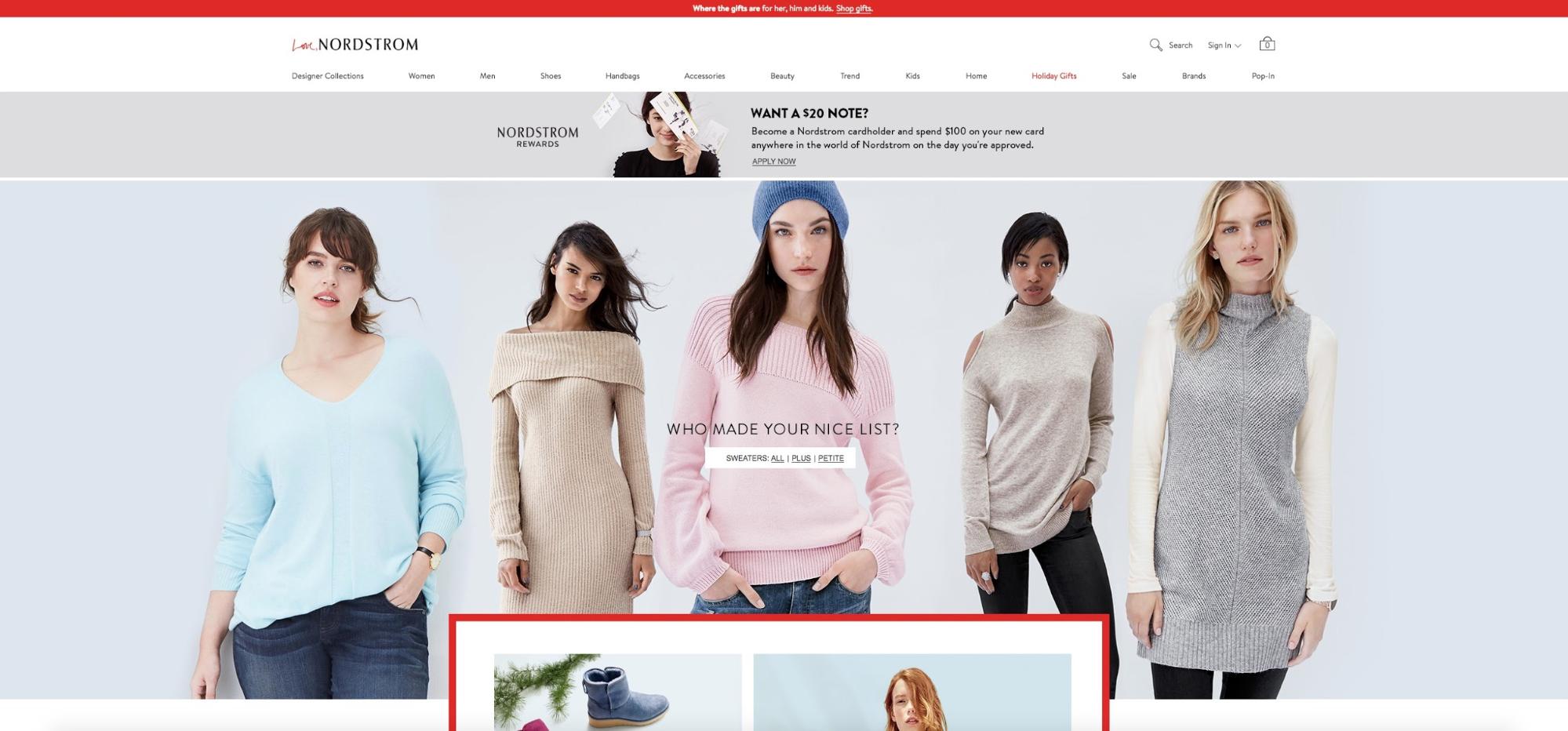
The homepage itself is extremely interesting for a number of reasons. First it’s a very, very long…long-scrolling page! In this way, the homepage effectively tells a sort of story about all of the wonderful deals, and gifts you can pick up from the site.
Plus, scrolling down, with new page elements gradually revealing new deals, gift ideas, and shopping categories — you’d be forgiven for making the comparison to almost unwrapping a present of sorts, and seeing more details as you progress.
Other design elements that help them sell more for Christmas include:
1. Female presence in photos
The homepage features many female models, and one study showed that including images of women in a direct-mail marketing campaign increased response rates by 4.5 per cent. In general, studies also show that more attractive people do better as well. Applying this reality to web design, this homepage is using beauty to sell more.
2. Shopping incentives
Notice the Nordstrom cardholder offer, just underneath the navigation bar. New cardholders get to spend $100 when they sign up — that’s a pretty good deal, considering everything you can buy from this store for that amount.
3. The color red (again)
At the very top of the homepage is a thin, horizontal bar that spans the entire length of your screen, which is colored red, and calls on people to buy gifts for men, women, and children. This call to action shrouded in red is hard to miss, because it draws the eye of shoppers.
4. Extreme white space
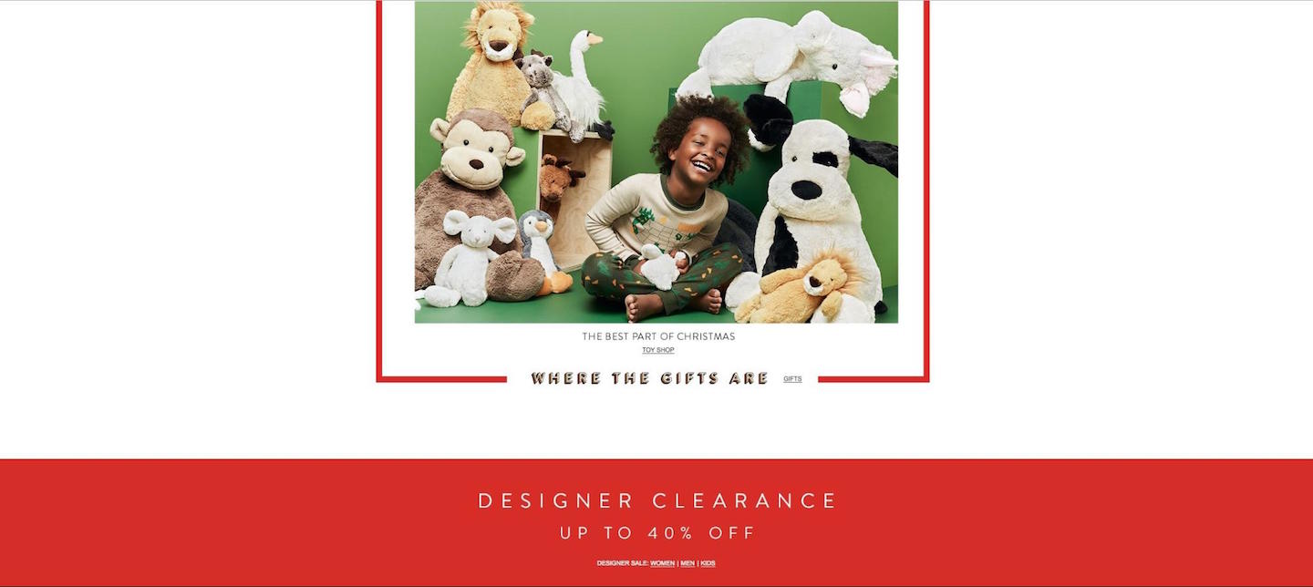
Scroll down the homepage, and you’ll see a centered block of content that highlights gifts in various categories. The use of white space all around this block of content is made even more effective by the simple, red border around the gift-categories content. When this homepage section features this much white space, it literally forces a shopper’s eyes to the content, highlighting different gift categories.
5. Links to Christmas-specific blog entries
Near the bottom of the homepage, you’ll find another box of content, but this one is for links to the Nordstrom blog. What makes this box attractive is the use of card-based design to highlight what each blog entry is about, complete with images and a short, enticing description. Because the blog content is holiday-centric, it only reinforces the message of the homepage, which is to get excited about, and therefore shop for, everything Christmas.

JCPenney
This well-known retailer uses a mishmash of design tactics on its site to persuade shoppers to buy, buy, buy for the Christmas shopping season. Landing on its site, the first thing we notice is the conspicuous single-column layout, right down the center of the homepage. The presence of white space on both sides immediately directs a shopper’s eyes to the important sales-related info in the main column of content.
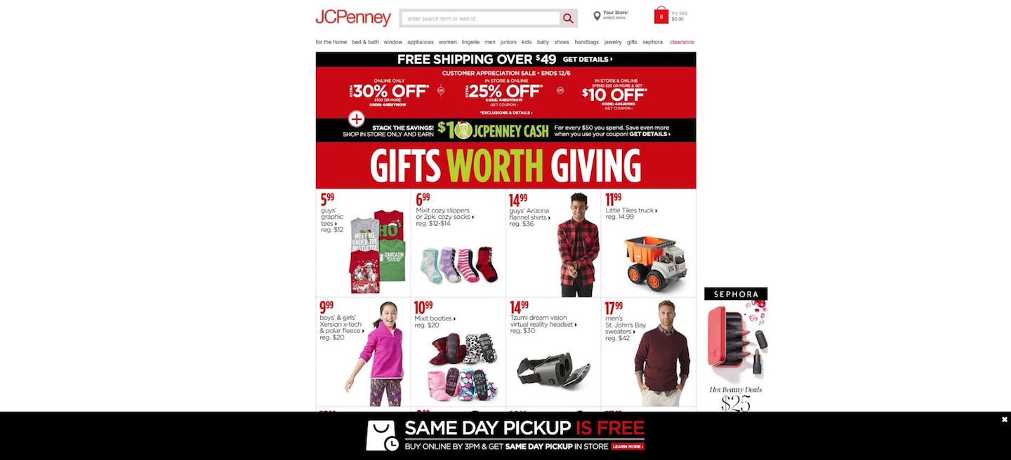
Here are the design elements JCPenney’s homepage is using well:
1. The use of urgency
Urgency is one of those tried, tested, and true marketing strategies that works online and offline. As Neil Patel puts it, urgency is the inescapable feeling that you have to act quickly to take advantage of a sale or deal, because something exceptionally important is going on, and there’s only limited time left. Note the “Customer Appreciation Sale – Ends 12/6” subheadline on the red background, right underneath the navigation menu. This is telling shoppers that they have to move quickly to take advantage of the store’s deals, as they only have a few days left.
2. Free shipping notice
Offering free shipping in the marketing world, is one of the most persuasive parts of any ecommerce store’s design. According to various studies and research, it can be responsible for anything, from boosting online store conversions by as much as 50 per cent, to increasing orders by approximately 90 per cent. That’s why JCPenney’s homepage has a huge, white-on-black “Free Shipping” notice, right under the navigation.
3. The color red (yet again!)
Are you beginning to see a pattern here? Yes, red is definitely a traditional Christmas color, but this is more than a mere coincidence. The color red has been proven to stir passions and energy, making it ideal for clearance sales (see the Kissmetrics infographic cited above). Online retailers are grateful when Christmas rolls around, since not only is red apropos in their designs, but it also helps unleash greater conversions.
Best Buy
Best Buy’s homepage does things a bit differently, design-wise, than other retailers on this list. That’s why it’s useful to highlight what Best Buy’s holiday season design is doing, so web designers understand that there are multiple ways to design an optimized site or page for holiday ecommerce deals.
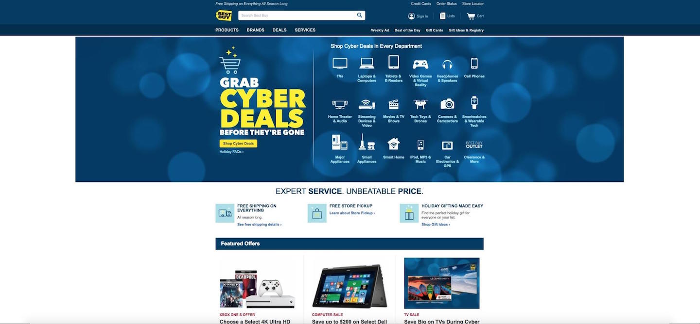
These design elements stand out the most:
1. The color blue
Finally! One retailer bucks the trend of red, red, red to choose the cooler, and softer color blue. Right away, this’ll strike shoppers as “un-Christmassy,” because it deviates from the traditional color of Christmas, but there are ecommerce advantages to be had with this design choice.
According to the same Kissmetrics infographics on color psychology above, blue provides a feeling of trust and security. A lot of Best Buy’s products are big-ticket items, like pricey TVs, computers, and expensive home appliances; so a sense of trust during an ecommerce transaction is essential.
2. Color contrast
Color contrast is fundamental to designing for sales or clearance pages, because it grabs a shopper’s eyes and helps them pick out vital information immediately. Note the use of striking yellow in the “Cyber-Deals” announcement, as well as the call to action button, directly beneath said headline, urging all shoppers to “Shop Cyber Deals.”
3. Plentiful icons
This homepage is also different in that it’s a very short page. You can’t scroll down the fold nearly as much as the previous sites on this list. Part of that is the absence of many rich images, like Nordstrom's long-scrolling pages.
Instead, Best Buy uses icons as part of its Cyber-Deals sales announcement to help make usability much, much easier for shoppers who want to quickly navigate to their favorite product categories. Indeed, if the icons being used on the page are familiar to users and clearly labeled — which they most certainly are on this homepage — then usability is enhanced.
Merry Christmas…Shopping Season!
The holidays produce quite a huge bounty of web design spectacle when you peruse various ecommerce retailers’ sites. All online stores at this pivotal time of year are determinedly trying to earn as much as they can, and the gift-giving tradition of Christmas is the ideal time in which to try to drive sales.
In the service of more conversions and store revenues, the web design has to be on-point, too. That’s why I showcase of some of the biggest retailers’ design adjustments for sales, discounts, and special offers during December.
If you want to make your own ecommerce store earn more this shopping season, then remember to:
- Use the color red or blue
- Use big headlines
- Incorporate mentions of discounts
- Use images of women
- Incorporate mentions of shopping incentives
- Use links to your store’s blog content
- Use urgency in design
- Incorporate mentions of free shipping
- Use color contrast
- Use icons when they’re familiar and well-labeled
