Focusing users on buying a product is the number one goal of an ecommerce site, but often as designers, we fail in that goal. Fortunately, three little questions can help us get back on track.
I am often amazed how the obvious is not always so obvious. Take for example your ecommerce site. The primary goal for an online store is to get users to place an order. But that obvious fact is not so obvious, judging by your average ecommerce site.
Too often, ecommerce designs become cluttered with elements that distract from ordering a product. But, why is that?
These situations arise because we ourselves become distracted by our secondary objectives. We want to know whether one of our marketing campaigns has been successful, so we add a “How did you find us?” to the checkout process. Or, we see our high bounce rate and attempt to grab users by asking them to sign up for a newsletter. The list could go on.
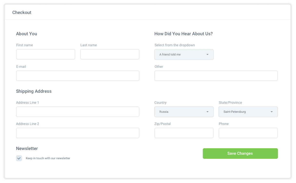
But each time we become distracted, we also distract the user. Every secondary call to action we add distracts from the call to buy. Whether it’s “Follow us on Twitter” or “Check out our latest TV campaign,” the result is the same — users not purchasing.
To counteract this problem, I have created three simple questions you can ask of every element within your ecommerce design. These questions are inspired by John Maeda’s book, ‘Laws of Simplicity’. The insight you receive from these questions will streamline your sales process and focus your site on its job of selling products.
You can apply these questions to everything from your website logo to the terms and conditions in the footer. I would encourage you to do an audit of every element, and ask the following three questions in order.
You might also like: The Seven Deadly Sins of User Experience Design
1. Can it be removed?
I know this sounds like an obvious question, but when was the last time you asked this about every element on your website? Once something has made it onto the site, we rarely question whether it is appropriate anymore.
Circumstances may have changed and the reasoning behind adding the element may no longer apply. Also, if we are honest, often we shouldn’t have added it in the first place.
Sometimes when you take this approach, you will meet resistance from colleagues. This is especially true of those who asked to add the element in the first place. In such situations, I ask one more question: what would happen if we removed this element?
This puts them on the defensive. You don't have to articulate the negative consequences of keeping the element. Instead, the pressure is on them to say why it would be bad to remove it.
We can apply the question of removing elements to every part of your website. But it is particularly important to apply it to the checkout process. Once a user has expressed an interest in buying (by adding it to their basket), it is best practice to remove all distractions.

Of course, sometimes the answer to our question is that we cannot remove it. This is a legitimate answer, but leads us to another question: could we hide it?
You might also like: Web Design Experts Share Their Advice for Attracting Your Next Client
2. Could we hide it?
There are many elements that we need to include, but are given a higher priority than they should receive. Social media calls to action are a great example of this.
We want to give visitors to our website the opportunity to follow us on Twitter, Facebook, and other social networks. But often they become a distraction to the purchasing process. After all, only a small number of users are going to want this option. Also, given a choice between both actions, we would prefer people to buy something over following us on Twitter.
Yet many ecommerce sites you visit are plastered with social media icons. To make matters worse, they often stand out like a sore thumb because their design does not match the rest of the website.
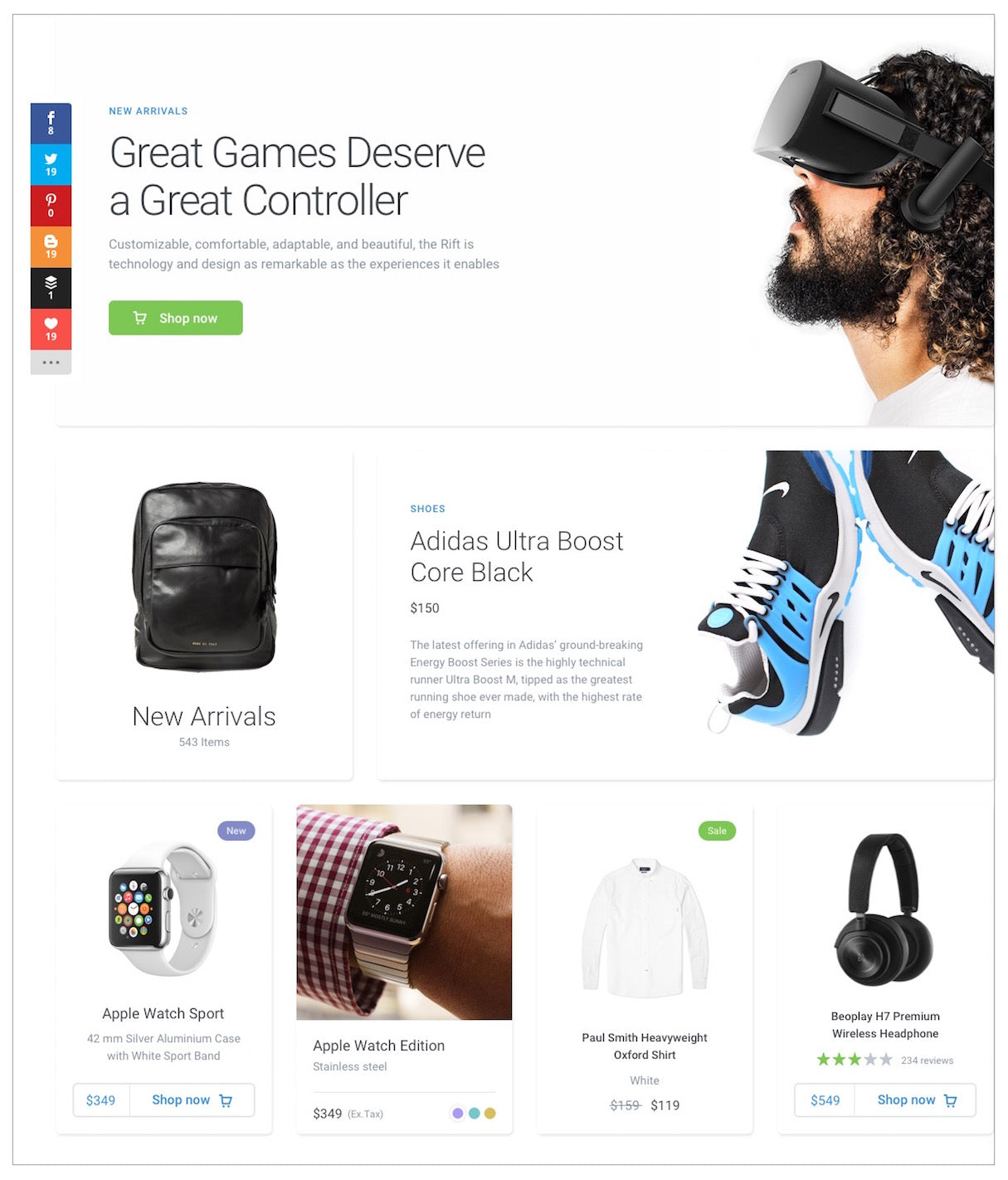
If we cannot remove these elements, what should we do with them? One viable option is to consider hiding them.
Hiding does not mean that we need to make the secondary calls to action hard to find. It just means that we do not have them alongside our primary calls to action — actions like add to cart or checkout.
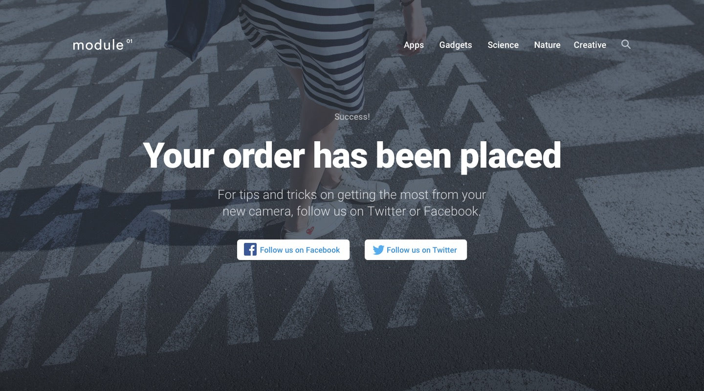
For example, a great time to ask users to follow you on social media is once the user has completed buying a product. At the end of the checkout process, many ecommerce sites have a ‘continue shopping’ link. This is possibly the weakest call to action on the web! Why would anybody want to continue shopping after they had just bought something?
Instead, we could use this opportunity to encourage people to follow us on social networks. They have completed the primary call to action, so now is a great time to ask them to consider secondary actions. We can even customize those secondary calls to action based on what they have bought.
That said, there are some elements that although secondary we cannot hide. This is when we move onto our third and final question: could we shrink it?
You might also like: Designing With Customer Service In Mind Above All Else
3. Could we shrink it?
Although our ultimate goal is to persuade users to buy something, this is only the final step of their journey — a journey often referred to as a sales funnel. This funnel consists of many steps. Steps from discovering a need, through researching options to buying, and beyond.
Each step along the road has associated calls to action. For example when users are researching the best product for their needs, we may wish to encourage them to sign up for a newsletter. This helps with their research process, but also enables us to keep our website and brand in their minds.
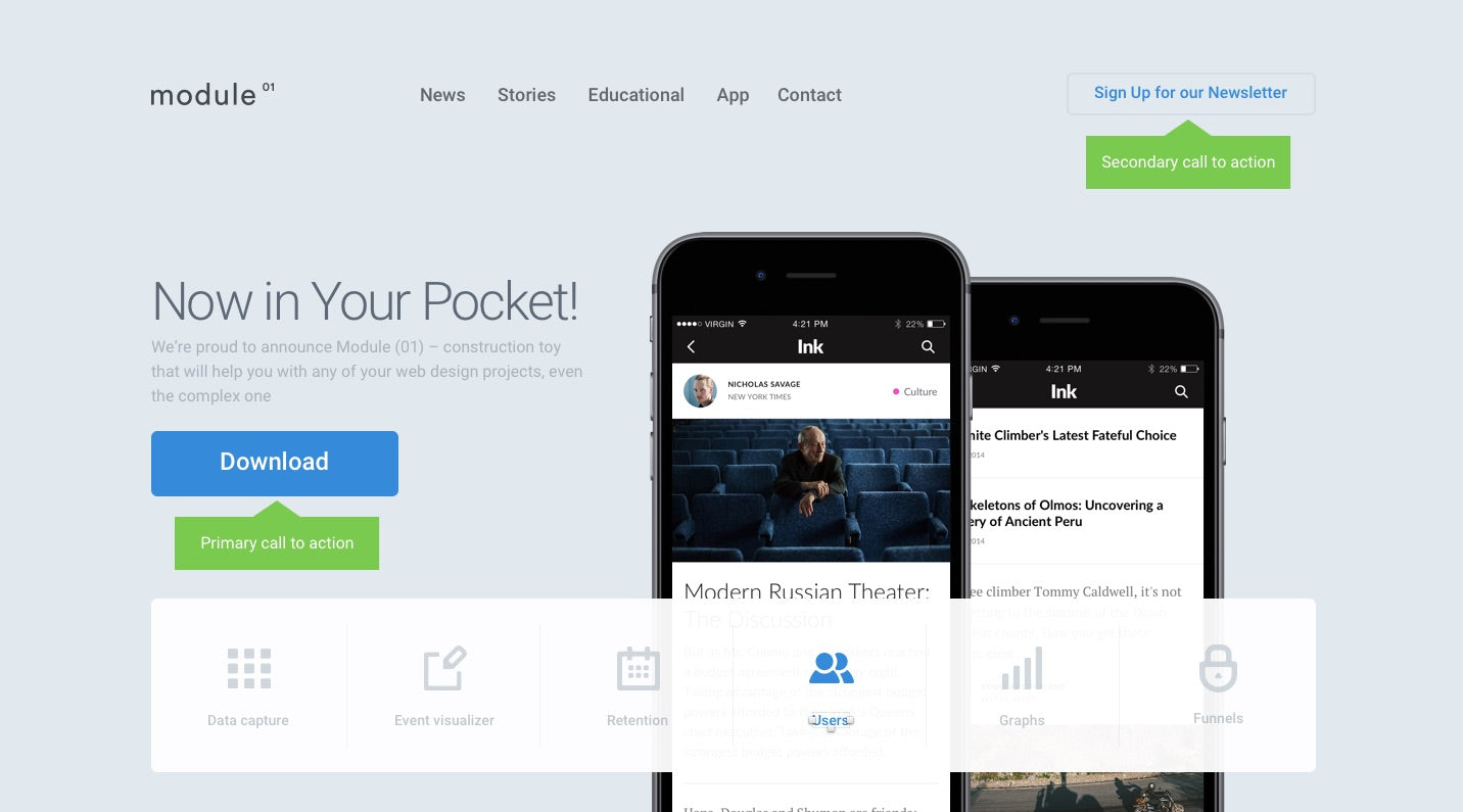
The problem is the call to action for signing up to the newsletter could prove distracting for users who are about to place an order. This secondary call to action is important, but still not as important as checking out.
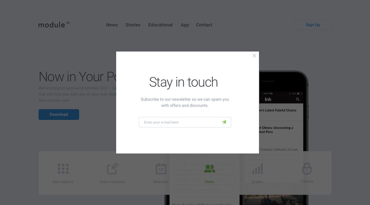
With these kinds of secondary actions you cannot just remove or hide the element. This would make it too hard for people earlier in the sales funnel to find. The alternative is to shrink them.
If you cannot remove or hide an element, then you can reduce its prominence. It is important that the secondary calls to action are prominent on the website. But they need to be de-emphasised to ensure that users see our primary action first. This can be accomplished through your choice of color, font, or the sizing of your elements in relation to each other.
Simplify your ecommerce design with just three little questions
These three questions are not revolutionary. But they are a handy reminder that help us think about, and apply, design best practice on an ongoing basis. They prevent us from becoming distracted, thereby distracting the user. You will be surprised what a difference these three little questions can have on your conversion rate. Just try them and see.


