While you’ve probably put a lot of thought into making your homepage or landing page represent your brand and personality, other web pages tend to get a lot less love. Your Contact Us might seem like another standard link in the navigation, but it’s often one of the least optimized parts of an online store.
By making this page more personable and inviting, you’ll give customers who need to talk to you a better experience.
Having a well-structured Contact Us form also helps reassure customers that someone is listening to complaints and feedback. Being available to answer questions can convert curious website visitors into customers.
Contact Us page best practices
- Include all relevant contact information
- Add a compelling call to action
- Add an FAQ section
- Provide links to a help center or relevant guides
- Send a confirmation and response time
To get the most from your Contact Us page, consider these best practices:
1. Include all relevant contact information
Contact Us pages generally include an email address or form; but if you have other ways for customers to get in touch with you—such as via phone, chat, social media, or at a physical location—list them here. This allows customers to get in touch with you using the channel they find most comfortable.
2. Add a compelling call to action
Inevitably, someone will land on your Contact Us page and not fill out the form to contact you. This is a great opportunity to invite them to do something else, such as sign up for your newsletter, check out your sale products, or follow you on social media.
The bottom of a Contact Us page is the perfect place for an inviting CTA (call to action).
3. Add an FAQ section
You’ll find that a lot of shoppers have similar questions. They might want to know how long delivery times are, your shipping costs, or whether they need additional products to go with their initial purchase.
Adding an FAQ section to your Contact Us page can help customers self-serve and get answers to their questions.
4. Provide links to a help center and relevant guides
If the FAQ section isn’t enough, shoppers might look for guides they can work through to find answers to their questions. Link to your help center or support page, or direct shoppers to specific blog posts that answer their questions.
5. Send a confirmation and response time
Once users have submitted their query, it’s helpful to them to know it’s been received and by when they’re likely to get a response.
The importance of a Contact Us page
When someone lands on your Contact Us page, they’re already engaged with your brand. Maybe they have questions before purchasing, need support, or want to explore a partnership. If your Contact page is hard to find or unhelpful, you create unnecessary friction that could cost you trust, sales, or customer loyalty.
Here’s why a Contact Us page is crucial:
- It builds trust. A business that’s easy to contact feels legitimate. If your contact details are hidden (or nonexistent), customers may wonder if you’re avoiding them.
- It removes barriers to purchase. Sometimes, the only thing standing between you and a sale is an unanswered question. Maybe someone wants to confirm shipping details, check if a product is in stock, or ask about pricing. If they can’t get a quick answer, they might leave and shop elsewhere.
- It improves customer experience. An easy-to-use contact form makes it easy for people to reach the right person without jumping through hoops.
- It helps with problem-solving. Issues are inevitable, but how you handle them matters. A well-structured Contact page with clear response times, support options, or a helpful FAQ can turn a frustrated customer into a loyal one.
- It opens the door to new opportunities. Not every visitor is a customer. Some might be potential collaborators, press contacts, or future partners. A welcoming, well-designed Contact page makes it easy for the right people to get in touch and helps you capture unexpected opportunities.
18 best Contact Us page examples
- KeySmart
- ban.do
- Tommy John
- Skims
- Allbirds
- Magnolia Market
- Casper
- Lululemon
- MOTH Drinks
- Quince
- Roxanne First
- Mejuri
- Elevated Faith
- Our Place
- Beardbrand
- Haus
- NEMO Equipment
- Settler’s Club
By using the Contact pages already included in their Shopify themes (or going even just a little out of the box), the stores below transformed the simple contact form into a valuable resource for their customers.
The best thing about these pages is their uniqueness to each brand. It just shows that you can take the basic traits of a great Contact Us page and make it something special for your store to better serve your customers. Use these examples as inspiration for your own Contact Us page:
1. KeySmart
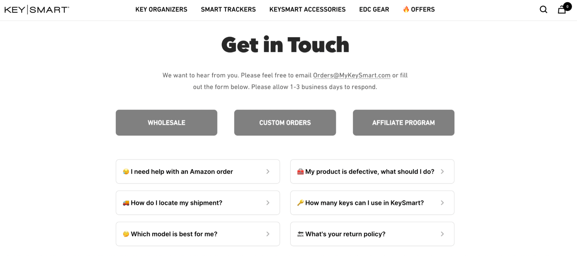
This Contact page manages to fit a lot of information into a simple, clean layout. KeySmart allows users to email in their questions, fill in a standard form, or choose one of six common question types for a more tailored experience.
What makes this great:
- Clear expectations. The Contact Us page clearly lays out expectations on how long users can expect to wait for a response—a turnaround time of one to three business days.
- Options for specialized queries. Beyond the usual user queries, the Contact Us page offers options for those who have questions about wholesale and custom options, and about the brand’s affiliate program.
- Value propositions. The bottom of the page presents users with three value propositions: free US shipping on orders over $45, a two-year warranty, and a 100%-secure checkout.
2. ban.do

Ban.do’s Contact page is funny and approachable, in keeping with their playful brand voice and products.
What makes this great:
- Friendly tone. The copywriting uses a conversational and casual tone that helps put visitors at ease and encourages them to reach out.
- Visual appeal. The use of colorful vintage telephones serves as a visually engaging element that makes even this often-dull page memorable.
- Messaging options. While the Contact form takes up most of the page, the brand also has options for users to call in during work hours, for those who prefer spoken interactions or have more urgent questions.
3. Tommy John

Tommy John’s Help Center combines the FAQ and Contact Us pages into one neatly designed format. The page has a clean, minimalistic design with a search bar at the top for easy navigation. Below that are the customer service hours and options, a return/exchange option that takes you to a separate form, and finally, categories of common questions and concerns.
What makes this great:
- Extended support hours. Providing customer support on weekends and evenings caters to customers who might need help outside of normal business hours.
- Multiple communication channels. Tommy John provides customers with an email or phone option, stating both clearly at the top of the page, so customers can choose what works best for them.
- Search functionality. The search bar at the top of the page makes it easy to find answers without having to look through multiple categories of questions.
4. Skims

Skims offers website visitors a selection of ways to get in touch so they can choose their preferred method. Down the side of the page, it provides links to relevant information and FAQs.
What makes it great:
- Variety of contact methods. Live chat, text, and email give customers multiple ways to reach out.
- Timeline and tips. The Contact Us page tells users when to expect a reply, and advises adding the help email address to their contacts to prevent messages ending up in spam folders.
- Organization. It’s easy to navigate and find information quickly with the categorized help topics on the left side.
5. Allbirds

A clear and straightforward header on this Contact page from Allbirds asks, “How Can We Help?” and offers online chat, text, and call options, along with service hours. Below that is an FAQ section grouped by topics, as well as a search bar.
What makes it great:
- Clear availability. Listing hours for support provides transparency and sets expectations for when customers can get help.
- Easy access to answers. Providing a search bar and categorically organized FAQs allows customers to find answers quickly.
- Chat feature. Customers can get immediate help by clicking the “Chat with us” link at the top of the page, or the Chat button in the lower right-hand corner.
6. Magnolia Market

Magnolia Market’s Help Center includes store contact information, addresses, helpful articles, and three contact options: a 24/7 chat service, email, and a phone number to call during business hours.
What makes it great:
- Visual cues. Using icons with each help category makes it easy for shoppers to find the specific help they need.
- 24/7 availability. Round-the-clock chat service caters to customers in different time zones and with urgent questions.
- Clear phone support hours. When you state customer service hours, it helps manage expectations and prevent confusion.
7. Casper

Casper’s Contact Us page has a user-friendly design with clear headings and sections. It provides customer service hours for both support and sales inquiries, along with a phone number for direct assistance. There’s also a contact form for submitting questions or messages.
What makes it great:
- Accessible support hours.Offering good customer service seven days a week means assistance is available when customers need it.
- Direct communication. Providing a phone number lets customers speak directly with Sleep Specialists for personalized support.
- Convenient contact form. The Contact form offers an alternative method for customers to reach out with their inquiries.
8. Lululemon

Lululemon’s Contact page is well-organized with multiple support options, including phone, live chat, and text. It also offers a searchable Help Center and details on in-store support.
What makes it great:
- Varied contact methods. Customers can choose phone, chat, or text for real-time assistance, or send an email.
- In-store support details. Providing information about physical stores helps those who prefer face-to-face service.
- Searchable Help Center. Having a search bar makes it easy for users to find answers.
9. MOTH Drinks

Moth Drinks’ Contact pageis concise and straightforward, with email addresses for general inquiries, trade inquiries, and press requests.
What makes it great:
- Clear inquiry categories. The form directs messages to the right team, encouraging faster responses.
- Simple layout. There are no distractions on this page—just a quick way to get in touch.
- Dedicated press and trade options. Tailoring support for different types of inquiries streamlines communication.
10. Quince

Quince’s Help Center page has links for three common support queries on top (tracking orders, starting an order, or starting a return). This is followed by a searchable FAQ section, and below that, three options for getting in touch.
What makes it great:
- Multiple contact options. Customers can choose between email, text, or chatbot assistance.
- Searchable Help Center. Quince’s FAQ section is exhaustive, with topics ranging from shipping to shopping tips and referrals, and discounts..
- Clean, user-friendly design. Though the page has a lot of information, it’s broken up into three distinct sections, which makes the information easy to navigate and find.
11. Roxanne First

Roxanne First’s Contact page is very on-brand and to the point, featuring two columns of information about the brand’s location, opening hours, and contact details.
What makes it great:
- Direct contact options. Email and phone support make it easy to get personalized assistance, which promises to come within 24 hours.
- Minimalist design. No unnecessary distractions—just the essential info.
- Option for press queries. There are special email addresses for press queries to ensure they go to the right department and don’t get lost in the mix.
12. Mejuri

Mejuri’s Contact page is well-structured, offering various ways for people to get in touch with the brand, depending on their needs. It’s also consolidated some of the most common inquiries so customers can find what they need ASAP.
What makes it great:
- Influencer and brand collaboration options. The jewelry brand’s Contact page includes links to its affiliate program and ambassador program applications, as well as a dedicated email for press and brand collaborations.
- Comprehensive Help Center. The Contact Us page links out to a dedicated FAQ page, an extensive resource for existing and potential customers.
- Live chat button. Mejury offers a live chat option, which site visitors can access from any page on the website.
13. Elevated Faith

Elevated Faith keeps things simple with a handful of ways customers can get in touch. As well as reaching out via the embedded contact form, customers are directed toward relevant resources that may be able to help them quickly.
What makes it great:
- Easy-to-use contact form. Elevated Faith’s contact form is easy to use. No unnecessary steps—just fill it out and submit.
- Additional resources. In addition to contact information and a link to its returns center, the brand also directs users to its pre-loved center, the official destination for buying and selling their goods.
- Friendly tone of voice. The copy is friendly and welcoming, in keeping with the brand’s image.
14. Our Place

Our Place’s Contact page is laid out neatly, with an easy-to-navigate block layout and various options for customers to get in touch or find further resources.
What makes it great:
- Features top FAQs. Though Our Place has a separate FAQs page, it features some common questions on the Contact page, with the option to navigate to the more extensive resource center.
- Form with order number. The contact form has an optional section to fill in the order number, which may help bypass the need for a first round of communications to exchange those details.
- User-friendly design. Everything is laid out clearly for easy navigation.
15. Beardbrand

Beardbrand’s Contact Us page is bold and straightforward, with an email-based support system. There’s also a unique text option that customers can use to get personalized styling tips— a great way for the brand to add subscribers to its email and SMS list.
What makes it great:
- Text option. Customers can get personalized tips via SMS, and the brand can add subscribers to its list.
- Value proposition. Below the contact form, the brand offers information about its ingredients, exchange policy, and shipping.
- Call to action. For users who want to know more about the brand and its products, the intriguing call to action to “grow your mind” encourages them to subscribe.
16. Haus

Drinks brand Haus’s Contact Us page is minimal, with an email address for inquiries and an abridged list of FAQs.
What makes this great:
- Minimalist design. Haus’s aesthetic is sleek; its minimalist Contact page and simple options are in keeping with the theme, both in content and in design.
- Abridged FAQs. The contact page has answers to common questions about customer orders. A separate, dedicated FAQ page has more details about the products and the company.
17. NEMO Equipment

NEMO Equipment’s Contact Us page is detailed and user-friendly and provides links to their detailed forms that cover a number of different situations.
What makes it great:
- Detailed forms. Sometimes companies need details before they can help. Forms for requesting spare parts or repairs ask for information including the product ID, and repair and warranty claims make customers agree to send in their gear clean.
- Warranty support. In addition to the Contact page, NEMO’s customer support pages include detailed warranty pages with contact information for distributors in multiple countries, and a detailed returns page.
18. Settler’s Club
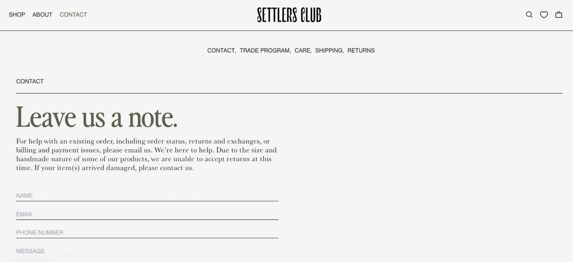
Home décor brand Settlers Club’s Contact Us page is simple and to the point, featuring a contact form for customer inquiries. In the blurb above the contact form, the brand gives a few prompts for reasons customers might want to get in touch.
What makes this great:
- Easy-to-use form: Quick and hassle-free way to reach support.
- Carousel with brand highlights: Below the fold, the Contact Us page features a simple carousel with the words “Free Shipping” and “Crafted with Care,” highlighting important features of the brand’s offerings.
3 tips for an effective Contact Us page
Use these three tips to help you create a standout Contact Us page that serves your needs and represents your brand:
1. Make your Contact page easy to find
If no one can find your Contact Us page, there’s no point in having one. Being accessible means customers can navigate to your Contact page when they need to talk to you. There are two places that work really well: your main navigation bar and the footer at the bottom of every page.
2. Create a welcoming page
Once site visitors find your website’s Contact Us page, do they know if you welcome emails, phone calls, and feedback? Or does your contact page resemble a series of hurdles designed to keep trespassers out? It sounds obvious, but depending on what your page actually says, your customers might not follow through with contacting you.
You can add copy at the top of your default Shopify Contact page, to provide additional information and help customers complete the form. Including a request for customers to let you know if they need anything makes your brand feel approachable. Here are a few examples you can adapt to suit your needs:
- “We read and respond to every customer inquiry. We really do want to hear from you!”
- “Our customers mean the world to us, and we love hearing from you.”
- “We get lonely when we don’t hear from you. Get in touch today!”
- “Make our day and fill our inbox with comments, questions, and concerns.”
3. Choose your goals
Not every Contact Us page serves the same purpose. Depending on your goals, you may need to adjust the language, have dedicated email addresses, or add FAQs.
Here are a few common purposes for Contact Us pages:
- Support. Help resolve the concerns of existing customers who are having issues with their order, want to return or exchange a product, or are having trouble completing an order.
- Sales. Help potential customers make a decision, convert prospects into customers, and offer a channel for bulk or warehouse orders.
- Press or PR. Help the media get in touch with the right people to share your story.
- Human resources. Help potential employees apply for a job or ask questions about your company.
How to add a Contact Us page in Shopify
- Build your page
- Choose your form fields
- Route contact requests to the right team
- Customize your form
Here’s how to add your company’s contact information to a separate page in your Shopify store:
1. Build your page
Follow these steps to create a Contact Us page on your Shopify store:
- In your Shopify admin dashboard, go to Online Store > Pages and click “Add page.”
- Add a title for your page, such as Contact Us or Get In Touch.
- Enter any text you want to show above the contact form in the Content box (you can leave it blank if you don’t want any text).
- In the Online store section, choose “Contact” from the theme template dropdown menu.
- Click Save.
2. Choose your form fields
Shopify’s built-in simple contact form includes three fields: Name, Email, and Message. This might be enough for you if you’re just starting because it easily captures enough information to respond to the customer and have a productive conversation.
3. Route contact requests to the right team
If you’d like to route contact requests to different departments or capture more information, you might want to customize your form fields.
For example, if you use a help desk to keep track of your incoming customer requests, embedding their ticket form on your Contact page can automatically tag and route incoming emails to the right department.
4. Customize your Contact Us form
You have a few options available for customizing the Contact Us form. While the default Shopify form fields require some basic code editing to update fields, you can also embed the contact forms from your help desk directly into a page. Use Shopify’s website builder, or use a Shopify app to design a more full-featured contact form. Here are a few of our favorite apps:
These apps allow you to add as many fields as you’d like to your forms, so you can ask for order details and other information to respond to customers more effectively.
But beware: Making your forms too long can deter customers from getting in touch. Find a balance between asking for the information you need (like an email address) and making it easy for customers to reach out.
Read more
- 10 Best Website Builder Picks for Online Businesses (2024)
- What Is a Domain? A Complete Guide to Domain Names (2024)
- 10+ Best Welcome Email Examples That Really Work
- 21 Best FAQ Page Examples (+ How To Create Your Own)
- 6 Strategies for Building a Customer Retention Program
- What Is a Transactional Email? Types and Best Practices (2024)
- 7 Best WordPress Ecommerce Plug-ins in 2024
Contact Us page FAQ
What can I say instead of “Contact us now?”
Instead of “Contact Us Now,” try phrases like “Get in touch today,” “Reach out to us,” or “Start the conversation.” These alternatives are friendly and encourage immediate action without sounding too formal.
What is a Contact Us page?
A Contact Us page is a dedicated page on an ecommerce website where visitors can find out how to get in touch with the company.
Does my online store need a Contact Us page?
Having a Contact page makes it easy for shoppers to get in touch if they have a question or issue. This helps resolve problems, build trust, and promote customer loyalty.
What should be included on my Contact Us page?
Many business Contact pages include one or more of the following elements: a contact form, an email address, a contact phone number, a live chat option, a text number, an FAQ, and links to a help center or guides. Local companies often include a map and a physical address.
Are there alternative phrases to “contact us” we can use?
Yes, you can use phrases like “get in touch” or “reach out to us.” You want to make sure the phrase is something customers understand, so keep it simple.
How do I make a Contact Us page for my Shopify store?
- Go to Online Store > Pages in your admin dashboard.
- Click “Add Page.”
- Enter a title for your page.
- Add the text you want to show above the contact form.
- Choose “Contact” from the theme template dropdown.
- Click Save.