Popular searches
Grow your expertise with Shopify Academy


Earn badges and stand out from the competition
Shopify Verified Skills badges prove your learning of specific topics covered in Academy courses and learning paths
Earn badges within our Fundamentals, Retail, or Storefront series.
DiscoverEarn Verified Skills Badges

Prove your abilities in specific topics covered in Shopify Academy
How to get started
1
Login with Shopify
Start learning today with your Shopify account
2
Discover courses and paths
Focus on learning topics curated for your specific needs
"Having a Shopify Academy badge really proves to our clients that we have knowledge about the platform, and it provides a lot of trust and credibility."
Left Designs
Shopify Partner
“The availability of a trained and certified talent pool does heavily influence our purchasing decisions!”
Imran Saadi
Sr. Director of Product & Engineering at Warner Bros. Entertainment
Featured courses and learning paths

Shopify Flow Fundamentals: Building Powerful Automation for a Store
Learn about the Shopify Flow interface and its core components to build powerful automations that streamline an ecommerce business.
FREE
3 Courses

Liquid Storefronts for Theme Developers Path
Learn how to use Liquid, Shopify's templating language, to optimize Shopify themes and deliver exceptional user experiences.
FREE
3 Courses

Expanding Your Shopify Business Internationally Path
Learn to guide your business through the key steps of an international expansion.
FREE
7 Courses

Navigating the Shopify Admin
A collection of interactive demos and articles that provides an overview of the capabilities of the Shopify admin. You’ll explore the features and tools that will help you maximize your success with the admin.
FREE
13 Resources

Creating a Digital Marketing Strategy Path
From unified commerce foundations to strategic seasonal campaigns, learn the essentials of marketing with Shopify to build your brand, engage your audience, and drive conversions.
FREE
6 Courses

Shopify POS Launch and Operations Path
Learn about Shopify POS launch and operations to effectively set up and manage hardware, train staff, execute operations, and optimize growth for seamless business operations.
FREE
5 Courses

Conversion Rate Optimization with Shopify
Learn how to effectively maximize your Shopify store's potential from applying CRO best practices to personalizing customer experiences.
$299
4 Courses
Education and reference resources
The resources listed below cover some of the topics within this exam
FREE

[Article] Introduction to Shopify’s Development Resources
Learn about the tools and resources available to you as a Shopify developer.
8

Introduction to POS UI Extensions
Learn how to take advantage of POS UI extensions by exploring practical applications, learning to navigate developer documentation, and gaining hands-on experience in creating innovative extensions.
FREE
40
Week 3
FREE

[Article] Selling fractional quantities
Learn how to enable fractional and non-traditional quantity sales in your Shopify store
5

Enhancing Checkout with UI Extensions
Learn how UI extensions create unique shopping experiences in the checkout.
FREE
25

Customizing Business Logic with Shopify Functions
Learn how Shopify Functions apply unique business processes to checkout.
FREE
30
Site Audit Walkthrough
Walk through an 8 minute site audit of the 6 key areas to focus on when optimizing your ecommerce site for conversion.
FREE
10

Onsite Cart Abandonment Strategies
Learn hands-on tactics to convert more customers through abandoned cart recovery
FREE
5 min
Growing with Shopify
Recommended for merchants whose annual sales are between $100K and $1MM
FREE

[Video] Packaging 101 with Arka
Discover the best practices for packaging products to make success-oriented decisions.
20

[Article] Auditing SEO Performance
Implement regular SEO audits to measure performance, identify opportunities, and maintain visibility in search results.
5

Introduction to Headless Storefronts Solutions
Explore custom storefront solutions available to Shopify merchants, including features and benefits of Hydrogen, Oxygen, and the Storefront API.
FREE
70

Introduction to Shipping & Fulfillment with Shopify
Get a comprehensive understanding of Shopify’s shipping and fulfillment tools.
FREE
30

Introduction to Shopify
Learn about who Shopify is, our mission, core features of the platform, and how we support businesses of all sizes to start and grow.
FREE
20

Getting Started on Shop
Your customers are already on Shop, you just need to meet them there. Watch these short videos to understand how you can leverage Shop’s features to re-engage your most valuable customers.
FREE
10

How to Optimize your Page and Site Speed
Improve your page and site speed with actionable tips you can implement yourself immediately, as well as more complex strategies you can address with your developer to
FREE
20

The Value of Social Listening
Learn the value of social listening and how to leverage what you "hear" to grow your business
FREE
29 min
Week 1
FREE
Week 2
FREE

Planning for Peak Season 2024
Prepare for a successful 2024 peak holiday season and Black Friday - Cyber Monday (BFCM) with this comprehensive course packed with valuable insights and actionable tips.
FREE
30

Fulfillment and Order Routing
Examine factors to decide which fulfillment methods to offer for your products and orders
FREE
30

Expanding Your Developer Toolkit
This course will introduce you to more advanced or multi-function tools, commerce-pillar specific extensions, and cover how to stay up to date on product changes relevant to developers.
FREE
20

Shipping Settings and Strategies
Learn how to align business goals to fulfillment strategies
FREE
60
Shopify POS Walkthrough
Click through the Shopify POS app to learn about it's features and functionality.
FREE
Grow with Shopify POS
Learn how to grow as a Shopify Partner, with Shopify POS
FREE

[Article] Building Your SEO Strategy
Create an effective search optimization strategy tailored to your business stage, from new brands to established companies.
5

Training and Managing Staff for POS
Enhance your skills in training and managing employees effectively with Shopify POS, focusing on onboarding, continuous improvement training, and using roles and permissions.
FREE
20
Selling Shopify Series
Not currently available

[Video] Why Unified Commerce?
Physical retail is back! In store and online are now effectively one continuous experience and no longer separate lanes of business. Watch to learn more about how Shopify empowers you to make a seamless shopping experience for your customers with Unified Commerce.
4

Mastering the Art of Positioning Shopify Checkout
Learn how to promote Shopify Checkout to prospective brands
FREE
40
Square Switcher Toolkit
Resources to help Partners migrate merchants from Square to Shopify POS
FREE

Customizing Themes
Learn the fundamentals of frontend development at Shopify with an emphasis on theme development.
FREE
120

Shopify Development Fundamentals Path
Learn Shopify's framework and the necessary steps to start developing on Shopify’s platform.
FREE
4 Courses

Positioning the value of Shopify Checkout
Learn how to pitch and position Shopify Checkout and checkout extension features to prospective and existing merchants. After completing the learning path, pass a proctored assessment to earn your Positioning the Value of Shopify Checkout badge.
$149
4 Courses

B2B on Shopify: Launch and Customization
Learn how to start selling wholesale by setting up and customizing B2B features in a Shopify store. After completing the learning path, pass a proctored assessment to earn your B2B on Shopify: Launch and Customization badge.
$149
4 Courses

Selling Shopify Fundamentals
Learn how to effectively co-sell with Shopify teams from efficient prospect discovery to delivering a winning pitch. After completing the learning path, pass a proctored assessment to earn your Selling Shopify Fundamentals badge.
$149
5 Courses

Selling and Positioning Shipping Solutions on Shopify
Learn how to leverage Shopify’s shipping and fulfillment tools to enhance operational efficiency. After completing the learning path, pass a proctored assessment to earn your Selling and Positioning Shipping Solutions on Shopify badge.
$149
3 Courses

Shopify Development Fundamentals
Learn Shopify's framework and the necessary steps to start developing on Shopify’s platform. After completing the learning path, pass a proctored assessment to earn your Shopify Development Fundamentals badge.
$149
6 Courses

Expanding Your Shopify Business Internationally
Learn to guide your business through the key steps of an international expansion. After completing the learning path, pass a proctored assessment to earn your Start Here and Go Abroad – Taking Your Store International badge.
$149
8 Courses

Creating a Digital Marketing Strategy
This learning path covers essential brand marketing knowledge, including unified commerce, strategic initiatives, audience engagement, and social media growth. Explore influencer and affiliate marketing. Complete the path and pass an assessment to earn your Digital Marketing Strategy badge.
$149
7 Courses

Solution Planning Fundamentals
Learn how to analyze, visualize, and plan technical implementations with Shopify. After completing the learning path, pass a proctored assessment to earn your Solution Planning Fundamentals badge.
$149
4 Courses

Selling and Positioning Shopify Marketing Products
Learn how to effectively communicate the value of Shopify's marketing products. After completing the learning path, pass a proctored assessment to earn your Selling and Positioning Shopify Marketing Products badge.
$149
3 Courses

Marketing Fundamentals
Learn how to optimize your use of Shopify’s marketing products and products to expand your customer base, increase sales, and grow your business. After completing the learning path, pass a proctored assessment to earn your Marketing Fundamentals badge.
$149
5 Courses

Headless at Shopify for Business Consultants
Learn about Shopify’s custom storefront solutions and learn best practices to guide clients through all phases of headless implementation. Once you’ve completed this learning path, pass a proctored assessment to earn your Headless at Shopify for Business Consultants badge.
$149
3 Courses

Headless at Shopify for Developers
Understand Shopify’s custom storefront solutions and learn best practices to guide clients through all phases of headless implementation. After completing the learning path, pass a proctored assessment to earn your Headless at Shopify for Developers badge.
$249
5 Courses

Shopify POS Launch and Operations
Learn about Shopify POS launch and operations to effectively set up and manage hardware, train staff, execute operations, and optimize growth for seamless business operations. After completing the learning path, pass a proctored assessment to earn your POS Launch and Operations badge.
$149
6 Courses

Customizing the POS Experience
Learn how to design and implement personalized solutions for a business's needs using POS UI extensions.
$249
4 Courses

Positioning International Selling with Shopify
Learn how Shopify supports international selling and how you can identify and align the right merchant with the right solution. After completing the learning path, pass a proctored assessment to earn your Positioning International Selling with Shopify badge.
$149
3 Courses

Solution-Based Selling with Shopify POS
Learn ways to partner with Shopify as well as how to understand product positioning for Shopify POS. After completing the learning path, pass a proctored assessment to earn your Solution-Based Selling with Shopify POS badge.
$149
5 Courses

[Article] Using Strategic Promotions to Drive Sales and Customer Retention
5

[Article] Building Customer Loyalty Programs
5

[Article] Driving Sales with Smart Product Recommendations
5

Working with Merchants
Be prepared to work with Shopify merchants of all types.
FREE
30
Partner Marketing Toolkit
Marketing and brand guidelines
FREE

Positioning and Selling Shopify's Shipping and Fulfillment Solutions
FREE
30
Shopify POS Sales Sheet
A pdf to help Shopify Partners present Shopify POS to merchants
FREE
Learn about Shopify POS
Complete the POS learnings paths & get your Verified Skill Badge
FREE

Seasonal and Event-Based Marketing
Learn to create a holiday-specific marketing strategy that resonates with your audience by tailoring campaigns to each holiday's unique themes and understanding the psychological triggers of urgency and scarcity.
FREE
30

Build a Custom Storefront with Hydrogen
Discover how to build essential ecommerce storefront pages using Hydrogen and the Mock.shop API.
FREE
60

The Five Reasons Why Your Ecommerce Business is a Cash-Eating Monster
In this pre-recorded webinar, learn from Jason Andrew of SBO Financial on how to run a more profitable business
FREE
56 min

Search Engine Optimization
Join the Shopify Merchant Success team as they discuss tactics to improve your store’s search engine optimization (SEO)
FREE
58 min

Getting Started on Shopify Plus
Learn about Shopify Plus exclusive features, education and community resources.
FREE
30

Shipping and Fulfillment Fundamentals
Learn the art of configuring and optimizing shipping settings and strategies in Shopify to enhance operational efficiency and customer satisfaction.
FREE
3 Courses

Onboarding B2B on Shopify
Learn how to implement key B2B on Shopify features, including: companies, locations, catalogs, sales staff, and themes.
FREE
30

Sell in China with Social Media
In this pre-recorded webinar, learn tips to sell into China by leveraging their digital ecosystem and social media
FREE
60
Week 4
FREE

Build With Us: B2B
In this session, get a better understanding of B2B on Shopify and how you can expand your reach and simplify operations.
FREE
60
[Article] Navigating the Shopify Partner Ecosystem
Learn about the tools and resources available to you as a Shopify partner.
8

Introduction to custom storefronts for developers
Learn about Shopify’s headless framework, tooling, and hosting options.
FREE
45

Theme architecture with Liquid for Developers
This course introduces you to Shopify’s standard theme architecture while diving deeper into the Liquid basics learned in the previous course.
FREE
45

Developing Your International Go-to-Market Strategy
Explore how to set goals and make a plan for international expansion.
FREE
20

Researching Your International Target Market
Learn how to identify market demand when selling to a new region.
FREE
20
Fundamentals Series
Learn the essentials for success on the Shopify platform and as a Partner or developer.
FREE
Building with Shopify
Recommended for merchants whose annual sales are between $0K and $100K
FREE
Scaling with Shopify
Recommended for merchants whose annual sales are over $1MM and growing
FREE

Grow your Business with Data Analysis
Understand your customers and what motivates their behavior. Learn how to draw insights from data to better inform your business decisions.
FREE
120

User Experience and Optimization
Join the Shopify Merchant Success Team as they cover how to optimize the user experience (UX) of your store.
FREE
55 min

TikTok x Cheekbone Beauty Case Study: Optimizing Paid Campaigns on TikTok
Follow along with Plus merchant, Cheekbone Beauty, as the TikTok Creative Team conducts an audit of their current TikTok strategy.
FREE
40 min

Optimizing Site Speed for Wild Fork Foods with Diff Agency
Walk through the execution of a site speed audit with Shopify Partner DIFF.
FREE
0 hr 11 min

Branding, Positioning, and Building an Effective Online Presence
Learn to create a powerful brand identity that resonates with your audience by defining your mission, vision, and values while crafting unique value propositions and engaging storytelling.
FREE
45

How to Drive Sales With Your Customer Support Team with Gorgias
Walk through tactics to increase conversion by leveraging your support team
FREE

How to Grow a Successful B2B Business on Shopify
In this 60-minute event, you’ll learn how to successfully grow a B2B business on Shopify. Hear it live from Greg Macdonald, CEO and Founder of Bathorium, and Lizzie Scolari, Product Marketing Manager at Shopify.
FREE
58

Using the Partner Dashboard
Learn about the Partner Dashboard so you can effectively collaborate with merchants and Shopify.
FREE
15

Shopifyと共同販売活動を行う (Selling Shopify Fundamentals)
Shopifyチームとの効果的な共同販売方法を学びましょう。効率的な見込み客の発見から成功するピッチの提供までをカバーしています。学習パスを完了した後、監視付き評価に合格して「Selling Shopify Fundamentals」バッジを取得してください。
$149
5 Courses

Digital Marketing Essentials
Learn how to create effective digital marketing strategies that drive customer engagement, increase conversions, and build long-term loyalty through optimized content, email, and SMS campaigns.
FREE
65

[Article] Using AI in your SEO strategy
Use AI tools responsibly to help you be more efficient without hindering SEO ranking
5

[Video] Getting Started with POS UI Extensions: Demo
A concise walkthrough on generating and previewing a POS UI extension using the Shopify CLI tool. The process includes generating a template for the extension, configuring it through a toml file, and starting a development server to preview the extension.
4

App Surfaces Examples
Explore how apps can extend Shopify’s functionality across multiple app surfaces to improve both merchant and customer experiences.
FREE
30

Recruiting the Best Talent
In this pre-recorded webinar, learn from Steph Corker of the Corker Collective on how to recruit the best talent
FREE
32 min

Identifying Features that Customize Shopify Checkout
Learn use cases and features of checkout customization technologies.
FREE
45

Positioning the Shopify Advantage
Learn how to position Shopify as the preferred commerce platform for prospective merchants.
FREE
60

Liquid optimization for performance
This course introduces you to various tools and techniques for optimizing Liquid themes for performance.
FREE
30

Getting Started with International Selling
Dive into the fundamentals of international selling and discover global market opportunities.
FREE
25
Liquid Storefronts for Theme Developers
Learn how to use Liquid, Shopify's templating language, to optimize Shopify themes and deliver exceptional user experiences. After completing the learning path, pass a proctored assessment that tests your knowledge of the Liquid Storefronts for Theme Developers learning path content.
$249
4 Courses

Localization Strategies
Learn how to make your brand feel like it belongs across borders.
FREE
25

Pricing Your Products When Selling Cross-Border
Discover how to manage pricing and payments when selling to international customers.
FREE
15

[Video] Sneak Peek: Conversion Rate Optimization with Shopify
Learn how to improve your online store’s conversion rates through a data-driven audit that will inform a CRO roadmap and A/B tests to track success. You’ll be equipped with a DIY toolkit to develop an optimization strategy based on expert guidance and tested frameworks used by our growth experts.
1

[Video] Building with POS UI Extensions: Zapiet
Join Andy, founder of the popular POS apps Zapiet and Zapiet Eats, as he dives into their approach to app development using Shopify's POS UI Extensions. Plus, discover insider tips on developing apps with POS UI Extensions.
8

[Video] Agency Success: Scaling Success – Projects, People, Process & Profit
In the second session on agency success, Rachel, a recognized authority in scaling e-commerce agencies, shares her insights on creating scalable systems. She emphasizes the importance of project management, profitability, and effective team structures, highlighting the need for clear communication and accountability.
90

[Article] Managing inventory in the Shopify Admin
Whether you're receiving new stock, conducting an inventory audit, or holding inventory for an upcoming product launch, you can efficiently manage your inventory for all your locations from the Shopify admin.
4
ソリューションプランニングの基礎 (Solution Planning Fundamentals)
Shopifyを使用した技術的な実装の分析、可視化、計画方法を学びましょう。学習パスを完了した後、監督付きの評価に合格すると、Solution Planning Fundamentalsバッジを取得できます。
$149
2 Courses
New courses and paths
FREE
Storefront Series
FREE

Getting started with Liquid for Developers
This course introduces you to Liquid for theme development work.
FREE
45
Retail Series
FREE
Shopify POS Opportunity for Partners
A short guide outlining the opportunities Shopify Partners have, with Shopify POS
FREE

Scale Your Shipping Strategy
This course explores consumer expectations for shipping, how to develop the right shipping strategy for your business, and how to put your strategy into action.
FREE
45 mins
Step 3: Start working on your mandatory Shopify Verified Skills
FREE

How to Go Global
Product Manager Cole Atkinson teaches you how to use key Shopify products including Markets to sell cross border
FREE
25

Activating Your Partnership
Learn actionable tips and best practices to successfully complete your letter of intent requirements and graduate into the Shopify Partner Program.
FREE
25
Sell & Market Shopify POS
Resources to help you market, pitch, and sell Shopify POS to merchants.
FREE

Shopify開発の基礎 (Shopify Development Fundamentals)
Shopifyのフレームワークと、Shopifyプラットフォームで開発を始めるために必要な手順を学びましょう。学習パスを完了したら、監督付き評価に合格してShopify開発の基礎バッジを獲得しましょう。
$149
4 Courses

Getting Started Selling B2B on Shopify
Learn about the B2B commerce landscape, how to evaluate merchant fit, and strategies for crafting an effective B2B sales pitch.
FREE
60
Step 4: Learn how to co-market with Shopify
FREE
Step 5: Continue your onboarding journey
FREE
Step 2: Complete the Activating Your Partnership Course
Hit the ground running toward meeting your letter of intent requirements in this course filled with actionable tips and best practices.
FREE
Step 1: Attend the live event or watch the recording
You will receive the details and registration form via email from your partner manager. Or, ask your partner manager for a link to watch the recording.
FREE

Optimization and Growth with POS
Explore advanced strategies to optimize operations and drive business growth with Shopify POS.
FREE
60

Site Speed Optimization
Join the Shopify Merchant Success team and a Performance Expert as they discuss tactics to improve your store’s site speed
FREE
61 min

Email Marketing Strategies for Ecommerce
Use email effectively in your ecommerce marketing strategy
FREE
20

Building Custom POS Interfaces with UI Extensions
Learn how to design and develop custom POS interfaces by engaging in comprehensive, hands-on practice with UI extensions.
FREE
45

Hydrogen Best Practices
Learn best practices to optimize a custom storefront
FREE
60

Create a Diagram for an Employee Stipend Program
Work from business case to completed technical diagram.
FREE
60

[Video] Development Workflows: Partner Webinar
This webinar provides an overview of Shopify deployment methods, covering general setup best practices, staging and testing, optimizing performance, the process of pushing changes and feature updates to production, and the differences between Headed Development and Headless Development.
60

[Video] The Power of Shopify's New Customer Account Extensibility
In this exclusive Shopify webinar, join Hayward Pierce, Senior Partner Solution Engineer, and Graeme Kemp, Senior Product Manager, as they introduce Shopify's customer account extensibility. Learn how these new features can enhance the customer experience by offering personalized, self-serve functionalities.
FREE
27

Liquid to Hydrogen Migration
Learn the steps to successfully transition from a Liquid storefront to Hydrogen.
FREE
40

Co-selling with Shopify
Learn how to navigate the Shopify sales cycle and partner with key Shopify teams for successful co-selling.
FREE
60

Creating Solutions for Shopify Checkout
Learn what’s possible with customizing checkout beyond what’s available out-of-the-box. After completing the learning path, pass a proctored assessment to earn your Creating Solutions for Shopify Checkout badge.
$149
8 Courses

Introduction to Shopify Partner Program
Identify opportunities to collaborate with merchants and Shopify to grow your business as a Partner.
FREE
15

Shopify Partner Program Essentials
Begin your journey as a Shopify Partner by exploring essential courses that provide foundational knowledge for your success.
FREE
4 Courses

Solution Planning Fundamentals Path
Learn how to analyze, visualize, and plan technical implementations with Shopify.
FREE
3 Courses

Headless at Shopify for Business Consultants Path
Learn about Shopify’s custom storefront solutions and learn best practices to guide clients through all phases of headless implementation.
FREE
2 Courses

Positioning International Selling with Shopify Path
Learn how Shopify supports international selling and how you can identify and align the right merchant with the right solution.
FREE
2 Courses

Craft a Winning Shopify Value Pitch
Learn how to deliver a tailored Shopify value pitch that drives sales momentum.
FREE
60

Deciding on Your B2B Store Format
Learn about the two B2B storefront formats available on Shopify, and how to choose the right setup for specific business needs.
FREE
30

Personalizing the B2B Buying Experience
Learn how to create a personalized buying experience for wholesale customers.
FREE
30

Creating Solutions for Shopify Checkout Path
Learn what’s possible with customizing checkout beyond what’s available out-of-the-box.
FREE
7 Courses

Create a Landing Page That Converts
A great landing page helps you delight your visitors and convert them into leads.
FREE
3 mins

Extending Checkout with the Checkout Blocks App
Learn how Checkout Blocks tailors your checkout experience.
FREE
30

How to Increase Customer Conversions with Shopify POS
5 features a retailer may want to use to increase their efficiency and in-store conversion.
FREE
40

Launching on Shopify Plus
Learn how to plan and execute your migration and setup on Shopify Plus
FREE
30

Influencer and Affiliate Marketing
Explore the essentials of influencer and affiliate marketing to grow your business by identifying suitable influencers, building strong partnerships, and utilizing performance-based strategies.
FREE
30

[Video] Riess Group: Adding POS to your partner portfolio
Watch now to hear how the Riess Group transformed their partner portfolio with Shopify Point of Sale.
9

[Article] Gift Cards in the Shopify Admin
Gift cards can be added to your store from the admin just like any other product, providing a convenient option for your customers to share their enthusiasm for your brand with friends and family.
4

[Video] Sales Foundations: Pitching
Learn how to craft a winning Shopify value pitch that drives sales momentum. This series covers how to frame the challenge, why Shopify is different and how Shopify delivers value. Watch now to learn how to tailor your pitch with details about a prospects GMV, complexity and pain points.
15

[Article] Conditional Delivery Instructions Input
Read a real-world example that uses checkout UI extensions to provide a delivery instructions input at checkout.
6
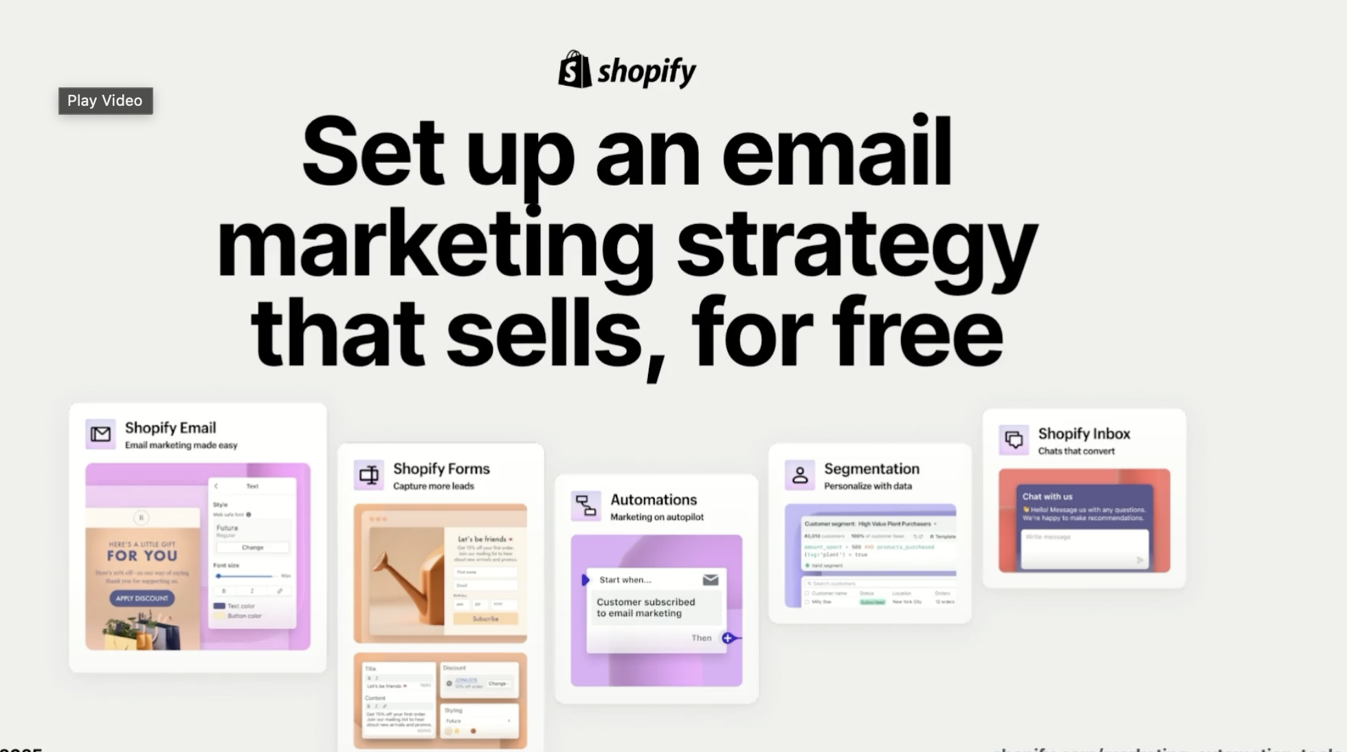
[Video] Set up an email strategy that sells, for free
Get set up with the marketing automation tools available to you in Shopify. In just under an hour, our expert team will guide you through setting up a full email marketing strategy—from building your list to turning on key email automations and sending up to 10,000 emails a month for free.
45

[Article] Creating Variants in the Shopify Admin
Add Variants and Collections using the Shopify Admin.
6

Solutioning with POS UI Extensions
Learn how to develop tailored solutions using POS UI extensions to address specific business challenges.
FREE
25

Building Backend Logic for Shopify Checkout
Extend your Shopify store's checkout capabilities by mastering metafields and Shopify Functions.
FREE

Headless at Shopify for Developers Path
Understand Shopify’s custom storefront solutions and learn best practices to guide clients through all phases of headless implementation.
FREE
4 Courses

POS Hardware and Payments
Optimize the customer experience in your retail store through innovative hardware and payments solutions.
FREE
60

Storefront API Customization
Understand the purpose, structure, and capabilities of the Storefront API
FREE
60
Introduction to Storefronts
Learn about four different storefronts that all work seamlessly with and within the Shopify platform.
FREE
20

Foundations of Unified Commerce Marketing
Gain a foundational understanding of unified commerce by exploring its key components, sales channels, and performance metrics in this course.
FREE
60

Product Positioning for POS
Gain the product knowledge you need to position Shopify POS as a key part of a unified commerce approach.
FREE
30

POS Operations
Discover how to streamline your business operations and focus on business growth with Shopify POS.
FREE
50

Social Media and Content Marketing
Discover effective strategies for leveraging social media and content marketing to enhance your brand's presence and foster business growth through a well-structured content calendar.
FREE
80

Customizing the Appearance of Shopify Checkout
Learn how to visually design your checkout with the checkout and accounts editor and Checkout Branding API.
FREE
25

Getting Started with Selling Shopify Retail
This course will teach you how to talk about Shopify POS’s features and benefits to retail merchants.
FREE
30

POS Setup and Configuration
Learn the foundational steps for selling in person with Shopify POS, including secure data migration, Shopify admin setup, app installation and configuration, and effective issue troubleshooting.
FREE
35

Analyzing the International Competitive Landscape
Explore how to assess international competition when entering a new market.
FREE
25

Marketing Your Shopify Services as a Partner
Unlock the full potential of marketing your Shopify offerings
FREE
45

Positioning the value of Shopify Checkout Path
Learn how to pitch and position Shopify Checkout and checkout extension features to prospective and existing merchants.
FREE
3 Courses

[Article] Adjust Prices with Shopify Functions and Checkout UI Extensions
Read a real-world example that uses Checkout UI extensions and Shopify Functions to adjust pricing in the cart.
11

[Video] Working with Graph QL on Shopify
This video series introduces the basic concepts of GraphQL to help developers think about finding and working with data in Shopify differently from REST API.
7

[Video] Shopify Products Marketing Journey
Join Naomi, a newly hired e-commerce marketing manager, as she transforms her skincare brand's marketing strategy using Shopify's marketing tools. Discover how she boosts conversion rates through targeted ad campaigns, influencer collaborations, and automated email sequences, setting a new benchmark for success.
3

[Video] Learn how to sell more with segmented emails
Discover how to build a great foundation for your marketing with five always-on customer segments that will deliver results, using the tools you already have in Shopify.
45

Misconceptions on ERP and Fulfillment
Learn how to select the right tools to power up your business
FREE
Identifying Fit for Shopify Checkout
Explore Shopify Checkout’s features and benefits to identify merchant fit
FREE
15

[Video] Checkout Extensibility
Shopify offers a high-converting checkout, right out of the box. Some businesses have unique needs that require extending on top of native capabilities. In this series, you’ll learn about all the available technologies to offer a unique and customized Shopify checkout experience.
10
[Article] Adding a Product in the Shopify Admin
Add products to your online or retail store with the Shopify Admin.
8

[Video] The Pathways Podcast: Leading with Checkout
Join our Shopify team to discuss how Partners and Business Consultants are able to lead with checkout when pitching and selling Shopify to new prospective brands.
30

[Video] Business Shipping Challenges: Mid-Market & Enterprise
Follow along with real Shopify merchants and get a firsthand look at their shipping challenges. This series explores common shipping issues for both mid-market and enterprise businesses and how they overcome those obstacles.
4

[Article] Implementing File Attachments with DropZone Component
This article will guide you through the process of implementing file attachment functionality within Shopify’s Customer Account and Checkout UI extensions using the new DropZone UI component.
7

Developing Apps for Shopify Assessment
To earn this badge, pass a proctored assessment that tests your knowledge of the Developing Apps for Shopify learning path content. We recommend you complete all the courses in the learning path prior to attempting the assessment.
$249
35

Planning and Implementing a Custom Storefront
Learn best practices for managing a client relationship through each phase of a custom storefront implementation on Shopify.
FREE
60
Build Black with Shopify Pathway
Welcome to the Build Black Pathway, an empowering journey designed to equip Black entrepreneurs with the essential tools to help transform their business visions into realities.
FREE
13 Courses

Developing Apps for Shopify Path
Learn the essentials of Shopify app development, from building your first functional app to successfully launching on the Shopify App Store while meeting platform standards and enhancing merchant experiences.
FREE
3 Courses

[Video] Getting Started with Building on Shopify
Follow along with an applied framework that you can apply to your own business or clients.
9

Developing Apps for Shopify
Learn the essentials of Shopify app development, from building your first functional app to successfully launching on the Shopify App Store while meeting platform standards and enhancing merchant experiences. After completing the learning path, pass a proctored assessment to earn your badge.
$249
4 Courses
App Development Fundamentals
Learn the fundamentals of Shopify app development and how to extend the platform.
FREE
35

[Video] Integration with an ERP System
In this video we’ll review a practical example of how integrating Shopify with an ERP system can enhance the efficiency of a particular task. Learn more about technical implementation planning as part of Shopify Academy’s Solution Planning Fundamentals learning path, plus earn your Shopify Verified Skill badge today.
3

[Video] Peak Season: Tips from Experts
Hear directly from experts on how to maximize this year's peak season. These seasoned partners have successfully guided countless merchants through one of the most exhilarating and busy times of the year. Watch the series to learn their top tips and strategies.
12
4 Ways to Use Shopify POS to Grow Your Partner Business
Learn from successful retail partners how to use Shopify POS to gain new clients, solve common commerce challenges, and boost your agency's growth.
FREE
POS Pro Yearly Subscription
Introduce your prospects to the new POS offer so that they can benefit, and you can close more deals.
FREE

Solution-Based Selling with Shopify POS Path
Learn ways to partner with Shopify as well as how to understand product positioning for Shopify POS.
FREE
4 Courses
EY Report: Future Proofing Retail
Share this EY unified commerce research report summary with your prospects.
FREE
Lightspeed Switcher Toolkit
Resources to help Partners migrate merchants from Lightspeed to Shopify POS
FREE
4 Strategies For Pitching and Solutioning Shopify POS
Learn from Shopify retail partners how to effectively pitch and customize Shopify POS for your clients while growing your business.
FREE
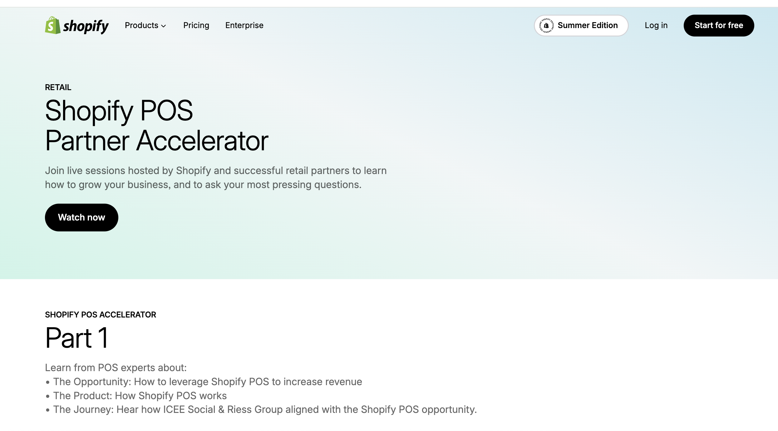
POS Partner Accelerator Webinar - Part 1
Learn from successful retail partners how to grow your business with Shopify POS
FREE
Pitching Shopify POS Video
Watch this 3 minute video to see an example of how to pitch Shopify POS, as a Partner.
FREE
Expanding your service offerings with Shopify POS
This guide will help you learn how to incorporate Shopfy POS into your existing business
FREE

Customizing the POS Experience Path
Learn how to design and implement personalized solutions for a business's needs using POS UI extensions.
FREE
3 Courses
Unified Commerce Marketing Deck
This deck provides guidelines + resources for Partners to effectively market Shopify's Unified Commerce platform to medium to large retailers.
FREE

[Video] Sales Foundations: Prospecting
Learn how to determine merchant fit, lead effective discovery, and prepare to handle some of the most common objections. This series explores three different market segments: Mid market, Large account, and Enterprise. Watch now to learn more about evaluating prospects, identify merchant challenges and priorities, and predict common objections.
12
Video: How to Earn with Shopify POS
There’s a new way to earn as a Shopify partner. We’ve introduced profit sharing.
FREE

[Video] Sneak Peek: Making an app for Shopify
Learn the essentials of Shopify app development, from building your first functional app to successfully launching on the Shopify App Store while meeting platform standards and enhancing merchant experiences. After completing the learning path, pass a proctored assessment to earn your badge.
FREE
1
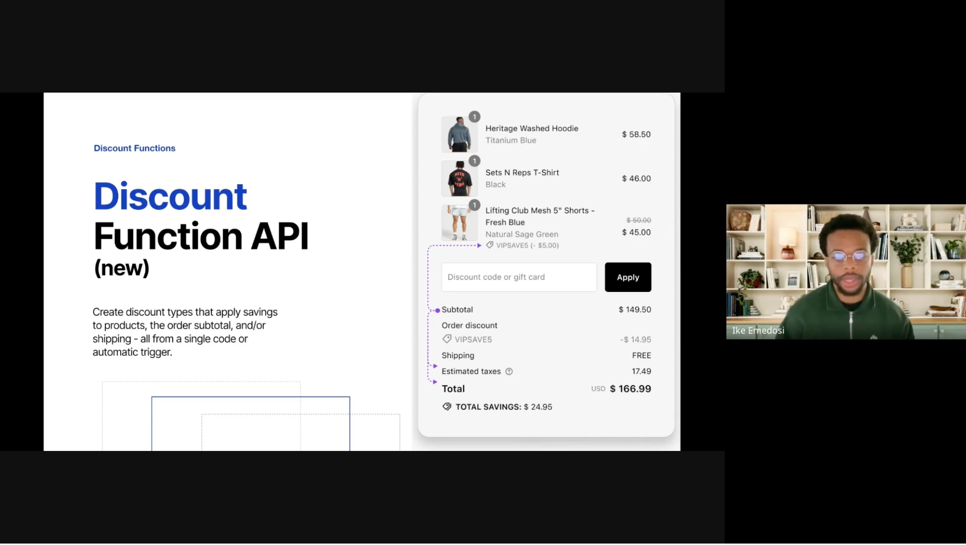
[Video] Unlocking Shopify Checkout: Extensibility and the New Discount Functions Overview
Join us for a comprehensive webinar on Shopify Checkout Extensibility and the new Discount Functions. We dive into checkout customization, the future of Shopify scripts, and the advanced capabilities of Discount Functions. Learn about migration, building merchant experiences, and leveraging Shopify's powerful platform features to enhance your checkout process. Suitable for developers and merchants aiming to boost performance and scalability for high-traffic events.
FREE
25

[Video] Learn with Darryn | Internationalisation + Markets
The video discusses the importance of international expansion for e-commerce. It emphasizes the need for businesses to manage unique catalogs, currencies, and inventory across different markets, with Shopify providing tools to simplify this process. The video also touches on the significance of choosing the right domain strategy and managing multiple business entities for successful internationalization.
35

[Video] Surfaces to Create Apps For
You can create public apps to list on the Shopify App Store, or create custom ones for a single merchant. Apps interact with different areas of the shop by platform and extend its functionality.
4

[Video] Shopify Admin Essentials: A Day with Kaycee
Join Kaycee as she walks you through how she uses the Shopify admin in her day-to-day work. She oversees shipping and fulfillment, rotating products, and ensuring a seamless shopping experience for customers. Because the Shopify admin is the central hub for managing a business, she will be spending lots of time there. Join us as Kaycee takes you on a guided tour of the Shopify admin.
3

[Video] Building a custom workflow with Shopify Flow
Learn how to build a powerful custom workflow in Shopify Flow to automatically add a special welcome gift to customers who place their first order. In this video, educational expert Jan Frey from Coding with Jan demonstrates building this no-code automation, showing you how to identify new customers, tag orders, add a free item, and set up internal team notifications.
FREE
15

[Video] Learn with Scott | Supercharge Shopify Development with AI
In this session, Scott Dixon, a partner solutions engineer at Shopify, discusses the transformative impact of AI on web development, particularly within the Shopify ecosystem. The session includes practical demonstrations of using AI for tasks such as building a spend bar and optimizing store performance. Ultimately, Scott encourages developers to embrace AI as a powerful ally in their work.
40

[Video] Agency Success: The Foundation for Scaling – Positioning, Pipeline & Pitching
In this session, Rachel, an experienced agency consultant, shares her insights on agency growth through effective positioning, pipeline management, and pitching strategies.
90
Briefing: POS Total Cost of Ownership
Leverage these resource to show your clients how Shopify POS reduces retail operation costs better than the competition.
FREE

[Video] Become a Migration Master: Accelerate the Thank You and Order Status Page Upgrade
This webinar focused on the Thank You and Order Status page upgrade, highlighting efficient techniques for migrating a larger number of merchants. The session aimed to enhance technical skills, improve support for current clients, and identify opportunities to attract new business. It served as a guide for becoming a reliable partner for merchants in their Thank You and Order Status page upgrades.
60

[Video] Sneak Peek: Shopify Flow Fundamentals
Imagine having a digital assistant working 24/7 to handle those tedious jobs, freeing you up to focus on strategic growth. That's the power of automation with Shopify Flow. Learn about the Shopify Flow Fundamentals and how to build powerful automation for your store.
FREE
2
[Article] Managing your Shopify Pipeline as a Partner
Learn how to qualify, submit, and manage Shopify leads to maximize your success in the Shopify ecosystem.
8

[Video] Shopify Flow Fundamentals
Learn about the Shopify Flow Fundamentals and how to build powerful automation for your store. You'll learn what Shopify Flow is and how to build your first flow with a pre-built template.
FREE
2

[Video] Partner Solutions: Combined Listings
In this webinar, Senior Partner Solutions Engineer Kevin Horner and special guests Wes Baker and Gemma Curl from the Shopify Combined Listings product management and development team discuss the fundamentals of the Shopify Combined Listings app. Learn how to boost conversions for merchant clients by effectively managing product models and enhancing SEO.
FREE
19
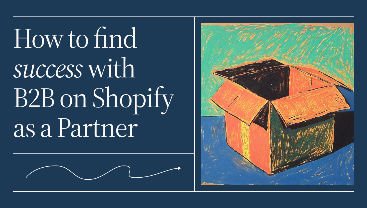
[Video] How to find success with B2B on Shopify as a Shopify Partner
Discover why partners name Shopify as their top choice for building custom B2B experiences for clients.
FREE
5
Riess Group increased deal sizes by 3-4x with Shopify POS
Riess Group, a commerce consulting agency, has had a long-standing partnership with Shopify. They boosted their deal sizes by 3-4x by incorporating Shopify POS into their service offerings.
FREE

[Video] Building with POS UI Extensions: Marsello
Join Brady, co-founder and Chief Product Officer at Marsello, as he shares how their app seamlessly connects online and in-store loyalty using Shopify’s POS UI Extensions. Plus, get insider tips on innovating with new Shopify technologies.
8
Shopify POS Demo Kit
This kit is loaded with resources and guidance to help you demo Shopify POS.
FREE

[Video] Get started with B2B on Shopify
Join fictional B2B merchants Zone Furnishings, Maison, and Home Haven as they discover how Shopify’s B2B features help improve their operations.
8

[Video] Crafting Your Campaign
This video series outlines four key steps for creating a successful marketing campaign.
12

[Video] Handling Shipping Objections
This video series tackles common objections you may hear when crafting a pitch for Shopify Shipping
6
Exploring Checkout Extensibility for Advanced Customization Needs
Learn how to position Checkout Extensibility features to merchant goals
FREE
20

[Video] International Selling: Bathorium Case Study
Join Bathorium Founder, Greg MacDonald, as he breaks down how they approach selling into new international markets and leverage Shopify’s International Selling Tools.
10

Selling and Positioning Shopify Marketing Products Path
This learning path empowers Shopify partners to understand the full spectrum of Shopify's marketing products.
FREE
2 Courses

Shipping Products Internationally
Explore how to select the right shipping strategies when fulfilling international orders.
FREE
20

B2B on Shopify: Launch and Customization Path
Learn how to start selling wholesale by setting up and customizing B2B features in a Shopify store.
FREE
3 Courses

Marketing Fundamentals Path
Learn how to optimize your use of Shopify’s marketing tools and products to expand your customer base, increase sales, and grow your business.
FREE
4 Courses

Selling Shopify Fundamentals Path
Learn how to effectively co-sell with Shopify teams from efficient prospect discovery to delivering a winning pitch.
FREE
4 Courses
Selling and Positioning Shipping Solutions on Shopify Path
Learn how to leverage Shopify’s shipping and fulfillment tools to enhance operational efficiency, reduce costs, and ensure timely delivery.
FREE
2 Courses
[Article] Strategies to accelerate the sales cycle as a Partner
Learn how to build a sustainable pipeline by focusing on different strategies to engage with prospects at the top, middle, and bottom of the funnel.
8

Shopify販売の基礎評価 (Selling Shopify Fundamentals Assessment)
このバッジを取得するには、Selling Shopify Fundamentals学習パスの内容に関する知識をテストする監視付き評価に合格する必要があります。
$149
Shopifyと共同販売活動を行う (Co-selling with Shopify)
この入門コースは、Shopifyでの開発のジャーニーを開始するためのものです。このコースを完了すると、以下の目的のためのツールと知識を身につけることができます。
FREE
60

セールスプロスペクティングとディスカバリー (Sales Prospecting and Discovery)
この入門コースは、Shopifyでの開発のジャーニーを開始するためのものです。このコースを完了すると、以下の目的のためのツールと知識を身につけることができます。
FREE
60
Shopifyの優位性を位置づける (Positioning the Shopify Advantage)
この入門コースは、Shopifyでの開発のジャーニーを開始するためのものです。このコースを完了すると、以下の目的のためのツールと知識を身につけることができます。
FREE
60
勝利を掴むShopifyバリューピッチを作成する (Craft a Winning Shopify Value Pitch)
この入門コースは、Shopifyでの開発のジャーニーを開始するためのものです。このコースを完了すると、以下の目的のためのツールと知識を身につけることができます。
FREE
60
Sales Prospecting and Discovery
Learn how to determine merchant fit, lead effective discovery, and prepare to handle some of the most common objections.
FREE
60

Selling Shopify Fundamentals Assessment
To earn this badge, pass a proctored assessment that tests your knowledge of the Selling Shopify Fundamentals learning path content. We recommend you complete all the courses in the learning path prior to attempting the assessment.
$149
[Article] Adding Web Pixels
Learn how web pixels track user behavior and explore the two types of pixels you can set up on Shopify.

Creating a Digital Marketing Strategy Assessment
To earn this badge, pass a proctored assessment that evaluates your understanding of the Creating a Digital Marketing Strategy learning path content. We recommend completing all courses within the learning path before attempting the assessment.
$149
30

Creating an App for Shopify
Learn to create a basic Shopify App from scratch that allows merchants to create and track issues for products within their Shopify admin.
FREE
25

Staying Engaged with Customers to Boost LTV
Leverage Shopify's email solutions, marketing tools, and automations to maintain engagement, identify high-value customer segments, and enhance retargeting strategies to boost customer lifetime value and loyalty.
FREE
20

Aligning Shopify Marketing Products to the Customer Life Cycle
Explore how Shopify’s marketing products help you find new customers and grow your business
FREE
45

Converting Site Visitors to First-Time Buyers
Learn about some of the specific challenges associated with getting potential customers to convert to first-time buyers
FREE
45

Marketing Fundamentals Assessment
To earn this badge, pass a proctored assessment that tests your knowledge of the Marketing Fundamentals learning path content.
$149

Finding New Customers with Shopify
Focus on how Shopify's marketing tools can simplify the complexity of finding new customers, building brand awareness, and targeting quality leads
FREE
45

Visualizing Technical Solutions for Shopify
In this course we’ll create visualizations of Shopify processes, tools, and component integrations with architecture diagrams.
FREE
60

Analyzing a Business
In this course, we’ll look at how to analyze a business when planning the implementation of new software or technology.
FREE
60

Technical Implementation Planning
In this course we’ll look at the technical considerations when planning implementation with Shopify.
FREE
60

[Article] Why Automation Is Essential for Ecommerce
Discover how the power of automation in ecommerce could help you overcome scaling challenges.
8

The Anatomy of a Shopify Flow Workflow
Unlock the power of automation! Learn the core components of Shopify Flow workflows – triggers, conditions, and actions – and build automations to streamline your ecommerce operations.
FREE
30

Building a Workflow with Shopify Flow
This practical, framework-driven course empowers you to automate your ecommerce tasks and build your first Shopify Flow workflow.
FREE
45
Liquid Storefronts for Theme Developers Assessment
To earn this badge, pass a proctored assessment that tests your knowledge of the Liquid Storefronts for Theme Developers learning path content. We recommend you complete all the courses in the learning path prior to attempting the assessment.
$249

Positioning Business Growth with Marketing Products
This course will demonstrate how to introduce, position, and sell Shopify’s marketing products to merchants based on their needs and goals.
FREE
30

Introduction to Shopify’s Marketing Products
This course will highlight specific tools, features, and strategies that a Partner can highlight to add value to a typical merchant’s marketing program.
FREE
15

Positioning International Selling Tools & Managed Markets
Learn how to address common merchant challenges and discover how Shopify helps merchants expand and grow across borders.
FREE
60

Introduction to International Selling with Shopify
Explore the many features and benefits available to Shopify merchants with international selling tools and Managed Markets.
FREE
30
Build Black with Shopify Pathway
FREE
BAS - Trial, Shopify Admin, Tasks
How to set up a trial at Shopify, Navigating the Shopify Admin, and Beginning Build a store (BAS) tasks.
FREE
BAS - Products & Collections
Learn all about products & collections
FREE
BAS - Themes
Learn how to add and edit your theme in Shopify
FREE
BAS - Adding Pages, Policy Pages, Menus & Navigation
Learn about adding and editing your pages, policy pages and menu's.
FREE
BAS - Shipping
Learn about setting up shipping and an introduction to Shopify Shipping.
FREE
BAS - Pricing, Payments and Security
Learn about Shopify's Pricing, Payments and Security features.
FREE
Marketing and Apps 101
Learn about Shopify's Marketing Tools and Apps.
FREE
Marketing and Apps 102
Learn about Shopify Apps, Sales Channels, and Reports.
FREE
Marketing and Apps 103
Learn about Search Engine Optimization and Blogs
FREE
Why Shopify 101: Point of Sale & Mobile Responsiveness
An introduction to Point of Sale and Mobile Responsiveness
FREE
Why Shopify 102: Introduction to Financial Services
An Introduction to Shopify's Financial Services - Capital, Credit and Balance.
FREE
Shopify Support & Continued Learning
Learn how to get in touch with Shopify Support and further your learning
FREE

Shopify POS Launch and Operations Assessment
To earn this badge, pass a proctored assessment that tests your knowledge of the Shopify POS Launch and Operations learning path content.
$149

B2B on Shopify: Launch and Customization Assessment
To earn this badge, pass a proctored assessment that tests your knowledge of the B2B on Shopify Launch and Customization learning path content. We recommend you complete all the courses in the learning path prior to attempting the assessment.
$149
40

Headless at Shopify for Developers Assessment
To earn this badge, pass a proctored assessment that tests your knowledge of the Headless at Shopify for Developers learning path content.
$249

Integrating with Shopify
In this course we’ll cover the fundamentals of backend development at Shopify with an emphasis on APIs and webhooks, GraphQL, and common surfaces for custom apps.
FREE
120

Developing on Shopify
This course will introduce you to the Shopify platform, explain how it’s different from other commerce platforms, and give you examples of what’s possible as a Shopify developer.
FREE
60

Exploring and Extending Shopify’s Data Model
This course will introduce you to Shopify’s data model and custom data objects.
FREE
90
Shopify Development Fundamentals Assessment
To earn this badge, pass a proctored assessment that tests your knowledge of the Shopify Development Fundamentals learning path content.
$149
[Demo] Managing Products in the Shopify Admin
Learn how to manage products, collections, and inventory in the Shopify admin, including product variants and metaobjects.
FREE
5
[Demo] Customers and orders in the Shopify Admin
Discover how to manage customers, orders, and segments in the Shopify admin to improve sales.
FREE
5
[Article] Setting up Sales Channels for Social Media in the Shopify Admin
Learn how to reach more customers by adding social media sales channels to your store.
4
[Article] Creating a Draft Order in the Shopify Admin
Discover how to create and manage draft orders and send invoices to customers.
4
[Article] Setting up Role Based Access Controls in the Shopify Admin
Discover how to manage user permissions using role-based access controls in the Shopify admin.
4
[Article] Creating Metaobjects and Metafields in the Shopify Admin
Learn to create metaobjects and use metafields to customize product information in your Shopify store.
5
[Demo] Sales Channels, Marketing, and Discounts in the Shopify Admin
Explore how to expand your reach using sales channels, marketing campaigns, and discounts in the Shopify admin.
FREE
5
[Demo] Finance and Analytics in the Shopify Admin
Understand how to use financial data and analytics tools in the Shopify admin to inform your business decisions.
FREE
5
[Demo] Introduction to the Shopify Admin
Take a guided tour of the Shopify admin to learn how to navigate the platform and its key features.
FREE
5

テーマをカスタマイズする (Customizing Themes)
この入門コースは、Shopifyでのテーマの開発のジャーニーを開始するためのものです。
FREE

Shopifyでの開発 (Developing on Shopify)
この入門コースは、Shopifyでの開発のジャーニーを開始するためのものです。
FREE
30

Shopifyのデータモデルの紹介と応用 (Exploring and Extending Shopify’s Data Model)
この入門コースは、Shopifyでの開発のジャーニーを開始するためのものです。このコースを完了すると、以下の目的のためのツールと知識を身につけることができます。
FREE
40

Shopifyとの統合 (Integrating with Shopify)
この入門コースは、Shopifyでの開発のジャーニーを開始するためのものです。このコースを完了すると、以下の目的のためのツールと知識を身につけることができます。
FREE
30

Selling and Positioning Shopify Marketing Products Assessment
To earn this badge, pass a proctored assessment that tests your knowledge of the Selling and Positioning Shopify Marketing Products learning path content.
$149

Expanding Your Shopify Business Internationally Assessment
To earn this badge, pass a proctored assessment that tests your knowledge of the Expanding Your Shopify Business Internationally learning path content. We recommend that you complete all the courses in the learning path prior to attempting the assessment.
$149
40

Creating Solutions for Shopify Checkout Assessment
To earn this badge, pass a proctored assessment that tests your knowledge of the Creating Solutions for Shopify Checkout learning path content. We recommend you complete all the courses in the learning path prior to attempting the assessment.
$149
30

Positioning the Value of Shopify Checkout Assessment
To earn this badge, pass a proctored assessment that tests your knowledge of the Positioning the Value of Shopify Checkout learning path content.
$149

Craft the POS Solution
Learn to craft a solution that meets merchant needs and sets them up for continued success.
FREE
30

Pitch to Win for POS
Learn how to identify retail opportunities and craft a winning pitch.
FREE
30

POS for Partners
Learn about partnering with Shopify to offer your clients retail solutions.
FREE
30

Shopify POS Solution-Based Selling Assessment
To earn this badge, pass a proctored assessment that tests your knowledge of the Shopify POS Solution-Based Selling learning path content.
$149

Customizing the POS Experience Assessment
To earn this badge, pass a proctored assessment that tests your knowledge of the Customizing the POS Experience learning path content. We recommend you complete all the courses in the learning path prior to attempting the assessment.
$249
45

Headless at Shopify for Business Consultants Assessment
To earn this badge, pass a proctored assessment that tests your knowledge of the Headless at Shopify for Business Consultants learning path content.
$149

Positioning International Selling with Shopify Assessment
To earn this badge, pass a proctored assessment that tests your knowledge of the Positioning International Selling with Shopify learning path content. We recommend you complete all the courses in the learning path prior to attempting the assessment.
$149

Selling and Positioning Shipping Solutions on Shopify Assessment
This assessment tests your knowledge of Selling and Positioning Shipping Solutions on Shopify learning path content.
$149
ビジネスの分析 (Analyzing a Business)
この入門コースは、Shopifyでの開発のジャーニーを開始するためのものです。このコースを完了すると、以下の目的のためのツールと知識を身につけることができます。
FREE
60
Shopify向け技術ソリューションの可視化 (Visualizing Technical Solutions)
この入門コースは、Shopifyでの開発のジャーニーを開始するためのものです。このコースを完了すると、以下の目的のためのツールと知識を身につけることができます。
FREE
60

Solution Planning Fundamentals Assessment
To earn this badge, pass a proctored assessment that tests your knowledge of the Solution Planning Fundamentals learning path content.
$149

CRO Analysis and Optimization
Learn how to analyze your Shopify store using reports and create a CRO roadmap.
Not currently available
45

CRO Implementation and Testing
Learn how to apply testing methodologies to create data-driven improvements that will help increase your conversion rates.
Not currently available
45

CRO Targeting and Personalization
Learn how to improve conversion rates by personalizing the customer experience using techniques such as customized landing pages and targeted messaging.
Not currently available
45

CRO Overview and Best Practices
Learn how to apply CRO best practices and understand visitor intent to effectively drive conversions.
Not currently available
35
Shopify販売の基礎評価 (Selling Shopify Fundamentals Assessment)
このバッジを取得するには、Selling Shopify Fundamentals学習パスの内容に関する知識をテストする監視付き評価に合格する必要があります。
$149
Shopifyと共同販売活動を行う (Co-selling with Shopify)
この入門コースは、Shopifyでの開発のジャーニーを開始するためのものです。このコースを完了すると、以下の目的のためのツールと知識を身につけることができます。
FREE
60
セールスプロスペクティングとディスカバリー (Sales Prospecting and Discovery)
この入門コースは、Shopifyでの開発のジャーニーを開始するためのものです。このコースを完了すると、以下の目的のためのツールと知識を身につけることができます。
FREE
60
Shopifyの優位性を位置づける (Positioning the Shopify Advantage)
この入門コースは、Shopifyでの開発のジャーニーを開始するためのものです。このコースを完了すると、以下の目的のためのツールと知識を身につけることができます。
FREE
60
勝利を掴むShopifyバリューピッチを作成する (Craft a Winning Shopify Value Pitch)
この入門コースは、Shopifyでの開発のジャーニーを開始するためのものです。このコースを完了すると、以下の目的のためのツールと知識を身につけることができます。
FREE
60
Sales Prospecting and Discovery
Learn how to determine merchant fit, lead effective discovery, and prepare to handle some of the most common objections.
FREE
60
Selling Shopify Fundamentals Assessment
To earn this badge, pass a proctored assessment that tests your knowledge of the Selling Shopify Fundamentals learning path content. We recommend you complete all the courses in the learning path prior to attempting the assessment.
$149
Positioning the Shopify Advantage
Learn how to position Shopify as the preferred commerce platform for prospective merchants.
FREE
60
Craft a Winning Shopify Value Pitch
Learn how to deliver a tailored Shopify value pitch that drives sales momentum.
FREE
60
Co-selling with Shopify
Learn how to navigate the Shopify sales cycle and partner with key Shopify teams for successful co-selling.
FREE
60
Create a Diagram for an Employee Stipend Program
Work from business case to completed technical diagram.
FREE
60
Extending Checkout with the Checkout Blocks App
Learn how Checkout Blocks tailors your checkout experience.
FREE
30
Identifying Features that Customize Shopify Checkout
Learn use cases and features of checkout customization technologies.
FREE
45
Customizing Business Logic with Shopify Functions
Learn how Shopify Functions apply unique business processes to checkout.
FREE
30
Enhancing Checkout with UI Extensions
Learn how UI extensions create unique shopping experiences in the checkout.
FREE
25
Customizing the Appearance of Shopify Checkout
Learn how to visually design your checkout with the checkout and accounts editor and Checkout Branding API.
FREE
25
[Article] Adding Web Pixels
Learn how web pixels track user behavior and explore the two types of pixels you can set up on Shopify.
Branding, Positioning, and Building an Effective Online Presence
Learn to create a powerful brand identity that resonates with your audience by defining your mission, vision, and values while crafting unique value propositions and engaging storytelling.
FREE
45
Creating a Digital Marketing Strategy Assessment
To earn this badge, pass a proctored assessment that evaluates your understanding of the Creating a Digital Marketing Strategy learning path content. We recommend completing all courses within the learning path before attempting the assessment.
$149
30
Influencer and Affiliate Marketing
Explore the essentials of influencer and affiliate marketing to grow your business by identifying suitable influencers, building strong partnerships, and utilizing performance-based strategies.
FREE
30
Social Media and Content Marketing
Discover effective strategies for leveraging social media and content marketing to enhance your brand's presence and foster business growth through a well-structured content calendar.
FREE
80
Digital Marketing Essentials
Learn how to create effective digital marketing strategies that drive customer engagement, increase conversions, and build long-term loyalty through optimized content, email, and SMS campaigns.
FREE
65
Foundations of Unified Commerce Marketing
Gain a foundational understanding of unified commerce by exploring its key components, sales channels, and performance metrics in this course.
FREE
60
Seasonal and Event-Based Marketing
Learn to create a holiday-specific marketing strategy that resonates with your audience by tailoring campaigns to each holiday's unique themes and understanding the psychological triggers of urgency and scarcity.
FREE
30
Using the Partner Dashboard
Learn about the Partner Dashboard so you can effectively collaborate with merchants and Shopify.
FREE
15
Working with Merchants
Be prepared to work with Shopify merchants of all types.
FREE
30
Introduction to Shopify Partner Program
Identify opportunities to collaborate with merchants and Shopify to grow your business as a Partner.
FREE
15
Introduction to Shopify
Learn about who Shopify is, our mission, core features of the platform, and how we support businesses of all sizes to start and grow.
FREE
20
App Surfaces Examples
Explore how apps can extend Shopify’s functionality across multiple app surfaces to improve both merchant and customer experiences.
FREE
30
App Development Fundamentals
Learn the fundamentals of Shopify app development and how to extend the platform.
FREE
35
Creating an App for Shopify
Learn to create a basic Shopify App from scratch that allows merchants to create and track issues for products within their Shopify admin.
FREE
25
Developing Apps for Shopify Assessment
To earn this badge, pass a proctored assessment that tests your knowledge of the Developing Apps for Shopify learning path content. We recommend you complete all the courses in the learning path prior to attempting the assessment.
$249
35
Staying Engaged with Customers to Boost LTV
Leverage Shopify's email solutions, marketing tools, and automations to maintain engagement, identify high-value customer segments, and enhance retargeting strategies to boost customer lifetime value and loyalty.
FREE
20
Aligning Shopify Marketing Products to the Customer Life Cycle
Explore how Shopify’s marketing products help you find new customers and grow your business
FREE
45
Converting Site Visitors to First-Time Buyers
Learn about some of the specific challenges associated with getting potential customers to convert to first-time buyers
FREE
45
Marketing Fundamentals Assessment
To earn this badge, pass a proctored assessment that tests your knowledge of the Marketing Fundamentals learning path content.
$149
Finding New Customers with Shopify
Focus on how Shopify's marketing tools can simplify the complexity of finding new customers, building brand awareness, and targeting quality leads
FREE
45
Visualizing Technical Solutions for Shopify
In this course we’ll create visualizations of Shopify processes, tools, and component integrations with architecture diagrams.
FREE
60
Analyzing a Business
In this course, we’ll look at how to analyze a business when planning the implementation of new software or technology.
FREE
60
Technical Implementation Planning
In this course we’ll look at the technical considerations when planning implementation with Shopify.
FREE
60
[Article] Why Automation Is Essential for Ecommerce
Discover how the power of automation in ecommerce could help you overcome scaling challenges.
8
The Anatomy of a Shopify Flow Workflow
Unlock the power of automation! Learn the core components of Shopify Flow workflows – triggers, conditions, and actions – and build automations to streamline your ecommerce operations.
FREE
30
Building a Workflow with Shopify Flow
This practical, framework-driven course empowers you to automate your ecommerce tasks and build your first Shopify Flow workflow.
FREE
45
Liquid optimization for performance
This course introduces you to various tools and techniques for optimizing Liquid themes for performance.
FREE
30
Getting started with Liquid for Developers
This course introduces you to Liquid for theme development work.
FREE
45
Theme architecture with Liquid for Developers
This course introduces you to Shopify’s standard theme architecture while diving deeper into the Liquid basics learned in the previous course.
FREE
45
Liquid Storefronts for Theme Developers Assessment
To earn this badge, pass a proctored assessment that tests your knowledge of the Liquid Storefronts for Theme Developers learning path content. We recommend you complete all the courses in the learning path prior to attempting the assessment.
$249
Positioning Business Growth with Marketing Products
This course will demonstrate how to introduce, position, and sell Shopify’s marketing products to merchants based on their needs and goals.
FREE
30
Introduction to Shopify’s Marketing Products
This course will highlight specific tools, features, and strategies that a Partner can highlight to add value to a typical merchant’s marketing program.
FREE
15
Positioning International Selling Tools & Managed Markets
Learn how to address common merchant challenges and discover how Shopify helps merchants expand and grow across borders.
FREE
60
Introduction to International Selling with Shopify
Explore the many features and benefits available to Shopify merchants with international selling tools and Managed Markets.
FREE
30
Build Black with Shopify Pathway
FREE
BAS - Trial, Shopify Admin, Tasks
How to set up a trial at Shopify, Navigating the Shopify Admin, and Beginning Build a store (BAS) tasks.
FREE
BAS - Products & Collections
Learn all about products & collections
FREE
BAS - Themes
Learn how to add and edit your theme in Shopify
FREE
BAS - Adding Pages, Policy Pages, Menus & Navigation
Learn about adding and editing your pages, policy pages and menu's.
FREE
BAS - Shipping
Learn about setting up shipping and an introduction to Shopify Shipping.
FREE
BAS - Pricing, Payments and Security
Learn about Shopify's Pricing, Payments and Security features.
FREE
Marketing and Apps 101
Learn about Shopify's Marketing Tools and Apps.
FREE
Marketing and Apps 102
Learn about Shopify Apps, Sales Channels, and Reports.
FREE
Marketing and Apps 103
Learn about Search Engine Optimization and Blogs
FREE
Why Shopify 101: Point of Sale & Mobile Responsiveness
An introduction to Point of Sale and Mobile Responsiveness
FREE
Why Shopify 102: Introduction to Financial Services
An Introduction to Shopify's Financial Services - Capital, Credit and Balance.
FREE
Shopify Support & Continued Learning
Learn how to get in touch with Shopify Support and further your learning
FREE
Building Custom POS Interfaces with UI Extensions
Learn how to design and develop custom POS interfaces by engaging in comprehensive, hands-on practice with UI extensions.
FREE
45
Solutioning with POS UI Extensions
Learn how to develop tailored solutions using POS UI extensions to address specific business challenges.
FREE
25
Introduction to POS UI Extensions
Learn how to take advantage of POS UI extensions by exploring practical applications, learning to navigate developer documentation, and gaining hands-on experience in creating innovative extensions.
FREE
40
POS Hardware and Payments
Optimize the customer experience in your retail store through innovative hardware and payments solutions.
FREE
60
Shopify POS Launch and Operations Assessment
To earn this badge, pass a proctored assessment that tests your knowledge of the Shopify POS Launch and Operations learning path content.
$149
Optimization and Growth with POS
Explore advanced strategies to optimize operations and drive business growth with Shopify POS.
FREE
60
POS Operations
Discover how to streamline your business operations and focus on business growth with Shopify POS.
FREE
50
Training and Managing Staff for POS
Enhance your skills in training and managing employees effectively with Shopify POS, focusing on onboarding, continuous improvement training, and using roles and permissions.
FREE
20
POS Setup and Configuration
Learn the foundational steps for selling in person with Shopify POS, including secure data migration, Shopify admin setup, app installation and configuration, and effective issue troubleshooting.
FREE
35
Introduction to Shipping & Fulfillment with Shopify
Get a comprehensive understanding of Shopify’s shipping and fulfillment tools.
FREE
30
Shipping Settings and Strategies
Learn how to align business goals to fulfillment strategies
FREE
60
Fulfillment and Order Routing
Examine factors to decide which fulfillment methods to offer for your products and orders
FREE
30
Onboarding B2B on Shopify
Learn how to implement key B2B on Shopify features, including: companies, locations, catalogs, sales staff, and themes.
FREE
30
Deciding on Your B2B Store Format
Learn about the two B2B storefront formats available on Shopify, and how to choose the right setup for specific business needs.
FREE
30
B2B on Shopify: Launch and Customization Assessment
To earn this badge, pass a proctored assessment that tests your knowledge of the B2B on Shopify Launch and Customization learning path content. We recommend you complete all the courses in the learning path prior to attempting the assessment.
$149
40
Personalizing the B2B Buying Experience
Learn how to create a personalized buying experience for wholesale customers.
FREE
30
Staying Engaged with Customers to Boost LTV
Leverage Shopify's email solutions, marketing tools, and automations to maintain engagement, identify high-value customer segments, and enhance retargeting strategies to boost customer lifetime value and loyalty.
FREE
20
Finding New Customers with Shopify
Focus on how Shopify's marketing tools can simplify the complexity of finding new customers, building brand awareness, and targeting quality leads
FREE
45
Converting Site Visitors to First-Time Buyers
Learn about some of the specific challenges associated with getting potential customers to convert to first-time buyers
FREE
45
Aligning Shopify Marketing Products to the Customer Life Cycle
Explore how Shopify’s marketing products help you find new customers and grow your business
FREE
45
Headless at Shopify for Developers Assessment
To earn this badge, pass a proctored assessment that tests your knowledge of the Headless at Shopify for Developers learning path content.
$249
Hydrogen Best Practices
Learn best practices to optimize a custom storefront
FREE
60
Introduction to custom storefronts for developers
Learn about Shopify’s headless framework, tooling, and hosting options.
FREE
45
Storefront API Customization
Understand the purpose, structure, and capabilities of the Storefront API
FREE
60
Build a Custom Storefront with Hydrogen
Discover how to build essential ecommerce storefront pages using Hydrogen and the Mock.shop API.
FREE
60
POS Operations
Discover how to streamline your business operations and focus on business growth with Shopify POS.
FREE
50
Training and Managing Staff for POS
Enhance your skills in training and managing employees effectively with Shopify POS, focusing on onboarding, continuous improvement training, and using roles and permissions.
FREE
20
POS Hardware and Payments
Optimize the customer experience in your retail store through innovative hardware and payments solutions.
FREE
60
Optimization and Growth with POS
Explore advanced strategies to optimize operations and drive business growth with Shopify POS.
FREE
60
POS Setup and Configuration
Learn the foundational steps for selling in person with Shopify POS, including secure data migration, Shopify admin setup, app installation and configuration, and effective issue troubleshooting.
FREE
35
Customizing Themes
Learn the fundamentals of frontend development at Shopify with an emphasis on theme development.
FREE
120
Integrating with Shopify
In this course we’ll cover the fundamentals of backend development at Shopify with an emphasis on APIs and webhooks, GraphQL, and common surfaces for custom apps.
FREE
120
Developing on Shopify
This course will introduce you to the Shopify platform, explain how it’s different from other commerce platforms, and give you examples of what’s possible as a Shopify developer.
FREE
60
Exploring and Extending Shopify’s Data Model
This course will introduce you to Shopify’s data model and custom data objects.
FREE
90
Expanding Your Developer Toolkit
This course will introduce you to more advanced or multi-function tools, commerce-pillar specific extensions, and cover how to stay up to date on product changes relevant to developers.
FREE
20
Shopify Development Fundamentals Assessment
To earn this badge, pass a proctored assessment that tests your knowledge of the Shopify Development Fundamentals learning path content.
$149
[Demo] Managing Products in the Shopify Admin
Learn how to manage products, collections, and inventory in the Shopify admin, including product variants and metaobjects.
FREE
5
[Demo] Customers and orders in the Shopify Admin
Discover how to manage customers, orders, and segments in the Shopify admin to improve sales.
FREE
5
[Article] Setting up Sales Channels for Social Media in the Shopify Admin
Learn how to reach more customers by adding social media sales channels to your store.
4
[Article] Creating a Draft Order in the Shopify Admin
Discover how to create and manage draft orders and send invoices to customers.
4
[Article] Setting up Role Based Access Controls in the Shopify Admin
Discover how to manage user permissions using role-based access controls in the Shopify admin.
4
[Article] Creating Metaobjects and Metafields in the Shopify Admin
Learn to create metaobjects and use metafields to customize product information in your Shopify store.
5
[Article] Adding a Product in the Shopify Admin
Add products to your online or retail store with the Shopify Admin.
8
[Article] Gift Cards in the Shopify Admin
Gift cards can be added to your store from the admin just like any other product, providing a convenient option for your customers to share their enthusiasm for your brand with friends and family.
4
[Demo] Sales Channels, Marketing, and Discounts in the Shopify Admin
Explore how to expand your reach using sales channels, marketing campaigns, and discounts in the Shopify admin.
FREE
5
[Demo] Finance and Analytics in the Shopify Admin
Understand how to use financial data and analytics tools in the Shopify admin to inform your business decisions.
FREE
5
[Article] Creating Variants in the Shopify Admin
Add Variants and Collections using the Shopify Admin.
6
[Article] Managing inventory in the Shopify Admin
Whether you're receiving new stock, conducting an inventory audit, or holding inventory for an upcoming product launch, you can efficiently manage your inventory for all your locations from the Shopify admin.
4
[Demo] Introduction to the Shopify Admin
Take a guided tour of the Shopify admin to learn how to navigate the platform and its key features.
FREE
5
テーマをカスタマイズする (Customizing Themes)
この入門コースは、Shopifyでのテーマの開発のジャーニーを開始するためのものです。
FREE
Shopifyでの開発 (Developing on Shopify)
この入門コースは、Shopifyでの開発のジャーニーを開始するためのものです。
FREE
30
Shopifyのデータモデルの紹介と応用 (Exploring and Extending Shopify’s Data Model)
この入門コースは、Shopifyでの開発のジャーニーを開始するためのものです。このコースを完了すると、以下の目的のためのツールと知識を身につけることができます。
FREE
40
Shopifyとの統合 (Integrating with Shopify)
この入門コースは、Shopifyでの開発のジャーニーを開始するためのものです。このコースを完了すると、以下の目的のためのツールと知識を身につけることができます。
FREE
30
Branding, Positioning, and Building an Effective Online Presence
Learn to create a powerful brand identity that resonates with your audience by defining your mission, vision, and values while crafting unique value propositions and engaging storytelling.
FREE
45
Influencer and Affiliate Marketing
Explore the essentials of influencer and affiliate marketing to grow your business by identifying suitable influencers, building strong partnerships, and utilizing performance-based strategies.
FREE
30
Digital Marketing Essentials
Learn how to create effective digital marketing strategies that drive customer engagement, increase conversions, and build long-term loyalty through optimized content, email, and SMS campaigns.
FREE
65
Seasonal and Event-Based Marketing
Learn to create a holiday-specific marketing strategy that resonates with your audience by tailoring campaigns to each holiday's unique themes and understanding the psychological triggers of urgency and scarcity.
FREE
30
Foundations of Unified Commerce Marketing
Gain a foundational understanding of unified commerce by exploring its key components, sales channels, and performance metrics in this course.
FREE
60
Social Media and Content Marketing
Discover effective strategies for leveraging social media and content marketing to enhance your brand's presence and foster business growth through a well-structured content calendar.
FREE
80
Introduction to Shopify’s Marketing Products
This course will highlight specific tools, features, and strategies that a Partner can highlight to add value to a typical merchant’s marketing program.
FREE
15
Positioning Business Growth with Marketing Products
This course will demonstrate how to introduce, position, and sell Shopify’s marketing products to merchants based on their needs and goals.
FREE
30
Selling and Positioning Shopify Marketing Products Assessment
To earn this badge, pass a proctored assessment that tests your knowledge of the Selling and Positioning Shopify Marketing Products learning path content.
$149
Analyzing the International Competitive Landscape
Explore how to assess international competition when entering a new market.
FREE
25
Shipping Products Internationally
Explore how to select the right shipping strategies when fulfilling international orders.
FREE
20
Expanding Your Shopify Business Internationally Assessment
To earn this badge, pass a proctored assessment that tests your knowledge of the Expanding Your Shopify Business Internationally learning path content. We recommend that you complete all the courses in the learning path prior to attempting the assessment.
$149
40
Researching Your International Target Market
Learn how to identify market demand when selling to a new region.
FREE
20
Developing Your International Go-to-Market Strategy
Explore how to set goals and make a plan for international expansion.
FREE
20
Getting Started with International Selling
Dive into the fundamentals of international selling and discover global market opportunities.
FREE
25
Pricing Your Products When Selling Cross-Border
Discover how to manage pricing and payments when selling to international customers.
FREE
15
Localization Strategies
Learn how to make your brand feel like it belongs across borders.
FREE
25
Create a Diagram for an Employee Stipend Program
Work from business case to completed technical diagram.
FREE
60
Creating Solutions for Shopify Checkout Assessment
To earn this badge, pass a proctored assessment that tests your knowledge of the Creating Solutions for Shopify Checkout learning path content. We recommend you complete all the courses in the learning path prior to attempting the assessment.
$149
30
[Article] Adding Web Pixels
Learn how web pixels track user behavior and explore the two types of pixels you can set up on Shopify.
Customizing Business Logic with Shopify Functions
Learn how Shopify Functions apply unique business processes to checkout.
FREE
30
Enhancing Checkout with UI Extensions
Learn how UI extensions create unique shopping experiences in the checkout.
FREE
25
Extending Checkout with the Checkout Blocks App
Learn how Checkout Blocks tailors your checkout experience.
FREE
30
Identifying Features that Customize Shopify Checkout
Learn use cases and features of checkout customization technologies.
FREE
45
Customizing the Appearance of Shopify Checkout
Learn how to visually design your checkout with the checkout and accounts editor and Checkout Branding API.
FREE
25
Mastering the Art of Positioning Shopify Checkout
Learn how to promote Shopify Checkout to prospective brands
FREE
40
Exploring Checkout Extensibility for Advanced Customization Needs
Learn how to position Checkout Extensibility features to merchant goals
FREE
20
Identifying Fit for Shopify Checkout
Explore Shopify Checkout’s features and benefits to identify merchant fit
FREE
15
Identifying Fit for Shopify Checkout
Explore Shopify Checkout’s features and benefits to identify merchant fit
FREE
15
Mastering the Art of Positioning Shopify Checkout
Learn how to promote Shopify Checkout to prospective brands
FREE
40
Positioning the Value of Shopify Checkout Assessment
To earn this badge, pass a proctored assessment that tests your knowledge of the Positioning the Value of Shopify Checkout learning path content.
$149
Exploring Checkout Extensibility for Advanced Customization Needs
Learn how to position Checkout Extensibility features to merchant goals
FREE
20
Integrating with Shopify
In this course we’ll cover the fundamentals of backend development at Shopify with an emphasis on APIs and webhooks, GraphQL, and common surfaces for custom apps.
FREE
120
Developing on Shopify
This course will introduce you to the Shopify platform, explain how it’s different from other commerce platforms, and give you examples of what’s possible as a Shopify developer.
FREE
60
Customizing Themes
Learn the fundamentals of frontend development at Shopify with an emphasis on theme development.
FREE
120
Exploring and Extending Shopify’s Data Model
This course will introduce you to Shopify’s data model and custom data objects.
FREE
90
Getting started with Liquid for Developers
This course introduces you to Liquid for theme development work.
FREE
45
Theme architecture with Liquid for Developers
This course introduces you to Shopify’s standard theme architecture while diving deeper into the Liquid basics learned in the previous course.
FREE
45
Liquid optimization for performance
This course introduces you to various tools and techniques for optimizing Liquid themes for performance.
FREE
30
Craft the POS Solution
Learn to craft a solution that meets merchant needs and sets them up for continued success.
FREE
30
Pitch to Win for POS
Learn how to identify retail opportunities and craft a winning pitch.
FREE
30
POS for Partners
Learn about partnering with Shopify to offer your clients retail solutions.
FREE
30
Product Positioning for POS
Gain the product knowledge you need to position Shopify POS as a key part of a unified commerce approach.
FREE
30
Personalizing the B2B Buying Experience
Learn how to create a personalized buying experience for wholesale customers.
FREE
30
Onboarding B2B on Shopify
Learn how to implement key B2B on Shopify features, including: companies, locations, catalogs, sales staff, and themes.
FREE
30
Deciding on Your B2B Store Format
Learn about the two B2B storefront formats available on Shopify, and how to choose the right setup for specific business needs.
FREE
30
Pitch to Win for POS
Learn how to identify retail opportunities and craft a winning pitch.
FREE
30
POS for Partners
Learn about partnering with Shopify to offer your clients retail solutions.
FREE
30
Craft the POS Solution
Learn to craft a solution that meets merchant needs and sets them up for continued success.
FREE
30
Shopify POS Solution-Based Selling Assessment
To earn this badge, pass a proctored assessment that tests your knowledge of the Shopify POS Solution-Based Selling learning path content.
$149
Product Positioning for POS
Gain the product knowledge you need to position Shopify POS as a key part of a unified commerce approach.
FREE
30
Building Custom POS Interfaces with UI Extensions
Learn how to design and develop custom POS interfaces by engaging in comprehensive, hands-on practice with UI extensions.
FREE
45
Customizing the POS Experience Assessment
To earn this badge, pass a proctored assessment that tests your knowledge of the Customizing the POS Experience learning path content. We recommend you complete all the courses in the learning path prior to attempting the assessment.
$249
45
Introduction to POS UI Extensions
Learn how to take advantage of POS UI extensions by exploring practical applications, learning to navigate developer documentation, and gaining hands-on experience in creating innovative extensions.
FREE
40
Solutioning with POS UI Extensions
Learn how to develop tailored solutions using POS UI extensions to address specific business challenges.
FREE
25
Headless at Shopify for Business Consultants Assessment
To earn this badge, pass a proctored assessment that tests your knowledge of the Headless at Shopify for Business Consultants learning path content.
$149
Planning and Implementing a Custom Storefront
Learn best practices for managing a client relationship through each phase of a custom storefront implementation on Shopify.
FREE
60
Introduction to Headless Storefronts Solutions
Explore custom storefront solutions available to Shopify merchants, including features and benefits of Hydrogen, Oxygen, and the Storefront API.
FREE
70
Positioning International Selling with Shopify Assessment
To earn this badge, pass a proctored assessment that tests your knowledge of the Positioning International Selling with Shopify learning path content. We recommend you complete all the courses in the learning path prior to attempting the assessment.
$149
Introduction to International Selling with Shopify
Explore the many features and benefits available to Shopify merchants with international selling tools and Managed Markets.
FREE
30
Positioning International Selling Tools & Managed Markets
Learn how to address common merchant challenges and discover how Shopify helps merchants expand and grow across borders.
FREE
60
Hydrogen Best Practices
Learn best practices to optimize a custom storefront
FREE
60
Build a Custom Storefront with Hydrogen
Discover how to build essential ecommerce storefront pages using Hydrogen and the Mock.shop API.
FREE
60
Storefront API Customization
Understand the purpose, structure, and capabilities of the Storefront API
FREE
60
Introduction to custom storefronts for developers
Learn about Shopify’s headless framework, tooling, and hosting options.
FREE
45
Selling and Positioning Shipping Solutions on Shopify Assessment
This assessment tests your knowledge of Selling and Positioning Shipping Solutions on Shopify learning path content.
$149
Positioning and Selling Shopify's Shipping and Fulfillment Solutions
FREE
30
Introduction to Shipping & Fulfillment with Shopify
Get a comprehensive understanding of Shopify’s shipping and fulfillment tools.
FREE
30
Creating an App for Shopify
Learn to create a basic Shopify App from scratch that allows merchants to create and track issues for products within their Shopify admin.
FREE
25
App Surfaces Examples
Explore how apps can extend Shopify’s functionality across multiple app surfaces to improve both merchant and customer experiences.
FREE
30
App Development Fundamentals
Learn the fundamentals of Shopify app development and how to extend the platform.
FREE
35
Introduction to Shipping & Fulfillment with Shopify
Get a comprehensive understanding of Shopify’s shipping and fulfillment tools.
FREE
30
Positioning and Selling Shopify's Shipping and Fulfillment Solutions
FREE
30
ビジネスの分析 (Analyzing a Business)
この入門コースは、Shopifyでの開発のジャーニーを開始するためのものです。このコースを完了すると、以下の目的のためのツールと知識を身につけることができます。
FREE
60
Shopify向け技術ソリューションの可視化 (Visualizing Technical Solutions)
この入門コースは、Shopifyでの開発のジャーニーを開始するためのものです。このコースを完了すると、以下の目的のためのツールと知識を身につけることができます。
FREE
60
Getting Started with International Selling
Dive into the fundamentals of international selling and discover global market opportunities.
FREE
25
Researching Your International Target Market
Learn how to identify market demand when selling to a new region.
FREE
20
Localization Strategies
Learn how to make your brand feel like it belongs across borders.
FREE
25
Developing Your International Go-to-Market Strategy
Explore how to set goals and make a plan for international expansion.
FREE
20
Pricing Your Products When Selling Cross-Border
Discover how to manage pricing and payments when selling to international customers.
FREE
15
Shipping Products Internationally
Explore how to select the right shipping strategies when fulfilling international orders.
FREE
20
Analyzing the International Competitive Landscape
Explore how to assess international competition when entering a new market.
FREE
25
Craft a Winning Shopify Value Pitch
Learn how to deliver a tailored Shopify value pitch that drives sales momentum.
FREE
60
Positioning the Shopify Advantage
Learn how to position Shopify as the preferred commerce platform for prospective merchants.
FREE
60
Sales Prospecting and Discovery
Learn how to determine merchant fit, lead effective discovery, and prepare to handle some of the most common objections.
FREE
60
Co-selling with Shopify
Learn how to navigate the Shopify sales cycle and partner with key Shopify teams for successful co-selling.
FREE
60
Introduction to Headless Storefronts Solutions
Explore custom storefront solutions available to Shopify merchants, including features and benefits of Hydrogen, Oxygen, and the Storefront API.
FREE
70
Planning and Implementing a Custom Storefront
Learn best practices for managing a client relationship through each phase of a custom storefront implementation on Shopify.
FREE
60
Solution Planning Fundamentals Assessment
To earn this badge, pass a proctored assessment that tests your knowledge of the Solution Planning Fundamentals learning path content.
$149
Analyzing a Business
In this course, we’ll look at how to analyze a business when planning the implementation of new software or technology.
FREE
60
Visualizing Technical Solutions for Shopify
In this course we’ll create visualizations of Shopify processes, tools, and component integrations with architecture diagrams.
FREE
60
Technical Implementation Planning
In this course we’ll look at the technical considerations when planning implementation with Shopify.
FREE
60
CRO Analysis and Optimization
Learn how to analyze your Shopify store using reports and create a CRO roadmap.
Not currently available
45
CRO Implementation and Testing
Learn how to apply testing methodologies to create data-driven improvements that will help increase your conversion rates.
Not currently available
45
CRO Targeting and Personalization
Learn how to improve conversion rates by personalizing the customer experience using techniques such as customized landing pages and targeted messaging.
Not currently available
45
CRO Overview and Best Practices
Learn how to apply CRO best practices and understand visitor intent to effectively drive conversions.
Not currently available
35
Shopify販売の基礎評価 (Selling Shopify Fundamentals Assessment)
このバッジを取得するには、Selling Shopify Fundamentals学習パスの内容に関する知識をテストする監視付き評価に合格する必要があります。
$149
Shopifyと共同販売活動を行う (Co-selling with Shopify)
この入門コースは、Shopifyでの開発のジャーニーを開始するためのものです。このコースを完了すると、以下の目的のためのツールと知識を身につけることができます。
FREE
60
セールスプロスペクティングとディスカバリー (Sales Prospecting and Discovery)
この入門コースは、Shopifyでの開発のジャーニーを開始するためのものです。このコースを完了すると、以下の目的のためのツールと知識を身につけることができます。
FREE
60
Shopifyの優位性を位置づける (Positioning the Shopify Advantage)
この入門コースは、Shopifyでの開発のジャーニーを開始するためのものです。このコースを完了すると、以下の目的のためのツールと知識を身につけることができます。
FREE
60
勝利を掴むShopifyバリューピッチを作成する (Craft a Winning Shopify Value Pitch)
この入門コースは、Shopifyでの開発のジャーニーを開始するためのものです。このコースを完了すると、以下の目的のためのツールと知識を身につけることができます。
FREE
60
Sales Prospecting and Discovery
Learn how to determine merchant fit, lead effective discovery, and prepare to handle some of the most common objections.
FREE
60
Selling Shopify Fundamentals Assessment
To earn this badge, pass a proctored assessment that tests your knowledge of the Selling Shopify Fundamentals learning path content. We recommend you complete all the courses in the learning path prior to attempting the assessment.
$149
[Article] Adding Web Pixels
Learn how web pixels track user behavior and explore the two types of pixels you can set up on Shopify.
Creating a Digital Marketing Strategy Assessment
To earn this badge, pass a proctored assessment that evaluates your understanding of the Creating a Digital Marketing Strategy learning path content. We recommend completing all courses within the learning path before attempting the assessment.
$149
30
Creating an App for Shopify
Learn to create a basic Shopify App from scratch that allows merchants to create and track issues for products within their Shopify admin.
FREE
25
Staying Engaged with Customers to Boost LTV
Leverage Shopify's email solutions, marketing tools, and automations to maintain engagement, identify high-value customer segments, and enhance retargeting strategies to boost customer lifetime value and loyalty.
FREE
20
Aligning Shopify Marketing Products to the Customer Life Cycle
Explore how Shopify’s marketing products help you find new customers and grow your business
FREE
45
Converting Site Visitors to First-Time Buyers
Learn about some of the specific challenges associated with getting potential customers to convert to first-time buyers
FREE
45
Marketing Fundamentals Assessment
To earn this badge, pass a proctored assessment that tests your knowledge of the Marketing Fundamentals learning path content.
$149
Finding New Customers with Shopify
Focus on how Shopify's marketing tools can simplify the complexity of finding new customers, building brand awareness, and targeting quality leads
FREE
45
Visualizing Technical Solutions for Shopify
In this course we’ll create visualizations of Shopify processes, tools, and component integrations with architecture diagrams.
FREE
60
Analyzing a Business
In this course, we’ll look at how to analyze a business when planning the implementation of new software or technology.
FREE
60
Technical Implementation Planning
In this course we’ll look at the technical considerations when planning implementation with Shopify.
FREE
60
[Article] Why Automation Is Essential for Ecommerce
Discover how the power of automation in ecommerce could help you overcome scaling challenges.
8
The Anatomy of a Shopify Flow Workflow
Unlock the power of automation! Learn the core components of Shopify Flow workflows – triggers, conditions, and actions – and build automations to streamline your ecommerce operations.
FREE
30
Building a Workflow with Shopify Flow
This practical, framework-driven course empowers you to automate your ecommerce tasks and build your first Shopify Flow workflow.
FREE
45
Liquid Storefronts for Theme Developers Assessment
To earn this badge, pass a proctored assessment that tests your knowledge of the Liquid Storefronts for Theme Developers learning path content. We recommend you complete all the courses in the learning path prior to attempting the assessment.
$249
Positioning Business Growth with Marketing Products
This course will demonstrate how to introduce, position, and sell Shopify’s marketing products to merchants based on their needs and goals.
FREE
30
Introduction to Shopify’s Marketing Products
This course will highlight specific tools, features, and strategies that a Partner can highlight to add value to a typical merchant’s marketing program.
FREE
15
Positioning International Selling Tools & Managed Markets
Learn how to address common merchant challenges and discover how Shopify helps merchants expand and grow across borders.
FREE
60
Introduction to International Selling with Shopify
Explore the many features and benefits available to Shopify merchants with international selling tools and Managed Markets.
FREE
30
Build Black with Shopify Pathway
FREE
BAS - Trial, Shopify Admin, Tasks
How to set up a trial at Shopify, Navigating the Shopify Admin, and Beginning Build a store (BAS) tasks.
FREE
BAS - Products & Collections
Learn all about products & collections
FREE
BAS - Themes
Learn how to add and edit your theme in Shopify
FREE
BAS - Adding Pages, Policy Pages, Menus & Navigation
Learn about adding and editing your pages, policy pages and menu's.
FREE
BAS - Shipping
Learn about setting up shipping and an introduction to Shopify Shipping.
FREE
BAS - Pricing, Payments and Security
Learn about Shopify's Pricing, Payments and Security features.
FREE
Marketing and Apps 101
Learn about Shopify's Marketing Tools and Apps.
FREE
Marketing and Apps 102
Learn about Shopify Apps, Sales Channels, and Reports.
FREE
Marketing and Apps 103
Learn about Search Engine Optimization and Blogs
FREE
Why Shopify 101: Point of Sale & Mobile Responsiveness
An introduction to Point of Sale and Mobile Responsiveness
FREE
Why Shopify 102: Introduction to Financial Services
An Introduction to Shopify's Financial Services - Capital, Credit and Balance.
FREE
Shopify Support & Continued Learning
Learn how to get in touch with Shopify Support and further your learning
FREE
Shopify POS Launch and Operations Assessment
To earn this badge, pass a proctored assessment that tests your knowledge of the Shopify POS Launch and Operations learning path content.
$149
B2B on Shopify: Launch and Customization Assessment
To earn this badge, pass a proctored assessment that tests your knowledge of the B2B on Shopify Launch and Customization learning path content. We recommend you complete all the courses in the learning path prior to attempting the assessment.
$149
40
Headless at Shopify for Developers Assessment
To earn this badge, pass a proctored assessment that tests your knowledge of the Headless at Shopify for Developers learning path content.
$249
Integrating with Shopify
In this course we’ll cover the fundamentals of backend development at Shopify with an emphasis on APIs and webhooks, GraphQL, and common surfaces for custom apps.
FREE
120
Developing on Shopify
This course will introduce you to the Shopify platform, explain how it’s different from other commerce platforms, and give you examples of what’s possible as a Shopify developer.
FREE
60
Exploring and Extending Shopify’s Data Model
This course will introduce you to Shopify’s data model and custom data objects.
FREE
90
Shopify Development Fundamentals Assessment
To earn this badge, pass a proctored assessment that tests your knowledge of the Shopify Development Fundamentals learning path content.
$149
[Demo] Managing Products in the Shopify Admin
Learn how to manage products, collections, and inventory in the Shopify admin, including product variants and metaobjects.
FREE
5
[Demo] Customers and orders in the Shopify Admin
Discover how to manage customers, orders, and segments in the Shopify admin to improve sales.
FREE
5
[Article] Setting up Sales Channels for Social Media in the Shopify Admin
Learn how to reach more customers by adding social media sales channels to your store.
4
[Article] Creating a Draft Order in the Shopify Admin
Discover how to create and manage draft orders and send invoices to customers.
4
[Article] Setting up Role Based Access Controls in the Shopify Admin
Discover how to manage user permissions using role-based access controls in the Shopify admin.
4
[Article] Creating Metaobjects and Metafields in the Shopify Admin
Learn to create metaobjects and use metafields to customize product information in your Shopify store.
5
[Demo] Sales Channels, Marketing, and Discounts in the Shopify Admin
Explore how to expand your reach using sales channels, marketing campaigns, and discounts in the Shopify admin.
FREE
5
[Demo] Finance and Analytics in the Shopify Admin
Understand how to use financial data and analytics tools in the Shopify admin to inform your business decisions.
FREE
5
[Demo] Introduction to the Shopify Admin
Take a guided tour of the Shopify admin to learn how to navigate the platform and its key features.
FREE
5
テーマをカスタマイズする (Customizing Themes)
この入門コースは、Shopifyでのテーマの開発のジャーニーを開始するためのものです。
FREE
Shopifyでの開発 (Developing on Shopify)
この入門コースは、Shopifyでの開発のジャーニーを開始するためのものです。
FREE
30
Shopifyのデータモデルの紹介と応用 (Exploring and Extending Shopify’s Data Model)
この入門コースは、Shopifyでの開発のジャーニーを開始するためのものです。このコースを完了すると、以下の目的のためのツールと知識を身につけることができます。
FREE
40
Shopifyとの統合 (Integrating with Shopify)
この入門コースは、Shopifyでの開発のジャーニーを開始するためのものです。このコースを完了すると、以下の目的のためのツールと知識を身につけることができます。
FREE
30
Selling and Positioning Shopify Marketing Products Assessment
To earn this badge, pass a proctored assessment that tests your knowledge of the Selling and Positioning Shopify Marketing Products learning path content.
$149
Expanding Your Shopify Business Internationally Assessment
To earn this badge, pass a proctored assessment that tests your knowledge of the Expanding Your Shopify Business Internationally learning path content. We recommend that you complete all the courses in the learning path prior to attempting the assessment.
$149
40
Creating Solutions for Shopify Checkout Assessment
To earn this badge, pass a proctored assessment that tests your knowledge of the Creating Solutions for Shopify Checkout learning path content. We recommend you complete all the courses in the learning path prior to attempting the assessment.
$149
30
Positioning the Value of Shopify Checkout Assessment
To earn this badge, pass a proctored assessment that tests your knowledge of the Positioning the Value of Shopify Checkout learning path content.
$149
Craft the POS Solution
Learn to craft a solution that meets merchant needs and sets them up for continued success.
FREE
30
Pitch to Win for POS
Learn how to identify retail opportunities and craft a winning pitch.
FREE
30
POS for Partners
Learn about partnering with Shopify to offer your clients retail solutions.
FREE
30
Shopify POS Solution-Based Selling Assessment
To earn this badge, pass a proctored assessment that tests your knowledge of the Shopify POS Solution-Based Selling learning path content.
$149
Customizing the POS Experience Assessment
To earn this badge, pass a proctored assessment that tests your knowledge of the Customizing the POS Experience learning path content. We recommend you complete all the courses in the learning path prior to attempting the assessment.
$249
45
Headless at Shopify for Business Consultants Assessment
To earn this badge, pass a proctored assessment that tests your knowledge of the Headless at Shopify for Business Consultants learning path content.
$149
Positioning International Selling with Shopify Assessment
To earn this badge, pass a proctored assessment that tests your knowledge of the Positioning International Selling with Shopify learning path content. We recommend you complete all the courses in the learning path prior to attempting the assessment.
$149
Selling and Positioning Shipping Solutions on Shopify Assessment
This assessment tests your knowledge of Selling and Positioning Shipping Solutions on Shopify learning path content.
$149
ビジネスの分析 (Analyzing a Business)
この入門コースは、Shopifyでの開発のジャーニーを開始するためのものです。このコースを完了すると、以下の目的のためのツールと知識を身につけることができます。
FREE
60
Shopify向け技術ソリューションの可視化 (Visualizing Technical Solutions)
この入門コースは、Shopifyでの開発のジャーニーを開始するためのものです。このコースを完了すると、以下の目的のためのツールと知識を身につけることができます。
FREE
60
Solution Planning Fundamentals Assessment
To earn this badge, pass a proctored assessment that tests your knowledge of the Solution Planning Fundamentals learning path content.
$149
CRO Analysis and Optimization
Learn how to analyze your Shopify store using reports and create a CRO roadmap.
Not currently available
45
CRO Implementation and Testing
Learn how to apply testing methodologies to create data-driven improvements that will help increase your conversion rates.
Not currently available
45
CRO Targeting and Personalization
Learn how to improve conversion rates by personalizing the customer experience using techniques such as customized landing pages and targeted messaging.
Not currently available
45
CRO Overview and Best Practices
Learn how to apply CRO best practices and understand visitor intent to effectively drive conversions.
Not currently available
35