If you’ve been building websites and applications for even a little while, you’ve most likely already heard of progressive enhancement. The idea has been around since 2003, it’s one that is often confused and misunderstood.
For some, progressive enhancement is dead. Others see it as something that needs to be re-assessed in its usefulness as a concept today. With the growing size of websites and the mobile revolution , I believe that the core concepts of progressive enhancement are more relevant today than ever before.
However, before we can discuss progressive enhancement, we need to agree on a definition. Because after so many years, there still seems to be a lot of confusion on the subject.
Progressive enhancement does not mean a website has to work without any JavaScript. It does not mean that you need to cater to users who have JavaScript turned off in their browsers.
Progressive enhancement is a development approach, not a technology choice.
Progressive enhancement is a development approach, not a technology choice. You as the developer, decide on a base level of user experience for your site or application, and more advanced functionality is added if a browser supports it.
You might also like: Free Course 10x Your Shopify Theme Dev Skills.
Why progressive enhancement is not the same as graceful degradation
Graceful degradation is the practice of building an application for modern browsers, while ensuring it remains functional in older ones. In a way, graceful degradation is the opposite approach of progressive enhancement, in that it caters to modern browsers first, then ensures that basic functionality will work in older ones. What this has come to mean for a lot of people, is to build the website or app in a modern browser, and then make sure it works in some version of IE. This is not the best approach to graceful degradation but that’s for another article. For the purposes of this article I want to be clear that we’re talking about progressive enhancement and not graceful degradation.
The layers of progressive enhancement
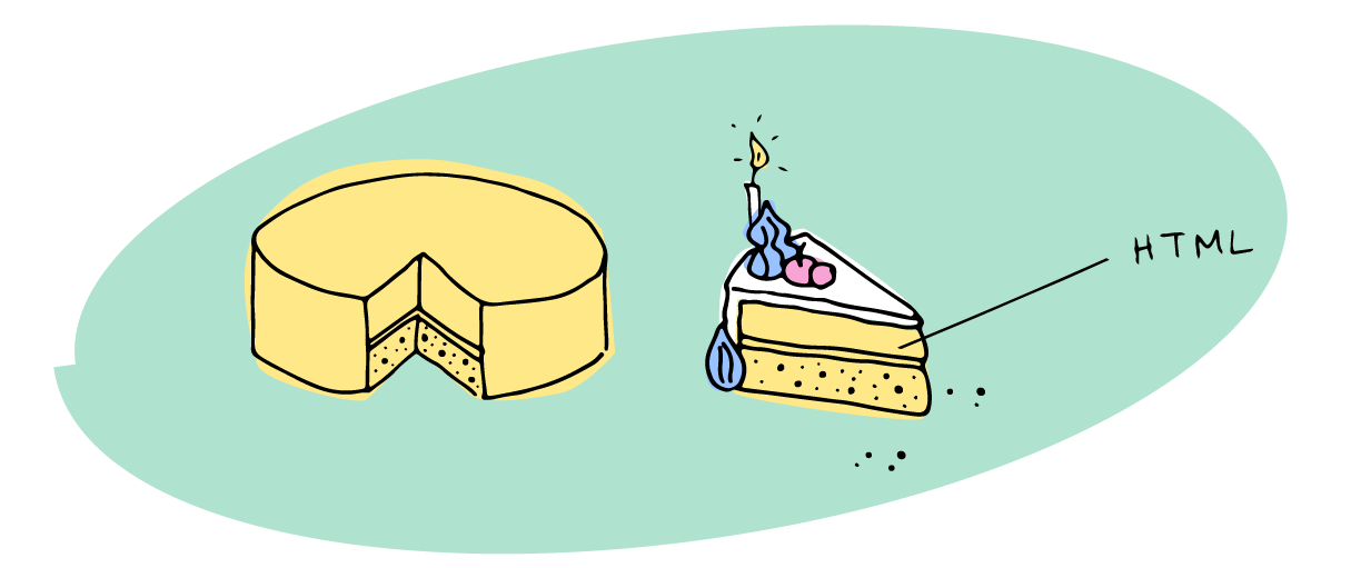
The most widely known analogy to describe progressive enhancement is that of a Peanut M&M. When I was teaching college students, I would often use this analogy interchangeably with that of a cake.

To illustrate the most extreme case of this, I’ll break it down as follows:

To make a cake, you need to start with a foundation and structure, the cake itself. It means at it’s core, you might be building an HTML-only application where all important processing is rendered server-side. Your application would work in any browser or mobile device, lynx browser, and even IE 1.0. I understand supporting IE 1.0 is unrealistic, but I mean only to illustrate my point: HTML works everywhere.

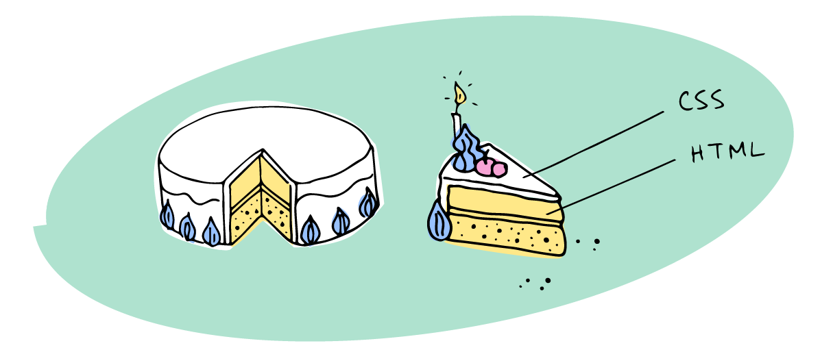
Having a plain cake might be nice, but having a cake that has a really amazing icing makes it even better. The next layer of progressive enhancement is CSS. When a browser doesn’t understand a CSS property, it simply ignores it — CSS is progressively enhanced by default.
Additionally, you can add to the site layout with media queries, providing an improved experience for a variety of devices. The addition of @supports statements can also enhance the experience in browsers that support newer CSS properties, like flexbox and CSS grids.

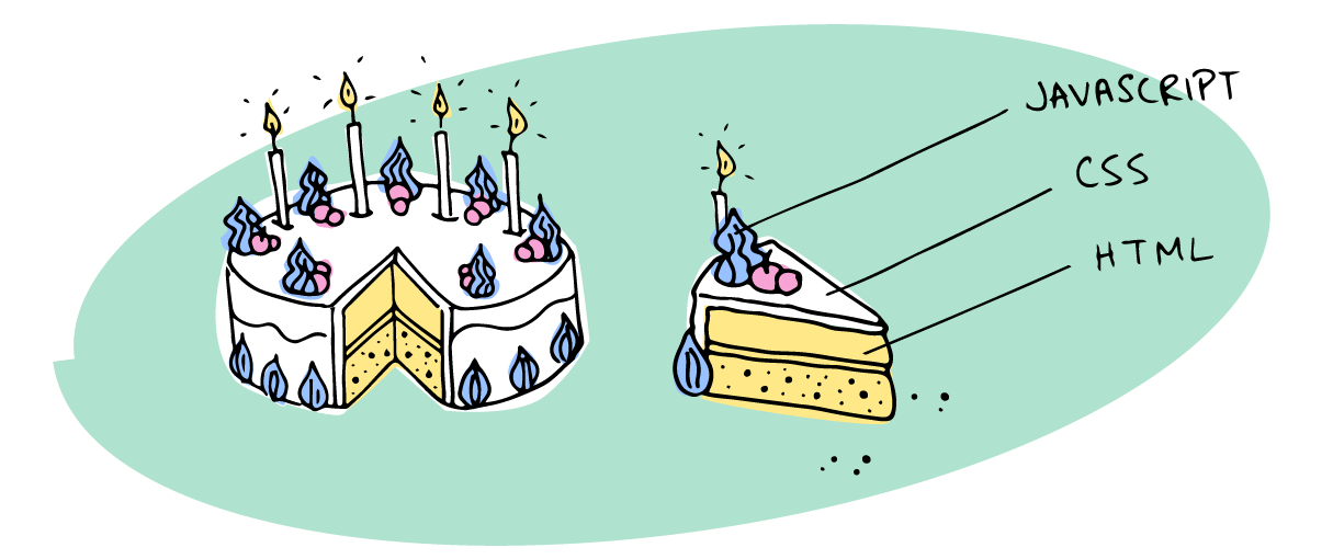
Finally, we have the toppings and accessories. A cake topper or set of candles can change the function of a cake, from a simple dessert to a wedding or birthday cake. Which leads us to the next step, enhancing the functionality of our site or app with JavaScript.
This can be the most tricky part because language and API support varies from browser-to-browser. If your JavaScript runs, you should test if certain features are available before using them. For example, you could be trying to build a progressive web app with service workers — but before you register a service worker, you should check if the service worker API is available, that way you won’t end up with an error if it isn’t.
Progressive enhancement doesn’t mean you can’t use JavaScript, but you do need to define what your baseline of support is for your website or application, and from there, build enhancements and features. What core functionality needs to happen, and can it happen with or without JavaScript? If you decide your website or application can’t run without JavaScript, that’s okay. But make sure to consider what the baseline of support is when doing so, and to build for such a scenario.
Improve performance and accessibility with progressive enhancement
Like I mentioned before, today’s websites are larger than they’ve ever been. Today’s average web page is around 2.35MB of downloadable resources, according to HTTP Archive, a site that tracks website performance and the technologies they use.
It’s been said that the next billion people who come online will use the web almost exclusively through smartphones. So we need to understand how to cater to mobile, and more specifically to mobile offline when we think of emerging markets. This is where performance and accessibility, as it relates to progressive enhancement, become not only imperative, but necessary.
Performance for growing websites
Faster websites = increased conversions, so performance is not a consideration, but a requirement when building for ecommerce. When it comes to JavaScript, there are a ton of things you can and should consider, to improve performance and overall experience.
What that means from a progressive enhancement perspective is that by thinking about how features enhance our existing sites, we not only build for the long term, but also for performance. If you choose a baseline of support, iterating and building new features or enhancements is much easier. Consider pre-fetching content for your user or preloading fonts.
Feature detectionIt’s also important to make sure that when we load scripts, we check to see whether specific features are available, so that we aren’t loading scripts that will fail or won’t be used. This is one way of improving performance via progressive enhancement.
To put it simply, we can use a cut-the-mustard approach for this type of development, first coined by the BBC as a way to easily separate support concerns between HTML4 browsers and HTML5 browsers. This allows us to provide an enhanced experience for those with newer browsers, using feature detection as a means of progressive enhancement.
if('querySelector' in document
  && 'localStorage' in window
  && 'addEventListener' in window) {
  // bootstrap the javascript application
}
You might also like: How to Optimize Themes for Performance.
Keeping accessibility at the forefront
Accessibility from a progressive enhancement perspective starts with HTML. Using semantic markup from the beginning ensures that your site is not only going to work in any browser, but that it’s also going to be understood by search engines and screen readers alike.
HTML as the base of accessibility
The magic of the web is that HTML just works because of its simplicity. Sir Tim Berners Lee, creator of the world wide web, called it the principle of the least power . Even with well tested code, which doesn’t always happen, complicated programs written in JavaScript have more ways they can fail. That’s because HTML and CSS are simply less complicated, because they are declarative languages.
You might also like: Developing Shopify Themes with Accessibility in Mind.
Accessibility is not just about supporting people with disabilities, with the use of alt tags and aria roles, it’s more than that. Accessibility is about supporting all people who use the web, no matter what browsing technology they use.
Media queries for accessibility
I would argue that even using media queries helps to widen the scope of accessibility and ease-of-use on a multitude of devices for a variety of users. A mobile first approach to designing and building a site is in a lot of ways tied to progressive enhancement. It’s important to note, when using media queries to create responsive sites avoid disabling zoom , as it not only makes assumptions about our end users needs, but also makes it impossible for people with poor eyesight to make things larger on touch devices.
<meta name="viewport" content="width=device-width, initial-scale=1.0">Remove limiting attributes, that disable zoom on mobile.
<meta name="viewport" content="width=device-width, initial-scale=1.0, minimum-scale=1.0, maximum-scale=1.0, user-scalable=no">Service workers for offline and push notifications
Service workers are a great way of progressively enhancing the experience of your site for your end user. There’s a great article about building progressive web apps (notice that progressive enhancement is part of the core practice) on Google’s developer site.
When using service workers, use feature detection to ensure that you’re implementing with progressive enhancement in mind.
if ('serviceWorker' in navigator) {
  // check to see if service worker API exists
  window.addEventListener('load', function() {
    navigator.serviceWorker.register('/sw.js').then(function(registration) {
      // registration was successful
      console.log('ServiceWorker registration successful with scope: ', registration.scope);
    }).catch(function(err) {
      // registration failed :(
      console.log('ServiceWorker registration failed: ', err);
    });
  });
}
You might say, “but Tiffany, I’m building themes, why would I use a service worker?” I would reply that service workers can enhance experiences, and help build offline content or even push notifications that help customers. For ecommerce stores, push notifications are probably one of the most common use-cases. One great example of this is the Firepush app or Aimtell for Shopify. It uses service workers to send push notifications via the browser, which could be used for package tracking updates, sales notifications, and more.

CSS fallbacks and @supports
Usually, when we talk about progressive enhancement the conversation hangs around JavaScript. And although Javascript can have some gotchas around progressive enhancement, with all the new CSS3 features being added to browsers and the W3C specifications, there are some best practices we can follow.
Fallbacks
The most common practice for progressively enhancing CSS is using fallbacks. We can use the architecture of CSS to effectively create a fallback, when a CSS property isn’t found or isn’t supported by a browser. Because a browser reads CSS chronologically, we simply need to place the fallback property before the newer one. This is how we’ve supported specific vendor prefixes for newer CSS properties.
h1 {
  background-color: #000;
  background-color: rgba(0,0,0,0.5);
  color: white;
}
Back in the day, if a browser didn’t support rgba (IE8), then you could specify an alternative color before it, so it would simply ‘fallback’ to the last color it understood. Most commonly, we see the use of this technique with newer properties and CSS prefixes.
.wrapper {
  display: -webkit-box;      /* OLD - iOS 6-, Safari 3.1-6 */
  display: -moz-box;         /* OLD - Firefox 19- (buggy but mostly works) */
  display: -ms-flexbox;      /* TWEENER - IE 10 */
  display: -webkit-flex;     /* NEW - Chrome */
  display: flex;             /* NEW, Spec - Opera 12.1, Firefox 20+ */
 }
This example shows the prefixes needed for flexbox support, with old, tweener and new syntax.
@supports
At Smashing Conf last year, I saw Jen Simmons talk about @supports in a presentation about Real Art Direction on the Web. @supports acts mostly like a feature detection for CSS, and can be really powerful. The nesting is similar to @media. You can pass it any CSS declaration combined with different operators, such as not, and, and or. It can also take custom properties (CSS variables) as an argument.
Check for basic property and values pairs.
@supports (display: flex) {
   .wrapper {
      display: flex;
  }
}
Use a not keyword to check for no-support.
@supports not (display: flex) {
  .wrapper {
    float: left; /* alternative styles */
  }
}
Multiple CSS property checks can be made via chaining the or and and operators.
@supports (display: -webkit-flex) or
  (display: -moz-flex) or
  (display: flex) {
  /* styles */
}
Learn more about @supports by visiting the specification on the Mozilla developer network.
So why should I care?
Progressive enhancement has been around for a long time, and with good reason. It’s an important best practice around how to develop websites and applications.
Considering how quickly things change, and how many new devices there are every year, it’s imperative that we continue to build websites and applications that can scale, change, and employ new features as they become available. To do this, and continue to make sure that the web is accessible for all, we need to ensure progressive enhancement is at the heart of everything we do.

Illustrations and animations by Tiffany Tse.
How do you incorporate progressive enhancement into your workflow? Tell us in the comments section below!
Read more
- Free Webinar] Getting Started with Sass and Shopify
- Intro to CSS: A Beginner’s Guide to Cascading Style Sheets
- How to Build Fast and Secure Websites With the JAMstack
- Free Webinar] Developing with Shopify: Using JavaScript to Add Ecommerce to Any Website
- Building Icon Systems With SVG
- Four Smart Reasons to Embed a Shopify Store in Your Client Websites
- Getting Started With a CSS Grid Layout on Shopify
- The 20 Best Brackets Extensions for Front End Developers

