In today’s highly competitive market, user experience design has become increasingly important. Companies that invest in UX design outperform their competitors. And when it comes to UX design, there’s one activity that creates a foundation for future products—prototyping.
Prototyping is a cornerstone of the design process. To develop a successful product, it’s essential to take prototyping seriously. Establishing a strong feedback loop early on in a product design journey, and adjusting that prototype according to the user’s needs is much cheaper than making changes in a system that has already been implemented.
When it comes to prototyping, there are many different approaches designers can choose from. But there’s one particular approach that is the most mysterious for many designers—rapid prototyping.
In this article, I'll reveal the mystery of the rapid prototyping process. I also share some of the best prototyping tools, tips, and techniques that can be useful for projects that practice rapid prototyping. But before we get into that, it’s essential to define what a prototype is.
You may also like: 5 of the Best Prototyping Tools to Test Out Your Web and Mobile Designs.
What is a prototype?
The term ‘prototype’ is used in a lot of different contexts. Because of this, there might confusion regarding its meaning, but at its heart, a prototype is a way to give our ideas a presence.
In its basic form, a prototype is a simulation of a final product, which is used for testing prior to launch. In the context of digital products, a prototype is a simulation of the interaction between the user and the interface. Depending on what a product team needs their prototype to do, it can simulate a single interaction or an entire app.
A lot of people confuse prototypes with sketches, wireframes, and mockups. These design artifacts are not prototypes. The idea of simulation (read, ‘interactivity’) is crucial for prototypes. That’s why static design artifacts can’t be considered prototypes.
Why is a prototype so helpful?
Human brain is a powerful tool for solving problems, but it can be hard to share ideas when they’re locked in our heads. Of course, we can explain our ideas using plain words. But explaining abstract ideas in words can be tough—not everyone can imagine a future state of a product.
Most people are familiar with the old idiom, ‘a picture is worth a thousand words.’ Often, a complex idea can be conveyed with just a single still image. Presenting information in a visual format is the fastest way to get other people to engage with that information, as human brains are hard-wired to process visual information better and faster than text. That’s why prototypes are so useful—they facilitate discussion through visuals.
Prototypes are also great for pitching ideas. There’s a famous quote from IDEO’s founders about it: “If a picture is worth 1000 words, a prototype is worth 1000 meetings.”
It’s much easier to get feedback on design decisions when everyone can see and experience things for themselves.
You may also like: What Are Design Sprints and Should You Be Running Them?
Traditional prototyping and its problems
Prototyping has its own part in a product design process. Product teams start a process of prototyping by defining an experience they want to create, and spend time working on a prototype that they’ll use for validation. A prototype can be validated through usability or acceptance testing.
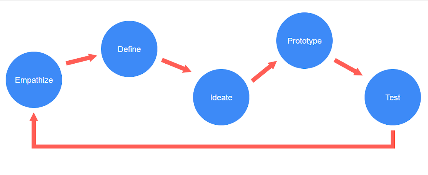
The traditional prototyping process is a sequential process that contains following steps:
- Sketching: Creating sketches that represent the product’s screens on paper or in a digital tool.
- Wireframing: Creating the skeletal structure of user interfaces.
- Mockuping: Mockups are ‘better dressed’ wireframes. Designers add UI design details such as content, typefaces, and imagery on each screen.
- Prototyping: Making mockups interactive by connecting screens together.
- Coding: Turning a prototype into a final product.
The most significant problem of the traditional approach to prototyping is the time required to create a prototype. The situation gets worse if, during the validation phase, the team realizes that a prototype was built on an incorrect hypothesis. No matter how well the prototype is executed, a wrong assumption is still a bad assumption, and a big waste of time and energy.
With so much at stake, it’s critical to reveal a lousy idea as early as possible. So, how can a team distinguish a good idea from a bad one?
The answer is to use rapid prototyping. It’s vital to invest heavily in prototyping before getting locked into the engineering phase.
What is rapid prototyping?
The ‘rapid’ part of rapid prototyping implies that this type of prototyping is faster (and probably cheaper) than creating a traditional prototype. Basically, rapid prototyping is the process of quickly mocking up the future state of a product, and validating it with users and stakeholders. The key difference from the traditional prototyping process is that a team focuses on building just enough of a prototype—something that users can test, without additional features. The whole concept of rapid prototyping is based on the idea that by setting a direction for a design team and iterating rapidly, it’s possible to create a product that will have the maximum value for people who will use it.
Lean UX and rapid prototyping
The concept of rapid prototyping was popularized by the Lean UX movement. One of the core principles of Lean UX is the idea of learning as quickly as possible. When teams that practice Lean UX build something, they have a clear answer to the question, ‘Why are we doing this?’ They get to this understanding by trying a lot of different things, and learning what works and doesn’t work for their project.
Rapid prototyping is based on progressive iterations of a three-step process:
- Prototype. Creating a solution that can be reviewed and tested by users/stakeholders.
- Review. Giving a prototype to users/stakeholders and collect feedback that helps the team understand what works well and what doesn’t.
- Refine. Based on feedback, the team identifies areas that need to be refined or reworked. The list of required changes will form a scope of work for the next design iteration.
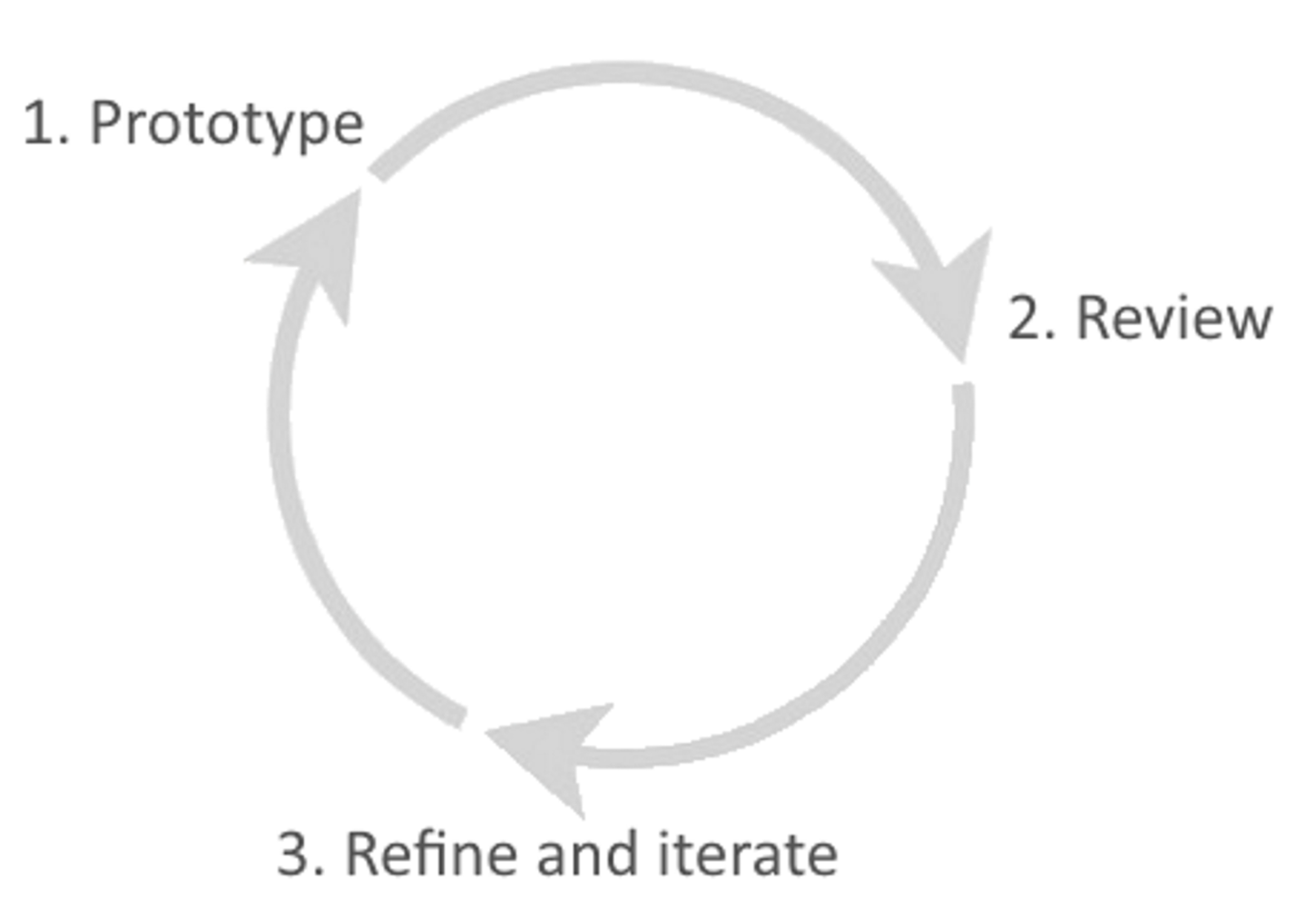
Rapid prototyping is an iterative approach to product design that includes prototyping, reviewing, and refinement.
As you can see, rapid prototyping is basically a build-test-learn cycle, where the essence of the ‘rapidness’ of the process becomes evident in the iterations of this cycle.
Product teams strive to reduce the time of each iteration of the build-test-learn cycle without sacrificing quality. They build a prototype as quickly as possible, test it with real users, and iterate based on feedback they receive. This means that the team rarely follows a traditional sequential prototyping process, since they can mix and match different prototyping approaches based on the requirements. For example, a product team can go straight from a detailed sketch or wireframe into a prototype.
How to define a scope of a prototype
‘How much should be prototyped?’ is a fundamental question for rapid prototyping. To find the answer, it’s essential to understand that the point of rapid prototyping is to prove a hypothesis, without prototyping the entire product.
Therefore, to get the maximum learning from the prototype, it should be highly focused. It's vital to establish a clear purpose for each prototype—way before starting to prototype, the team should have a clear understanding of what pages and layouts they need, and why.
Let’s assume that a team is working on an ecommerce website. The team is at the early stages of a design process, and their goal is to create smooth user interactions with a product.
The team should remember the Pareto principle, which says that for many events, 80 percent of the effects come from 20 percent of the causes. In the context of rapid prototyping, this principle means that you need to focus on the 20 percent of the functionality that will be used 80 percent of the time (therefore, the key user flows). For ecommerce websites, the primary user flows will likely be:
- Looking for a product (which will include browsing a product category or using a search feature to find a product)
- Purchasing a product (which will include the checkout flow)
"The team should remember the Pareto Principle, which says that for many events, 80 percent of the effects come from 20 percent of the causes."
When it comes to actual prototyping, it’s recommended that you follow the approach of starting with breadth, then diving into depth. In other words, design all key user flows, but don’t focus too much on details.
Tip: Try to find a scenario of interaction for each fprototype you create. For example, for an ecommerce website, it might be the story of how someone is looking for a particular product on a site. You can use a tool called storyboard to visualize how people would interact with your service or app.
You may also like: How to Build Usability Testing Into Everything You Do.
How to select the prototype’s fidelity
After a team identifies the flow (or flows) they want to prototype, the next question will be choosing a fidelity for a prototype. Fidelity refers to how closely the prototype resembles the final solution. There are many types of prototypes, ranging anywhere from low-fidelity to high.
Low-fidelity prototyping
A low-fidelity (lo-fi) prototype is a prototype that has only essential characteristics of the target product. Lo-fi prototyping is a quick way to translate high-level product requirements into testable artifacts. The first and most crucial role of low-fidelity prototypes is to test functionality, rather than the visual appearance of a product.
Here are the fundamental characteristics of low-fidelity prototyping:
- Visual design: Only some of the visual attributes of the final product are presented—designers use shapes instead of UI elements.
- Content: Text placeholders and dummy text are used instead of real text. Real content is limited—only vital content such as screen names or headlines are available.
- Interactivity: Human-computer simulation (during a testing session, someone who is familiar with design acts as a computer and manually changes the design’s state in real-time), or basic interactivity (such as clickable sketches or wireframes).
High-fidelity prototyping
High-fidelity (hi-fi) prototypes appear and function as close as possible to the actual product that the team plans to release. Teams usually create high-fidelity prototypes when they have a solid understanding of how the final version of design should look and behave, and/or when they need to test a prototype with real users or get final design approval from stakeholders.
Some of the essential characteristics of a high-fidelity prototype are:
- Visual design:Realistic and detailed design—all interface elements, spacing, and styling options make the prototype look like a real product
- Content: Designers use either real text or text that closely resembles the final version
- Interactivity: Prototypes have highly realistic interactions
When it comes to selecting a fidelity for your prototype, thefidelity of your prototype should match the stage of the design process you're at. Or, as Bill Buxton says, there is no such thing as high or low fidelity, only appropriate fidelity.
The rapid prototyping techniques
It’s vital to understand that rapid prototyping is nota separate prototyping process. A team that practices rapid prototyping uses the same techniques of traditional prototyping, but do it more efficiently. In rapid prototyping, the team revises quickly based on feedback they receive from testing, and use multiple prototyping approaches based on the requirements.
A product team selects an appropriate prototyping technique depending on many factors, such as the stage of the design process and the goals of the prototype. Based on how a team combines visual fidelity and functionality, most rapid prototypes fall in one of four categories:
1. Low visual fidelity and no interactivity
Low visual fidelity static prototypes are one of the earliest prototypes design team produce. Such prototypes are usually made from paper sketches or paper wireframes. To test this prototype, a team needs someone to act as a ‘human computer,’ to move from screen to screen.
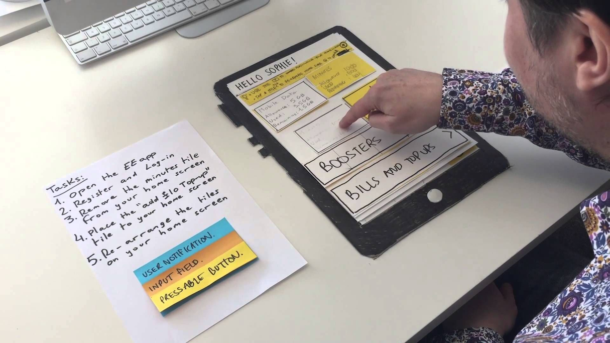
‘Human computer’ is a human being that controls and drives interactions. Image credited to UX Playground.
This technique has two main advantages: low cost and high speed. These prototypes are made quickly, and can be thrown away and replaced just as quickly. This property makes this technique extremely helpful during the early ideation phase of the design process, when a team needs to explore a wide range of concepts before sticking to one or a few promising ones. Low fidelity prototypes force designers to concentrate on the essence of a product’s design (what a product does), rather than its aesthetics (how a product looks).
"The first and most crucial role of low-fidelity prototypes is to test functionality, rather than the visual appearance of a product."
At the same time, it’s essential to understand the natural limitations of this technique. For example, it won’t help the team to test the usability of a product. Using a paper prototype, it’s almost impossible to check whether the user interface provides appropriate visual feedback to the user. It also will be hard to evaluate aesthetics, since it will be hard to understand how a future design will look like just by glancing at rough sketches.
Paper prototypes created from sketches
We have a lot of digital prototyping tools today that allow us to create prototypes with the least possible amount of effort, but sketching on a paper remains the most valuable tool for any UX designer. Sketching is a fundamental part of the design process. Putting pen to paper is the quickest way to start prototyping, because it allows designers to visualize a lot of different ideas in a short space of time.
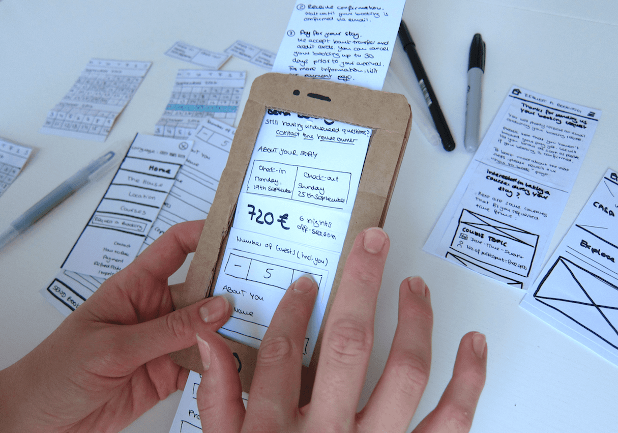
Many designers believe that paper prototyping can be used only during the early stages of a design process, but that’s not true. Paper prototyping can be helpful during development and even after product is released and on the market. Pen and paper come handy because it is much faster to communicate new ideas through sketches—so you might bust out a pen and paper even if you already have a hi-fi digital prototype.
Here are a few pro tips for paper prototyping:
- Don’t get stuck with the first solution that comes into your head. In most cases, your first ideas won’t be good enough, especially if you’re at the early stage of ideation. Generate as many different designs as possible instead of focusing solely on your first solution.
- Don’t try to make your sketches look perfect. A sketch isn’t a work of art; it shouldn't look pretty. Don’t spend extra time polishing your sketches.
- One sketch per screen. Don’t try to visualizes two screens or two separate states of the same screen on the same sketch. Try to reduce the visual noise for the people who will review your sketches by drawing a separate sketch for each screen.
- Use a pen, not a pencil. Ink is better than graphite because it creates a commitment—there’s a much better chance that you’ll finish the sketch. With a pencil, you can always undo what you’ve drawn.
- Don’t reject ideas without visualizing them first. It’s common for designers to think that some ideas are worthless. Don’t question your ideas while they’re in your head—let them out.
- Add notes to sketches. First, it will be much easier to explain your sketches to other people. Second, it’ll be much easier for you to remember what a sketch is all about after a period of time.
- Start with smaller screens.If you design a product that will be used on a variety of screens, it’s better to sketch mobile screens first. The limited space of a mobile viewport will act as a natural constraint and will force you to prioritize your content.
- Create copies of your sketches. Bringing a notebook with your sketches to meetings is fine, but printing copies of your sketches and passing them around is much better. You can also create a digital version of your sketches by taking photos of your work. Digital copies will help you avoid carrying a paper prototype from meeting to meeting.
You may also like: How to Conduct Research That Drives A/B Testing.
2. Low visual fidelity and basic interactivity
Low-fidelity prototypes with basic interactivity are prototypes that are created right from paper sketches or wireframes. Unlike paper prototypes, low fidelity prototypes with basic interactivity are created using a digital prototyping tool. Interactivity can be simulated by linking pages.
Clickable wireframes
A wireframe (also known as ‘skeleton’) is a static, low-fidelity representation of different layouts that form a product. Wireframes help designers arrange page elements. Clickable wireframes are the simplest form of an interactive prototype—they are created by linking static wireframes together.
Just like paper prototypes, clickable wireframes often don’t look like a finished product, but they do have one significant advantage over paper prototypes—they don’t require a separate person to work as a facilitator during the review/testing session.
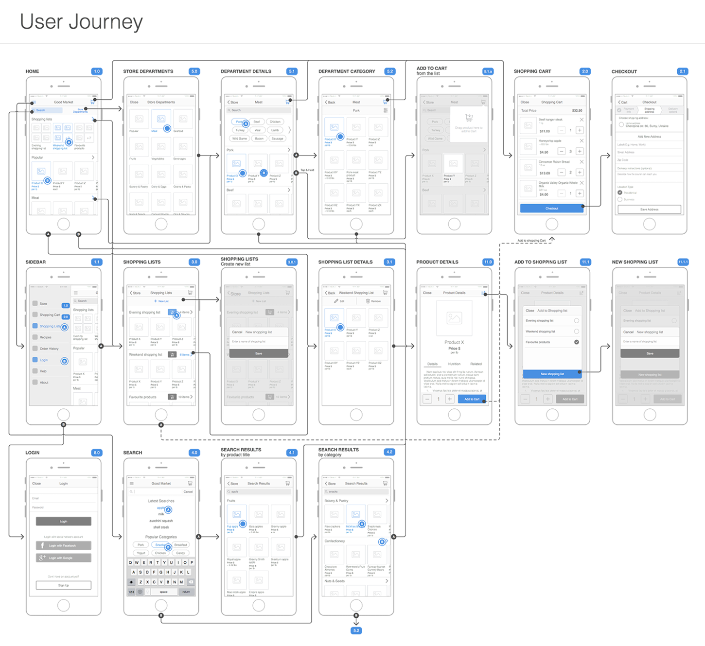
Creating a user journey by linking wireframes. Image credited to Volodymyr Melnyk.
A few tips about clickable wireframes:
- Clickable wireframes require moderated usability testing. If you plan to use clickable wireframes for usability testing with real users, you need to conduct a moderated testing. Since the design will be far from complete, it’s recommended that a person helps create context or explain some interactions. It will help to reduce the risk of confusion.
- When selecting a digital prototyping tool for clickable wireframes, it’s better to choose a tool that also allows you to add visual details and interactions later on. This will help you translate a lo-fi prototype in a hi-fi prototype. Otherwise, your clickable wireframes will be dead-end documents.
3. High visual fidelity and limited interactivity
These prototypes are static mockups connected to each other. Basically, it’s a polished version of the first technique, but instead of a ‘human computer’ that simulates interactivity, the digital prototyping tool does all the work.
This technique is helpful when a team is working on a product redesign. For example, if an organization plans to release a new visual design for a website, they might choose to create this prototype right after the low visual fidelity prototype. Product teams can then send the prototype to stakeholders to get the final confirmation.
"It’s essential to understand that when giving people a prototype with a high visual fidelity, you need to get them to focus on the visual design details."
It’s essential to understand that when giving people a prototype with a high visual fidelity, you need to get them to focus on the visual design details. As a result, you will have their opinion on typefaces, colors, and other visual attributes of the design. As such, it’s not recommended to create hi-fi prototypes if you didn’t already validate core usability assumptions through previous testing. Otherwise, you might find that you invested in visual design, but the information architecture is broken.
Interactive mockups
High-fidelity prototypes created in a prototyping tool can have on an additional benefit to developers. They can also serve as supplementary documentation for developers. Using tools like Zeplin or Sympli, it’s possible to translate a prototype into a living spec.
In comparison to a static specification, a live spec is much easier to understand. It can be extremely useful during design handoff (when designers send a prototype to engineering for development).
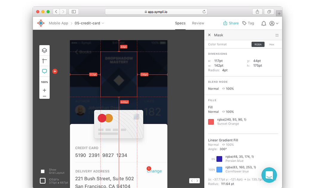
Inspecting a high-fidelity prototype in Sympli. Image credited to Sympli
A few things to remember when working on a prototype:
- Avoid dummy text. You should avoid avoid dummy text like lorem ipsum in the early stages of digital prototyping. But when it comes to hi-fi prototyping, dummy text is prohibited. Use real content to understand how it affects the overall design.
-
Keep in mind that polished design can prevent a product team from receiving honest feedback.
 It might be hard for test participant to critique you, especially when they know how much time is required to create such design. It’s critical to start each test session by saying something like, “Don’t be afraid to say what you really think. You won’t hurt our feelings.”
You may also like: Selling a UX Design Process That Ensures Results.
4. High visual fidelity and fully interactive prototypes
High-fidelity prototypes can be easily mistaken for the final product, as such prototypes are just one step away from being complete. They are extremely useful when a team needs to test complex functionality (such as animated transition effects). Since the design looks and behaves like a finished product, test participants won’t need to use their imagination to understand how specific features or UI will look and behave.
Hi-fi interactive prototypes can be created in a specialized prototyping tool or as a native prototype.
Hi-fi prototypes created in a prototyping tool
A few years ago, the only way to create high-fidelity prototypes was to actually code it using a programming language. These days, prototyping tools like InVision or Adobe XD allow non-technical users to create high-fidelity prototypes that simulate the functionality of the final product in minutes.

Hi-fi prototypes are designed to emulate not just the functionality of the product but also the look and feel. High-fidelity prototype created in Adobe XD. Image credited to Adobe.
Here are a few practical tips for creating hi-fi prototypes:
- When designing high-fidelity interactive prototypes, build in realistic delays.This is especially important for screens that handle time-consuming operations, such as a search page. Doing so will help you to collect more relevant usability feedback and set realistic expectations for stakeholders.
- Know the limitations of implementation. Don’t prototype features or functionality that cannot be implemented by developers. When in doubt, it’s always better to ask developers whether something is technically feasible or not.
Native prototyping
Native prototyping means writing code. When you prototype natively, you build and test your design ideas on real devices. This type of prototyping requires strong technical proficiency. Native prototyping is essential when a product requires data that is hard to emulate using design software (for example, if you’re building a mobile app that needs real GPS data).
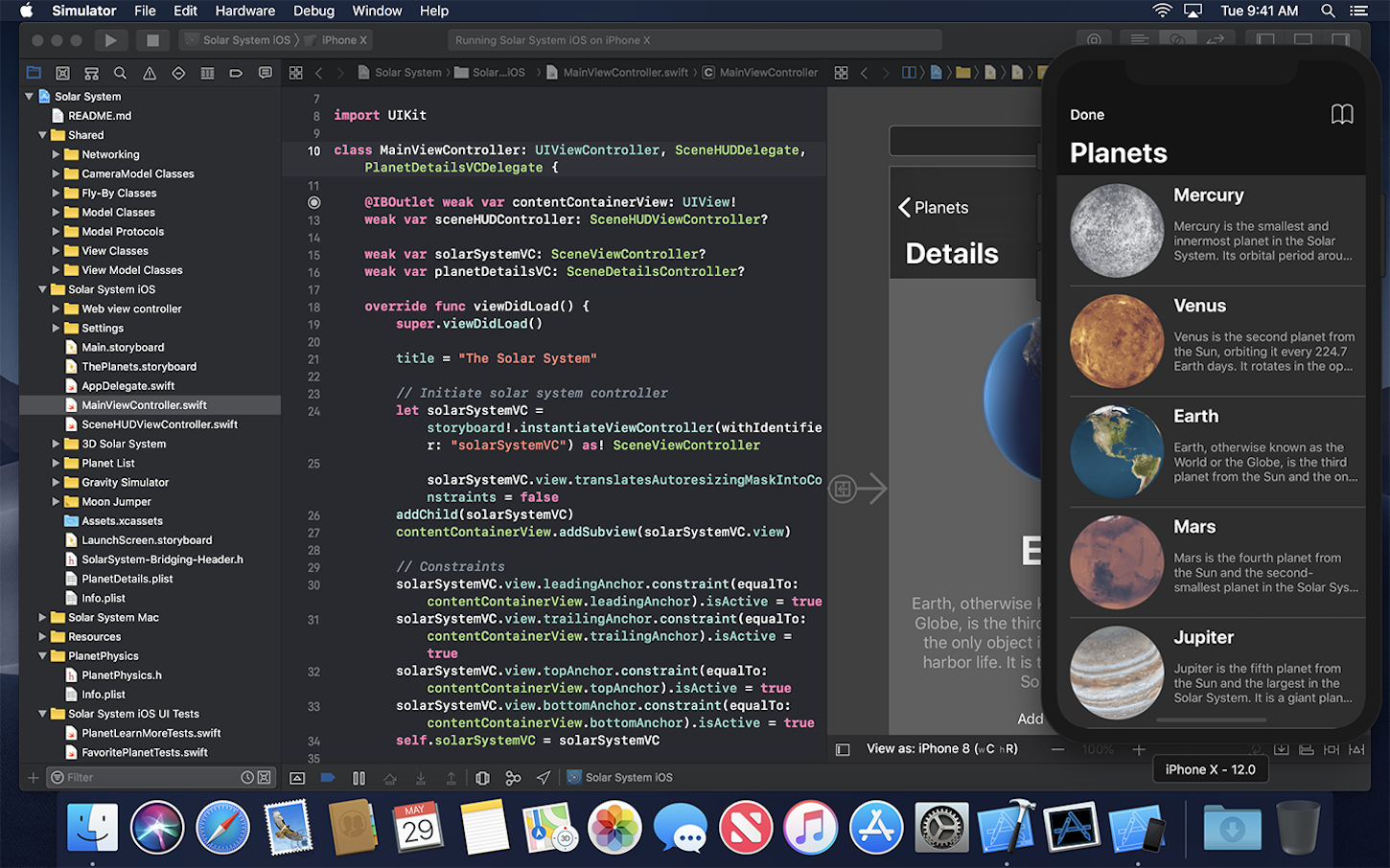
Native prototyping is writing code—writing an actual Android/iOS app or developing a website. Image credited to Apple.
While native prototypes often look like fully-functioning versions of a product, it’s important to remember that a coded prototype isn’t the same thing as a final product. Always remember that the point of rapid prototyping is to showcase how something will work without building the entire product.
Here are a few things to remember when creating a high fidelity interactive prototype:
- Estimate how much time is required to develop a prototype.It’s possible to build almost everything. But the key question is how much time it’ll take. It’s better to avoid native prototyping if you don’t have solid development skills and can’t give a clear estimation on how long it will take to build a prototype.
- Use real devices and real data.Since the goal of native prototyping is to understand how an app will work in the real world, you’ll need a realistic experience that you can put in the hands of your users to collect valuable feedback. As much as possible, use actual devices and real data to validate your design decisions.
- Try to reuse code. You should develop prototypes with the intention of reusing code from the prototype in the finished product. If it’s possible to use prototype code in the final product, you’ll save a massive amount of time and energy during development.
The Complete Guide to Web Design Project Management
Read our complete guide to web design project management for developers, designers, and marketers. Learn how to work with stakeholders, manage budgets, and keep your clients happy.
Learn moreRapid prototyping for validation
Rapid prototyping can put you and your team on the fast track to success. By creating the right mindset with a strong focus on learning, and investing in prototyping early on in the design process—way before you get locked into the engineering phase—you’ll save a lot of time and money down the road.
Rapid prototyping paired with an iterative mindset generates feedback early and often in the process of building a product, helps product teams improve the final design, and reduces the need for changes during development.
Read more
- Inclusive Design: 12 Ways to Design for Everyone
- My First Year as a Freelancer
- Top 13 Web Design Conferences You Should Attend in 2016
- Top Ecommerce Web Design Trends from January
- 6 Design Conferences to Last You 'Til The End of 2016
- Top Ecommerce Resources for September
- How to Use Video Footage in Web Design
- Top 5 Features to Include When Building a Successful Fitness Site
- 4 Things to Consider When Designing Wholesale Stores for Clients
- Pitching Animation: How to Talk About Motion in a Design-Centric Way
Have you had mentors in the past? Share your experience in the comments below!

