Digital illustrations are one of the most popular trends of recent years. Top industry players like Google, Airbnb, and Dropbox have embraced illustration as a distinctive part of their products.
In this article, I explore various illustration styles that modern products use, as well as provide tips on what you need to consider to create a style that will suit your brand. But before that, it’s important to understand why illustrations are so important.
The importance of illustration
Perhaps one of the most important facts you need to understand about illustrations is that illustrations are not just a trend—they’re a tool. By its nature, illustration is a visual interpretation of a particular concept, text, or process. People have used illustrations for thousands of years to communicate and to empathize.

Using illustrations in your design is beneficial because the vast majority of people perceive visual information faster than textual (Words Versus Pictures, PDF).
Illustrations give designers three superpowers:
-
Understanding complex information. For complex information, visuals are better than text. While words can tell you something, illustration can show you something.
-
Better recall of information. Every time we try to remember something, our brain creates an image. It’s much easier to remember an illustration than plain text, because we have a ready-to-use image. Also, images tend to stick better in our long-term memory.
-
Brand identity. Identity is a combination of many different elements that contribute to a lasting impression
 . Good brand identity is something that makes your brand stand out from the crowd. Brand identity benefits from well thought out and consistent illustrations, and custom illustrations establish a solid foundation of originality.
The language of illustrations in digital products
There are four main types of illustration that are found in digital products. Below, we look at each of these types and how they are used.
Icons

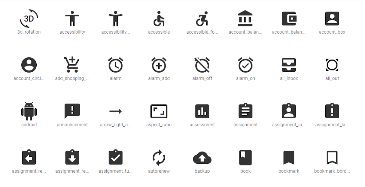
An icon is a symbol representing a larger idea. It’s a functional element—something we can easily interact with. Although we often don’t notice such small elements, icons are an essential part of the visual language of a product.
In an attempt to use icons in a structured way, many companies create guidelines. For example, Shopify platform uses Polaris for this purpose.
Spot illustrations

A spot illustration usually accompanies text. As users, we typically see such illustrations on landing pages or in product updates and announcements. Spot illustrations are used to explain a body of text more succinctly.
Many people confuse spot illustrations with icons (probably because it’s possible to use icons for spot illustrations), but it’s vital to understand that these are not the same thing. Spot illustrations have a different functional purpose: they are not interactive elements.
Scene illustrations

Scene illustrations often include an object, action, or character. Scene illustrations use the power of visual storytelling, by relying on metaphors to tell bite-sized stories. Such illustrations are commonly used in onboarding, as well-crafted illustrations help designers tell the story of any given feature, and make it crystal clear for users on how it might fit into their life. Scene illustrations are also useful for error states—situations when it’s vital to describe what just happened in order to get the user back on the path to success.
Hero illustrations

A hero illustration is one of the first (ideally, the first) objects that a visitor sees when they visit a product’s landing page. Such illustrations have a limited number of cases where they can be used without getting in the way. Most often, hero illustrations are used in the introduction to a product, either on a landing page or the welcome screen.
You might also like: 4 Trendy Visual Design Techniques.
Popular illustration styles
In the world of tight competition, it’s vital to stand out. And in an attempt to stand from the crowd, companies try different approaches with their illustrations, which is why illustration styles come in and out of fashion all the time.
Focusing solely on current trends in this article will make it out outdated, so instead, I want to talk about two fundamental types of digital illustration design in modern products.
Flat hand-drawn illustrations
As the name suggests, each illustration is drawn by hand—the artist either draws on a piece of paper and then makes a digital copy of their work, or draws on a digital pad. Below are some examples of brands that use the flat hand-drawn style.
Dropbox

Illustrations have been a part of Dropbox’s product since they started over ten years ago. Dropbox uses these illustrations to bring the product to life.

In 2018, the company introduced a new illustration style with loose, witty drawings. Despite their simplicity, this style creates a truly memorable experience for first-time users—a friendly and relaxing atmosphere that users relate to.

Intercom

Intercom produces a messaging platform that allows businesses to communicate with prospective and existing customers within their app, on their website, through social media, or via email. Intercom is an excellent example of a product that uses illustration as a supplement to written content.

Recently, the company introduced a new digital illustration style. Instead of anthropomorphic giraffes and walruses, Intercom started to use illustrations of people who use the service. The great thing about this approach is that when users see such illustrations, they start to imagine themselves in this role.
Slack

Slack is a collaboration tool for business. In 2017, Alice Lee worked on the Slack redesign; her team introduced a new illustration style that was intended to personalize the brand by representing people in illustrations. At that time, it was one of the first companies that followed such an approach.

The Slack team is continuing to experiment and bring new ideas into their design.
Shopify

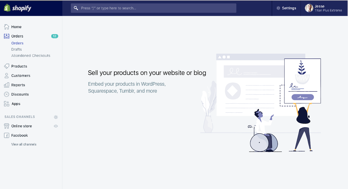
Shopify uses illustrations to cultivate a more emotional relationship with users. In her article Building a New Illustration Style for Shopify, Meg Robichaud shares a lot of insights on how the team came up with the style the company uses today.
Shopify actively uses metaphors to deliver the key idea. For example, the illustration below makes it clear that the platform is accessible for customers with all abilities.
3D illustration
3D vector illustrations became trendy at the end of 2018. One of the reasons why this trend suddenly became popular is simple—such illustrations better resemble the digital nature of the product.
SPAR!

SPAR! is a social habit building app that uses 3D illustration to create a more playful image of a product.
Pitch

Pitch is an open platform for presentations and content collaboration. The Pitch website uses a similar concept of 3D illustration, but it bakes an element of animation to make it more alive.
Three-step guide for creating your own illustration style
The illustration style you choose to use for a project should map to the voice of the product you’re representing. But how can you figure out your style? In this section, I want to talk about rules that will help you build recognition through illustration.
1. Define
When you just start working on your illustration style, you probably won’t have a clear vision of what your illustrations should look like. You’ll need to spend some time experimenting and trying various approaches. But before you make a first drawing, it’s vital to define your goals, so you know what to aim towards. You need to understand what the value is of adding an illustration to that product.
Decide how you want the brand to be perceived
Start with an understanding of the brand. Here are a few important questions that need to be answered before moving to the design part:
- What does the brand represent?
- What are the unique traits of the brand?
- What do you want to achieve from using illustrations in your product?
If you have brand values or brand guidelines, it’s a perfect moment to check them. The information from these guidelines will help to define the tone of the illustrations and their qualities. Try to articulate where you want your illustration to land:
- Serious vs. playful
- Realistic vs. abstract
- Simple vs. detailed
Learn about your users
When deciding on a particular style, it's important to take into account the target audience preferences and balance them with business goals.
The information you learn about your users will help you define the qualities of your illustration. Knowing your users is especially important because you want to connect with them on a personal level.
Two essential aspects you need to consider are:
- Ensuring that the metaphors that you choose to use in your design will be clear to your target audience. Symbols and metaphors do not always cross cultures. If the message isn't clear to your users, this can lead to an incorrect understanding of the idea that your illustrations are trying to convey.
- If you plan to bake humor in your design, make sure that users appreciate your sense of humor.
You might also like: Using Humor in Design: Why, When, and How.
2. Explore
The goal of exploration is to articulate the illustration style. Articulated style becomes a shared language that everyone on the team should use when creating illustrations.
Get inspiration
The process of exploration starts with inspiration. The more styles you explore, the better understanding you’ll have. Dribbble and Behance are good places to search for inspiration. You can also check Inspiration Grid or Creative Boom, which are resources dedicated to creative inspiration.
Don’t forget to structure your thoughts and ideas. A tool called a moodboard can help you with that. Put together a moodboard of illustrations that you feel may work for the style you want. If you work with a team of illustrators, ask each one of your team members to find examples they think are relevant to the brand, and put them on the wall.

Try various styles
While you’re looking at different styles, select a few to test with your brand. Try each of them, and choose the one that works for you and your team (meaning, you and your team have to enjoy drawing in this style).
Tips:
- Choose a long-lasting style. Make sure the style you choose will evolve with your brand.
- Ensure that the style you choose to use will work for your primary platform. It’s one thing to design for desktop screens where you have plenty of screen space, and entirely another for mobile screens with tight constraints. If mobile is your primary platform, it’s essential to simplify the style of illustrations. Look for the elements of your illustration that actually set it apart, and get rid of the rest.
You might also like: 15 Myths That Can Ruin Your Mobile UX.
3. Design
Once you’ve decided on a style, it’s time to outline some rules to follow when creating illustrations.
Each illustration should have a purpose
One of the major misconceptions many designers have about digital illustrations is that using them in design is about making a product more beautiful. A digital illustration is a tool that should combine beauty and clear functional purpose. Product illustration without a functional purpose is distracting and overwhelming.
"Product illustration without a functional purpose is distracting and overwhelming."
You need to have a clear purpose for each illustration you want to use in your product. Every illustration should amplify the message you want to deliver to your user . Otherwise, illustration becomes just a cool decoration.
Create all your illustrations in a single style
You’ve probably heard that consistency is one of the most important characteristics of a well-designed product. Being consistent in illustration means considering the smallest details in a single illustration—perspective, light source, line weight, etc. Consistency speaks to your attention to detail and tells your users that you care. That’s why it so important to pick one style, and don’t deviate from it.
The illustrations used in your product should feel like they came from the same source—the same person—even though they were created by different illustrators.
Be deliberate about color
Color plays a critical role in creating illustrations for two reasons:
- It can influence user mood. Color alone can set the mood before the user consumes the content.
- Color can represent a brand. If the colors are taken from the brand color scheme, the illustration becomes a part of the brand's identity.
It’s important to consider both points when creating a color palette. Generally, it’s recommended to use a limited number of colors in the palette (2–3 colors, max) and stick with that palette for all your illustrations.
Illustrations are a superpower
Creating a distinct illustration style is not a simple task, but it is definitely worth your time. Well-designed illustrations can enhance your brand experience and help you to create a very personal connection with your users. Such illustrations become an essential part of your product, and both you and your users won’t be able to imagine your brand without them.
Read more
- Product Photography Tutorials — Master Ecommerce Images with These 6 Post-Production Techniques
- Top Ecommerce Resources for August
- How to Build a Winning Ecommerce Design: An Interview with Vitaly Friedman
- 4 Things to Consider When Designing Wholesale Stores for Clients
- Symmetry vs. Asymmetry Difference in Layout Design
- The Power of the Dark Side: Dark User Interfaces
- Top Ecommerce Resources for October
- Top Ecommerce Resources for July
How have digital illustrations helped you design products? Let us know in the comments below!

