How appealing your product pages are crucial when you open an online store. The content you use, the images, graphics, colors, words, and typography form the heart of any ecommerce website and can transform visitors into customers.
Spend more time on your product pages than on your homepage, About page, or other parts of your store. Refine the basic features of your product pages—the images, descriptions, and interactive elements that highlight your product’s benefits and convince a visitor to buy.
When you build product pages with an ecommerce platform, you have a wealth of design options at your fingertips. To guide your decisions and inspire your next product page design, here are some of the best ecommerce product page examples, with explanations of why they excel.
What is a product page?
A product page is a component of an online store. It’s a place where potential customers learn about a product’s features, benefits, and pricing. Product pages also prompt website visitors to make a purchase decision.
Basic product pages feature interactive elements that let users select options like size and color, and add products to their cart.
Most product pages extend beyond these basic functions to include informative content like high-quality product images, detailed descriptions, customer reviews, and product comparisons.
Well-designed product pages not only list details but also showcase how a product can solve problems or enhance a customer’s life.
Today’s best product pages are evolving to be more interactive and personalized. They might feature videos, 3D models, or augmented reality that help customers better understand a product. They might also provide personalized recommendations or live chat support to mimic the in-store experience.
Best product pages: 19 standout examples
Let’s look at some of the best product pages built using Shopify to see how they tell persuasive product stories, connect with customers, and drive sales.
- Master & Dynamic
- Figs
- Kit and Ace
- Love Wellness
- Dr. Squatch
- Holstee
- Kettle & Fire
- Hiya
- Studio Neat
- Leesa
- Outdoor Voices
- Luxy Hair
- PooPourri
- Rocky Mountain Soap
- United By Blue
- Sixty-Nine
- Manitobah Mukluks
- Perfect Keto
- Johnny Cupcakes
1. Master & Dynamic

Master & Dynamic applies every product page best practice in the book to maximize customer conversions for its wireless headphones.
The product description focuses on relatable benefits, not just technical details. Customers can easily imagine what it’s like to “hear your favorite songs in a whole new way,” and enjoy “multiple commutes, work days, and jam sessions without having to worry about plugging in.”
If customers are technically minded, there’s also a simple but comprehensive list of technical specs. And for hesitant buyers, there’s a feature to compare headphones with similar products in the store.
Other design features include:
- A wide variety of images with close-ups of key product details, plus lifestyle shots of the product in use.
- Standout product aspects are highlighted with icons.
- Anchor links allow visitors to jump to sections such as Features and Tech Specs.
- A large button makes it simple to add the headphones to your cart.
- A carousel of complementary products and accessories creates cross-selling opportunities.
2. Figs
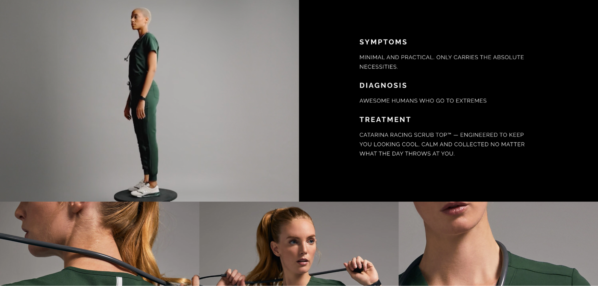
Direct-to-consumer health care apparel brand Figs is known for its fashionably cut, wear-resistant scrubs. Its customers need to feel that the product’s superior comfort and appearance don’t come at the cost of functionality.
To boost buyer confidence, Figs’ product pages balance clear, targeted information with high-energy content that references the intensity of a career in health care.
Product images show models in dynamic poses, while an animated GIF gives a full, 360-degree view. Further down the page, a video (set to autoplay) intercuts product development footage with scenes of first responders racing to an accident.
The copy on the product page is similarly on-theme. Features are phrased in medical terminology, while claims about product quality radiate confidence: “designed to withstand anything.” Trademarked names for fabrics and manufacturing methods (“our proprietary FIONx™ fabric”) provide a sense of technical expertise.
Other on-page tactics include:
- A wide variety of colors and sizes, including a custom embroidery option, to suit many business uses.
- An extensive cross-selling section that encourages shoppers to “wear it with,” and “complete your uniform.”
- “Shop more” buttons take users to relevant product catalog pages to continue browsing.
3. Kit and Ace
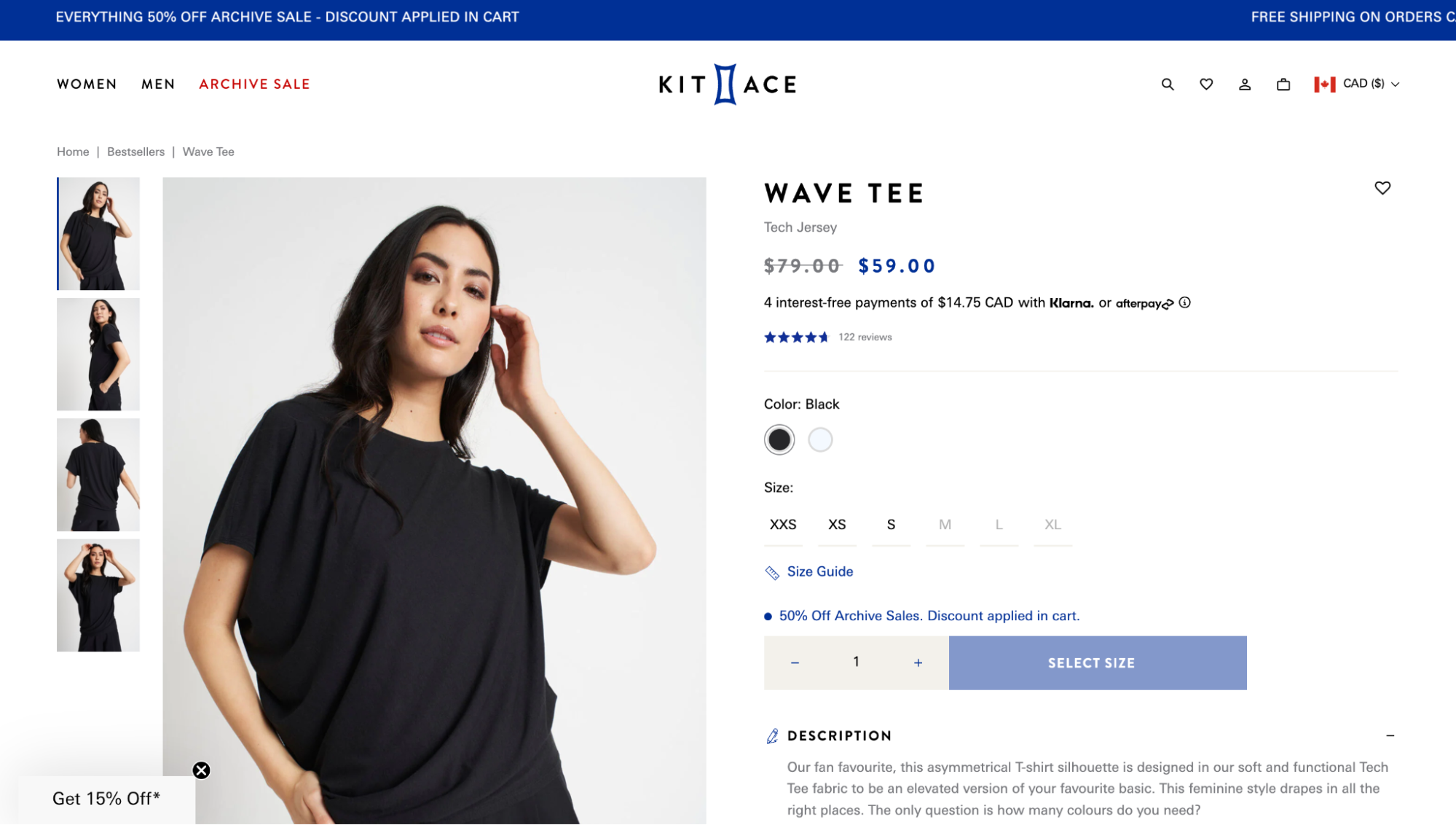
Subtle incentives are the name of the game on the product pages of athleisure brand Kit and Ace. While the product page is deliberately minimal and basic, its design successfully promotes discounts across the page—without feeling pushy or sacrificing the brand’s prestige.
A bullet point above the Buy button tells shoppers that a discount will be applied to their cart, but doesn’t reveal the exact amount. This encourages shoppers to add products to their cart to discover the discount, moving them further down the sales funnel.
Other promotional features include:
- A small scrolling header banner that entices shoppers to browse multiple product pages
- A discounted price is shown in a high-contrast bold color, while the original retail price appears for comparison
- A popout offers an additional discount for first-time customers
4. Love Wellness

The product page for Love Wellness’s Bye Bye Bloat supplement oozes with social proof—evidence that the product is popular and well-regarded. Shoppers can click on the circles below the "Buy Now" button to see influencers using the product and view a short video from the company's founder.
Evidence of a product’s popularity can help buyers feel more confident about their purchasing decision, especially when combined with product page design features, such as:
- Multiple payment options, including the high-converting Shop Pay, which make purchasing as accessible as possible
- Influencer video testimonials, which explain why they love the product
- A product walkthrough video
- A product description formatted in short bullet points outlining customer problems and how the product solves them
- A prominently displayed customer testimonial quote
- An FAQ section
- Searchable customer reviews with star ratings
- A persistent sidebar with key product information and an Add to Cart button
5. Dr. Squatch

Dr. Squatch’s product pages are designed to persuade shoppers to subscribe. The men’s personal care brand creates several compelling reasons for users to start a subscription for their favorite items. You can:
- Earn points on every purchase
- Subscribe for repeat deliveries in return for a discount
- Get free shipping on subscription orders
6. Holstee
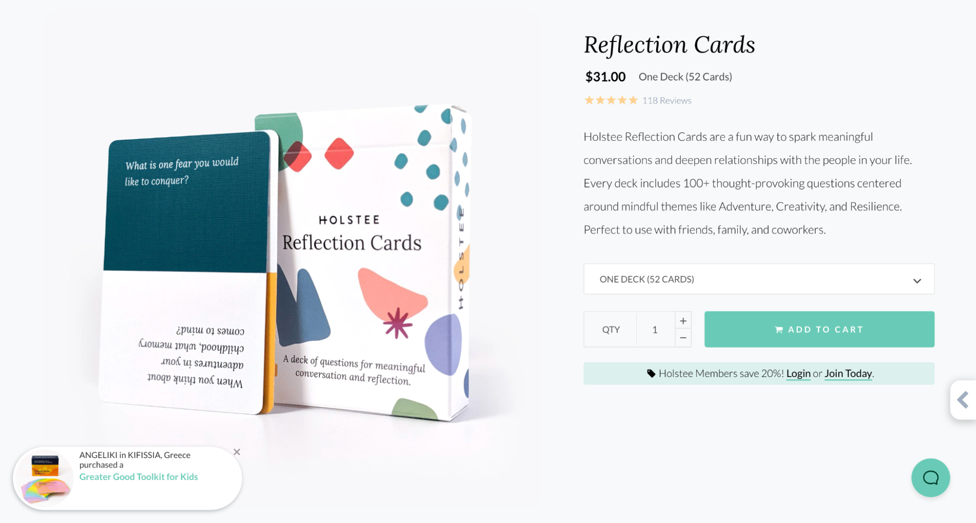
Holstee’s product page for its conversational card deck tells the story of the product with in-depth copy. It also leverages other popular product page elements, such as:
- A pop-up to notify shoppers of other recent purchases to enhance social proof
- A bundle and save option
- A wide variety of product photography to capture different use cases
- A video explaining the concept behind the product
- A history of product development and a sustainability commitment
- A persistent add-to-cart button, which is always present on the page
- Encouraging visitors to become a store member in return for a discount
7. Kettle & Fire
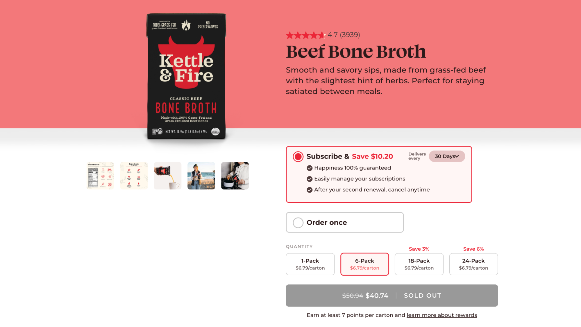
Kettle & Fire sells bone broths and soups in containers that you can keep in your pantry for up to two years. Their product pages offer a variety of purchase options, allowing users to save by buying multipacks or subscribing for repeat deliveries.
Potential savings are repeatedly highlighted, alongside other noteworthy on-page elements, such as:
- A prominently placed customer star rating
- Short, concise product description copy that includes a benefit: “Stay satiated between meals”
- A product subscription feature, which is promoted with short bullet points
- Product quantity ordering options with potential savings highlighted
- A Buy button that highlights potential savings
8. Hiya
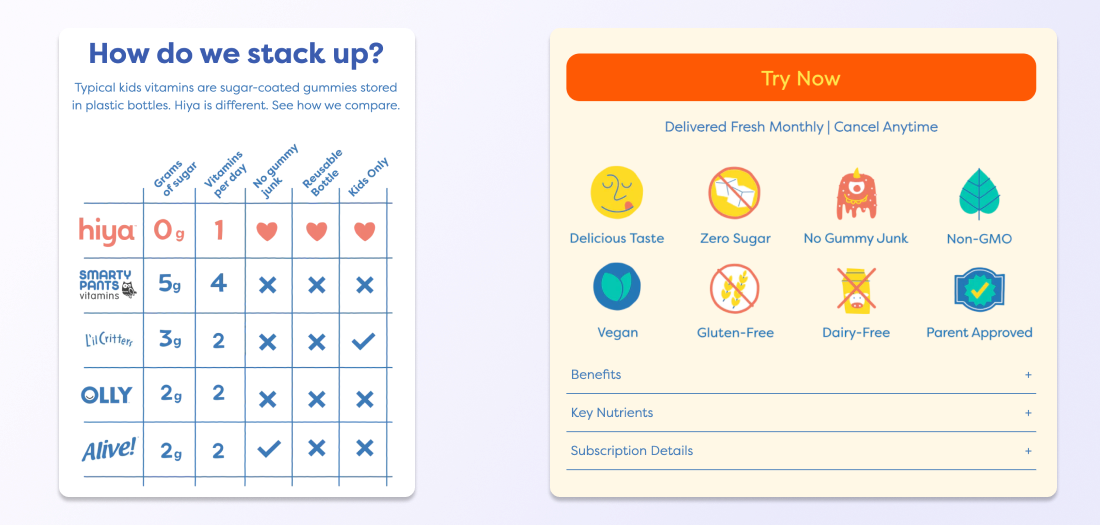
Hiya sells multivitamins for children, which presents a design challenge: making kid-friendly product pages that also meet the needs of meticulous parents.
Hiya’s solution is a series of product comparison sections rendered with simple visual illustrations. Parents can immediately understand the key differences between Hiya’s and competitor’s products, with all content clearly positioning Hiya as the superior choice.
The page also notes that each order includes a sticker decoration pack. Alongside providing a fun activity for children, the added perk demonstrates that Hiya is considerate of its end user.
Other design features include:
- A subscription-only payment option, which creates more revenue per customer
- A large discount on customers’ first orders, which creates a buying incentive
- Product sizes are measured “per kid” to simplify the selection process
- A video featuring relatable, real-life customer testimonials
- An extensive FAQ section preempting parent questions
9. Studio Neat

Stationery maker Studio Neat opts for a prominently placed video to walk buyers through the features of its overengineered ballpoint pens.
To compliment the video, product images, descriptions, and icons highlight unique aspects of the pen’s development (“the only all-metal mechanism on the market that has an actual “click” action”), as well as its benefits, (“It is satisfying as heck to click.”)
Pull quotes and conveniently placed links direct users to related products, such as ink refills or a matching notebook, while lifestyle photos show the product in a variety of everyday settings.
10. Leesa
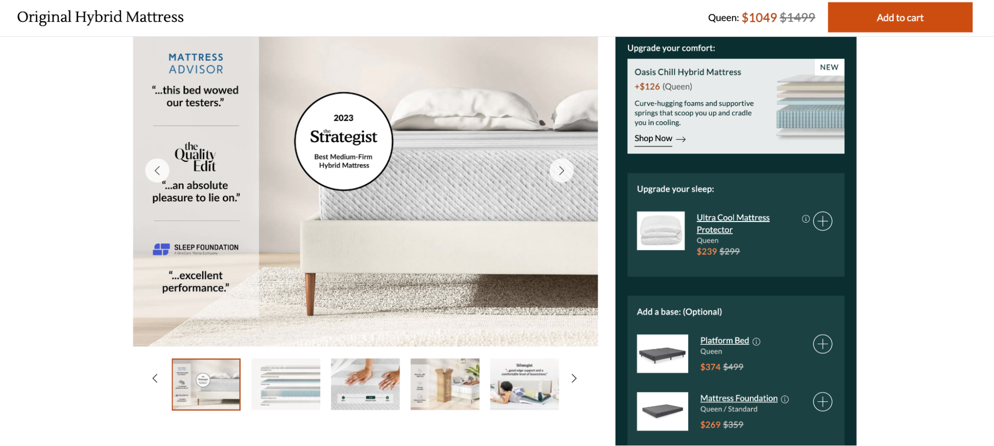
Leesa is a direct-to-consumer mattress company. Its product page is designed to emphasize two things: social proof and cross-selling.
Social proof is provided in the form of quotes from industry experts such as Sleep Foundation and Mattress Advisor, while a sidebar makes it easy for visitors to add complementary products to their cart.
Other page design details worth copying include:
- A persistent Add to Cart button at the top of the screen
- Tabs that sort product information into benefits and recommended uses
- Discounts and bonus offers clearly highlighted
- Product images with text and diagrams to demonstrate features
- A feature to add related products to the cart in one click
- A virtual assistant chat feature
11. Outdoor Voices
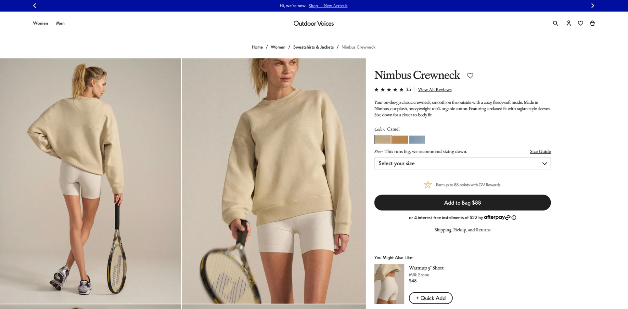
Outdoor Voices is a clothing company that sells athleisure sweats for everyday wear. Its product pages contain magazine-quality photos of models in casual or playful poses, making its product line feel more approachable for its target audience.
Shoppers can easily find information, thanks to a clean and functional design, including content on how to care for products, product specs, and payment options—without distracting visitors from the call to action Add to Bag.
12. Luxy Hair
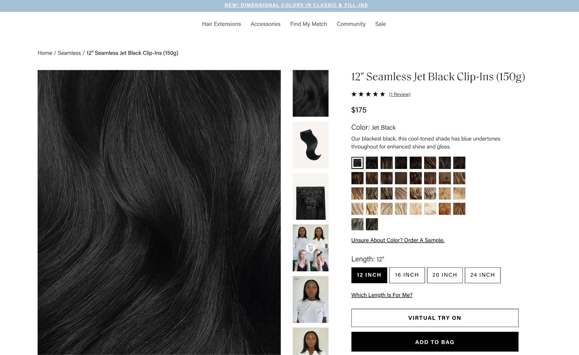
Luxy Hair sells hair extensions made from human hair, which come in a wide variety of shades and lengths. That presents a potentially confusing situation for online shoppers.
By organizing product variations into two categories and offering ways for users to validate their selections this product page avoids choice paralysis. One reassuring feature is the ability to order a color sample, while another allows visitors to virtually try on the product or text a hair stylist.
Placing the virtual try-on button above the add-to-bag button (but in a lower-contrast color) provides a convenient next step for those who aren’t quite ready to buy.
13. PooPourri
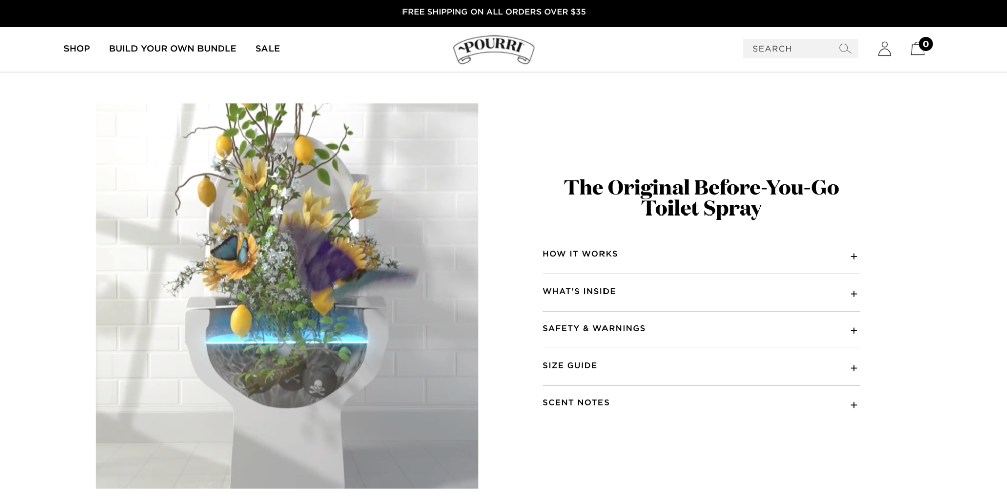
PooPourri’s products take a fun and witty approach to an embarrassing topic, and its product pages reflect that same energy. It uses a mix of humorous videos and concise product descriptions to give shoppers the necessary information to decide if they need a toilet spray.
A nice add-on is a section titled “The Internet Has Spoken,” which showcases popular reviews of the brand’s flagship products. Each review contains a button that takes a visitor directly to that product’s page.
14. Rocky Mountain Soap
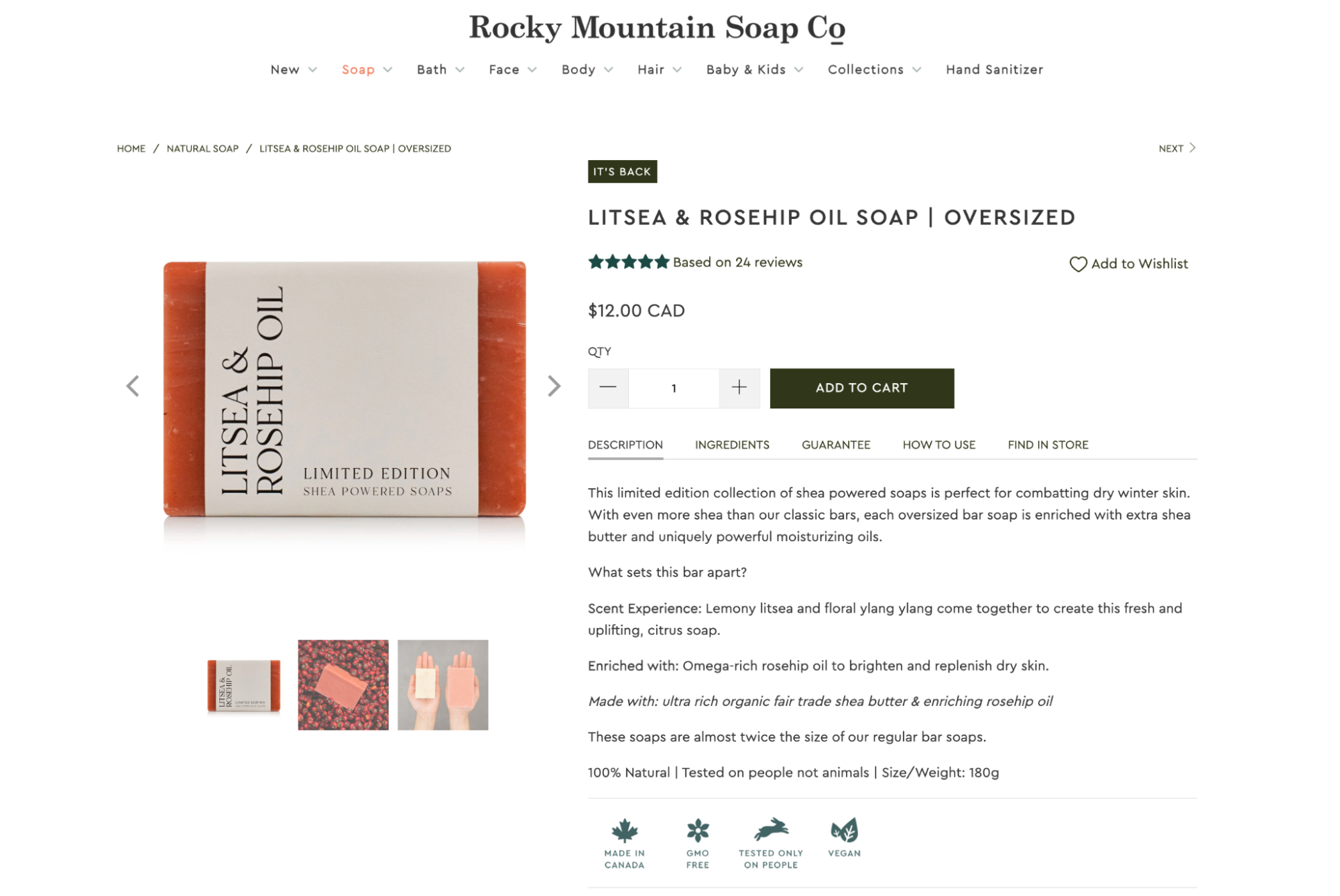
Rocky Mountain Soap, a natural body care retailer, knows its customers want wholesome, high-quality products. Its product pages include concise and informative descriptions with icons that make those key benefits pop: GMO-free, tested only on people, vegan, and 100% natural. These are all reasons why a shopper may choose Rocky Mountain’s body care products, so it makes sense to promote them as much as possible.
Another persuasive element of Rocky Mountain Soap’s product pages is the embedded customer reviews. If you’re unsure about buying one of its products, you can easily scroll through recent testimonials. Almost all consumers read reviews before they shop, particularly before first-time purchases, making positive reviews a sure way to lessen buyer anxiety.
15. United By Blue
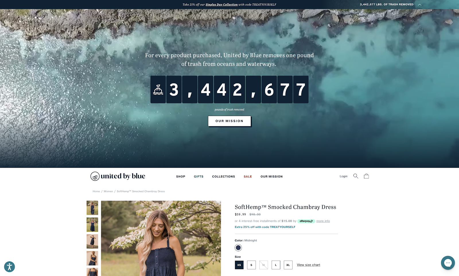
United By Blue is on a mission to eliminate trash from the world’s waterways. For every product purchased, it removes one pound of trash from the oceans.
Its product pages reiterate that goal with a live counter, tracking the amount of trash United By Blue customers have helped to clean up through their purchases. Displaying a commitment to an environmental or social cause can help align your brand’s values with those of your customers.
Other product page elements include:
- A sizing chart to help users find the right fit
- An upselling and cross-selling carousel
- Customer reviews that can be searched via extensive filters
16. Sixty-Nine
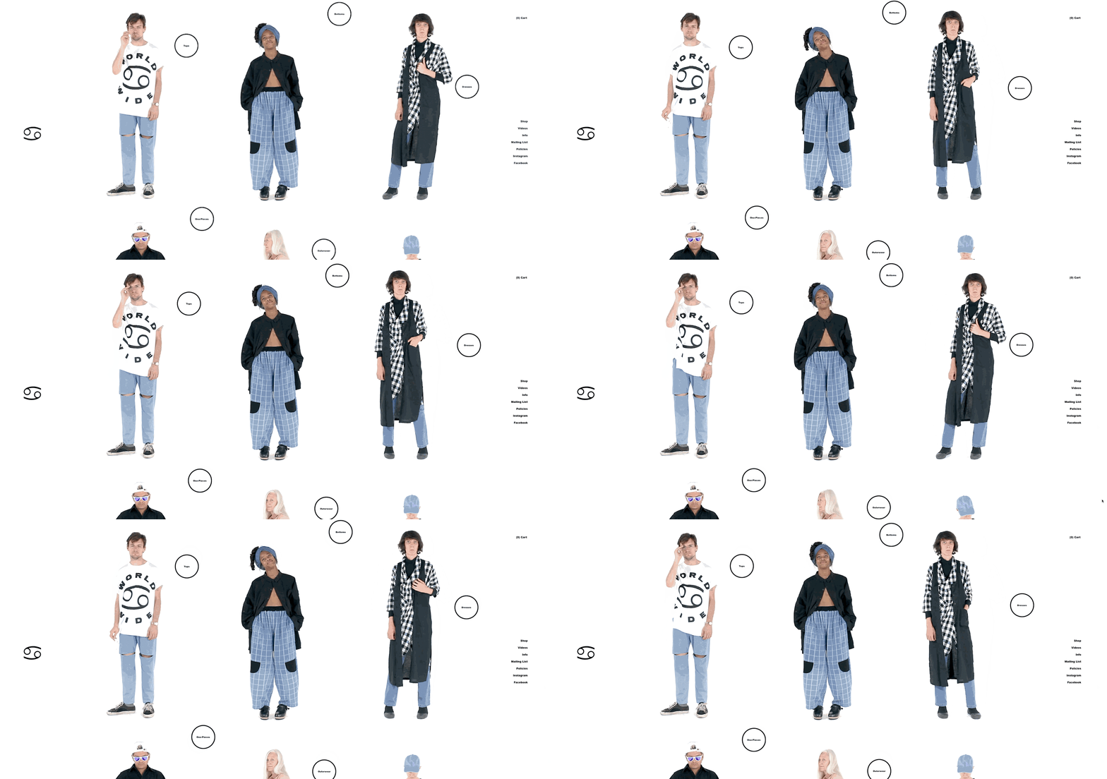
Sixty-Nine’s product pages use dynamic elements to keep visitors engaged. Product images scroll across the screen while the logo spins and the Add to Cart CTA flashes enticingly.
Because product pages are the key component of an ecommerce website, Sixty-Nine has even turned their homepage into a product catalog, which is also dynamic. This ensures the website’s most important real estate is used to push visitors down the sales funnel without anything to distract from the buying experience.
💡 For an example of just how dynamic your product pages can get, check out the Shopify Editions page, which is built on Shopify.
17. Manitobah Mukluks
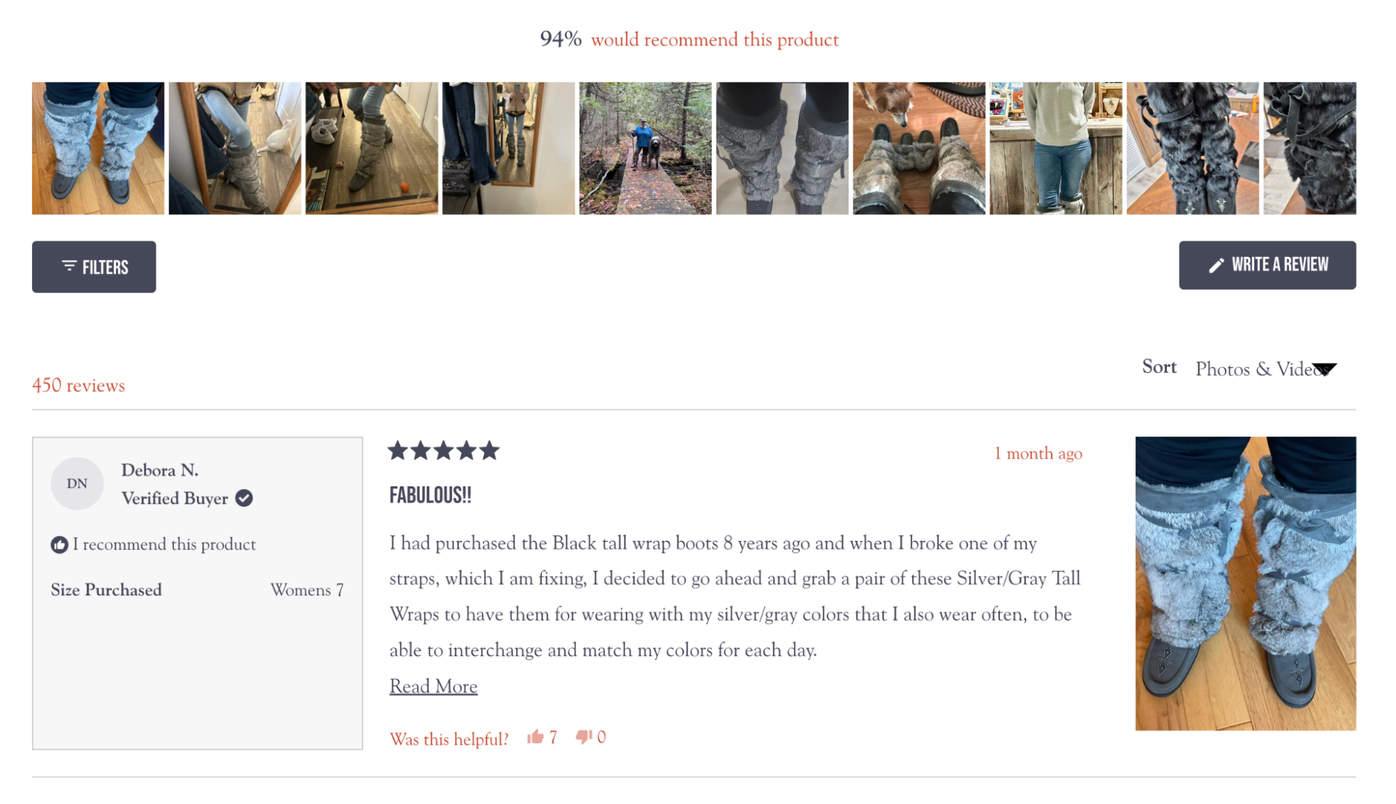
Manitobah Mukluks is a brand that understands the power of social proof in influencing purchasing decisions, especially when the product is expensive. This product page leverages customer-submitted photos and reviews, allowing shoppers to see the product in various everyday situations. This strategy helps to paint a vivid picture of product utility and value, making it easier for shoppers to picture the product as part of their own lives.
Product videos, recommended complementary products, and an FAQ section complete this effective product page.
18. Perfect Keto
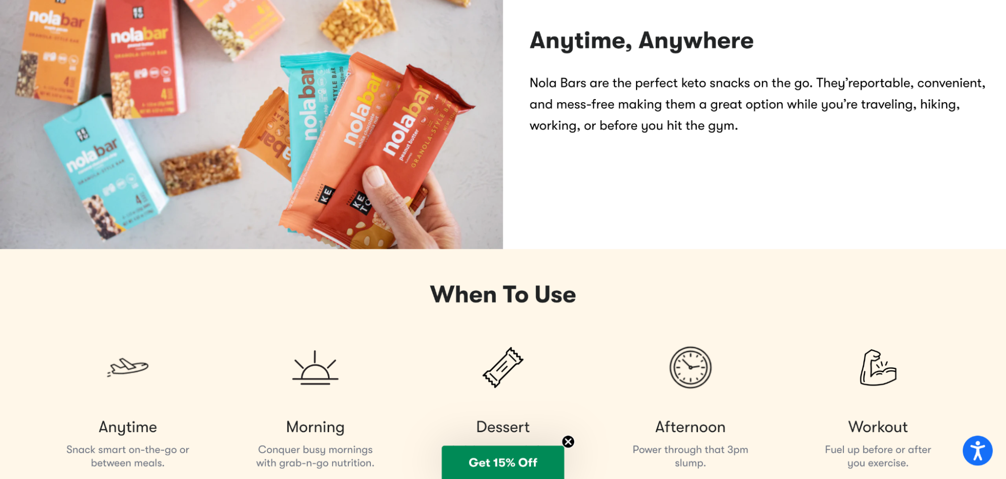
Perfect Keto makes a range of popular, keto-friendly snacks. The product page for its Nola Bars engages customers with:
- Simple guidance on the various situations in which the snack bars are useful, complete with eye-catching illustrations
- A pop-out offering a discount for first-time customers
- Multiple payment options, including a discounted subscription for recurring orders
- Super-concise product benefits, expressed in a few words
- Simple, clear recipes for each product that promote transparency
19. Johnny Cupcakes

Johnny Cupcakes’ product pages are faithful to the brand’s value proposition of being “the world’s first t-shirt bakery.” Product descriptions reference this theme with puns, such as calling new styles “freshly baked,” while print-on-demand t-shirts are “baked to order.”
Other product page optimization features include a banner promoting upselling incentives, such as a free pair of socks when you spend $200. This is emphasized once a visitor adds a product to their cart. After clicking the Buy button, the cart appears in a sidebar, with a “spend meter” to show how close the customer is to earning a gift.
Product page design: best practices
Product pages are the driving force for ecommerce businesses. They are the most important pages of an online store because they:
- Answer shoppers’ questions and concerns
- Allow shoppers to find your store on search engines
- Persuade shoppers to add items to their cart
That’s why it’s so critical to get them right.
Here are some tips and recommendations to create better product pages and Coming Soon pages that get found online, entertain shoppers, and help them decide what they want to buy.
Use product page UX best practices
When Nielsen Norman Group analyzed hundreds of ecommerce product pages, they found that successful pages almost always include the following core user experience elements:
- Descriptive product names
- Identifiable product images
- Zoomed-in view of product images
- Price, including any additional charges
- Clear product variant selections, such as color and size
- Product availability
- A way to add an item to the cart and clear feedback that an item has been added
- A concise and informative product description
Beyond these basics, good product page UX is about making product information accessible and persuasive—using tactics like those below.
Use high-quality product images
Did you know that 75% of consumers find product images to be the most important part of a product page? When shoppers land on your page, show them large, clear images to help them envision your product and imagine using it in real life.
Ideally, you should include two types of images to showcase products:
- Capture products against a neutral background to highlight unique selling points
- Shoot lifestyle photos to showcase the benefits of your product in use
Consider adding videos or 360-degree images to boost interactivity and increase product page conversions.
Write compelling product descriptions
Support product photos with descriptions that tell a persuasive story in simple language about the benefits of owning your products.
Great product descriptions are written with your ideal customer in mind, speaking to their perspective, in vocabulary they’re familiar with.
Most shoppers respond well to short paragraphs and bullet points, as well as:
- Product specifications
- Technical information
- Spec sheets and sizing charts
- Comparisons to similar products from your catalog
Add a live chat window
A good product page needs to anticipate and answer product questions. But there will always be some potential customers who need more specific information and want to contact your business.
Live chat enables site visitors to interact with you in real time, without the pressure or inconvenience of a phone call. With a live chat window, a potential customer can easily reach your sales reps, get their answers, and move forward with a purchase.
💡 Add a live chat app to your Shopify store and harness the power of AI.
Show customer ratings and social proof
Product reviews matter a lot to shoppers. How many there are, how positive they are, and how recent they are can sway people’s opinions. If your ecommerce product pages don’t show customer testimonials and reviews, shoppers might go to other websites to find this info—and you can’t control what they see there.
So, what’s the fix? Put customer feedback right on your product pages. That way, shoppers don’t need to go hunting for it.
Here are some simple ways to make your reviews work harder for you:
- Show off the best reviews: Highlight the most glowing reviews. These can catch a shopper’s eye and help them see the best parts of your product.
- Ask customers to share their thoughts: Encourage your customers to leave reviews with an incentive such as a discount code. This can help you get more feedback and show shoppers that you value their opinions.
- Quickly address negative comments: If a customer isn’t happy, respond to their review quickly and professionally. This shows that you care about your customers’ experiences and are willing to make things right.
Build your product pages with Shopify
Product pages are where shoppers go to figure out whether they want to buy from you. You don’t need to be an experienced designer to build a website and create product pages that look good and drive sales. With Shopify, you can create product pages for your online store that balance beautiful design with conversion power.
Illustration by Cornelia Li
Read more
- Website Builder & Website Maker by Shopify
- How To Use Ecommerce Analytics For Your Online Store
- The 13 Best Dropshipping Suppliers in 2024
- Examples and Tips for Beautiful Ecommerce Website Design
- What Is Affiliate Marketing and How to Get Started
- How to Start a Dropshipping Business- A Complete Playbook for 2024
- 20 About Us Page Examples With Templates
- 10 Ways to Write Product Descriptions That Persuade (2024)
- How to Sell in China Through WeChat
- 3 Live Workshops to Help You Plan for a Breakthrough Black Friday Cyber Monday
Product pages FAQ
How do you create a compelling product page?
- Craft a descriptive product name. Make sure your product name clearly communicates what the product is.
- Use high-quality images. Add clear, recognizable images with the option to zoom in for a closer look.
- Display pricing. Make sure the price of your product is clearly visible, including any additional charges.
- Provide clear product options. Offer easy-to-understand options, like color or quantity, and make them simple to select.
- Write concise descriptions. Keep your product descriptions short and packed with useful information.
- Leverage social proof. Show off customer reviews, user generated content, and ratings to build trust.
- Show product availability. Let customers know if the product is in stock.
- Simplify the add-to-cart process. Make it easy to add items to the cart, and provide clear feedback when an item has been added.
How do you showcase products on your website?
- Invest in high-quality product photography. Clear, professional photos can make your products stand out.
- Include additional images. Show different angles or detailed views of your product.
- Use animated images or videos. Show your product in action to help customers understand how it works.
- Recommend related products. Suggest other items that customers might be interested in.
- Experiment with virtual try-ons. Test out augmented reality or 360-degree photos to give customers a better feel for your product.
- Provide step-by-step instructions. If your product needs some explaining, include clear instructions on how to use it.
How do you create a product page in Shopify?
- To add or update information about a product on a Shopify store:
- Head to the Products page in your Shopify admin.
- From the Products page, click Add product.
- Enter a title for your product, along with additional details.
- Click Save.
What are the benefits of a product page?
- Improves the online shopping experience.
- Increase trust in your product.
- Strengthens brand recognition and loyalty.
- Provides real-time support through live chat.
- Helps rank pages higher in search engines.


