When beginning to build a theme or prototype, many developers use some form of placeholder text or image. This is usually because we want and need our design to feel real, authentic, and similar to the final product. The best way to do that is with real content, but when you don’t have access to real content—since that’s usually the last thing a client gives you—the next best alternative is to use placeholder images and text. Often we turn to solutions like placeholder.com or {placekitten} for images, and lorem ipsum or its many variations for text.
While images of kittens 🐈 are pretty amazing, they don’t necessarily convey any information about the purpose of an image within your design. Luckily, Shopify has a built-in solution for your placeholder needs, especially when building Liquid templates and theme styles. This is what’s known as the placeholder_svg_tag filter, which takes a placeholder name and outputs a placeholder SVG illustration. In this article, you’ll learn how to use this tag in your theme development work.
Why are placeholder images useful?
As was previously mentioned, when developing websites, you might not always have real content to use in the building stage. It’s always best to use real content if you have it, but if that’s not possible, an alternative is to use placeholders. In these cases, we still need to build something, and often we already have a good idea of what the image dimensions are that we need to lay out in a theme design.
Placeholders can help us better understand and interpret how images and their layout will move, shape, resize, and reflow as the browser or device changes.
They are also helpful, when given a bit of context, to convey meaning about the intended content. For example, a placeholder image that shows a single product versus several products conveys to a client what the intended use of this image might be in the future, and what to replace it with.
You might also like: How We Improved Theme Development Tooling Using Checksums.
Using the placeholder_svg_tag filter
It’s really easy to use Shopify’s placeholder SVGs, since including them is a breeze with the placeholder_svg_tag filter.
Simply include the placeholder name, followed by the placeholder_svg_tag filter:
{{ 'product-1' | placeholder_svg_tag }}
The output is simply an inline SVG:
<svg xmlns="http://www.w3.org/2000/svg" viewBox="0 0 525.5 525.5">...path content...</svg>
Image options
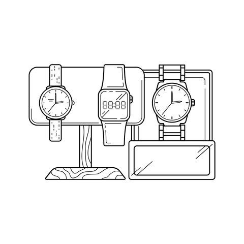
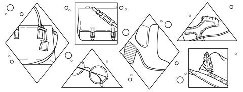
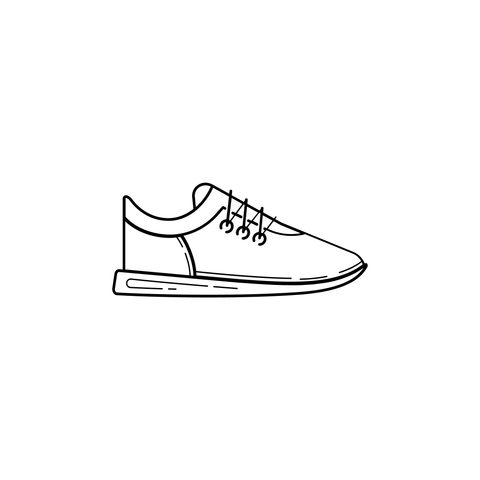
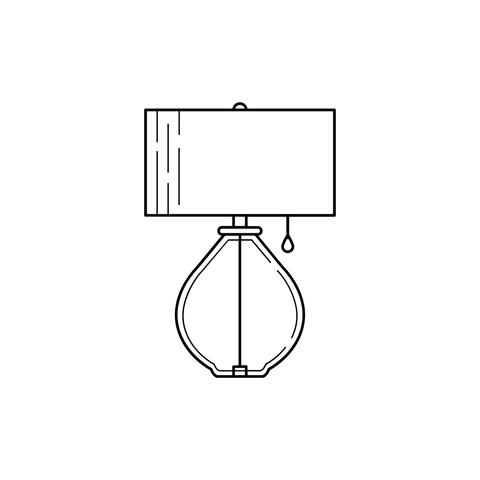
There are several types of SVG placeholder illustrations that you can render with the placeholder_svg_tag filter, including image, collection, lifestyle, and product.
You can see a preview of each placeholder name in the chart below, along with the preview of what they render:
|
Placeholder Name |
Preview |
|
|
|
|
|
|
|
|
|
|
|
|
|
|
|
|
|
|
|
|
|
|
|
|
|
|
|
|
|
|
|
|
|
|
|
|
|
|
|
|
|
|
|
|
|
You might also like: How to Use Math Filters with Liquid.
Adding a custom class
You can add a custom CSS class or classes to your SVG by passing a class parameter to the placeholder_svg_tag filter:
{{ 'product-1' | placeholder_svg_tag: 'my-custom-class' }}
To add more than one class to the SVG, simply add a space between them inside the class parameter:
{{ 'product-1' | placeholder_svg_tag: 'my-custom-class my-custom-class--two' }}
There are several important things to remember about class names:
- Similar to adding CSS classes to HTML elements, if you use spaces between class names, a web browser renders them as separate classes
- You should never start a class name with a number or dashes, as per the W3C specification
- Class names can only contain the characters
[a-zA-Z0-9]andISO 10646charactersU+00A0and higher, plus the hyphen-and the underscore_ - The best practice is to use
lowercase-separated-with-dashes - Class names are case sensitive, so it’s best to avoid randomly capitalizing letters
- Use values that describe the nature of the content, rather than values that describe the desired presentation of the content, as per the W3C specification
Using placeholder images for all things 🖼!
To summarize, using the placeholder_svg_tag filter is as simple as knowing the placeholder name and where you’d like to output that image. Placeholder images help developers and designers test their work and provide context for themselves and their clients.
This is especially helpful when the final content for a website is unavailable. A placeholder image can communicate what type of image is intended to be shown in a particular place, and how it should layout, resize, and flow within the browser.
Start taking advantage of Shopify placeholder images today!
Read more
- Introducing New Payout Methods for Shopify Partners
- Introducing Online Store 2.0: What it Means For Developers
- How to Build a Shopify App as a Front End Developer
- Build Forms on Shopify: How to Use Liquid to Build Robust Forms for Shopify Themes
- How to Build a Shopify App: The Complete Guide
- How to Manipulate Images with the img_url Filter
- How to Get Web Design Clients Fast
- Live Reloading Shopify Themes: Sass Compilation with Theme Kit and Prepros
- Understanding Progressive JPEG and WebP Formats


