
Do you find that certain colors make you feel a certain way? Blue may make you calm, or yellow might bring about feelings of happiness. This is color psychology in action. Marketers and designers have researched how color can directly impact emotions, mood, and spending habits, and found that it plays a significant role in shopping experiences.
Ahead, learn more about color psychology, explore the research that highlights color perception’s impact on decision-making, and get tips on how to choose the best colors for your brand.
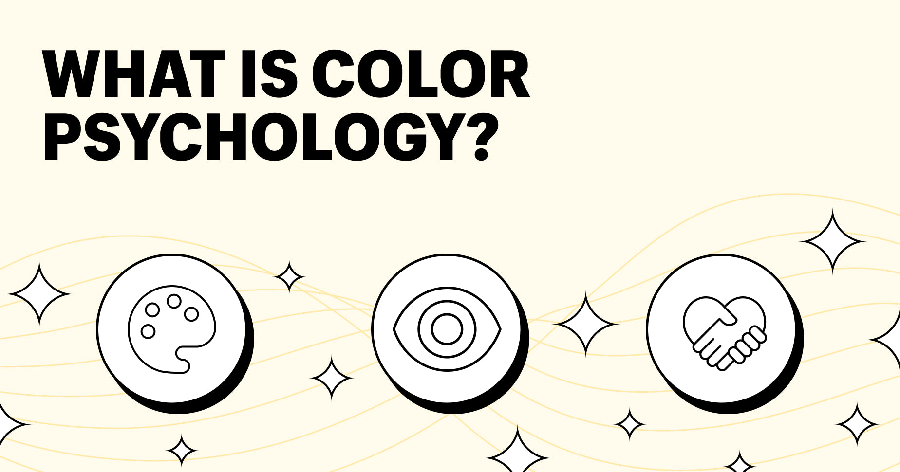
What is color psychology?
Color psychology is the study and application of using the color wheel to influence decision making, often with commercial intent such as improving the conversion rate on an ecommerce store.
The colors you use on your website can have a significant impact on the mood of your customers. Getting the right mix of colors can mean the difference between a repeat customer and a fleeting one-time visitor.
Why color is important
Human feelings are fleeting. Our moods can fluctuate depending on the time of day, what’s going on in our lives, and even how nourished we are. Color is so prevalent in our daily lives that it can influence our moods and our attitudes toward certain products. For example, someone having a bad day might come across a bright red blazer that changes their entire frame of mind.
The power of color association makes it a very important element in your website design—and not just because it determines how customers feel when they browse your site. According to one piece of color research, people make up their minds within 90 seconds of interacting with a product, and 62% to 90% of that assessment is based on color alone.
The psychological effects of color
Color impacts our mood and decision-making because it incites emotion.
For example, when we see the color red, our heart rates increase and we feel a sense of urgency, which is why SALE signs in shops are almost always red. Similarly, when we see a graded test covered in red ink, we might start to panic. If given the option between a bank with pink branding or blue branding, we’ll probably choose the latter, because blue creates a sense of trust and security.
Color theory suggests that different colors can have different effects on us, from increasing our happiness to causing anxiety and fear.
One study found that people commonly associate certain colors with different emotions:
- 68% associated the color red with love
- 52% associated the color yellow with joy
- 51% associated the color black with sadness
- 50% associated the color pink with love
- 44% associated the color orange with joy
- 43% associated the color white with relief
- 39% associated the color green with contentment
- 36% associated the color brown with disgust
- 35% associated the color blue with feelings of relief
- 25% associated the color purple with pleasure
The psychology of color
Choosing the right color palette can help customers connect better with your products, increase trust, and boost overall sales. Here are some options to get you started:
Psychology of the color brown
In the previously cited study, 36% of participants associated the color brown with disgust, but 64% didn’t think that. Brown often can be used to signify nature and provide a calming feel to designs. Different neutral brown shades can work together to create a sophisticated natural look for sustainable brands, like the Handmade theme in the Shopify Theme Store. This is a paid option, but there are plenty of free theme templates to choose from.

Psychology of the color orange
Orange evokes optimism, joy, and confidence—it’s the epitome of summer. If you want to radiate a sense of warmth, happiness, and summery vibes, orange is the perfect color to weave into your color palette. It seamlessly combines the energetic feel of the color red with the joy and vitality of yellow. The Launch theme in the Shopify Theme Store uses splashes of orange against a white background to bring a sense of cheeriness.

Color psychology of yellow
Yellow represents fun, intellect, creativity, and fresh ideas—there’s a reason the original Post-it notes are yellow. It’s the lightest hue in the color spectrum and is often considered uplifting and joyful. Similarly to orange, yellow evokes happiness, hope, and playfulness. Shopify theme Loft uses lemon yellow to emphasize and draw attention to certain parts of a store.

Green color psychology
Green is synonymous with nature and growth. It’s often used to create a sense of peace and harmony, but a darker version of the color can also signify wealth and prestige. Green is a great choice for brands that want to portray a healing and wholesome outlook or promote environmentally friendly products. The Impact Shopify theme boasts a beautiful green color scheme that can be customized to suit your brand’s needs.

Psychology of the color pink
Pink can have universal appeal since it exudes kindheartedness, romance, and love. It also has a soothing effect, so can be used to offset more aggressive colors, like black, orange, and red. The Blockshop Premium Shopify theme uses a warm and welcoming pastel pink color palette.

Psychology of the color red
Red taps into the deepest, most primal emotions of shoppers. Since red is usually associated with love, life, and confidence, it can convert potential buyers into lifelong customers if used correctly. Red is often considered energizing and exciting, which can motivate shoppers to act—but it can also be a great way to give shy shoppers confidence. Reformation is a premium Shopify theme that cleverly uses red to highlight important information.

White color psychology
White exudes purity, wholesomeness, and clarity, and is essential to most web pages. It provides a fresh, clean feel as well as a sophisticated contrast to bright colors on the page. Always include empty white space around your content so that customers don’t feel boxed in. The Story theme is a perfect example of using white to create a modern feel.

Purple color psychology
Purple has long been associated with royalty, power, and affluence, but it can also represent imagination and spirituality. It’s often used to inspire introspection and deeper thoughts, which can lead to positive thinking around purchases. There’s also a sense of calm about the color purple—it can evoke peace and tranquility, and highlight a superior version of a product. Publisher is a free theme that features a pale purple backdrop.

Psychology of the color blue
Blue tones convey feelings of trust, peace, and productivity. They promote loyalty and integrity, which is why blue is often seen in branding for banks and legal firms. Using the color blue on your site can create a feeling of space and stability. However, too much navy can seem conservative—so, if you’re selling a fun range of products, stick to more pale, brighter shades. Motion is a premium Shopify theme that leverages a pale blue in its imagery.

Psychology of the color gray
Gray is usually connected with seriousness and is a firm favorite for people who don’t want to stand out with lurid colors. The right shades of gray can serve as a great backdrop for other more vibrant colors, such as orange, red, and royal blue. The free Craft theme successfully uses gray to create a sophisticated feel to the site.

Black color psychology
Black is associated with strength, power, and dominance. When used in ecommerce, it sends a confident message to potential customers and can represent mystery and luxury—hence why premium vehicles are often black. Excessive use, however, can give off a bland and gloomy feel, so it should be used in moderation alongside tranquil colors. Ride is a free Shopify theme that spotlights the color black against a vibrant color palette.

The Shopify Theme Store has thousands of free and premium templates to choose from, all of which spotlight different color palettes. Find your perfect color match here.
How to use psychology to influence purchases
Color, when used correctly, can be a powerful guide in purchasing decisions. Here are some key outcomes from a considered approach to using color:
- Increase brand recognition: A study by the University of Loyola found that color increases brand recognition by up to 80%. This will help you and your products stand out against competitors.
- Be memorable: Color helps consumers process and store images more efficiently, which means they can remember them better.
- Improve ad performance: Ads in color are read up to 42% more often than the same ads in black and white—increase the chances of shoppers stopping mid-scroll to read your ad by using color.
- Draw attention to key information: Color is a great way to emphasize important information about your products. Use it alongside bullet points and white space to guide shoppers on a journey.
- Make a good first impression: People make snap judgments about products within 90 seconds of first seeing them—up to 90% of that assessment is based on color alone and could be the reason shoppers stick with you or jump ship.
- Help customers choose a product: 84.7% of respondents in one study claimed that color accounts for more than 50% of the factors important in choosing a product.
How to find the right colors for your brand
There’s no systematic way to choose the right colors for your brand. Part of it will come down to personal preference (if you really don’t like the color purple, why would you want to look at it every day?), but you should consider the impact of color on consumer experiences and public perception of your brand.
1. Create your business persona
What type of products do you sell? If you’re selling a new take on a traditional product like Fishwife, consider how you want customers to feel when they land on your website.

Here, it’s a good idea to list out some words that reflect your brand personality, such as “serious,” “fun,” “playful,” or “serene.” These will impact the color palette you choose—for example, if your business persona is playful, you want to steer clear of neutral tones like browns and grays.
2. Match the color psychology with your audience
Who is your target audience? Think about how the colors you choose align with the types of consumers you want to attract. For example, if you’re targeting spiritual shoppers, you might choose purples and greens instead of reds and oranges.
3. Analyze the color psychology of your competitors
Look at the colors your competitors are using. If you find that the majority of them incorporate blues and blacks into their branding, there could be a good reason for that. While it might be tempting to use oranges and yellows to stand out, you might quickly find these palettes don’t reflect the needs of the consumers you’re targeting.
4. Differentiate the colors of your brand
While you should take into account the colors your competitors use, you also want to differentiate yourself in some way. This might be through splashes of contrasting colors or by using a different shade of a common color. Remember to consider your audience and brand personality here. For example, Mint bank goes against the traditional blues associated with banking and uses a pale green palette instead.

5. Keep track of changes and test different color schemes
Make a note of what brand elements you’ve changed, and don’t be afraid to experiment with different color preferences in the color wheel. It’s easy to assume you know what your customers want, but the best way to find out is to ask, test, and track. If you’re worried that bright oranges might put off shoppers but it aligns perfectly with your fun product line, give it a go and see what happens—you might be surprised at the results.
Examples of color psychology in marketing
Coca-Cola: Red for energy
Coca-Cola has one of the most recognizable brands in the world. The heavy use of red indicates energy—something that reflects the qualities of the drink itself.
Apple: Gray for balance and elegance
Apple’s branding is sleek and sophisticated. Whites and grays come together to create a futuristic color palette that reflects the vision of the brand.

IKEA: Yellow for optimism
IKEA’s bright yellow color combinations indicate a sense of fun and playfulness—something that it imbues with its simple, easy-to-construct furniture.

Barbie: Pink for playfulness
Barbie’s famously pink color palette has made it a very memorable brand. The choice of color perfectly reflects the fun and playfulness of the brand and its products.

Color psychology: a final thought
Color psychology plays a major role in the shopping experience. Choosing the right color combinations can increase sales, create a positive brand perception, and boost customer loyalty—use the tips highlighted here to ensure your color preferences are doing your brand justice.
Additional research: Mark Hayes
Read more
- How To Design a Memorable Logo in 8 Easy Steps
- Customizing Your Shopify Theme- How to Use Images, Colors, and Fonts
- How to Create Your Shipping Policy (With a Template and Examples)
- How to Create a Stunning Website Hero Image
- Top Wholesale Marketplaces to Sell Your Products (2023)
- How to Turn Around a Struggling Business- Tips and Real-Life Examples
- Make Money on Twitch By Selling Merch
- Real-Time Marketing- How to Use Trending Moments to Reach a Larger Audience
- From Content to Commerce- The Best Ecommerce Plug-ins for Your Existing WordPress Site
- Turn Showrooming Into Sales- Introducing Buy Online for Shopify POS
Color psychology FAQ
What does psychology say about colors?
Colors can evoke different thoughts and feelings in people. Warm colors like reds, yellows, and oranges can inspire feelings of happiness, comfort, and joy, while cool colors, such as blues and greens can create feelings of calmness, serenity, and loyalty.
Is color psychology a real thing?
Yes, color psychology is a real thing. It’s the study of how different colors can change the way people think and feel. Most studies explore how different colors and different shades can influence emotions and decisions, and how the way people feel about colors is determined by many factors, including their age and cultural differences.
How is color psychology used today?
The psychology of color is used in marketing and ecommerce to identify how different color palettes influence consumer decisions.
What is the best color psychologically?
The best color psychologically is the color that represents your brand, products, and the shoppers you’re targeting. This will depend on how you want consumers to perceive your brand and what feelings you want to evoke when they visit your site.