You want more traffic.
You want more leads.
You want more sales.
We all do.
Here’s something interesting I read recently.
“Businesses with 1-5 employees get on average between 12-20 visitors per day to their website.”
Check out the study for yourself from Hubspot. Why is this interesting?
It shows that most businesses don’t get a ton of traffic to their sites . There’s a ton of competition out there for your user’s attention. And everyone thinks that the secret to growing their business is to mindlessly churn blog posts, guest posts, and social media posts hoping that it leads to more sales.
It’s tough — if this was easy we’d all be sipping mojitos on a beach in Koh Samui.
Whether you’re a web designer/developer, or you’re promoting an affiliate offer like Shopify, there are HUGE opportunities to cash in on your existing visitors.
There’s actually a much, much easier way to grow. Let me share some math to help you understand.
Imagine if you have a promotions page — you’re trying to promote a product or maybe it’s for collecting email addresses.
If your original page gets: 10,000 visits a month, with a 2 percent conversion rate = 200 converted referrals.
Not bad. Lets try to increase our conversions. You can do one of two things:
Number 1. You can try to double the traffic: 20,000 visits a month, with a 2 percent conversion rate = 400 conversions.
Take a second to think about the amount of work it’d take to double your traffic. That’s going to be months/years of blog posting, SEO, and social media work.
- You learn about sales psychology.
- You learn about landing page optimization.
- You make a few changes to your landing pages.
Both methods end up getting the same amount of conversions, but I think one method is superior. If you focus on trying to double your conversion rates, you get the same results with far, far less effort.
I’m not saying you shouldn’t focus on trying to grow your traffic. I’m saying that people don’t focus enough on optimizing what they already have . It drives me crazy seeing how many people have horribly converting landing pages, when Shopify makes it so easy for you to improve it.
You might also like: 25 Affiliate Resources You Can't Miss.
With all this in mind, here are the four simple, but highly effective principles I use every single time I promote something online (that you can implement over a weekend).
1. Sell a cure, not a prevention

This is a concept I learned from Joseph Sugarman’s AdWeek Handbook.
Prevention headline = “Oh, at some stage in the future this may help me avoid a problem.”
Cure headline= “I am in so much pain right now I would literally do anything to fix this.”
Can you tell the difference in someone’s mind when they read each one?
A prevention sell is hard — you’re trying to get someone to worry about the future. A cure sell is easy — you show them how much they need your solution - right now.
Think about health and fitness as a real-world example:
Prevention = Eating good food in moderation to prevent sickness.
Cure = Surgery, diet and weight loss plans etc.
I wish it were different, but sadly there’s not much money to be made telling people to eat in moderation.
When you are selling anything, you should aim to sell it from the perspective of a “cure.”
Let’s look at a couple of examples.
Example 1: Are you a freelancer?
You have one big headline on your homepage. Which one would you choose to run?
Prevention headline = “Responsive websites built to satisfy every visitor.”
Cure headline = “Are you losing 57 percent of your website visitors (and hundreds of dollars) every single day?”
With the prevention angle we are talking about a potential benefit in the future.
What’s the problem with that? The problem is that the customer is not suffering any pain right now, so they don’t feel the urge to buy.
The cure headline talks about the massive problem they have right now (losing a huge percentage of their traffic, and income, because their website isn’t setup properly for modern standards).
People don’t buy when they are happy and fulfilled — they buy when there is a problem and they’re in pain.
The “cure” headline gets them thinking…
- “How can I be losing so many visitors?”
- “Can I fix this problem, it sounds technical?”
- “How much money am I personally losing because of this problem?”
The prevention headline has them thinking:
- “I do love the idea of a responsive website.”
- “At some stage in the future I’ll get my site coded up again.”
- “Nobody really complains and things are going okay for me, so it’s not urgent.”
People want vitamins, but they NEED painkillers.
People want vitamins, but they NEED painkillers.
Example 2: Are you an affiliate?
Let’s say you promote Shopify on your website and you want to implement this strategy of selling a cure instead of a prevention.
Here are a few ways you could promote it in your headlines.
- “Are you overpaying for your current ecommerce platform?”
- “Is your ecommerce software clunky, hard to use, and losing you $$$?”
- “Why I switched over to Shopify from XYZ platform (I spent more time fixing other platforms than selling on them).”
Most people only look for cures, not prevention.
Sell a cure, not a prevention.
2. Design makes or breaks you
 Have you heard of the psychological bias called Anchoring?
From Harvard Law School:
“Anchoring is a cognitive bias that describes the common human tendency to rely too heavily on the first piece of information offered (the ‘anchor’) when making decisions.”
How does this affect us as website owners, affiliates, developers, etc.? It tells us that first impressions are pretty much the only impression that matter. The very first thing you feel about a website will stick with you.
Cluttered and hard to navigate? Or minimal and easy to use?
Is the site asking you to do five different things? Or is there one clear call to action?
Do you leave the website satisfied or frustrated?
Maybe it’s your amateur color scheme that is turning people away. Maybe it’s your standard WordPress theme you’ve never customized since you installed it five years ago. So how can you improve the look and feel of your site to get more sales?
Study others
 If you’re an affiliate, what’s the biggest competitor in your niche doing?
If you’re a designer, what are your competitor’s sites like?
And don’t just look at your direct competition — look at the people at the top of their game.
Great design shows that you go the extra mile and customers love that.
Google the top keywords in your industry and see how the professionals are doing it — the people at the top of their game.
See what elements you can include from their sites that would work well for you and help you achieve your goals.
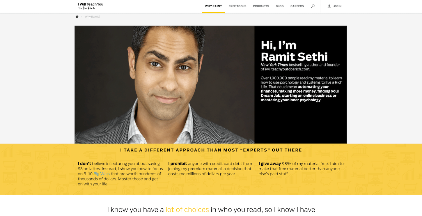
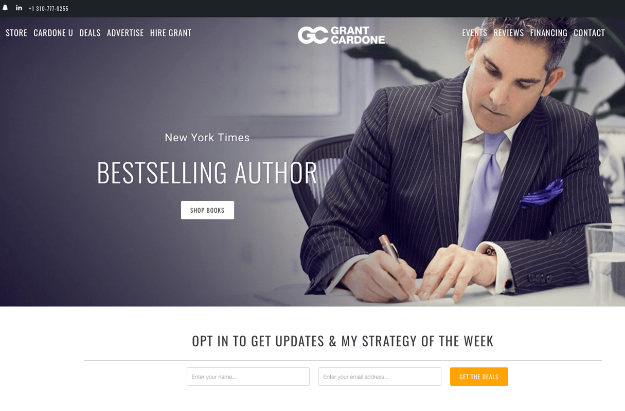
A couple of well-designed sites I love are Ramit Sethi’s and Grant Cardone’s. They both give off a premium feel, and they look great on all devices.
You might also like: 4 Tips to Help You Create a Profitable Affiliate Blog Post.
Get your site reviewed by others
You can set up a thread on Reddit design threads, hit up some Facebook groups, or use a site like Review by Others, or Five Second Test.
If you’re feeling adventurous, get this guy’s mom to review it, or get him to review it after a case of Bintang beer :-)
Just take all feedback with a grain of salt, especially Reddit/Facebook feedback. And try to be objective about the feedback — it’s going to make you more money so don’t get upset if someone is harsh.
Set up some simple split tests
You want your website to look great, but the design is not just about aesthetics.
What’s the number one goal of your website? It’s to make more money. You need to decide how to test different ways to convert someone from a visitor into a buyer.
If you’re selling affiliate products, run tests using things like Johnson boxes and sidebar ads. Try putting up more images (that all link to your affiliate offers), and see if that boosts your conversion rates. Headline split tests are easy and effective with software like VWO or Optimizely.
If your business model is to get people to contact you, split test using exit popups versus timed popups, popup versus in-page form, etc.
There’s an interesting case study on Leadpages about split testing popups vs in-page forms that you should watch if you collect emails.
Track visitor behavior
 A high bounce rate shows that something is wrong with your funnel.
(Bounce rate is the measure of how many people leave your site without taking any “actions,” such as clicking through to another page. It’s the number of people who visit just a single page on your site.)
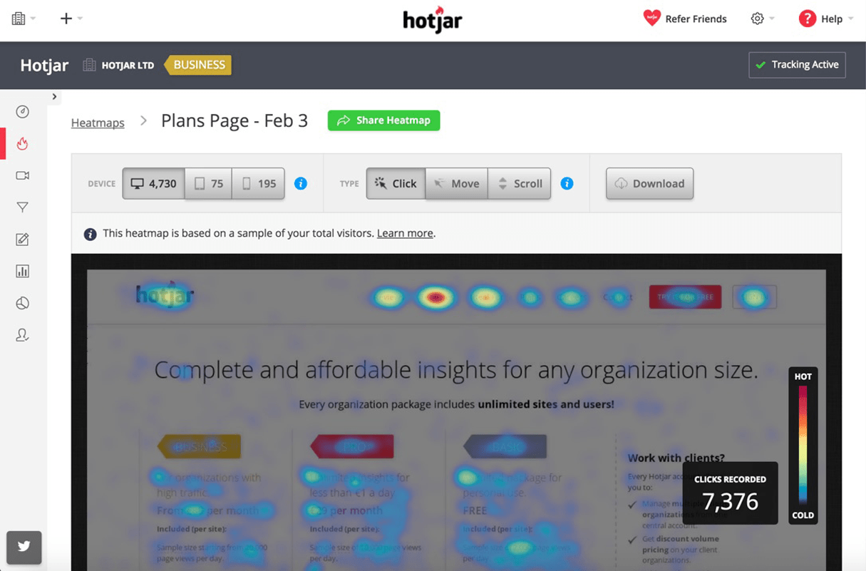
You can set up software like Hotjar to do screen recordings of actual people visiting your site. You can see where they move their mouse to and how they interact.
Are they confused? Or does it look like it’s easy for people to use your site?
The idea is that a lower bounce rate = a more engaging site. Keep track of your bounce rate and make sure it stays steady, or decreases over time.
3. How to use psychologically-charged feedback and testimonials
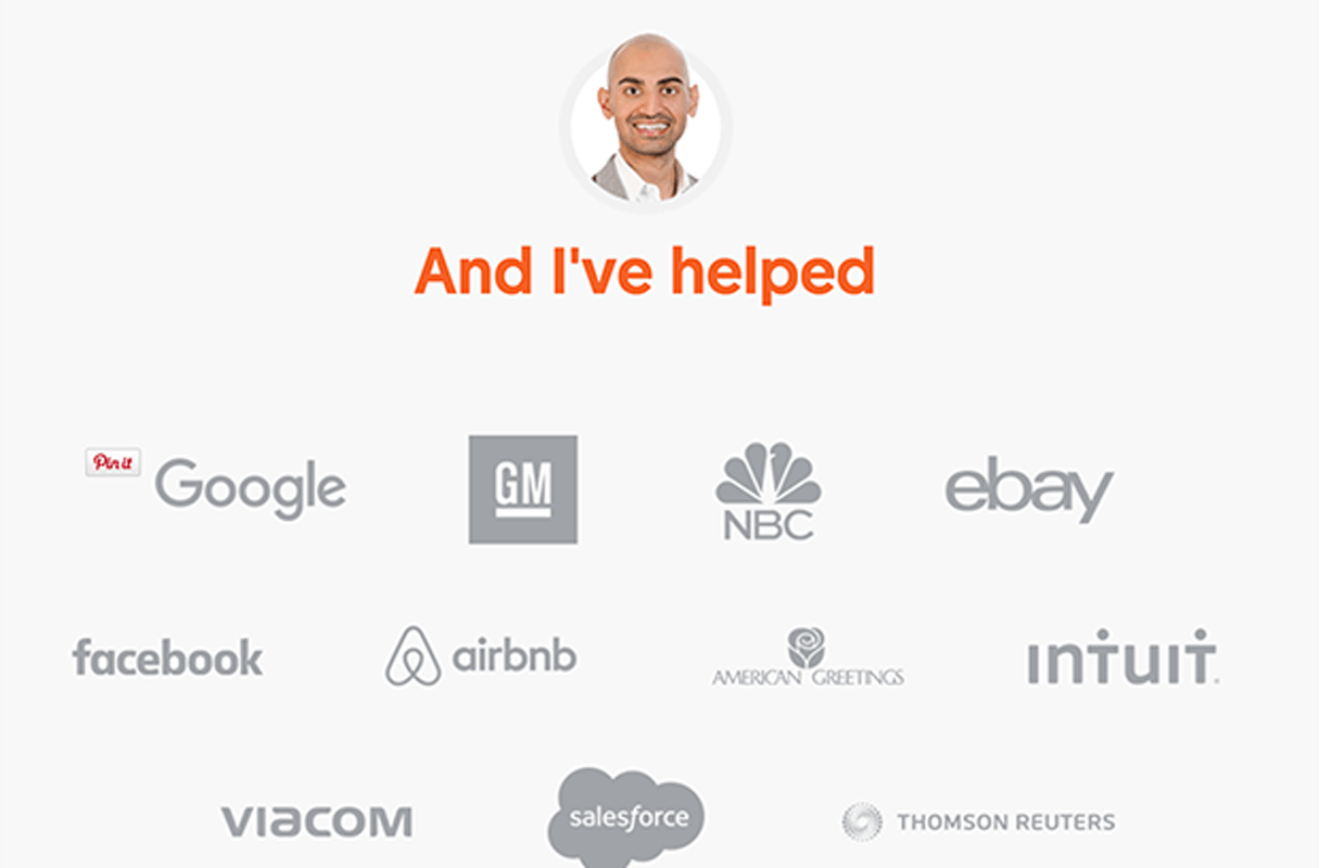
 Neil Patel’s list of clients shows he knows his stuff.
What’s the first thing you do when you need to find something in your city?
You Google it.
Then your first question is:
“How do I know this business/contractor/restaurant is as good as they say?”
You want to know someone is good at their trade, and the best way to know this is to hear other people say they are good.
But there’s a problem with most testimonials.They are from “nobodies.”
Anyone can leave a Google/Yelp/TripAdvisor review.
If you rely on those testimonials, you are forcing your customers to rely on the opinion of strangers who have zero credentials.
What does this mean?
Let’s look at two different testimonials:
Testimonial A
“Shopify is the best ecommerce solution I’ve used. It’s simple to use, makes me more money, and can be easily customized to any layout I want.”
— Charles N, New York
Testimonial B
“Shopify is the best ecommerce solution I’ve used. It’s simple to use, makes me more money, and can be easily customized to any layout I want.”
- Charles Ngo, 7 Figure Affiliate Marketer, Speaker, and Blogger at CharlesNgo.com
See the difference?
Exact same testimonial, but they are from different people.
One of them is from a random guy from New York called Charles N.
Nobody cares what a random guy called Charles N thinks of Shopify.
Nobody cares what a random guy called Charles N thinks of Shopify.
It could easily be made up — there’s no “proof” that it’s real.
But the second testimonial?
It shows that a guy called Charles Ngo (who has made seven figures from internet businesses, is a public speaker, and blogger) is recommending Shopify.
You know exactly where to find this guy Charles Ngo because there is a link you can click to see his website.
If you clicked through to his blog, you’d see that he gets 75-100k visitors per month, he recommends Shopify, and he’s written a ton about it.
Now that’s a good testimonial.
You can see he’s a real person with a real website. You can see his face, his videos, and read his story.
But…
Not everyone has the luxury of having big clients to list as testimonials.
Here are a couple of workarounds if you’re just getting started or you don’t have any noteworthy clients.
Testimonials for promoting affiliate products
One strategy I love to use is to talk about who else uses the product, and then borrow their authority.
When I promote Shopify on my website, I can mention that The Economist runs their store on Shopify.
So are the product stores for Red Bull and NYSE.
Everybody knows those companies, so I can borrow some of their authority by mentioning them on my site.
After I finish a blog post on an ecommerce topic, I could write:
“By the way, Shopify is the platform I use for all of my ecom stores. Billion dollar companies like NYSE, Red Bull, and The Economist also use it, so it’s safe to say it’s good enough to run an ecom store of any size on it :-)”
This gets people thinking...
“If it’s good enough for companies like Red Bull, it’s good enough for my ecommerce store. Plus if a guy like Charles is using it, that means it’s not just for huge corporations, but for everyone.”
Try and find out where the products you are using are being used, then leverage the authority of others.
Testimonials for selling your own services
If you’re a designer or developer,testimonials are vital.
People probably don’t know you when they first arrive at your site, so you have to prove to them that other people have had great results working with you.
The simplest way to get testimonials is to follow up with every single client after you finish their job.
Hint: You don’t have to copy and paste this message to all your clients. Automate it.
“Hey John, thanks for choosing me as your contractor, it was great to work with you and I look forward to helping out again in the future. Also thanks for the fast payment, I really appreciate it.
I was wondering if you could do me a super quick favor... Would you mind writing me a super quick review/testimonial?
Here’s a link to my Portfolio Page - you can write something similar to the other reviews if you like :-)
Please let me know if there’s anything else I can do, and all the best for your business!”
Here’s how you should do testimonials when you feature them on your site:
- *Use their first name, last name, and location.
- Put “ “ around the testimonial so it looks like an actual quote.
- *Include a headshot of them.
- Place a link to their website, and make it known what parts you did.
- Include some images of your work — you can use thumbnails that become full screen when you click on them.
*(Assuming they are okay with you using all of their info)
4. Build trust instantly

Testimonials help to build trust. So does good design.
But there is still more you can do.
Every time you land on a website, you have one burning question in your head.
“Who runs this website, and why should I trust them?”
Unless you’re a huge authority site like The Wirecutter or AskMen, people want to know who the person is behind the site.
They want to see that you’re trustworthy — chances are they’ve been burned before. Hey, it’s the internet, we’ve all been burned before :-)
You only need to have one minor element wrong or missing from your site for someone to hit the back button.
Here are the most important elements to have on your site to build trust and make more revenue.
About page
People want to know who you are as a person. They don’t want to deal with a mystery person. Include a high quality photo of yourself (without sunglasses), and put down a couple of your hobbies and fun facts.
Most people who buy from you will end up visiting your About page. People who are serious about buying will want as much info and reassurance as possible before they commit.
This is a place where you want to let your personality shine through.
Your clients and readers are looking for a real person, not a corporate-sounding public service announcement.
FAQ page
Everyone wants to know about prices, refunds, guarantees, delivery times, etc. Build up this page and add to it over time.
Brainstorm the most important questions people will have when they first arrive at your site.
Here are a few examples for your FAQ page:
- Do you do discounts?
- Who am I and why should you trust me?
- What do I sell, and how much does it cost?
- Who have you worked with before so I know you’re legit?
Contact details
To increase your trust factor, you should have an address (you can put your accountant’s address or a P.O box) and a phone number.
An email/contact form is the bare minimum. If you’re active on social media, include those links as well so people can see that you stay current. There are so many dormant websites out there, and social media is a good way to show people that your business is still active.
Your credentials
Did you graduate university? Certifications from Microsoft, Oracle, or Adobe? Have you spoken at, or attended industry specific events?
This should be part of your About page — the qualifications you have, languages/software you can use, and any impressive sounding previous jobs you’ve had that are relevant to your skills.
Check out my About page for an example. I tell people my “mini story” (how I got started in affiliate marketing), then I show some social proof (public speaking in front of thousands), then I show people what I can do for them.
What To Do Now?
We’ve gone over the four principles:
- Sell a cure, not a prevention
- Invest in high-quality design
- Using powerful testimonials and reviews
- Building credibility and trust with your customers
Now it’s implementation time...
Take the time to work on your business instead of in it.
First, schedule a couple of hours this weekend to go over your site. Take the time to work on your business instead of in it.
Which of the four topics I mentioned can you implement the fastest and most easily?
These principles are “quick wins” because most of them are free and don’t take too much time.
It’s extra content, some copywriting, reaching out to old customers, and maybe some design changes.
Second - study the book Cashvertising.
It’s the best book on copywriting and sales you can read for getting some quick wins. I require all of my media buying team to read the book a few times per year — it’s that good.
It’s full of tactical advice you can use to help build trust, sell more, increase loyalty, etc.
Did you find these tips helpful? Let us know in the comments below!

