Increasing your conversion rate is not that complicated. A relentless focus on making things easier will win over clever tricks every time.
Those who run ecommerce sites obsess over conversion. They are always looking for the latest trick or technique. Anything to add half a percent to the number of people clicking ‘buy.’ They obsess over driving traffic. They plaster sites with offers. They fret over getting that elusive email address, so they can nag people to buy.
There is no doubt that these persuasion and traffic generation techniques do matter. They do work. But underlying all that cleverness is a much more fundamental technique. One that will work over the long-term.
All you have to do is make the shopping experience easy.
Making the experience easy
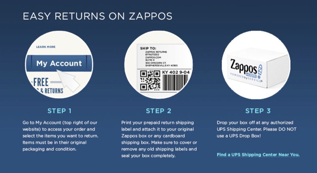
What made Zappos a success? They made buying shoes simple. They offer a 365 day unconditional return policy, and postage paid both ways. In doing so, they took the risk out of buying shoes online. Users don’t have the hassle of returning the product if they don’t like it.

What about Uber? Why did they succeed? They looked at the experience of hiring a taxi and removed the pain points. No struggling to hail a cab. No worrying about having enough cash. No asking for a receipt when traffic is piling up behind you. And no niggling feeling that the driver has taken you the long way round.
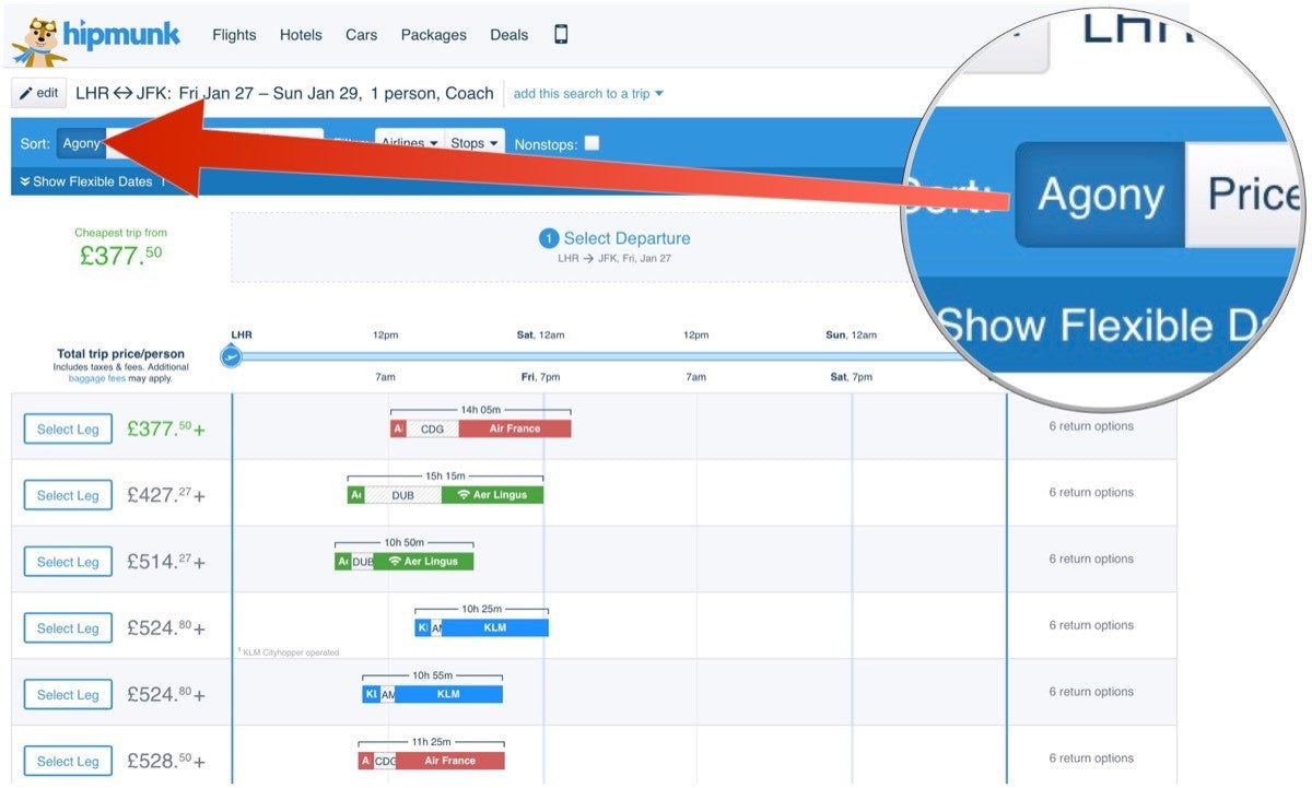
The list could go on: from Amazon’s one click ordering, to how Hipmunk sorts flights by the amount of hassle. Ease of use is the single biggest factor in conversion.

This is because we value our time above all else. In fact 70 per cent of adult Americans feel that they do not have enough time to do all they need to do. The result is that we go with the path of least resistance. Even if that convenience proves more expensive.
Yet, too often  ecommerce companies fail to place ease-of-use as a priority. In fact, they undermine it at every turn.
You might also like: 3 High-Impact Tips for Designing an Ecommerce Site That Converts.
How we undermine ease-of-use
Too many ecommerce businesses seem designed to frustrate the user. Here are five mistakes I see them making:
- We distract the user
- We add unnecessary steps
- We fail to sweat the details
- We put our workload on our users
- We are unwilling to change
Let’s look at each.
1. We distract the user
In our desire to improve conversion, we often end up distracting users from buying. Whether it’s pushing our client’s latest offer or encouraging people to sign up to the newsletter, we are so desperate to grab their attention, that we forget why users came to our client’s site in the first place.

It’s important to remember that those visiting a sites are at least considering buying. They do not come to our client’s website to see the latest offers, follow them on social media or sign up for a newsletter. They come to buy something.
Yet, in our desperation to convince we add distracting clutter. Clutter that makes it harder than it should be. Instead, every element we add to our website must justify its existence. Does it take the user one step closer to buying? Does it help or hinder that final decision to buy?
You only need to look at Amazon to see this kind of thinking in action. Amazon does not push their newsletter signup, or beg you to follow them on Twitter or Facebook. They focus on the products.
Furthermore, they strip away all distractions once you hit the checkout process. All offers and promotions are gone. Everything is about securing that conversion. This includes the removal of any unnecessary steps.

2. We add unnecessary steps
It’s amazing how many ecommerce websites make it harder for users to place an order than it needs to be. They create fields in the checkout process that are unnecessary to fulfil the order. “How did you find us?” fields, or “would you like to sign up to our newsletter?”
Yes, these fields are valuable from a marketing perspective. But every one creates a hurdle users have to overcome, in order to place an order. By all means, ask for this information, but do so once the user has handed over their cash.
But we don’t just add unnecessary steps to the checkout process. We make returns more difficult, or hide our contact information. Worst of all, we make the user search for answers to common questions, such as delivery charges.
Worst of all, we make the user search for answers to common questions, such as delivery charges.
Comedian Michael McIntyre perfectly sums up the pain of buying online.
Each of these tiny steps, add up to be death by a thousand cuts. Together, these minor annoyances make users feel they would be better buying elsewhere. It’s this attention to detail that makes a website feel painful or easy.
3. We fail to sweat the details
Successful ecommerce businesses are not established overnight. They do not launch their websites, and then watch the money roll in. Instead, they sweat the details, meaning they continually tweak and improve their websites over years, incrementally removing the rough edges to create a seamless and painless user experience.
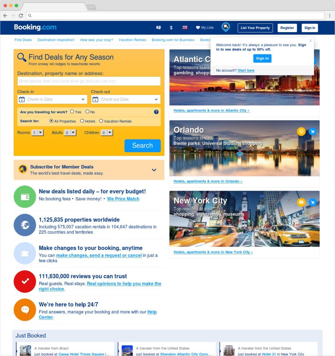
Using multivariate testing, analytics, and usability sessions they remove stumbling blocks users face. Companies like Amazon or Booking.com roll out new improvements on a daily basis. They agonize over the smallest change, realizing that it can make a big difference.

Yet many of us launch our clients’ sites and then walk away. But in doing so, we cannot hope to give the attention to the tiny things that make such a big difference.
I have seen users abandon a website because their postal code gets rejected, or because it was ‘incorrectly formatted’.
I have seen users abandon a website because their postal code gets rejected, or because it was ‘incorrectly formatted’.
I have seen people get frustrated because they couldn’t find their country in a large country list. I have watched users unable to buy because the password recovery process was too painful.
These are problems that only become clear with real life use. These are the details that emerge over time, and are crucial to a site’s success. But, worse still, some of these issues are down to our laziness.
4. We put our workload on our users
We can be our own worst enemy at times. We often damage the conversion rate of our client’s ecommerce site. All because we don’t want the extra work involved in improving things.
Take for example CAPTCHA. We put this in place on a site because we have a problem with spam. Yet, there are alternative solutions, such as honey traps. But we resort to CAPTCHA because it’s easy. Unlike coding a honey trap, CAPTCHA takes seconds to add.

Yet, in doing so we are making our problem with spam, the problem of our users. We are forcing them to identify themselves as a human. All because we won't spend the time to code a better solution.
We do this kind of thing all the time. We insist users create complex passwords because we have a problem with security. We ask them to format telephone numbers and postal codes in a particular way, so we don’t have to clean their data. We force them to dig out old account details because we don’t want duplicate accounts in our database.
But our unwillingness to place the user’s needs before our own is not limited to how we build sites. It affects all aspects of the business.
5. We are unwilling to change
Many ecommerce businesses did not start out as such. They used to sell their products through other channels. Channels such as direct mail or in physical stores. This means they structure themselves around these old business models. Unfortunately, this structure and thinking is not always appropriate for the digital age. Yet many organizations seem unwilling to adapt.
Return policies are a great example of this. Many companies stick to out-of-date attitudes towards returns. They worry that users will abuse a more generous approach. They end up stipulating limitations on what products they will accept back. This is in stark contrast to a modern business like Zappos.
But purchasing online is different to being able to see the product, and hold it in your hands. When buying online, it’s important that returns are easy.
Customer service is another example. In many ways, an ecommerce transaction is more complex than walking into a store. Things can go wrong and users are more likely to have questions. We need to offer better support both before and after people buy.
This willingness to change goes even deeper. Some of us will need to reconsider our client’s business models and help them change the products they offer. Take for example the high street music retail industry. Napster showed them that consumers wanted to be able to download music, rather than go to a store. It also showed customers wanted individual songs, rather than having to buy an album. Yet the sector refused to adapt choosing instead to resort to litigation. The result was that a few years later, Apple could step in and fulfil that need with iTunes.
We see this happening again and again. New players disrupting sectors because existing companies are unwilling to adapt. From taxis to travel, the changes are widespread.
You might also like: 5 Psychological Concepts Web Designers Should Use to Maximize Conversions.
Can you adapt?
The question is, does your company or your client’s company need to do more than set up an ecommerce site? Does it need to change the way it does business or change the products it sells? Does it need to change to make the experience easier? Because the world has changed. Customer expectations have changed and your company will need to change too, if it wants to survive.
As Charles Darwin wrote:
It is not the strongest of the species that survives, nor the most intelligent that survives. It is the one that is most adaptable to change.
How do you make the experience easier for users? Tell us in the comments section below!
Read more
- The Benefits of Using a UI Kit
- Free Webinar] How to Convert Visitors Through Persuasive Design
- Shopify's Mobile Device Testing Lab Gets Wheels
- 5 Common Digital Content Problems and How to Avoid Them
- How to Use Eye Tracking in Usability Tests
- Content Strategy: The Principles we Followed to Build the New Shopify App CLI

