Design is a broad discipline with a lot of different areas. There are many types of designers, each with their area of specialization: graphic design, motion design, and interaction design, to name a few. But no matter what you do in the design field, there is a set of rules that every designer should know: the foundational rules of Human-Computer Interaction (HCI) that define how people perceive and interact with digital products. These are principles that can be applied at both the macro and micro levels of product design.
There is an excellent resource called Laws of UX created by product designer Jon Yablonski that covers many important UX rules and creates a solid foundation for UX designers. In this article, I want to extend the list created by Jon with a few more laws that I think are essential for designers, and show how to apply them in practice.
1. The Aesthetic-Usability Effect
Attractive things work better. Users often perceive aesthetically pleasing design as design that’s more usable.
Researchers Masaaki Kurosu and Kaori Kashimura from the Hitachi Design Center first studied the Aesthetic-Usability Effect in 1995. They tested 26 variations of ATM user interfaces, asking study participants to rate each design on ease of use, as well as aesthetic appeal. They found a strong correlation between their ratings of aesthetic appeal and actual ease of use. Researchers found that users are strongly influenced by the aesthetics of any given interface, even when they try to evaluate only the functionality of the product.
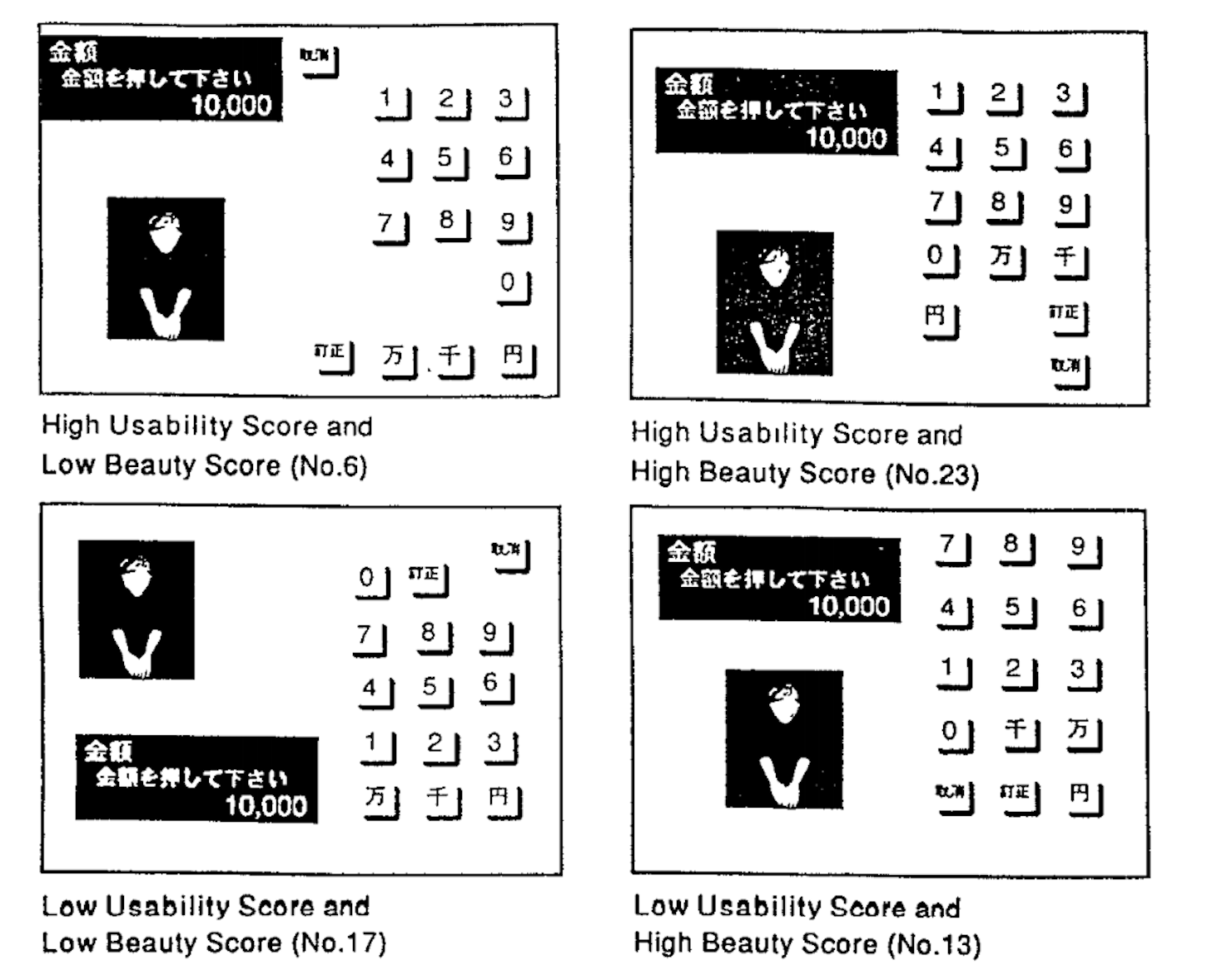
Aesthetically pleasing design can make users more tolerant of minor usability issues. In his book Emotional Design, Don Norman explores how the Aesthetic-Usability Effect applies to everyday objects.

Key takeaways for designers:
- Aesthetically pleasing design is worth the investment. Apart from having great usability, it is equally important to have excellent aesthetics.
- The Aesthetic-Usability Effect has its limits. A nice-looking UI can make users more forgiving of minor usability issues, but not of larger ones. Form and function should always work together to deliver excellent user experience.
"Form and function should always work together to deliver excellent user experience."
2. False-Consensus Effect
The False-Consensus Effect is a tendency to assume that others share your beliefs and will behave similarly in a given context. Many professionals suffer from the false-consensus effect, including designers.
Designers often assume that the people who will use their products are like them. As a result, designers project their behaviors and reactions onto users. But thinking that you are your user is a fallacy: you are not the user. The people who will use your product most probably have different backgrounds, different mental models, and different goals than you.
Key takeaways for designers:
- Testing with real users is an essential part of the design process. Only by testing your product will you will see how people interact with your design and what problems they face. During usability testing sessions, it’s vital to pay close attention to what test participants do and how this relates to what they say.
3. Pareto Principle
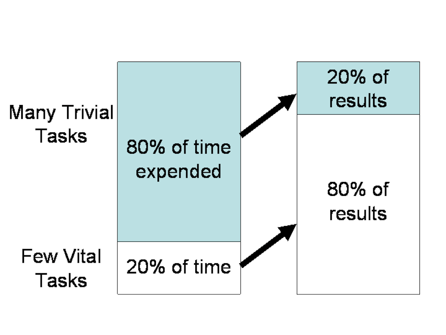
For many events, roughly 80 percent of the effects come from 20 percent of the causes.
The principle is named after Italian economist Vilfredo Pareto, who noted the 80/20 connection in his work, Cours d'économie politique. In this, Pareto showed that approximately 80 percent of the land in Italy was owned by 20 percent of the population.
In product design, the Pareto Principle can be applied to optimization efforts. Within any given system, only a few main variables affect the outcomes, while most other factors will return little to no impact. For example, Microsoft noted that by fixing the top 20 percent of their most-reported bugs, 80 percent of the related errors and crashes in a given system would be eliminated.
Key takeaways for designers:
- Prioritize your attention and resources. Narrow your focus down to essential features, those features that generate maximum value to you and your users.
4. Doherty Threshold
Productivity increases when a computer and its users interact at a pace that ensures that neither has to wait on the other.
Response time is the delay between the user’s request and the computer’s response. If the response time is too long, the user tends to lose patience. Experts at IBM measured the ideal response time that keeps users engaged. In 1982, Walter J. Doherty and Ahrvind J. Thadani published a research paper that set the requirement for computer response time to be no longer than 400 milliseconds.
"The requirement for computer response time should be no longer than 400 milliseconds."
Key takeaways for designers:
- Don’t make users wait; provide system feedback within 400ms in order to keep users’ attention.
- If a given process takes more than 400ms to complete, you should show a loading animation or other visual/audio feedback indicating that the process will take some time. Based on Jakob Nielsen’s research about response times, 10 seconds is the limit for users to keep their attention on a task. After this, users grow impatient if they don’t have enough information on how long they have to wait for the result.
5. Fitt’s Law
Ease interactions through the careful sizing and positioning of interactive elements.
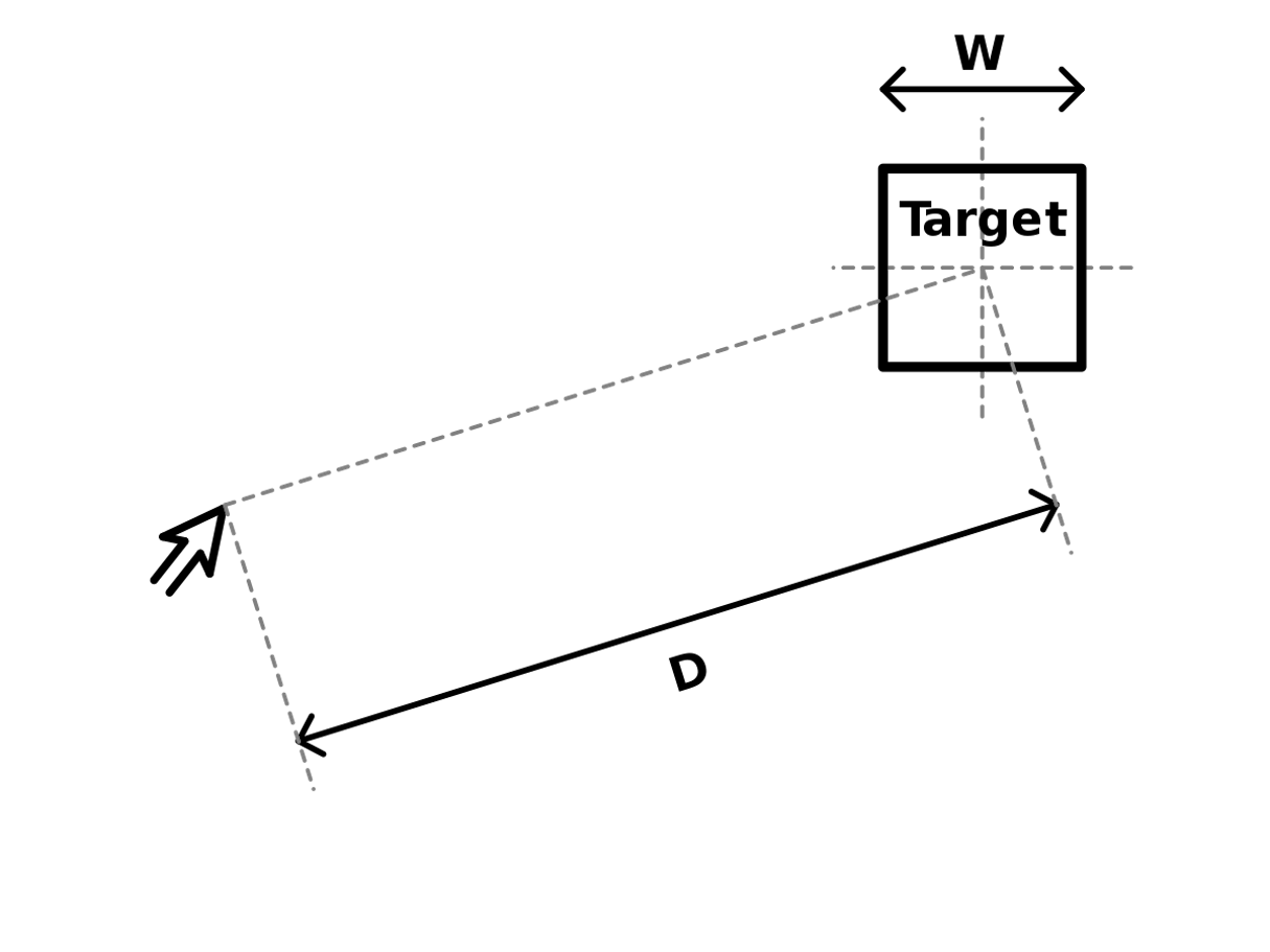
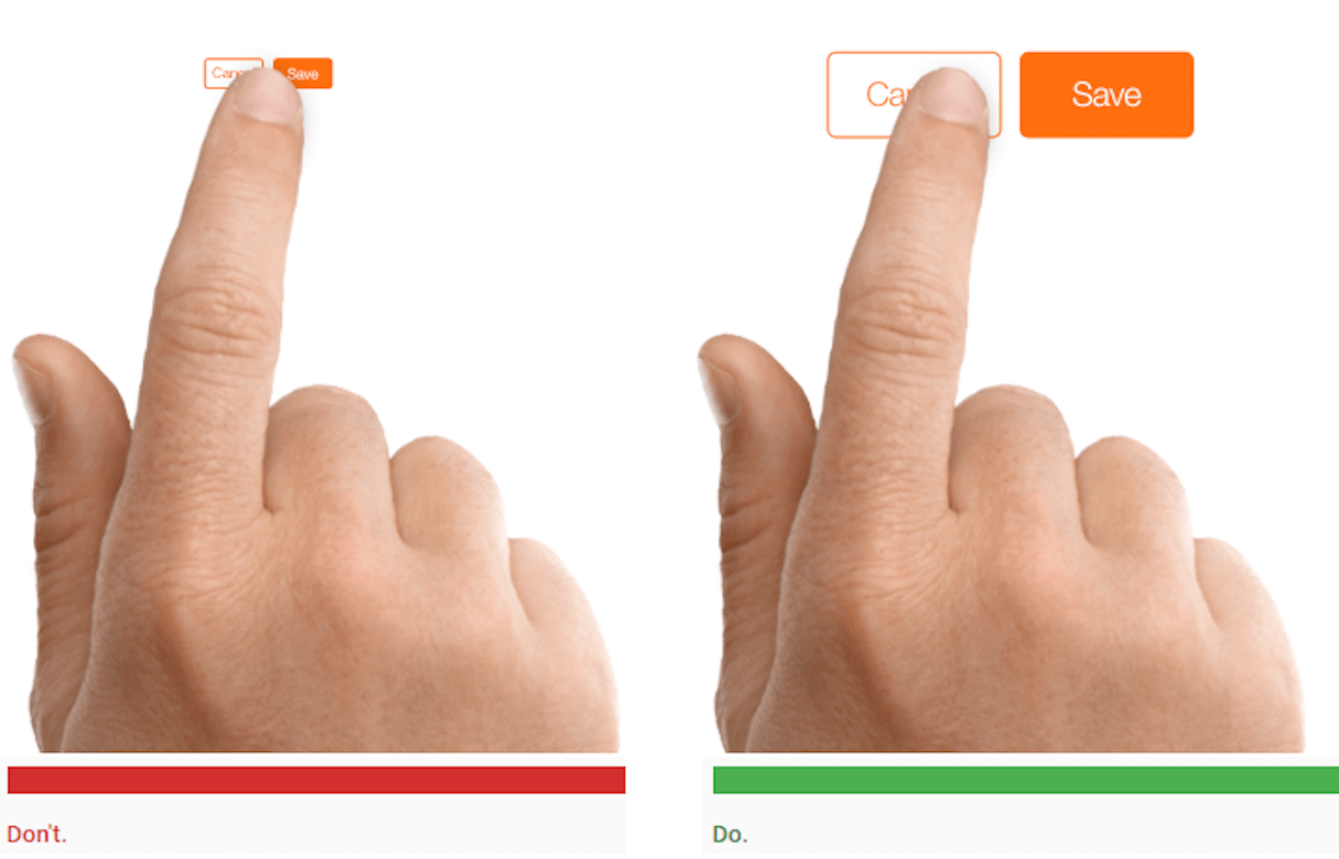
Fitt’s Law states that the time required to acquire a target is a function of the distance to and size of the target. The longer the distance and the smaller the target’s size, the longer it takes to acquire the target.
Key takeaways for designers:
- Make the UI elements you wish to be easily accessible large enough, and position them close to users.

6. Hick’s Law
The time it takes for a person to make a decision increases with the number and complexity of choices. Minimize choices to drive decision-making.
In 1952, psychologists William Edmund Hick and Ray Hyman set out to examine the relationship between the number of stimuli present and an individual’s reaction time to any given stimulus. They found that the more stimuli there are to choose from, the longer it takes the user to decide which to interact with. Increasing the number of choices increases the decision time logarithmically.
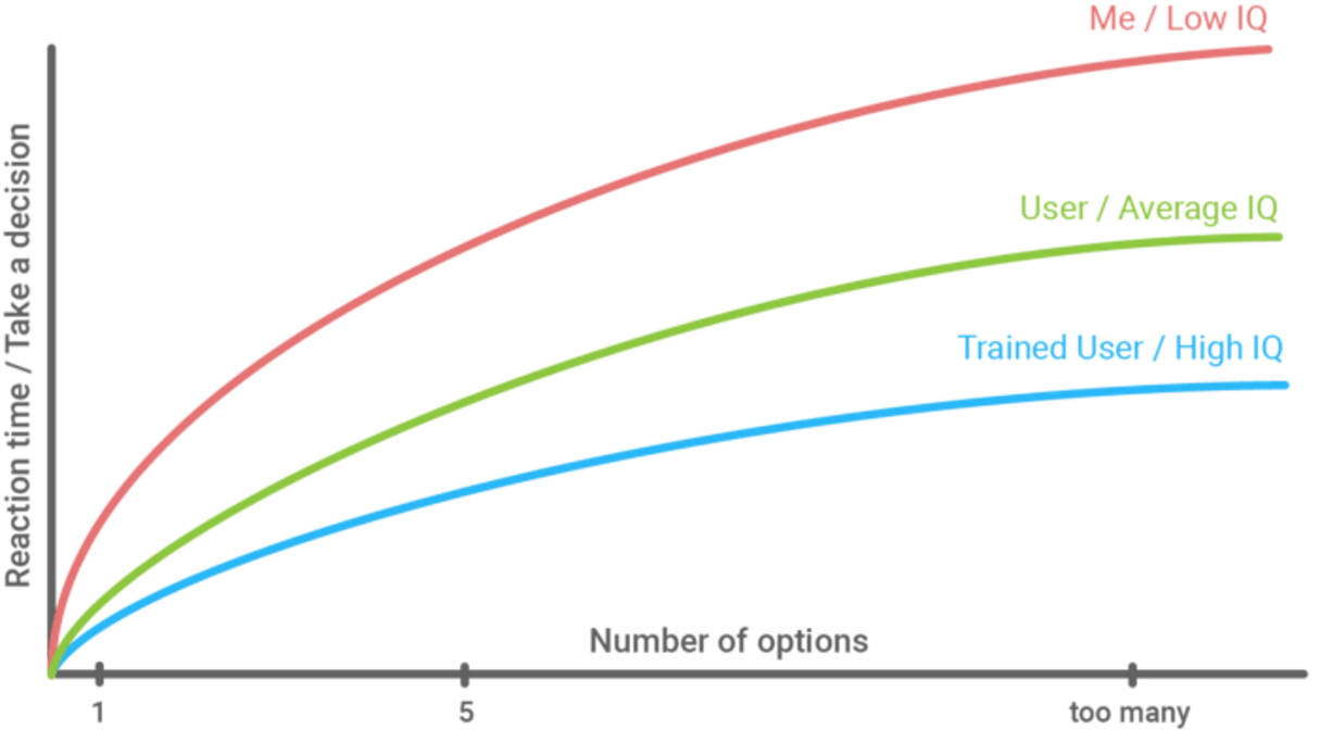
Many designers think that they’re improving user experience by offering lots of choices, but in reality, they’re adding extra cognitive burden. The more choices a user is confronted with, the more likely it is that they will face decision paralysis. This can be especially problematic in an ecommerce context, where users have to browse dozens of products that have similar properties. Offsetting decision paralysis leads to a higher conversion rate. This paradox is explored in the video below.
Key takeaways for designers:
- Reduce the total number of choices that users have to make. Having more choices results in more work users have to do in order to make a decision.
- Prioritize navigation options. Instead of providing an endless list of navigation options, focus on the most important options.
- Simplify the decision making process for the user by breaking down complex tasks into smaller steps and clearly highlighting the recommended options.

7. Weber’s Law of Just Noticeable Differences
Users don’t like dramatic changes. Subtle changes work better because the perceived change in stimuli is proportional to the initial stimuli.
Weber’s Law of Just Noticeable Differences states that the slightest change in things won’t result in a noticeable difference. Research shows that users dislike a massive change in products they use, even if those changes will benefit users. This means that if you do a significant redesign, there’s a high probability that users won’t like it.
Key takeaways for designers:
- Avoid dramatic redesigns. Introduce changes in your product gradually, not all at once.
8. The rule of the first impression
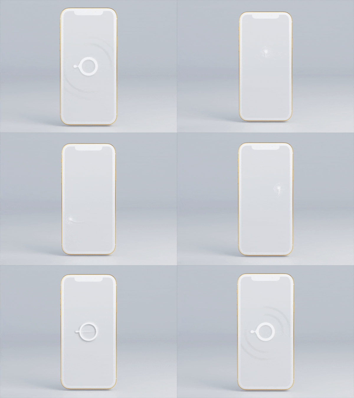
People make snap judgments. It takes a fraction of a second to make a great (or bad) first impression. Things that users see or hear when they start interacting with a product will shape their opinion of the product.
"Studies show that early impressions of a product influence long-term attitudes about their quality."
Studies show that early impressions of a product influence long-term attitudes about their quality. People experience a similar phenomenon with human attractiveness—the first impression of a person influences how the person is perceived and treated.
Key takeaways for designers:
- People do judge a book by its cover. Strive to create an aesthetically-pleasing design.
- Use emotions to make an impact. When users have a positive emotional response to your visual design, they tend to spend more time using your product.
- Use moodboarding to find a particular look and feel that fits your overall goal.
You might also like: 6 Tools to Create Beautifully Designed Mood Boards.
9. Von Restorff Effect (or Isolation Effect)
When multiple similar objects are present, the one that differs from the rest is most likely to be remembered.
The Von Restorff Effect, also known as the Isolation Effect, was coined by German psychiatrist and pediatrician Hedwig von Restorff. In her 1933 study, she found that when participants were presented with a list of categorically similar items grouped with one distinctive item, people better memorized the distinctive item.

Key takeaways for designers:
- Make important information or key actions visually distinctive.

10. Peak-End Rule
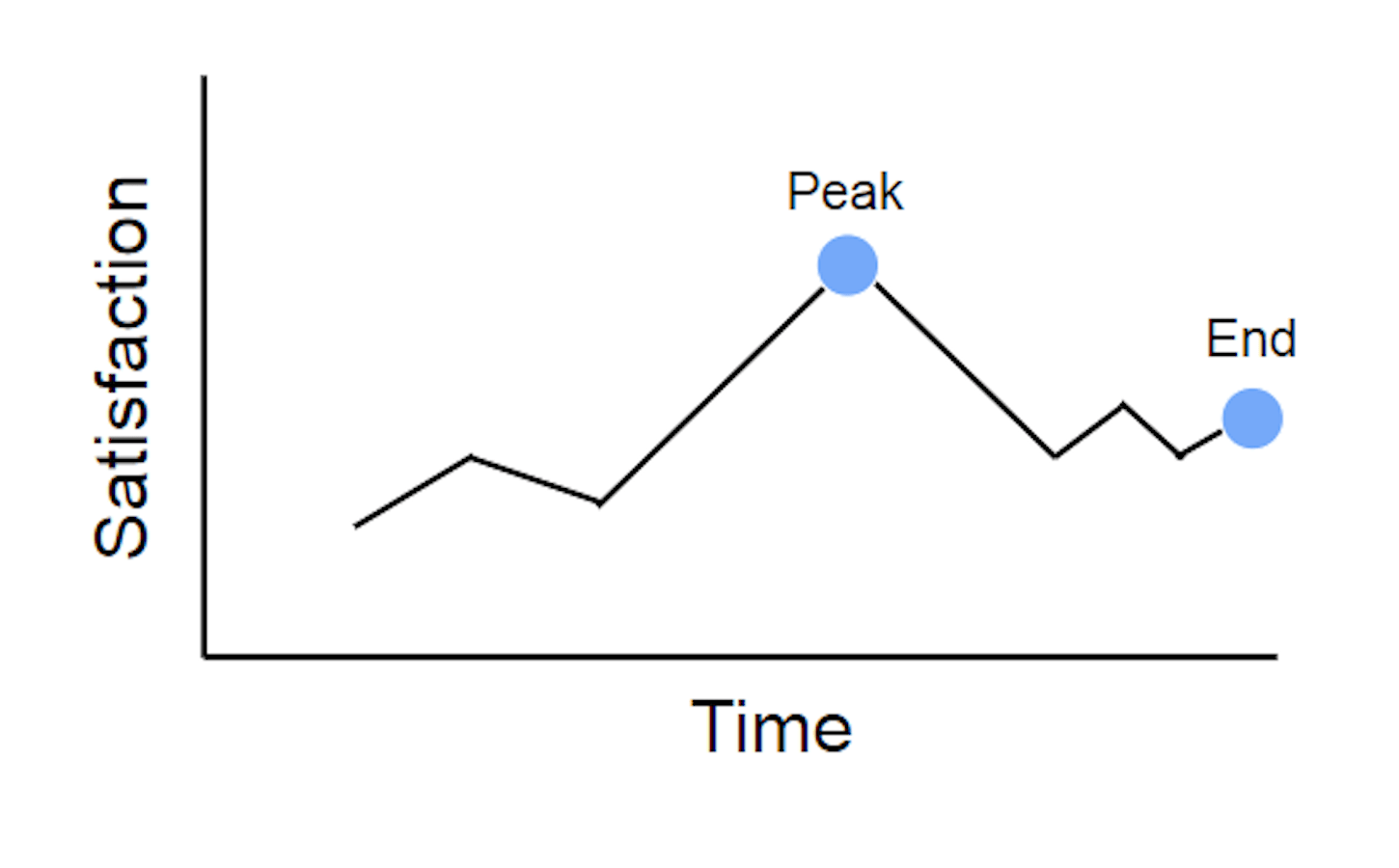
People judge an experience primarily based on how they felt at its peak and at its end, rather than the total sum or average of every moment of the experience. This effect occurs regardless of whether the experience is pleasant or unpleasant.
Key takeaways for designers:
- Strive to provide the best possible experience in the most intense points and the final moments of the user journey.
- Reduce the pain-points. People recall negative experiences more vividly than positive ones.
11. The principle of familiarity
Users prefer your product to work the same way as all the other products from the product's category.
In his article Top 10 Mistakes in Web Design, Jakob Nielsen states that users spend most of their time on other sites. This means that users prefer that your site works the same way as all the other sites they already know. This rule is applicable not only to websites but to all the products we use. By making your design predictable, you minimize the cognitive load that user experience when they use your product.

Key takeaways for designers:
- Don’t reinvent the wheel; design patterns that users are accustomed to.
- Apply the Principle of Least Astonishment to your product design: "If a necessary feature has a high astonishment factor, it may be necessary to redesign the feature."
You might also like: How to Use Smart Defaults to Reduce Cognitive Load.
12. Picture Superiority Effect
Pictures and images are more likely to be remembered than words. Studies prove that pictures outperform text dramatically in human memory recall.
Key takeaways for designers:
- Use visual storytelling in your products. By pairing text with images, you increase the chance that users will remember the information.
13. Miller’s Law
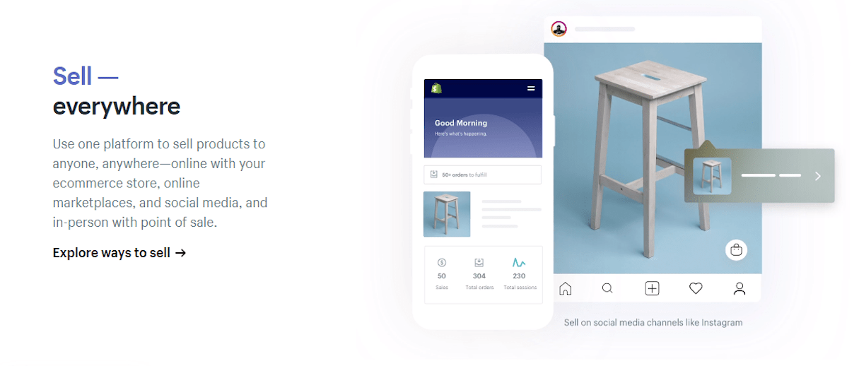
Humans can’t hold much information in their short term memory. The average person can only keep 7 (plus or minus 2) items in their working memory at one time.
Miller’s Law (also known as “The Magical Number Seven, Plus or Minus Two”) was coined by cognitive psychologist George A. Miller. According to this law, our brain has limited capacity for processing information—the number of perceptual ‘chunks’ an average person can hold in working memory is 7 ± 2. This law can be easily applied to UI design: the more chunks of information you add to a UI, the more difficult it becomes to work with it.
Key takeaways for designers:
- When showing telephone numbers, chunk the information so that it can be held easily in working memory. Instead of displaying a number like +16501251612, space the numbers out: +1 (650) 125-16-12.
- Use chunking to present groups of content in a manageable way. Organize elements of information in categories no larger than 9, but preferably 5 chunks.
14. The Zeigarnik Effect
People remember uncompleted or interrupted tasks better than completed tasks.
Russian psychologist Bluma Zeigarnik first noticed this phenomenon when she watched how a waiter worked with orders. While working, the waiter had better recollections of unpaid orders than paid orders. However, after everyone had paid the waiter was unable to remember any more details of the orders.
It’s hard for people to leave things incomplete because a task that has already been started establishes a task-specific tension. This tension is relieved only upon completion of the task. But if the task is interrupted, the reduction of tension is impeded.
Key takeaways for designers:
- The Zeigarnik Effect is often used in gamification. By adding progress trackers in a UI, you remind users about unfinished tasks and motivate them to complete the tasks.

15. Serial Position Effect
A user best remembers the first and last items in a series.
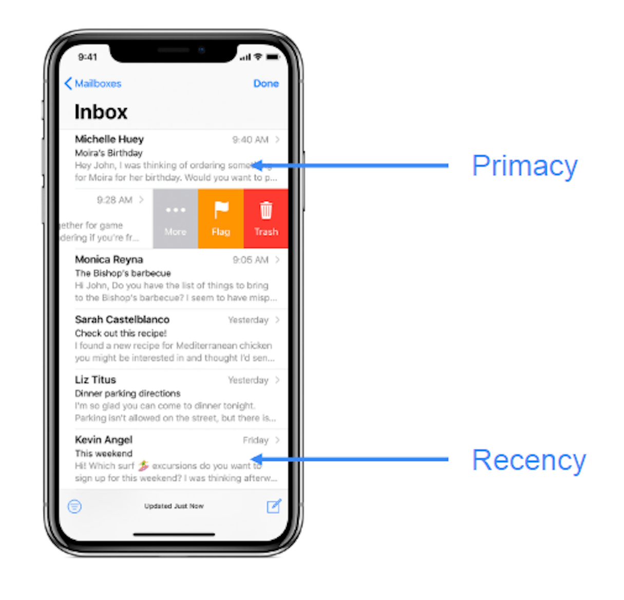
The Serial Position Effect (also known as the Primacy and Recency Effect) is a psychological phenomenon that states that items at the beginning (primacy) and items at the end (recency) of a list of information are more easily recalled than items in the middle. You remember the first item in a list is because it is the first thing you see when you start scanning a page (primacy effect), and you remember the last item on the list because it is the last thing you see on this page, and so ends up in your short-term memory (recency effect).
Key takeaways for designers:
- Consider this effect when delivering information to your users or displaying navigation options. It’s not an accident that many mobile apps put the “Home” and “Profile” items all the way to the left and right.
You might also like: Dark Patterns: 12 Tricks You Should Never Use in Your Products.
16. Occam’s Razor
Entities should not be multiplied without necessity.
Occam's Razor is a problem-solving principle that states that when we have two explanations for an occurrence, the one that requires the least speculation is usually correct. This idea is attributed to English Franciscan friar William of Ockham.
Key takeaways for designers:
- Analyze each element and remove as many as possible, without compromising the overall function.
Gestalt Laws of Perceptual Organization
Gestalt psychology was founded by German psychologists Max Wertheimer, Wolfgang Kohler, and Kurt Koffka. It focused on how people interpret the world. Wertheimer, Kohler, and Koffka established a few fundamental principles, also known as "laws of perceptual organization." The next laws are from these studies.
17. Law of Similarity
Elements that have similar visual appearances seems to be more related.
In the image below, you probably see the groupings of colored circles as rows rather than just a collection of circles:

Key takeaways for designers:
- Elements can be visually grouped together if they have visual similarities. It’s possible to create similarity using size, color, and shape.

18. Law of Common Region
Elements tend to be perceived in groups if they are sharing an area with a clearly defined boundary.

Key takeaways for designers:
- By adding borders around an element (or a group of items), you separate it from surrounding elements.

19. Figure-Ground
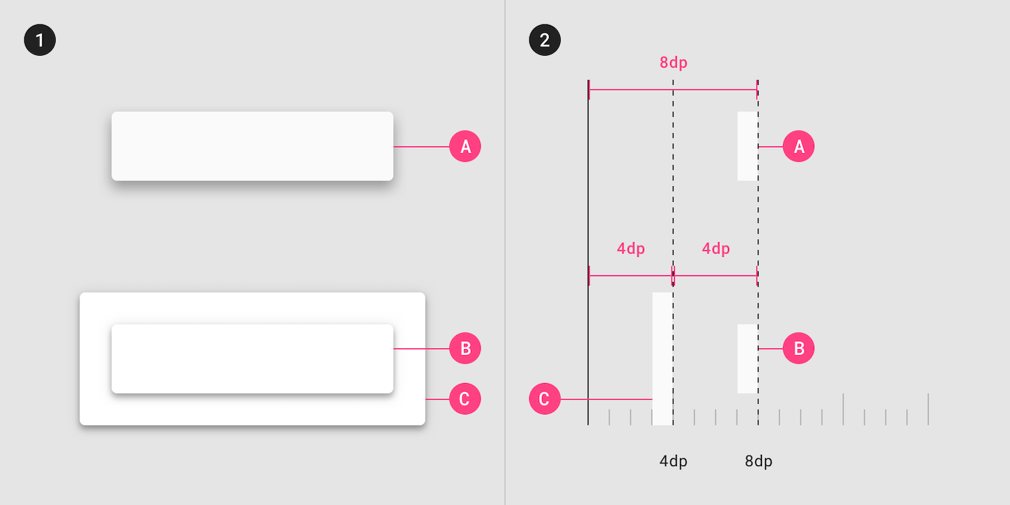
This principle refers to the human’s ability to visually separate objects on different layers of focus. The human eye can separate objects on different plans of focus: we intuitively know which elements are placed in the foreground and with ones are in the background.
Key takeaways for designers:
- Every time users see the modal popup, they witnessing a Figure-Ground effect. Material design classifies Z-axis of elevation, which is used to design overlays.
20. Law of Proximity
Objects that are near each other seem to be grouped together.
In the below image, the circles on the left appear to be part of one group while those on the right appear to be part of another:

Key takeaways for designers:
- Place related objects close to each other to create a connection.

21. Law of Continuity
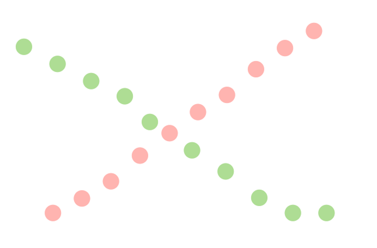
Objects connected by straight or curving lines are seen in a way that follows the smoothest path.
In the image below, lines created from circles are seen as belonging together:
Key takeaways for designers:
- Guide the user’s eye by creating a visual connection between items.

22. Law of Closure
Our brains tend to fill in gaps in information.
In the image below, you probably see two objects (a circle and a star), because your brain fills in the missing gaps to create a meaningful image.

Key takeaways for designers:
- This principle is worth remembering when you work on loading animations, as the user’s mind will automatically fill in the gaps to figure out the shape of your animation.

Laws to design better
'Don’t make users think' is a common adage in the product design. Designers should strive to reduce the user’s cognitive load and lower the cost of interaction by designing easy-to-use products. The principles above should be a part of your design toolbox. Applied correctly, they can help you create a better user experience for your users.
Read more
- The 8 Best Free Shopify Resources and Tools for Front-End Developers
- 9 Steps to Establish Strong Design Principles for Your Team
- How to Brand Your Shopify App to Earn More in the App Store
- Typography in UI Design
- The Pivotal Role of User Experience Design in Brand Building
- 10 Ways to Improve User Engagement for Your App This Valentine's Day
- 5 Common Digital Content Problems and How to Avoid Them
- Agile Design: An Introduction
- The Key Aspects to Consider When Building Multilingual Websites
- 8 Things My Mom Taught Me About UX
What UX laws have you relied on in your designs? Let us know in the comments below!

