Every day we read about best practices to apply to web design, but there’s a growing trend towards websites that break industry standards in favor of a more provocative approach. Brutalist web design — loosely defined as a functional and “raw” visual aesthetic — is heavily influenced by graphic design, and abandons many trademarks of typical web design, like headers and footers, or traditional menu navigation.
Borrowing its name from brutalist architecture, which features buildings with large blocks of exposed concrete, designers of these sites intentionally display pages that appear unpolished, and can often be uncomfortable for many audiences and users to interact with. On the other hand, this new style is seen by some to be a welcome response to generic design practices and conventions that typify many template-based websites.
Frameworks like Bootstrap and Foundation have allowed us to quickly construct websites for clients, but the price that these convenient libraries incur is a shift towards homogenous design, as more and more websites begin to have identical layouts.
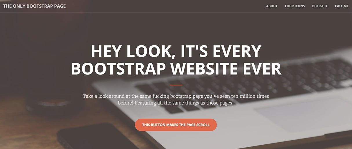
Other characteristics of brutalist web design include using basic system fonts, overly large imagery, handwritten HTML, unusual scroll or hover effects, and web-safe colors. By thinking outside the confines of currently accepted design patterns, many daring developers are creating playful and often humourous websites, that open up the possibilities for unique user experiences.
At the moment web brutalism is a niche movement, but it has seen some mainstream attention. As popularity for this unconventional approach grows, more retail brands are adopting brutalist techniques themselves. In this post, we’ll look at some of the characteristics of brutalist websites, and examine how developers can get inspired and inject some fresh ideas into their work.
A closer look at brutalist web design
Much of the recent interest in brutalist web design stems from the work of Pascal Deville, whose own Brutalist Websites page is the holy grail for anyone fascinated with this movement. Deville’s site is an ever-expanding portal to the web’s finest examples of brutalist web design.

Characteristically bare in appearance, the closest thing to an “About” page is the short definition, in plain Courier font that reads: “In its ruggedness and lack of concern to look comfortable or easy, brutalism can be seen as a reaction by a younger generation to the lightness, optimism, and frivolity of today's web design.”

But the site’s visual appearance is not the only thing that’s stripped-down and basic, the underlying code of the site is also quite primitive and unpolished. As can be seen above, the head section of the site has very simple inline styling and crude markup. While it’s a dramatic break from what you would typically see on most modern websites, it does mean there are no unnecessary elements like animated banners or pop-ups, which affect site loading speed.
Another great example of a brutalist website is from digital studio Apelido & Apelido, whose text-heavy, monochromatic website is clearly inspired by 1990’s web design. The company — who’ve worked with the likes of Speedo, Mercedes-Benz, and Adidas — use their landing page to express their own creativity through playful features and hidden details.
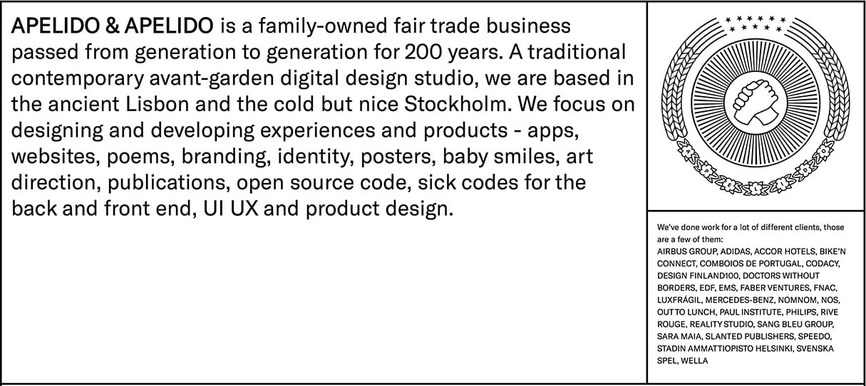
The visual aesthetic, with sharp, straight lines and carefully measured boxes suggest a strong background in graphic design — something that’s shared with many other brutalist websites. There’s also a humorous side with fortune-cookies, and a very simple paint tool, which literally ‘draws’ visitors in to produce a truly interactive and memorable experience.
When the site developer Vasco Gaspar was asked why Apelido & Apelido used the brutalist style on their site, his answer was “to express ourselves and the influence of fun, simple, early web.” This artistic and nostalgic sentiment is echoed by many developers of brutalist websites and the theme of humour reappears on almost every site, something that’s difficult to introduce into the more commonplace template-based themes.
But it’s not just design companies or portfolio sites that are exploring unusual designs, major brands like Nike have recognized this growing trend and have experimented with unusual, brutalist inspired techniques. Sites like Future of Air are deliberately difficult to navigate, have very little branding, and the purpose of the site is almost completely hidden.
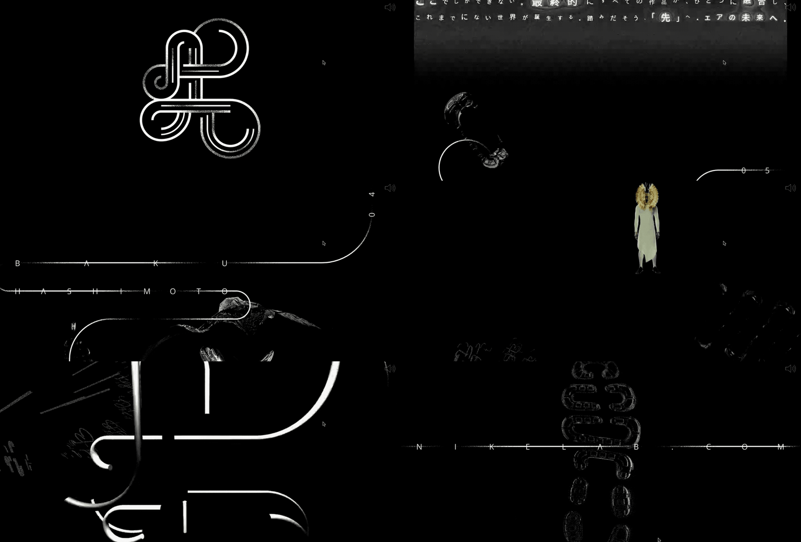
An infinite scroll feature, that loops back to the top of the site, hypnotic animation, and glitchy music are just some of the more curious effects the designers utilize to construct an alluring and immersive experience. When you explore the surface of this site, it appears to be very “busy”, however there isn’t much that the user can interact with. It’s clear this is a site that’s intended to be experienced, without input from visitors.
While the psychedelic visuals and sounds are a far cry from many other brutalist websites, a brutalist influence can be seen in the relatively raw code, as well as how unconventional the general layout is. As this trend gains popularity, it’s likely we will see brands adopting unorthodox designs , and some of the more functional brutalist methods may move from the underground to the mainstream.
Some brutalist traits can already be seen across existing websites, with Craigslist in particular being identified as a platform which has unintentionally become a reference point for a raw and unsophisticated aesthetic. The basic system fonts, minimal color variation, and almost complete transparent functionality makes Craigslist one of the easiest sites to navigate, and captures the spirit of what brutalist web designers hope to accomplish.

The classified message board also hints at nostalgia for the early days of web-browsing, particularly Usenet, a trait shared with many newer brutalist websites. The message here could be that a simple and unpolished website can be popular, as long as it’s fully functional. We could even add Google to this list!
Brutalist web design and ecommerce
There are many features of brutalist web design that won’t, and rightly shouldn’t, apply in an ecommerce context. There are insights, however, to be gained from looking at how a raw and playful aesthetic could create memorable experiences for a client’s stores.
There are many features of brutalist web design that won’t, and rightly shouldn’t, apply in an ecommerce context.
As we’ve already seen, the stripped-back style is becoming increasingly popular, particularly with younger audiences who have an interest in design. So it’s no surprise to see brands, especially apparel brands, are adopting brutalist approaches in their stores. Here are some examples of online stores embracing this bold and raw style that you can draw inspiration from for your own work in a website builder.
Yeezy Supply
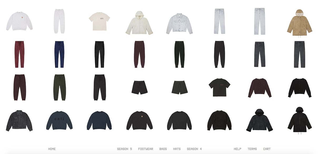
A personal favorite, Kanye West’s clothing line boasts a very unusual webstore that throws many of the standard features of an ecommerce store out the window. The homepage is simply a grid of products without titles or prices, and it’s even unclear what collection we’re looking at.
A collaboration between digital designers Lane Goldberg and David Baker, the site is a masterclass in building a very minimalistic, yet functional, online store. It only take four clicks of a mouse to bring you to the check-out and there are no unnecessary adverts or banners to distract from the browsing and purchasing experience.
The product page itself is deliberately bare — a basic image gallery, variant dropdown, and a six word product description in Courier, the font of choice for many brutalist designers. The developers have scrapped a header in favor of the sparse navigation menu that appears along the bottom of the page.
The distinct absence of trying to tell the customer a story, or even communicate any background to this brand is one of the most obvious characteristics of this site, without even so much as an “About Us” page. This makes for a refreshing interaction without many of the distractions customers have grown to expect.
Bonus points are awarded to #TeamYeezy for performance, as the homepage loads in 0.9 seconds, making it the fastest loading site we tested. This is no easy feat considering there are 32 images on the page, proving a brutalist approach does pay off in efficiency.
Carbon Beauty

While most of Carbon Beauty’s website may look like a regular ecommerce website, complete with attractive scrolling animation and dynamic imagery, there are influences of the brutalist attitude. This is especially visible on the product pages, which feature the sharp and bold lines usually reserved for the intentionally bare websites of graphic designers.
The cosmetic brand achieves a very specific tone, by paying attention to the smallest details, like quantity selectors, that are carefully crafted to be minimal and practical. The graphic design influence of the page is not hidden, and the layout of all the different elements is a perfect combination of art and functionality.
The rawest feature on the page however, is the customer review box, which is stunning in it’s monochrome simplicity. The box looks like it could have been quickly designed with a pen and ruler, producing a similar scrappy feel as the sectioned pages we saw earlier with Apelido & Apelido.
Balenciaga
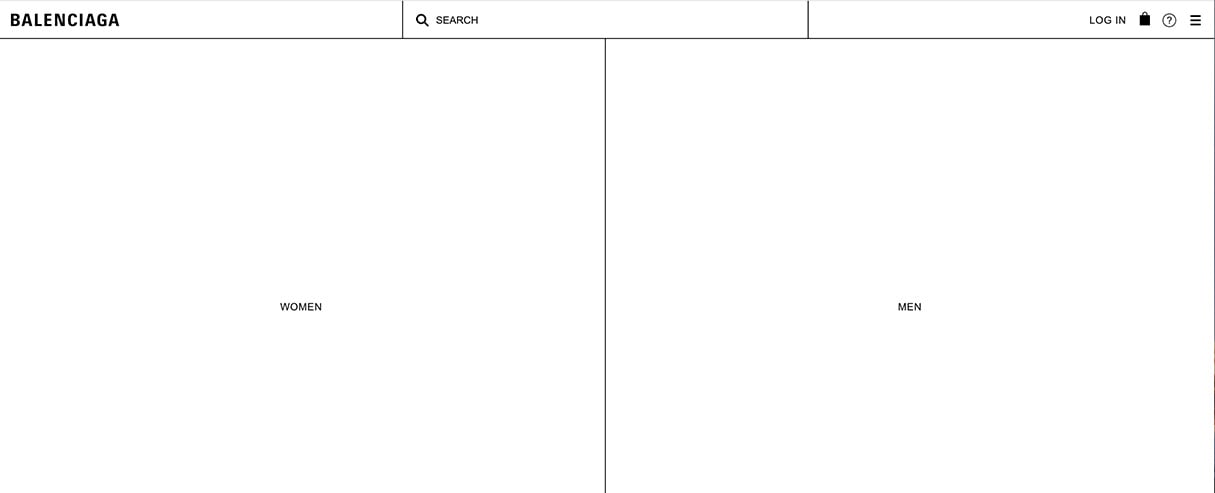
High fashion apparel brand Balenciaga takes brutalist design to it’s barest limits, with a site that takes customers on a purchasing experience like no other I’ve encountered online. When the homepage loads up, you would be forgiven if you thought there was an issue with the stylesheet, considering just how raw their design is.
The simple wireframe design gives customers the choice of clicking two huge boxes, “Women” or “Men”, which dominate the page. Once you pick your gender, another page of simple boxes loads, each representing a collection. Following this, another page of subcollections loads, until finally you reach a product page, and you can see some images.
This type of site is almost the opposite of what customers are expecting to see, and some may even consider the “container options” and lack of images to be cold or ugly. There’s no denying, however, that the site does provoke a reaction, whether that’s of shock, humour, or admiration.
The website also works too, as the simple design does direct a customer to the type of clothing they’re looking for, and it’s possible that such an extraordinary website would encourage customers to explore further once they’ve chosen a product. One thing is for sure, you won’t forget Balenciaga in a hurry.
You might also like: Working with Apparel Clients: Trends, Apps, and Themes to Consider.
Make sure it works!
While brutalist web design can seem like a daring departure from the norm and it can be inspiring to see what happens when designers experiment with unusual techniques, the style does come with limitations. This can be especially true from an ecommerce perspective, where specific actions need to be carried out with ease.
It’s crucial to carry out user testing to ensure visitors are able to accomplish tasks on your site . This applies to finding information on return policies and shipping, as much as purchasing products. Using heuristic guidelines to review your site is a great way to judge if your site really is as functional as it looks.
Rethinking how sites should feel
As we’ve seen, brutalist web design is increasing in popularity, and it will be fascinating to see how designers will put their own spin on established design patterns. By rethinking how sites should look and feel, developers can create new experiences for clients . Pascal Deville puts it best when he says: “Ignore the rules to come up with something unexpected. But to do so, you have to know the rules.”
Read more
- How to Customize Content by Country with Shopify
- Building a Clickable Call-to-Action Button for Your Shopify Theme
- Paul Boag Shares a Favorite Ecommerce Project
- 5 Common Digital Content Problems and How to Avoid Them
- How to Use Eye Tracking in Usability Tests
- 10 Ways to Improve User Engagement for Your App This Valentine's Day
- Why and How to Improve Ecommerce Website Accessibility
- Content Strategy: The Principles we Followed to Build the New Shopify App CLI
- Designing with SVG: How Scalable Vector Graphics Can Increase Visitor Engagement

