In today’s fast-paced world, people have no patience for products that make them slower. They quickly become frustrated when apps or websites make them work too hard to accomplish their goals. Such products are quickly abandoned and replaced with more user-friendly alternatives.
So it’s no wonder that creating frictionless user experience is a key goal for many businesses . Designers strive to create the smoothest, bump-free user journey for their products.
As designers and developers, it’s beneficial to familiarize yourself with the concept of friction, as well as methods that allow you to create frictionless interactions.
In this article we’ll cover following topics:
- What is friction
- Two types of friction—negative and positive
- How to identify negative friction
- What steps in the user flow often cause negative friction and what to do to prevent it
You might also like: Designing With the User's Context in Mind.
What is friction?
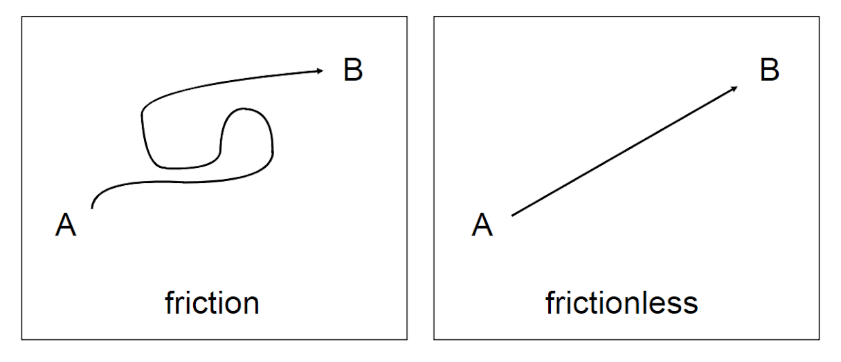
In experience design, friction is anything that makes users stop and think. It's a barrier standing between users and their goals—the resistance that slows users down.
There are two main forms friction can take:
- Interaction friction: All aspects of the user interface that hinder users from accomplishing their goal. Designers strive to prevent interaction friction by building intuitive and consistent interfaces.
- Cognitive friction: Friction is based on cognitive load or the total amount of mental effort required to use the product. When users experience high cognitive load when performing a task, it leads to significant cognitive friction.
Negative and positive friction
Friction has a bad reputation, but it’s not inherently negative. In fact, there are two types of friction in user experience—positive and negative friction. Positive friction is the one that can add value to an experience—sometimes people need a little friction in the process before they complete the action.
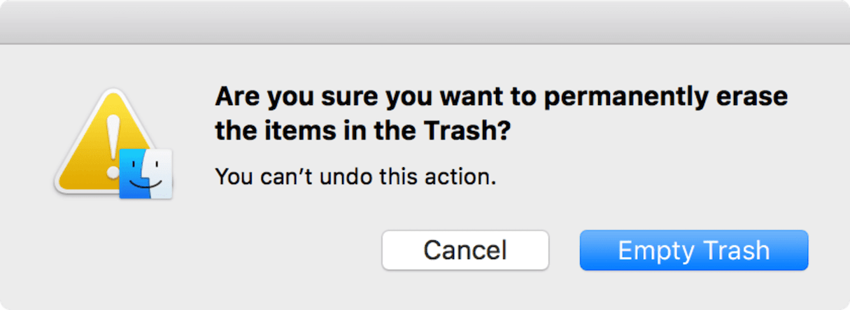
One typical example of this is protective friction, that prevents users from making mistakes. Error prevention is a fundamental usability principle, and protective friction help designers achieve this goal by making it harder for users to do something by mistake—especially when it comes to irreversible actions.
The MacOS confirmation dialogs that appear on the screen when permanently deleting items is a strong example of such friction. Introducing friction in this case can create an essential opportunity for the user to think about what they are doing.
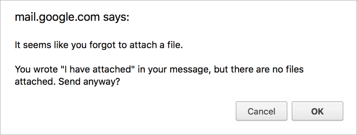
Another strong example of positive friction is the validation check in Gmail, which tracks certain phrases in email text and notifies users about the problem (for example, where users reference an attachment but forget to attach a file).
Games are another example where friction can be used for good. Can you imagine a game without any friction? Probably not, because there is absolutely no fun in playing such game. When it comes to designing game experience, product creators should maintain the right amount of friction. There’s a thin line between what’s exciting and what’s frustrating. Low levels of friction can make the game boring, but too high levels of friction can make the game discouraging.

Negative friction, however, is a completely different story. Negative friction is anything that prevents users from accomplishing their goals easily and intuitively. This friction comes in many forms: overloaded interface, unclear navigation, and unfamiliar terminology, just to name a few.
Bad friction is basically everything people complain about when they find product hard to use. This friction often leads to increased bounce rate and reduced conversion rate, and frustrates users to the point of abandoning a product. In this article, I’ll focus solely on negative friction.
How to identify negative friction
Crafting a frictionless experience requires designers to deeply understand how users interact with a product. Designers have to understand not only what goals users want to achieve while interacting with a product, but also how they want to achieve them. This knowledge will help designers understand when friction in a user journey can be helpful, and when it can be harmful.
Research target audience to understand user’s mental model
The key to accomplishing frictionless UX is to have a laser focus on a target audience. It’s essential to understand the user’s mental model and behavior, and to design a product that matches it. That means that a team needs to get to know their target user through user research and testing.
There are many ways to conduct user research. Below are a few ways to start:
- Create user personas: Creating personas helps designers understand who their end-users are. Personas are generated from qualitative data (surveys, interviews, and ethnographic observations) as well as quantitative data (tracking analytics data).
- Analyze user session recordings: Watching how real people work with a product is an excellent way of evaluating user interaction and measuring usability of a product.
- Collect and analyze user feedback: It is necessary to obtain feedback from your users on a regular basis. Properly collected feedback helps product teams identify potential pitfalls faced by users and design to prevent them. You can collect feedback through user experience testing, like a contextual inquiry.
Design a product with a full user journey in mind
The user journey is a step-based description of how a user interacts with a product. It can usually be represented as a storyboard or a flowchart. The user journey helps designers figure out what steps a user might take while interacting with a system or service.
Designing a product with a full user journey in mind is crucial because it helps designers figure out where friction is helpful and where it is harmful, to both the user and business goals.

7 ways to avoid creating bad friction
Ultimately, users want simplicity when interacting with a product. Frictionless designs are synonymous with simplicity because it makes things easier for the users.
Below are seven considerations designers should make to eliminate bad friction in their designs.
1. Avoid overwhelming users with content or features
User focus is one of the most crucial characteristics of user experience. Having a strong focus helps users achieve their goals without too much effort. On the other hand, when a product overwhelms users with content or features, it causes users to lose focus.
Reduce the number of choices
Many product designers believe that the more features or options they provide, the more valuable a product will be. It’s the wrong assumption. This abundance of choice can result in decision making paralysis and increased anxiety. This phenomenon is known as the paradox of choice.
In 2010, The New York Times published Too Many Choices: A Problem That Can Paralyze. This article referenced a famous jam study—an experiment where researchers offered samples of either 6 or 24 flavors of jam to customers at a store. When customers sampled 24 flavors, only 3 percent purchased a jam, but when customers sampled 6, 30 percent decided to buy a jam. The same principles apply to digital interfaces.
Trim all the fat
‘Clutter’ is a word we use when we speak about interfaces that are overloaded with information. Cluttered interfaces are not only unattractive, but they also decrease the user’s ability to comprehend the content.
Beat clutter by removing anything unnecessary—from extra information to extra UI elements. When designing your layouts, keep in mind the core principle of minimalism—less is more. Follow the minimalist approach and create layouts that have only the essential elements.
For example, when writing a text copy, you should always ensure it sticks to the following characteristics:
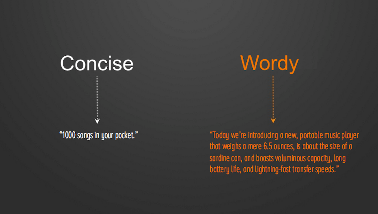
- Keep it brief. Author William Strunk, in the original edition of The Elements of Style, a must-read book for writers, advises that writers should strive to omit unnecessary words to keep content brief.
- Keep it spare. Don’t give users too much information, and don’t provide details unless they are really pertinent to what the user needs.
Divide and conquer
It is easy to overwhelm your user with too much information, especially when information is presented all at once. When you have a lot of content to display or questions to ask, it’s better to divide significant portions of content into smaller chunks.
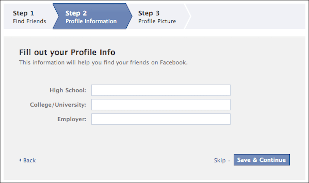
When it comes to asking questions, stepped forms are perhaps one of the most common examples of using chunking. This pattern not only reduces the complexity of the operation, but also allows users to set some expectations—users will be able to estimate how much time (approximately) is required to complete a task.
2. Don’t make users guess
Every time a user interface makes the user guess the next step, it increases the user’s level of uncertainty. Uncertainty leads to interaction friction. Here are some ways to make users more comfortable and certain with your product.
Provide visual feedback on user actions
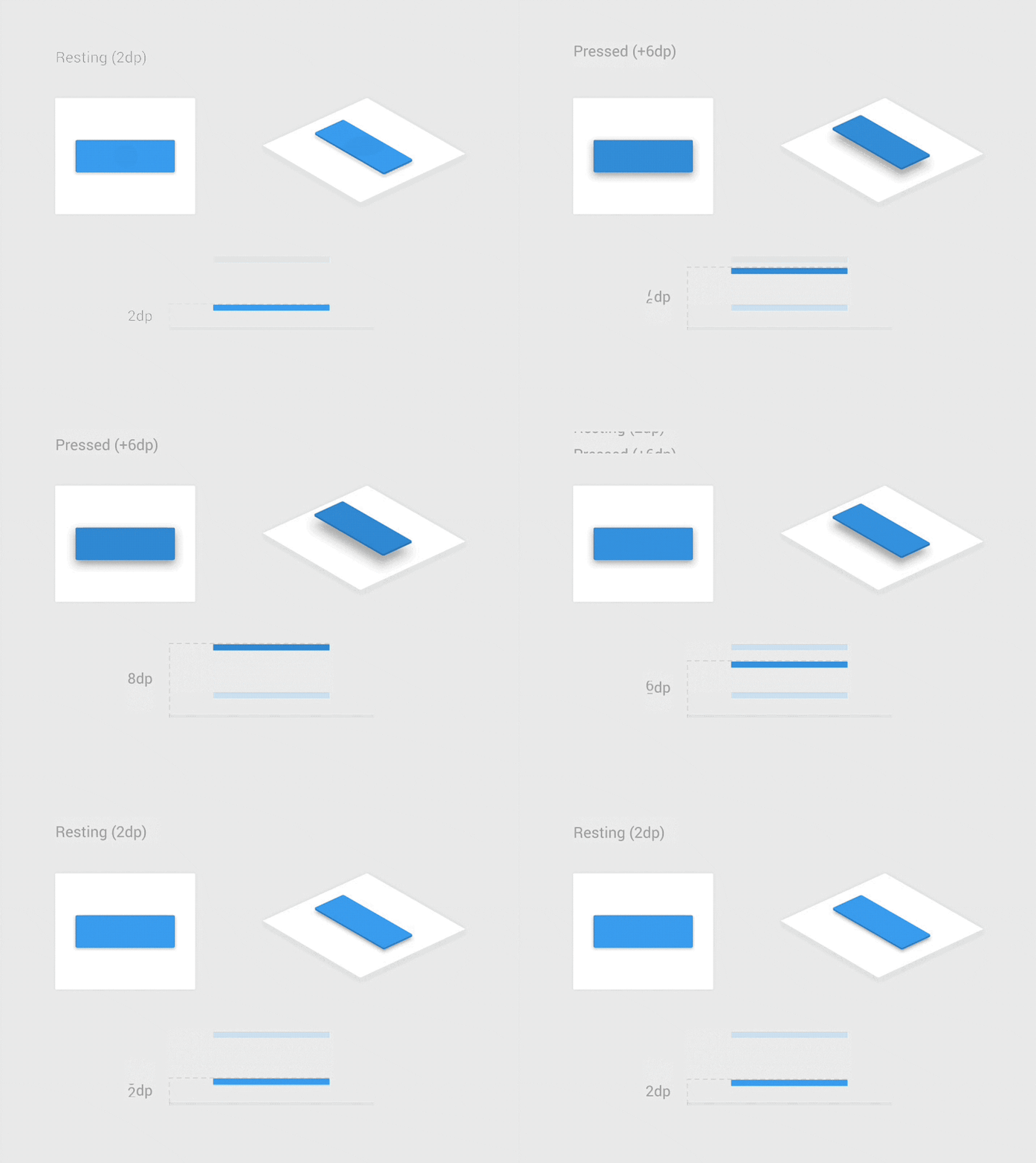
Lack of feedback from a system is a strong example of interaction friction. When users trigger some action and don’t receive an acknowledgment that the system got a request, they think that their request wasn’t delivered. As a result, they try again and again. This leads to the behavior known as rapid clicks. Those additional unnecessary actions often cause system errors.
It’s essential to design interactive elements that change appropriately when the user interacts with them. Furthermore, these changes should happen instantly and seamlessly. Interactive elements that respond to the user’s action alleviates the user’s fears.
Make loading transparent
It’s essential to provide visual feedback in situations where a system needs some time to process user’s request. Without any feedback, users start wondering if the app is doing anything or not.
For relatively short operations (that lasts less than 10 seconds), it’s possible to use a simple loading indicator (such as animated loading spinner).

For long-term operations (that last more than 10 seconds), it’s essential to provide information on how much time is required to complete the operation (otherwise users might think that the system is frozen).

Use visual affordances to provide strong clues
In digital design, affordance generally means that things that are interactive appear interactive in some way. As a designer, you should give the user hints about interactive objects. For example, if you design a button, you should use visual properties that will make it clear for users that this object is a button.
Make your design consistent
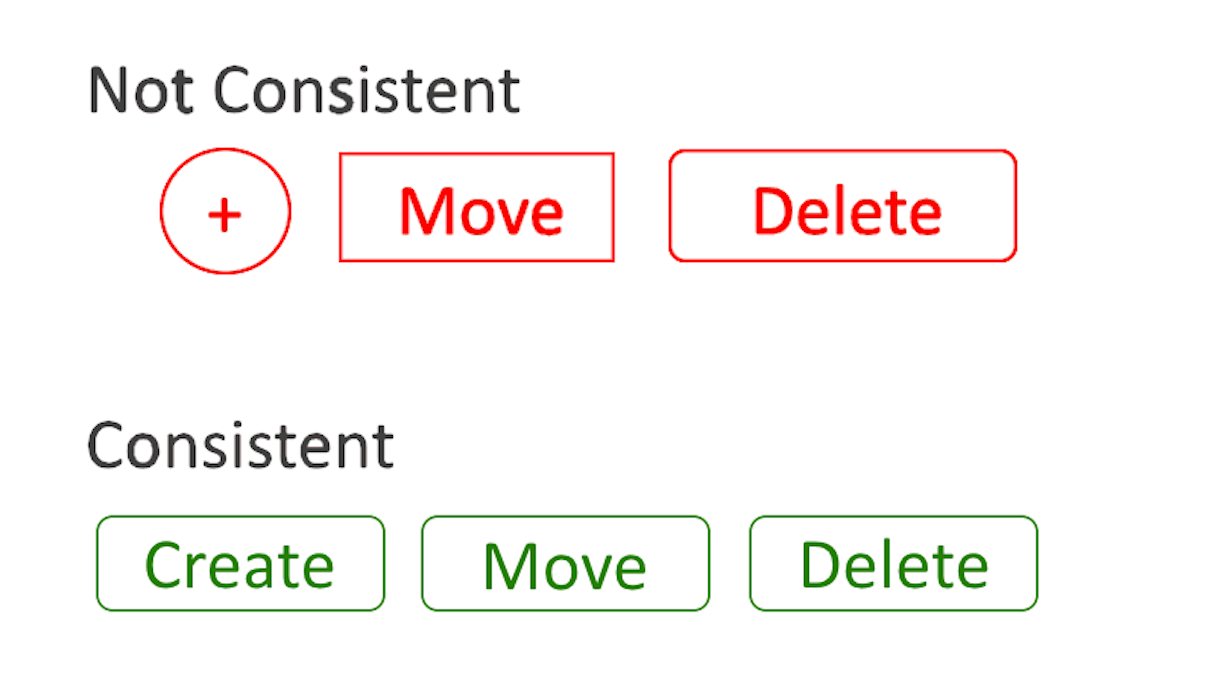
Inconsistency creates confusion. When elements with the same function look different in different parts of the app or website, users might get confused.
Consistent design allows users to transfer their previous knowledge to a new situation when interacting with a product. One way to achieve consistency in design is by leveraging style guidelines.
Clearly label elements
Vague labels on interactive elements is another common problem of many UIs. A button label that doesn’t offer a clear explanation of what happens next causes uncertainty. Uncertainty causes friction.
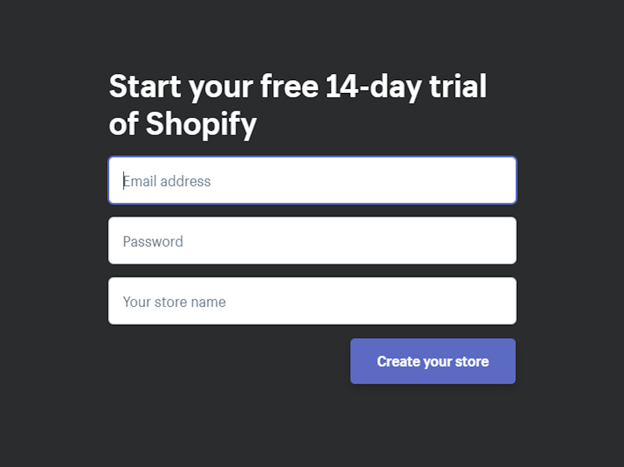
Users should always know what to expect when they interact with a UI. That’s why all interactive elements in the UI should be clearly identified with labels describing their function. When selecting labels, consider using the text that explains what will happen after users interact with an element.
You might also like: When Should You Personalize The Ecommerce Experience?
3. Guide users
Guiding users means helping them take action or make the right choice when interacting with an app or website. Below are some key ways to help guide users through the UI.
Emphasizing key functions, controls, and buttons
Imagine that you’re a first-time user arriving on a particular page. The page looks flat and nothing draws your attention. You probably won’t be able to tell what is more or less important on the page, so you’ll spend some time trying to figure it all out.
Make the task easier for a user by designing each page in a way that makes it easy to digest. The human brain is hardwired to see differences, and designers can use this property to direct user attention to particular elements of UI. Use color, size, and shape to prioritize and emphasize important elements.
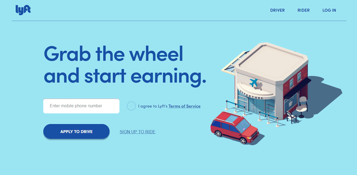
On their website, Lyft does a very good job of prompting new users to explore an opportunity to become a driver. Eye-catching text copy paired with big call-to-action button direct users to commit the action.
Provide contextual instructions
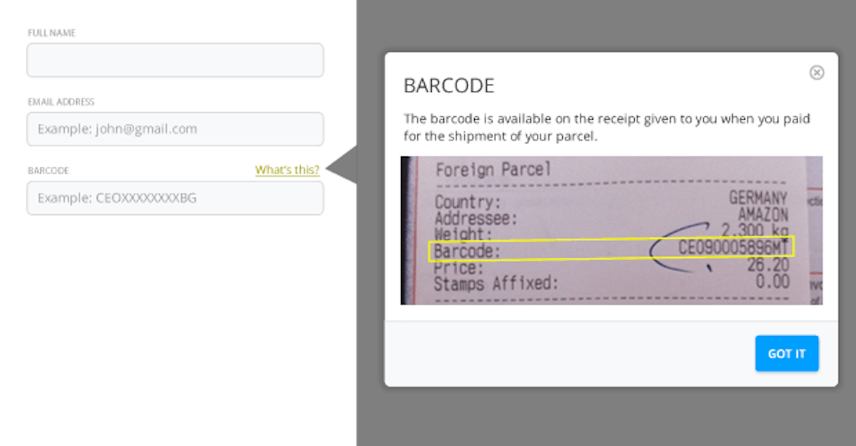
To really help guide users, give them instructions on how to complete a certain task. Contextual instructions are extremely important in parts of an app or website that require user input.
Forms are places where contextual instruction can really benefit your users. In the example below, users are asked for the barcode information. Without contextual instructions, users might wonder what this field means.
4. Make design accessible
A well-designed product is accessible to users of all abilities, including those with impaired vision, hearing impairments, or motor impairments.
Eliminate readability and legibility issues
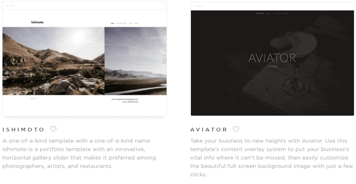
Text should be readable, large enough and well-spaced. Legibility issues are at their worst when text is placed within a ‘busy’ background, or when it doesn’t contrast enough with its background (i.e. gray text on gray background).
An easy way to check if text contrast meets WCAG 2.0 standards is to use the tool WebAIM: Color Contrast Checker.
5. Handle errors gracefully
Of course, apps should prevent users from making errors in the first place. But even when errors occur, good UI provides a clear route to resolve the issue.
Anticipate possible errors
Prevention is better than a cure. When designers brainstorm for potential pitfalls, they end up designing better experiences.
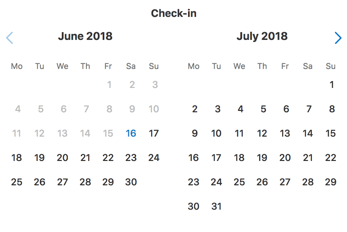
Booking.com is a good example of preventing user errors. They don’t allow users to choose check-in dates from the past.
Use inline validation
Users face a lot of trouble when filling out forms. It’s possible to make this process less painful by using a technique of inline validation. Inline validation notifies users about the problem precisely at the time when the problem arises, instead of when users submit the form.

Create FAQ sections
Introducing a section for frequently asked questions can help users solve common problems without reaching out to the customer assistance center. A study by Aspect Software found that 69 percent of users, “feel good about themselves and the company they are doing business with when they resolve a problem without talking to customer service.”
Provide users with the ability to solve their own problems, reducing friction for them and your business.
6. Prioritize clarity over cleverness
Clarity has a direct impact on user experience. By making things clear, designers make it easier for users to interact with a product.
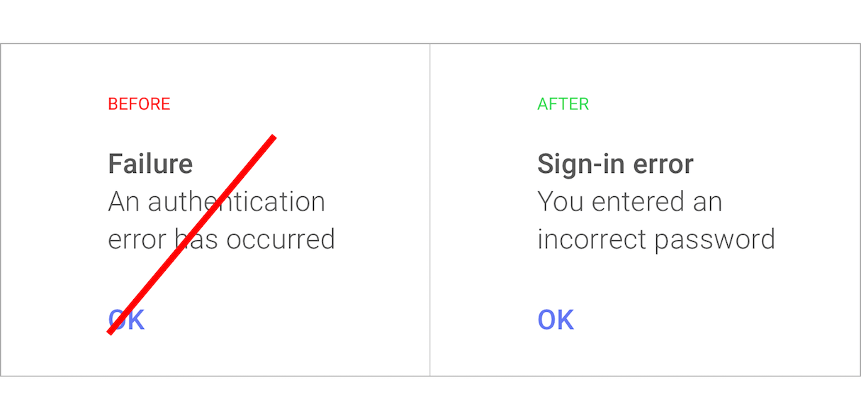
Avoid using jargon
Jargon increases complexity. While some designers add jargon intentionally (i.e. to sound smart), most often jargon is added without any particular purpose. Designers think that their users are just like them and won’t have any problem decoding the message.
Don't overestimate the technical competency of your users (even if your users are tech savvy). Keep in mind that copy needs to carry the lightest possible mental load. Think about using terminology your users will understand to help them interact without any difficulties.
Design predictable experiences
When users interact with a new product, they should be able to learn quickly. This happens only when users can transfer their previous knowledge and skills to the new experience.
Every time you stray from commonly-accepted patterns and use your own unique solution, you force users to relearn how to interact with your product. By sticking to recognizable conventions, you can reduce this learning curve.
Navigation made simple
It’s obvious that navigation has to be easy and intuitive. Surprisingly though, more often than not, navigation is the source of bad friction.
Navigation is a complicated subject. It is true that there’s no one-size-fits-all solution when it comes to navigation, but there are some common practices that can be applied to create better navigation experience. Help users navigate your app by:
- Designing clear layouts with distinct calls to action. Users should be able to move around to different areas of the app/website easily.
- Giving users confidence in knowing where they are in your app/website.
- Testing your design. Streamline the process of understanding what works and doesn’t work for your users by learning from them. Usability testing reveals how users access information—use techniques of card sorting and tree testing to figure out users’ natural thought patterns.
You might also like: 15 Myths That Can Ruin Your Mobile UX.
7. Shorten the number of steps
Every step in the journey, from the initial sign-up to individual operations, requires a certain amount of effort on the user’s side. This can create friction, so it’s essential to get rid of all extra steps in the user flow. Keep the conventions of the KISS design principle in mind when designing user flows, and remove or optimize steps that can cause friction.
Only ask for required information
Don’t ask users for the information you don’t need (at least don’t need right now). For instance, during sign up, it might be tempting to ask for as much information as possible. Avoid that temptation. The more steps it takes for a user to complete a task, the better the chances they’ll abandon the process. Thus, only ask for the information you absolutely need. You can get other details later if needed.
Airbnb’s book and apartment flow is an excellent example of asking just enough details. Airbnb delays asking for the contact confirmation until users find the apartment they want to book. At the point in the journey when a user has already found a home they’d like to book, they won’t mind spending an extra minute to confirm contact details.

Take advantage of default settings
Defaults are the values or settings that come out of the box. They might not seem like much, but defaults hold immense power—they make decisions for users. When you are sure that most of your users (say, 95 percent) will choose a particular option, you can save them the hassle of doing it themselves.
Statistically speaking, users will stick with the defaults you give them. According to Jared Spool and his article Do users change their settings?, less than 5 percent of users will change the default settings.

Offer personalized experience
Use the data you have about your users to deliver a personalized experience for them. Big corporations such as Amazon and Netflix offer tailored recommendations based on previous purchases and viewing habits.
Netflix’s ‘recommended’ category is a good example of personalized experience. By capturing what the user liked in the past, the service simplifies the process of making a choice—users have a limited number of options that were selected according to the user’s personal preferences.

Offer auto-populate details
In some cases, data in a product’s user interface can be filled automatically without additional user effort. For example, if an app or website knows the user’s location, it can auto-fill appropriate form fields.

Simplify routine operations
Routine tasks are something users have to do on a regular basis when they interact with a product. Users rarely find routine tasks exciting, but they know that such tasks are inevitable if they want to reach a goal. However, the less time required to complete routine tasks, the more beneficial product becomes for users.
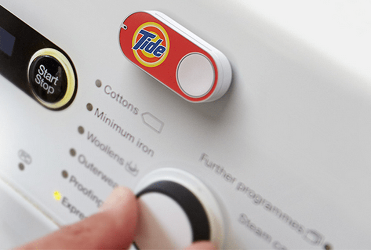
In the attempt to reduce friction when customers want to reorder a product, Amazon introduced their Dash order system. Ordering using this method means simply pushing a physical button every time you need a specific product.
Reduce friction to help users
Almost two decades ago, Steve Krug first advised designers to not make users think. Today, designers follow this advice by making frictionless interactions a qualifier for evaluating user experiences.
Mastering the art of reducing bad friction creates a significant competitive advantage. The smoother user flow, the better the chance of having happy users.
Read more
- How to Improve Your Shopify App's Onboarding Flow
- How to Get Reviews for Your Shopify Apps
- Content Strategy: The Principles we Followed to Build the New Shopify App CLI
- Shopify's Mobile Device Testing Lab Gets Wheels
- The Top UX Elements to Optimize Your Clients’ Product Page Design
- Typography in UI Design
- The Top 4 Reasons Users Abandon Their Carts and What to Do About it
- How to Use Eye Tracking in Usability Tests
- What Makes or Breaks an Ecommerce Shopping Experience? This Survey has the Answers
What steps do you take to minimize bad friction? Tell us in the comments below!


