If you’re doing conversion rate optimization for a client on their Shopify store and get a lift of 1%, that’s a huge win. You’ll be popping champagne and discussing what their business can do with tens of thousands of dollars of extra revenue.
So why is it that another tactic that often has the potential for a similar impact on a store’s bottom line often goes completely ignored?
If you didn’t put two and two together from the title of this post, I’m talking about performance optimization — the art of making websites load, render and respond faster.

So many sites these days are getting sluggish - huge images, slow load times, pages that are unusable until a custom web font has downloaded.
Sitting on a high-bandwidth connection in our offices, and not experiencing our stores through the eyes of customers, it’s easy for both developers and clients to overlook performance and instead focus on that snazzy new lightbox or worry about the colour palette.
In this post, I’m going to tell you why performance optimization should be on your agenda as you build your themes, and the tools and techniques you can use to turn a sluggish site that frustrates customers into a fast one that converts them.
You might also like: An Overview of Liquid: Shopify's Templating Language
So... why worry about performance?
Back in 2009, Eric Schurman at Bing and Jake Brutlag at Google ran a series of experiments to see how their users responded to increased server delays.
The results were pretty compelling: in Google’s case, an added delay of less than half a second led to a 0.6% drop in user engagement. Bing went even further and subjected their test users to a full 2 second delay - and saw engagement (and revenue per user) drop by over 4%.
In the context of eCommerce, site performance is now actually more important than ever. As more and more businesses move online, consumers have more choice about where to spend their money, and their patience for less-than-optimal purchasing experiences decreases.
Steve Souders, author of “How Fast Are We Going Now?”, puts it this way:
“Consumers are expecting a faster web. Businesses succeed with a faster web.”
How and what to measure
Okay, so now that you’re convinced that performance is important, how do we go about improving it in our Shopify themes?
Like so many things, the first step in being able to improve performance is to know where you stand currently (“you can’t manage what you can’t measure” and all that).
A few tools that help with this are:
PageSpeed Insights (Google’s online tool, also built in to Chrome’s developer console)
YSlow (A browser plugin for Safari and Firefox)
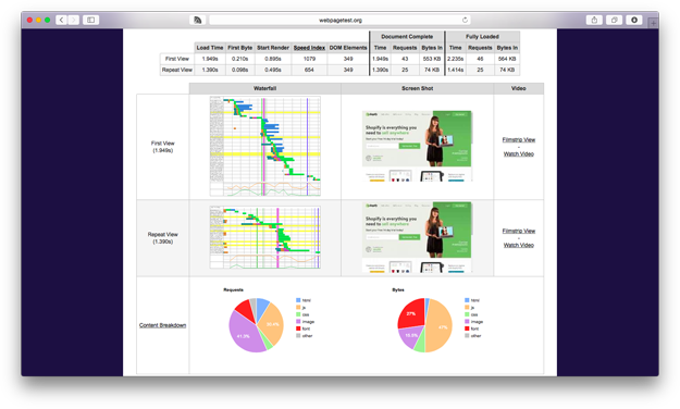
WebPageTest.org (My new favourite tool, with lots of advanced options).

It’s not so important to spend a lot of time deciding which tool - it’s just important to have a tool. Pick one that you’re comfortable with or have easy access to (PageSpeed insights is easy to get started with, especially as it comes integrated in Chrome).
All of the above tools will give you insight into the most important metrics for theme performance, which are:
- Page weight: How many bytes need to be transferred to the browser to display your site.
- Number of HTTP requests: Every HTTP request your browser makes for an asset, such as an image, stylesheet or script file, requires a round trip from browser to server and back again, along with all of the overhead that implies.
- Time to load: This is a bit of an ambiguous term, as it can mean different things (time to start rendering, time until the page is visually complete, time until all of the page assets are downloaded and ready). Generally, the most important interpretation for a Shopify site is the time taken for the page to be presented to the user, ready for interaction (time to the page being “visually complete”).
The rest of this post is going to cover a number of techniques you can use to improve these metrics. You should get into the habit of measuring, applying optimization techniques, then measuring again to evaluate any impact.
Over time, you’ll develop a good sense for which techniques give the biggest wins.
You might also like: An Introduction to Theme Options
Technique 1: Simplify and remove
You know the old saying, “less is more”? Well, in the case of web performance, that’s definitely true. The “less” of your theme there is — the fewer the images, requests, page elements — the faster your page will load and display.
Just like authoring good writing, authoring performant Shopify themes does require ruthless editing.
The great thing about this technique is that you get some side benefits beyond the performance implications. Just like editing writing makes things much easier for readers, editing your Shopify themes also makes things clearer and easier for your customers, as well as improving your life as a developer by reducing your maintenance burden. It’s a real win-win-win!
If you’re looking for ideas on the sort of things you can do to “edit down” your Shopify theme, here are some ideas:
- Refactor CSS: it’s easy to build up technical debt in your CSS files over the course of a site’s development. Refactoring and simplifying your CSS will not only save on stylesheet size, but also make the site more maintainable and consistent for visitors.
- Kill carousels: Carousels are not only horrid for usability, they often load lots of heavy high-resolution images. Do your users and your site’s performance a favour by replacing the carousel with a single (optimized) image.
- Replace background images with CSS: CSS can do some pretty awesome stuff these days. If you’re currently using tiled images for background images, consider replacing them with a CSS background.

Technique 2: Image optimization
Images make up the largest percentage of the weight of most sites, and you can get some big wins with very little effort.
Here’s the crazy simple way to trim down your theme in less than 50 seconds:
- Download ImageOptim and open it;
- Drag your theme’s “assets” folder into the application;
- Wait to see how much weight you just trimmed.
It really is that simple!
Once you’ve seen the benefits of image optimization in action, you’re likely going to want to use it all the time. That’s when having a development workflow that includes some task automation tools comes in handy. I strongly recommend Grunt, which has an official plugin for automating the optimization of images using the same libraries as ImageOptim.
Technique 3: Concatenating and minifying Assets
For every Javascript, stylesheet or image your page references, a client’s browser has to make a HTTP request to fetch, download, and parse that asset. We can reduce the number of files a browser has to download, and the size of those individual files, by using two common techniques:
Concatenation is the process of combining multiple asset files into a single file in order to reduce the number of requests the browser has to make, cutting down on this overhead and making for faster load times.
Minification strips out all of the extraneous information in assets that make it easy for humans to read and write but that aren’t needed by your browser (things like newlines and whitespace). In the case of Javascript, minification can also aggressively optimize your code size by doing things like rewriting “var aLongVariableNamedUsefulForHumans” to “var a”.
You can concatenate your script and stylesheet files simply by copy- pasting their contents into one large file. Minification can be achieved through a number of online services that accept your unminified input and spit back a compressed version (here is an example of one that handles both Javascript and CSS).
Of course, doing these things manually every time you change a file is a pain, so as with image optimization, I suggest you look at incorporating concatenation and minification into your workflow in an automated fashion. For Grunt users, grunt-contrib-cssmin and grunt-contrib-uglify have you covered.
Technique 4: Lazy image loading
This technique can be really powerful for Shopify stores, as they are often so image-heavy. Lazy loading images involves using a Javascript library to only load images when they should be visible in the user’s viewport, improving initial page load times.
It’s especially handy when your theme involves very tall pages where lots of visitors won’t actually need to load the majority of your content. Matt Mlinac’s lazyload jQuery plugin is a very solid implementation.
Technique 5: Device-responsive design
Before “responsive design” came to mean that thing we do dragging the width of our browser back and forth, it had a broader meaning — that websites could respond to a whole range of contexts to deliver the best experience.

A good example of where this idea comes in handy in the performance arena is with “retina” or “high-resolution” images. A common technique for high resolution images over the last few years has been to simply serve all clients a high-res image resized to be half the size. Browsers then do the work of resizing and displaying appropriately.
The problem with this approach is that it’s very wasteful when serving to screens that aren’t high-resolution — they’re downloading an image that is 4x the physical size for no advantage. “Device-Responsive Design” takes this sort of thing into account by only loading high-resolution images on high-resolution devices, either through the use of media queries or a Javascript library.
Interested in levelling up your Shopify theme skills?
In the new course Mastering Shopify Themes, Gavin shares his expertise in order to help you build themes that delight clients and convert customers. Learn more here.


