Design is about communication and the majority of information we receive on the web and in mobile apps is in written form. Name at least one web site or mobile app that you use that does not have text. It’s hard, right? But just the presence of text in the UI doesn’t guarantee a positive user experience. You need to honor the rules of typography.
Typography is a design discipline that explores how the formation of letters and words affects the readability and legibility of text. Typography directly impacts UX: the more you expand your understanding of typography, the more you can optimize the usability of a product.
"The more you expand your understanding of typography, the more you can optimize the usability of a product."
In this article, I want to offer a quick summary of basic typography terms and rules for designers.
The difference between “typeface” and “font”
Let’s start with a question many designers ask: “Are ‘typeface’ and font the same?”. The answer is no. Although these terms are often used interchangeably, they are quite different.
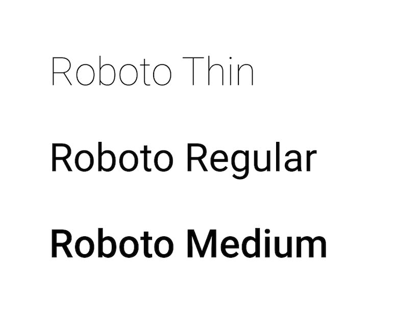
Let’s start with typeface. The word comes from physical print and it means the faces of physical letter blocks. A typeface represents shared patterns across a collection of letters. In the context of digital design, typefaces mean a family of related fonts. For example: Arial, Helvetica, and Roboto.
Font, on the other hand, is a specific style, size, or weight, within a typeface. For example, Roboto Regular 36 px is a font.
7 essential rules to remember when selecting typefaces
Now let’s discuss seven essential rules for selecting typefaces. The typography recommendations mentioned below are based on Apple’s Human Interface Guidelines, Google’s Material Design principles, and Microsoft’s guidelines.
Rule #1: Minimize the total number of typefaces you use in your design
Too many different typefaces can make your design look sloppy. Ideally, you should have two typefaces—one for headings and another for body text. It’s recommended to start by selecting a typeface for your body text.
Why?
Because body text is the most common element in a product and your body text's look and feel will have the greatest impact on how you want your design to be perceived. The typeface you select for your body text will affect any other typeface decisions like headlines.
Rule #2: Know the difference between serif and sans-serif typefaces
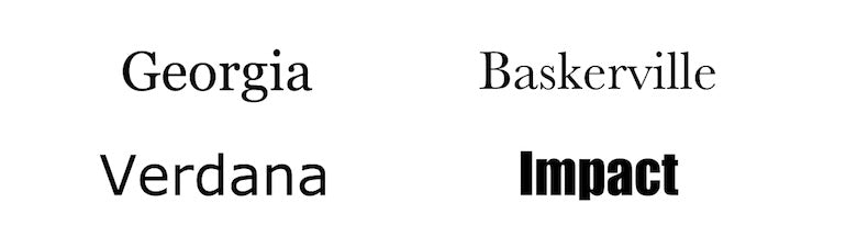
A serif is a small shape that appears at the beginning or end of a stroke in a letter. Typefaces with serifs are called serif typefaces. Serif typefaces look a bit old-fashioned, and they are useful for emphasizing sophistication and honoring traditions.

Sans-serif typefaces do not have strokes at the beginning or end of a letter. The word “sans” comes from French, and it means “without.” Sans-serif typefaces emphasize simplicity—the lack of decorative elements help show off a modern and casual look. Helvetica is probably the most famous sans-serif font of all time.
In digital design, serif typefaces work well for headings, but they are not suitable for body text (because they negatively impact readability).
Rule #3: Select complimentary typefaces
When you select two typefaces, ensure that they work well with each other. The typefaces should complement each other, not compete for the user’s attention.
Rule #4: Strive for consistency in your typeface selection
Consistency in UI design is using the same (or similar) visual style for UI elements from the same groups. Consistent visual design is the key to a comfortable user experience because it reduces confusion. When it comes to typeface selection, stick to the same typefaces throughout your entire design or product.
Rule #5: Select typefaces that scale well
Considering the likelihood that you will design a product for desktop and mobile devices, it’s vital to choose a typeface that will remain legible on smaller screen sizes. For that reason, it's better to avoid handwritten typefaces such as Vivaldi. Although a typeface like this is beautiful, it doesn’t scale well and text in this typeface is difficult to read on a small screen.

A safe bet is to select system typefaces like Apple’s SF Pro and Google’s Roboto because they are optimized to work on different types of devices and resolutions.
Rule #6: Consider localizability
If you’re building a product for a few markets, you need to consider how the text may look when translated into a different language. Typefaces should include characters that exist in other alphabets, not only in the English alphabet.
You might also like: Don't Get Lost in Translation: What is Pseudo-Localization and Why You Should Care.
Rule #7: Select a typeface that enriches the UX
Typography is a part of the visual language you use to communicate with your client’s users. It should not be purely utilitarian: you can use a typeface to make a bold statement. Select typefaces that express your client’s brand presence or convey the right mood. Think about the content the product is presenting and how you want your client’s product to be perceived.
7 typography properties for improving text readability and legibility
Now that we’ve discussed essential rules for selecting typefaces, it's time to focus on the two most crucial text properties—legibility and readability. Legibility is a measure of how easily a reader can distinguish individual characters of text. Readability is a property of text that refers to how easy it is to read words or blocks of text.
"Legibility is a measure of how easily a reader can distinguish individual characters of text. Readability is a property of text that refers to how easy it is to read words or blocks of text."
Here are several fundamental properties that have a direct impact on legibility and readability.
1. Text size
Text size is an essential property that has a direct impact on both legibility and readability. Finding the proper size for text is tricky—a small text size will cause eye strain, but a large text size will distract the reader and break the reading flow. Thus, when it comes to text sizing, it's vital to find a proper balance.
Here are two basic rules to remember:
- The larger the screen, the bigger the text. The more screen space you have, the larger text size you can (and should) use.
- Use density-independent pixels for fonts. When you use density-independent pixels for fonts, you allow users who have larger text settings for accessibility to see font sizes that match their text size preferences. Google's Material Design guidelines recommend using 16sp (“sp” means scalable pixels) as a minimum size.
2. Line height
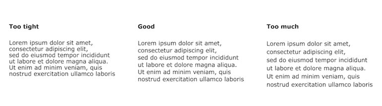
Line height is the vertical distance between lines of text. When the line height is too small, it becomes harder to read the text (it feels like the copy doesn’t have enough breathing space). By increasing the leading, you increase the vertical white space between the lines of text and it leads to better readability (most of the time) in exchange for screen real estate (as the text will take more screen space).
How do you find the ideal line height? It’s recommended to select a line height in proportion to font size. In many cases, the optimal line height is between 120 percent and 145 percent of the font size.
3. Line length
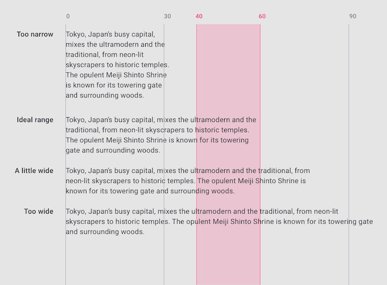
Having the right amount of characters on each line is key to make your text readable. When people read lines of text, their attention is focused at the beginning of each new line, but it slowly wears off as they start to read the words. The more words that are in each line, the harder it is for readers to stay engaged.
According to Material Design guidelines, the ideal line length for English body text is 40 to 60 characters per line (including spaces). This number of characters guarantees good readability.
You might also like: 9 Steps to Establish Strong Design Principles for Your Team.
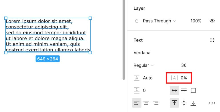
4. Letter spacing
Letter spacing is the spacing between individual letters. Generally, it's recommended to use tighter letter spacing for larger type sizes (i.e., headlines) because by reducing the space between letters, you will improve readability. However, in most cases you don’t need to worry about that because the letter spacing is defined by the tool you use to design products. Design tools like Figma handle character spacing for designers automatically.
5. Text alignment
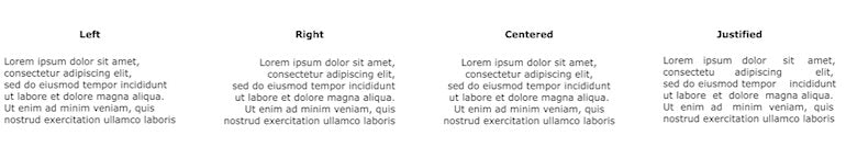
There are four types of text alignment:
- Left alignment (when text is aligned to the left margin). People who live in the Americas and Europe typically read from left to right, which makes left alignment the default option for the products focused on this market. Keeping your text to the left is the first step to ensuring good readability.
- Right alignment (when text is aligned to the right margin). Right-aligned text is the default option for Arabic, Hebrew, and other right-to-left languages.
- Center alignment (when text is aligned to the center of the content container). Centered alignment is not recommended for long copy, but it works well for relatively short text blocks such as pull quotes.
- Justified alignment (when the text is made to fit within a given space). Justification works by adding white space between the words in each line so all the lines have the same length. I recommend that you don’t justify text because it will create gaps within your text.
6. Vertical rhythm
Vertical rhythm is the process of organizing text for comfortable consumption. When users first arrive on a page, they scan it rather than read it. Having a good vertical rhythm will help them scan the page easier.
Here are a few things to remember when creating a rhythm:
- Use font style attributes (such as size, weight, and color). These can highlight the most critical information on a page or screen.
- Make essential elements such as headings and subheadings the most significant. The headlines should attract the eyes of a reader. Use different sizes or colors for titles.
- Use bullet points. Bullet points will help you reduce the monotony of paragraph after paragraph of text and help users comprehend the information you are trying to convey. Information in bullet points is generally easier to comprehend and remember than the same information presented in a regular paragraph.
- Add negative space around essential elements. Negative space is one of the necessary tools of minimalist web design. It affects how we focus our attention on content. The more whitespace around the element, the more our eyes are directed towards it.
- Avoid ALL CAPS. All caps text is copy with all the letters capitalized. This type of text is acceptable in contexts that don’t involve reading (such as acronyms or logos), but it's better to avoid it for body copy. As Miles Tinker mentioned in his book Legibility of Print, all-capital print dramatically slows down the speed of scanning and reading compared to lower-case type.
- Avoid blinking text. While moving or pulsating text can draw a user’s attention, it is likely to be annoying or distracting for your visitors.
7. Accessibility
Color and contrast plays an important role in text legibility. To maintain good text legibility, it's recommended not to use similar colors for the text and background. In fact, The Web Content Accessibility Guidelines (WCAG 2.0) require a 4.5:1 color contrast ratio between text and background for normal text and 3:1 ratio for large text. Use the WebAIM Contrast Checker to check whether your text passes these accessibility standards.
If your app has both a light and dark UI, ensure that the text is available in a contrasting color against each theme.
You might also like: Skeuomorphism in Digital Product Design.
Typography is the heart of good visual design
Typography is an integral part of almost every digital experience because it acts as a glue that holds the different parts of a product together. You should consider various aspects of typography (typefaces, font sizes, widths, colors, etc.) because all of them work together to create a usable and beautiful system. The ultimate goal is to make the copy feel pleasant to the eye, and when designers achieve this goal that improves the product’s overall UX.
Read more
- Shopify's Mobile Device Testing Lab Gets Wheels
- Forget User Experience. Start Thinking About Client Experience.
- 6 Principles of Effective Interaction Design
- Agile Design: An Introduction
- What to Consider When Planning a Website Redesign
- Paul Boag Shares a Favorite Ecommerce Project
- 5 Common Digital Content Problems and How to Avoid Them
- The Key Aspects to Consider When Building Multilingual Websites
- UI of the Future: The Basic Principles of Conversational User Interfaces
- 5 Killer Web Design Trends to Watch in 2016