When building tools for entrepreneurs, you have the responsibility, more than anywhere else, of optimizing for ease of use. As Shopify app developers, creating tools that entrepreneurs use to power their businesses is what we do at Swym day in and out — so making our software easy and intuitive to use is a key business requirement to ensure that we maximize the adoption and engagement we get for our products.
To make our apps consistent as we scale features, we use Polaris, Shopify’s design system. In part one of this three-part series, we will look at what led us down this path, the rationale behind design systems, and how Polaris in particular solves the problem of consistency.
Learn how to create an effective design brief to help your design process.
You might also like: Introducing New Updates to Polaris: More Ways to Build a Great App UI.
Identifying the problem
As you might be aware, our primary goal at Swym is to make it easy for Shopify stores to create a seamless experience for their end-users—shoppers. As it happens with most startups or app developers, we started with a baseline set of features in our apps, drawn up in prototyping, that we felt were good enough (learn more about rapid prototyping, or take a look at some great prototyping tools to help with your own process).
The core guiding principle we’ve followed is to keep the barriers to adoption as low as possible for our apps, for without customers adopting the app, everything else is moot. At the same time, we are always pushing to iterate faster, address customer feedback and to roll features out more rapidly so that our customers benefit from it as quickly as possible.
Attempting to address all of those opportunities in rapid development cycles inevitably leads to some healthy friction between pace of feature delivery and the need to ensure a consistent experience. And with small teams, consistency usually gets compromised in the interest of driving near-term value for customers.
While there might be some instant gratification with running fast and delivering that near-term value, the lack of consistency in the experience ends up costing you way more in the long run. Not only does this make integrating across features increasingly harder and more expensive over time, the lack of consistency also leads to a significantly degraded overall user experience and dissatisfaction among your customers.
As our adoption grew, this became painfully obvious to us. It was clear that we needed to step back and rethink our approach for it to be truly scalable. Solving this problem is where design languages come in.
Get some inspiration in our article on great examples of what makes a strong web design portfolio, or learn more about reducing bounce rate for your clients.
Designing consistently
Good design principles mandate that we make the most common tasks easily accessible , and provide a consistent experience to the user across all touch-points. However, the reality is that building a consistent user experience across the board becomes really hard to do, given the way teams work.
Teams of designers, typically working in parallel, create experiences depending on the project requirements. It isn’t always a straightforward process for them to come out with interfaces that feel consistent. This is particularly true in cases where the product scope has evolved organically over time, and taken on objectives that hadn’t originally been anticipated.
Furthermore, designs are created to cater to particular needs. Maybe a page needs a playful feel to it because of content heaviness, resulting in the use of lighter colors. Or maybe the ‘Save’ action of an important setting needs a two-phased commit process, resulting in the use of a modal with a confirmation message.
Even in these unique cases, the designers should stay consistent. This means that designers should use the existing foundation of colors and styles, and create variations on components cautiously. As users discover more functionalities of the app, they should still understand how things work, when to expect feedback, where to discover options, and most importantly, how to consume presented information. Every new learning curve you throw in the face of your users is one more reason you are giving them to not use your product.
"Every new learning curve you throw in the face of your users is one more reason you are giving them to not use your product."
You might also like: Building Apps: 3 Things we Learned in Making Design Consistent and Scalable.
What makes a good design language?
Design languages are like lego block sets : each block dictates by its inherent design attributes how and when it can be used.
A good design language provides the following three things .
- A set of reusable UI elements, such as buttons, form controls, etc.
- Guidelines and support on how to provide feedback on users’ actions, page loads, and other time-consuming processes
- A style guide that includes guidelines on typography, use of color, animation, best practices for the use of the reusable components, and notes on content (for example, how to write feedback or how to describe complex actions)
Design languages enforce consistency by clearly laying out the blocks and the color palette that one is allowed to play with. Given this, creating new experiences is just a matter of repeating those building blocks in the manner required by the functionality.
Using the right system
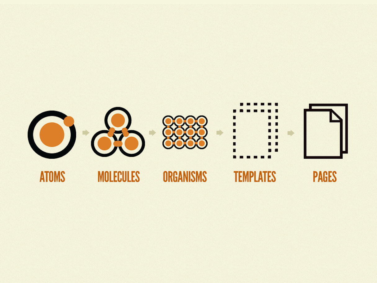
In his book Atomic Design, Brad Frost offers an interesting perspective on design systems, by drawing an analogy between design systems and atoms. Atoms are the building blocks of all matter, and complex organisms are just groups of two or more atoms held together by chemical bonds. The components of a design system function in a similar way.

Given this analogy, a question naturally arises. Can there exist one single design language that becomes the source of building blocks for all interfaces on the web? If so, we could use that across the board and solve our consistency problem.
As it turns out, that’s unlikely, primarily because interfaces built with a design language look very similar to each other. This is a good thing within a system, but it doesn’t work well across the web, where each business is working with a different audience with different priorities and preferences. It’s therefore important that you use a design system that’s appropriate to your design’s goals.
"It’s therefore important that you use a design system that’s appropriate to your design’s goals."
Of course, there are some very popular design languages/systems (for example, Bootstrap and Foundation by Zurb) that have a broad appeal, but these are relaxed versions of a full-blown ‘design language’ in the strict sense of the word. Ensuring consistency in the user experience isn’t a goal as such with these systems—instead, the focus is more on ease of development.
When it comes to a true design language, there typically always exists a mission statement — a group of ideals and principles that the language uses to make design decisions. Those ideals and principles derive largely from the primary audience that the language was intended for.
You might also like: Announcing Shopify’s New Sketch Plugin: Polaris Telescope.
Shopify Polaris
Given that their goal is to make commerce better for everyone, Shopify’s objectives with their Polaris design system stay true to that mission:
“We create tools that give even the most inexperienced entrepreneur the best chance to succeed. At the same time, we design products that help some of the world’s leading businesses manage enormous complexity.”
With Polaris, Shopify does a great job at including the components of a strong design system that we described earlier—reusable UI, guidelines for feedback, and a style guide—without being too rigid. The Polaris system can be accessed in two ways.
- An npm library that contains all the React components for the elements described in the language. This is as good as having APIs (React props) for each of the UI elements to provide callbacks for form controls, labels, button types, etc.
- A Sass/CSS file that contains classes for all the components used in the elements. This offers a more implementation-agnostic version of Polaris and can be used with any Javascript framework—or without any at all.
Using Polaris in our designs
Using Polaris, we’ve been able to solve some common UI challenges where inconsistencies tend to creep in. Below are three examples.
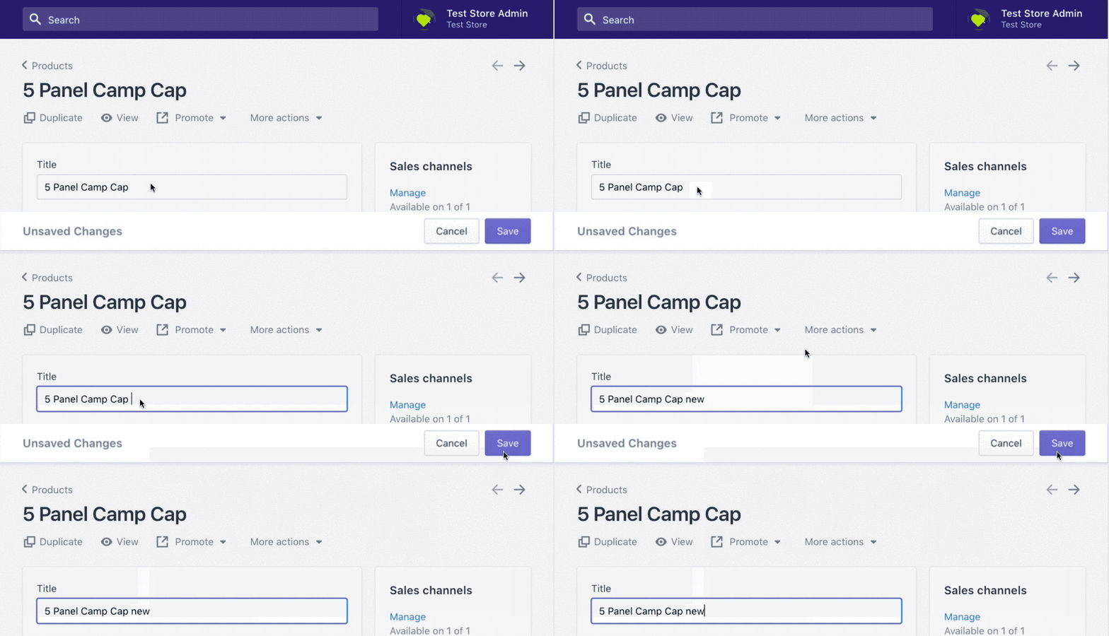
1. A two-phased commit process for an important setting
Sometimes, you need to build in functionality for users to confirm their actions in the app. Polaris suggests triggering a change of state in the Page header, enabling an explicit save button.

2. Custom buttons or non-primary CTAs
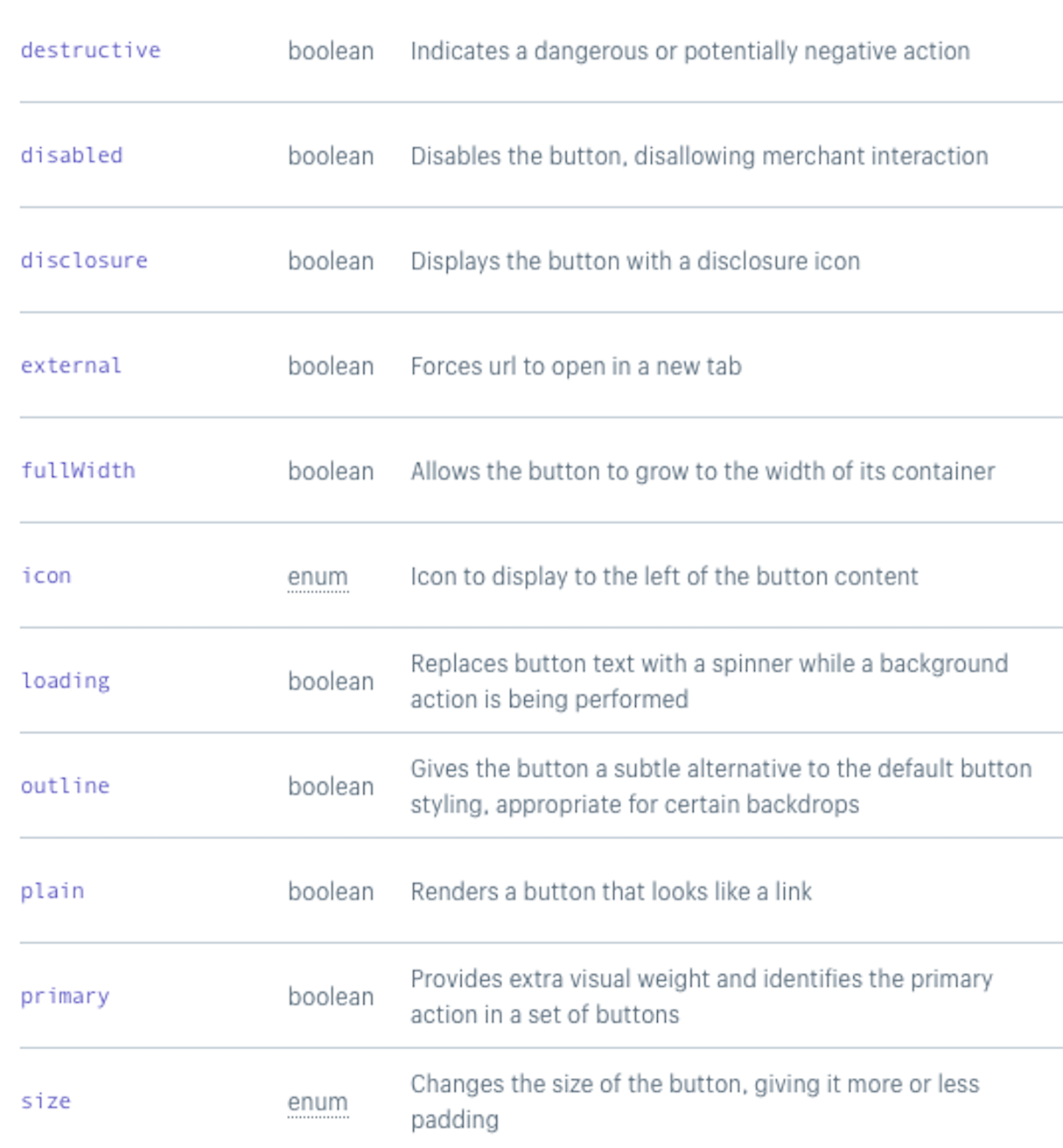
We inevitably run into situations where it is difficult to categorize buttons as being primary or not. Polaris offers a very clear spec for the kind of buttons one should use and how to use them.
With the detailed guidelines in the React Button Component API, it becomes very easy for us to decide which buttons to use in different conditions. For example, the Outlined buttons are great for secondary actions like upselling.

3. Feedback indication
This is an area where we commonly see inconsistencies crop up. This also happens to be a widely neglected area that can cause a lot of frustration to the user without anything being fundamentally wrong with the software. To help reduce user anxiety, Polaris offers several ways to show loading states for various types of processes.


All three options indicate to users the status of their action.
Designing for scale
These three uses just scratch the surface of the types of situations where Polaris can help. Its content guidelines, for example, are a great resource to help write CTAs in the proper tone, or to add consistent labels and descriptions.
It is always a challenge to take a step back and reevaluate your approach to design, because the immediate benefits aren’t necessarily obvious, and there are always new and compelling features to build that seem to get more attention. However, as your app platform matures, the varied and sophisticated set of capabilities you’ll need to support will require a robust design foundation.
Once you have the basic building blocks in place, your velocity of new feature development accelerates significantly. There isn’t one right answer to the ideal approach to take in that context, but the more clarity you have in your vision and how that aligns with your roadmap, the easier it will be to evaluate your options.
"The more clarity you have in your vision and how that aligns with your roadmap, the easier it will be to evaluate your options."
Based on our experience at Swym, using Polaris as our design language has helped us build a clear set of rules that we can follow as we build new features. This results in a user experience that looks polished and consistent, and the productivity gains we’ve seen in new feature development have more than justified the investments we made in adopting the system.
In our next post, we will go deeper into how we measured the areas of improvement in our original experience and what considerations one must make before deciding to migrate to Polaris.
Read more
- Learn About Shopify App Development at React Summit 2021
- How to Build Powerful In-App Surveys: Put the User First
- How to Level Up Your App with Theme App Extensions
- App UX Design In 2021: What You Need to Consider
- Creating Accessible React Native Apps
- How to Optimize Ads in the Shopify App Store
- How to Work with Shopify’s query Argument in GraphQL
- How We’re Improving Discoverability On The Shopify App Store
Have you implemented a design language in your work? Tell us your experience in the comments below!

