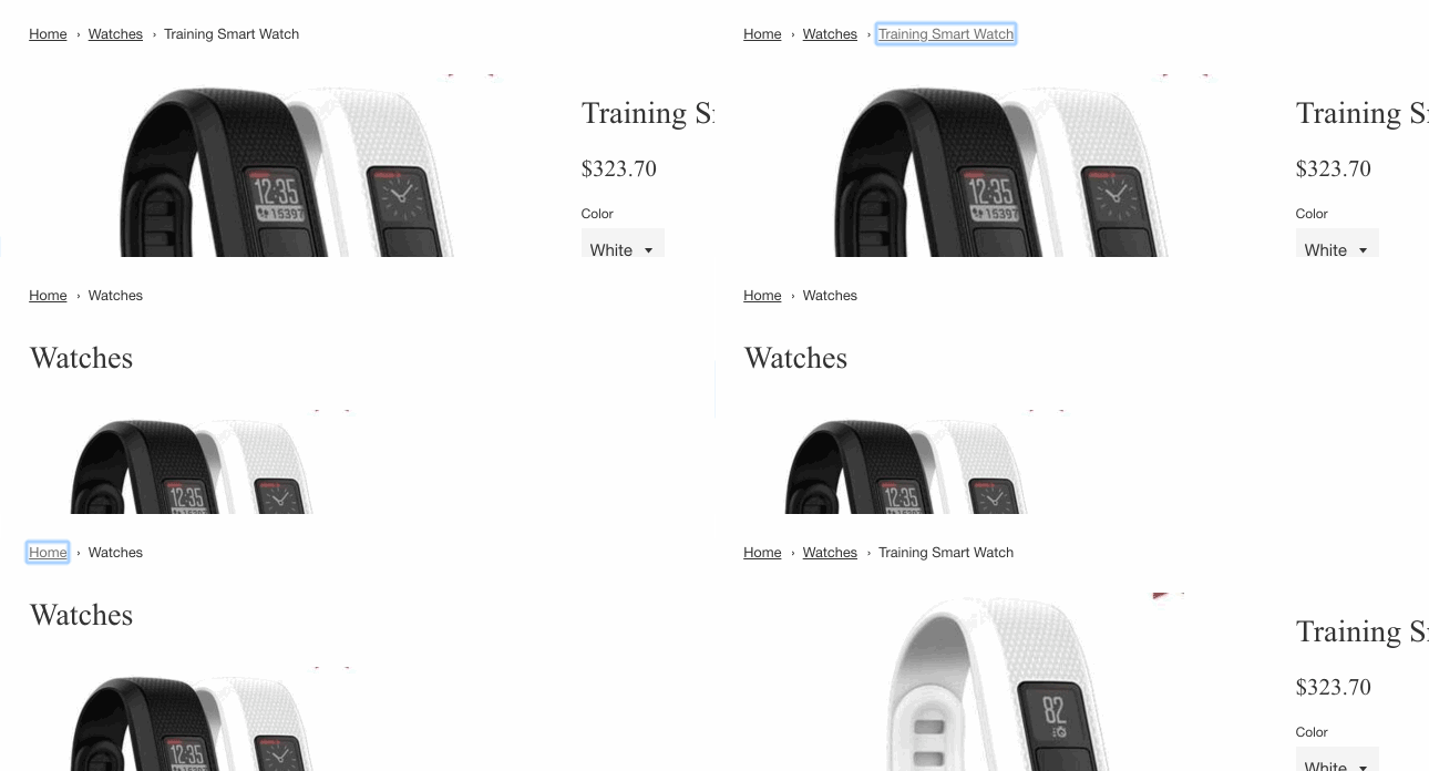
Breadcrumbs, or a breadcrumb navigation, can help to enhance how users navigate a website, especially if that website has many pages or products. Breadcrumbs can reduce the number of actions a visitor needs to take in order to navigate to a higher-level page, and improve the discoverability of a website’s sections and pages. A breadcrumb navigation shows a user which page they are currently viewing, by displaying a list of links to a user representing a website’s hierarchy in relation to that user’s current position.

This article will walk you through the process and reasoning behind creating an accessible breadcrumb navigation menu in a Shopify theme.
Basic structure and ARIA
After some research, I found documentation on breadcrumbs in the most up-to-date version of the WIA-ARIA (Web Accessibility Initiative–Accessible Rich Internet Applications) authoring practices. The WIA-ARIA specification outlines a basic example and some requirements when building accessible breadcrumbs. It states:
- Breadcrumb trail is contained within a navigation landmark region.
- The landmark region is labeled via aria-label or aria-labelledby.
- The link to the current page has aria-current set to
page. If the element representing the current page is not a link,aria-currentis optional.
There’s a great little example in this documentation. Additionally, Scott O’Hara has a nice implementation of it in this GitHub repo.
In this simplified example, a <nav> element has an attribute of aria-label="breadcrumb" to specify that this navigation is a breadcrumb navigation. This navigation element then contains an ordered list, because the items in it represent the hierarchical structure of the website. The last item in the list, which would contain a link to the current page, should have an attribute of aria-current="page" on the link element to indicate to screen readers which link refers to the current page.
Additionally, the › or / between breadcrumb navigation items should be added in with CSS, so that they do not interfere with screen readers.
So this is all well and good, but how do we make this work with Liquid and in a Shopify theme? Let me walk you through the implementation in a few steps.
1. Creating a Liquid snippet
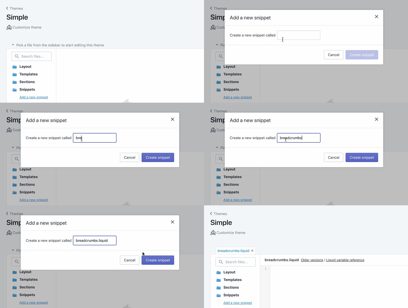
The first step is to create a Liquid snippet. We do this so that the code can easily be included in any template of a theme. To do this, you’ll need need access to your Shopify theme code, and in the snippets directory create a new file called breadcrumbs.liquid.

Add the snippet into layout.liquid
For us to test and to see our breadcrumbs, we need to include the snippet for all the pages of our site. The best place to output the breadcrumb snippet is above {{ content_for_layout }} in the theme.liquid file, just inside your main content wrapper. To output our breadcrumbs snippet add the following code where you wish them to appear:
{% include 'breadcrumbs' %}
Case statement for various templates
Now that we’ve created a new snippet for our breadcrumb, we can start writing some Liquid! First we’ll set up a case statement that can check each template type. This way, we can output the needed URL structure based on the template type.
First we assign the t variable to equal the template name, splitting on the . and then only grabbing the first word using the filter | first. This ensures that custom templates such as page.custom-name.liquid can be matched on the template type of page in our case statements. We’ve also set up the initial Home link here, and navigation structure to work within. The else case will output request.path along with the page_title variable as the link name to cover any additional cases that might fall outside of the ones we’ll be covering.
Because we need to include the aria-current="page" attribute on the link, we need to build our own <a> element manually with HTML and Liquid instead of relying on a filter to output an <a> element.
You’ll also probably notice that we’re missing › between each element. We’ll add those in later with CSS.
Page
Just after we open our case statement, we’ll check for page templates, and output the following list items.
Since pages are all on the same level, I’ve chosen to just include one level here. However, you can use linklist to output multilevel-page links if your site has a page hierarchy that is more robust.
You might also like: Building Nested Navigations with Shopify Link List.
Product
Next we’ll add a check for product templates.
In this next check, we look to see if a collection.url exists, and if it does output that before the product page link. I am using both the collection object and product object to output this breadcrumb structure.
Collection
For a collection template, building out the url structure is a tiny bit more involved.
We first want to make sure that a both a collection template and collection.handle exist. We also need to take into account that collections can be filtered by tagged products. I use the {% capture %} variable tag to set tag_url, which is the collection.url followed by the current_tags. You can test filtering with products in a collection with multiple tags by going to a url such as:
https://breadcrumbs-dev.myshopify.com/collections/collection-handle/tag-name+other-tag-name
Blog
We do something similar for the blog template, since Shopify has the option to have multiple blogs and articles filtered by multiple tags.
You can test that this is working by setting up a blog post with multiple tags and navigating to a url such as:
https://breadcrumbs-dev.myshopify.com/blogs/blog-handle/tagged/tag-name+other-tag-name
Article
The last template we need output breadcrumbs for are individual articles.
Here the breadcrumb is constructed of the blog.url and then the individual article.url.
Speaking of URLs, learn more about what a canonical URL is and why it's so important.
2. Checking for the homepage, cart, collection-listings and 404
If you navigate to the home page, we have a problem right now. You see a breadcrumb for Home that is outputting the name of the Store. Additionally, we probably don’t want breadcrumbs to show up on 404 pages, list-collection pages, or cart pages. We can wrap all the code in an unless statement, so the code only executes on pages that aren’t included in the list above.
The whole breadcrumb snippet together
For sanity’s sake, I’ve included the whole snippet with each case in our switch statement that was covered for each template type, as well as the pages we don’t want breadcrumbs to show up on.
3. Adding CSS and flourishes
To add in our › between breadcrumb links we can use CSS. This is the suggested way, as to not interfere with voice over or screen readers when navigating through the links.
You can add the following CSS to your stylesheet to style the breadcrumbs we’ve made:
These styles make sure to add hover and focus styles for the breadcrumbs, this ensures that interactions are visible at all times. We are also using the content field in our CSS to output › followed by a non-breaking-space using the following CSS entities ›\00a0.
4. Making it dynamic with theme settings
The last thing needed to really finalize our breadcrumb snippet is give the merchant the option to disable or enable breadcrumbs globally on their site. To do this we can use theme settings. All we need to do wrap the breadcrumb output in an if-statement, which references whether or not the theme setting is true or false. In your theme.liquid file around your {% include 'breadcrumbs' %} add an if-statement:
Then inside your settings_schema.json file, located in the config directory of your theme, add the following setting for Navigation and turning on and off breadcrumbs.
You might also like: An Introduction to Theme Options.
In conclusion
A breadcrumb navigation can be really useful for users navigating an online store . It’s an effective way of showing a website’s hierarchy in relation to that user’s current position and can provide some great usability benefits.
You should avoid using breadcrumbs for single-level websites, and they shouldn’t ever replace an effective primary navigation menu system. It is really an alternative way to navigate a website for visitors, but one that is great for discoverability.
Get building some breadcrumbs into your theme today!


