Minimalism is taking the world of design by storm. Today it is everywhere—in architecture, paintings, sculptures, digital products, and even in our lifestyles. Minimalism is also on the rise in digital product design, as more and more designers decide to follow a minimalist approach when creating products. Well-designed minimalist products are impressive—nice aesthetics paired with strong usability can create an excellent user experience.
But at the same time, minimalism is tricky to get right. In this article, we share six rules for creating effective minimalist designs. But before we get to that, it’s important to understand the concept of minimalism.
What is a minimalist design?
Minimalism is known as the art of less. Designers often use the phrase ‘less is more' when talking about minimalist design. But what does that really mean?
To find the answer to this question, we need to think about what design is. Designers know that design is not only about visual presentation and aesthetic—it is also about communication. Designers who follow a minimalist approach believe that this communication is best when it is concise. They try to strip away all unnecessary elements from their work and focus on what needs to be there: the key essentials.
The benefits of minimalist design
Why is minimalism so popular in design? There are a series of benefits that this approach provides.
-
Minimalism honours content. Content is king, and design should honor the king. One of the main goals of minimalist design is to bring attention to your content. Minimalism makes it easy to consume content, as users don’t need to spend extra time extracting essential information from tons of detail.
-
Minimalism helps achieve better performance. Minimalist products feature fewer objects and therefore load faster.
- Minimalism helps create a design that works for all screen sizes. With the growing use of mobile devices, many designers see minimalism as a solution for better compatibility between screen sizes.
You might also like: Frictionless Experience: How to Create Smooth User Flows.
Six elements of minimal graphic design
In order to achieve a minimalist design, there are six key elements you want to consider.
1. Content and features
Minimalism is about removing all unnecessary elements and distractions. When designers want to create a minimalist design, one of the first things they do is conduct a content and feature analysis. The goal of this activity is to prioritize all content and features, so they can identify what the essential components of the design are. Below are three aspects this analysis should consider.
The number of choices
Minimizing cognitive load is crucial for usable products. Hick’s Law states that the more choices a person is presented with, the longer it will take them to make a decision. Reducing the number of options and features not only optimizes a user’s approach to decision making, but also simplifies the task for designers.
Generic content
In his book The More of Less, Joshua Becker says, “You don’t need more space. You need less stuff.” In other words, it’s vital to get rid of anything that is not useful.
Here are a few simple tips that will help you achieve this goal:
- Think about each element individually and ask a simple question: “Does it serve a functional purpose? Or is it for decor?” If the element serves as a decoration, think about whether or not it should be in your design.
- Forget about generic stock photos. Do not include any elements unless they’re necessary to make your message clear.
- Communicate as succinctly as you can. Get rid of all unnecessary words and excess details.
Placement of high-level content
Your most relevant content should be placed at the top of a page. Visitors will choose to leave or stay on your page based on the first content that they see. In following the minimalist way of design, the content at the top of their screen should be relevant and succinct.
"Your most relevant content should be placed at the top of a page. Visitors will choose to leave or stay on your page based on the first content that they see."
2. Imagery
Some designers believe that true minimalist design doesn’t require any imagery. That’s not true. Minimalism isn’t about removing all illustrative elements, but rather the careful choice of when and where to use them.
Imagery is excellent for communicating ideas. When used correctly, imagery can act as a focal point:
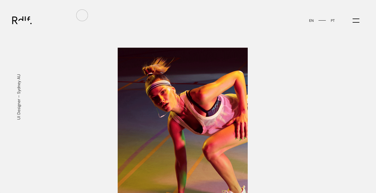
Or it can be used to create a balance:
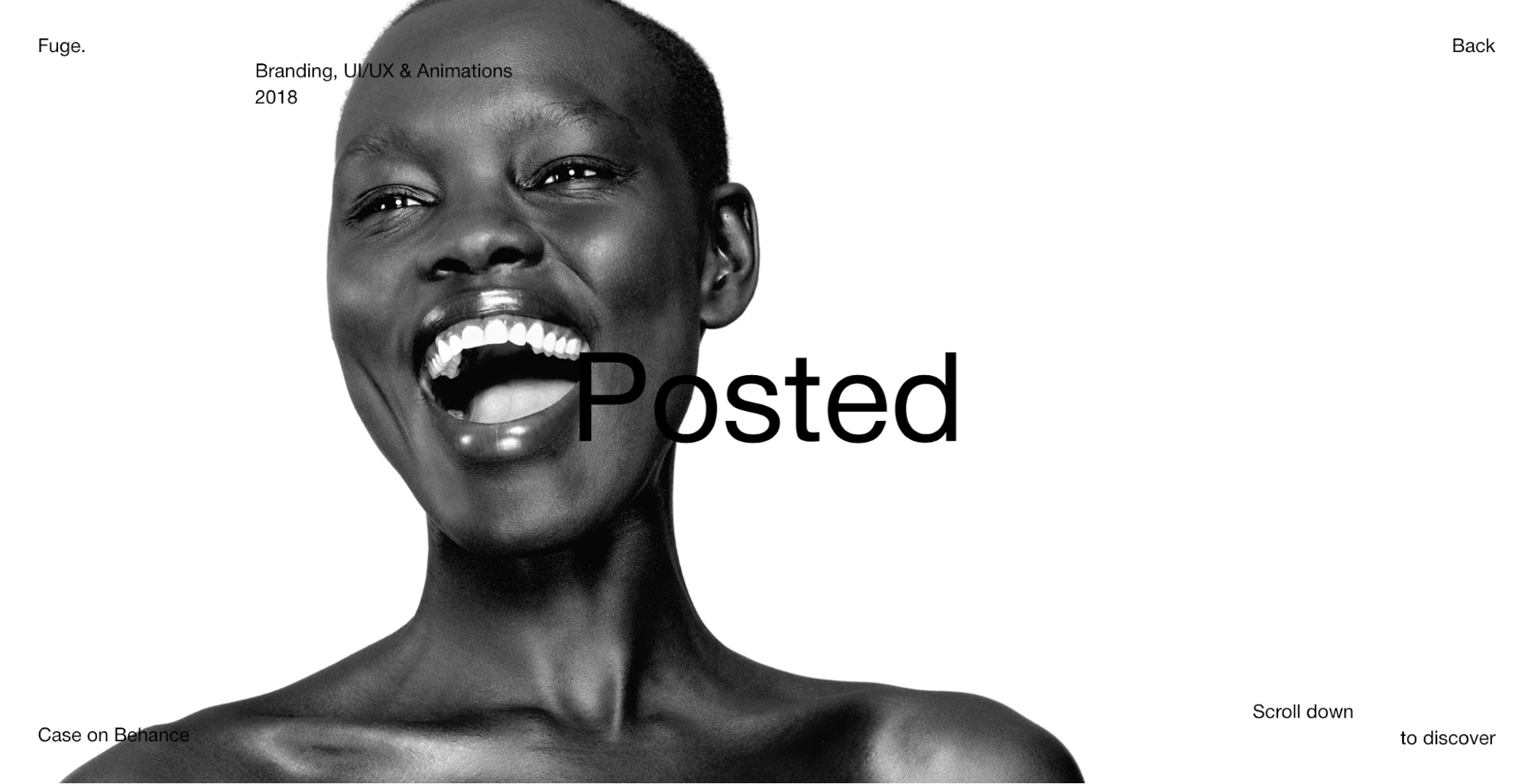
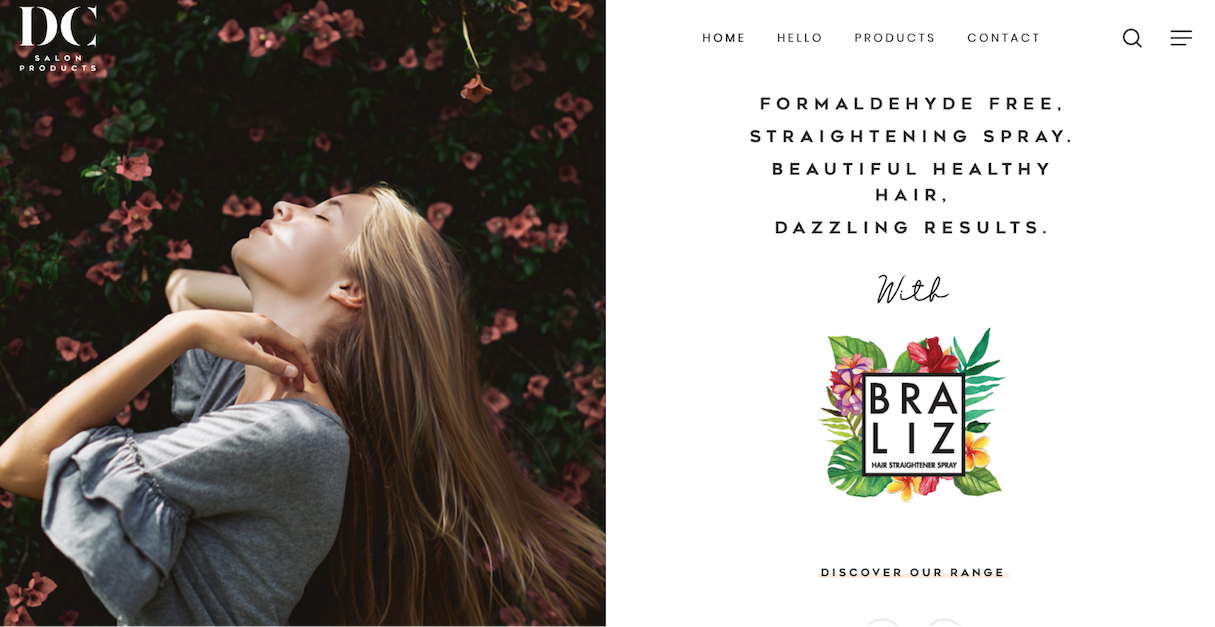
When it comes to selecting images in a minimalist design, you have to be picky. The choice of the wrong image can easily ruin your design integrity. Thus, when selecting imagery for your design, always look for photos or illustrations that follow the principles of minimalism.
"When it comes to selecting images in a minimalist design, you have to be picky. The choice of the wrong image can easily ruin your design integrity."
3. Typography
Font selection is vastly important in minimalist design. It should be treated with care, even more so than usual. Good minimalist design features clean and readable typography.
Similar to imagery, typography can be used to create focal points. Below are a few examples in which typography is used to create attention-grabbing texts:
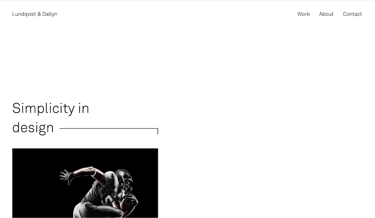
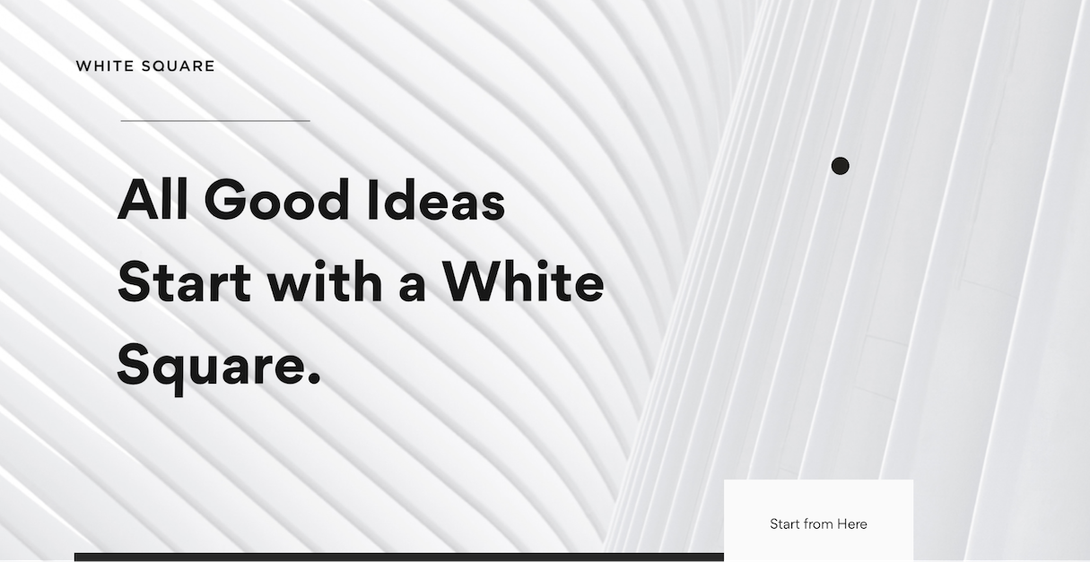
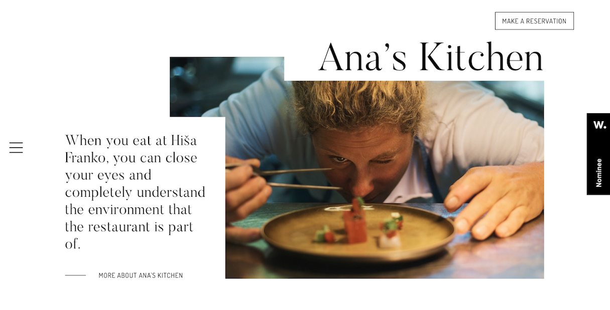
Select font pallets with one or two fonts families
In minimalist design, there shouldn't be too many objects competing for attention. By using one or two fonts, you’ll have a much better chance of creating a minimal and functional design. Every time you think that you need more than just two fonts, try instead to play with font size and font weight for the existing two fonts.
Legibility is important
Legibility is mostly a function of typeface design. No matter what creative techniques you apply to your text, always make sure it’s legible.
Divide text content into blocks
Text blocks make it easier for visitors to understand and consume the content on your site.
You might also like: Dark Patterns: 12 Tricks You Should Never Use in Your Products.
4. Colors and Contrast
The colors you choose for your site should be as simple as your typography selection. Color can be used for various purposes. For example, color can be used as a background texture:
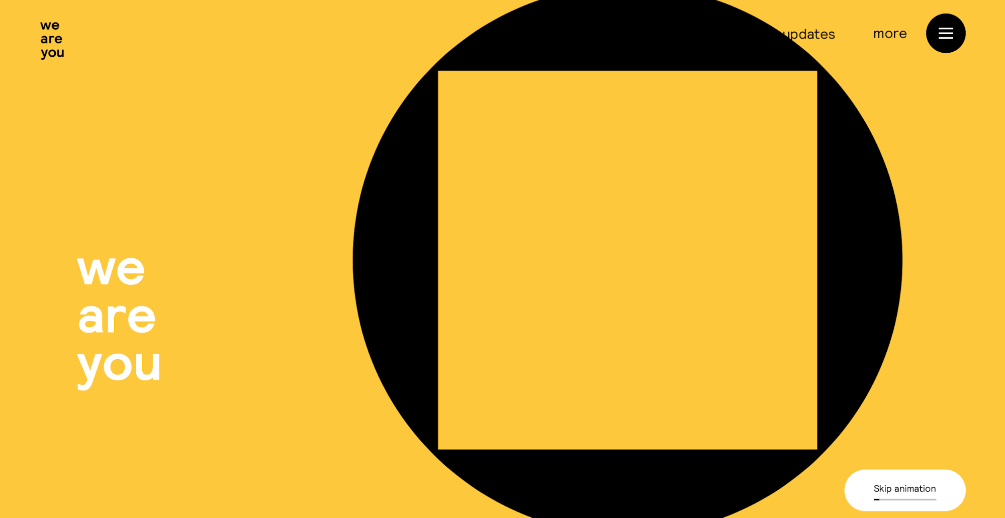
Or as an accent:

Don’t be afraid to experiment with color
Many designers believe that monochromatic color palettes are the be all and end all of minimalism. That’s not quite true. While it’s always better to use a limited number of colors, you should not be limited by your color selection.
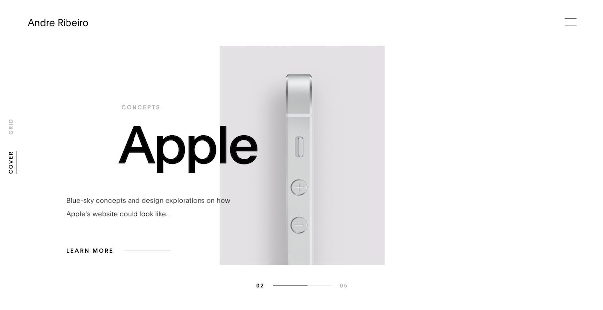
In minimalist design, you should only use the colors necessary to highlight your design. For example, adding a contrasting color in a monochromatic color scheme can be beneficial if you want to highlight certain elements of your design.
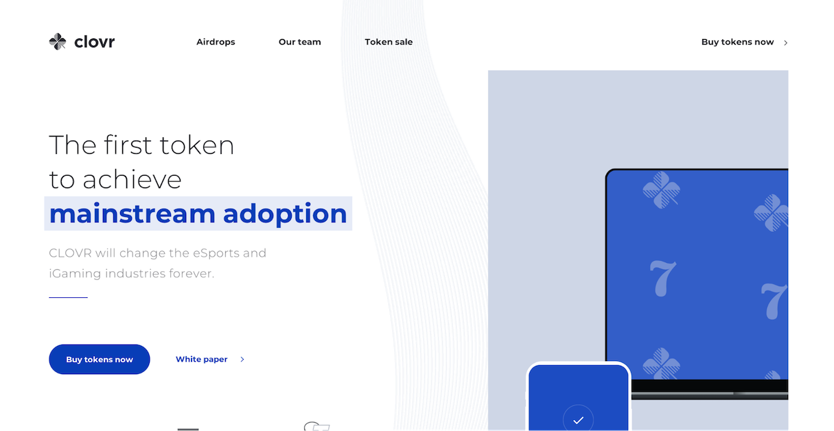
Use colors to convey the right mood
From a psychological perspective, colors convey particular associations and emotions to users. When selecting color combinations, think about what mood you want to convey in your product, and choose colors that reflect that mood and your message.
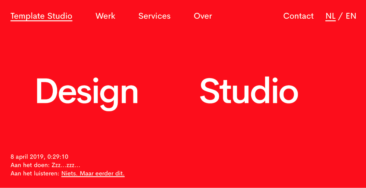
Play with high contrast colors
Minimalism often relies on contrast as a tool for good visual performance. High contrast designs help put your content in the foreground.
5. White space
Visual clutter is the worst enemy of minimalism. Designers often create visual clutter when they put too many objects in a visible area of the screen. They believe that by providing more information, they will deliver more value for users. In reality, such design decisions often lead to distractions—when too many things fight for user attention, the user becomes overwhelmed by the information.
"Visual clutter is the worst enemy of minimalism. Design decisions can often lead to distractions—when too many things fight for user attention, the user becomes overwhelmed by the information."
Fortunately, there's a simple solution to this problem: white space. White space, also known as negative space, is the blank space between content. White space is one of the critical ingredients of minimalism, because it helps designs breathe. Below are two things to consider when designing with white space.
- Use white space to force a user’s attention. With white space, it’s easy to make a particular element more noticeable—all you need to do is to increase negative space around it. Empty space will naturally direct the eye towards the object.
- Avoid using multiple focal points per screen. Give users one thing to focus on at a time.
To help you with your mockups, check out our list of funny lorem ipsum generators.
6. Visual hierarchy
Visual hierarchy is the relationship between visual elements. Good visual hierarchy moves the visitor’s eye across the page and pulls attention to certain elements.
One way of achieving visual hierarchy is by using a grid system. A grid consists of equal-sized columns with a space between them known as a gutter. Designers place elements within these columns to provide alignment with the rest of the content. A grid system is an effective tool for creating highly organized layouts, because it helps to structure all the UI elements and put them into the appropriate sizes and proportions.
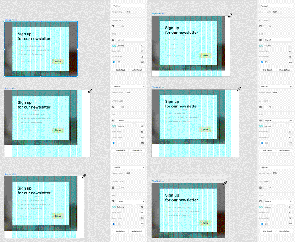
Balance and visual harmony in user interfaces
It’s vital to get the right relationship between all the visual elements you use in a design. Typography, photos, and colors should all work together to create a balance. A well-balanced design does not have any elements that overpower the other with no good reason.
Every time you need to introduce a heavy visual element into your layout, look for a way to balance it with other elements—content, white space, colors, etc.
You might also like: Everything You Always Wanted to Know About Rapid Prototyping.
The challenges of minimalism
As I’ve mentioned before, minimalism is not an easy concept to master. Quite often, designers create a minimalist design that is difficult to use. Generally, the more minimalistic the interface is, the more time and effort the designer should invest in making it usable.
It is worth mentioning that ‘simple design’ and ‘minimalist design’ are not the same thing. Minimalist style is created by the reduction of elements, while simplicity is a reduction of complexity. When designers strive for minimalism, what they actually want to do is to create simple, easy-to-use products—products that help the user accomplish something quickly and easily. But design decisions aiming for reduction can easily introduce more cognitive load and lead to bad user experience.
When designers follow a minimalist approach, they should strive to create designs that are:
Simple but not limiting
In an attempt to create minimalist designs, some designers remove essential design elements such as visual signifiers of interactive objects or visible navigation options. By doing so, they make the interface cleaner, but introduce complexity that makes using the product harder for visitors.
Hidden navigation is perhaps the most common example of this problem. When designers hide navigation objects behind some UI element (such as hamburger menu) or rely on gestures, they leave some users lost in the journey.
Clarity is an essential characteristic of minimalism. Every time you want to simplify your design, follow this simple rule: “Subtract until it breaks.” Remove elements and test your design decisions with real users to be sure that your design works for your target audience.
Simple but not primitive
Simple doesn’t mean primitive, but the line that divides simple and primitive design is very thin. Designers should not oversimplify things for the sake of minimalism. Minimalism means stripping a design to its very basic, necessary elements—emphasis on the word necessary. The idea is to make the content and features more clear for users, not hide or get rid of them.
Minimalism as a design choice
Minimalism is more than just a style; it’s a philosophy. This philosophy helps designers embrace complexity and create more efficient products. But creating good minimalist design requires practice. The principles that I’ve described above are the basic rules that you should take into account when creating your design.
Read more
- Top Ecommerce Web Design Trends for March
- Top Ecommerce Resources for October
- Working With a Grid Layout: How Breaking the Grid Can Create Memorable Experiences for Clients
- 14 Image Tools for Web Developers in 2017
- Top 5 Features to Include When Building a Successful Fitness Site
- How to Integrate Shopify into your Client's WordPress Website with Zillacommerce
- 13 Web Design Trends to Watch in 2020
- Working with Apparel Clients: Trends, Apps, and Themes to Consider
How do you tackle minimalist design? Share your thoughts in the comments below.

