Theming a shop for the holiday season is a clever way to turn casual browsers into buying customers. When your client’s shop is themed for the holidays, it will excite their visitors and get them into the holiday shopping spirit.
In this tutorial, I’ll go over four simple ways that you can theme a shop without a lot of effort, so you can give your client's store a quick holiday make-over just in time for the holiday rush. Plus: read to the bottom to find out how you can win the Christmas Mockup Scene Generator tool that I use in this tutorial!
For this demo, I’ll be using Shopify’s New Standard Theme as my base.

Most of the time, it’s a nice minimalist theme that can showcase a wide range of products, but in the spirit of the holidays, it could use a little sprucing up.
For my holiday store redesign, I’m going to use this beautiful Christmas Mockup Scene Generator by Visual Hierarchy. This bundle comes with several pre-made scenes which can be easily customized, or you can build your own scenes with the high resolution items included in the bundle. The pre-made scenes and items are formatted for Photoshop and organized into easy-to-read layers.

You can also find tons of other Christmas resources on Creative Market. Just make sure to find a set of resources that matches your client’s brand image to create a look and feel that is consistent with their store during the rest of the year.
Once you've sourced your holiday-themed design assets, follow these four simple steps to complete your ecommerce store's holiday design makeover.
You might also like: 5 Creative Strategies for Using Overlays to Boost Conversions During the Holidays
Step 1: Add a beautiful background image
Adding a holiday-themed background image to your shop is the easiest and most effective way to update a store for the holidays. Use a large image to ensure that it will look great on any screen regardless of size.
An image with dimensions of 1,400 pixels by 1,400 pixels is a good size to start with, but try to reduce the file size as much as possible. The last thing you want to do is increase your page load time, as this will actually repel rather than attract customers. When a page doesn’t load quickly enough, visitors are known to hit that back button or go somewhere else. Make sure your client’s online store is fully optimized for speed so they don’t lose those impatient buyers.
To begin, choose a background image from the Christmas Mockup Scene Generator (or whatever other design resource you've decided to use). For my store, I've chosen this lovely red coloured background with festive details on the sides.
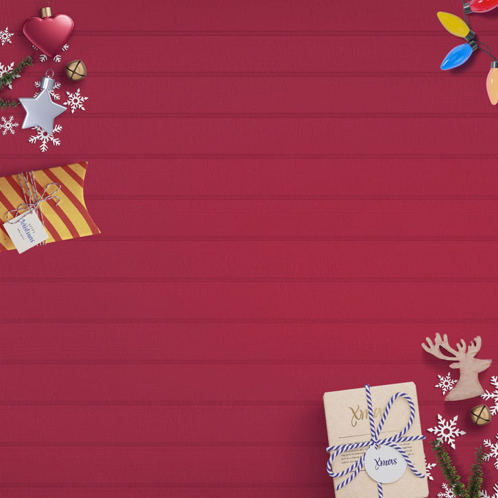
Once you've created or chosen a background image, it’s time to implement it into the store theme. To make this look really great, you’re going to want to ensure that the background image fills the entirety of the screen. Most Shopify themes have the capability to set a background image through a simple image upload, but if you’re using a theme doesn’t support this feature, you can customize it with the following code snippet:
If you would like to learn more about the this code snippet, check out this post on CSS-Tricks and how to create perfect full page images.
After uploading your background image and previewing it on your site, don’t hesitate to tweak the image. In this case, my original background image was prominently red. This turned out to be a bit too bold and took too much focus away from the products, so I decided to change the red into a festive solid gold.
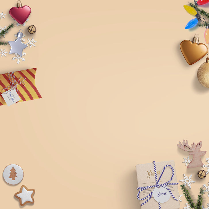
Taking that extra few minutes to get your background image just right will help maintain your visitors’ focus on the most important page elements.
Step 2: Add a top banner for sale items or promos
It’s probably safe to say that your clients will be running special promos and sales this holiday season. Let’s make sure that their visitors clearly know about them by adding a seasonally-themed top banner with all the special promo and sale details, plus a “Call-To-Action” button. For our shop, we want to promote our holiday shipping rate and delivery time after spending over $50.
I also created a button that reads “Shop Now,” which can be linked to any part of the shop. Use this opportunity to bring customers to bestselling products, current sale items, high margin items, or any set of product categories that you think will help your clients increase sales. In this case, I linked the button to the Cyber Monday sales page.
Here's the final result:

To add a top banner to your shop, open the theme.liquid file for your shop, find where your header for the site begins, and then add the following code:
We also added a small Christmas stocking to style the banner image and reinforce the holiday theme for our shop. It’s a subtle change, but it brings extra attention to our top banner that contains valuable information for holiday shoppers.
You might also like: 5 Design Tips to Boost Conversions this Holiday Season
Step 3: Add holiday-themed hero images
Styling the hero images on your homepage is also an easy win to theme a shop for the holidays. Whether you purchased a set of resources or designed your own, get creative by placing your products on a Christmas scene or even making a collage of some best-selling products. Using Visual Hierarchy’s scene generator once again, I created a Christmas background with one of our products at the centre of the scene.
When creating these type of hero images with your client’s products, make sure that the product is the main focus. As much as we want spruce up our product pages, we don’t want the festive elements to distract from what your client is trying to sell.
Using Photoshop, set to the holiday items to edge, then add a product image with a transparent background so that it blends nicely into the background scene.
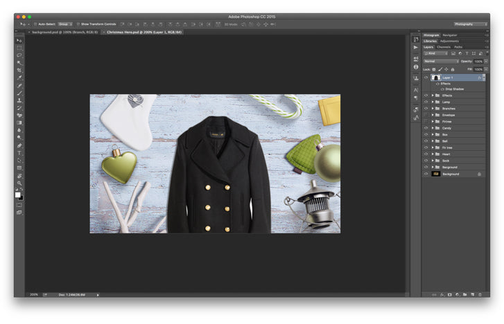
Pro-tip
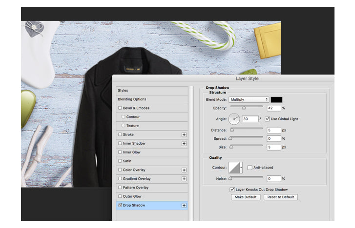
Add a shadow to your product to match the shadows in your scene. This will create a more consistent and photo realistic scene.
Step 4: Have some fun!
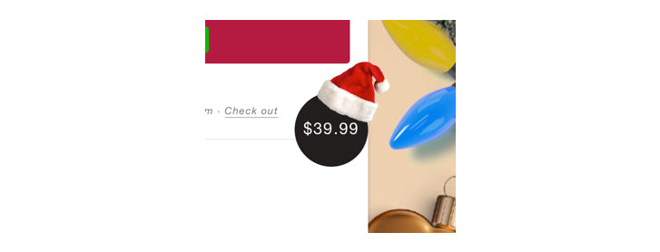
It’s holiday shopping season, and while it can be a busy time of the year, we shouldn’t forget to have a little fun along the way. That’s why we added a Santa Claus hat to our cart button. Once again, it’s a simple change, but it adds a little fun and some extra holiday spirit to our shop.
Deck the halls!
And voila! Combine all of these design tweaks together and you have yourself a beautiful ecommerce store completely re-designed for the holidays.

With some creativity and minimal effort, I added some holiday flair to my shop in 4 simple steps. It’s a great way to offer an additional service to your clients that will help them turn casual browsers into buying customers this holiday season. Take advantage of beautiful resources available online, get creative, and have some fun with these holiday theming techniques!
Read more
- Holiday Reading List: The Top 10 Stories of 2015 from Shopify Partners
- 3 Steps to Maximize Your Client’s Holiday Revenue Before 2016
- PODCAST: How You & Your Clients Can Make the Most of the Holiday Season
- How Ecommerce Stores Are Designing Web Pages for the Christmas Shopping Season
- 7 Tips to Help Your Clients Sell More This Holiday Season
You might also like: 7 Steps to Get More Shopify Clients This Holiday Season

