


Making money is an essential part of any business. To create more profit, many companies try to build a more customer-centric culture—they try to deliver a personalized experience and create an excellent customer service strategy.
But other companies try a darker approach—they purposefully trick users into converting, thus generating more sales. In the world of product design, these manipulative techniques are known as dark patterns.
Using these dark patterns is not encouraged. They erode trust, and take advantage of the individuals using your product. In this article, we discuss what a dark pattern is, and look at 12 recognizable patterns you should never use in your products.
A definition of dark patterns
Dark patterns are elements of product design created to make users do things they might not want to do—actions that benefit the business, not users. The term itself was originally coined by Harry Brignull in 2010. Harry created a website called Dark Patterns, which is dedicated to chronicling the worst examples of dark patterns.
Why dark patterns are bad
Products that use dark patterns create a deceptive design, a design that nudges the user to make decisions they don’t want to make. It's quite the opposite of what product designers should strive to do, which is creating transparent, user-centered designs.
How dark patterns work
Although many people believe that dark patterns are psychological tricks, most of them have nothing to do with psychology. They are simply cheap tricks that take advantage of the fact that people skim web and app pages, instead of reading the content carefully. People want to complete their task in the shortest possible amount of time, and usually select the path of least resistance, doing whatever the app asks them to do. As a result, they miss that they’re being taken advantage of.
"But a design that delivers the best conversion rate might not be the same that delivers the best user experience."
But some dark patterns are based on the psychological aspects of web interactions. The most conversion-effective patterns play on people’s sense of FOMO (fear of missing out) to push them to make a certain decision. Users feel like they don’t have time for additional research, and have to make their decision in that exact moment.
However overall, dark patterns are simple tricks played on users to make them behave in a way they didn’t intend.
Why products use dark patterns
The reason why businesses use these negative patterns is simple—money. Designs that use dark patterns can deliver the best conversion rates. Such designs demonstrate excellent results during A/B testing.
But a design that delivers the best conversion rate might not be the same that delivers the best user experience. When users figure out that a business tried to trick them, they become frustrated and distrustful. And a company can lose all the short-term benefits it gained from dark patterns, because users will abandon products that they don’t trust.
Below, we look at examples of dark patterns you should avoid, so you can continue to build trust with users and establish long-term benefits for your product.
You might also like: 10 Ways to Establish Trust on Ecommerce Sites and Apps.
12 dark patterns you should never use
Harry Brignull of Dark Patterns has created twelve categories of dark pattern types that should be avoided. Let’s go through each of them.
1. Bait and switch
In this type of pattern, the user thinks that her action will have one outcome, but instead, a completely different, undesirable outcome occurs.
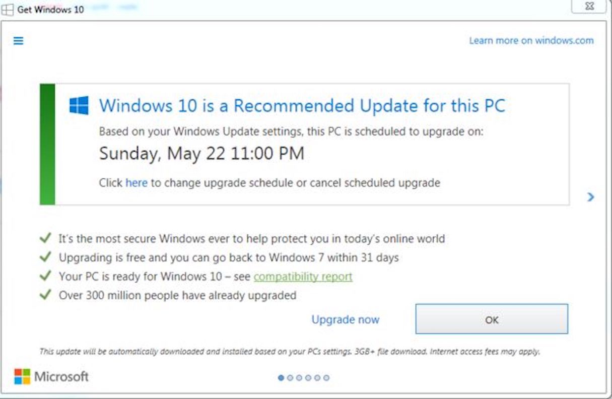
Perhaps the most famous example of bait and switch is Microsoft’s misguided approach to getting people to upgrade their Windows OS to Windows 10. Most users know that when they see a pop-up window, they can press the X at the top right corner to close the window, and that by doing that they also say ‘No’ to the question in the pop up.
"When you break a commonly accepted logic, you break trust."
However quite surprisingly, in the Windows 10 dialog, clicking on the X resulted in the upgrade being initialized—a completely unforeseen result for the majority of users.
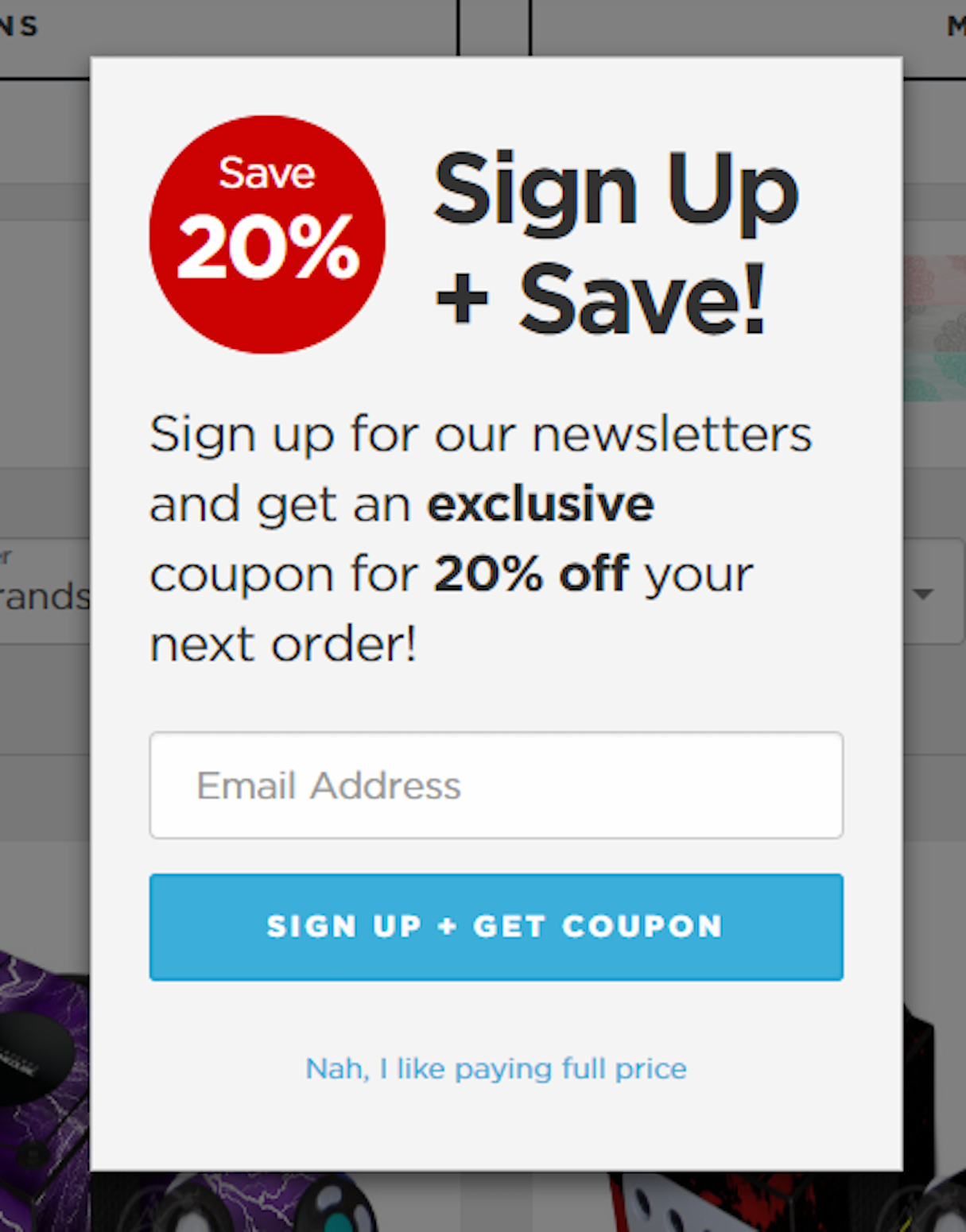
2. Confirmshaming
Confirmshaming is making the user into opt into something by shaming them if they don’t. This technique is still popular on the web today, especially as a way to get users to sign up for a mailing list. Users see a pop-up with two options: the first in a bold color and a call to action, and the second in a subtle color, shaming them for not making ‘the right’ decision.
The blog confirmshaming contains a lot of examples of this pattern found in real-world products.
3. Disguised ads
Usually, it's not hard to distinguish advertising from regular content. Ads are typically located in particular places on a page, and users only need a fraction of second to separate them from regular content.
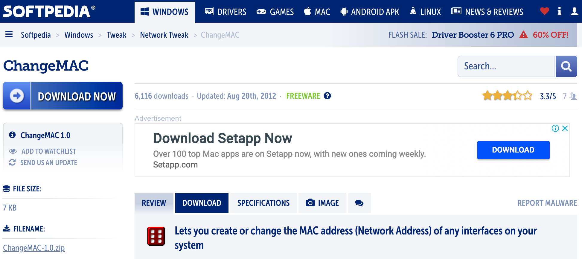
But disguised ads are a completely different story. Such ads are designed to look like regular content or navigation, in order to get users to click on them. For example, many pages on Softpedia, a popular software download site, contain ads that look like call to action buttons for downloading software. The buttons use almost the same font and the same dark blue color that is used for the real download buttons. As a result, it’s easy to click the wrong button accidentally.
4. Forced continuity
This pattern can be found on many of subscription-based services that offer a free trial. When users sign up for a free trial, they are asked to enter their credit card details. When the trial ends, users start automatically getting charged if they don’t remember to opt out. In many cases, users aren’t even given an easy way to cancel the subscription—they have to call the office or even send a request using regular mail to get their subscription cancelled.
You might also like: The Seven Deadly Sins of User Experience Design.
5. Friend spam
No one likes spam. But even worse than getting spam is finding out that your own account is used to send spam. I’m not talking about when someone hacks your account; I’m talking about when social services get access to your contact list, and use this information for their own benefit.
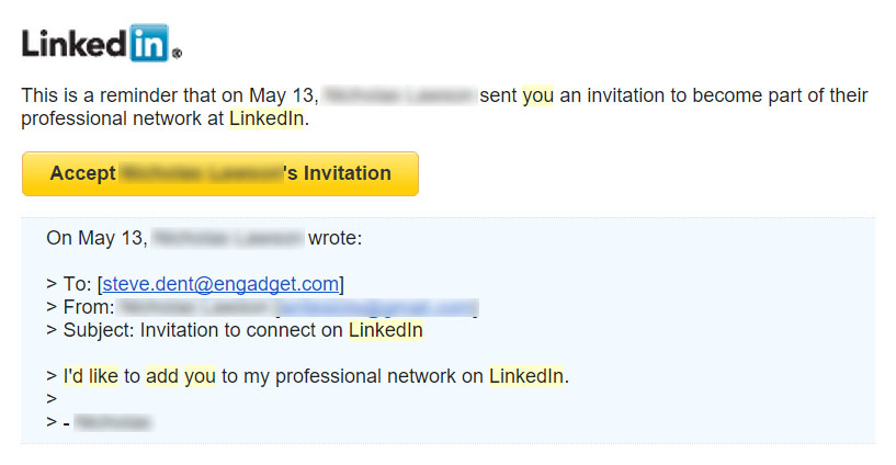
In 2015, LinkedIn lost a lawsuit for $13 million USD. The brand was found guilty of using its users’ contact lists for personal gain. Here’s what happened. In early 2010, LinkedIn added a new “Add to network” feature to its website. This feature was intended to reduce friction and enable users to connect with people they knew quickly— all users had to do is was share contact information of their connections with LinkedIn. Great plan, right?
Wrong. Because what should have been a simple, single email that said, “Let’s connect on LinkedIn,” turned instead into a number of follow-up emails to the user’s contacts. What made matters worse is that LinkedIn’s follow-up email reminders were designed to create a strong impression that the message came directly from the user.
Users weren’t happy, and a class action lawsuit was launched—one that, ultimately, LinkedIn lost.
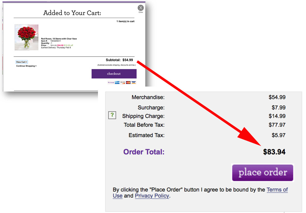
6. Hidden costs
Most of us have been in a situation where we visit a website, see an item we like, and are happy with the price it’s listed at. We go through a multi-step checkout process, and finally get to the last step of confirming the purchase.
But then, to our surprise, we discover that unexpected charges have appeared on our order—taxes, delivery charges, and sometimes more. And sometimes, even though we don’t like the fact that the price has changed, we decide to complete the order anyway, since we already invested a great deal of time and effort in the process of purchase.
In the article The User Experience Of Flower Websites, Jeff Sauro discusses the problem of the slow price reveal that many flower websites have, where charges are added after users agree to the initial cost. If there are additional costs to an order, these should be highlighted to users long before the final purchase stage.
7. Intentional misdirection
Intentional misdirection occurs when product creators try to guide users to an option that will result in more business value for the company.
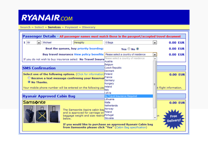
Perhaps the most well-known example of intentional misdirection is Ryanair’s design. When purchasing a flight, users are asked to select their country of residence—a mandatory question. Most users therefore, logically, select their country of residence. However, the question is actually related to buying travel insurance—in the list of countries, ‘No travel insurance required’ is an option listed between Latvia and Lithuania. Users who aren’t aware of this will therefore be tricked into purchasing travel insurance which isn’t actually mandatory.
This intentional money-grab is a great way to ruin trust with users.
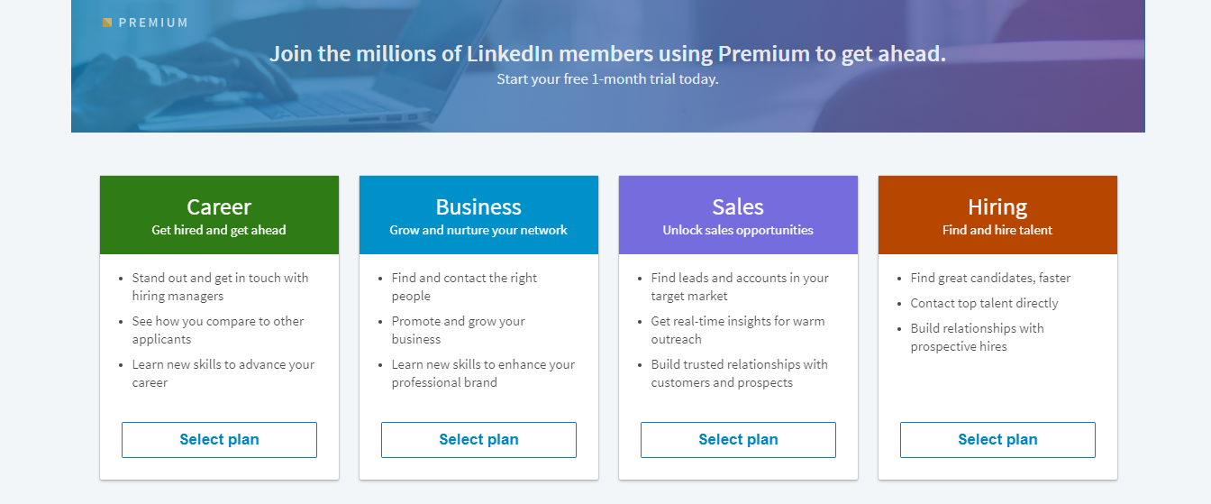
8. Price comparison prevention
Some online retailers and subscription-based services make it hard for the user to compare the price of an item with another item. As a result, users cannot make an informed decision.
A good example of this is LinkedIn, who want you to try out their Premium plans, but don't tell you the cost. This makes it easier for users to accidentally agree to a price they aren’t actually willing to pay.
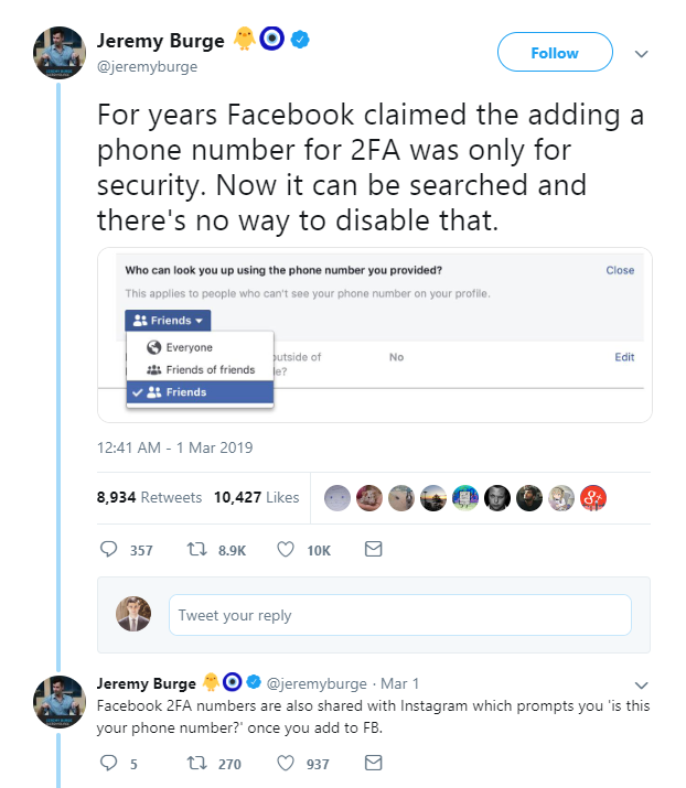
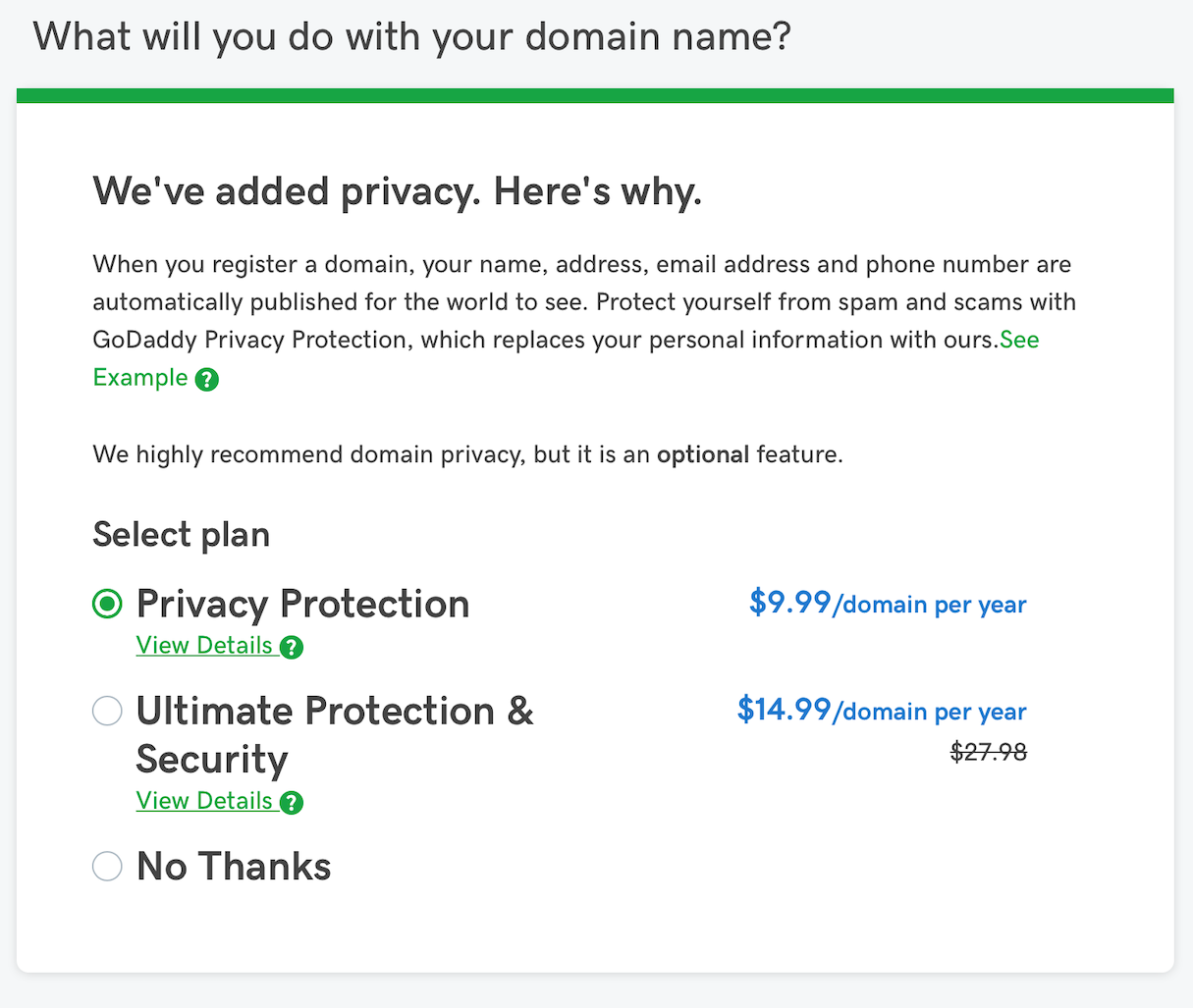
9. Privacy Zuckering
Privacy Zuckering is about making the user share more personal information than they really intended to. Harry Brignull named this dark pattern after Facebook’s CEO Mark Zuckerberg. Facebook makes privacy management notoriously difficult—the information about what the company can do with a user’s personal information is located in Terms of Service, and almost nobody takes the time to read them.
You might also like: Frictionless Experience: How to Create Smooth User Flows.
10. Roach motel
A roach motel occurs when a website or app makes it hard to opt out, such as deleting an account or unsubscribing from a mailing list.
For example, have you ever tried to close your Amazon account? The following video demonstrates the difficult process that needs to be undertaken to do so. Most users wouldn’t be able to cancel their account without help.
11. Sneak into basket
This dark pattern consists of an extra item being snuck into a user cart during online shopping. There are typically two ways that users figure out that there’s an unexpected item in their shopping cart.
1. The website automatically adds an extra item. Today, this strategy is rarely used on desktop users, since it’s easier for them to see when an extra item appears in their cart. But this pattern is more commonly used on mobile—since mobile users have less screen estate and are sometimes distracted, they can easily overlook the extra item and only find the additional charge after checkout.
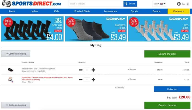
2. The website tricks the user into adding an extra item themselves. This sometimes occurs when a website pre-selects an option that adds the item.
12. Tricky questions
This pattern is based on using confusing language (such as a double negative) in questions. As a result, it becomes much harder for users to understand the question.
Typically, tricky questions appear when users are registering with a service. A series of checkboxes are shown, and the options of the checkboxes are alternated, so that ticking the checkbox means "opt out" while leaving it empty means "opt in".
Avoid dark patterns for your users’ benefit
While dark patterns might give a company short-term gains, such gains can cost them users in the long term. It’s always better to practice honest design. When we design products, we should always put our users first. Strive to create transparent and user-focused products, because only they will survive the long-term battle for users.
Read more
- Progressive Disclosure: Simplifying the Complexity
- 22 Basic UX Laws That Every Designer Should Know
- Typography in UI Design
- Selling a UX Design Process That Ensures Results
- 5 Common Digital Content Problems and How to Avoid Them
- Content Strategy: The Principles we Followed to Build the New Shopify App CLI
- Everything You Need to Know About Whitespace
- What Makes or Breaks an Ecommerce Shopping Experience? This Survey has the Answers
- When Should You Personalize The Ecommerce Experience?
- How to Use Eye Tracking in Usability Tests
What dark patterns have you encountered before? Let us know in the comments below!

