Could it be that the way you see the world and organize information is radically different from your users? Is it possible that what makes sense to you, does not make sense to them, and is negatively impacting your website?
Each person has built up a model of how the world works based on their personal experiences. This set of assumptions is built around relationships between different concepts, and not all of those assumptions are necessarily intuitive.
For example, most of us would agree that tomatoes should appear in the salad aisle of a supermarket, despite the fact that a tomato is, in fact, a fruit. Yet our shared mental model associates tomato more with salads than it does fruit.
As a freelancer, team, or business working with a client to deliver an ecommerce site, things become even more complicated as we do not all share the same mental models, and that can lead to different people interpreting information in very different ways.
The challenges created by mental models
Let me give you an example of what I mean. If I was to say to you:
“Gill is going to the bank. What do you imagine Gill is going to do?”
The majority of us will conclude that Gill is going to complete a financial transaction. But if you were particularly passionate about fishing or enjoyed kayaking, you may infer Gill was going to a river bank.

No doubt you can see how this can have consequences on things like site navigation, and that the choice of labelling could have a significant impact on our ability to easily understand a website.
You might be thinking that in most circumstances people share a similar mental model, and there is indeed a degree of truth to that. But there is one serious exception.
The impact of our level of knowledge
We start to see a significant difference in perception when there is a discrepancy between the levels of knowledge people have on a subject. This problem comes up often when creating a website because the people building the website often understand the subject matter considerably more than those using the website.
That problem typically manifests itself in the website creator using terminology that doesn’t match the mental model of the person using the website. Either they don’t understand the language used or have to think hard about its meaning. In either case, this is going to reduce the likelihood of them converting.
For example, I once ran a usability test session for a university website where 16-year-old high potential students routinely found themselves lost in the alumni section of the website, despite it having no relevance for them. The reason was that they didn’t know what Alumni meant, and so when they couldn’t quickly find the answer they were looking for elsewhere, they theorized that it might be in the alumni section. As you can imagine, this didn’t help users find the answers they needed to make a decision about which university to attend.

The answer to this problem is to ensure you understand the user’s mental model and to reflect that on your client’s website. You can do this through user research and by looking at the terminology they use when searching the website, or even the wording they use on social media. However, the most useful technique you can use for navigation is card sorting.
You might also like: Designing With the User's Context in Mind.
How to use card sorting to reflect the user’s mental model
If you haven’t done card sorting before, don’t worry. It’s very straightforward.
The first step is to print out no more than 30 critical pieces of content on separate index cards. Cards for an ecommerce site, for example, might include phrases such as “delivery”, “returns”, or “payment management.” Alternatively you could put different products on each card and see how users group them into categories.
In fact, if you have ever undertaken top task analysis, this makes a great starting point.
1. Create piles of cards
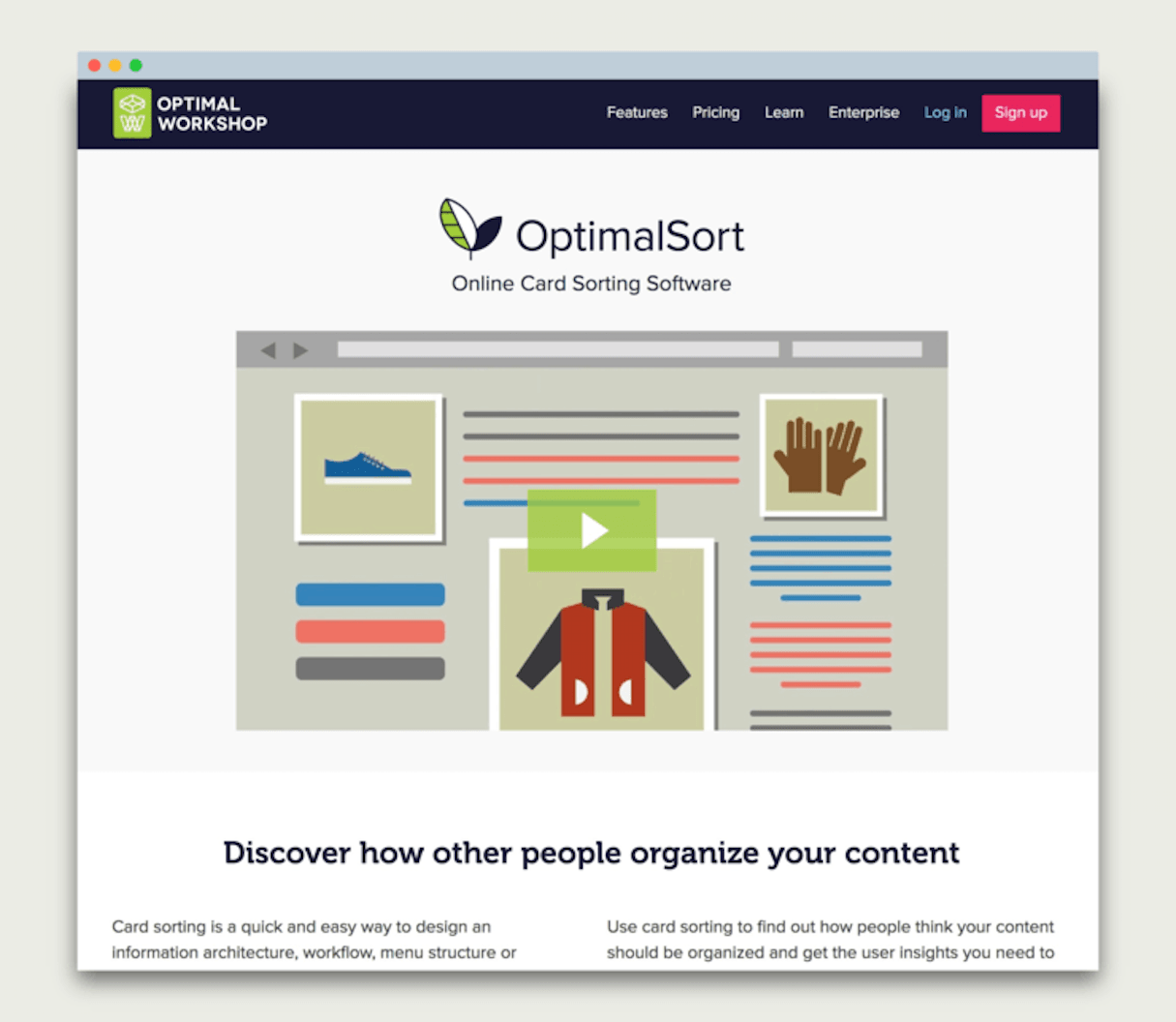
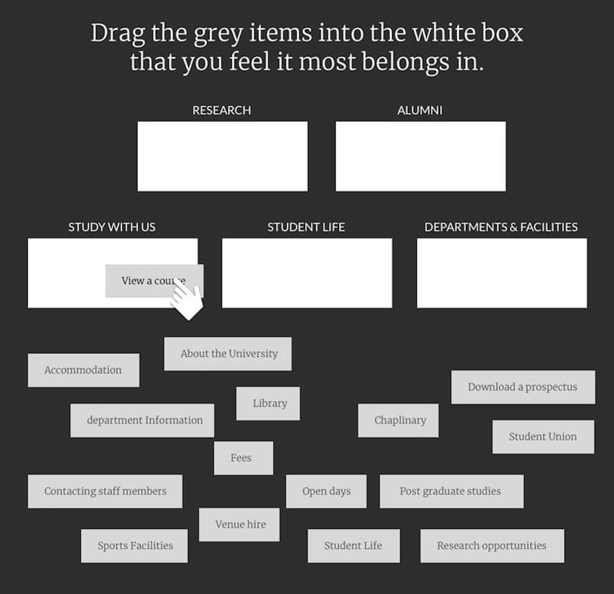
Next, we are going to ask users to sort the cards into groups. They can sort the cards in any way that makes sense to them. You can do this online using a tool like OptimalSort, or you can do it in person with people individually or in groups.

2. Label piles of cards
Once users have sorted the cards into piles, ask them to label those groups with whatever titles makes the most sense to them. That will give you some inspiration for the labelling of sections in the information architecture and ensure you reflect the terminology your audience uses.
Regarding how many people you do this exercise with; well that depends on available time. Even doing this activity with five or six people is better than nothing, but the more people you survey, the more statistically accurate the results.
An open card sorting session won’t leave you with a perfect top-level information architecture, but it will leave you a lot more informed about how users view things, and give you some ideas about how sections could be labelled.
With the open card sorting done, you can now create a draft information architecture based on what you’ve learned. That’s not going to be an exact science, but the open card sorting exercise should help you avoid the common pitfall of making the information architecture reflect your mental model, rather than that of your users.
Where possible, use the labelling and groupings created by users in the card sorting exercise, but don’t feel constrained by it. You will have more content to organize than you showed to users, so some changes will be required.
You might also like: Frictionless Experience: How to Create Smooth User Flows.
Validating your choice of terminology
Once you’ve created a draft information architecture, we can now validate its effectiveness with users through another card sorting exercise, but this time we will take a slightly different approach.
Instead of our previous approach, we’re going to do a closed card sorting exercise. That differs from the previous method we used (I explain how exactly it differs below).
This time we are going to print out more cards. Feel free to print out as many as 60 cards, each with a task or question printed on them.
Now we are going to ask the user to organize the cards again. But this time we are going to ask them to arrange those cards into a series of groups you pre-defined at the start of the exercise. Each 'bucket' will relate to a top-level section on the website.

By doing this, you can validate whether your top-level architecture matches the user's mental model. If the users put their index cards in the same groups as you intended, then you know your information architecture works. If they don’t, you know you have some work to do.
You will find that this kind of approach will make it considerably easier for users to find content, and that in turn is going to make a big difference to their cognitive effort. The lower their cognitive load, the more likely they are to take action.
But understanding a user’s mental model can have a more direct impact on conversion. That’s because it can allow you to shape your product and services to create a more relevant experience, providing a competitive advantage.
You might also like: How to Use Smart Defaults to Reduce Cognitive Load.
Building products and services around how people think
Imagine for a moment that you wanted to take a city tour and needed to organize it. You would probably start by asking yourself what kind of city you would like to visit. Would you prefer a historical trip or are you looking for somewhere full of entertainment and with a great nightlife? Or maybe you have an idea in your head of how far you are willing to travel.
You may have a rough idea of when you want to go, but the chances are there is some flexibility. You know you want to go over a weekend, but you could take the Friday off and make it a long weekend, and it could be either the first or third weekend in the month.
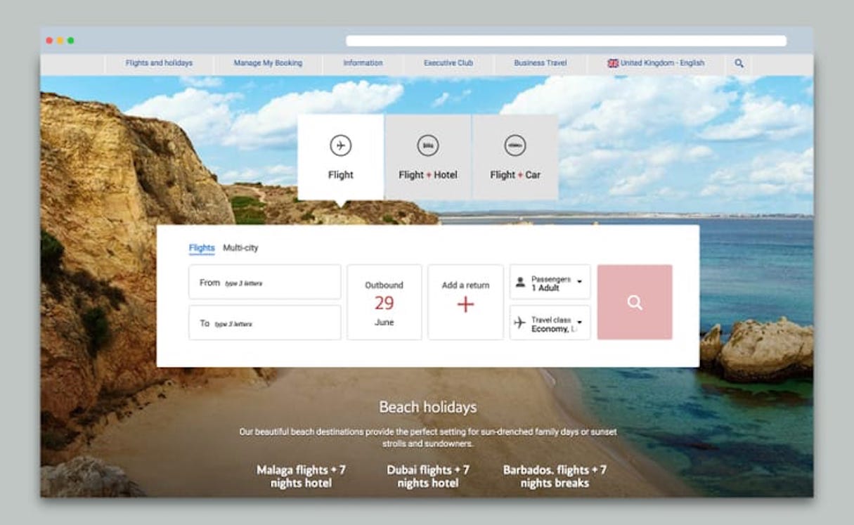
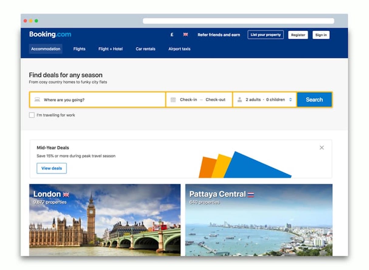
Yet when you go to book this experience online, nothing about what you are presented with matches that thought process. Before the site shows you any possibilities, you have to choose the city and the exact dates. It fails to match your mental model.

Even when you have decided on a city, booking hotels doesn’t get any easier. One of the big factors when choosing a hotel is its accessibility to the key attractions you want to visit.
Most hotel booking sites will allow you to sort and filter hotels by distance from a particular point, but how useful is that in most cities? You care about how long it takes to get to an attraction, not its physical distance. A 10 minute underground ride might be preferable to a 45-minute walk, but be approximately the same distance. It would be better to have a hotel further away near a direct underground line than being closer but needing to walk.

When designing and building websites, this idea of matching the user’s mental model to the products and services our clients offer can be applied in many circumstances. For example, as web designers the user’s mental model should inform how products are categorized, sorted, and filtered.
Pick easy every time
Understanding the thought process people go through in these scenarios will make an enormous difference in how your or your client’s website works. If you can match your user’s mental model, it will make your offering far more attractive because it will feel more natural—and at the end of the day, users pick easy every time.
Read more
- Typography in UI Design
- The Age of Nanodesign: How Mobile Commerce is Transforming UX and CX Forever
- Internationalization: Practical Tips to Build for a Global Audience
- 5 Common Digital Content Problems and How to Avoid Them
- User Research Methods: 13 Expert Tips to Master the Process
- The Key Aspects to Consider When Building Multilingual Websites
- Feature Creep: What Causes It and How to Avoid It
- Free Webinar] How to Convert Visitors Through Persuasive Design
- What Makes or Breaks an Ecommerce Shopping Experience? This Survey has the Answers
How do you ensure the website’s you build match the mental models of users? Share your insights in the comments section below!

