 As a web developer, you want to deliver high quality content while maintaining efficiency and expediency.
The problem? Marrying these three qualities isn’t an easy task. You’ll inevitably come across situations in which you feel that quality must be sacrificed for the greater good of the project.
I’m here to tell you that doesn’t have to be the case. There are literally hundreds of popular tools out there, at your disposal, that can greatly help you maintain quality and efficiency.
The catch? Sometimes the most popular tools aren’t the ones you really need.
From analyzing your site’s performance with an array of browsers, to creating an interactive 360° image rotator, these four lesser known tools are sure to increase your web development productivity, without making a single sacrifice.
Or, if you're in the prototyping stage, be sure to check out our article on the best prototyping tools.
1. WebPagetest

Starting off this list is WebPagetest, an open source tool used for measuring and analyzing the speed and performance of a web page.
Let’s face it, the longer it takes for a page to load, the less likely a user is to stay. It’s frustrating to wait for a page to load, and that frustration increases for mobile users who are use to lightning-fast results.
More than that, page speed is a major ranking factor for Google (especially since their mobile-first indexing announcement); a high bounce rate mixed with slow site speed makes for poor rankings. Google and other search engines place the focus on the user’s experience (UX), so anything that diminishes it will hurt your site.
This is especially troubling if you have an ecommerce site, where a one-second delay in page response time can result in a 7 percent reduction in conversions. This means that a business making $1,000 per day will lose $25,000 per year, and one making $100,000 per day, will lose a whopping $2.5 million.
Enter WebPagetest. With this tool you can measure and track site speed and other performance factors that are influencing user behavior on your site. Better yet, you can test your site’s performance from a multitude of browsers all over the world, allowing you to refine results depending on who your site caters to.
How to Run and Interpret a Speed Performance Test
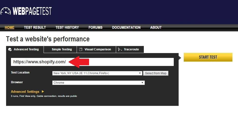
The first step is to choose the page(s) you want to test. Start with the homepage and go through the rest, prioritizing those that receive the highest traffic. Enter the URL as seen below:

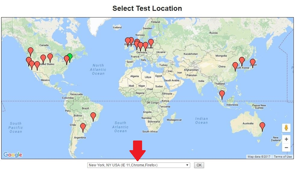
Next up, select a location. The machines are physically located around the world, so choose based on the probable location of your users.
If you have a U.S.-based ecommerce site, choose locations throughout the U.S. If you cater to international customers, choose heavily populated locations based on where you receive the most traffic.
Pick from a drop-down menu, or click on ‘Select from Map’ and pick a location from the map:

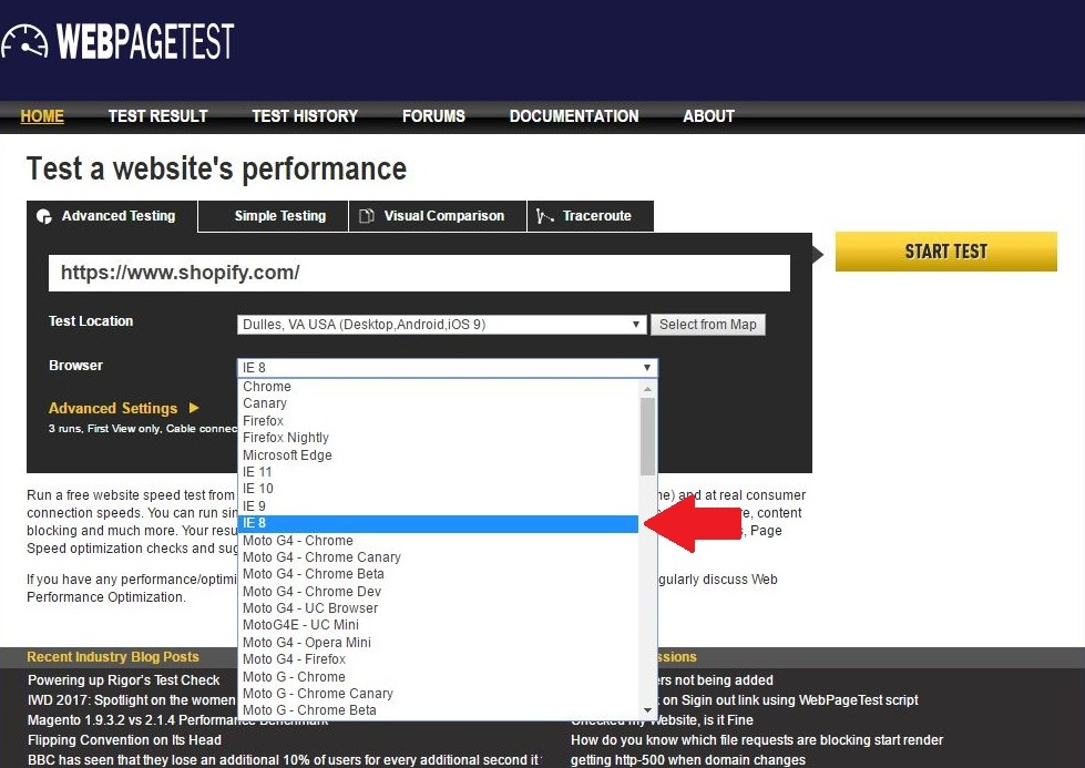
Next select a browser, simple as that. Keep in mind that browser options (including mobile browsers) depend on the location you choose, so while one location supports Chrome and Firefox, another may support both, as well as IE 8-11.
The Dulles, VA location supports all of the browsers that WebPagetest offers, and they recommend using IE8 as a starter browser because it’s easier to identify issues with it.

Submit the test by clicking the ‘Start test’ button.
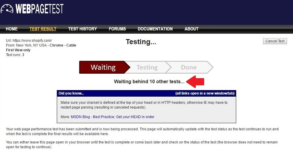
As you can see below, this may take a while depending on how many people are ahead of you (some locations such as New York typically have longer wait times). Allow one to five minutes for each test ahead of you.

Now it’s time to interpret the results. As you can see below, the top of the results page includes grades that cover basic optimizations. You’re good if the grade is an A or a B. If not, some optimization is needed.

You’ll be able to access a summary of performance results, a performance review with a full optimization checklist, a breakdown of content by MIME type (CSS, font, html, image, js, etc.), content breakdown by domain name, a processing breakdown, and a screenshot of the selected webpage.
Note that the ‘First View’ comment refers to the test being run on a browser with cookies and cache cleared. In other words, what a first-time visitor would experience.
You might also like: The 7 Best Free Shopify Resources and Tools for Front-End Developers.
2. Dabblet

As described by its creator, Lea Verou, Dabblet is an open source “interactive CSS playground” where you can write code, and instantly see results in the same window (you can view results in a horizontal, vertical, or separate window).
It’s similar to JSFiddle and CodePen in that you can quickly test snippets of code and get real-time previews, so definitely make use of it if you want to tweak your code or learn new things.
As you write, the code is sent to the result inframe after each keystroke, and the code editor monitors keyup events by checking which key was pressed. Because they can modify the code, ‘Paste’ and ‘Cut’ events are also monitored, and due to this constant monitoring and code overwriting, ‘redo’ and ‘undo’browser functions are unavailable (unless implemented from scratch).

One of Dabblet’s biggest drawpoints is that it uses -prefix-free for faster testing, effectively eliminating the need to add prefixes in your CSS code.
Not to say that prefixes are bad, but the repetition of adding prefixes manually can be error-prone and burdensome. -Prefix-free works as follows: regularly written CSS code without prefixes (Dabblet leaves prefixed code as is) is inputted, and only the prefixes needed for the current environment are added. Take a look below for a code comparison using prefixes vs. -prefix-free:
Before
| .download { | |
| position: absolute; | |
| top: 1em; | |
| left: -1.5em; | |
| width: 6em; | |
| height: 6em; | |
| padding: 1em 0; | |
| background: #80A060; | |
| background-image: -webkit-linear-gradient(transparent, rgba(0,0,0,.3)); | |
| background-image: -moz-linear-gradient(transparent, rgba(0,0,0,.3)); | |
| background-image: -o-linear-gradient(transparent, rgba(0,0,0,.3)); | |
| background-image: -ms-linear-gradient(transparent, rgba(0,0,0,.3)); | |
| background-image: linear-gradient(transparent, rgba(0,0,0,.3)); | |
| color: white; | |
| line-height: 1; | |
| font-size: 140%; | |
| text-align: center; | |
| text-decoration: none; | |
| text-shadow: .08em .08em .2em rgba(0,0,0,.6); | |
| -webkit-border-radius: 50%; | |
| -moz-border-radius: 50%; | |
| border-radius: 50%; | |
| -webkit-box-shadow: .1em .2em .4em -.2em black; | |
| -moz-box-shadow: .1em .2em .4em -.2em black; | |
| box-shadow: .1em .2em .4em -.2em black; | |
| -webkit-box-sizing: border-box; | |
| -moz-box-sizing: border-box; | |
| box-sizing: border-box; | |
| -ms-transform: rotate(15deg); | |
| -webkit-transform: rotate(15deg); | |
| -moz-transform: rotate(15deg); | |
| -o-transform: rotate(15deg); | |
| -ms-transform: rotate(15deg); | |
| transform: rotate(15deg); | |
| -webkit-animation: none; | |
| -moz-animation: none; | |
| animation: none; | |
| } |
After
| .download { | |
| position: absolute; | |
| top: 1em; | |
| left: -1.5em; | |
| width: 6em; | |
| height: 6em; | |
| padding: 1em 0; | |
| background: #80A060; | |
| background-image: linear-gradient(transparent, rgba(0,0,0,.3)); | |
| color: white; | |
| line-height: 1; | |
| font-size: 140%; | |
| text-align: center; | |
| text-decoration: none; | |
| text-shadow: .08em .08em .2em rgba(0,0,0,.6); | |
| border-radius: 50%; | |
| box-shadow: .1em .2em .4em -.2em black; | |
| box-sizing: border-box; | |
| transform: rotate(15deg); | |
| animation: none; | |
| } |
As you can see, the latter is much shorter and extremely beneficial when you need speed and expediency. It’s a real game changer.
Dabblet supports modern versions of Safari, Chrome, and Firefox, and you can save code in GitHub gists, which it uses (GitHub) as a third-party API for backend structure and data storage because it has no database of its own. All of this culminates in improved scalability and minimal costs.
Dabblet also has inline previews for CSS (or to a lesser extent, HTML) values such as colors, gradients, absolute lengths, durations, angles, and easing functions. You can make use of this feature via a hover effect for understanding and visualizing code as you type it out, as seen below:

To sum Dabblet up, here’s a compilation of code examples and their respective results:
How about making use of the following captioned images to show off your products (roll over the image to see the caption)?
Or maybe you want to dabble with text-shadows?You can’t forget about buttons, especially if you have an ecommerce site.
3. Haml

Let’s start with the basics. Haml stands for HTML abstraction markup language. It’s a markup language that excels at describing the HTML of any web document without the use of inline code. As you might have guessed, it replaces inline templating systems such as PHP, ASP, and ERB.
Because it’s already a description of HTML, there’s no need to explicitly code it into the template (a feature that will save you A LOT of time). Haml implementation is available under the MIT License, a permissive free software license, and can be used in three different ways:
- Haml as a command-line tool
- Haml as a plugin for Ruby on Rails
- Haml as a stand-alone Ruby module
Haml is somewhat similar to CSS, in that it follows some CSS markup conventions. For example, it uses the same dot and hashtag representation for classes, and similar to CSS, you can specify multiple class names by chaining the class names together with periods.
It also integrates with Ruby and implements Rails templates with the .haml extension. Liquid is a template language written in Ruby and the backbone of Shopify’s themes, because Haml evaluates Ruby, you can use Haml to speed up your development workflow if you are also using Ruby or Rails in your workflow.
You can also develop locally in Haml and then deploy it to your Shopify store, or take a look at this GitHub repository that provides a Jekyll converter for Haml files (that also conveniently helps you use Liquid with Haml’s clean markup).
Take a look at the screenshot below for a comparison between Ruby and Haml:

Curious as to how Haml came to be? No problem, the four principles that come together to produce it are:
- Markup should be beautiful: Unfortunately, many have come to view markup as a simple (and limited) tool to get browsers to render a page as needed. In reality, markup should be user-friendly, pleasant, and something to be proud of.
- Markup should be dry: By nature, HTML involves repetition; you simply can’t avoid it. Elements are named twice, once before contend and once after. Because Haml relies on indentation to determine where elements and blocks of code begin and end, it avoids repetition, creating smaller and cleaner templates.
- Markup should be well-indented: This one is quite straightforward, as well-indented code reflects the underlying structure of the document.
- HTML structure should be clear: Haml’s logic is based on indentation of child elements in which structures are naturally preserved, making documents easier and more logical to understand.
Interested? Have a look at Haml’s source code from its GitHub Repository.
You might also like: 12 Free Tools for Remote Developers and Designers.
4. IcoMoon

Who are you most likely to trust, a relatively new and clean store, or a shady shop with furniture that went out of style in the late nineties? Appearance is of utmost importance in web development, especially when dealing with an ecommerce site that needs to be visually appealing. This is why you go to Shopify for themes, and IcoMoon for icons. After all, they were the first to introduce custom icon font builders.
In addition to conveying brand personality through color and style, icons must first and foremost communicate meaning in a graphical user interface. Icons are, by definition, a visual representation of an object, action, or idea.
As the quote above points out, icons convey information. They’re easily recognized and usually share cross-cultural similarities that bypass language barriers. More than that, they’re perfect targets for both mouse cursors and fingers.
And with over 4,000 free and open source icons, IcoMoon excels at conveying any and all information you want, especially with their IcoMoon app that lets you build and use your own icon sets in a myriad of formats such as SVG, Polymer, PDF, XAML, and more. Even better, you can use their Chrome app for offline (and more secure) use.
Rewinding a little bit to get our bearings, IcoMoon offers three main services: vector icon packs, the IcoMoon app we mentioned earlier, and the ability to host icons as SVGs or fonts. The first, vector icon packs, includes three separate options. One is a free and open source icon pack, the next is a paid line icon set called Linearicons, and the final is the Ultimate/Essential icon pack that, as its name states, houses icons suitable for all situations.
Building on what we covered of the IcoMoon app above, it’s an HTML5 application that you can use to download and edit icons, import your own custom icons, make icon fonts, and my favorite, generate icons in SVG and more. Why is this my favorite? Easy: you can download your favorite icons as SVGs, and then use them as inline SVGs in HTML.
Let’s focus on using inline SVGs. When you do get around to downloading an icon pack, you’ll also receive a demo.html file with icon definitions that can be referenced and used as inline SVGs, like this example that embeds symbol definitions in the HTML:
| <svg class="icon-home"> | |
| <use xlink:href="#icon-home"></use> | |
| </svg> |
Another option is to link an external SVG that already has the definitions, as you can see below, although this option is limited to modern browsers (with the exception of IE9+):
| <svg class="icon-home"> | |
| <use xlink:href="symbol-defs.svg#icon-home"></use> | |
| </svg> |
Seeing as how it’s hard to speak bad about IcoMoon, we’ll close this section with praises. IcoMoon’s high quality icons are as such because they’re designed on a pixel grid for utmost precision. This means that they’re extremely flexible and scalable due to their vector nature that is resolution independent, on both mobile and desktop devices. And if you enjoy being ‘in the know,’ how about taking a look at their blog that’ll keep you updated on all the latest IcoMoon news?
You might also like: 15 More Chrome Extensions That Will Increase Your Productivity as a Web Designer.
Increased productivity
Maybe you can only make use of one tool, maybe you can find use for all of them. Either way, try them out because following through with at least one will undoubtedly result in increased web development productivity.
Here’s a quick reminder of what each tool can help you accomplish:
- WebPagetest will help you optimize your website for the fast-paced environment it resides in. Make sure to use it when choosing your website’s theme, as some with heavy images or too many requests and page elements can slow your site.
- Dabblet lets you quickly test snippets of code, so it’ll be a big help and a huge time-saver when developing your website or editing its theme.
- Hamlfacilitates HTML descriptions without inline code, so you can use it to clean up and streamline your development process.
- IcoMoon gives you scalable icons and icon fonts for any and every occasion. Being scalable, their size can be increased while keeping their small file size for faster website loading times and reduced hosting costs.
Read more
- 10 Ways to Create Delightful and User-Friendly Web Animation
- Free Webinar] Getting Started with Sass and Shopify
- How Google’s AMP Project is Changing the Mobile Web
- 6 Animation Libraries to Save Time and WOW Clients
- Free Webinar] Developing with Shopify: Using JavaScript to Add Ecommerce to Any Website
- Getting the Most Out of Chrome Developer Tools: 4 Modern Features You Need to Know
- What is Markdown Syntax?
What are your favourite web development tools to use? Let us know in the comments section below.


