Ads on the Shopify App Store are a powerful way for you to accelerate your growth, by helping you get in front of merchants in the Shopify App Store. Taking advantage of this channel means carefully optimizing your ad campaigns.
Today, measuring the success of those campaigns just got easier, as we’re launching improved reporting that allows for customer and revenue data to be attributed to your ads, available in your Partner Dashboard. Attribution data is available all the way down to the search term level, and is available retroactively on impressions served as of May 5, 2020.
In this article, we dig into what this new data can tell you, and how to interpret it to improve your ad campaigns in the Shopify App Store.
The importance of ad attribution
Since launching ads, the top request we’ve had from developers is for the ability to attribute customer and revenue figures to ad performance. In other words, developers want the ability to identify which keywords are driving performance beyond just installs. They also want to know the actual customer conversion rate and revenue that comes from their ads. In other words, you want to be able to know your advertising return on investment, and what’s driving (or detering) it.
This is the insight the new customer and revenue metrics provide—a deeper understanding of how your ads are performing, so you can make optimizations that lead to a positive return.
How to interpret the attribution data
The customer and revenue metrics behave similarly to the other metrics in the reporting dashboard, but are unique in one way: all of the customers and revenue acquired from ads are attributed to the date the ad was served.
Let’s take a look at how to interpret this data.
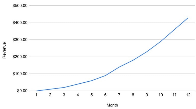
The revenue graphs we’re used to seeing for successful SaaS businesses may look something like this:

In the above chart, revenue is reported on the time it’s received (ie, the merchant paid their bill on June 1, so it shows up in the reports as June 1). The revenue earned in month 12 has nothing to do with the actions taken in month 12, and likely little to do even with month 1.
However, with ads on the Shopify App Store, the customer and revenue metrics can look different. Instead of trending up and to the right, the same revenue profile as shown above could look like this:

The reason for this difference is that revenue is attributed to the ad activity that led to that revenue, and not the date that the revenue was generated.
Here’s a live example: your app is a recurring revenue subscription app that charges a monthly fee.
You launch an ad in the app store, and on March 23, that ad acquires an install of your app. However, in the time since, it has not generated any revenue or converted to a paying customer (this is due to a variety of factors—see our frequently asked questions for more information on how much time there can be between an install and a customer conversion).
If you look at the metrics associated with that ad, then, this is what you’ll see:
|
Date |
Amount spent |
Keyword |
Impressions |
Clicks |
Installs |
Customers |
Revenue |
|
March 23 |
$1 |
checkout |
1 |
1 |
1 |
0 |
$0 |
But then on April 23, the user who installed your app decides to purchase it, so your ad is now responsible for one paying customer. This means that all revenue from that customer going forward will be attributed to March 23, the day that your ad ran.
Which means in April, your metrics will look like this:
|
Date |
Amount spent |
Keyword |
Revenue |
Customers |
Return on ad spend |
|
March 23 |
$1 |
checkout |
$10 |
1 |
1,000% |
And in three months on July 1st, after your user has paid three monthly fees, it’ll look like this:
|
Date |
Amount spent |
Keyword |
Revenue |
Customers |
Return on ad spend |
|
March 23 |
$1 |
checkout |
$30 |
1 |
3,000% |
What this means in the long term is that longer-running ads often have a more complete view of customer conversion and revenue, because they’ve had more time to accrue monthly fees from users who converted thanks to the ad. That can lead to a somewhat jarring trend line, when you graph those results over time.
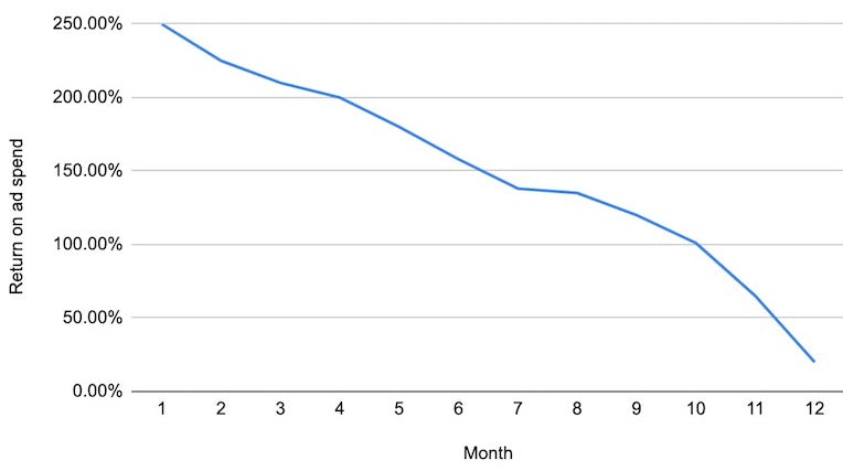
For example, here is a chart showing return on ad spend:

The reason for this shape is because the customers your oldest ad acquired have had the longest time to pay the monthly subscription revenue.
Here is how the customer conversion rate looks over time:

The reason for this shape with conversion rate metrics is the same as above, but with one distinction: after a certain amount of time, all potential customers have converted, and no more can convert, explaining the dramatic-looking dropoff.
Why metrics are presented this way
While these metrics aren’t necessarily presented in a way you’ve seen on other platforms, it’s for a good reason. Presenting the data this way is the most accurate view to match up customers acquired and revenue with the activity that generated those customers and revenue.
Put another way, if we’d presented revenue and customers on the date that the merchant became a customer, or on the date revenue was generated, the revenue would be reported on a date that is not connected with when you acquired that customer.
Presenting the customer and revenue metrics this way allows you to identify both the keyword or search term that drove the conversion, and the date the customer made the search. That insight will help you get a more complete picture of the returns your ads are generating, and better optimize your ads as time goes on. You should periodically check your ad performance for older date ranges to get this information.
Learn more about determining attribution through revenue and customer metrics
We hope this clarifies how ad optimizations work, helps you meet your objectives, and provides a clearer understanding on the returns your ads on the app store are generating.
If you’d like to learn more about these new metrics, check out our frequently asked questions and our ads reporting metrics documentation.
Read more
- User Testing Your Shopify App: Public App Use Cases You Should Test
- How to Run a Design Sprint for Your App Marketing Team
- Shopify Fulfillment Orders API: A Better Fulfillment Experience
- Ensuring trust and quality in the Shopify App Store
- How We Built Out Our Reporting Dashboard with Shopify Polaris
- Shopify App Store Staff Picks: Everything You Need to Know
- How to Optimize API Rate Limits
- Persistence Matters: 6 Lessons From My First 6 Months on the Shopify App Store
- Shopify API Release: January 2021
- How We’re Improving Discoverability On The Shopify App Store

