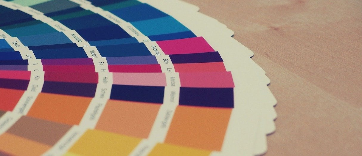
Color is one of the most powerful tools in a web designer’s toolbox. It can be used to attract attention, express meaning, create desire, drive conversions, and even earn a customer's loyalty. This is especially important in ecommerce website design where information needs to be communicated quickly and expressively in order to convert casual browsers into committed buyers.
But how can color accomplish all of this and still maintain a consistent brand identity? The answer is to develop an effective color scheme. Every ecommerce website design project should begin with a color palette that is used consistently throughout the entire website, starting with the main brand color and including all the different shades that work together to create a beautiful design that resonates with the brand's target audience.
In most cases, a well-developed website color scheme will accomplish two things: create a strong brand identity and drive conversion. In the case of brand identity, color can be used to convey meaning or information about the brand, as well as create a sense of uniformity and cohesion between different products on the website. The chosen color palette should use color theory to combine different colors and evoke the right emotions for that brand. By using the right colors, designers can create combinations that not only look great, but communicate their brand's identity to users.
Conversion, by contrast, is most easily driven by the use of accent colors. Accent colors use contrast to highlight specific products and give strong directional cues—such as pointing towards a page's CTAs and buy buttons. Accent colors can be found using a color wheel. Often, they are the complementary color directly across a color wheel from the brand's primary color, and will therefore stand out on a web page and draw the user's eye.
To get a better understanding of how ecommerce websites use color schemes to accomplish both of these goals, let’s take a look at a few examples of effective ecommerce website color schemes. The lessons learned from these sites can help you create the perfect color scheme for your web design clients.
Without further ado, here are 10 ecommerce website color schemes to inspire your next design project.
1. Helbak
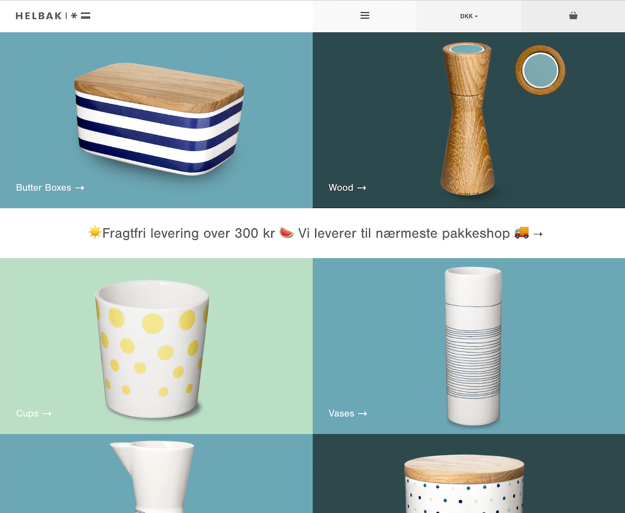
Helbak's almost monochromatic color scheme helps focus the viewer's attention on the product image and distinguish different product categories from the other. It’s an excellent example of how a color scheme can create variation while still providing continuity.
2. Oi Polloi
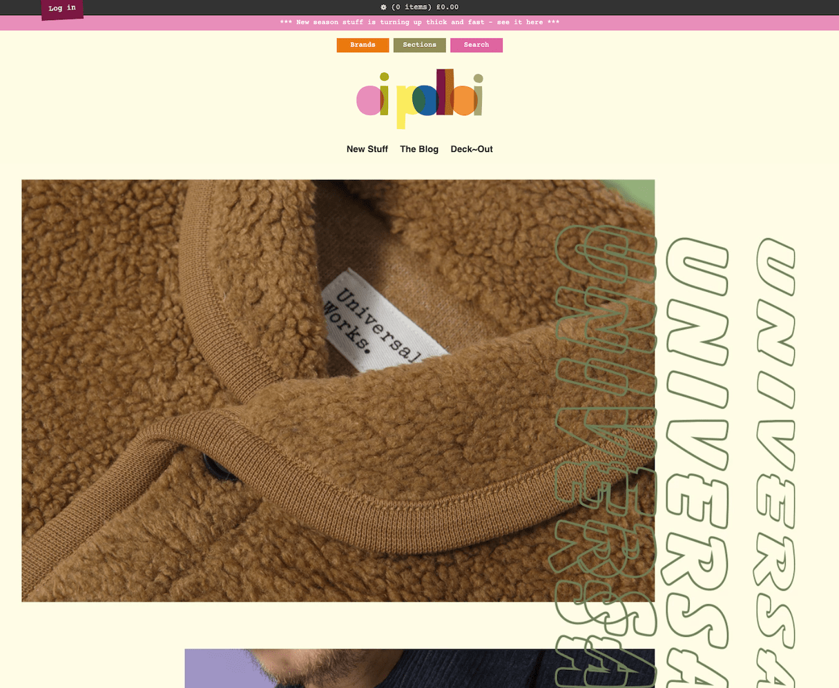
The playfulness of the Oi Polloi brand comes through in its color scheme, which is established by the logo and riffed upon throughout the rest of the site. Although at first it seems fragmented, the multivarious nature of the color scheme helps reflect the variety of brands offered by the store.
3. L/L Supply
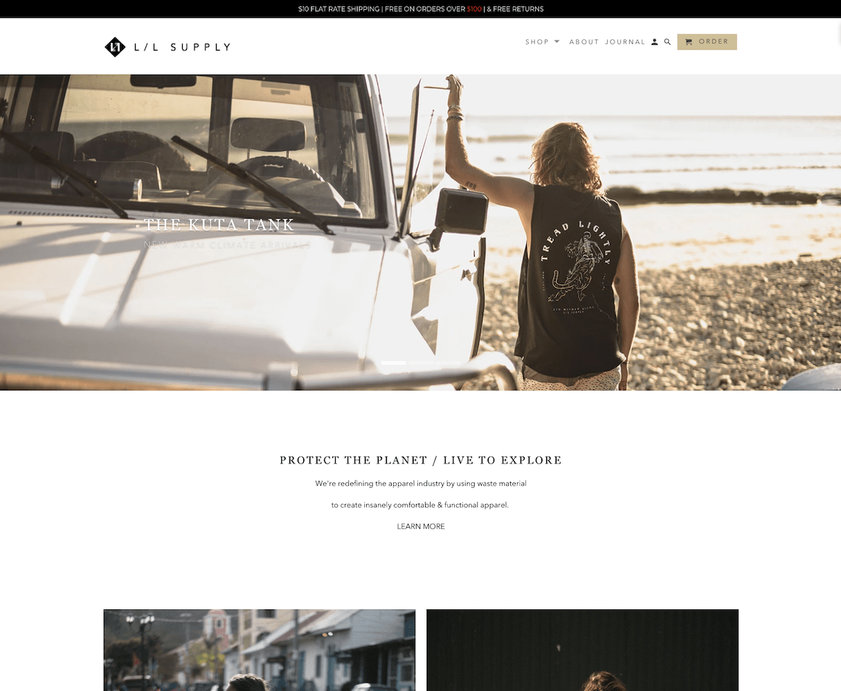
The clean minimalism of L/L Supply's homepage ties directly to the brand of this eco-conscious clothing company. With a white background and earthy neutral tones, the colors serve the story—an experience that carries through the product pages and beyond.
4. Drybar
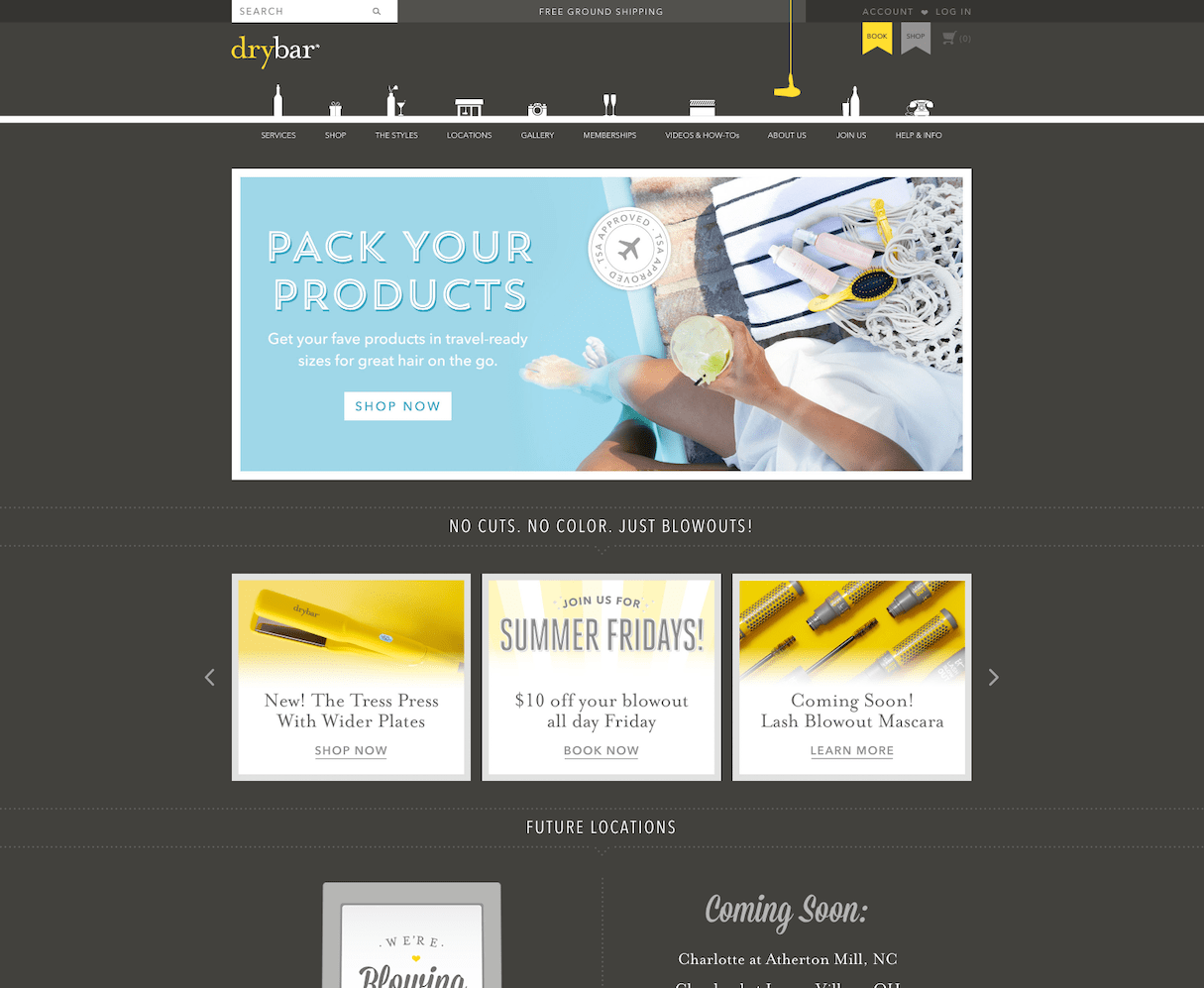
This site might not seem like much at first, but Drybar is another stellar example of how color schemes can be used to connect different site elements and give specific directional cues. Greys and neutral tones provide the perfect contrast to the cheery bright yellow, which simultaneously links and emphasizes the brand name, product pictures, and navigational elements.
5. William Abraham
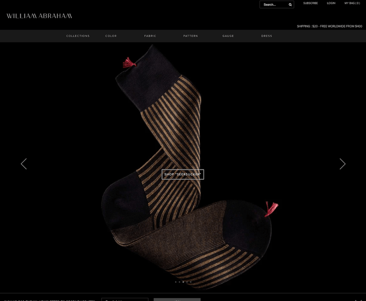
This color scheme for William Abraham is all about style. Crisp product images stand out in sharp contrast to the deep black background. Strong reds and confident blues express authority and conviction, while rich browns add a touch of warmth.
6. Chacos
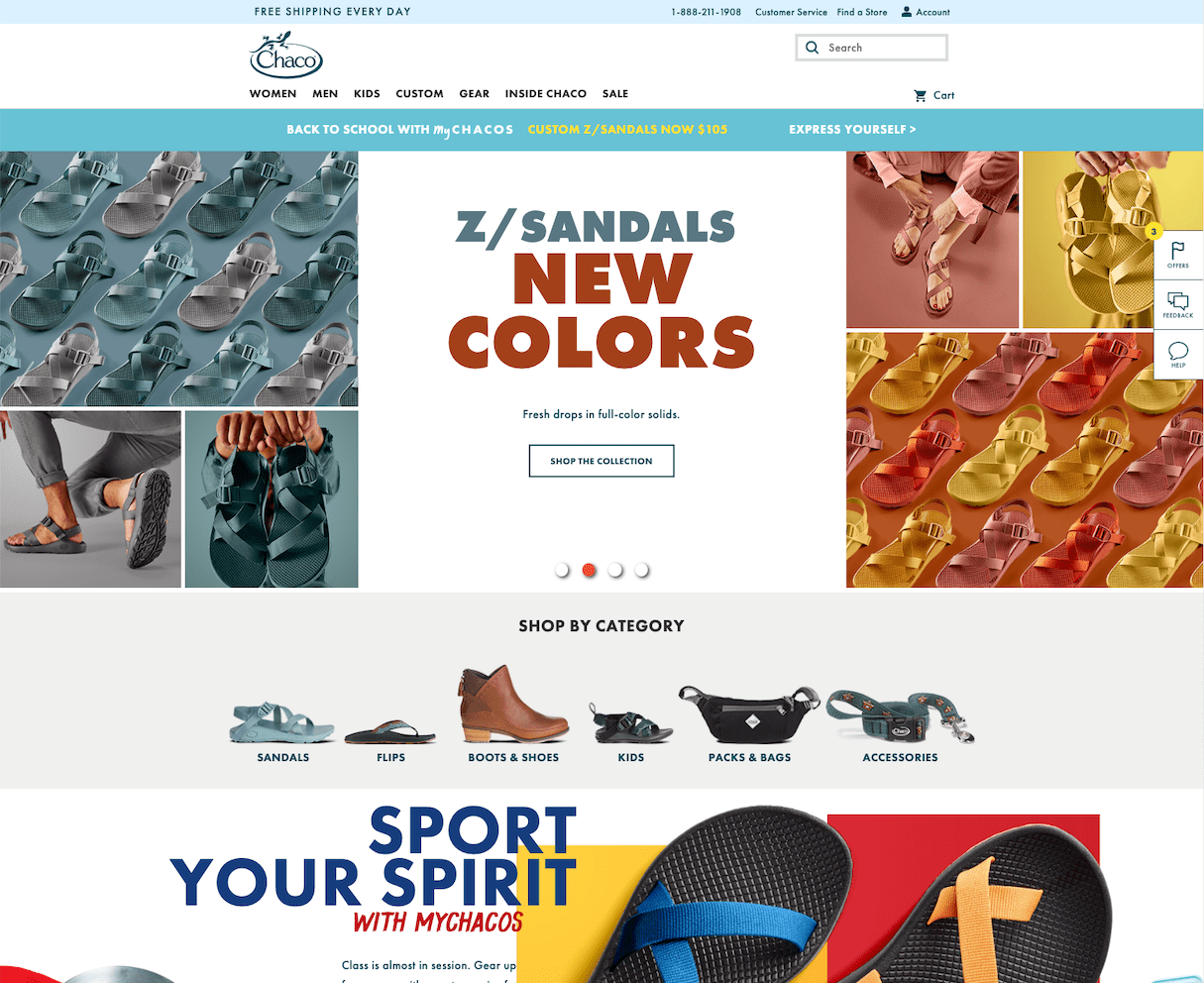
The palette for Chacos is all about color. The blues, yellows, and oranges are bright, playful, and tie directly into their colorful, unique products. They use their product to inform the chosen colors, which helps bring the whole brand together.
7. Triangl

Although this website’s strength is in the incredible imagery, the simple color scheme is essential for conveying Triangl’s strong brand and driving conversions. With such excellent product photography, it makes sense to rely on vast white space to let the products come to the forefront.
8. Patagonia Provisions
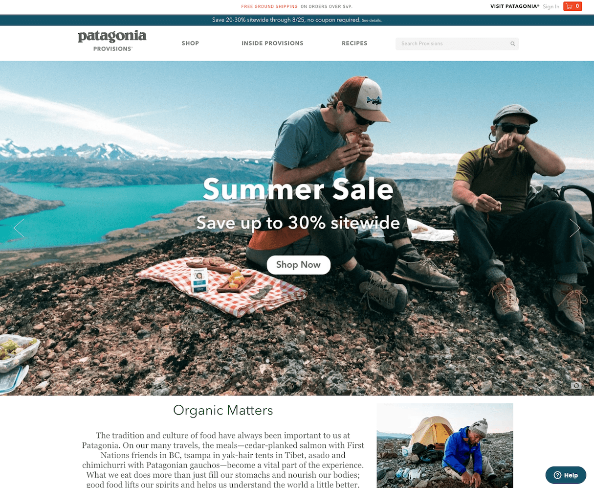
With earthy tones and a simple background color, Patagonia Provisions associates their brand with nature, health, and vitality, forging a strong link between Patagonia’s products and wider cultural associations.
9. Sundry
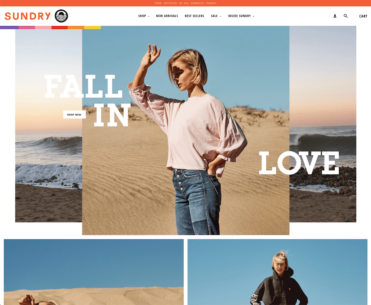
The consistent use of nautical colors like blues and teals in addition to a vibrant orange logo create succinct lifestyle imagery for this apparel webstore. The washed-out backdrop focuses the eye on the product at the center of the page, while the brightly-colored bar on the left draws a visual link between the product and the brand name.
10. Truvelle Bridal
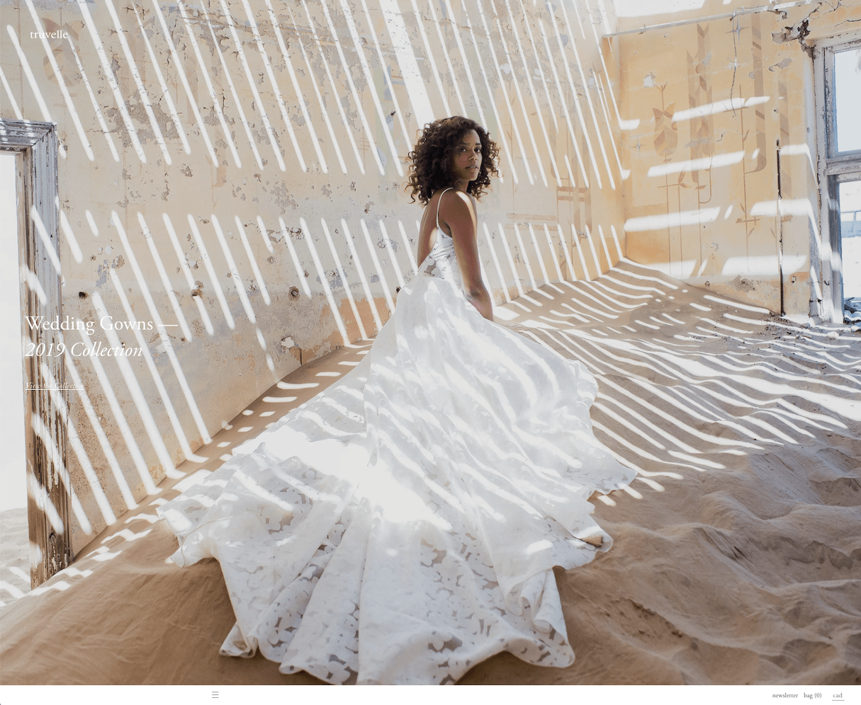
Truvelle Bridal is all about simple, clean, elegant wedding dresses, and their color scheme of whites, taupes, and grays lets their product take center stage. With muted neutrals and soft tones, this color palette puts the focus on the brand story.
Need some help finding the perfect ecommerce website color scheme? Check out our list of top online color palette generators to find the perfect complementary colors (and their hex codes!) to your client's brand.
Website Color Scheme FAQ
What is the best color scheme for a website?
What are the 7 major color schemes?
- Monochromatic
- Analogous
- Complementary
- Split Complementary
- Triadic
- Tetradic
- Square
