Our experience and impression of a product are shaped by a combination of factors, with interaction playing a key role. In fact, the details of interaction design and animation make a fundamental difference in how modern mobile apps are received by users. This is why it’s essential to consider mobile app animation when designing looking at app UI and UX design.
As the ZURB Foundation says, “We’re no longer just designing static screens. We’re designing for how the user gets from those screens to actually view [the] content.”
Well thought-out and tested interface animation is able to support fast and easy interactions. In this article, we will consider the role of animation in modern mobile UI design, as well as its functions and usability.
Why is mobile app animation important for the user experience?
Animation has a special role in interface design, as it is one of the most important tools of creating successful interactions. It can be said that without animation, there cannot be interaction. People are mostly visually-driven creatures, meaning the force behind the picture, which is worth a thousand words, gets even stronger with the help of animation.
Animation breathes life into the process of interaction, and is especially good for mobile apps that have to be developed with limited screen estate, while providing an informative and functional interface.
The 2 major types of animation
There are two major types of animation in modern user interface:
- Functional
- Delightful
Functional animation is subtle animation that we embed in a UI design as part of the process. The goal of functional animation is to help the user better understand what’s going on and how to use your app effectively.
Delightful animation is focused on user emotions. The goal of this type of animation is in entertaining the user, and bundling a brand’s values into a product.
We will now expand on each of these types.
You might also like: 4 Trendy Visual Design Techniques.
1. Functional animation
Functional animation tells users a story about how the app works. It’s supposed to:
- Build meaningful transitions
- Provide visual feedback
- Show system status
- Help the user get started
Let’s take a look at these points in more detail.
A. Build meaningful transitions
Transitioning between two visual states should be clear, smooth, and effortless. A well-designed transition helps the user clearly understand where their attention should be focused.
"Transitioning between two visual states should be clear, smooth, and effortless."
Spatial orientation
User interfaces are often based on static displays—a series of displays that each show a new state of the system. State changes in such UIs involve hard cuts by default, which can make them difficult to follow.
In cognitive science, this is called change blindness— when sudden change prevents users from noticing new information. With all these complex interactions and possibilities in mobile apps, users can quickly lose context; if visual changes in the UI are sudden, users can lose an understanding of the interface. This problem can be seen in the example below.

It is unclear how the new view is related to the old, because no transition occurs and there isn’t a clear focal point.
Functional animation fills the comprehension gaps. Animated transitions work as intermediaries between different UI states. Designers can use animation to smoothly transport users between navigational contexts and explain changes in the arrangement of elements on a screen.

Zoom-in (or parent-to-child)
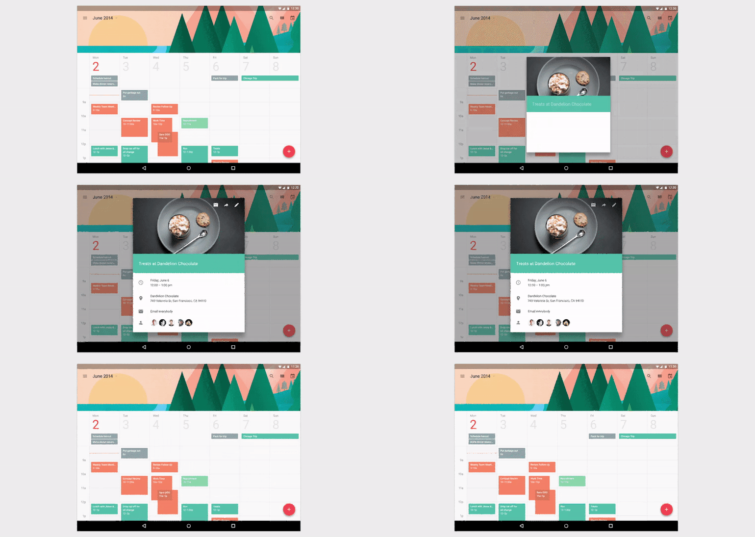
Most transitions are hierarchical in nature. Zoom-in transitions are movements between a high-level view, to a detailed view.
Such an interaction is commonly seen in lists, image galleries, cards, and item selectors. A user selects an item, and they immediately see the detailed screen that is associated with that selection. Animation for this interaction allows the user to maintain context: when elements lift up and expand, the visual change indicates a shift in focus, from parent to child elements.
Function change
In certain cases, designers are forced to design an action button whose functionality changes under certain conditions. Due to the fact that mobile screen estate is limited, we often see icons that serve dual functions in designs. “Play”/”Stop” and “Hamburger”/”Back” buttons are probably the most common examples of switchable buttons.
Animation in this case shows how an element changes when a user interacts with it. Transforming the menu icon into the back arrow, in the example below, signifies that the two actions are connected, and that one cannot exist while the other is present.

B. Provide visual feedback
Visual feedback is crucial for any user interface. It makes users feel in control, and for the user, control means knowing and understanding their current context, in the app, at any given time.
"Visual feedback is crucial for any user interface."
Enhance the sense of direct manipulation

This section is devoted to UI responsiveness. In terms of UI design, building a responsive interface means building an interface that responds to the user at all times. Human software should feel as responsive as the humans who are using it.
In the physical world, buttons, controls and other objects respond to our interactions with them. People expect a similar level of responsiveness from user interface controls.
User interface elements, like buttons, should appear tangible, even though they are behind a layer of glass. To bridge the gap, visual and motion cues should acknowledge input immediately and animate in ways that look and feel like direct manipulation.
Visualize the result of action
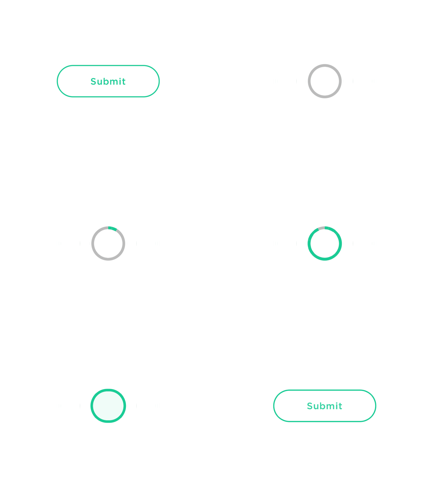
Visual feedback is also helpful when you need to inform users about the results of an operation. Animation is able to reinforce the actions a user is performing.
In the example below, when the user clicks “Submit”, a spinner briefly appears before the app shows the success state. A checkmark animation makes users feel like the process has been completed successfully.
C. Show system status
There are always a number of processes happening backstage in your app (e.g. data is being downloaded from the server, calculations are taking place, etc.). Such operations always take some time.
You should let a user know that the app isn’t frozen and indicate the status of its ongoing process. Visual signs of progress give users a sense of control over the app.
Loading Indicators
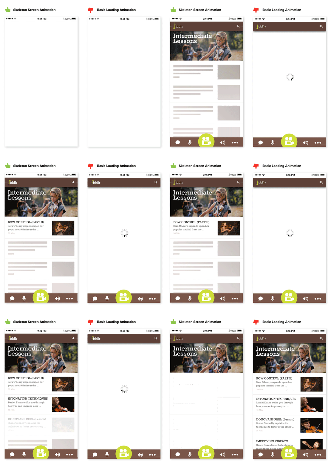
Loading time is an unavoidable situation for most digital products. But when we can’t shorten the time, we can certainly make the wait more pleasant. While animation won’t solve the problem, it definitely makes waiting less of a problem.
A well-designed animation, such as a “wireframe screen” in the example below (left), can be used to replace a spinning load indicator (right), which basically just reminds the user that they’re still waiting.
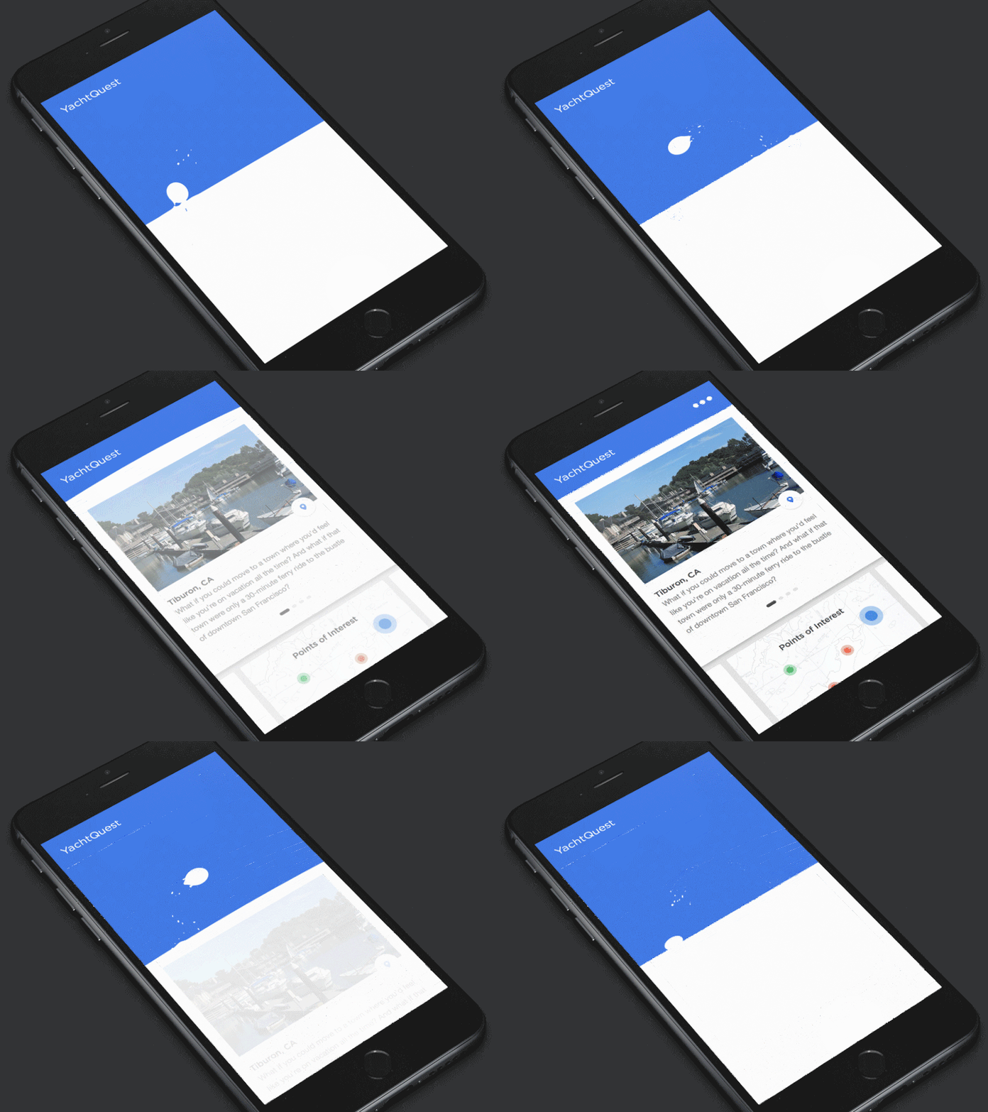
Content update
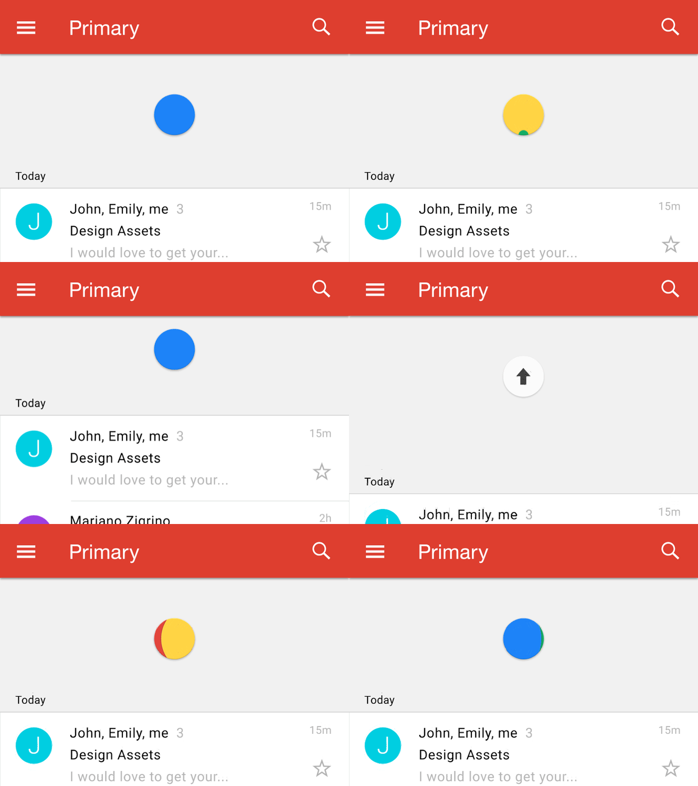
A well-known animation for this group is the “pull down to refresh,” which initiates a process of content updates on mobile devices. Pull-to-refresh animations should match the design outline of the app—if the app is minimalistic in design, the animation should be as well.
Notification

If an interface features a lot of elements, it can be desirable to shift the attention of the user to a specific element on the screen. Motion, by its nature, has the highest level of prominence in a user interface. Neither text paragraphs nor static images can compete with motion. App designers can take advantage of this property to grab the user's attention.
You might also like: How to Build a Shopify App in One Week.
D. Help the user get started
Animation can guide and teach the user how to interact with the interface.
First-time experience

User onboarding demands a flawless user experience. Some apps have a complex structure, and if you don’t want to frighten users, you should explain how an app works at the very beginning.
Good animation throughout the onboarding flow has a strong impact on how first-time users will engage with the app. It teaches users how the app works in a much more interactive way than a text description or video tutorial.
Visual hints
Good user interfaces never rely on the user’s intellect to figure out how to operate everything. Functional animations can be used as cues, guiding beacons, or visual hints that assist users to better understand how to interact with an app’s interface. Visual hints are especially needed in designs that contain a unique navigation method.
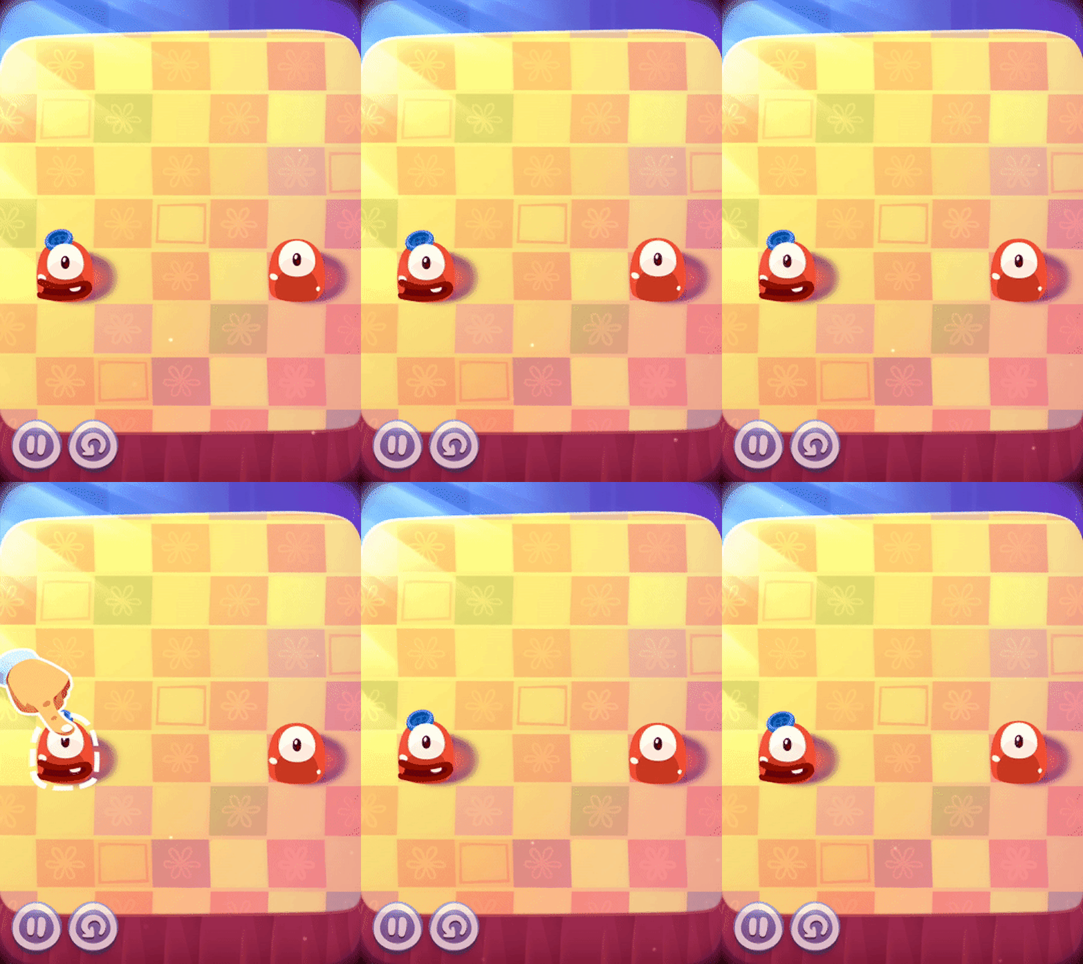
For example, see below where a quick one-time animation can demonstrate how certain functionality in the design is supposed to operate.
2. Delightful animation
Many believe that user experience is all about usability (how a product works), but actually, UX is about a lot more than the “ability to use” something. UX, is in fact, all about your users’ feelings.
“Delight” is a word that we’re hearing and using more often to describe pleasurable moments in our products. Delight is the magic that makes us fall in love with a product. It’s a core element to strive for when designing an app. And animation can make the user experience truly delightful and memorable.
Let’s look at a few ways animation can help create delightful moments on mobile apps.
A. To demonstrate polish

With so many best practices in mobile design, things start to look awfully similar. When everything looks the same, animations can make the key difference: users do notice the details. Details make your app interesting—they are powerful little things that make your design stand out and create truly memorable experiences.
B. To reward the user

Focusing on user emotions plays a huge role in UI interactions. As Aarron Walter said in his book Designing for Emotion: “Personality is the mysterious force that attracts us to certain people and repels us from others.”
Make the UI experience feel like there’s a human on the other end, not a computer. Reward the user with an animation when they accomplish personal goals. For example, when a user reaches inbox zero, create deeper engagement with the app using features like animation.
"Make the UI experience feel like there’s a human on the other end, not a computer."
Giving a reward is a truly emotional interaction: positive emotional stimulus builds a sense of engagement with the user. People forgive the app’s shortcomings when you reward them with positive emotion.
C. To bring personality and humanity to the app

Personality is key in creating memorable experiences. It’s personality that helps drive brand awareness. When there is a personal connection, there is an emotional connection. Users are able to like the brand, because those subtle animations let your users see the people—the real human beings—behind the app. Interfaces that can tap into emotion effectively not only create a broad fan base, they build an army of loyal brand ambassadors.
Animation can also help users express different psychological moods.

D. To entertain users
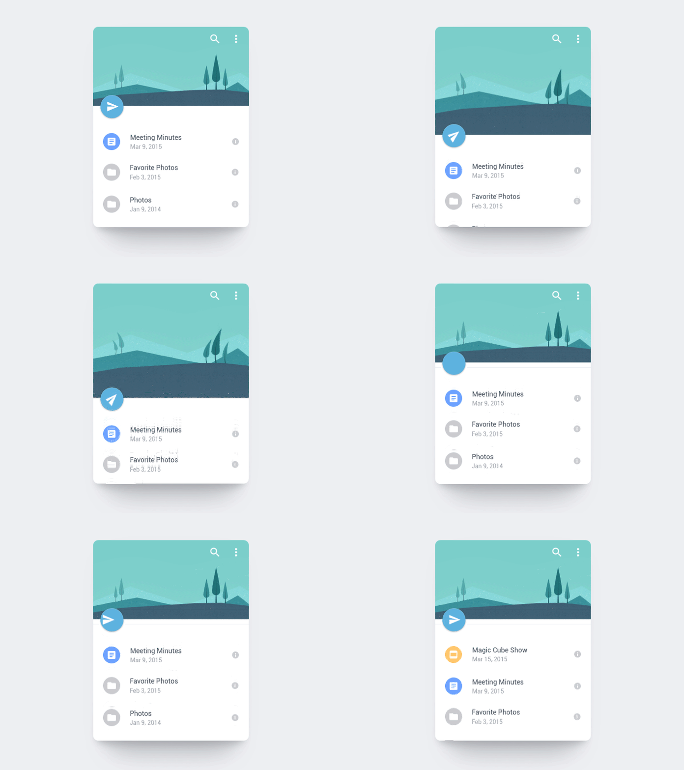
Animations have the power to encourage users to actually interact with an app. It can transform familiar interactions into something much more enjoyable. Attention to fine movements can delight and surprise the user, and create a sense of superb craftsmanship. Well-designed animations make the experience feel well-crafted.
You might also like: Developing Your First Shopify App: 4 Mistakes to Avoid.
Remember this when designing your app’s animations
Animate with purpose.
Animation is powerful when used in a sophisticated way. But with great power comes great responsibility. When deciding to use animation in your app, use it only when it has meaning, and won’t distract the user from successfully completing what they intended to do. Remember that the best animations are those that seem natural, and don’t draw too much attention to themselves.
You can easily test the animation. Michael Villar suggests the following testing method: "If you disable animations, the flow should feel broken; if it is not, this might mean your animations are superfluous."
If you disable animations, the flow should feel broken; if it is not, this might mean your animations are superfluous.
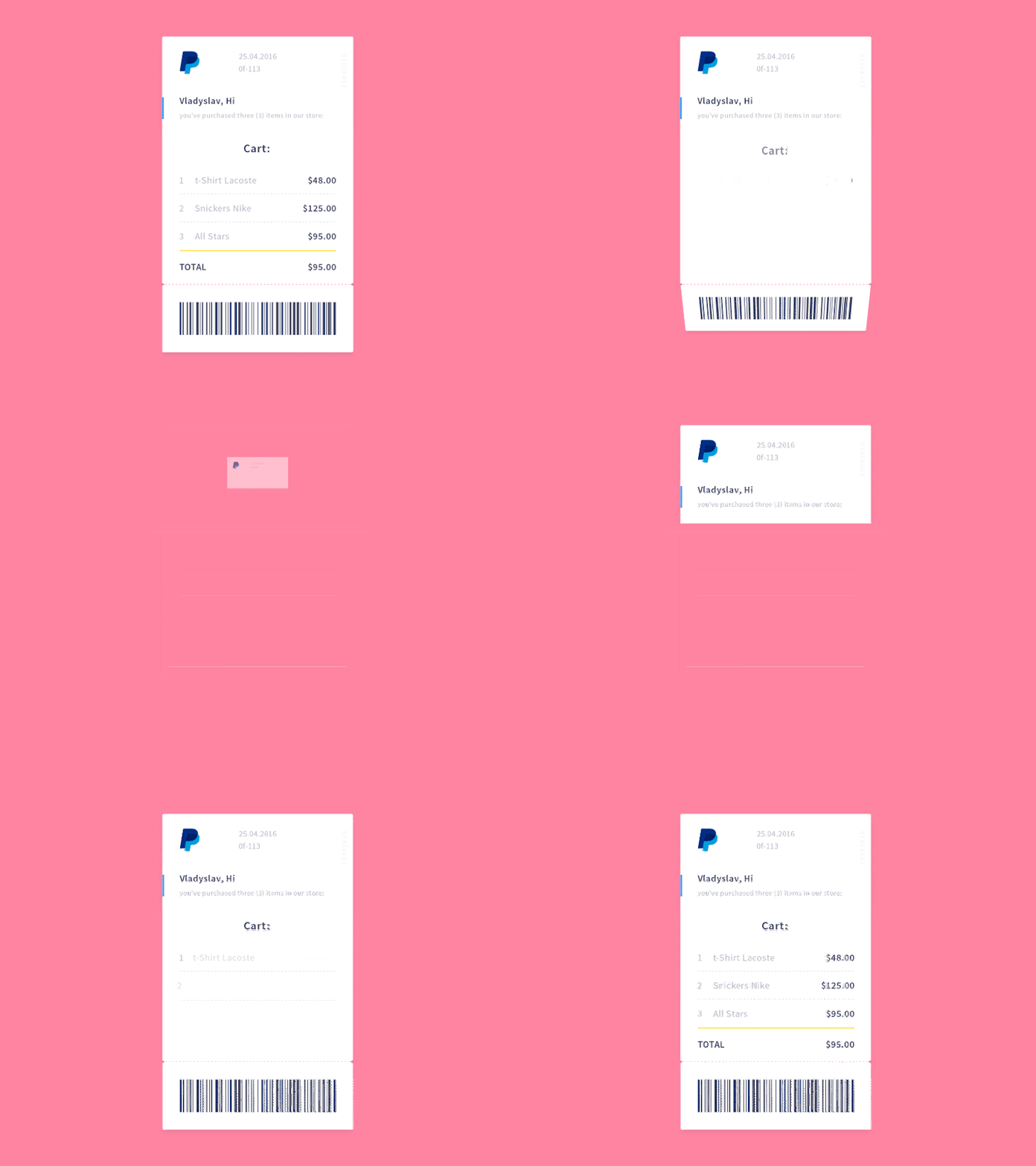
Unfortunately not all animation can pass this test. The animation in the example below is a bit superfluous, in that it could be removed without breaking the flow.
Keep longevity in mind
Keep interactive content simple and designed for repeated use. Ask yourself a question: “Will this animation get annoying on the 100th use, or is it universally clear and unobtrusive?”
Done right, animation has a huge impact on an app’s UX design. It can turn a digital product from a sequence of static screens, into carefully choreographed dynamic experiences that keep your users coming back again and again.
Read more
- Effective App Onboarding: How to Convert Free Trial Users to Paying Customers
- Developer Digest: April 25, 2019
- Three Types of Trending Apps in 2017 and What You Can Learn for 2018
- How to Upload Files with the Shopify GraphQL API and React
- Shopify Marketing: How and Why You Should Integrate Your App
- How to Work with Shopify’s query Argument in GraphQL
- How to Level Up Your App with Theme App Extensions
- App Development: Working Together for the Greater Good
- How to be Successful on the New Shopify App Store
How have you used mobile app animation to improve your app’s UI and UX? Let us know in the comments section below!


