One of the main goals of building a website is to design something that users will remember. Although the goal sounds simple, it is difficult to achieve. There are hundreds or even thousands of websites in every niche, and all of them are fighting for the audience’s interest and attention.
Content and design are two major factors that define whether or not a site will stay in user memory. And when it comes to design, the website’s layout is one of the most critical elements that make a website a success—or a failure. Well-designed layouts are powerful tools to keep users engaged and coming back for more.
In this article, we’ll take a look at seven prevalent layouts you can find on countless sites today, and show how to use them to create a memorable experience.
Website layout definition
A website layout is a pattern that defines a website’s structure. It has the role of structuring the information present on a site for the site’s visitors. Good usability is the first and foremost requirement for website layouts. Website layouts should also have an excellent visual hierarchy—they should make important information easily accessible and intuitive to find. A well-designed layout creates a flow and guides visitors to discover the key information.
But good usability is not enough for creating a truly memorable experience. To create this, you need to be ready to experiment and try various design approaches.
Don’t reinvent the wheel
When it comes to creating a layout for a website, many designers believe they should build a genuinely unique website layout for every project they work for. However, this is far from the truth. If you visit popular websites, you’ll notice that many of them use similar layouts. This isn’t a coincidence. These layouts have a significant advantage—they’re familiar to visitors.
Good user experience is created by building a sense of familiarity with users. When people visit a website that looks familiar, they don’t need to think about how to navigate the site; instead, they focus on consuming content. That’s why while each project is unique and requires an individual approach, it’s always helpful to use familiar layouts.
You might also like: How Theme Developers Can Learn From Brutalist Web Design.
7 common layouts
Below are seven of the most common layouts you’ll find while designing websites, and examples of how you can use them to create a memorable user experience.
1. Single column layout
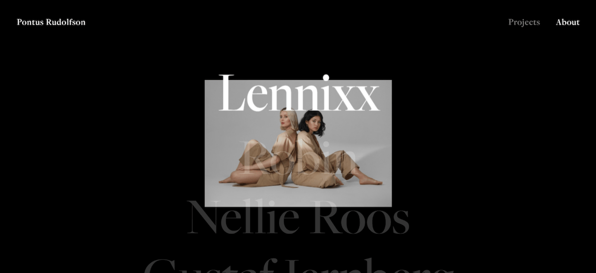
Single column layouts present the main content in a single, vertical column. This type of website layout is perhaps the simplest on our list and is the easiest for users to navigate—all visitors need to do is scroll for more information. The rise of mobile devices made a tremendous impact on the popularity of this type of layout, as they fit mobile screens perfectly.
When to use it
This layout is well-suited for personal portfolios based on minimalistic design principles. It is excellent for photographers, writers, bloggers, and other creatives.
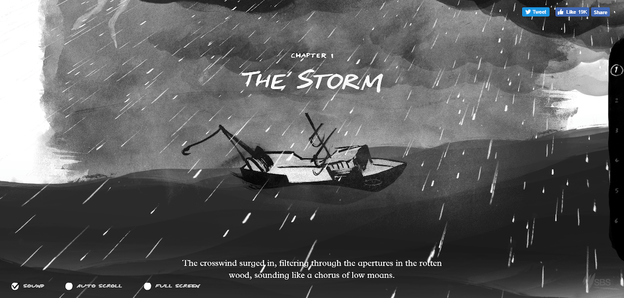
A single column layout is also great for telling stories. Check The Boat example below. On this web page, sections come one by one to tell a complete story.
2. Z-shape and zig-zag layouts
The Z-shape layout is based on the “Z” scanning pattern. Its design mimics the route the human eye travels when it reads the content:
- People scan the page from the top left to the top right, forming a horizontal line
- Next, their eyes wander down and to the left side of the page, creating a diagonal line
- Lastly, they glance back across to the right again, forming a second horizontal line
A zig-zag pattern is a Z-pattern repeated a few times on the same page. A well-designed zig-zag layout can create a rhythm that will keep visitors interested.
When to use it
The Z-shape website layout is better suited for sites or individual pages with a singular goal, such as a single-page promo website or a landing page for a particular service. Such websites/landing pages visually look and feel like online posters. The visitor’s attention is directed to specific points such as text sections or call to action buttons.
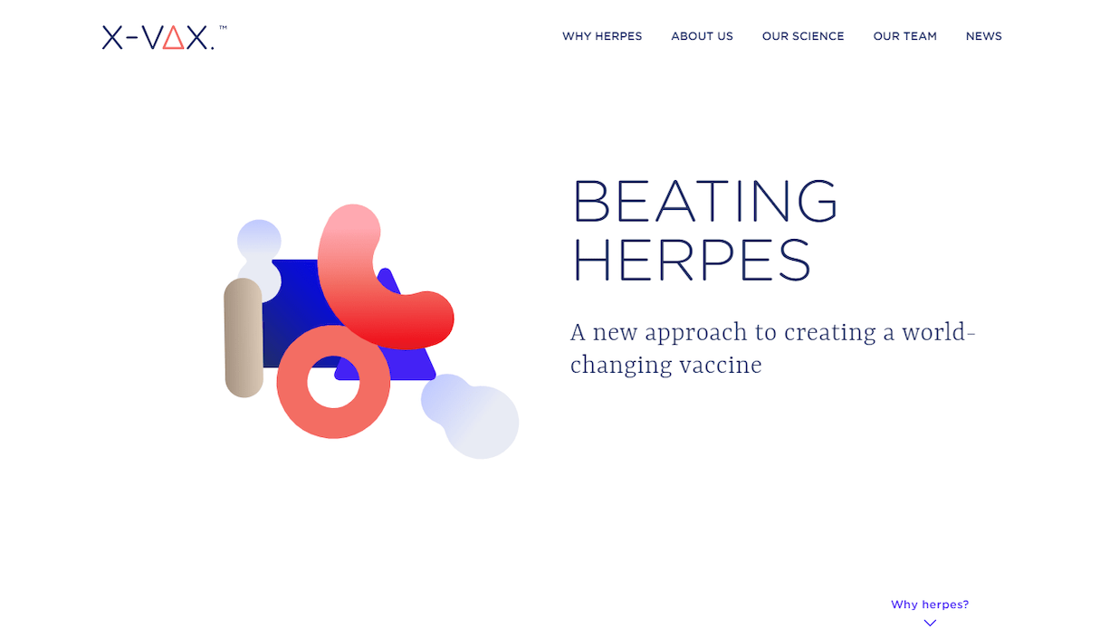
The zig-zag layout is excellent when you want to introduce visitors to a few important topics, but don’t want to overwhelm them with too much information.

You might also like: 22 Basic UX Laws That Every Designer Should Know.
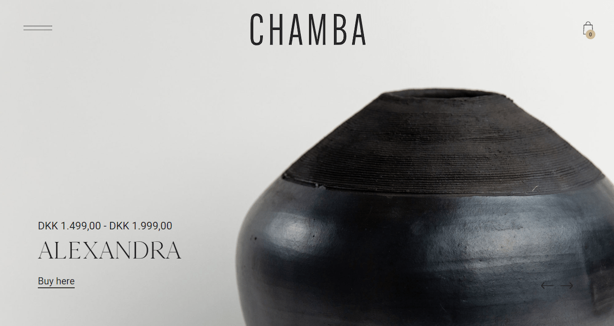
3. Fullscreen photo or video
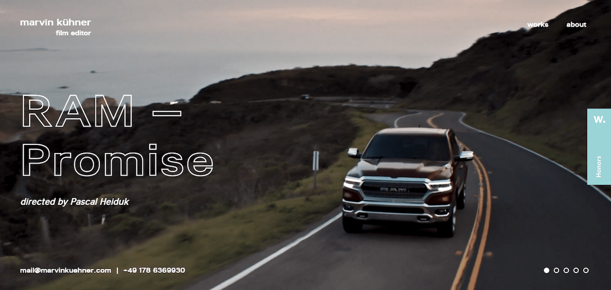
The core element of this layout is one big visual that is used as a background for the entire page. Using images or videos in design is the fastest way to sell products, ideas, or solutions because imagery creates an emotional connection with visitors. A big, bold photograph or video of a product makes a strong statement and creates a stunning first impression.
When to use it
This website layout is excellent for anyone who wants to follow the approach ‘say less, show more.’ It works best when you need to demonstrate only one idea/product/service and focus a user’s entire attention on it. This type of layout helps build a genuinely immersive, emotional experience.
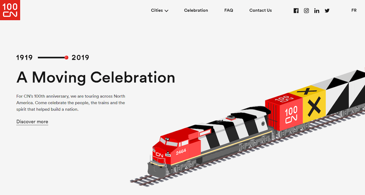
4. Intentional asymmetry
Asymmetry is the lack of equality between the two sides of the layout. It is a long-favored technique in traditional art, but is also quite popular among web designers.
Asymmetry is excellent for creating tension and dynamism because it focuses the user’s attention on individual elements (focal points).
When to use it
This type of layout can be used when designers want to create exciting and unexpected layouts, while still providing directional emphasis. Generally, this layout is more appropriate for a website that is less strict and more artistic.
Color is the secret ingredient of asymmetry. It’s easy to add focus to a particular element by playing with contrasting colors. When visitors scan the page, their attention will be naturally drawn to objects that have more visual weight.
You might also like: Dark Patterns: 12 Tricks You Should Never Use in Your Products.
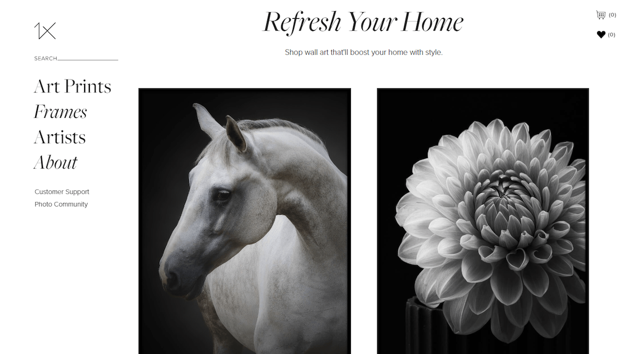
5. Fixed sidebar
Navigation is a critical part of any website—the menu is the first thing most users look for when they want to navigate a site. The fixed sidebar layout attempts to solve the problem of navigation by providing a fixed navigation bar to the left or right side of the screen. The bar is always visible no matter where visitors are on the web page.
When to use it
This website layout works well for websites with a relatively limited number of navigation options.
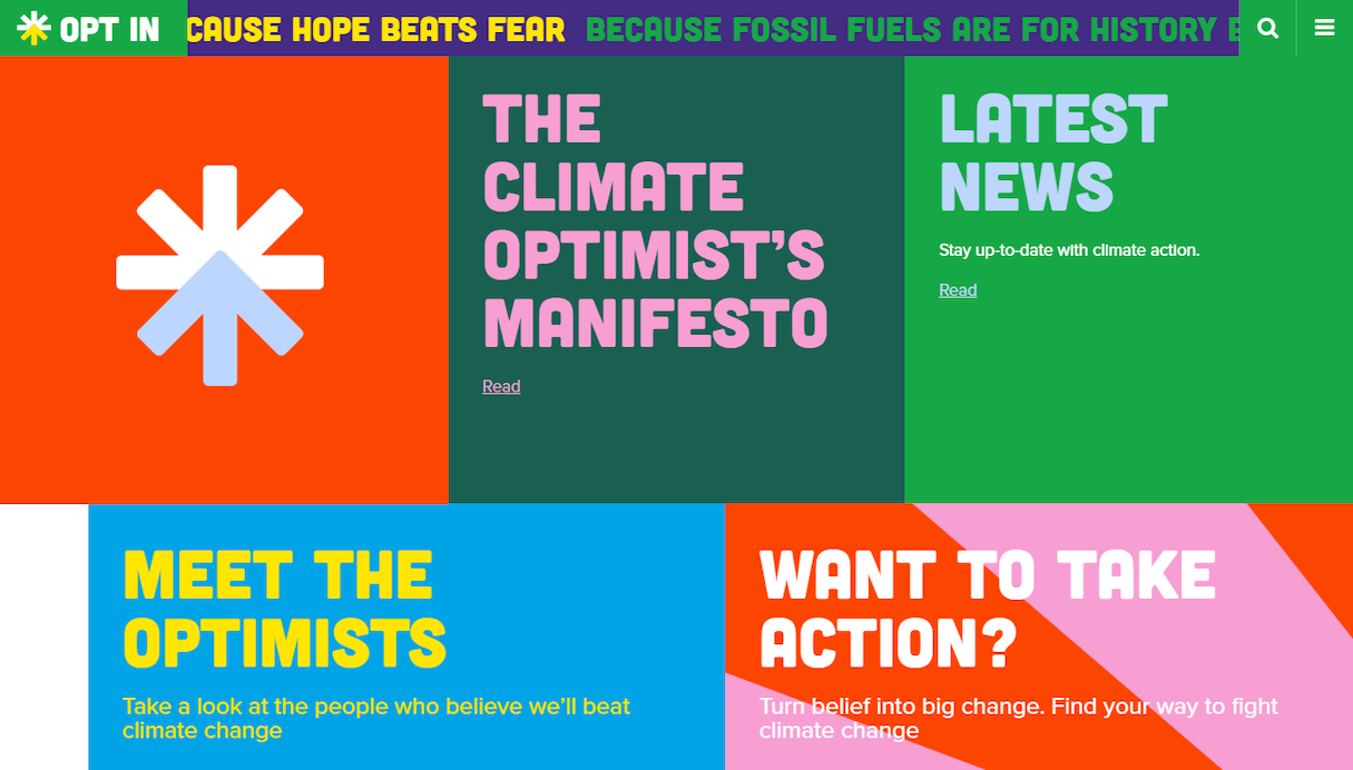
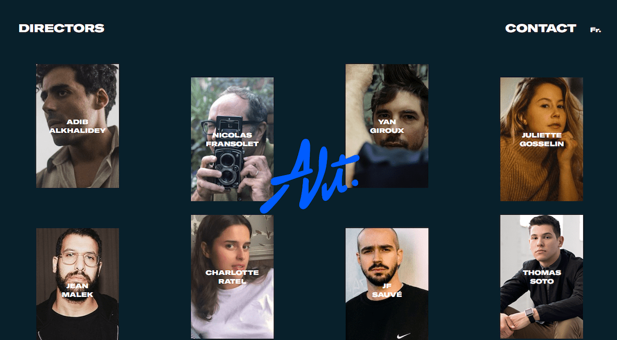
6. Grid of cards
Cards are great containers for information. They allow designers to present a large amount of information in an easily digestible manner. Cards act as bite-sized previews that help visitors to find the content they like, and then dive into the details.
The great thing about a grid of cards is that this type of layout is very manipulatable. Grids can vary in size, spacing, and the number of columns, and the style of the cards can vary based on screen size, since they can be rearranged to fit any screen. That’s why grids of cards work so well with responsive designs.
When to use it
A grid of cards website layout is good for sites that need to display a lot of items with equal hierarchy.
7. Split screen
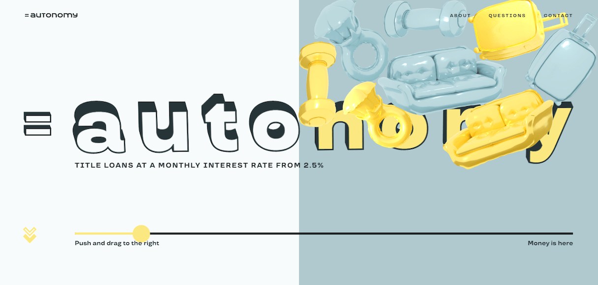
A split screen (or one screen divided into two) layout allows designers to display two pieces of content simultaneously while giving them equal visual weight.
When to use it
A split-screen website layout is great when you need to present two different pieces of content that have equal importance and should be shown in the same manner.
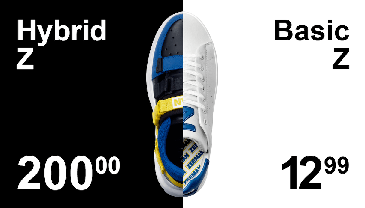
But this layout is also good for making bold creative statements.
You might also like: Frictionless Experience: How to Create Smooth User Flows.
Keep visitors coming back
When designing a website, your ultimate goal is to select a website layout that will be simple to navigate and a joy to spend time on. If you meet this goal, you will create a great first-time experience and increase the chances that people will visit your site again in the future.
What are your favorite website layouts? Share your thoughts in the comments below.


