In early September of this year, the Shopify team launched the new Shopify App Store. The new design boasts a beautiful layout complete with updated app listing pages and four Shopify Staff Picks featured at the top of the home page. As Shopify app developers, we worked hard to make sure our app page reflected the design requirements of the new app store.
A few weeks after launch, we found out that our app Shippo would be featured as a Shopify Staff Pick in just three days. We’ve been around for awhile, so we had no worries about our integration with Shopify. But we knew we wanted to take full advantage of the staff pick listing by updating our app listing page to ensure the best possible user experience. So what followed were three days of getting our app page ready for its big show.
What we learned is that these changes can be implemented at any time, and can be done in as little as a few days. In this blog post, we share our step-by-step process for how we prepared to be a staff pick, and how you can do the same to optimize your listing at any time.
Step 1: Coming up with assignments
We got an email from the Shopify Apps team the morning of Friday, September 21 that we would be featured on Wednesday, September 26—giving us less than three business days to prepare before go time.
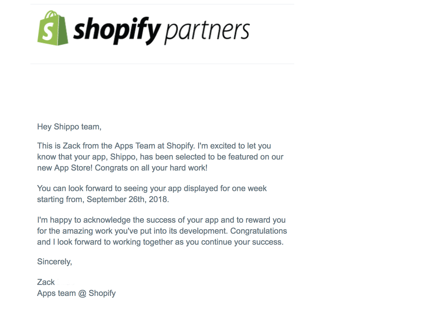
This new opportunity to get exposure to so many new merchants was a special one, so we divvied up the work of optimizing our app listing into three main assignments. The experiments we ran can help you quickly optimize your app listing at any time.
Below, we look at how we approached each assignment to create an amazing user experience.
Assignment 1: Updating our feature image
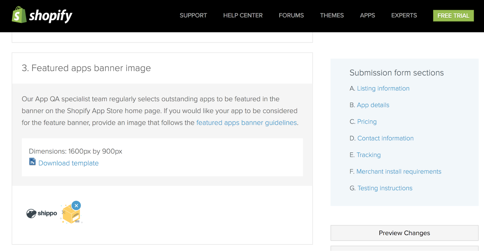
When editing our app listing, we noticed that there was a separate section to upload the banner image for staff picks, located at No. 3 under section “B. App Details.” We originally had a simple image with just the Shippo logo in white over a green background. We tapped our design team to think about how we could capitalize on this prime real estate and make our feature image stand out among the other three selections.
Assignment 2: Reviewing the Shippo app page copy
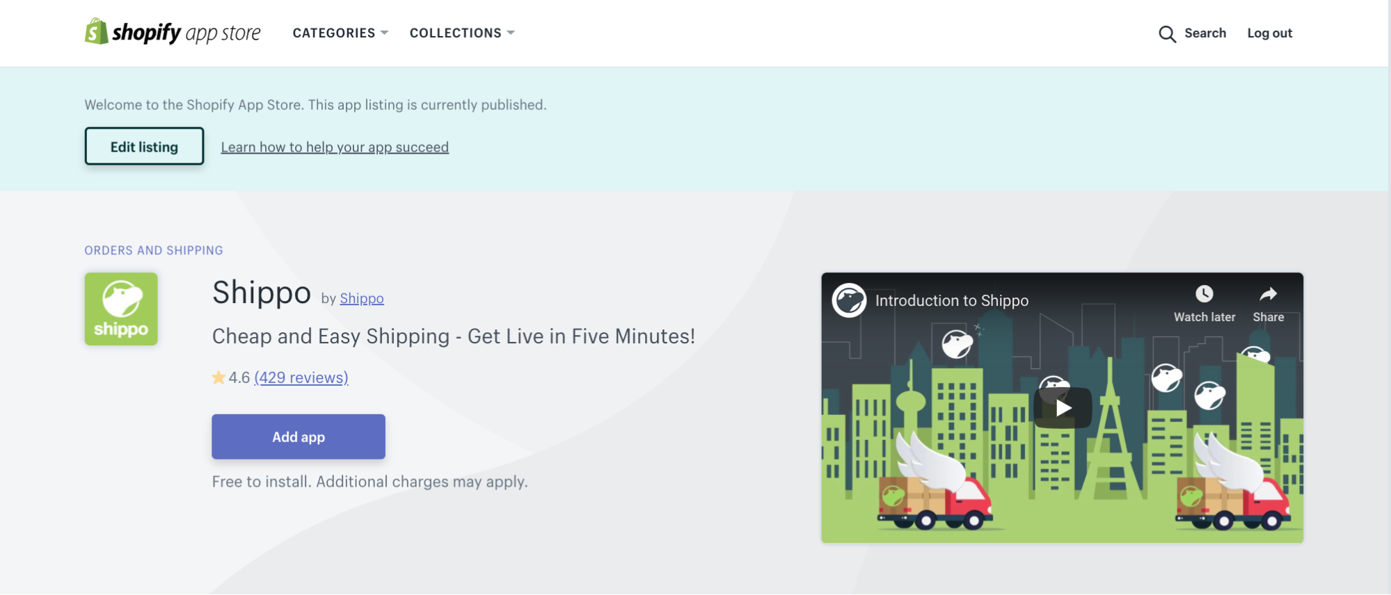
Next, we knew we were going to get more eyeballs on our app listing page, so we wanted to make sure we were putting our best foot forward with the messaging there. Our content team jumped up and started reviewing our content and value props to see what we could improve.
Assignment 3: Perfecting the Shopify user experience with Shippo
As all Shopify app developers know, the experience doesn’t end once the user clicks “Add App.” We wanted to make sure the onboarding experience was optimal for these new users, as well.
With our tasks divided between us, we got to work.
You might also like: How to be Successful on the New Shopify App Store.
Step 2: Iterating on our existing content and flows
Since we didn’t have lots of time, we knew we had to work with the content we already had to get ready for the staff pick listing. Below, we look at how we completed our assignments on time, without rebuilding our marketing assets from the ground up.
The feature image
We also created a new featured image design to differentiate Shippo from the other staff picks. We experimented with a few different options.
The original had a solid green background with our white logo overlay. However, we had recently updated our website and the image didn’t quite fit with our new style and iconography. Our design team created a few other options for us to consider.
Original:

Option 1:

Option 2:

Option 3:

Option 4:

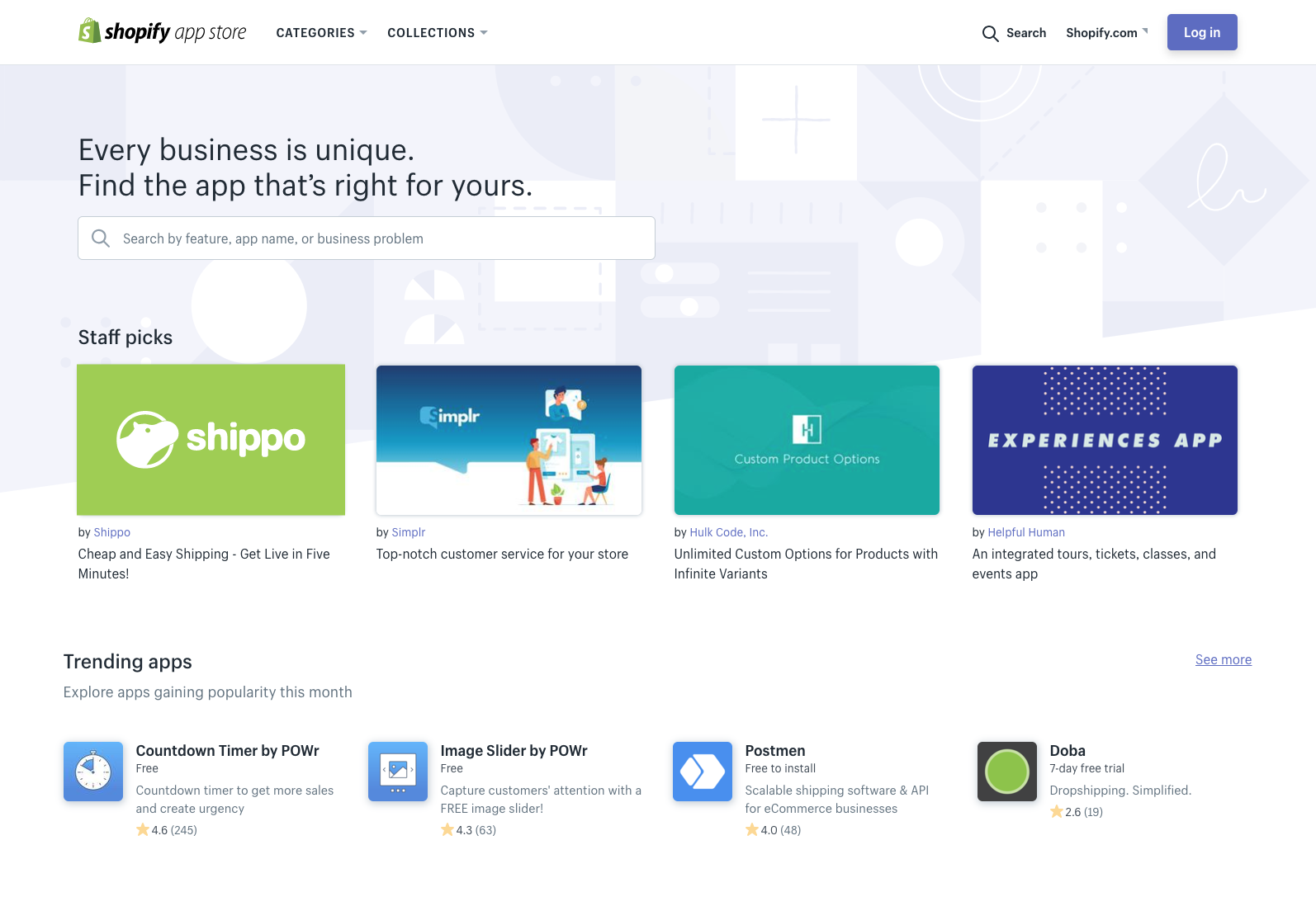
We chose Option 1 since it was clean and simple. We also tested each option by taking a screenshot of the current staff picks and adding our banner and app information as an overlay. Taking a look at your logo in context of the overall apps page is a good way to get a sense of how your app stands out from the competition.
You might also like: Research 101: How to Conduct Market Research for Your App.
The app listing page
Like we mentioned above, it had been a while since we reviewed the Shippo app listing page. We were already planning to give the copy a facelift, and this Shopify Staff Picks feature added further fuel to our fire and bumped this up as a priority.
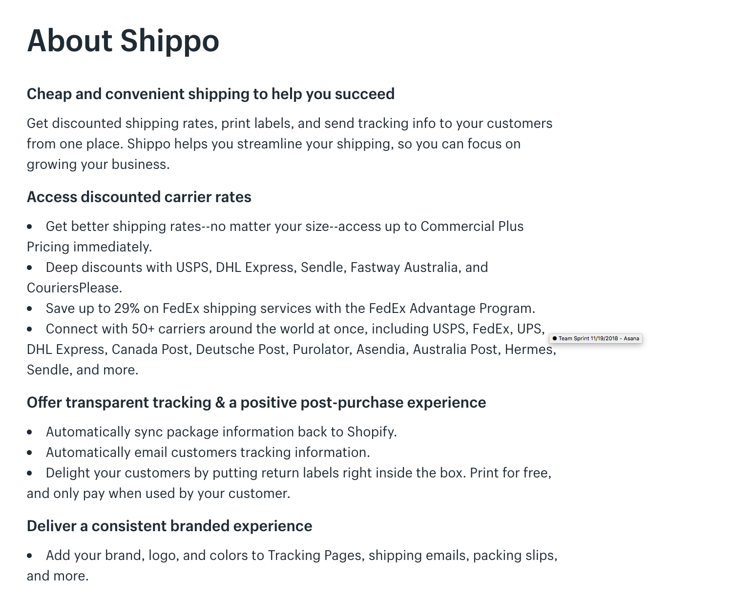
The copy had some wonky formatting, possibly stemming from when we copied the content to Shopify’s new app listing format. Only one subhead was bold, and the rest blurred into each other without a clear depiction of where each sentence ended. We tidied up our formatting, and then turned our attention to the copy itself.
"We added bold subheadings and bullet points to make it easier to read to make it clear how our app can help them."
We took a look at other shipping and fulfillment apps in the Shopify App Store to compare value propositions and analyze their messaging. We wanted to make sure the copy was clear and concise, while also making sure our messaging was up to date and relevant from a competitive perspective.
Once we’d finished reworking it, we had much cleaner copy. We added more bold subheadings and bullet points to make it easier to read, and walk merchants through exactly how our app can help them.
Our onboarding experience
The work isn’t done once a merchant installs our app . We also took time to review our Shopify onboarding experience, making sure the emails that new users received were relevant, up-to-date, and useful for getting up to speed using Shippo.
Since we had just recorded new “How to Shippo” YouTube videos, we repurposed some of that content to create an onboarding video specifically for Shopify users. We added this to our email onboarding sequence, so new users would see the content right after they signed up.
We found that onboarding videos are helpful tools to ensure users know where to find important features and get them set up with Shippo as quickly as possible. You can use tools like FullStory to monitor the customer experience, find customer pain points, and then use onboarding videos as one of the many avenues to help alleviate those issues.
With this final update, we were ready for Shippo to be featured as a Shopify Staff Pick. We queued the emails, uploaded our changes, and waited for the big day.
Step 3: Analyzing in real time
The day came, and our app went live as a staff pick. But our work wasn’t done—throughout the time that Shippo spent on the front page, we continuously monitored and made changes when necessary.
One of the first updates we made was with our image. The morning of launch, we took a peek at the Shopify App Store home page and realized that another staff pick had the same turquoise blue background color as our banner image. To better differentiate and stand out, we published our second option image from our design ideas.

This worked out well for us. Since the staff picks tend to be a mix of different services, including marketing, operations, and fulfillment apps, we decided to include some packaging iconography to the image to explain to Shopify users that Shippo is a shipping app.
Here’s the result:
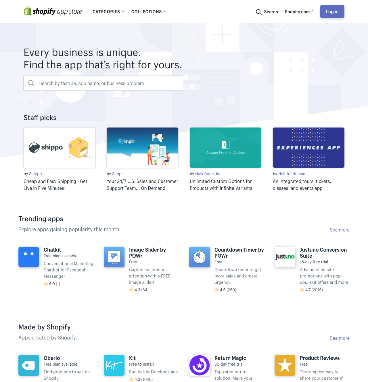
Keep an eye on the changing context of your app. Have there been further updates to the app store? Does your app still stand out? Is your app listing page still at its best? Regularly revisiting how your app is presented is a good way to ensure that you’re putting your best foot forward.
Lessons learned
During the week that we were featured as a Shopify Staff Pick, we had three times (yes, 3x) more signups than we do during a typical week. We learned a lot during the process—and most of it is information that matters whether or not your app is a staff pick. Some of our key takeaways include:
- Be nimble. After spending a lot of time perfecting that banner image, we had to change it quickly to differentiate Shippo—a decision that ended up being beneficial for us.
- Spend time on the details. We did a deep dive into the content on our app page, making sure the smallest details were perfect. We think this played a big part in having a professional look and feel.
- Put yourself in your customer’s shoes. We wanted to make sure the experience was a positive one. In order to do that, we had to go through our own onboarding flow and app store experience to ensure that everything was seamless.
Even when you’re not featured in the app store, these learnings are great to keep in mind as you’re preparing and evolving your app listing. All these factors helped us build an app listing page that led to more conversions, and helped merchants better understand our product.


