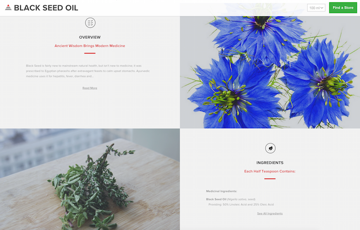
Enerex is a nutritional supplement that helps people meet their dietary needs. They enlisted digital branding agency Skyrocket to help design an online store that showcased Enerex's unique brand philosophy through user experience.
We caught up with Mo Dhaliwal, Director of Strategy at Skyrocket, to find out what inspired the design.
Tell us a little bit about Skyrocket.
We're a digital branding agency. Essentially, we work with clients to help them engage their audiences online. In some cases our clients are community and cause-based organizations, and in some cases they are online retailers looking to connect with their customers. For us, brand isn’t a logo, or identity, or look and feel — brand is your relationship with your audience. And because we have such a deep understanding of brand, what it means, and the importance of that relationship, it informs our approach to user experience. User experience is an extension of brand because it's another opportunity to create a relationship with your audience.
Brand isn’t primarily a logo, or identity, or look and feel — brand is your relationship with your audience.
You might also like: Partner Spotlight: Fifty & Fifty Designs Site for Kickstarter Product
What's your favourite Shopify project you've worked on?
Probably Enerex. As far as pushing the envelope on the content side, and what we can do structurally with Shopify's Liquid templating engine, Enerex is the farthest we’ve taken it.

Where did the inspiration for the store's design come from?
Mike, our Creative Director, spent a lot of time looking at the company’s strategy and product line. He also took some time to understand their philosophy, which is all about taking a holistic approach to health by using extremely high-quality, high-purity ingredients in all of their products. The idea was to showcase the product philosophy through the user experience.
What changed along the way?
The new website was a huge departure from their old one, so it’s not so much that we switched direction, but more so there were a couple of things that evolved. As we got a deeper understanding of the Enerex brand and their message, there were some aspects of aesthetics that we really brought in line with their brand. I would say the design evolved over time, and, beyond that, some of it just came from learning.
For example, we came to understand that Enerex has a depth of content and information related to every product. A regular product detail page might feature the product, price, and some general overview of why that product is good — but the reality was that the Enerex team actually spends a lot of time on the research and the explanation of what a product's health benefits are. So we had to figure out how to make all this information actually accessible in a usable and friendly way. You could say some of these learnings came up as we proceeded to go through with the design.

Did Enerex request any unique features?
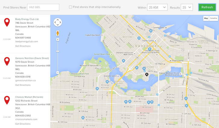
Yes. For example, they wanted a "Store Locator" function. Enerex has a very deep relationship with their network of distributors and retailers. So in building an ecommerce storefront, they didn’t want to depart from all that. Instead, they wanted to actually showcase their network of partners. To do that, we elevated Store Locator in the website hierarchy more than we would have done for a conventional ecommerce website.
We also changed the way the retailers are updated; essentially automating the process through bulk import, which made it possible to update store locations by hundreds at a time. Because Enerex supports retailers so much, they are actually quite happy to send traffic to them. So we added conditional searches to Store Locator. Now, users can find retailers that ship internationally, have their own online presence, etc. We really put a lot of time and effort into thinking about how Enerex’s retail network is going to show up on the website.

What tools did you find most useful while creating the website?
We do a lot of curation of the Shopify app marketplace, which is, thankfully, very rich and extensive. I guess the only challenge there is to find something that works best out of thousands of different options,. So, naturally, over time, we’ve started to curate the types of plugins we use more often than others. Normally, they would have a fair amount of support, a solid community of users and frequent updates. It’s very important for us to have trust in the publisher before we integrate their app into the client’s website.
Store Locator by Bold Apps is definitely a big one. There is also Traffic Control - Bulk Redirects by Refersion. We used it because Enerex’s old website had been around for quite a while and had a lot of content legacy URLs that needed to be transferred over. When you have 600–700 unique URLs to redirect, you need a bulk way of doing it systematically. Traffic Control app handles that, as well as some wildcard redirects for URLs we want to do pattern matching for. Then, we also used some common apps like Product Reviews and Shopify's Desktop Theme Editor for advanced customizations.
You might also like: 5 of the Best Prototyping Tools to Test Out Your Web and Mobile Designs
What makes this shop unique?
I think everyone who has seen this build said the same thing — that it doesn’t look like a Shopify store, and that it’s quite distinctive to the brand.
There are a lot of things that are common on an ecommerce site: a landing page, a product category page, and a product detail page. But the challenge is to implement those sections without the website ending up looking like a typical ecommerce store or a marketplace. So I think that the extent to which we were able to bring the Enerex brand into the look and feel made the store really unique.
There are a lot of things that are common on an ecommerce site... But the challenge is to implement those sections without the website ending up looking like a typical ecommerce store.
What’s your favourite feature on the site?
Frankly, it’s the product navigation. We came up with a tagging methodology for the products, whether you are clicking into the main product areas (Essentials, Builders, or Functionals); or whether you are looking at recommended or featured products; or whether you are filling out their questionnaire for what your body needs. This tagging system gives us a lot of metadata around the products.
But not only do tags help us quickly search and come up with a relevant product list for the consumer — they are also bringing in the Enerex brand and the Enerex product strategy. We pulled in intelligent tagging to associate the Enerex pyramid with all the products. Everywhere a product appears, you will see the pyramid that tells you what this product is: Essential, Builder, or Functional. Creating these sort of associations and having that sort of design language following you throughout the site is not an incredibly complex feature, but it’s just one of those thoughtful solutions that makes the experience more intuitive and engaging.

What was the most difficult part about creating this store?
Probably coming up with the methodology for creating and then associating product pages and subpages with all the additional content that Enerex has for its products. It’s fine to upload everything and sort of get it done, but we also wanted to leave the client in a state where the backend was highly usable and configurable. We were able to come up with a really intelligent way of using Shopify’s built-in page templating system, which is much easier than configuring convoluted methods via third-party plugins.
What did you learn while creating this website?
Having a CMS with a deep content structure and a lot of meta content related to the products is, perhaps, seen as a weakness in Shopify, or something that requires third-party plugins to enable properly, and, sure, there are a lot of apps and plugins that are available. However, with some thoughtful planning, you can achieve some powerful effects with Liquid. I'm specifically referring to the ability to associate additional metadata with products.
I think the biggest learning for us was that, frankly, if you just come up with the right conventions, there are a lot of interesting ways to associate rich content — like creating extra hidden subpages that funnel data to the product page. It might seem like a lot of complex content structures at first, but once you get the hang of it, you can create associations with products no problem.
Read more
- Determination and Devotion: How Two Entrepreneurs Changed the Ecommerce Industry in Mexico
- From Bookmarks to a Marketplace: Aveste Built a Custom Marketplace Serving Both Customers and Small Brands
- How Shopify Plus Partner Maestrooo Balances Building Themes and Apps, with Client Work
- How Bold Commerce Built an App Development Company From the Basement Up [Part I
- For Designers, By Designers: InVision's Marketplace Launches On Shopify
- How We Built a Global Empire from a Small Island in the Pacific Ocean
- In Search of the American Dream: How Ethercycle Found Success with Shopify
You might also like: Partner Spotlight: Ethercycle Boosts Conversions for Everest Bands

