Understanding why buyers abandon their online store purchases is key to learning how developers and designers can improve their custom themes and boost their client’s conversions. According to the Baymard Institute, 26 percent of US online shoppers have abandoned an order in the past quarter solely due to a ‘too long / complicated checkout process’.
The user experience on a store’s cart and checkout pages is crucial for determining whether or not a sale will be completed. If theme developers and designers can remove complexity from these pages, and introduce familiarity, buyers will feel more at ease, which should lead to a lower cart abandonment rates for your clients.
Shopify’s dynamic checkout buttons facilitate a checkout experience which is tailored for a buyer’s preferred form of payment, be that Apple Pay, PayPal, or others. These buttons simplify navigation during the payment process by offering the buyer access to the most suitable call to action button.
Now that dynamic checkout buttons are available on the cart page and product pages, you can provide themes that ensure a streamlined and expedited checkout process no matter where a buyer is on the site.
In this article, we’ll look at how to implement dynamic checkout buttons onto your custom theme’s product and cart page. We’ll also look at what role dynamic checkout buttons play in the buyer's journey and considerations that need to be taken into account when using them.
Designing for choice and consistency
It’s critical to recognize that your client’s buyers have different preferences, and that theme developers can empower clients to service these different preferences through careful store design. The rise in popularity of digital wallets and alternative payment options means that you can give your themes the competitive edge with dynamic checkout buttons.
One of the quickest growing digital wallets is Apple Pay, which allows buyers to use their bank accounts to pay for products quickly through iPhones and Apple Watches. Many of the world’s biggest brands have adopted Apple Pay as a payment option, including 74 of the top 100 US retailers.
As these unique payment options gain in popularity, there will be an increasing expectation from buyers to experience the specific look and feel they’re accustomed to when using a particular wallet. With Shopify’s dynamic payment buttons, merchants are now able to provide this frictionless buyer experience.
Currently dynamic payment buttons which connect with PayPal, Google Pay, and Amazon Pay can be added to a themes cart or product pages. Each of these buttons will lead to a buyer through a specialized checkout process, designed with ease of use in mind.
When dynamic checkout buttons are added to a product page, buyers skip the cart page when they click on it and are automatically brought to the Express checkout flow. When dynamic checkout buttons are added to the cart page, the buyer can simply use this checkout flow for their purchases rather than continuing to the regular Shopify checkout.
As well as an expedited and simplified checkout experience, there’s an additional benefit of using dynamic checkout buttons. By using Liquid to generate these buttons, you can ensure a consistent user experience on each of your theme’s pages.
Since the icons for the available payment options will be the same whether on the product, cart, or checkout pages, you don’t have to worry about any visual inconsistencies. Having the same visual language across your client’s stores will contribute to the buyer’s experience and their trust in that store.
You might also like:Progressive Disclosure: Simplifying the Complexity.
Implementing with Liquid
Implementing dynamic checkout buttons on product pages involves using the Liquid {% form %} tag to create add to cart and checkout buttons. As we learned previously, the form Liquid tag generates an HTML <form> element along with the necessary inputs to send submitted data to a specific endpoint.
In this case, {% form 'product' %} can be used to output the regular add to cart button, as well as the dynamic checkout buttons. Within your theme, you’ll need to find the product form by searching for <form action="/cart/add", and replace it with the following:
{% form 'product', product, id: "oldID", class: "old-class" %}`
Since we’re no longer using a HTML form tags, you’ll also need to replace the closing </form> tag with it’s Liquid equivalent: {% endform %}.
Next, you’ll need to find where the add to cart button is being generated by searching for an input or a button tag that has the attribute type="submit". If you want the dynamic checkout buttons to appear below the regular checkout button, you should find the closing <button> tag, and add this:
{{ form | payment_button }}
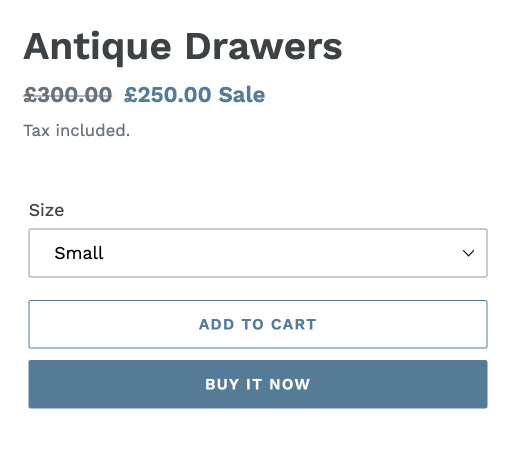
Once this has been added to your theme, you should see a dynamic checkout button, which reads “Buy it Now” on the product page:

Adding dynamic checkout buttons to cart pages is a relatively more straightforward process. For cart pages, the dynamic checkout buttons are automatically generated using the {{ content_for_additional_checkout_buttons }} Liquid object.
However, it’s important that this object is wrapped in a container with a class of “additional-checkout-buttons”. You can add this to your cart template file, below the closing <button> tag for checkout, and we can use an if statement so that the container only loads if there are additional payment options.
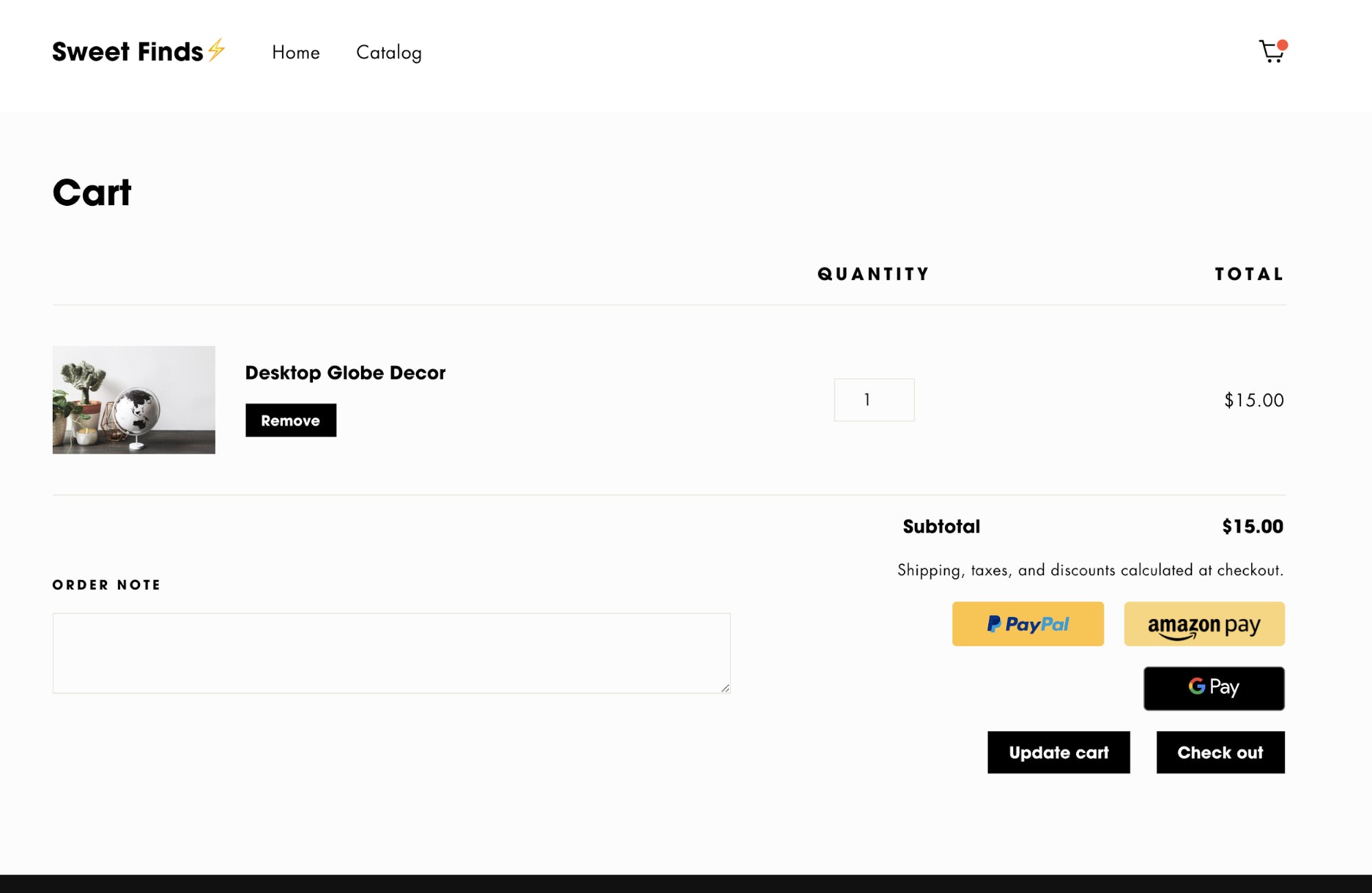
When it’s set up on the cart page, it should appear like this:
{% if additional_checkout_buttons %}
  <div class="additional-checkout-buttons">
   {{ content_for_additional_checkout_buttons }}
  </div>
{% endif %}
Now when you navigate to the cart page, you should see the available dynamic checkout buttons appearing:

Considerations for accelerated checkouts
Before implementing dynamic checkout buttons across the board for all of your custom themes, it’s worthwhile to consider which of your clients this payment process would be suitable for. Depending on the types of products your clients are selling, it’s possible that an accelerated checkout might not be the best fit.
Currently with dynamic checkout buttons on product pages, it’s not possible to capture cart attributes, so if your clients have fields for customizing products or adding a cart note, this data won’t be captured.
In addition, if your client has a terms and conditions checkbox on their cart page, it will not be compatible with dynamic checkout buttons. If these are requirements for a client, you shouldn't add them to their theme.
To ensure your theme provides the best possible service for your client, be aware of their unique requirements and products to avoid adding functionality that would limit them in the long-term.
To ensure that the buttons retain their visual consistency and layout, it’s strongly advised that no custom CSS is applied to the additional-checkout-buttons class. Since the code for the additional checkout buttons is subject to change, custom styling could result in conflict and visual issues with any future updates.
You might also like:How to Build a Customizable Related Products Section.
Improve conversions for your clients
With the rise in popularity of new ways of paying for products online, you can future-proof your theme by integrating accelerated checkout methods. As well as providing additional payment options, implementing dynamic checkout buttons is one way to simplify the checkout process for your clients and maximize conversions.
Read more
- Introducing Online Store 2.0: What it Means For Developers
- Storefront API Learning Kit
- SidePanda: From Indie Makers to SaaS Business Owners
- How Safe As Milk Grew a Successful Theme Partner Business
- 8 Development Tips for Building Better Custom Shopify Sites
- Best Practices for Developing Scalable (and Sustainable) Shopify Themes
- Shopify’s Buy Button 101: How to Use BuyButton.js in a WordPress Theme
- How to Test your Theme Before Submitting to the Shopify Theme Store
- A CSS Grid Framework for Shopify Collection Pages
How have you used dynamic checkout buttons in your theme designs? Share your experiences below.

