We’re designers, which means we love to make things useful, and the ecommerce websites we build are no exception. But if we call ourselves UX designers, we need to think beyond the edge of the screen.
"But if we call ourselves UX designers, we need to think beyond the edge of the screen."
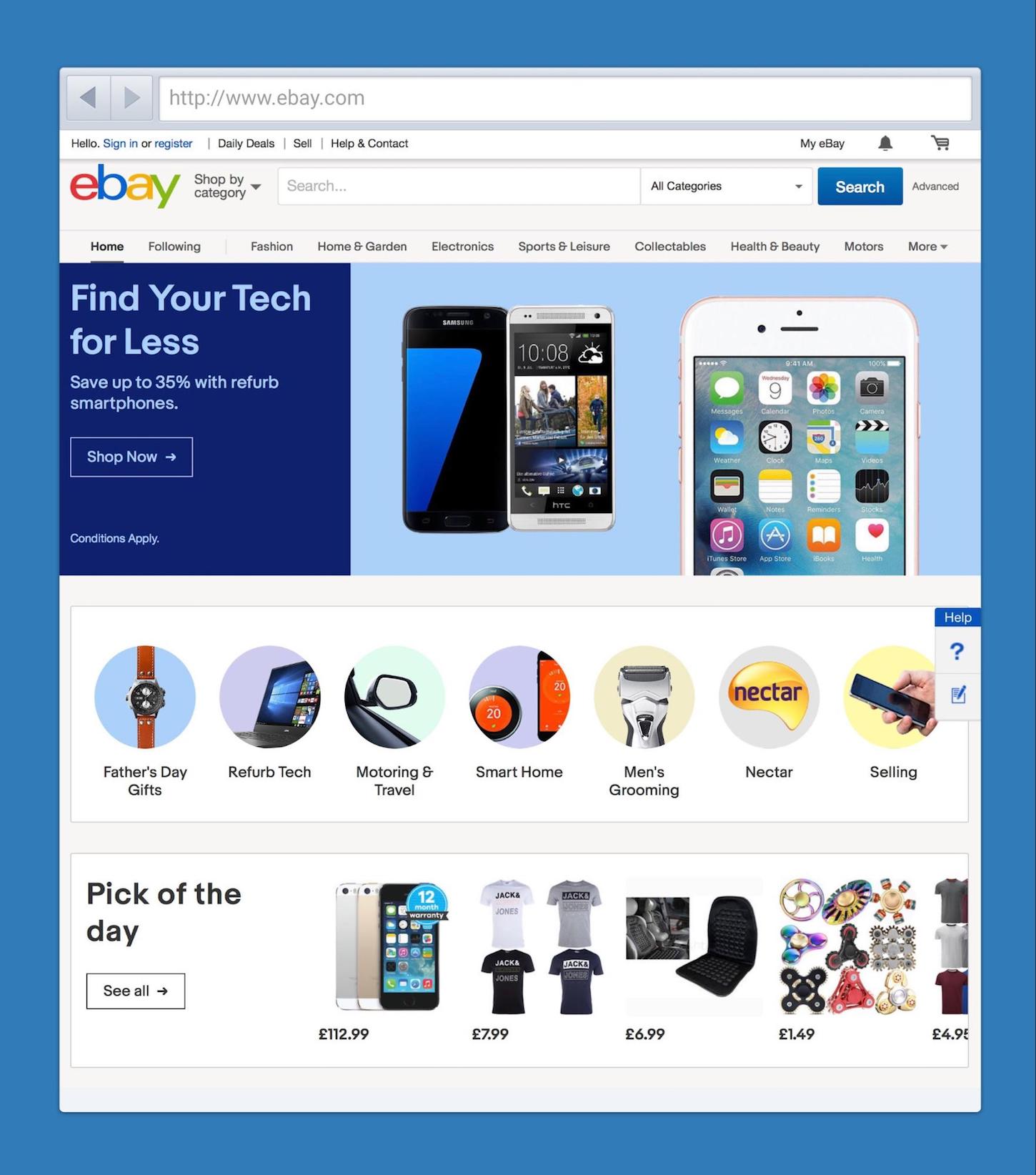
Have you ever wondered why some of the most successful ecommerce sites are just damn ugly? Think about it for a moment. eBay, Craigslist, Amazon, none of them are particularly attractive. Not only that, they even have some serious usability issues. Despite this, they’re phenomenally successful. How can that be?

The answer lies in the fact that a successful ecommerce business is about a lot more than a beautiful user interface. But don't misunderstand me, good usability and a well-designed UI are incredibly valuable. However, they are not the whole story.
That means if we’re going to help our clients, we need to look beyond the design of the user interface. Fundamentally this is the difference between a UI designer and a UX designer. The first focuses on the design of interfaces (does it give buyers the info they need? Can they look closer at products with jQuery image zoom?), and the other looks more holistically at the whole experience. Both are a critical role, and neither is more important than the other. They’re just different.
In this article, I want to look at three areas of ecommerce you should consider if you want to position yourself as a UX designer. Areas that a UI designer would consider outside of their responsibility. But areas that our clients desperately need help addressing. These areas are:
- Top-notch communication
- Removing risk
- Offering outstanding customer service
Let's dive in.
You might also like: You’re Nothing Special: How to Stand Out in a Crowded Marketplace.
Is your client’s communication top-notch?
"I often see sites that first insist a user searches the knowledge base before they can contact the person. Why?"
Making a purchasing decision involves answering many questions. Questions about everything from delivery to return policy, or the physical dimension and color of a product. A well-designed website will address these issues, but users often still want to get in touch. They may wish to clarify something, have a question not on the site, or just want some advice. Whatever the case, your clients need to be there for them.
Unfortunately, all too often, ecommerce businesses fail at this kind of communication. The website receives all of their attention. So the question is; do you put as much time, money, and thinking into other communication channels as you do your client’s website?
For a start, do you help clients make it easy for customers to contact them or is their telephone number and email address hidden somewhere on the site? Alternatively, do you make the user jump through hoops before they can talk to a real human being? For example, I often see sites that first insist a user searches the knowledge base before they can contact the person. Why?

Next, how quickly does your client reply when someone contacts them? How long do they make a user sit on hold when they call? Do they offer 24/7 support, or are they only available during business hours? For example, one of my pet peeves is live chat facilities that when used, has nobody manning them. A UI designer would add the feature. A UX designer makes sure that feature is either staffed or removed when it’s unavailable.

Then, of course, there is the kind of reply they get from your client. Too often companies try and save money by encouraging customer support staff to use canned responses. There’s nothing wrong with these answers in theory. But often they don’t answer a user's specific enquiry. Support staff should use canned responses as a starting point. They should not send them to customers without customization.
There’s so much more advice we need to be offering clients about communication, from how we respond to unhappy customers, to how much they spam existing customers with promotional messages. But for now, it’s enough to realize that we need to put as much effort into getting our client’s communications right as we do in improving their website. So let’s turn our attention to another critical issue — that of reducing risk.
Are you removing the risk of buying?
Buying products online can feel like risky business, and people hate taking risks. Is the site secure? Is the merchandise going to look like it does on the website? Have I made the right choice? Will the company sell my data?
We can do our best to reassure customers through our designs, but we shouldn’t stop there. Once again, we should look beyond the user interface in our mission to encourage customers to buy.
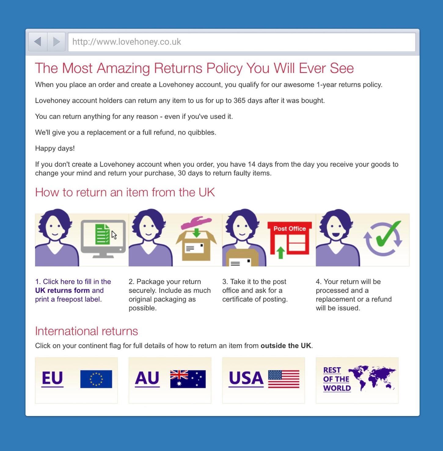
Take for example the ecommerce retailer LoveHoney. LoveHoney sells sex toys. An unusual choice as a case study you might think. But think about it, if ever there was a company that needed to reassure first-time buyers it’s this one. What if somebody finds out what I’m buying? What if someone sees my credit card statement? What if the package splits on delivery? What if I don’t like what I’ve bought? To a company targeting those who have never bought sex toys before, this is a huge issue.
That’s why LoveHoney goes above and beyond to remove risk. They have a video describing how they securely pack their products. They make sure the credit card statement is inconspicuous, and they provide a 365-day return policy. You can even return products you’ve used! Products that they obviously cannot resell! But that’s a price worth paying to make people feel comfortable. Sure, they’ll get some returned products, but the additional sales they make more than make up for that.

You could argue that LoveHoney is in a unique situation. But many customers worry about making a purchase. That’s why Zappos also offers an unconditional 365-day return policy on its shoes.
But don’t stop at the return policy. Think too about security. Suggest to clients they guarantee any transactions that the user considers fraudulent to make them feel comfortable parting with their credit card number. Perhaps they could promise never to email customers other than in regards to their transaction, to reassure them they won’t spam their email.
My point is that we should be looking beyond the website to reassure users. We should be suggesting to clients that they consider changing the way they do business.
Reassuring users in this way won’t just encourage them to purchase. It will also delight them with the quality of the experience.
You might also like: Streamline Your Ecommerce Experience With The Laws of Simplicity.
Are you delighting through customer service?
Wiltshire Farm Foods sell frozen ready-meals to the elderly. But they faced a challenge. How to persuade the older audience to buy their product rather than get all their groceries (including ready-meals) delivered by a big supermarket chain.
Instead of relying on a lavish website, they offered something the big supermarkets could not, a superior experience targeted at their specific audience.
They knew their audience could not carry heavy baskets of groceries into the house, but they also don't want to let strangers into their home. That’s why they police-checked all their delivery people. That makes their audience confident to allow staff to come into their home, and put the meals away in the freezer for them. That’s something no supermarket would do because it would reduce the number of deliveries they can make.

Wiltshire Farm Foods have identified real customer problems, and went above and beyond to meet them, even if it ate into their profit margin. As a result, they have seen phenomenal growth over the last decade.
But Wiltshire Farm Foods are not alone. Delivery company DPD have added GPS to their delivery vans, so that you can see exactly when your package will arrive. No more missing your package because you made the mistake of going to the toilet!
Look beyond the edge of the screen
Of course, persuading clients to do this kind of thing isn’t easy. They much prefer to throw money at their website rather than change the way they operate. But if we want to claim to be user experience designers, we cannot just stick to the areas of the experience that are easy. We need to break out of our comfort zones and start looking at the entire experience. After all, if it were easy, everybody would be doing it.
So the question is; what do you want to be? Do you want to be a UI designer, or are you going to push yourself and your clients to look beyond the edge of the screen?
Read more
- How to Use Eye Tracking in Usability Tests
- Streamline Your Ecommerce Experience With The Laws of Simplicity
- 5 Common Digital Content Problems and How to Avoid Them
- Lean UX: A Guide for Remote Teams
- Typography in UI Design
- Website Personalization: Improving Conversion with Personalized Shopping Experiences
- 10 Accounts to Follow on Instagram for UX & Web Design Inspiration
- Tips for Creating Multilingual Digital Products
How do you push yourself to look beyond the edge of the screen? Tell us in the comments section below!
