When you start designing a new product, one of the first considerations you make is choosing a color scheme for the user interface. This is a very important moment, because the color scheme you choose will have a long-lasting impact on the overall user experience of your product. But even before you start to select primary and secondary colors, you need to choose a background on which all design elements will be placed. Designers choose between two options: light or dark.
While in most cases designers select a white background, there are cases when using a dark background can be beneficial for the product . In this article, I’ll describe which elements you should take into account when choosing a background, as well as how to improve a dark UI.
Things to consider when choosing a background
Quite often the decision to go for a dark UI is based on personal preferences, rather than a solid understanding of what’s right for the product. But the decision to go with a dark UI should be a well thought-out. Instead of assuming what might be good for your product, it’s much better to answer the following essential questions:
What is the nature of your content? Do you have more textual or visual content?
The background you choose for your layouts will influence the level of readability of your product—how easy for users to read a written text. Readability should be considered before all else, especially if a major part of the content on the website or app is text. Poor readability is one the main reasons for bad usability.
"Readability should be considered before all else, especially if a major part of the content on the website or app is text. Poor readability is one the main reasons for bad usability."
Unfortunately, dark backgrounds and light text lower readability. In the 1980 study by Bauer and Cavonius, visual fatigue was significantly greater when people read bright characters on a dark background vs dark characters on a light background. You can see an example of this below.
The amount of text on the website or app is also a critical factor for background selection.
A light background is preferable for large bodies of text that users are likely to be reading for long periods of time. That’s why text-heavy news websites and blogs usually use a white background.
Does your product have a complex interface? Would you like to reduce visual distractions in the UI?
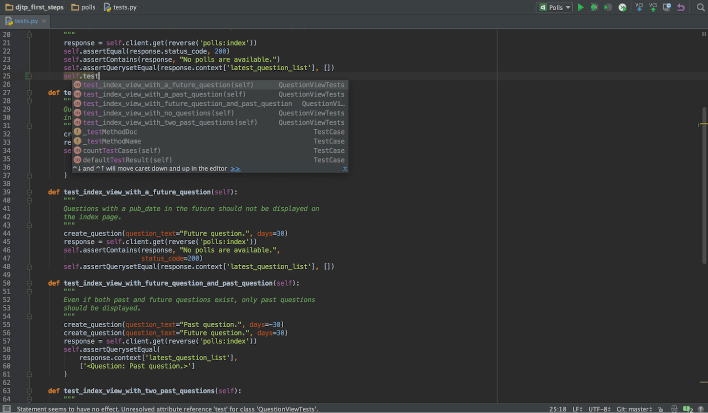
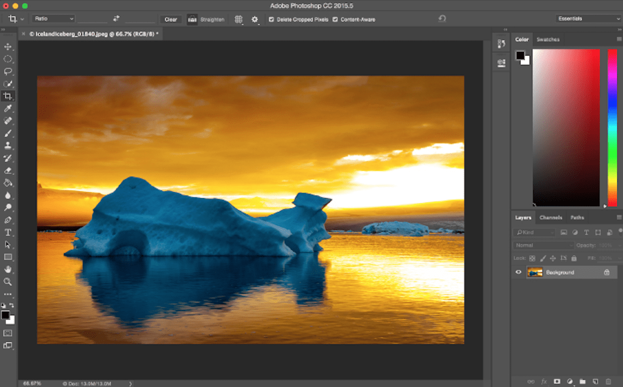
Programmers and designers can benefit from using software with a dark UI because it allows the interface to fade into the background and the content come to the forefront. As a result, core elements of the page can stand out and gain prominence.
This works whether a programming code in IDE:
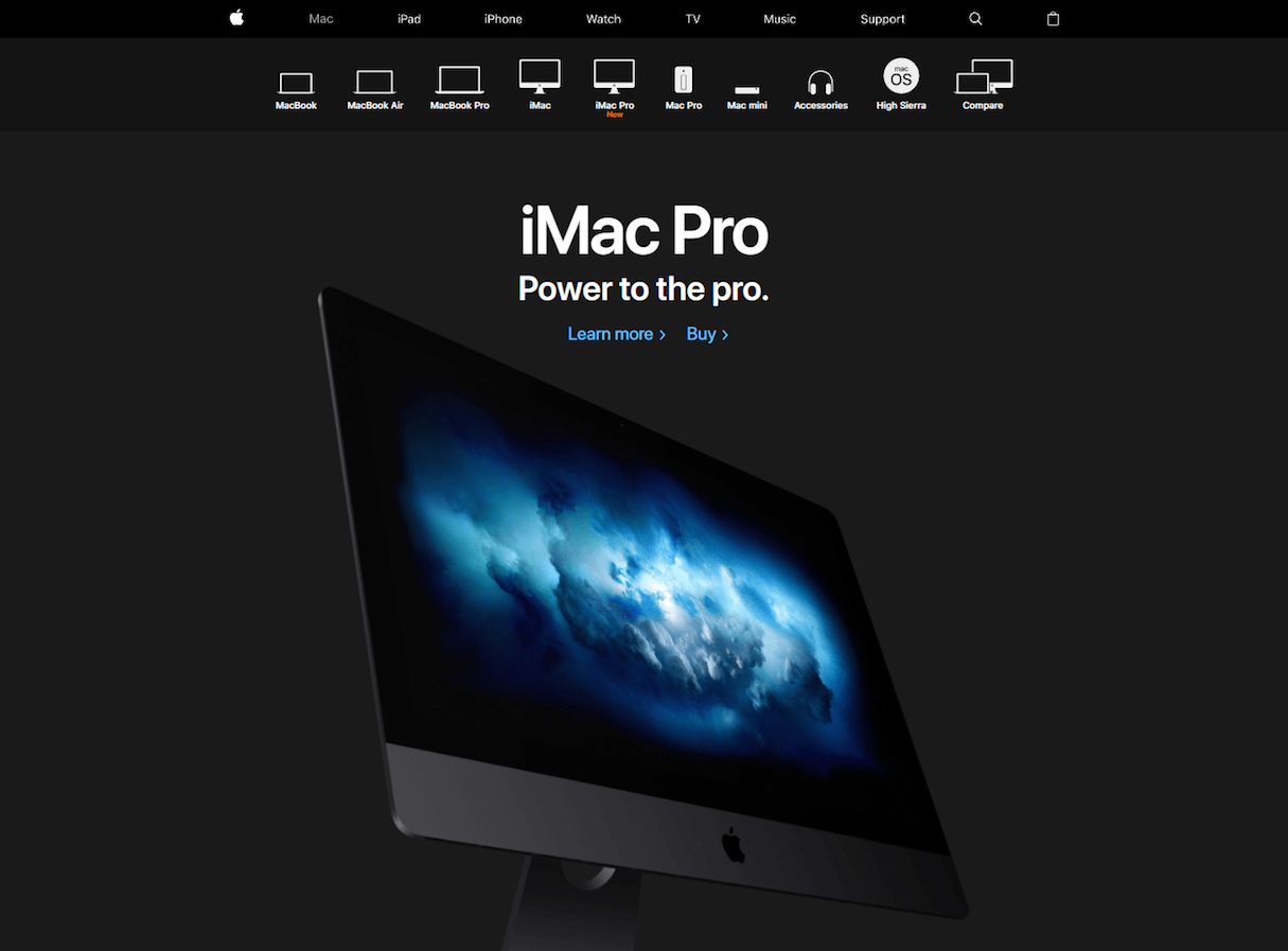
Or using a graphical editor:
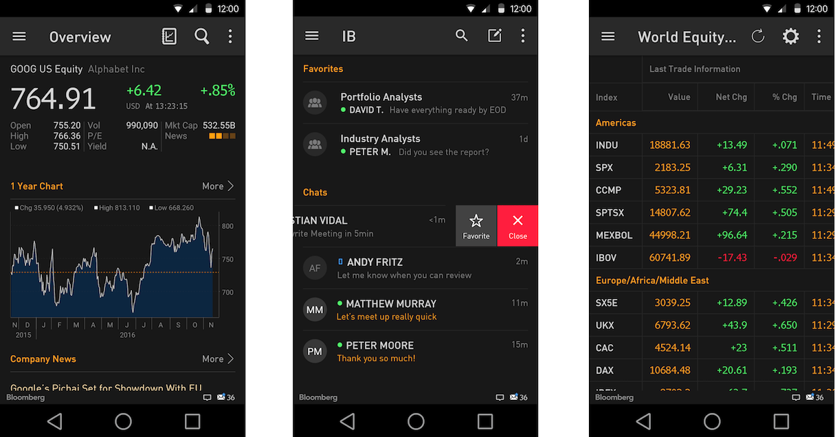
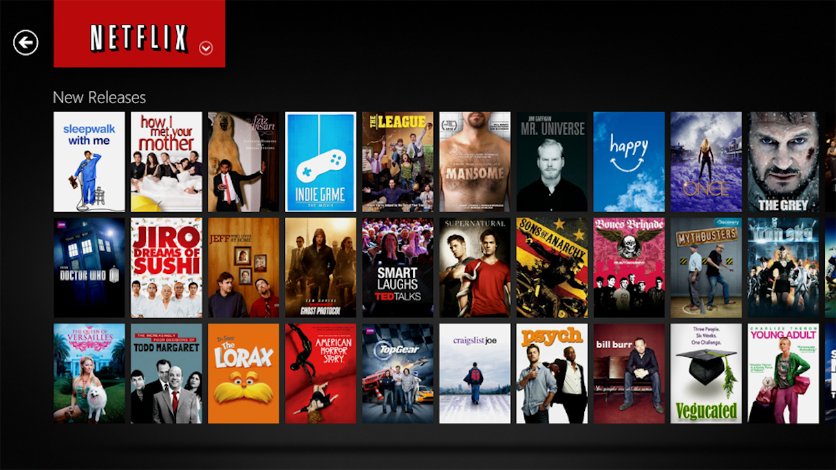
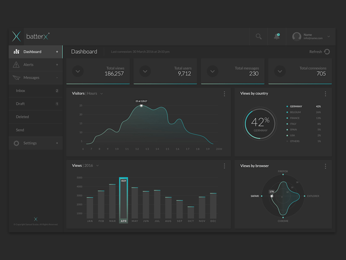
A dark UI can be preferable for interfaces that require fast scanning. The natural property of dark backgrounds to absorb some of the light from the other elements reinforces the ability to comprehend information in a glance. That’s why such interfaces are popular among analytical tools, where users need to quickly understand the situation.
What emotional perception would you like to create?
Color psychology is another thing to consider when choosing a background. In the article A Practical Guide For Creating the Best Website Color Schemes, I’ve mentioned that color directly impacts the user’s emotions. Dark designs can elicit more emotional responses than light designs.
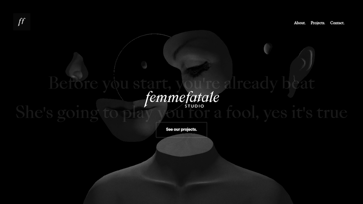
Shades of black are often associated with elegance, formality, prestige, and power. This property makes it ideal for the following.
Promotional websites

Creative projects
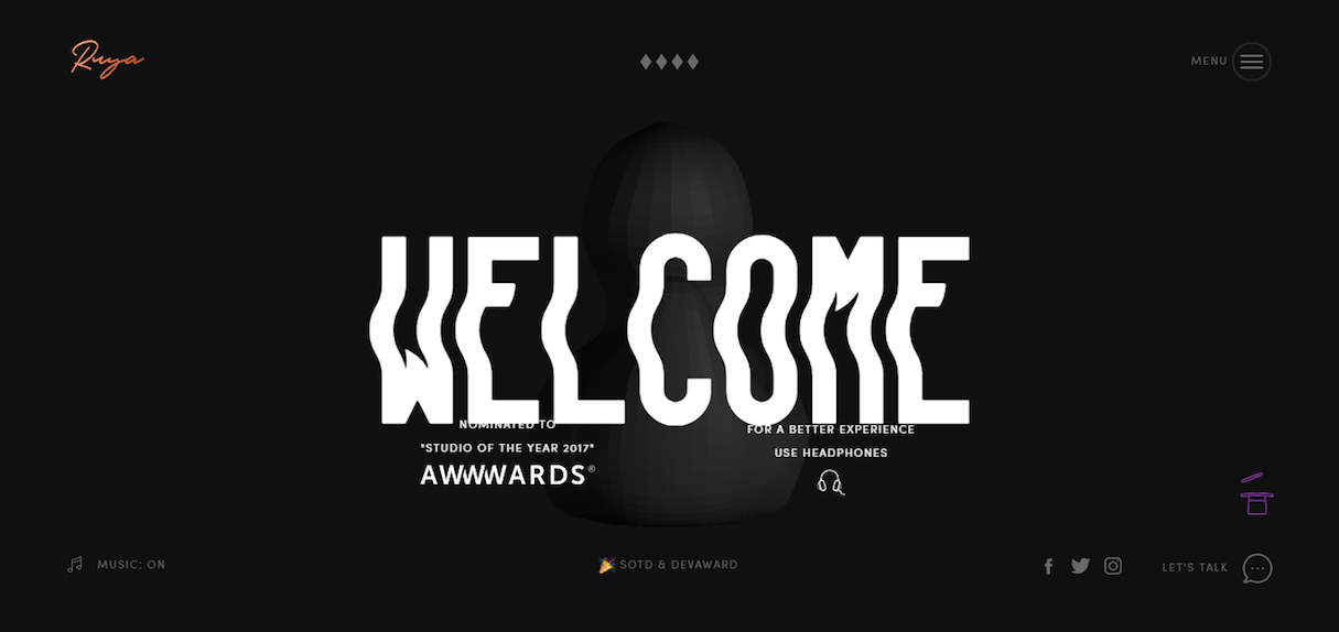
Websites with very little content (such as creative portfolios)

In what environment will people use the product?
Consider the environment that the interface is likely to be used in, as well as the time of day when the majority of users will interact with your product. Ideally, the selected background should match the user’s environment—use light interfaces for products that will be used in the daytime, and dark interfaces for products that are used in a darker environment or during the night. This allows a low contrast between the screen and a user’s environment and reduces the amount of undesired screen glare.
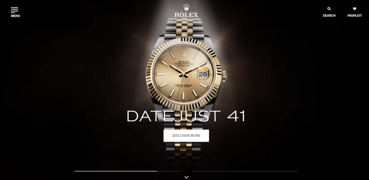
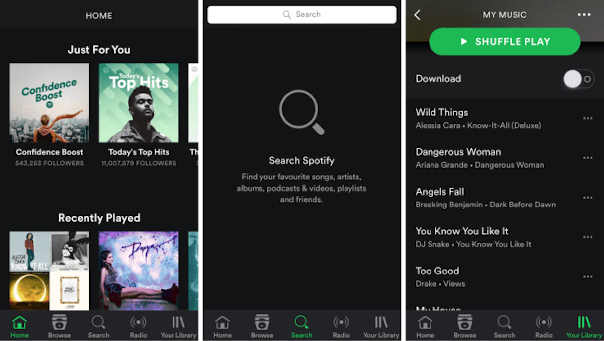
The majority of entertainment-related products tend to have dark-themed UI designs. This is because entertainment-related activities usually occur in the evening.
Who’s your target audience? What style preferences do they have?
Knowing your potential user and their preferences is the first step in designing UI for your product. Different user groups have different tastes and different expectations.
It’s essential to start with competition research. Research of close competitors will give you an understanding of which design solutions have already been applied by other players on the market, as well as the factor influencing design solutions.
Do the product’s brand colors work well with a dark UI?
Not all brand color schemes work with a dark background. It’s better to avoid using a dark background if your design calls for a wide range of colors.
You might also like: The User Experience Delusion.
How to improve a dark UI
Once you’ve decided to use a dark UI for your product, there are a few things that should be taken into account.
Use enough whitespace
While effective use of whitespace is important for any type of user interface, it even more important for products with dark backgrounds. Because of the natural property of a dark background to absorb part of the light from other elements in the design, designers should add more whitespace to prevent the interface from feeling too heavy.
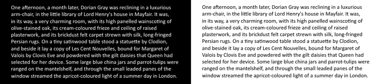
Because readability is the number one concern when using dark backgrounds, designers must pay extra attention to the text sections. It’s possible to improve readability on dark layouts by using more whitespace between lines of text. The example below shows that by increasing line spacing, it’s possible to make the text more readable.

Another way to improve readability for text on a dark UI is to increase the font size. More whitespace within each letter will make the text easier to read.
Avoid using pure black backgrounds
A dark background doesn’t necessarily mean a black background. In fact, the best results usually come from background that isn’t pure black. When we see dark things in real life, we often assume they are black things. In reality, pure black almost never exists. All of the ‘black’ objects around us have some amount of light bouncing off of them, which means they aren’t truly black—they’re actually dark grey.
When you place pure black next to a set of colors, the black overpowers everything else. It stands out because it’s not natural. Lots of the apps we use and sites we visit on a daily basis have blacks that aren’t real blacks, but dark grays instead. For example, the darkest color on Apple’s top bar isn’t #000000; it’s #333333. So remember to always add a bit of saturation to your color.
To find a perfect dark background, take some time testing different sorts of backgrounds and colors to present the content.
Ensure you don’t have over-bright lettering
Light versus dark color schemes are all about one key design component: contrast. When it comes to contrast, both too much or too little can cause problems. Finding the perfect contrast means balancing the darkness of the background with the lightness of the text.
Avoid using pure white lettering on a dark background; instead, tone it down to a pale gray. As a rule of thumb, it’s recommended to use 5 percent gray to cut the glare of bright white. Such text will be perceived as white for users but won’t put as much stress on the user’s eyes.
Use sans-serif fonts
Fonts play a significant role in the design and should be taken into thoughtful consideration with dark layouts. In general, it’s better to avoid serif typefaces for body text. The image below shows the same text section in serif and sans-serif fonts. The second version (with sans-serif font) is more legible for a dark background.

But there’s an important reason why so many designers prefer to use serif fonts—they make the text look more elegant. It’s possible to balance the need for elegance with the requirement for good readability by using serif fonts for headlines and clean sans-serif fonts for body text.
Limit color palette
Since dark layouts already have depth, you need to use color with caution. To give their dark designs a clean look, designers should always opt for minimal color schemes. It’s recommended to stick to color palettes with a minimum number of colors (two or three). More colors will make a dark layout look too busy.
Maintain sufficient contrast for good readability
As was mentioned a couple of times before, readability is number one characteristic of good design. It is t directly connected to the usability and overall user experience of product. So, even if your UI doesn’t focus on reading text, it’s essential to achieve a proper contrast between the background and text. Make sure the contrast complies with W3C’s standards.
Offer a style switcher
A darker UI might be preferable for nighttime. But what to do when your app can be used at any time of the day? One solution for this might be to provide a style switcher. Style switching allows users to select whether they want to have light or dark scheme. Some apps available on the market do it automatically based on daytime. For example, Google Maps switches to the dark theme during the night.

Test rigorously
Dark backgrounds should be rigorously tested on different types of screens and in diverse resolutions. What looks good in a studio on designer’s high-resolution monitor might not look as good on user’s mobile screen.
"What looks good in a studio on designer’s high-resolution monitor might not look as good on user’s mobile screen."
You might also like: UI of the Future: Conversational Interfaces.
Tread carefully
A decision to move to the "dark side" should be approached with care. Designers should clearly understand not only benefits and downsides of a dark layout but also whether or not it suits the content they want to deliver. Even when dark layout can be beneficial for the product, designers need to avoid common pitfalls (such as bad readability) to create a powerful and appealing solution.
Read more
- 10 Beautiful Ecommerce Website Color Schemes
- Inclusive Design: 12 Ways to Design for Everyone
- Everything You Need to Know About Whitespace
- 6 Design Conferences to Last You 'Til The End of 2016
- Top 13 Web Design Conferences You Should Attend in 2016
- 14 Image Tools for Web Developers in 2017
- Top Ecommerce Resources for October
- Pitching Animation: How to Talk About Motion in a Design-Centric Way
- Top Ecommerce Resources for August
- Working With Technology Clients: Strategies, Apps, and Themes to Consider
Have you worked with dark UI? Share your experience in the comments below!