As someone who loves to cook, nothing feels more satisfying than whipping up something completely from scratch in the kitchen. Whether it’s just a DIY spaghetti sauce or homemade pasta, crafting something that’s wholly and uniquely yours always leaves a sense of accomplishment.
But as much as I love homemade cooking, I’ll be the first to admit it’s rarely practical. Nobody bakes their own bread every time they want toast, or whips up their own signature salsa whenever they get a craving for chips. We simply get those ready-made ingredients from a store—after all, somebody’s already done the work for us.
That ethos is the essence of UI patterns, or basic interface elements common to most websites. UI patterns are tried-and-true solutions to everyday design problems, like ‘how do I design a user-friendly form field?’ or ‘what does a well-crafted progress bar look like?’. Instead of designing your own components from scratch, you can simply use a UI pattern as a launchpad.
UI patterns help expedite both the design and development processes, and are typically more user-friendly as well. We immediately recognize and understand UI patterns, eliminating the risk of a user stumbling over a designer’s more “creative” solution.
"We immediately recognize and understand UI patterns, eliminating the risk of a user stumbling over a designer’s more 'creative' solution."
While they’re used for just about every digital experience under the sun, UI patterns are especially beneficial for ecommerce site designers. That’s partially because ecommerce experiences are (roughly) the same across most retail sectors, and because online shopping is so inherently process-based—the fundamental elements that UI patterns provide make up almost 90 percent of your typical ecommerce site.
I rounded up a few UI patterns that should be in every designer’s toolbox, and asked a few UI gurus at the ecommerce design agency I work for to give me their favorite pattern libraries for selecting them.
Ecommerce UI patterns
Below are 12 UI patterns typical to eCommerce sites, and where you can find them.
Product page
The cornerstone of every ecommerce experience, the product page is an excellent candidate for a UI pattern reference.
UI-Patterns, one of the larger and more common UI pattern libraries, has a great selection of different product page patterns—from enterprises like Uniqlo to smaller, niche retailers. Its community feature lets designers upvote and downvote patterns as well, if you’re interested in the general consensus.
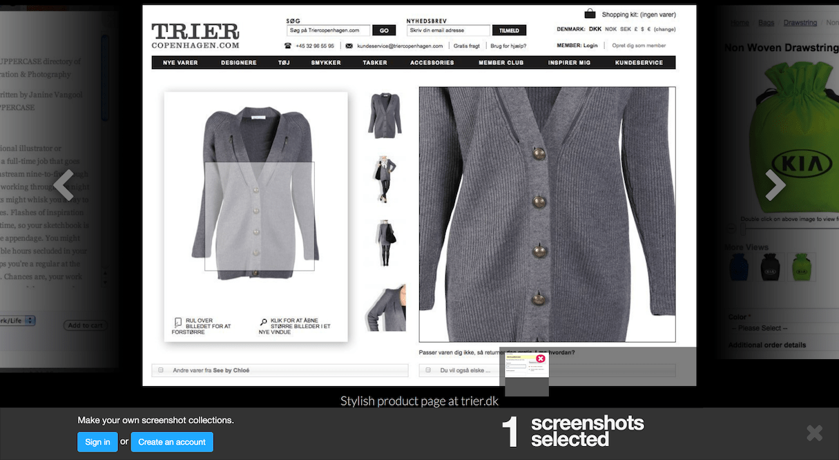
One of these are likely to match the style you’re going for—the only time you might want to consider designing from scratch is if you’re selling an extremely small amount of products, maybe even just one. That’s a situation where taking a more creative approach could benefit the overall experience, provided you still include all the necessary product information.
Store locator
If you have a brick-and-mortar presence to accompany your digital one, having a store locator on your site is a must. I’d absolutely recommend relying on a UI pattern for them too—they can be tricky to design (especially if you’re integrating a map), and it's easy for inefficiencies and user pain points to slip through the cracks.
An excellent resource for this is Map UI Patterns, an aptly-named site dedicated to all geographic-based UI patterns. Their store locator breakdown and UI pattern only scratches the surface of their extensive library.
Color palettes
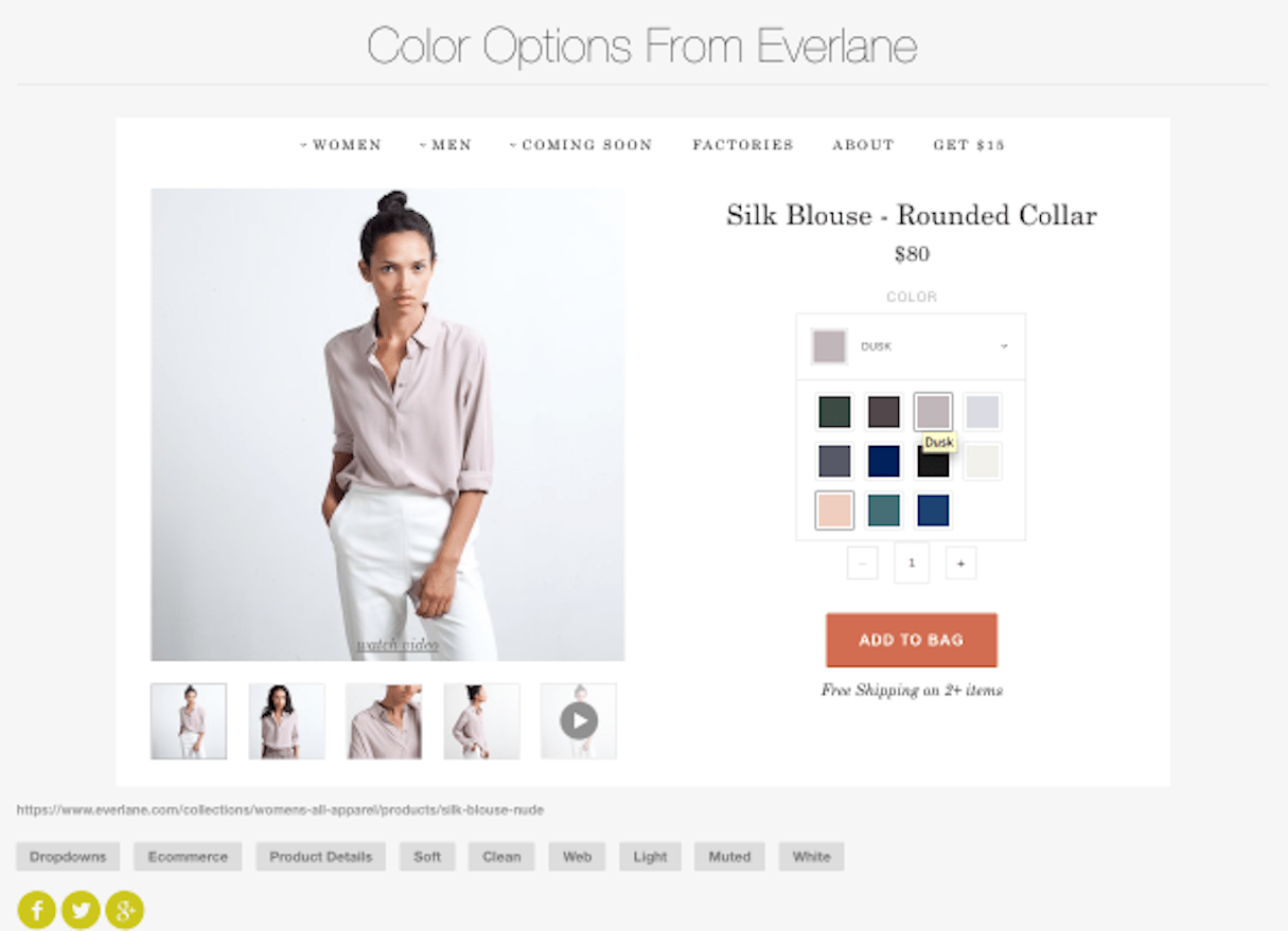
Seems simple, but you’d be surprised how many ecommerce site designers get it wrong. Color palettes are more than just throwing hex codes into basic squares—there needs to be an accompanying dropdown, a connected photo gallery, and some way show if certain colors aren’t available, just to name a few.
There are a ton of color palette UI patterns out there—I really like the one featured on Pattern Tap. Pattern Tap has an enormous library of patterns, but doesn’t delve into the analysis as much as other sites. Still, its size alone makes it a worthwhile stop for inspiration.
Product reviews and testimonials
Another essential ecommerce component that can be difficult to pull off—you’ll need to account for ratings, a username, a ‘verified purchase’ indicator, and a text display that’s flexible enough to work for two word reviews and two thousand word ones.
You’ll be able to find a testimonial pattern in just about all of the libraries I’ve mentioned so far, but if you want a deeper dive I’d recommend The Baymard Institute’s selection. They have over fifty different testimonial patterns, all of them rated by their user base.
Progress meter and steps remaining
Splitting your checkout process into multiple, digestible chunks is common practice in ecommerce web design. But to implement this successfully, without user frustration or confusion, you’ll need some sort of indicator of the buyer’s position in the checkout process.
This is typically done with a progress meter, a simple ‘steps remaining’ indicator, or sometimes a hybrid of the two. It’s a fairly simple UI pattern, and one you can probably take the liberty of having some fun with. Check out UI Movement’s selection for something more unique than your typical green bar.
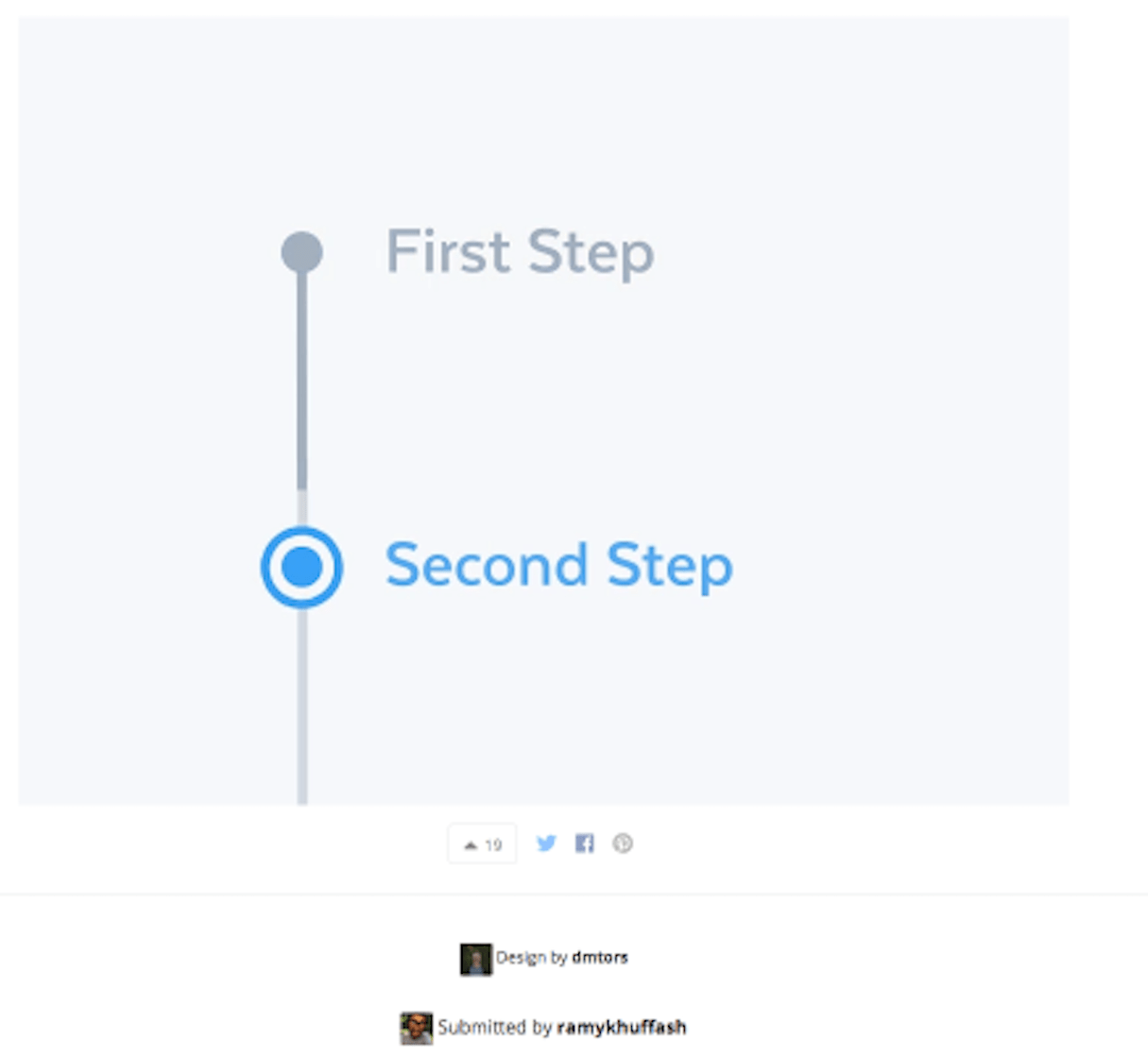
Image zoom
There’s no point investing in a high-resolution product photo shoot if your client’s online store doesn’t have a user-friendly mechanic to support it. Will you be using a pop-up? A simple zoom overlay? What if I want to switch images while zoomed in?
These are the questions you’ll need to answer when crafting an image zoom function. I’m double-dipping here, but UI-Patterns is again the best source for this component—it has examples for all different kinds of products.
You might also like: jQuery Image Zoom for Shopify in 5 Easy Steps.
Product comparison
Common to most ecommerce sites and online stores, a product comparison feature can range from a simple no-frills table to a highly robust, interactive module. If you’re going for the latter, you can look at the patterns on Dribble.
Dribble has a solid selection, but it's not super well organized and doesn’t offer in-depth analysis. I searched ‘comparison’ to get these, and while there are some great product comparers, there’s also some noise to sort through as well.
You might also like: Build Forms on Shopify: How to Use Liquid to Build Robust Forms for Shopify Themes.
Slideshow or gallery
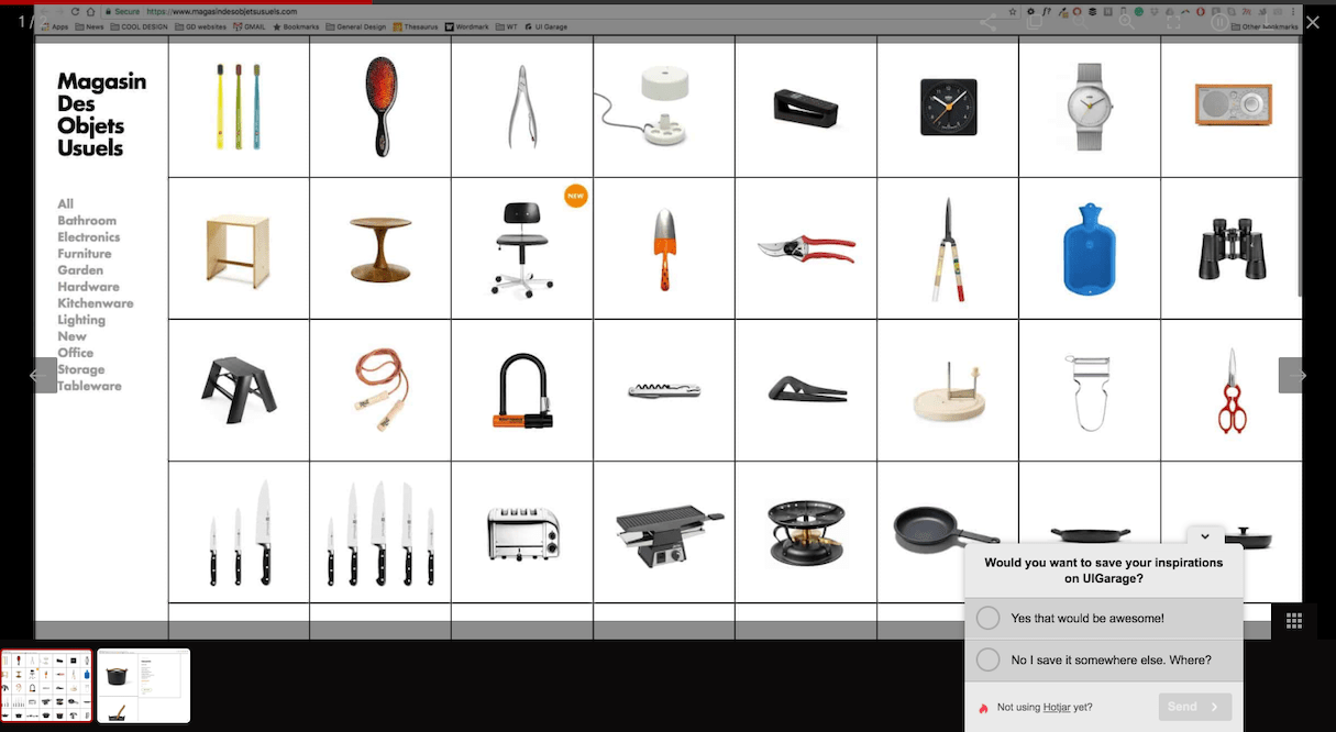
Though it's not exclusive to just ecommerce sites, many have some sort of gallery or slideshow for their product images. Another great resource for this kind of pattern is UI Garage, a library that covers a lot of breadth and depth.
Lazy registration
Another typical interface element that isn’t wholly unique to ecommerce, but is almost always considered best practice: lazy registration. Lazy registration, or lazy signup, describes the practice of delaying account creation until the user has completed or nearly completed their task.
In the ecommerce context, this usually manifests as a ‘guest checkout’ feature. You don’t want to impede the user’s path-to-purchase by forcing them to create an account, so you allow for guest checkout and then tack on a quick ‘create account’ at the end of the process, after the conversion has been made.
If you’re looking for inspiration on the best way to design a lazy registration, especially for an ecommerce use case, I’d check out UI Patterns iO.
Mobile payment
As mobile ecommerce continues to gain traction, more designers are being tasked to create checkouts that aren’t just responsive, but specifically optimized for a smartphone. Caviar serves as an exemplary case study (though you could argue it falls under the category of on-demand apps, rather than ecommerce ones).
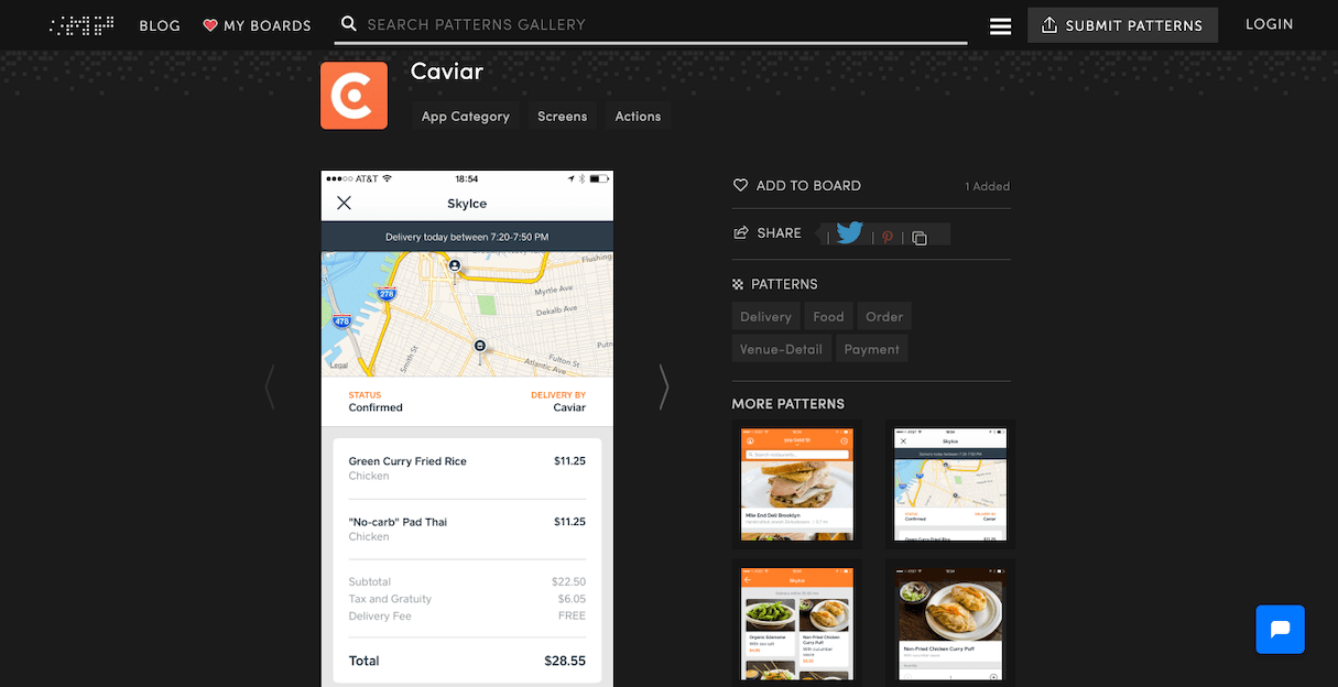
Regardless, their mobile-based checkout acts as a solid example for ecommerce web designers, and you can find Caviar’s UI pattern, along with a few other great ones, at the Mobile Patterns library.
Form filling
Seems simple enough, but poor usability when it comes to form filling and data entry during checkout is a surefire way to torpedo your conversion rate. I understand it’s not exactly the most thrilling part of designing an ecommerce experience, but it’s still one of the most important.
Don’t believe me? The excellent PatternFly, one of my personal favorite pattern libraries, dedicates hundreds of words to its analysis of form-filling. PatternFly even includes code snippets as well—it’s open-source one-stop shopping for any UX or UI designer.
You might also like: How to Use Smart Defaults to Reduce Cognitive Load.
Filters
If you’re managing a large product catalog with a lot of variety, it’s likely your product pages will need robust filters, so that shoppers can easily narrow down their options before making a selection.
Though your specific filters will obviously depend on the catalogs specific criteria, the filters UI pattern from USPTO’s design library are an excellent starting point.
Taking precautions with patterns
The twelve ecommerce UI patterns listed here only scratch the surface of the available ones out there—many of the resources I’ve linked to have a vast collection of other patterns, common elements, and UI components. I’d highly recommend bookmarking a few of your favorites.
But I’d also recommend exercising caution when relying on a UI pattern—its purpose is to serve as inspiration or a jumping-off point; not necessarily a plug-and-play solution. You don’t want to slap the pattern into your design verbatim and consider your work done, as it might not work for your particular use case.
Patterns are sometimes criticized for stifling the creativity of web designers. But in reality, they can help anchor more creative designs in usability. Don’t see patterns as a burden on your creativity—see it as an opportunity to craft something exciting and new, while still keeping your design engaging and user-friendly.
Read more
What are some of your favorite UI libraries? Let us know in the comments below!


