One of the strengths of the web is that there are multiple ways to achieve the same thing. The challenge for us developers is to find the best way.
In the early days of the web, HTML evolved rapidly alongside the emergent JavaScript and CSS standards. Things slowed down after 1997 when HTML4 was released before the divergence of XHTML and eventual realignment of HTML5.
HTML5 was exciting. It lacked a space, forms made a bit more sense, media elements got their own thing, and pages got structural elements.
From a certain point of view, HTML6 has already happened as part of what's called a "living standard", where the standard keeps evolving over time without key milestones. The problem with this is that "living standard" isn't as fun as version numbers, which makes it harder to foster support for the new parts of the standard.
Without set version numbers to focus on, this has widened the knowledge gap between the specification, the browser vendors, and those of us writing the code. There's a debate about this at the moment since the lack of numbered increments doesn't encourage people to even look for new things.
What exactly is new in HTML then? Several elements have been added to the standard, and they exist in various states of practical usability, ranging from "Use this now!" to, "Well… maybe not". In this article, we’ll go over six of them.
In this article
Measures of usefulness
While introducing new elements can be great, how can we measure the worth of these new elements? How do we know if they really are ready to be used? To evaluate the elements' worthiness levels or otherwise, I've used three measures as defined below. Anything less than a perfect score makes it difficult to recommend in a production environment.
A. Does it work?
This measure is oddly difficult since the definition of "does it work" may vary according to the particular execution. HTML has evolved to fill gaps in what's missing, but that doesn't mean that the community at large hasn't filled those gaps themselves.
Early attempts at a native date picker fell apart due to patchy execution by browser vendors and the many, many different ideas from people about what a date picker might actually do. What works for one project, might not work for another.
B. Is it accessible?
Since browser support for new features is gradual, accessibility can be complicated. No matter how "native" a browser feature might be, it's not production-ready if it's not accessible.
C. Can we style it?
Nice logo bar you've got there. Can we have it in blue? Custom styling is something we've gotten used to and, once again, browser support varies for this.
Styling expectations tend to increase with more complex components once again due to the many custom components that are out there.
Quick note: The Shadow DOM
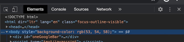
Before we go any further, it will help to have an understanding of the Shadow DOM, especially as it relates to inspecting HTML elements. It’s worth noting that, despite what it might sound like, the Shadow DOM is not in fact a mysterious collective fighting against the forces of evil.
Enabling your browser(s) to view the Shadow DOM will let you dive into the separate parts of native web components and get a better idea of what you're looking at. Each browser has it's own way of enabling this.
Firefox
about:config to bring up the browser config
shadowRoots to select devtools.inspector.showUserAgentShadowRoots
false, double click to change to true, and you're done
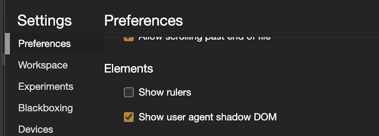
Chrome
Safari
Safari has shadow element inspection enabled by default. Woo hoo!
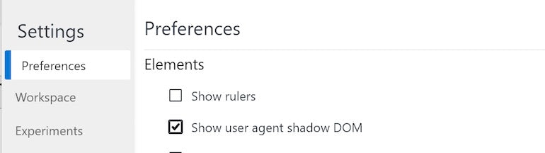
Edge
As of Chromium Edge, the method is the same as Chrome:
Now, we can get into the list of the six native elements you can use today.
1. Input type range
A range is an ideal form control for choosing from a discrete set of values when the exact value doesn't particularly matter. A great usage example would be volume control, while a poor usage example would be a person's age.
Set the min and max values, and you're good to go. It's possible to declare a custom step to force jumps between set points and even tie in a <datalist>.
Out of the box, a range won't return the selected value to the screen, but that's where the <output> element kicks in. You will need a couple of lines of JavaScript to wire the output up to the range, but the result is great.
Does it work?
The HTML range does most of what it should, though it won't be useful for more complex requirements. For example, if you want two (or more!) thumbs–the buttons for moving the range–then you're out of luck.
As well, some parts of the W3C specification aren't entirely supported. In theory, adding a <datalist> will render marks for each list point, but this doesn't work in Firefox. It is possible to add label properties to the <datalist> and <option> elements, but they don't render in any browser at the time of writing. From my experience, it's better to add labels yourself to allow for better control in narrow screens. Too many labels just won't fit on a small screen.
Otherwise, the <output> element works perfectly. Technically it could be a <div> element, but then you miss out on free accessibility bonuses.
Is it accessible?
The <input type=”range”> element has been around for a while, and accessibility support is fairly decent, especially when combined with an <output> element, which is typically rendered with an aria-live role.
Can we style it?
You bet you can! The better question might be, "Can we style it easily?" because you sure can't.
Fortunately, Ana Tudor has done a lot of the hard work in working out how to style a range. That said, styling a <range> is difficult even with Ana's work combining custom browser selectors, CSS custom properties, and the Shadow DOM. You'll definitely want a CSS preprocessor to make your life easier too.
You might also like: The 20 Best Brackets Extensions for Front End Developers.
2. Progress
The HTML Progress element displays a progress bar. Set the max and value attributes and you're good to go. If you leave off the value, browsers will render an indeterminate version of the <progress> element, typically with a pulsing animation.
Does it work?
Indeed it does! The <progress> element does one thing and does it well. If you need to display a progress bar, look no further.
Is it accessible?
Somewhat but it's fairly easy to fix. You'll need to set a few ARIA roles (aria-valuemin, aria-valuenow, and aria-valuemax), remove the element from tab focus, and you're done.
Can we style it?
Absolutely! Browser-specific selectors are required but it's possible to make a <progress> look pretty.
3. Meter
A HTML Meter is like a highly specialised <progress> element. In addition to min, max, and value, the <meter> element has the properties for low, high, and optimum value ranges.
Does it work?
Once again, the <meter> does one minor thing and does it well. A perfect example would be to show password strength.
Is it accessible?
Browser support is good though additional care is helpful depending on usage.
Can we style it?
Browser-specific selectors are required, but it's very possible.
4. Details or Summary
Rather than one element, this is a coupled set of <details> and <summary> elements, which looks and functions a lot like an accordion.
Does it work?
A native accordion! Yes! Except, it's not. Unfortunately, it's a bit odd and ultimately nearly useless. Dave Rupert provides a great summary of why.
Is it accessible?
Despite being nearly useless, <details> or <summary> is reasonably good as far as accessibility goes.
Can we style it?
Styling is very possible. <summary> is essentially a button which makes it easy to play with, and <details> is a container of sorts, except that it lacks support for animation. Given animated hide/show effects get applied to nearly everything that hides and shows, it's notably lacking in the style department.
You might also like: Canonical URLs: What Are They and Why Are They Important?
5. Hidden attribute
You read that right: this is an attribute, not an element, but its impact is significant. Adding hidden to an element hides it. Amazing.
Does it work?
Add hidden to an element and the element hides. Awesome.
Is it accessible?
Remarkably, hidden works better than any other method for hiding elements.
Can we style it?
Using the hidden attribute means you don't need styles. No display: none or off-screen CSS tricks required.
6. Dialog
You read that right: this is a native HTML dialog!
The open attribute can be toggled to open and close the dialog, otherwise there's a DOM API or <form> submit method.
Does it work?
The <dialog> does a slightly more complex thing…and does it well. Browser support is somewhat patchy (notably no Internet Explorer, and Safari is pending at the time of writing), but there is a polyfill.
Is it accessible?
Support is quite good, but it does need a little ARIA support to go to production. What's really good about the <dialog> element is that most accessibility support is built in, making it a far better starting point than having to create your own fixed inline custom dialog component.
Can we style it?
For the most part, the <dialog> element is a box but with the bonus ::backdrop pseudo-element that gives us the very quick ability to grey out everything else. Strangely, it only kicks in if the <dialog> element is opened using the DOM API. Unfortunately, browser support for ::backdrop is patchy, but it's definitely promising.
You might also like: 30 Developer Resources to Diversify Your Skill Set.
Where to from here?
While most of the elements here are great, what we'd really like is all those things that are included in every component library you've ever seen like accordions and tab groups.
You may have noticed that most of the elements have very specific usages and are simple to use. This is why they work–for those that do. More complex elements require a significant amount of time, effort, and compromise to implement properly.
The date input has effectively failed because there are so many very different concepts of what it should do. Which date input should browser vendors implement? The three field version favoured by the UK Government Design System, or a pop-out like the React Datepicker?
While we might not get a usable date input any time soon, other elements are in various states of discussion and implementation. Time will tell whether we get tabs or panels, but rest assured, HTML is here and truly evolving.
Read more
- 6 Shopify App Reviewer Insights for a Faster App Review
- Understanding hreflang Tags for Multilingual Stores
- Getting the Most Out of Chrome Developer Tools: 4 Modern Features You Need to Know
- Free Webinar] Developing with Shopify: Using JavaScript to Add Ecommerce to Any Website
- A Modern Approach to CSS Pt. 2: Building Resources
- How Web Fonts Can Enhance Your Client’s Custom Ecommerce Store
- 15 Tools to Customize Your Terminal and Command Line
- How to Get Published in the Shopify Theme Store
- Embrace Localization and Multilingual Content with HTML and CSS