After a successful Kickstarter campaign, Biolite needed a website that would help them achieve their goal of bringing energy to the world. Their product is a small portable camp stove that burns wood and other biomass to produce heat (to cook with), energy (to charge your devices), and light (to... light things).
Fifty & Fifty is a design agency that specializes in "digital craftsmanship for the social good," and was therefore a logical choice for the project.
We caught up with Tracy Hebrew — a web engineer at Fifty & Fifty — to talk about her experience working with Biolite.
What makes Fifty & Fifty unique?
We’re a creative collective who designs and develops innovative websites and branding for social good organizations.
It is our mission to see good causes and organizations take up more of the popular culture space. It’s more than selling a product; it’s about engaging the world in the worthwhile. We work solely with people and missions that are socially and ethically defensible. We believe we’re leaving the world better than we found it — aesthetically and morally.
You might also like: How Pixel Union Diversified Their Service Offerings and 10x’d Their Business
Tell us about BioLite’s Kickstarter campaign.
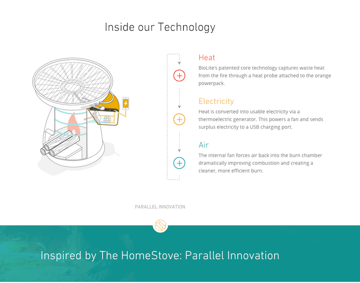
BioLite’s unique model, Parallel Innovation, incubates core technologies and then productizes them across both outdoor and emerging markets. The BioLite CampStove, BioLite’s original product, was the foundational inspiration for the HomeStove, BioLite’s forced draft cookstove that is currently sold in India, Ghana, and Uganda.
Over the past two years, BioLite started getting lots of request from their outdoor customers to make the HomeStove available to them. BioLite designs all their products with specific users in mind, so they went back to the lab and developed a variation of the HomeStove that would be ideal for outdoor cooking and grilling in a recreational setting. Enter the BioLite BaseCamp.
BioLite BaseCamp was crowd-demanded, so BioLite decided that crowd-funding it on Kickstarter would be the best way to demonstrate that the product belonged in the marketplace — and true enough, the customers showed up. BioLite raised over $1 million in 30 days, making it one of the most successful Kickstarter projects of all time.
Did BioLite have any unique requirements because of their crowdfunding?
The success on Kickstarter really motivated BioLite to try and tell the story behind their products on the new website, in addition to the traditional information you might find on an ecommerce page.
Features on the product pages like "Inside The Tech" and the Parallel Innovation expandable bar were inspired by sections on the BaseCamp Kickstarter page that garnered a lot of engagement and attention.

Where did the inspiration for the shop’s design come from?
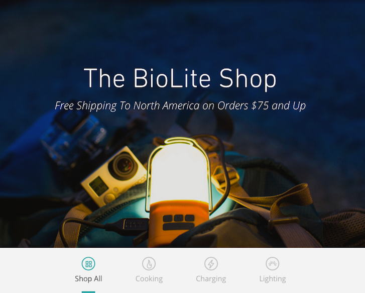
Before laying out the pixels of the site, we had to be strategic with the best method for implementing their story completely and uniquely. Recognizing and focusing on the primary goal of the site — raising individual product sales — we worked backwards, beginning with the product page designs first. We studied all we could from the successes of both Apple and Nest products, noting their simplicity, subtle animations, and successful storytelling with beautiful assets.
The shop’s design was partially inspired by the desire to create an immersive experience that introduced you to the products in a compelling way: beautiful photography balanced by straightforward tech specs, product videos balanced by user reviews, etc. We want you to have fun shopping on this site and leave not only knowing about the products, but about the company behind it and its broader mission.

What changed along the way?
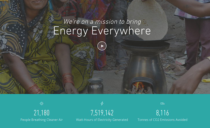
The majority of the iterations we found ourselves making in back-and-forth critiques with BioLite were regarding the strategic storyline of the company and its products. BioLite transitioned from primarily Camp Stoves into an “Energy Everywhere” company with products focusing on cooking, charging, and lighting products. Aside from the evident innovative usability of the products, the storyline of BioLite had to include the technology that allows such functionality, as well as the mission driving the company: to end energy poverty.
You might also like: From Reddit to Redesign: How Fuel Made Increased One Merchant's Revenue by 30%
What were some of the unique features that BioLite wanted for their site?
Ultimately, they wanted a brand experience, not just an ecommerce solution. They have beautifully designed products — and such a great story — and they really wanted to convey all of that on the site.
They also needed to control global currency pricing on all their products, regardless of the daily conversion fluctuations. In other words, a product needs to always be exactly 100 British Pounds regardless of what today’s U.S. Dollar equivalent is — adjusted in real-time automatically. This was a tricky thing to pull off, but we found a solution using the Shopify API and built a custom Shopify App to keep those prices up-to-date.
What tools did you find most useful when creating the website?
As an agency, we have a set of tools and processes that we use for all of our projects that allow us to work as a team efficiently. Shopify allowed us to use those same processes and tools, namely GitHub code repositories, deployment procedures, rollback capabilities, and local development environments. A specific tool that our team used for this Shopify site was ShopifyFD. We created metafields that allowed BioLite to control the content on their pages — including hero images, slider content, bundled product offerings, related products, and much more.
What integrations did you use?
We integrated GitHub for theme development in order for our team to work simultaneously on the site, while allowing a few members of the BioLite team access to the theme files as well. We deployed a custom application for the site on Heroku to handle bulk and custom order migrations, pricing updates, and theme updates.
What makes this shop unique?
We worked very closely with the team at BioLite to bring out all the different aspects of their products; to sell not just a stove, but a philosophy. From the detailed technical specifications to the rich product shots, the result is much more than your typical ecommerce site.

What’s your favourite feature on the site?
It’s hard to say… obviously the product pages are beautiful, and they are probably what stands out the most. Also, we really love the Mission Page. It displays a fairly complex issue in an intuitive and understandable way, and helps visitors immediately understand the impact they can have by supporting BioLite and making a purchase of their own.

On the technical side, we completely customized the ajax cart to complement their international pricing — and we really like how that came out.
What was the most difficult part about creating this shop?
In general, the hardest part was the high level of quality that BioLite held us to throughout the process — with the constraints of budget and timeline. We pushed the envelope in terms of design and functionality, and solved a lot of technical hurdles so that the final site could accomplish all of the goals they had in mind. Specifically, the international pricing solution was challenging. Also, dialing in a somewhat automated GitHub deployment process and managing a major migration of 50,000 orders and customers from the previous store added to the mix. A post-launch issue we needed to figure out was how to handle the blog pagination limitations, so that was another technical solution we put together in a short amount of time, but we're happy with the result.
What did you learn while creating this website?
We learned a lot about what Shopify can do in terms of providing the CMS functionality we would typically implement with something like Wordpress. By leveraging the blog capabilities, the page templates, the metafields, and the API, we were able to build the entire site within the Shopify environment. That would not have been possible a few years ago; we would have had to bolt together both an ecommerce solution and a CMS solution, and try to create one seamless experience while switching between the two. We’re big believers in the API revolution and we relied heavily on the Shopify API.
Want more amazing insights into customized Shopify designs created by our Partners? Check out our complete Case Study collection.
Read more
- Partner Spotlight: SplitMango Gets Flexible With Namaste TV
- How Singapore’s Jumpstart Commerce is Taking Over the World
- How Verbal+Visual helped an international home decor brand get a 163% revenue boost
- Developing Customer Centric Solutions: How Yoast scoped, built and launched their Shopify App
- Partner Spotlight: Jivaldi Builds American Sniper Store
- How Shopify Plus Partner Maestrooo Balances Building Themes and Apps, with Client Work
- Determination and Devotion: How Two Entrepreneurs Changed the Ecommerce Industry in Mexico
- How We Built a Global Empire from a Small Island in the Pacific Ocean
You might also like: How a Partner Team of Two Introduced an Old-World Antique Shop to New-World POS

