Every good designer knows that a well crafted user experience (UX) will increase the effectiveness of an ecommerce website. When clients place their website design in the hands of an agency or freelancer, they expect an user experience that attracts visitors and converts them. And there is no section on site that is more critical for conversion than the product page.
The following nine concepts that will show you how to design an ecommerce product page that, not only looks fantastic, but will help increase sales on your clients’ online stores.
The Importance of User Research in Product Page Design
Over the course of my career, I have researched and designed product pages for brands including AO.com, eBay, Wiggle, Mothercare, and Clarks shoes.
I believe the most important aspect of user experience is undertaking research to help us understand what the stores users want. For each of the projects I mentioned above I spoke to six, sometimes more, users and watched them interact with my client’s store as well as those of their competitors. This research process provided valuable insights that helped my team understand the importance, and make-up, of page elements for our clients’ users.
A good way to start the design of any page is to list its elements in order of importance. Ordering the page elements based on solid user research guarantees the page will not only meet the needs of its users, but also make the design process much more streamlined.
Based on user research I have previously done, I'd suggest the following order of importance for UX elements on a product page:
- Product Image
- Product Name
- Buy / Add to basket Button
- Price
- Product Headlines
- Delivery options
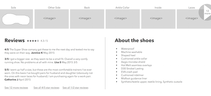
- Reviews
- Further photos / Gallery
- Specification / Full Product blurb
My background in psychology, along with research, has shown me that when making a buying decision, users assess a product on both an emotional and a rational basis. Therefore the product page on your clients’ website needs to speak to both. The page should both excite and reassure the user — without both, the page won't perform.
In this article I'll talk about each of the nine page elements outlined above, assess their emotional and rational aspects, as well as highlight some do’s and don'ts. To help solidify the concepts, I’ll work through a practical example using an online shoe retailer.
You might also like: How to Take a Design from Concept to Production — Part 2: Product Pages
Product image
The product image sells the item. Regardless of your product, whether it be washing machines or shoes, it's the most important element on the page. It's through the product image that we speak to the emotional part of the brain.
The product image helps us create excitement about the product itself. It conveys how the product makes you feel and how it will make your life better. This is true for all products — however boring they may seem on the surface. The image is used to get a feel for the product in a way that a product description never can.
I've seen users rely on the product image to assess features. For example, looking at the dial on a washing machine to see what wash types it has, zooming in on the tyres of a bike to see what terrain they'd work on using jQuery image zoom, or seeing how the washing machine will make life easier with a quick wash. These instances represent two distinct appeals communicated by the image — the emotional “feel” and the rational “utility” of the product.
A good product image does all the hard work for you. For the image to be effective it needs to be big, as big as you can make it. Then when you've maxed out the size of your image, integrate the ability for the user to zoom in on specific details on the product. This is especially important for clothing stores where consumers are more concerned with detail. During research I've seen users zooming in to look at seems, zip types, and buttons, which have influenced their purchasing decision.
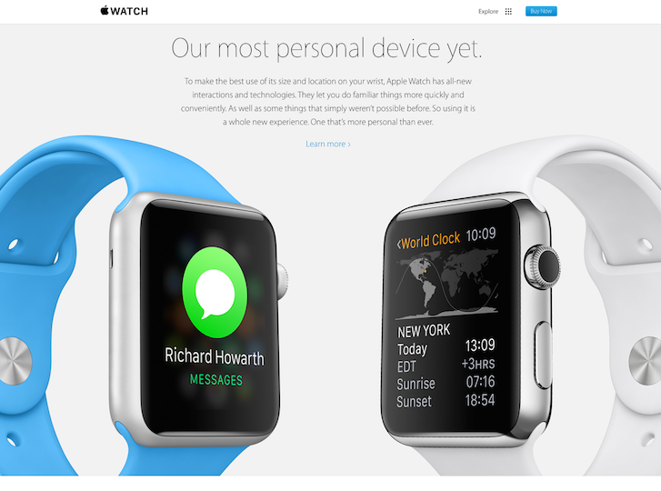
Good product photography also requires work. AO.com, Wiggle and others have dedicated photographers on staff to ensure their product images look unique and stand out from their competition. Think about getting yourself, or suggesting to your client they get, a good camera and a white background in order to take high quality photos without having to hire a professional.
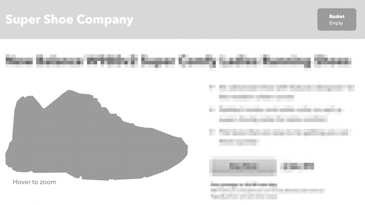
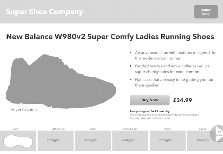
The image below illustrates how this concept applies to our footwear product page. As you’ll note, I’ve included a product image with zoom controls that is large enough to capture the attention of the user:
Product name
The product name has to achieve two things. It of course plays a rational role considering the user needs to check it's the item they want. But it needs to do a little more as well.
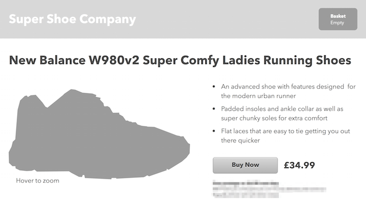
Think about adding in a very short description of the product within the name itself. If you are selling shoes, in our case New Balance W980v2 Ladies Running Shoes, try adding a descriptor to hit the user's emotional buttons:

Including a descriptor in the product name provides another benefit as well. One of the main behaviours I've seen in user research is that users copy the product name and use it as a query in Google to see if they can get it cheaper elsewhere. If they are searching using your unique product name, you should appear first in the search results which gives you more credibility with users even if you aren't the cheapest option.
Buy / add to basket
The buy button needs to be easy to see on the page — after all it's what you want your users to do next.
One quick win is to use the squint test to see how prominent the button is. It’s pretty easy — simply squint and blur the page with your eyes. Does the button stand out more than any other element? If the answer is no, then make it stand out by giving it a unique colour not used anywhere else on the page or make it larger and the text bolder.
It’s also important to consider the copy used on the button. 'Buy now' should be used if you are a retailer that expects to sell one item per transaction. Hitting this button takes you directly to the basket with the item added. Now don't get greedy, we all want to sell multiple items in a single transaction. But if it really isn't going to happen (I won't buy two bicycles in one session!) then stick with buy now as it will perform better than other alternatives.
If you do sell multiple items in one translation, then use ‘Add to basket’ as your copy.
For our American cousins consider using ‘cart’ rather than ‘basket’ as this is a British term and may not resonate with your audience. Please don't use anything fancy like Bag or Tote as you'll just create unneeded confusion. Cart and basket are well used terms that are easily recognised.
Once the Add to Basket button has been hit, offer the choice to take the user to the basket or to continue shopping.

You might also like: How to Take a Design from Concept to Production – Part 3: The Cart Page and Footer
Price
There are two ways to approach price. If you are competing on price, that is you are selling the same product as many other vendors, then make more of the price.

If you are competing in other ways, e.g. you are selling a unique product or a product with related services (like speedy delivery or personalisation), then you want to reduce the display emphasis on price. Essentially you want your product to be selected on something other than the price — price after all is a very rational thing. Sell the benefits your products will bring to your user through emotion, as emotional appeal will trump rational appeal in particular cases.
Product headlines
Product headlines need to speak to the emotional and the rational decision-making processes of the user. They need to cover what the product does, how it makes your user feel and how it will make life better for your user.
Let’s put this into context of our shoe product page:
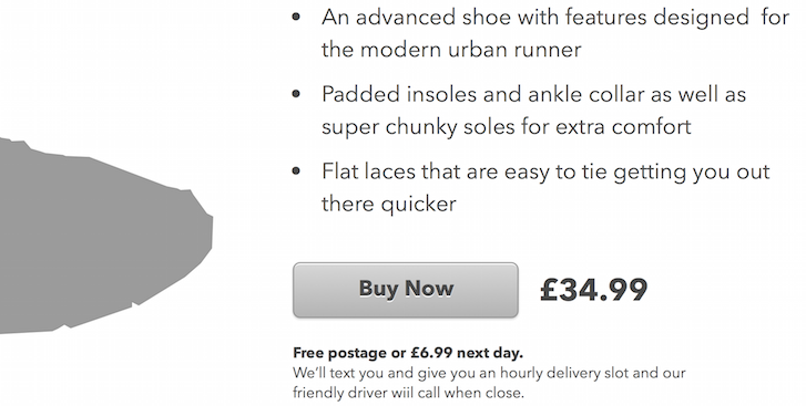
- Flattering - An advanced shoe with features designed for the modern urban runner
- Rational and emotional - Padded insoles and ankle collar as well as super chunky soles for extra comfort
- How my life will be better - Flat laces that are easy to tie getting you out there quicker
You'll need to write these features for each product rather than relying on the default text supplied by the manufacturer. Drafting your own text for these elements will provide an added benefit of improving your on-page SEO as you'll have the ability to integrate keywords into the unique copy for each item.
Delivery options
One of the biggest reasons for basket abandonment is that many product pages don't list the delivery options and costs. Ideally, you'll offer a free delivery and a premium get-it-to-me-quick option. Be sure to list them both with associated costs within the design of your product page.
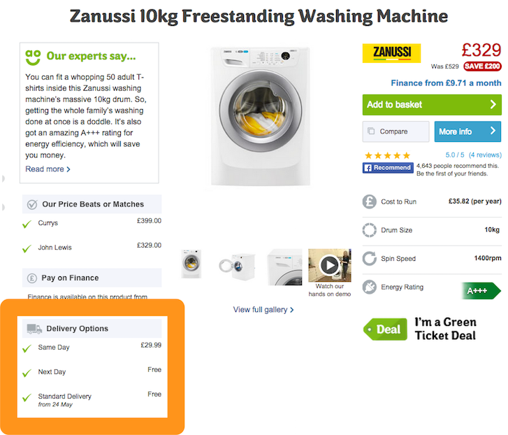
By including these options on-page, we’re already appeal to the rational — now think emotional. If you are using a courier that offers tracking, text updates, and generally a great service, it’s important to let buyers know. Shipping represents a real pain point for many users and they may well choose your site over a competitor if you offer a great shipping service.
Further photos / gallery
The more product images you have within your product page layout the better. It’s vital to show all sides of the product and don't forget that product images are used to sell to both the emotional and the rational sides of a user.
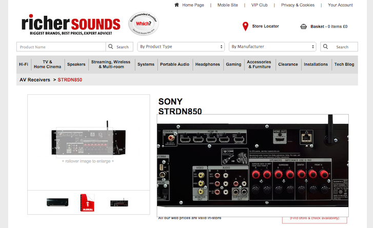
Show practical shots that show detail and features. For example, if you’re selling a TV show the input ports at the back to help the user understand what it can be used with. For a washing machine, show the control dial so users can see what settings it has.
For our shoe example, we’re including an image of the sole to help give the user an idea of the level of grip this particular shoe has. To optimize your usage of the gallery photos, use images associated with the product details highlighted in the product headlines such as the comfort elements we talked about above. Finally, label your images with relevant text to emphasize the quality of the product.
Reviews
Customer reviews are used in two different ways by users. Firstly they are used to assess the quality of the product and of your service. Buyers are looking to be reassured that what you say on the rest of the page is true.
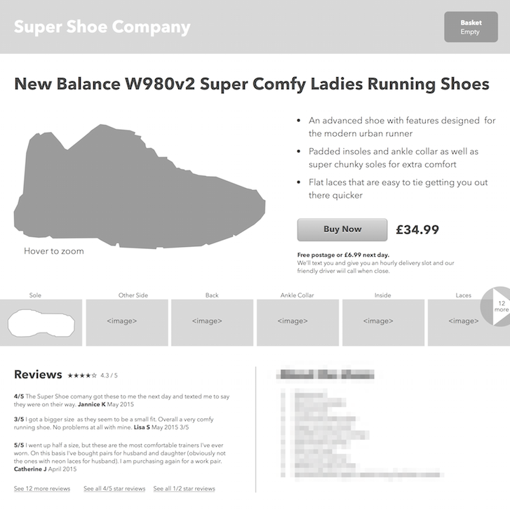
Secondly, buyers often use reviews to find out about features that might not be listed on the page.
If we take our shoe example, reviews might be read by users to check if the sizing of the shoes is accurate —e.g. if a size 5 of this shoe is larger or smaller than normal. If you are selling a bicycle on your product page, a review might detail the feel of the saddle. And if it's a washing machine, a review might highlight just how long the quick wash takes.
If you can build up a good set of reviews, they will add credibility to your product page and help sell the product on your behalf.
Finally, it’s important to not hide any negative reviews. If all the reviews are overly positive it leads users to question their accuracy and validity. Be sure to offer a link to negative reviews as these often highlight aspects such as fit, that in the long run might help reduce returns and refunds — a topic we’ll be discussing in a future post.
Product blurb and specification
Having the product blurb and specification at the end of our list might be surprising. A huge list of features can be intimidating and let’s face it, a little boring for a user. We don't want to make the majority of users feel like this stuff is important because it's not. It’s for this reason we push the product blurb and specifications to a lower point in the design of our product page.
Exact specifications play an important role appealing to the rational. If we haven’t yet mentioned a feature of the product, it’s likely because this particular feature will only appeal to a niche user group. In the case of our shoe example, it might be that the material is waterproof or that the shoes come with a further set of coloured laces. These items are less important for convincing a user to buy and can be moved further down our list and our UX design.
But what about...
You may have noticed that I have not mentioned all the elements that should be included in your product page design, as the inclusion of these elements vary per product type.
For example, returns and refunds are very important elements — particularly with clothing. Additionally SKUs, product variants, alternate items, related items, accessories and many other elements may be required on page depending on the product being displayed. I've worked on a number of ecommerce projects where different product page designs are used for different products within the same store. Consider optimizing the user experience of a page for the various products being sold.
When you go through your own ranking exercise be sure to place those options in the hierarchy at a point that matches your users needs, rather than where you think it should go.
Bringing it all together for an optimized product page design
Here’s our finished design with each element having a placement and a visual emphasis based on the list of importance we started with.
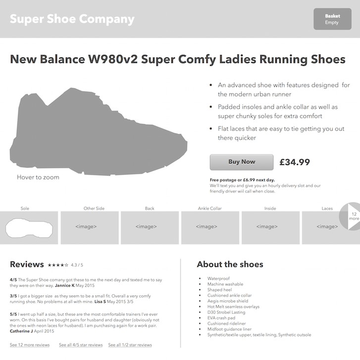
Designing a product page using this approach will not only help streamline your design process, but will ultimately improve the user experience within your clients ecommerce store. And considering the impact a well thought out product page can have on visitor conversions and sales, both you and your client will be glad you spent the time focusing on optimizing your product pages.
Do you want access to the Sketch file Joe used to design this product page wireframe? DM @mrjoe on Twitter and he'll send it your way!
Read more
- The Key Aspects to Consider When Building Multilingual Websites
- Agile Design: An Introduction
- UI of the Future: Conversational Interfaces
- Content Strategy: The Principles we Followed to Build the New Shopify App CLI
- Task Modeling User Needs for Ecommerce Design
- Building a VR Shopping Experience for the Web: Tips and Takeaways
- What Makes or Breaks an Ecommerce Shopping Experience? This Survey has the Answers
- 5 Common Digital Content Problems and How to Avoid Them
- 8 Things My Mom Taught Me About UX
You might also like: 5 Simple Hacks for an Optimized Mobile Ecommerce Design

