Accelerated Mobile Pages (AMP) is an open-source framework, launched by Google in February 2016, that’s focused on putting mobile performance first. While there’s been a huge focus on adapting websites for the limitations of mobile — high data costs, slow loading times, and poor content rendering — mobile browsers have lacked the benefits of a dedicated framework.
"What Google wants to achieve is a consistent standard to apply to web pages when delivering content to any phone, tablet, or mobile device, ensuring that pages load instantly and elegantly."
What Google wants to achieve is a consistent standard to apply to web pages when delivering content to any phone, tablet, or mobile device, ensuring that pages load instantly and elegantly.
To reach this goal the AMP team has developed a new web page format, which is basically a simplified version of HTML, specifically for mobile devices. By allowing only the most performant design patterns and imposing restrictions on resource-heavy JavaScript, AMP pages are dramatically faster the average HTML page found on the web today.
To improve loading speeds further, AMP uses server-side rendering of AMP components, to cache page content on Google servers, so that content reaches the browser as quickly as possible. The strategy appears to be catching on, as there currently is over two billion AMP pages online, on over 900k domain name worldwide.
AMP is a leap forward for mobile optimization and theme responsiveness, as now there’s a provision for mobile device experiences that use distinct code, and remove content that’s redundant on a small screen. Just like regular webpages, Accelerated Mobile Pages will load in any modern desktop browser too, and the project’s own website is coded solely in AMP.
In this post, we’ll take a look at which brands are using AMP, how to build an AMP page, how AMP can improve ecommerce sites, as well as some of the framework’s shortcomings.
You might also like: How to Use Polaris to Build an App UI in HTML or React.
What AMP looks like
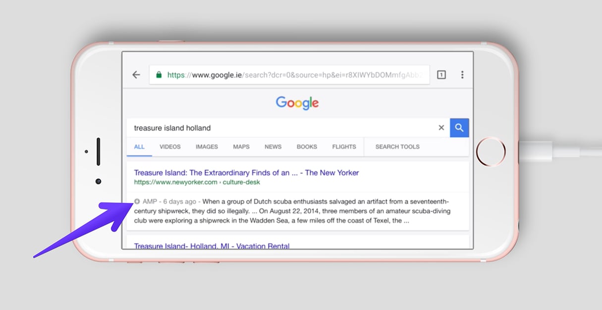
If you’ve been browsing Google on your phone over the past year, chances are you’ve already been viewing AMP pages. When you search a specific keyword on Google, for example “Mars,” you’ll see AMP links appear in a carousel within the “top stories.” You can distinguish which links are AMP search results when you see a lightning icon below the title of an AMP article.

Once a page has an alternative AMP version, which is indexed by Google, it should appear in search engine results, with the lightning symbol and the AMP tag. Typically, you’ll give your AMP-optimized page a unique address, for example: testsite.com/testpage/amp.
For sites that don't have an AMP version of their page, the mobile-friendly page will be listed on search engines, or the desktop page if there's no mobile-friendly version.
Who’s using AMP?
In a study carried out by Chartbeat, it was discovered that as of December 2016, top publishers within the United States are now seeing AMP make up seven percent of all their traffic . This statistic is game-changing when you consider that AMP was only launched in February of last year, while the same study determined that readers engage with AMP content for 35 percent longer than standard mobile web content
 .
.
Publishing powerhouse Condé Nast were an early adopter of AMP, and were quick to recognize how their brands, which include The New Yorker, Wired, and Vanity Fair would gain from having stripped-down and Google-cached content for mobile. In a blog post from August this year, Oscar Perez, Senior Software Engineer at Condé Nast, described how AMP improved the browsing experience for their readership:
“Users arriving from Google undergo an uninterrupted flow from search into our content. AMP content loads quickly thanks to Google’s CDN and AMP HTML enforced performance guidelines. The AMP Layout System ensures a great reading experience by preventing pages from jumping around as third-party content loads. Our regular sites are not by any means slow, we constantly beat our competitors’ load and render times, but there are certain performance guarantees that Google can deliver to their users (e.g. prefetching) when content is on their CDN.”

How to build pages with AMP
If you’re already familiar with regular HTML and styling for the web, adapting to AMP should be easy. Although it’s stripped-down, the syntax and code structure is modeled on existing web-design standards, with some new tags to identify the page as an AMP document, as well as to load unique libraries. We’ll take a look here at how to get started building pages with AMP.
1. Markup
Since AMP is a redesign of regular webpages, but optimized for mobile, there are some major differences in markup between regular HTML and AMP. For example, the top-level <html> tag for AMP is <html amp> or <html ⚡️>, which allows a browser to recognize the page as AMP content.
Similarly there is a specific JavaScript library that must be loaded, by adding <script async src="https://cdn.ampproject.org/v0.js"></script> within the <head> tag of the page.
Also, since not all visitors will use a mobile device, you can point to a regular HTML version of the page by including a canonical link within the <head> tag of the page. This would look something like <link rel="canonical" href="$SOME_URL">, and if you’re happy using the AMP version of a page for desktop users you can point the canonical link back to the AMP url.
Other differences include how images are added to pages. <img> isn't supported with AMP, but the slightly enhanced custom <amp-img> is the replacement for images. A fixed width and height are included within <amp-img> tags, as well as the usual `alt` attribute, so a typical image could look like this:
<amp-img src="hello-world.jpg" alt="hello" height="400" width="800">You can also make your image fully responsive on different sized screens by simply including layout="responsive" within the <amp-img> tags. You can find the complete HTML specification from the AMP project page here.
2. Styling
Since AMP is a stripped-back framework, it’s not surprising to find that a lot is missing when compared to regular webpages. Some interesting CSS requirements to make note of include no external stylesheet, meaning that all styles must be defined in the <head> of the page, as well as no !important qualifier due to AMP enforcing its own element sizing rules.
While there are some very significant changes to, or entire omissions of, expected code, there usually is a logical justification for this revision. To demonstrate this difference, the AMP project team have provided a boilerplate page, that acts as a perfect starting point for building pages with AMP.
3. Validation
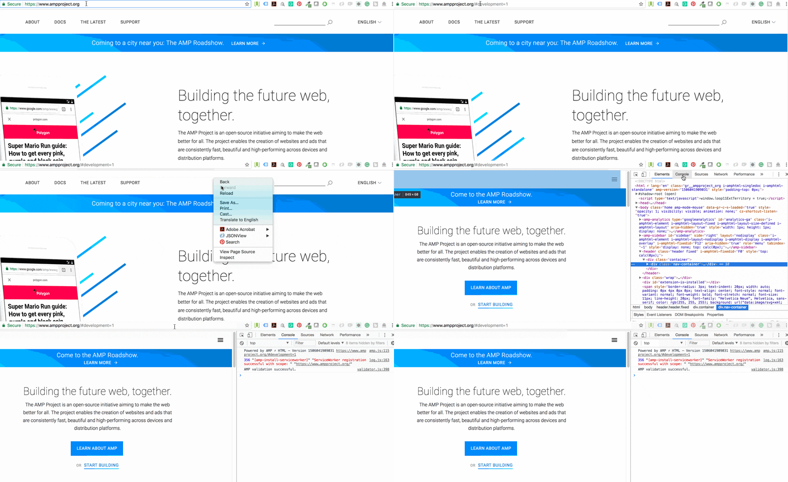
Once you’ve created your AMP pages, you can review them by using the AMP validator. You can also use Google’s Chrome Dev Tools to validate your AMP pages, further cementing Dev Tools as one of the most versatile extensions in a web-designer's arsenal.
To validate using Dev Tools:
- Open your AMP page in your browser.
- Add "#development=1" to the end of your URL, for example, https://www.ampproject.org/#development=1.
- Right-click on the page and select “Inspect”.
- Open the “Console” tab. If the page is AMP validated, you will see “AMP Validation Successful”.

You might also like: Building a Clickable Call-to-Action Button for Your Shopify Theme.
Amp and ecommerce
While the benefits that AMP has to offer the news media are clear — quicker article loading and higher engagement with content — the real question for many ecommerce developers is how can AMP improve their client’s experience, and drive more sales to stores?
One advantage that AMP shares with both media channels and ecommerce is speed, since faster loading sites will simply have better opportunities to make sales.
If a site loads slowly, customers will abandon their purchase , and 53 percent of mobile site visits are abandoned if pages take longer than three seconds to load. To most developers, a three second loading time on mobile might sound easily achievable, but it’s also important to consider that some phones have slower processing speeds and some networks can have reduced performance. And this is before considering that many parts of the world are untouched by 4G connectivity.
In this context, if you could dramatically lower a store’s loading speed for mobile by adopting a streamlined framework, your client could be reaping huge rewards over their competition. Imagine if an ecommerce store is making $100,000 per day, a one second page delay could potentially cost you $2.5 million in lost sales every year.
Currently, it’s possible to create AMP versions of Shopify pages through the API, and there are some apps in the Shopify App Store that have successfully leveraged this technology to provide a conversion service for clients.
For example, both RocketAmp and FireAMP allow users to easily create optimized AMP product pages for all products on a store. On a theme level, however, it’s not possible to simply generate AMP validated pages for Shopify stores. Developers looking to design Shopify sites which are AMP validated have the option of either creating a custom app, which will convert pages, or use an existing app, which provides this service.

AMPs growing pains
Since AMP’s launch last year, members of the tech community have challenged a number of aspects of the framework, usually focusing on some of the more limiting features. By its own minimalistic nature, AMP’s rules can be restrictive, especially if you’re using a lot of JavaScript on your pages. However, there are AMP alternatives for elements such as image galleries with carousels and star ratings.

Similarly for analytics, critics have taken aim at the range of reporting, compared to Google Analytics. This is an area where the project team itself is looking to improve, however one of the major short-term aims of the AMP team is to “deepen support for basic analytics, such as new event triggers, variables, and flexibility in constructing hit requests, as well as provide support for e-commerce analytics”.
This is achieved, in part, with the amp-analytics component library, which captures tracking data from an AMP document, and can send it to third-party reporting systems, such as Google Analytics.
Another criticism of the format is the lack of support for common types of on-page advertizing, like flash, non HTTPS, and resizing rich media ads. To counter this, the <amp-ad> tag can be applied to less resource heavy ads, like HTML5 ads, and supported video players can also be integrated to introduce dynamic movement into embedded ads.
Some of AMP’s shortcomings are even being solved by unlikely third-parties, as is seen with how Safari has managed to convert AMP page URLs to regular URLs when an AMP page is shared. Currently when a visitor on an AMP page shares the direct URL, they’ll end up sending a link to the AMP version of the page, instead of the canonical URL. With the recent updates to Safari iOS 11, the AMP part of the URL is stripped when it’s being shared, allowing for a more graceful user-experience.
AMPing up for the future
Moving forward, it’s likely that AMP will see growth internationally, given that Google announced during a recent developer conference, that AMP will be available over the Baidu, Sogou, and Yahoo Japan search engines.
The open-source project continues to build momentum, and various plans for improvement are outlined in an ambitious road-map, including third-party log-in and support for ecommerce analytics.
The framework may be young and still experiencing some teething issues, but AMP could potentially improve the mobile web by boosting performance, encouraging consistency and streamlining ecommerce purchases.
Read more
- A Modern Approach to CSS Pt. 2: Building Resources
- Free Webinar] Developing with Shopify: Using JavaScript to Add Ecommerce to Any Website
- 5 Easy-to-Implement Website Maintenance Tips for Your Client's Ecommerce Business
- How to Use PWA and AMP for User Centered Design
- Understanding hreflang Tags for Multilingual Stores
- Embrace Localization and Multilingual Content with HTML and CSS
Have you had any experiences using AMP to develop mobile-optimized pages for your clients? Do you think this could be a positive or negative development for the mobile web? We would love to hear your insights in the comments below.

