


To succeed in the modern, highly competitive market, companies need to do more than produce a good product or provide reliable service: they need to create a bond with their users. It’s possible to create a bond by establishing an emotional connection with users. While designers can use various strategies for this, one of the most effective ways of building a relationship is by adding humor in design.
In this article, we’ll see why humor is an incredible tool for emotional connection, and what techniques designers can use to create that connection with their users.
And speaking of silly, check out our list of funny lorem ipsum generators.
Why humor is so important
People don’t just use products; they experience them. Every time we interact with a particular product, we put emotions into that experience. Whether it’s positive or negative, we always have feedback in our heads. But what makes one product memorable and others easily forgettable?
"Humor sells. It makes the experience of using your product more memorable."
In the book Emotional Design: Why We Love (or Hate) Everyday Things, Don Norman digs into this question. His fundamental idea: attractive products work better. Attractiveness makes the user more tolerant of minor difficulties. But attractiveness doesn’t mean only beauty—it also means a genuine personality. And when it comes to product design, there’s one thing that helps us convey a personality—humor. Used effectively, humor can engage users and increase product stickiness. It can set your experience apart from others in a positive way.
Humor sells. It makes the experience of using your product more memorable.
Bringing a smile to a user’s face can transform that experience from likable to lovable. As a result, people not only remember the delightful experience, but they tell others about it as well.
Is humor the only ingredient of good UX?
Does this mean that to create a great product all we need to bake humor into our designs? Absolutely not. Humor cannot fix a product that has fundamental usability issues. As explained by Aaron Walter, creating a pleasurable experience is only at the top of the user’s hierarchy of needs.
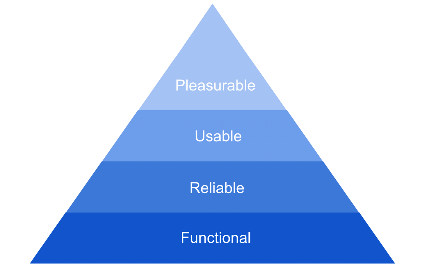
This means that products we create should satisfy the basic needs of users—they should be functional (solve the problem for users), reliable (users can count on the product), and usable (easy to learn and easy to use). And when a product serves these basic requirements, then it’s possible to add delight to the user experience. Adding a bit of fun into interactions can move you up to the pinnacle of a pyramid.
4 types of humor designers can use in digital design
Humor and fun can come in many forms. In this section, we’ll review just a few basic types of humor.
1. Personification
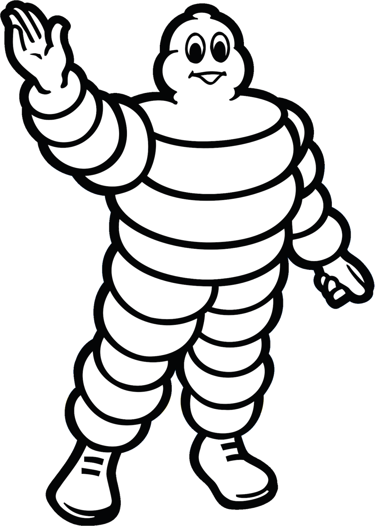
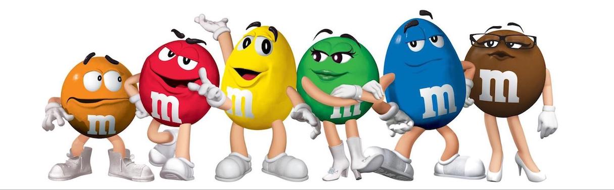
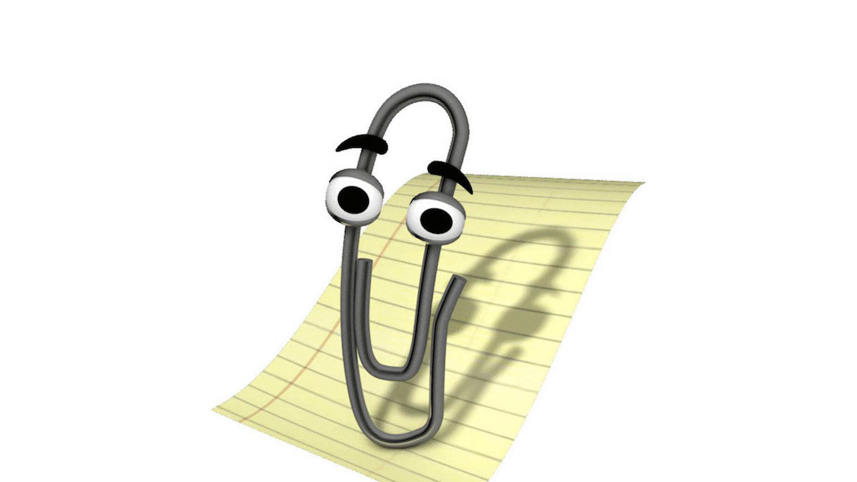
Personification is attributing human characteristics to objects or creatures. It’s one of the most popular ways of using humor both in product design and advertising, because personification makes it easier for people to understand key concepts.
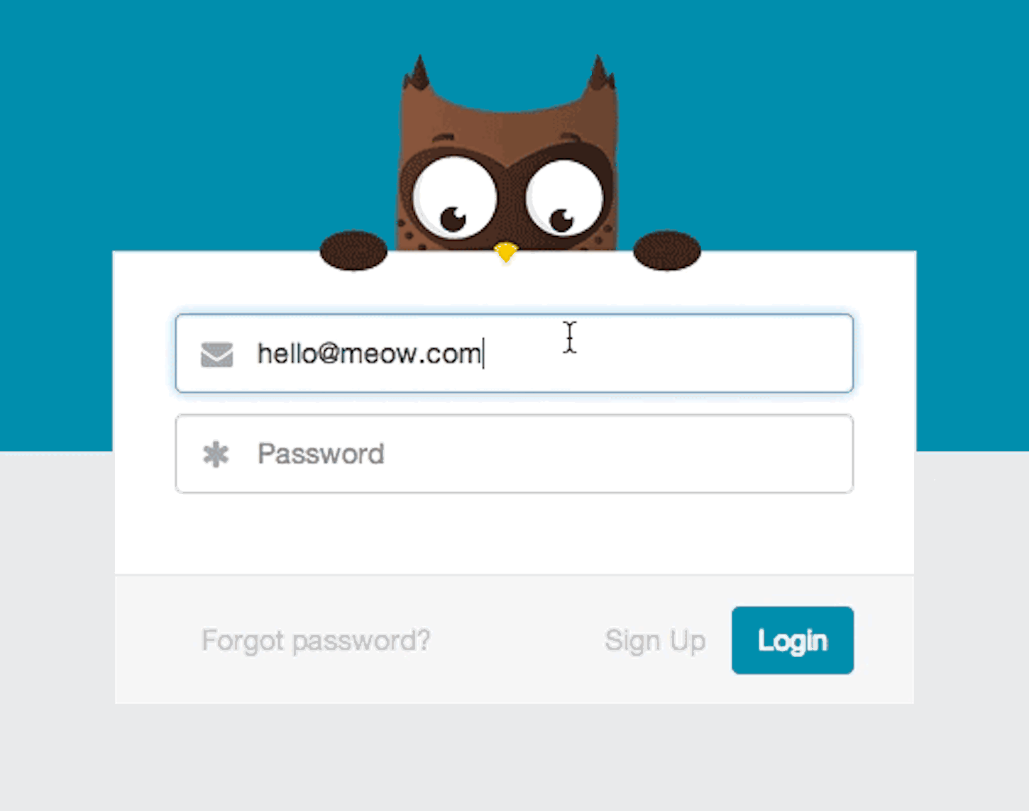
Designers often use mascots (nicely designed creatures intended to evoke sympathy) as a tool for personification. Many world-famous brands use mascots to bake a personality into their brand identity. For some of them, mascots became a natural part of brand identity—when people hear the name of a brand, they picture a mascot in their heads.
In digital products, it’s possible to use mascots for many different purposes. A mascot can greet your website visitors and make them feel more comfortable. Or it can be used at the time of anxiety when users need extra care and support.
When it comes to using mascots in digital products, it’s vital to make them a natural part of a user journey. That’s why timing and user expectations are two main properties that should be taken into account. The mascot shouldn’t appear uninvited; otherwise, it will annoy users.
2. Comparison with exaggeration
This type of humor puts two (or more) objects together to create a humorous contrast. This type of humor makes it easier for people to understand the point you’re trying to make.
Perhaps one of the best-known examples of comparison with exaggeration is the “Get a Mac” advertising campaign created by Apple. Each commercial in the campaign involved a general comparison of Mac and PC, but done in a hilarious way.
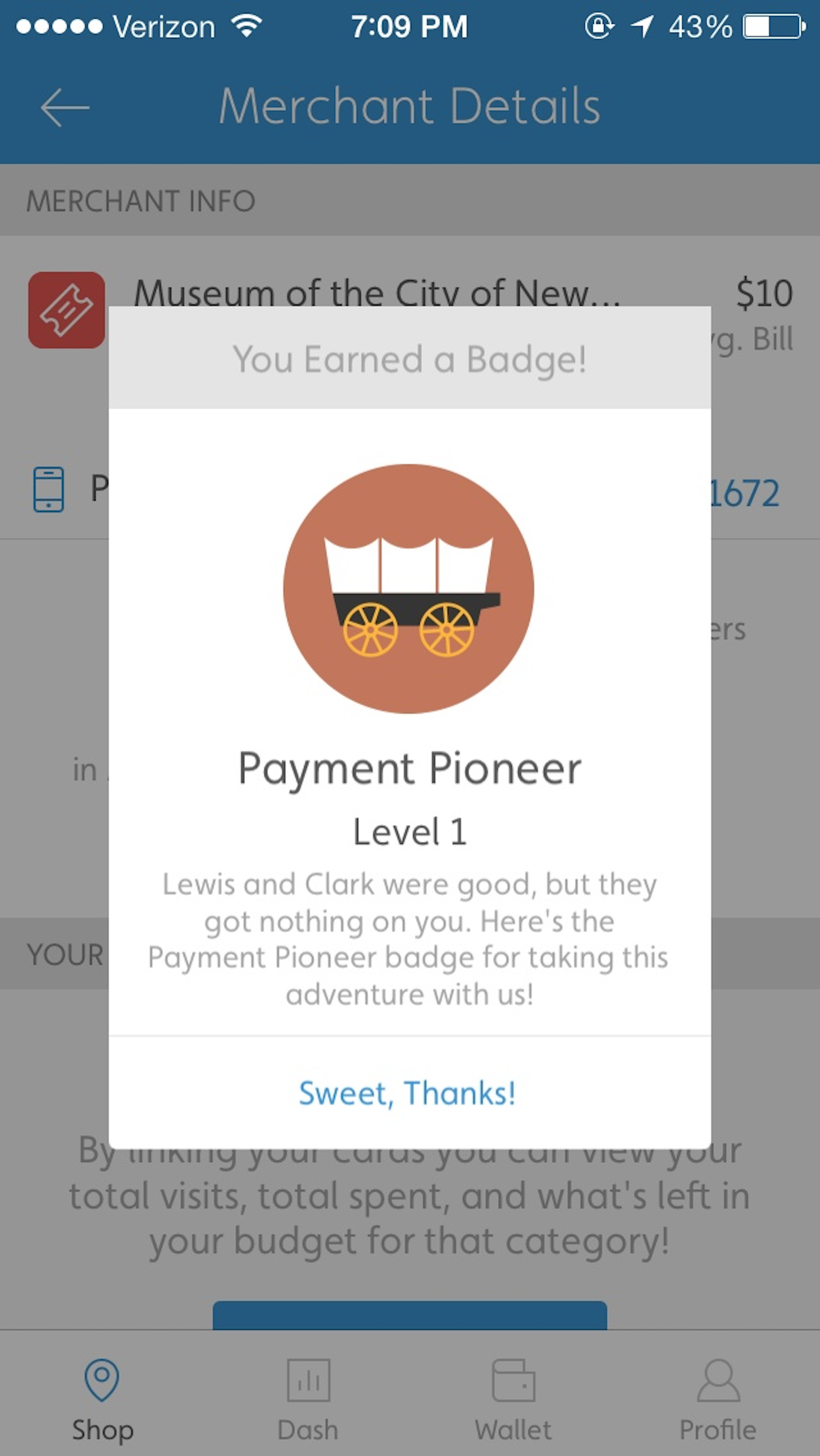
3. Surprise
People feel a sense of surprise when something happens that’s not in line with their expectations. The crucial detail of successful surprise is that a person shouldn't expect something to happen (surprise shouldn’t be predictable otherwise it won’t be a surprise).
4. Easter egg
Easter eggs are hidden messages/images or secret features. The term was initially coined to describe a hidden message in the Atari video game Adventure, which soon started a trend of players looking for hidden messages in other games.
Today many digital products contain easter eggs. One good example is Google Search. Type “askew” in the input field, the page with search results will literally skew itself for you.
Surprise and easter egg may sound like the same concepts, but there’s an important difference between two—surprise always comes unexpectedly, while Easter eggs are something users know about, since they have to hunt for them to find them.
You might also like: Symmetry vs. Asymmetry in Layout Design.
Where to include humor in a user interface
As with anything, there is no simple formula for injecting humor into your design. Each product is different and requires its own approach. However, there are a few places where humor can be implemented without too much risk.
First successful interaction with a product
Old wisdom says that you only have one chance to make a first impression. Similar to human relations, your app has only one opportunity to create an excellent first impression on your users. It’s possible to increase the likelihood of this by introducing humor and delight.
Success state—a state users see when all goes according to the plan—is a perfect place to bake in humor. This could be on a screen users see in email app when they send their first email, or an order confirmation screen in a food ordering app. Sometimes even simple things can help you make the first interaction with a product unforgettable.
Anywhere you have storytelling elements
Humor is proven to have a beneficial effect on memory—funny information is easier to remember than non-funny information. For this reason, it can be beneficial to add bits of humor to elements of your storytelling, such as in the imagery on your landing page. The story you tell your users will be a memorable one.
The about page
The about page is one of the most important pages on your website. It’s where visitors go to find out more about a company and its culture. Even though this page is extremely valuable for your visitors, it all too often looks way too generic—necessary information about a company paired with images of people who work in it. When people visit such pages, they usually forget them as soon as close the browser’s tab.
With a little bit of creativity, it’s possible to turn the about page into a fun and memorable experience for your visitors. All you need is to figure out your company's unique identity, and then share it with other people.
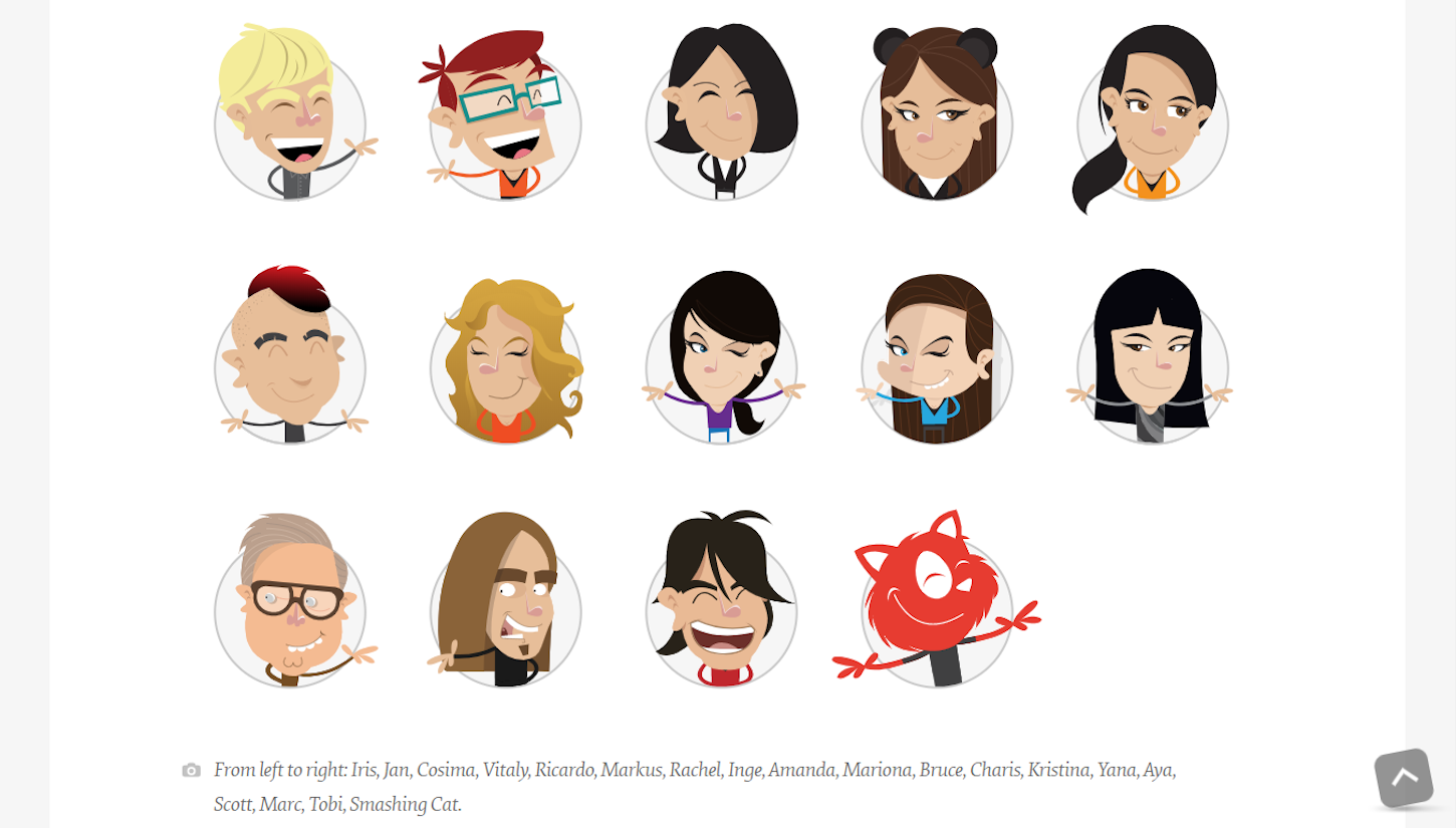
One great example is Smashing Magazine’s about page, which features cartoon representations of Smashing’s management team. The page serves a clear functional purpose: it introduces the team, but it does it in a very informal way.
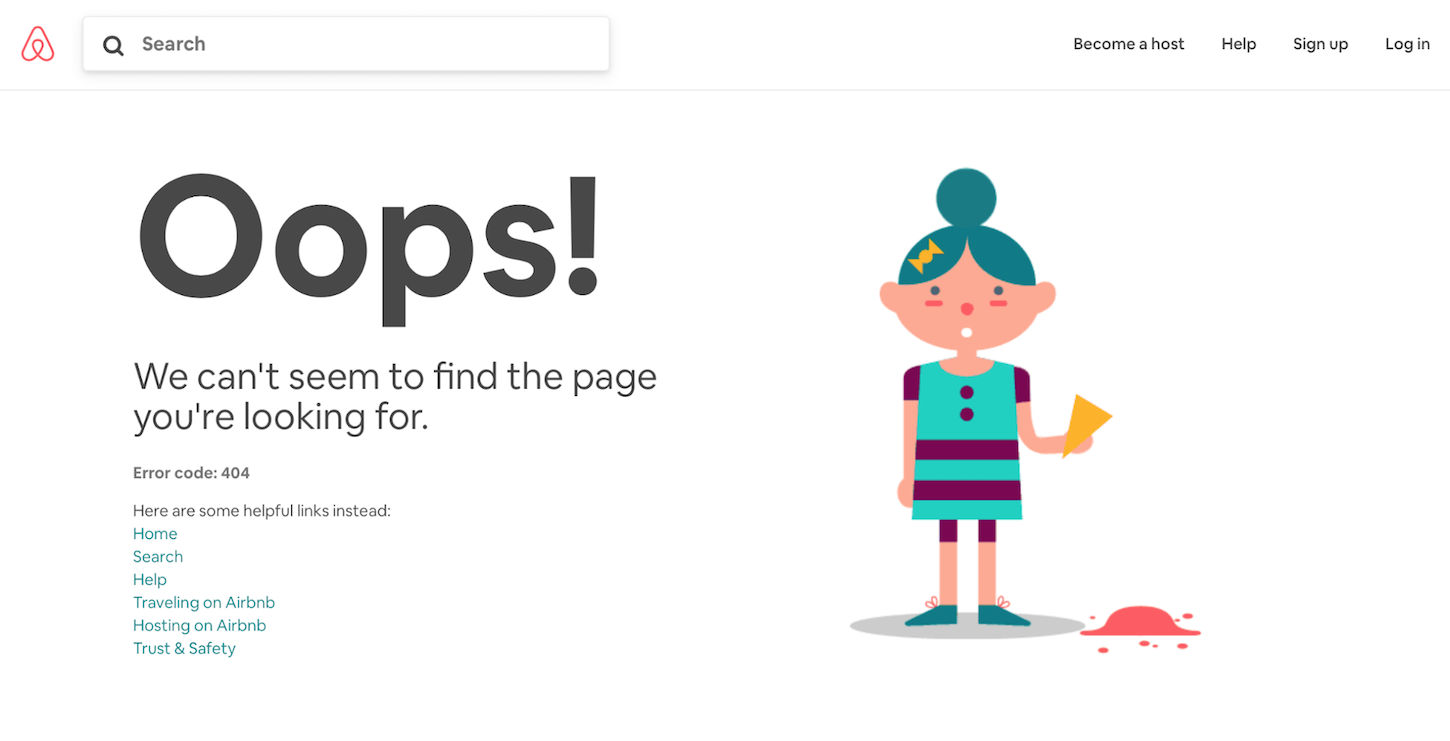
The 404 page
The 404 error page is another page that most websites have. Visitors see a 404 page when they try to access non-existing page. While the reason of showing 404 may vary—maybe the link the user used to navigate was broken, or the user mistyped a URL—the experience they have on 404 will impact their overall experience.
Good 404 page communicates why a particular page can’t be loaded and what users can do next. Great 404 pages not only reduce the user’s frustration of not finding what they are looking for, but also makes them smile. Below, Airbnb’s 404 page uses an animated illustration to humanize the problem.
You might also like: How to Craft the Best 404 Pages for your Clients.
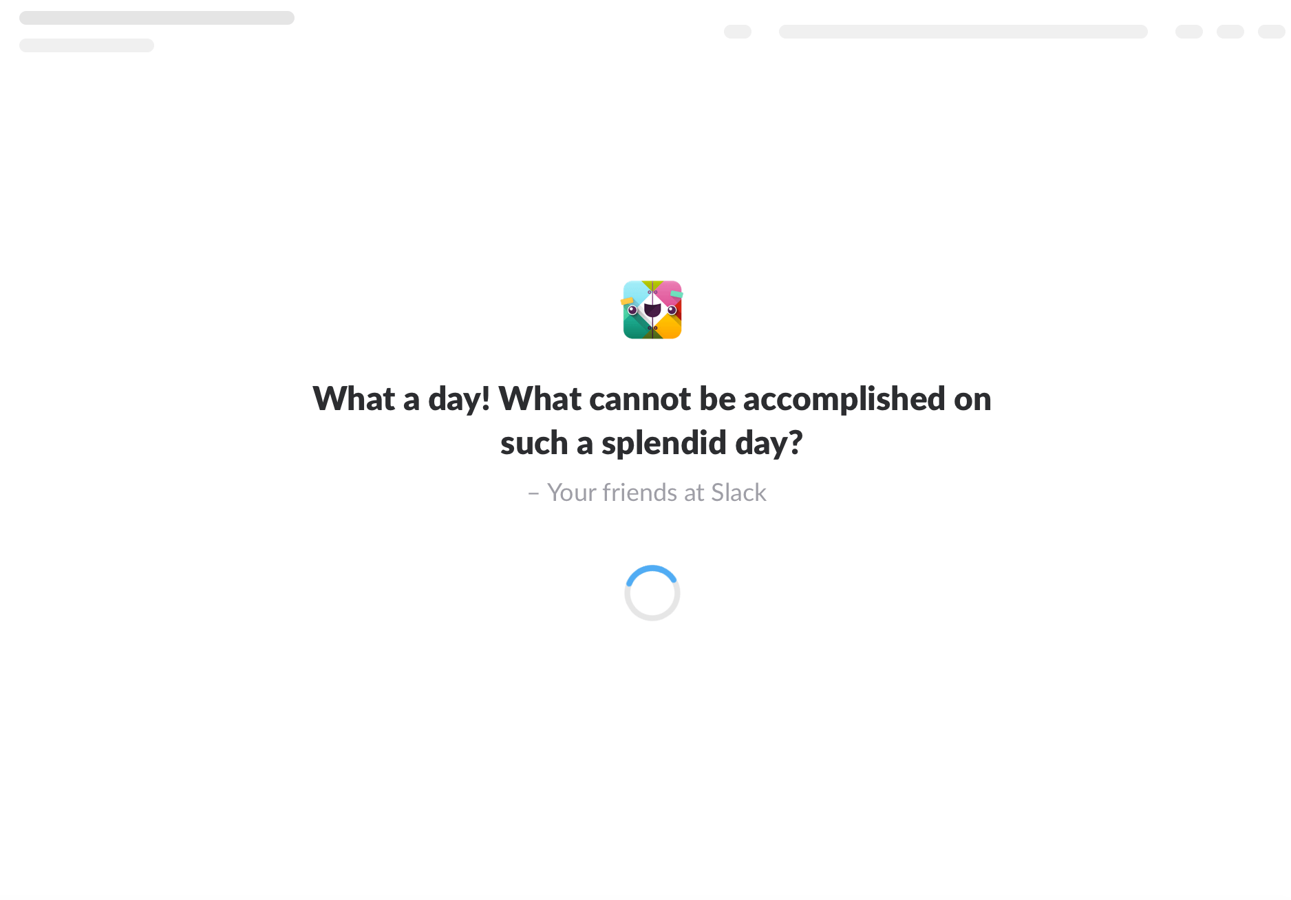
Loading screen
Who enjoys waiting times? Most probably nobody. Still, waiting time is a natural part of our daily experience with products. When a system asks us to wait, we usually consider it a bad experience. And the more we have to wait, the less happy we will be about a product.
Waiting time can be caused by many different reasons. For example, the system itself might be slow, or users may be experiencing a slow internet connection. Not all problems are easy to solve. Thus, if you can’t shorten the line, you should at least make the process a bit more pleasant.
Some products have found a creative way of using the loading screens. Instead of showing an infinite loading spinner paired with the word “loading,” such products add humor. One of the great examples is Slack, which often cracks a joke when users log in into the app.
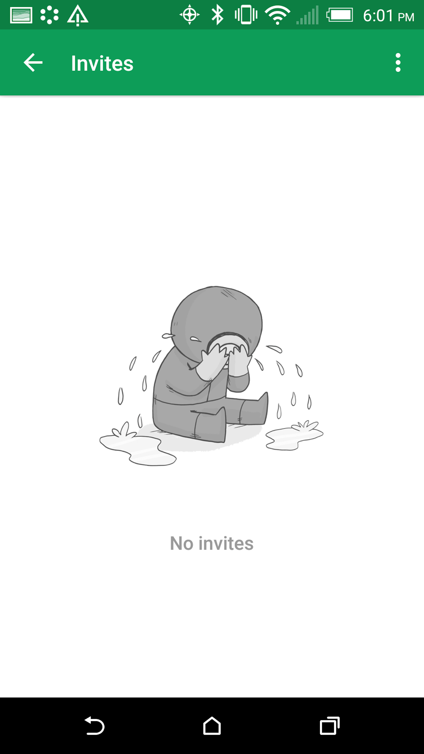
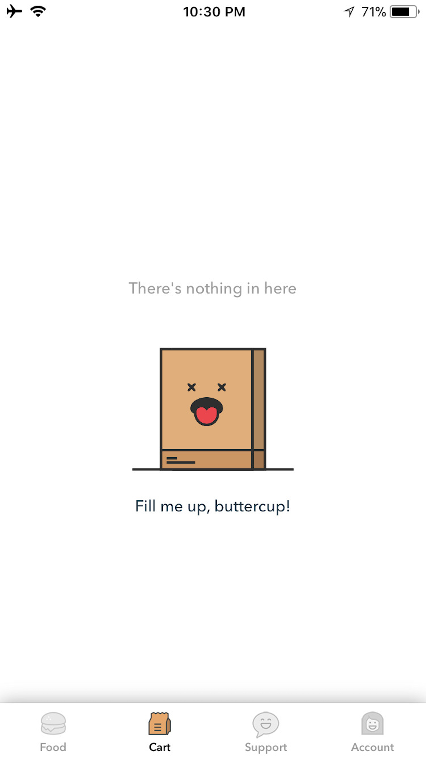
Empty state
Empty states are pages that don’t contain any data. The page might be empty because users just recently started using an app and the app doesn’t contain any data to display, or the app might encounter a network error and can’t download data. Whatever the reason is, the way you design empty states plays a vital role.
Many apps available on the market today have empty states that are too...empty. They don’t provide any valuable information to users; they just state that the system doesn’t have any data to show. But in most cases, it’s possible to make empty state pages much more pleasant for your users. A well-designed empty state will not only tell users why they don’t see any data, but can also motivate users to interact with the app to fill it with data.
Microcopy and macrocopy
Words form the backbone of communication in digital products, which is why writing copy should be a vital part of the product design process. When product creators invest in UX writings, the product becomes not only more useful, but also more pleasurable.
There are two types of copy—microcopy and macrocopy.
-
Microcopy are the small bits of copy that we have in user interfaces. These include button labels, form field descriptions, system messages, etc. Despite their size, microcopy are the tiny words that matter.
- Macrocopy is a natural part of a ‘brand dictionary.’ This type of copy includes brand slogans, product descriptions, terms and conditions, and more.
It’s vital to consider both micro- and macrocopy when working on a product. Below are examples of how microcopy can create a better user experience.
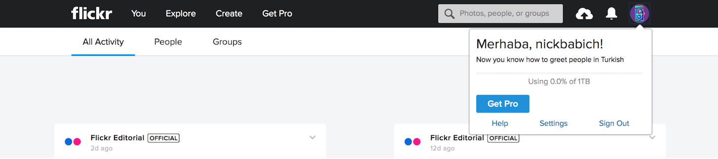
- Flickr and multilanguage greetings. Flickr mixes humor with learning using microcopy. Its introductory greeting often changes to a different language. For example, the message below reads ‘Merhaba!” which is hello in Turkish. Now you know how to greet people in Turkey.
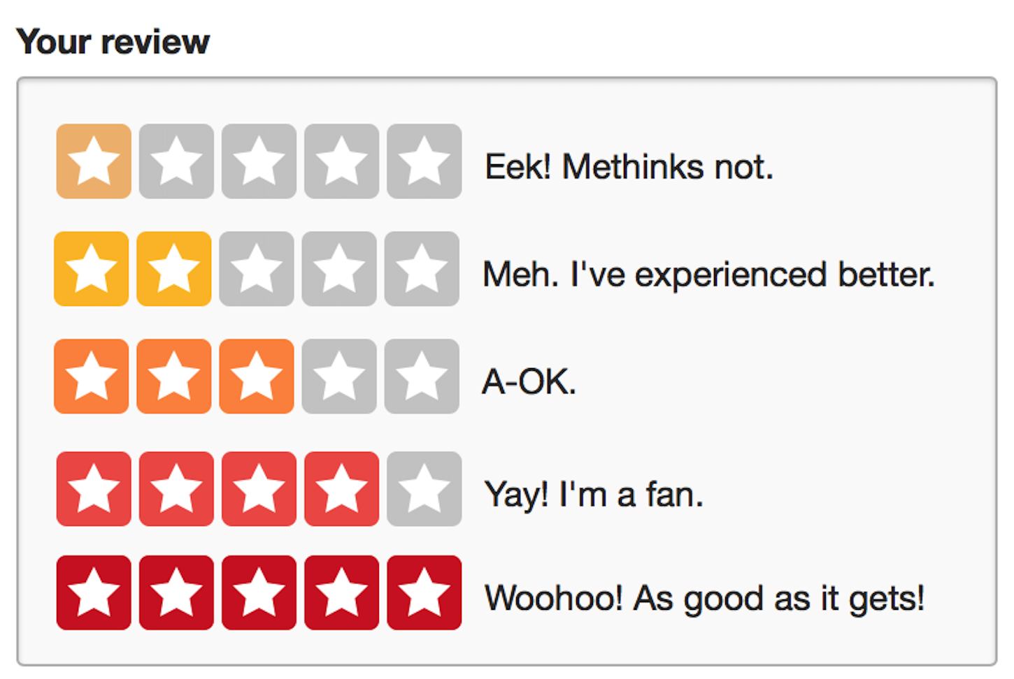
- Yelp and user reviews. The context of action is another great place to bake humor in design. For example, Yelp adds humor in its rating responses. So, instead of a dull one to five star system, users see phrases like “Eek! Methinks not.” Such a simple change creates a strong positive effect on users—their response becomes more human.
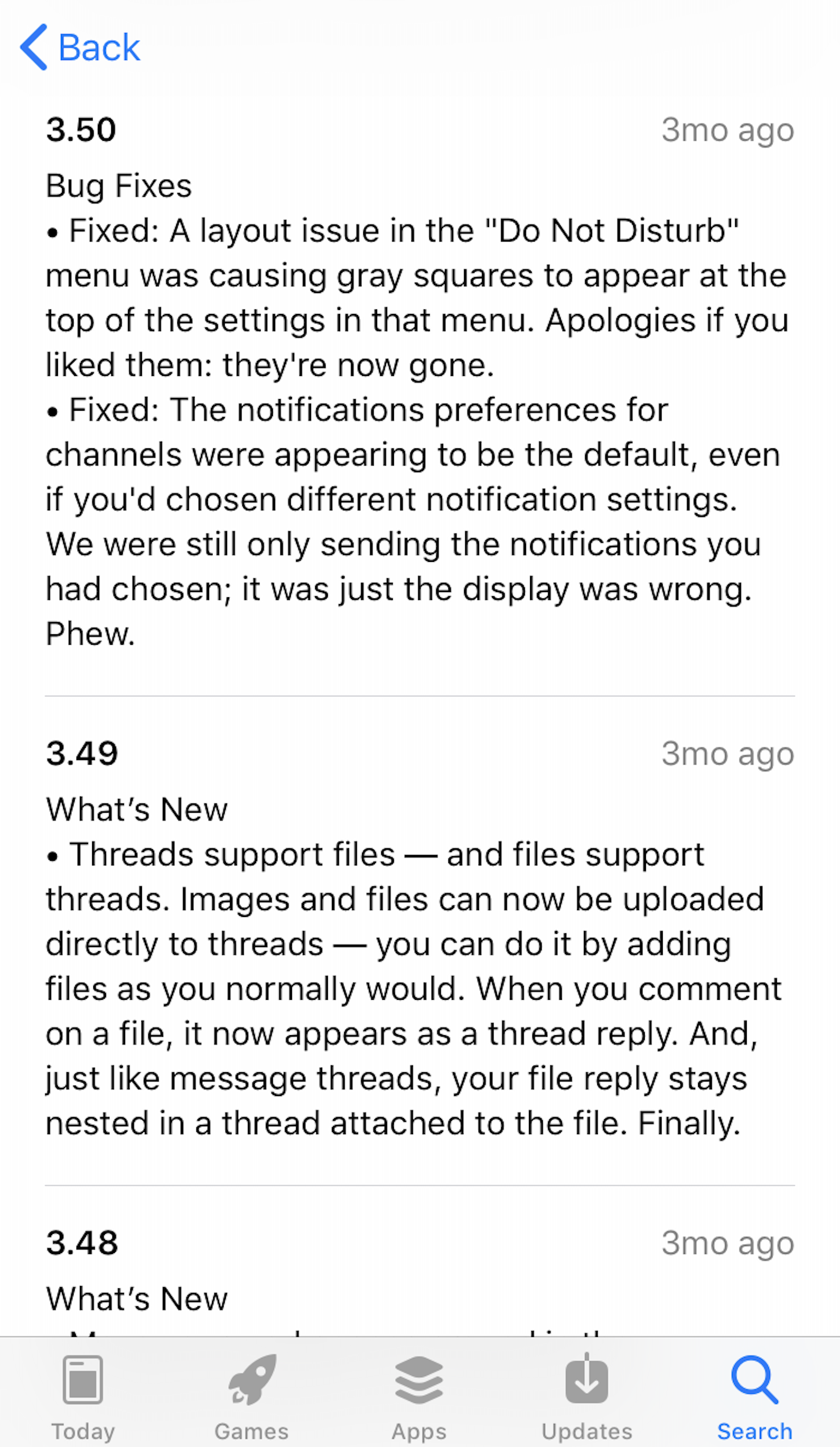
And below is an example of macrocopy that brings a smile to users’ faces—Slack’s release notes. Slack adds humor in its information about the fixes it has made for their iOS app.
When it comes to writing a copy, it’s essential to understand the context in which your user will interact with your product. This will help you understand how to adjust your tone to the situation.
Places where humor can cause harm
Humor is a double-edged sword. It can bring delight when used appropriately, but it can cause a lot of harm when it’s implemented without tact and foresight.
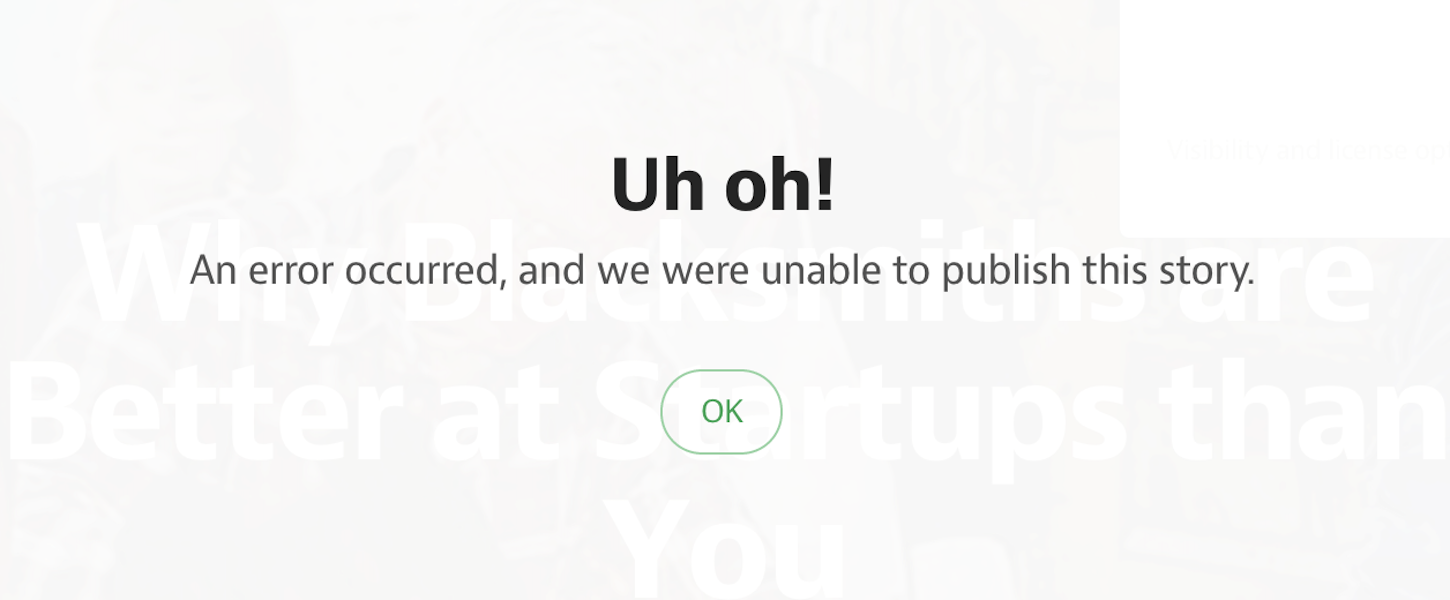
Humorous error messages when user lose valuable data
Humor is contextual. A joke that can be funny in one situation can be terrible in another. It’s important to put extra attention to the copy you use for error states of your app (especially when the problem has a negative impact on your users).
"Humor is contextual. A joke that can be funny in one situation can be terrible in another."
Imagine a situation when you work on a document for a few hours and finally decide to save it. When you press the save button, the system shows a loading spinner, before displaying a system error message with the text “Uh-oh, the app crashed, and we don’t have any idea why. Your work is gone forever, oops.” This message will most probably make you angry.
You might think that no single product has a copy like this, but unfortunately, that’s not true. Messages like this exist, even in highly popular products.
When humor creates uncomfortable situations for users
Never make fun of your users. Imagine a situation when someone tries to purchase a product in an ecommerce store, but don’t have enough money on their account. The copy around this needs to be sensitively written—you can’t just say, “Hm, it looks like you don’t have enough money on your account. Why don’t you get a better job, pal?” Almost nobody will appreciate a humorous message that reminds them of their financial situation.
You might also like: Inclusive Design: 12 Ways to Design for Everyone.
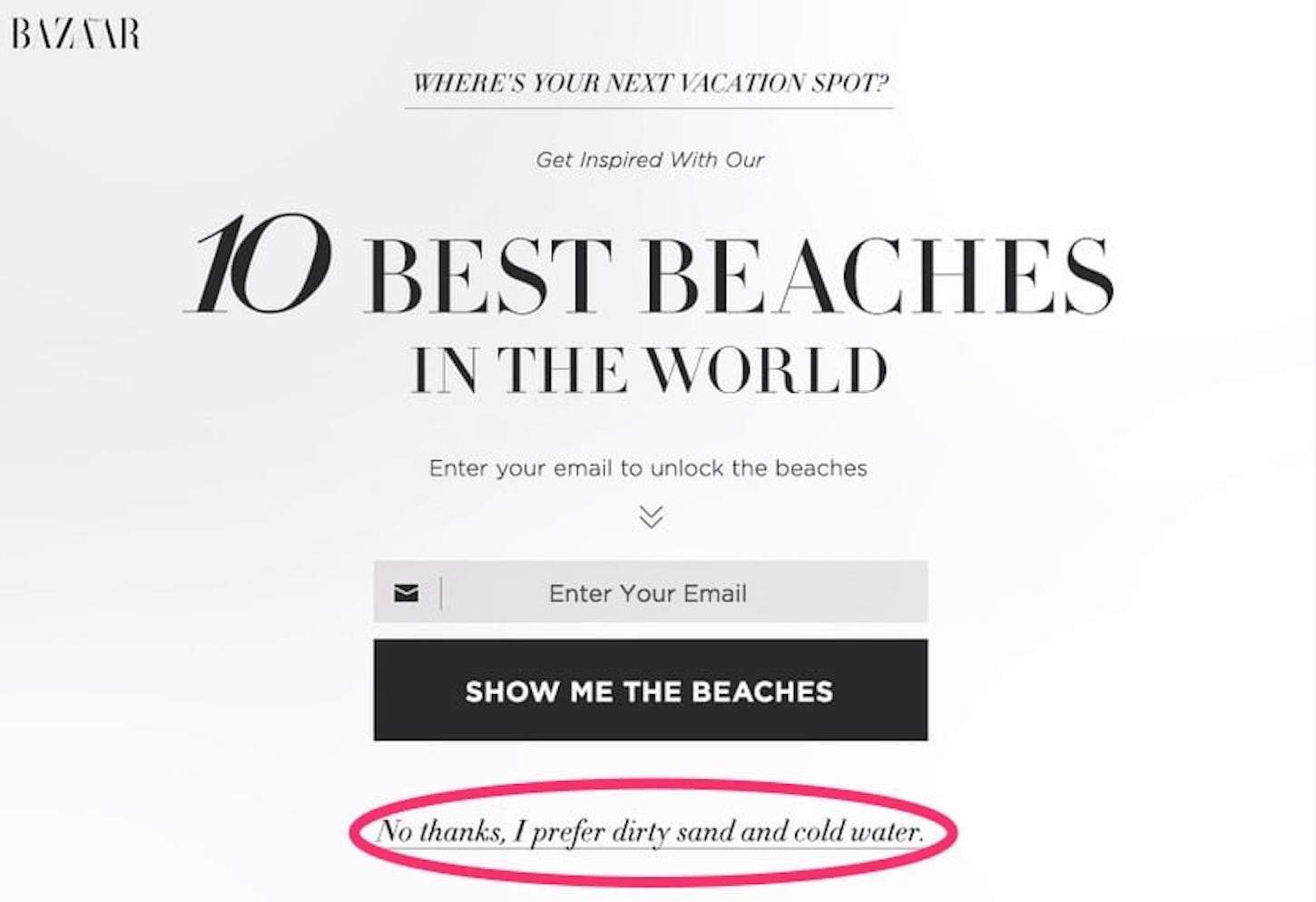
Confirmshaming
Confirmshaming is the act of making the user opt into something by shaming their choices. This pattern is often used in popup forms that collect visitors’ email addresses.
In the attempt to gather more subscribers, they add a copy that is supposed to motivate users to opt in. In UX design, confirm shaming is considered a dark pattern—it’s insulting and disrespectful to users.
6 Practical tips on how to implement humor in your product
To make humor in your design work, there are some practical ways to leverage it.
1. Make sure humor suits your brand
Not all projects have a place for fun. For example, when it comes to government organizations, adding humor to sites and apps that represent such organizations can interfere with user expectations.
2. Research your audience
The process of building a product starts with understanding its users. It’s vital to be aware of your audience and their preferences. Especially when you are designing to make an emotional connection, it’s important that you have a clear understanding of who your users are and what kind of humor they find funny. Always try to use language that resonates with them.
Take into account the following:
-
Humor is subjective. What someone might find funny other people might find dull. Thus, don’t rely on individual opinions. Instead, create personas to guide the use of humor in your design.
- Humor is cultural. Humor isn’t something that is easily transferable to other cultures. If you have an international presence make sure you localize the humor to the relevant country.
3. Hire a UX writer
Recently, many organizations realized the importance of having a good copy. This lead to an increase in demand for UX writers—specialists responsible for writing copy for digital products.
UX writing is quickly becoming a standalone discipline. Many big companies, such as Google, Dropbox, and Amazon consider hiring UX writers as an investment in the future, especially as interactions with products become more voice-based).
4. Strive for consistency
Humor is a part of the visual language you use to communicate with your users. And this language should be used consistently across all your channels and media. The jokes you use on your website should have the same tone as jokes you use in your paper booklets. It will help you create a sense of familiarity and make it easier to remember the brand.
This is why it’s so worthwhile to write a content style guide describing the process of copywriting, and the brand tone.
5. Don’t go overboard with humor
One of the challenges with adding humor into your design is knowing when to stop. The right amount of fun can create a memorable experience, but too much can have the opposite effect—it can drive users away. That’s why it’s vital to achieve a balance.
Here a few practical tips:
- Don’t replace the valuable content with jokes. You don’t have to be all or nothing about your use of humor. Don’t try to turn your product into a meme. The product you design should convey a message and deliver specific information to your audience.
- Check frequency. Be mindful of how frequently users see each joke. Avoid using the same joke over and over again. Remember that nothing is funny twice.
- Never use humor at the expense of clarity. If your users have to stop for a moment and reread the sentence to understand a joke, that’s a really bad sign. Nothing in your interface should come at the expense of clear and concise communication.
- Humor should never get in the way of the workflow. Don’t use humor if it extends the time it takes for a user to complete a task.
6. Test your design with real users
Being funny is a difficult thing—it’s hard to hit the right tone on the first try. But even when you’re absolutely sure that your users will react positively to your jokes, it’s always better to test it out. And when I say ‘test,’ I don’t mean test only with your product team. Peer feedback certainly helps, however, it won’t prevent you from having jargon or jokes that real users might find too ambiguous.
Be open-minded and willing to take criticism, and conduct usability testing to understand whether the humor you use is in alignment with user expectations. Test humor with users for both understanding (whether they get the joke) and impact (whether it has a positive effect on them).
A little humour goes a long way
Adding humor into your design can help you build a stronger bond with your users. Done appropriately, it can defuse a stressful situation and help you convey your message more effectively. Endeavor to design and develop experiences that are unforgettable, and try to make your users have a smile on their face every time they use your product.
Read more
- How to Integrate Shopify into your Client's WordPress Website with Zillacommerce
- Top Ecommerce Web Design Trends for March
- Top 13 Web Design Conferences You Should Attend in 2016
- How to Use Video Footage in Web Design
- 4 Things to Consider When Designing Wholesale Stores for Clients
- Top Ecommerce Resources for October
- Working with Apparel Clients: Trends, Apps, and Themes to Consider
- Top Ecommerce Resources for September
What’s your favorite use of humor in design? Share in the comments below!

