 An ecommerce site has one primary purpose: to lead its visitors down a sales funnel. Sure, it all starts with a great product, but a powerful site supports its customers through every step of the way by creating a positive, effortless user experience. A site that converts is one that works to minimize any and all roadblocks in the discovery and purchase flows.
As you design your client’s site, use these eight best practices to create a straightforward and enjoyable experience for customers.
1. Highlight the value proposition
Highlighting the value of an ecommerce site is an essential part of turning casual browsers into buyers. Visitors form an opinion of a site, and inevitably a brand, in less than two-tenths of a second. How can you immediately showcase the most possible value so visitors will stick around and buy something?
Consider a catchy headline in clear, legible text, and subtext that underlines a clear value proposition. When writing these, take into account your client’s key differentiating factor. What makes their company special, and their products worthy of purchase? Supported with compelling imagery, this could be the key to launching leads down the sales funnel.
Don’t forget that value comes in different shapes, sizes, and offers. Highlight free shipping, discounts, and referral programs with an eye-catching call-to-action. Here are 6 other tips for writing effective web copy that highlights your client’s brand differentiators and converts visitors.
Dropbox’s homepage is a great example of immediately communicating value: “Get to all your files from anywhere, on any device, and share them with anyone.”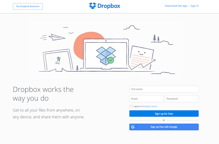
You might also like: Building a Brand: How to Create a Lasting Impression for Your Clients
2. Incorporate visual hierarchy
The web is without a doubt a highly visual medium. And with so much competing for a user's attention, it’s important to organize and prioritize content in order to communicate your client’s message – in other words, incorporate a strong visual hierarchy. A key principle in design, visual hierarchy tells the visitor’s eyes where to look first and how to navigate your design.
Make the site as easy to navigate as possible and use Fitt’s law, which states that the bigger an object is, the more likely the eye will be drawn to it, and the more likely a user will click on it.
Simple enough, right? Taking this law into account, use large graphics and text to communicate important information, and make them clickable! Consider bold accent colors to showcase links of priority that can help guide visitors down the sales funnel.
3. Simplify the navigation
Don’t think navigation is important? Consider that studies have shown 94% of a user's first impressions have to do with visual appeal and navigation.
Websites need an intuitive navigation that will feel second nature to visitors, so keep things simple. Don't offer an overwhelming number of options, instead give careful consideration to how you want to organize content and divide navigation into subcategories.
Reduce the number of clicks it takes a user to get where they want to go, group similar pages under a single navigation item, and combine similar pages into a single page. Also, consider which pages are most important to both you and your visitors, and make sure those are featured prominently.
Remember, you don’t need to reinvent the wheel. Take a peek at what successful competitors in the space are doing – that could be a great indicator of what your client’s visitors expect from the site’s navigation.
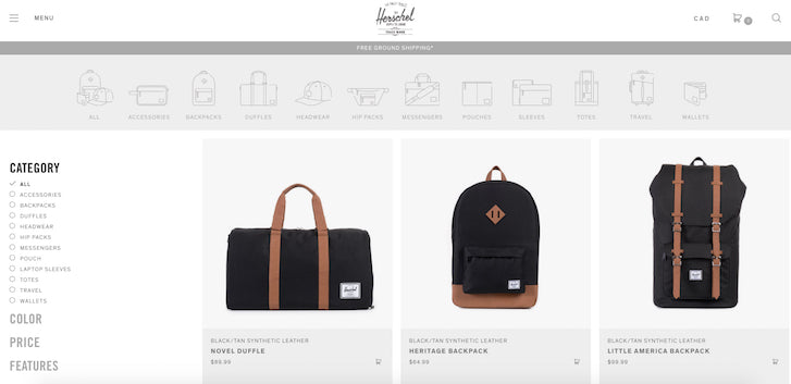
Herschel's main collections page offers their users a horizontal navigation menu at the top of their page that uses visual cues for individual product collections, while also including a sidebar navigation to filter results based on variants like color, price, and features.
4. Optimize for search
There are two types of people who come to ecommerce sites: those who know what they want and those who don't. For those who do, it’s important to create an effortless search experience. How can you get the customer to the product they’re looking for in the least amount of steps?
Making the search bar visible is a strategic first-step in reaching that goal. If your site has a large product offering, highlighting the search bar can effectively draw a motivated user to the end goal: a purchase.
Another thing to note is the importance of keyword-rich product names and descriptions. This makes it easier for the search function to find relevant products. To help you get started, check out our beginner’s guide to keyword research for ecommerce.
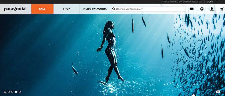
Patagonia's on-site search is highly functional, but also inviting as it greets users with the simple question "What are you looking for?". This encourages visitors to use the search bar rather than randomly looking through the navigation menus.
You might also like: Understanding SEO: An Excerpt From Shopify Empire
5. Implement relevant product filters
Since many visitors only have a loose idea of what they want to buy, your client’s ecommerce site should use relevant product filters to help visitors focus on items that match their needs. Surprisingly, 42 percent of ecommerce sites don't use category-specific filters, even for their core product categories.
When adding filters, think about what criteria are most important to shoppers. You may want to create filters for variables such as:
- Prices
- Materials
- Brands
- Sizes
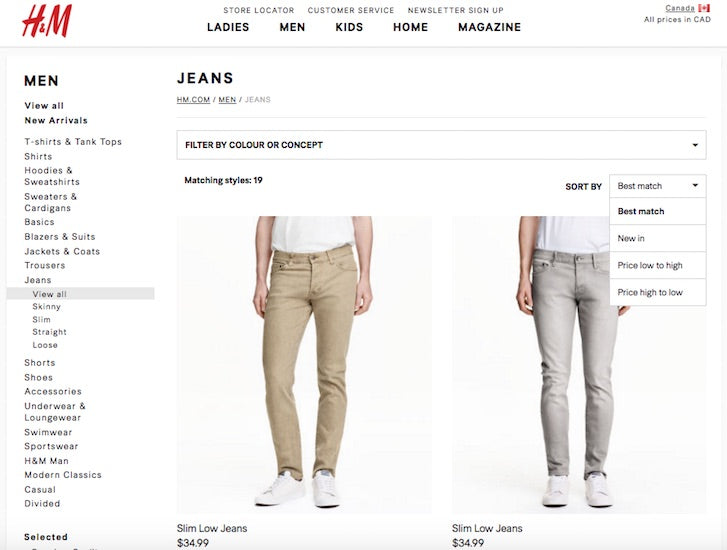
You can take advantage of this added functionality by placing filters in prominent positions or presenting them after a shopper visits a category page. However, keep in mind that if the filters aren't clearly visible, they won't add any value. Apparel sites, like H&M, are great examples of ecommerce stores that effectively utilize product filters like style, recency, and price to help users easily discover the perfect product for their needs and budget.
6. Make the checkout process painless
The ecommerce world is plagued with shopping cart abandonment – a whopping 69% of online shoppers don’t complete their transactions. Though many different factors might lead to this, sites can benefit from keeping the checkout process as painless as possible.
Lower the risk of shopping cart abandonment by following a few simple rules:
- Eliminate distractions from the checkout pages. Keep a clean layout that keeps the focus on the checkout task at hand.
- Break things up into multiple steps so customers can focus on one step at a time.
- Let shoppers check out as guests rather than forcing them to register.
- If your client’s site uses a multi-step checkout procedure, then educate them about the process by simply telling them what step they are on (e.g., "Step One of Three") or providing a visual map that shows where they are in the checkout process.
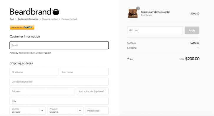
While Beardbrand's cart looks simple, it's highly effective at keeping user focus on the task at hand since all other navigation menus and opportunities to leave the page have been removed. Plus, it also features a flow chart demonstrating the phase of checkout the user is currently in.
7. Create a trustworthy environment
Few things are more important than creating a credible environment visitors can trust. Considering that cybercrime may account for up to $400 billion of financial loss around the world, shoppers have good reason to worry.
Including trust indicators throughout your client’s website will help combat fears of scams and malware. Be sure to include:
- Positive testimonials from other buyers, which demonstrates trust from other consumers.
- Mentions of your client’s business in the press. If it’s well-known media, be sure to include their logo.
- The faces behind the brand. Encourage clients to include a message from the President, or photos of the staff. This demonstrates that your client is a real human working in a real office, which gives users more confidence that the website is supported by a legitimate business.
- Numbers that show how many successful transactions have been made. Numbers never lie and can help persuade even the most skeptical visitor to make a purchase.
- Product reviews and ratings. This helps visitors comparison-shop and shows browsers that your client’s company is honest and trustworthy.
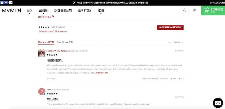
The more information visitors have, the more willing they are to trust your client’s site and business. One of the simplest ways to build that trust is through user-submitted product reviews, like those featured on MVMT Watches product pages seen below.
8. Personalize the customer experience
It’s no secret that personal touches go a long way with in-store shoppers. Today, the reality is that shoppers crave and expect the same personalization when browsing online, too. Research shows that 73% of consumers prefer to do business with brands that use personal information to make their shopping experience more relevant. Other studies have demonstrated that a majority of shoppers like brands with personalized messaging and offers, even if it meant less privacy, and get frustrated with content that has nothing to do with their interests.
To get the best results try using different personalization methods. Some of the most successful options include:
- Product recommendations based on previous purchases and searches.
- Recommendations that could enhance the usefulness of items in the shopping cart.
- Products purchased by consumers who match the current buyer's profile.
With new online stores springing up everyday, the ecommerce space has become fiercely competitive. Adding a personalized customer experience will give your clients a competitive edge and build up customer loyalty.
Apparel brand Frank & Oak takes user personalization to the next level with their personal stylist — a six question quiz that identifies clothing styles suited to the user's unique tastes. After completing the quiz, users receive regular shipments of suggested clothing directly to their doorsteps and it's up to them what they keep and they return.

Streamline your ecommerce design
These tips will hopefully get you thinking about all the ways you can better design your client’s ecommerce website, keeping conversion front of mind. There are so many more ways to remove roadblocks in the discovery and purchase flows, and considering tweaks, both big and small, can improve user experience tenfold.
What are some of the ways you create a straightforward and enjoyable customer experience? Share your insights in the comments section below.
Read more
- 9 Web Design Conferences to Supercharge Your 2018
- How to Integrate Shopify into your Client's WordPress Website with Zillacommerce
- Top Ecommerce Resources for September
- Top Ecommerce Resources for August
- Top 13 Web Design Conferences You Should Attend in 2016
- The 15 Web Design Books of 2018 You Can’t Afford to Miss
- Top Ecommerce Resources for December
You might also like: 5 Psychological Concepts Web Designers Should Use to Maximize Conversions


