Too many choices (also known as choice paralysis) can quickly overwhelm users and cause your conversion rates to plummet. Fortunately, there are ways to fix the problem. If you ask most people whether they like having a choice, the answer will be yes. How can options possibly be a bad thing?
But when it comes to sales, a large selection can actually hurt your clients’ revenues.
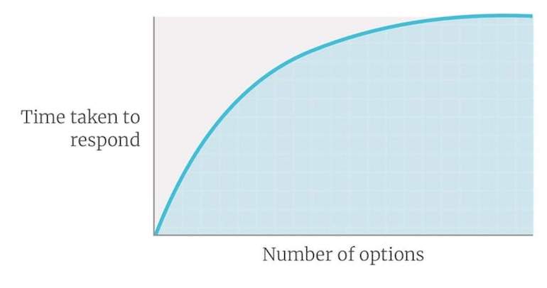
Although people like choice, they become overwhelmed by it. Hick’s Law perfectly demonstrates this. It states that there is a measurable increase in how long it takes somebody to make a decision as the number of options that are available goes up.

That delay in decision making can prove damaging on an ecommerce site because it tends to result in users giving up. They are paralyzed by the decision, and so, they decide to go away and think about it. That will significantly reduce the number of people who eventually make a purchase.
"That delay in decision making can prove damaging on an ecommerce site because it tends to result in users giving up."
Worst still, choice paralysis isn’t just limited to product selection. Users can be equally paralyzed trying to choose between navigational elements such as product categorization. They are forced to think too much and so they can also give up here.
What then, can we do about choice paralysis? This article will cover five strategies to keep in mind when designing stores for clients.
1. Limit choice, so you limit choice paralysis
I know it can be hard to convince clients to limit the variety of products or complex options they offer on their sites, but there is some strong evidence to support your cause.
Researchers in California ran an experiment in a local grocery store. They set up a stall in the store selling jam. Some days the booth would sell six flavors of jams, while on other days it offered 24 varieties. The results were significant.

On days where they sold 24 varieties, they saw a mere four percent conversion rate. However, when they offered only six choices, that figure rose to a staggering 31 percent. Limiting choice works.
That experiment perfectly demonstrates both the problem and the solution. However, I am not naive. Despite the evidence, you will not always be able to persuade clients to reduce choice. The next best option is to hide some of those choices.
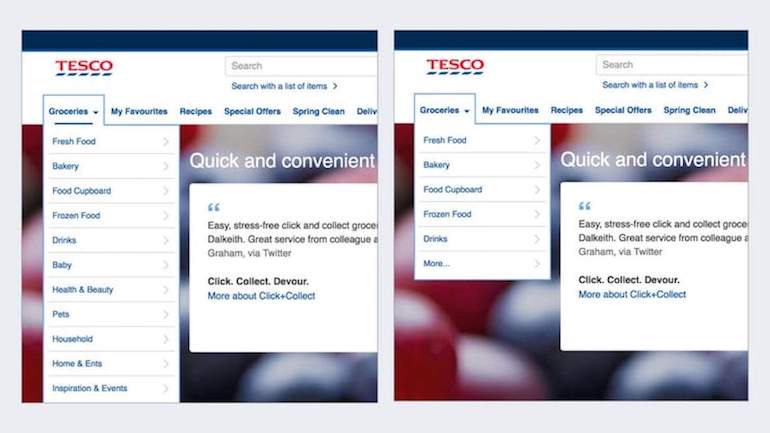
Unlike a stall in a grocery store, we have more flexibility online regarding how products are displayed. We can highlight some options and de-emphasize others.
For example, you could display the best selling categories of products, while hiding other groupings under something like a “more” option.

But there is another factor at play here. Our inability to make a decision is not just about the number of choices. It is also about how clear those choices are from one another.
You might also like: Card Sorting: Learn More About Your Users and Create Better Products.
2. Make the options distinct
When confronted with 24 varieties of jam, the challenge isn’t just about the sheer quantity. It is also about assessing the differences between each choice.
The more options there are, the more similar they often are, and the decision becomes harder to make. Even a choice between two items can be difficult if those items are incredibly similar. The difference is too subtle for a customer to make an obvious decision.
Take for example the Wikipedia website. For years, their website had a search box accompanied by two buttons. One button read “go” and the other “search.” There was only a choice between two options, but people were still paralyzed because the difference between the two was not clear enough.
Then there is the Amazon mobile app. When you try to preorder a product you again see two buttons. One reads “Pre-order now” and the other “Pre-order today.”
“Pre-order now” goes straight to checkout while “Pre-order today” adds the item to the cart. However, this difference isn’t clear, and leads to choice paralysis.

Whether we are talking about products, categories, or even navigation, the solution is the same. We need to make the distinction between options obvious.
But what do we do if the choices are inherently complicated? What if we are unable to reduce the decision further?
You might also like: Color Psychology: How Color Influences Decisions.
3. Simplify the choice
Some online transactions are complicated by their nature. Maybe you’re buying a car that involves an excess of choices about everything from paint color to financing. Or perhaps you are buying insurance online with their vast variety of conditions, levels of coverage, and excess.
The solution to this challenge is to break the choice down into more manageable chunks. A series of smaller, better-defined decisions is easier for us to process.
John Lewis does an excellent job of this when you try to buy a TV from their website. They provide advice about the different choices the customer has to make and guide them through the process.

That said, we still need to keep the whole process as simple as possible, because we want to encourage users to make a decision quickly.
4. Encourage quick decision making
We all know what it feels like to start overthinking a decision. We reach a point where we can no longer see the choices clearly, and even when we do make a decision, we are not happy with it. The longer we take to make a decision, the less confident we typically are in the outcome.
As a result, we want to encourage users to make a fast decision on our clients’ sites. The faster somebody can make a decision, the less likely they are to suffer from choice paralysis and the more likely they will go away happy.
"The faster somebody can make a decision, the less likely they are to suffer from choice paralysis and the more likely they will go away happy."
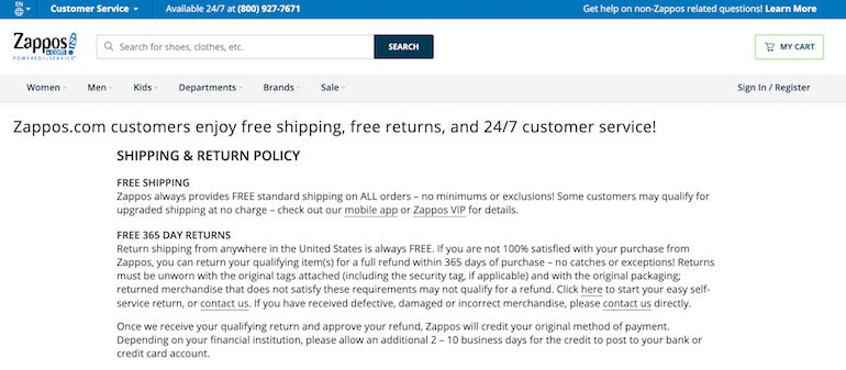
One way of achieving this is to make the decision a no-brainer, usually by reducing the cost and/or the risk. Your clients can do this in a variety of ways, such as when they’re setting their prices. A low cost will allow for impulse purchases, which users typically make in the spur of the moment. Another option is to encourage your clients to offer an outstanding return policy.
In both cases, you are reducing risk for their customers, which in turn increases their confidence in the outcome. This makes it more likely they won’t overthink their decision and will act faster.

However, there is one more approach you can take to avoid choice paralysis: you can choose on behalf of your users.
5. Make the choice for the users with good default options
We ask users to make a ridiculous number of choices that are entirely unnecessary for the majority of them. This is because we become obsessed with edge cases.
Even though we know that the majority of users will make a particular choice, we worry that other people might want to choose something different. For example, we show all our product categories even though 80 percent of customers purchase from the top three. Or, we display an entire country list when the majority of people buy from our native country.
The problem with this approach is that the user experience of the majority suffers to cater to the minority. That is not just bad for the experience of users; it is terrible for sales.
I am not suggesting that you remove all countries other than your client’s home one. Neither am I suggesting you remove all product categories on their site except for the best sellers. Instead, I am saying we should default to the most common choices and allow users the option to change them if they need to. Choose your default options wisely.
"Choose your default options wisely."
We can apply this principle to everything from delivery addresses to credit card information. Don’t make your clients’ users select these each time. Instead, default to the last one used.
Good defaults can reduce the cognitive load on users, while not taking away the choices available to them. That is a powerful tool for overcoming choice paralysis.
You might also like: Landing Page Optimization: 10 Tips for Increasing Conversions.
Lower choice paralysis to increase conversion
Choice paralysis will almost certainly lower your clients’ conversion rates, so we need to start working hard to reduce it.
Take the time to look at your clients’ analytics and hunt down the pages that have a high exit rate. It wouldn’t surprise me at all if those pages require users to make a choice that they were not prepared to make, causing them to feel the dreaded choice paralysis. Fixing those issues can make all the difference to your clients’ conversion rates and revenues.
Read Guides for Shopify Partners and Developers
From development skills to actionable business advice, our guides will help you grow and find success as a Shopify Partner or Developer.
Learn moreRead more
- Color Psychology: How Color Influences Decisions
- Landing Page Optimization: 10 Tips for Increasing Conversions
- Build for the 20 Percent: How Cleverific Evolved to Meet Merchant Needs
- What Are the Most Important Website Metrics You Should Track?
- How to Optimize Popups on Your Clients’ Stores
- Why Every Shopify Store Needs a Marketing & Sales Funnel
- Off Page SEO: 3 Quick Fixes and 3 Long Term Strategies
- Indexable PWAs: Making Progressive Web Apps Perform for Users and Search Engines

