Getting people to sign up for a mobile app is tough.
It requires a lot of time, energy, and money, yet many apps lose most of those hard-won users immediately after their first-time experience. According to the research of Andrew Chen, “the average app loses 77 percent of its daily active users within the first three days post-install ."
."
Businesses put so much effort into acquiring new users, only to lose the majority of them immediately after first use. Are these low retention rates a result of poorly made apps? In some cases the answer is yes. But not always.
Users try out a lot of apps but decide which ones they want to ‘stop using’ within the first three-to-seven days. For ‘decent’ apps, the majority of users retained for seven days stick around much longer. The key to success is to get the users hooked during that critical first three-to-seven day period.
What happens right after installation can make or break any app. You may come up with the best looking app (see this tutorial on mobile logos for tips), but if users cannot learn how to use it easily, they’re most likely going to abandon it.
To ensure users don’t delete your app after the first use, you should teach them how to complete key tasks, making them want to come back for more. In other words, you need to successfully onboard and engage users during those first interactions.
In this article, I’ll provide a few common onboarding techniques for mobile apps, as well as tips on the do's and don’ts of each one. These onboarding strategies will help you provide the best experience for users right from the start.
Learn more about how to build a Shopify app.
What is onboarding?
Onboarding is a human resources term that was borrowed by UX designers, and is defined as a way of making someone familiar with an app.
Onboarding is a critical step in setting users up for success with your app, because good onboarding increases the likelihood that first-time users become full-time users.
Should I use onboarding in my app?
Many of you have probably had to answer this question. Although, there are different opinions on the usefulness of onboarding in mobile apps, one thing is for sure — once someone opens your app, they need to know how to use it.
If your app is simple or self-explanatory, it may not need onboarding. But you may need an onboarding strategy if your app:
- Contains non-standard interactions (e.g. an app which uses bespoke gestures as a primary method of interaction).
- Has a fairly complex workflow or handles complex tasks (e.g. a complex business app, which has a variety of user roles, each with specific access rights and restrictions).
- Requires users to populate it with data because its default state is empty.
- Has undergone a major redesign and you want to introduce existing users to new features and changes.
- Introduces a brand new concept itself. The concept might be unfamiliar to users.
If your mobile app includes any of the above, you need to ensure people who pass through your onboarding have a clear sense of what to do, and where to go next.
Onboarding technique #1 — walkthroughs and tutorials
A tutorial and walkthrough are popular ways of introducing an app to a first-time user. They can take many forms, ranging from a set of static instructions to an interactive demo session.
❌ Don’t: Long up-front static walkthrough or tutorial
A swipe-through walkthrough/tutorial is almost standard for the industry today. Every second app on the market shows this type of onboarding during the first launch of a mobile app.
A walkthrough/tutorial aims either to introduce what an app does (value proposition tour), or to educate users on how to interact with the app by explaining the key actions.
A static walkthrough/tutorial is an inelegant way to explain the core functionality of an app, or to demonstrate its value to users, because:
- You’re literally blocking users from doing exactly what you want them to do: use your product. Users want to start using the app the moment they launch it, but instead are forced to scan seven or eight screens. As a result, many users skip the tutorial because they don’t want to learn about the app, they just want to use it.
- You’re increasing cognitive load. There is simply too much information at one time, because this type of onboarding is trying to explain everything at once. As a result, walkthrough/tutorials become too explicit and long.
The first set of screens a user interacts with set the users’ expectations of the app. Don’t use them to spout everything your app does.
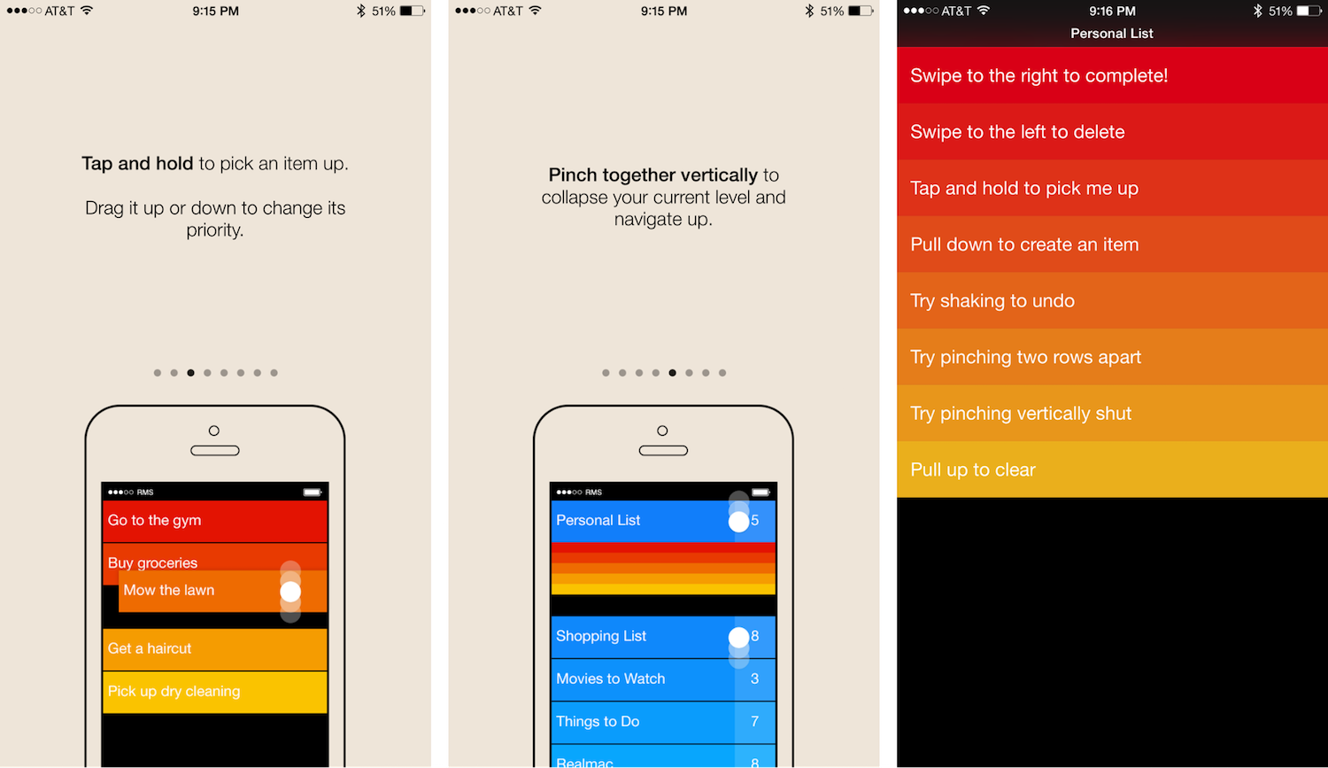
In the example below, you can see a seven-screen tutorial. This tutorial provides all possible interactions available to the user, and these interactions are shown before users can start doing anything with the app. Expecting users to remember every possible function before they even start using the app is too much.
✅ Do: Short and focused set of screens as a part of the core UX
Think of a walkthrough/tutorial as an entry ramp for users to use your app: it shouldn’t be generic or disruptive, it should be beneficial to the user. You can reduce any friction on a user’s journey by following a simple rule: “show less, provide more.”
If you’re going to use up-front walkthroughs in your app, make sure that they explain only the most important interactions. Usually, a minimal walkthrough (five screens or less) is able to establish a good starting point for new users. This way, the user gets to learn about the app without getting bored or slowed down by too much information. And don’t forget to offer a “skip tutorial” option for your impatient or tech-savvy mobile app users.
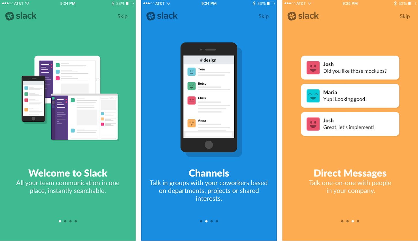
The walkthrough in Slack for iOS helps users understand the app’s basic value proposition. It uses the first screens to create some context, and focuses on benefits instead of features.
Tip: Animated walkthroughs are much more engaging than a static one (since animation is great at grabbing attention).
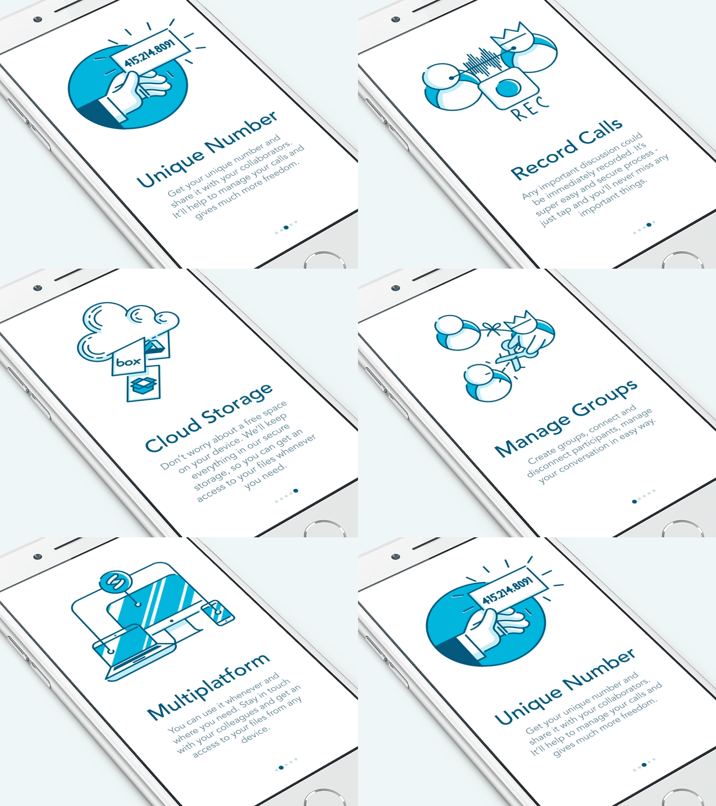
You might also like: Using Animation to Improve Mobile App User Experience.
✅ Do: Reactive and proactive guidance
It’s most effective to walk users through an app’s features by providing a completely integrated and contextual experience, rather than present a slideshow or static instruction before users get started.
One way to achieve this is by using an interactive tour. Interactive tours are a user-guided tour, where tutorials are only triggered when the user reaches the appropriate point in their experience.
An example of such a tutorial can be a practical exercise, in which users are taken into a dedicated flow to complete tasks that represent the main interactions of the app. It’s well known that often, the best way to learn anything is to learn by doing. Rather than ask your users to remember everything up-front, you can provide guidance as they go.
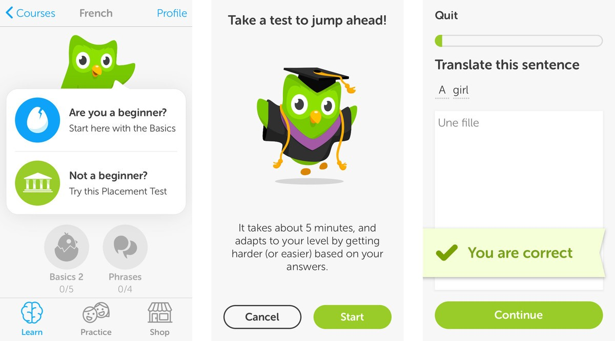
Duolingo uses this technique to educate their users. Users are encouraged to jump in and do a quick test in the selected language. The app guides users as they go, and helps them learn more features and functions. This helps build a personal focus (looking at it from an end user's perspective). Also, it’s a much more engaging way to show the value of the app.
Onboarding technique #2 — visual hints
Visual hints assist users to better understand how to interact with an app’s interface. This technique is especially needed for designs that contain a lot of interactive objects, or a unique navigation method.
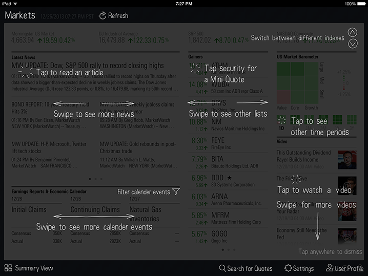
❌ Don’t: Multiple coach marks at the same time
Coach marks are a popular approach to onboarding. They work in a simple way: when a user opens the app, the screen fades out, and tooltips explain what a certain button or field means.
At first glance, this solution looks pretty good. What could make it a bad choice? There are a few reasons for that, but the main reason is obvious: lack of context.
The first-time user barely knows what the app does, and yet is forced to read instructions for all possible actions. Similar to long up-front tutorials, coach marks require users to work upfront — users have to patiently read all the information and try to commit it to memory.
In practice, this is hardly achievable (unfortunately, our short-term memory cannot retain much information). Because there is no context, the interface seems much more complicated than it actually is, and users are easily overwhelmed.
In the example below, coach marks outline every possible action a user can perform on the screen, but there is no interaction with the user, just a static “read here, here, and here.”
❌ Don’t: A chain of tips
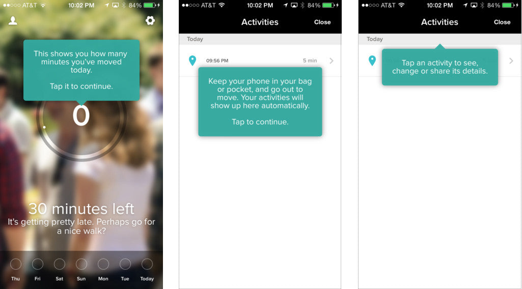
Showing multiple coach marks or tips in a row might look like a solution to the problem mentioned above. But unfortunately, it's not a proper solution.
Hints that frequently appear on the screen cause users to dismiss them quickly, regardless of how helpful each may be. This also makes an app appear overly complicated to new users.
✅ Do: Focused contextual hints
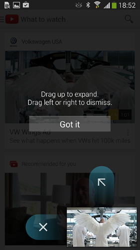
A contextual (or just-in-time) onboarding approach is a good way to avoid screens full of coach marks. Such hints are presented to users at precisely the right time; when they’re needed. Helpful information surfaces at the point of action.
Good contextual hints are:
- Essential — They shouldn't explain obvious things.
- Prioritized — Since a first-time user experience should be focused, apps should showcase only the primary features, and let users discover secondary features over time.
- Succinct — When designing tips and any other types of hints for mobile apps, keep them as short as possible.
Contextual tips can be found in the YouTube app for Android. The app minimizes the amount of instructions, by focusing a user’s attention on a single, primary action. The hint appears on the screen when the user reaches the relevant section of the app.
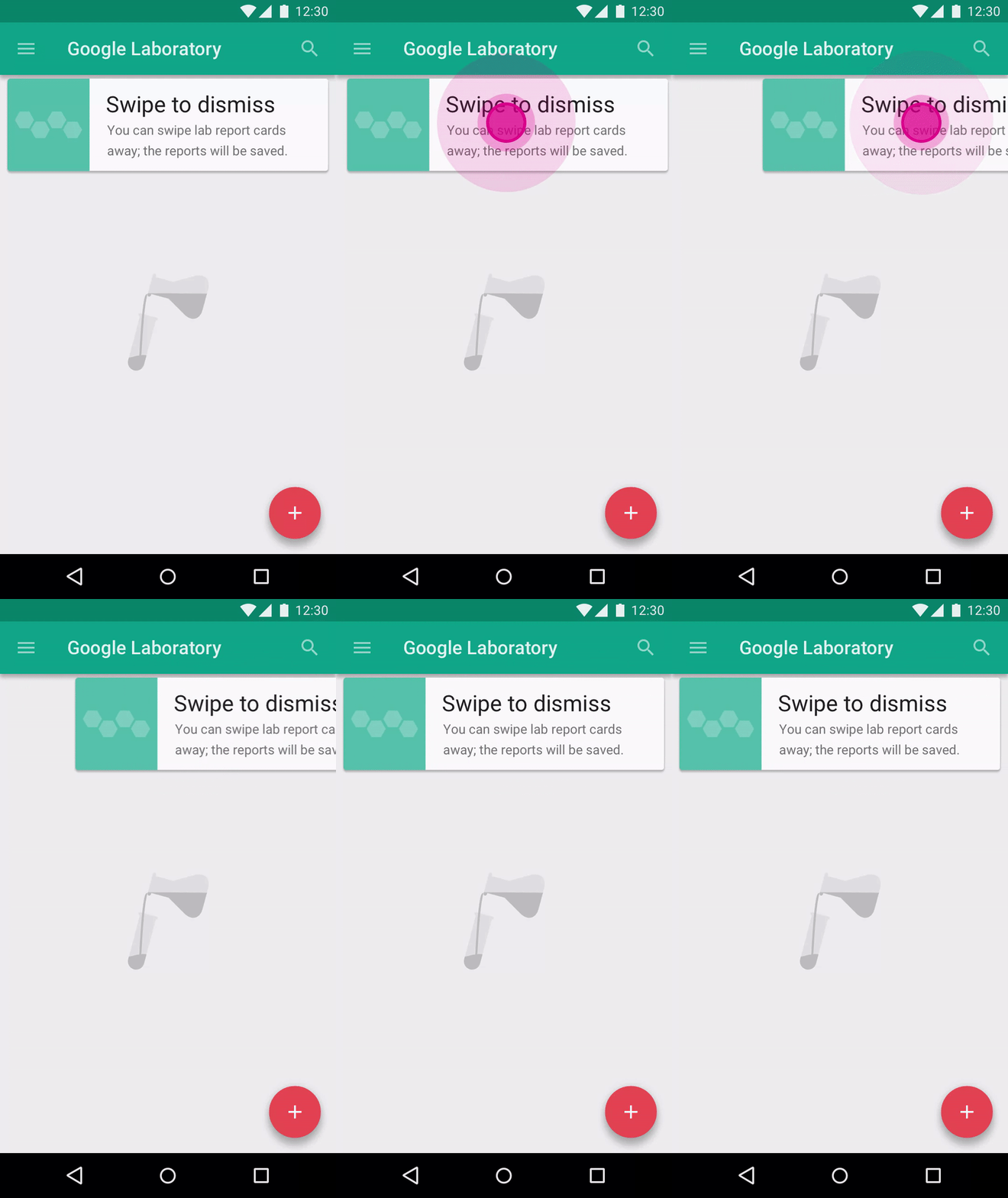
An even more interesting solution can be created with animation.
“Hint motion” in the example below shows a preview of how sample cards move when performing the action marked by the gesture indicator.
You might also like: How to Use Shopify Theme Settings to Create Mobile Logos.
Onboarding technique #3 — empty states
Content is what provides value for most apps. It’s why people use them — for the content!
Thus, it’s critical to consider how we design empty states, those places in the experience where a user might not have content yet. This could be because the user has just signed up, or the user has cleared the data themselves. An empty state is a natural point to inject some onboarding, and to continue guiding users along.
❌ Don’t: Create dead-end page
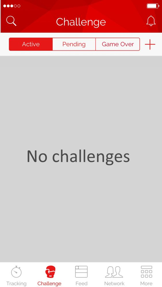
The absolute worst thing you can do with an empty state is to drop your users into a dead-end. Dead-ends create confusion, and lead to additional and unnecessary steps.
Below is a fake version of the original Khaylo Workout app’s empty state, which I’ve created to demonstrate an ineffective empty state that provides no guidance, no examples — only a dead end.
✅ Do: Provide an obvious way to move forward
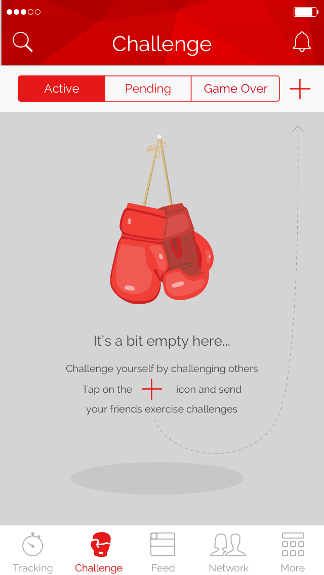
Instead of leaving an empty state blank, you should use it efficiently — to guide, educate, and prompt. Even if it’s meant to be a temporary onboarding step, you should maximize its communication value for users, and provide directions on how to change an empty state into an active one.
For example, the first page users see after signing up for the Khaylo Workout app is empty. To make activation easier, Khaylo Workout turned this page into a learning opportunity: where you would normally see your challenges, it says “Tap on the + icon and send your friends exercise challenges” with an arrow pointing to the camera option.
✅ Do: Set expectations for what will happen
Don’t forget that empty states should also help users understand the context. Another way to use empty states for onboarding is to deliver the information in a show-or-tell format. “Show” the user what the screen will look like when it’s populated with sample data, and “tell” them with a written explanation how to achieve that.

✅ Do: Provide some sample data
If the app is preloaded with sample data, the user will feel comfortable experimenting and learning how the app works, and they’ll be better prepared to input real data. This is particularly helpful in apps that handle sensitive data (such as finances).
A “Welcome Board” is the first thing a user sees in task management app Trello. This board includes pre-populated to-do list items, with each item explaining a different interaction or feature within the app. This approach allows users to learn features much more effectively than with a static screen.

✅ Do: Introduce success states
The moment a user completes an important task for the first time is a great opportunity for you to create a positive emotional connection between them and your product. Let your users know that they’re doing great by acknowledging their progress, and celebrating the success with the user.
For example, inbox zero is certainly a positive achievement for Gmail users. It’s great that the app delights users with a nice animation.

You might also like: How to Improve Your Shopify App's Onboarding Flow.
Think of the first-time user
Before designing your app’s onboarding, stop and think about what kind of experience first-time users deserve. Give some thought to what you’re trying to accomplish, and which techniques are most appropriate.
Remember that users don’t launch an app to spend time learning how to use it , but rather to complete a task in a short amount of time. Your app’s onboarding should help users accomplish this.
Read more
- 10 Useful Newsletters for Keeping Web Developers Current
- 10 Usability Heuristics and How to Apply Them to App Design
- Tapping the Huge Market for Mobile-Optimized Apps
- Leveraging the Partner API: Useful Business Tools You Can Build
- How to Use GraphQL Operation Names and Variables
- Learn About Shopify App Development at React Summit 2021
- Effective App Onboarding: How to Convert Free Trial Users to Paying Customers
- Expert Advice for Branding Your Shopify App
- How to Level Up Your App with Theme App Extensions
Do you have any tips for designing a great app onboarding flow?Share with us in the comments section below.


