Last week, we held a Partner Session webinar with Joe Leech — a UX consultant in Bristol, UK who has worked with companies like Ebay and the Ritz Carlton. In Joe’s webinar, he introduced three steps to create ecommerce websites that convert.
In this article, I’ll provide a brief overview of each step accompanied by Joe’s presentation deck. You can also watch the webinar in full below.
You might also like: 5 Psychological Concepts Web Designers Should Use to Maximize Conversions
1. Drive engagement through larger images
 A quality image can quickly and effectively describe a product to a customer. By using a visual element on your page, you can emulate the browsing experience that customers are accustomed to when shopping in real life.
Customers don’t walk into a department store and read the manual of a product, instead they look and visually analyze the options they have. When purchasing a washing machine for example, a customer looks at the design, the available buttons that tell us about its feature, and if it will work in their household. To create a high-converting ecommerce site, we must showcase the features and benefits of our products visually, as well. The images we use need to be large enough to capture attend and detailed enough that customers can quickly assess and understand the product.
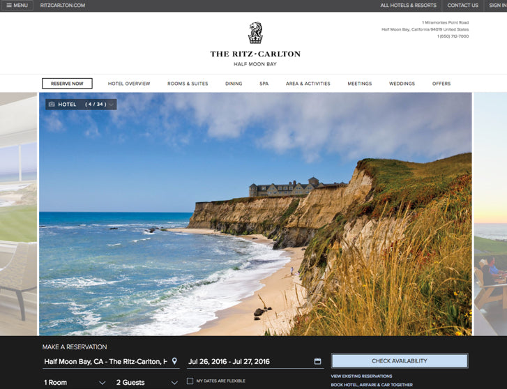
Let’s look at the Ritz Carlton Hotel website as one example. On the homepage, there is a large image of the hotel that takes up about 80 per cent of the page. The image is very important because it provides potential customers with many visual cues about the experience of staying there. The image tells the customer things more effectively than text like: it’s quiet, peaceful, and isolated from the city, and that it’s next to a sandy beach that would make for a nice evening walk.
Using large, detailed pictures can help skeptical customers make a final decision on a product. This is because it allows you to describe the product in detail without the customer having to read a single word of the description.
2. Design for two types of purchasing behavior
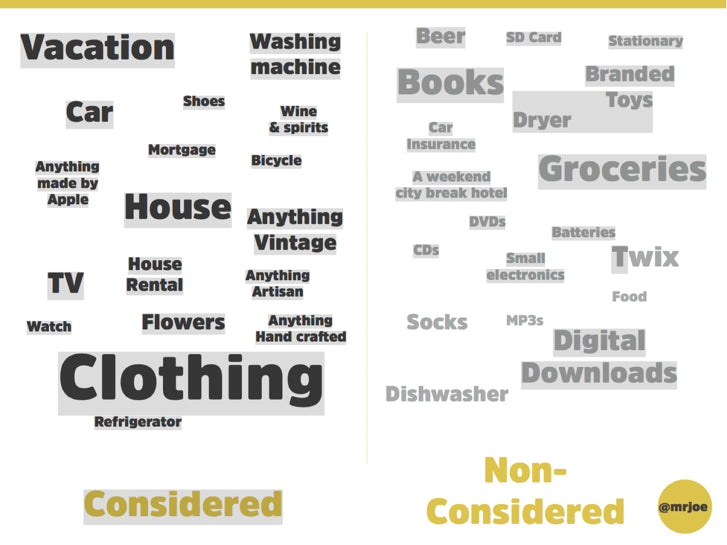
 You may not know this, but there are two types of purchasing behaviors: considered and non-considered. Considered purchases are where customers put thought into their buying decision, whereas non-considered purchases are when customers buy on a whim.
For example, buying a car would be a considered purchase given the complexity of the purchase — the buyer will conduct a significant amount of research around competitors, financing, model types, and more before making a final decision. On the other hand buying a pair of socks would be a non-considered purchase since the product is simple and there is no major difference between competing brands. Since the customer’s thought process is completely unique, based on the purchasing type, knowing whether your product is a considered or non-considered purchase can help you design the ideal ecommerce site for your customers.
One of the biggest factors influenced by purchasing type is the device used to assess your products. Customers looking to buy a considered product will more likely visit the product page on multichannel platforms — meaning that they will browse products on a desktop, tablet, and smartphone as they make their decision to buy. On the other hand, non-considered purchases are more likely to be made on mobile phones. Another important piece of data to note is that considered product pages will be viewed 2.1 times more than a non-considered product page.
When designing your ecommerce site, make sure to consider the purchasing behavior of customers when they browse products. Watch the recording of our Partner Session webinar to learn more about designing for various purchasing behaviors.
3. Increase average order value with the Twix effect
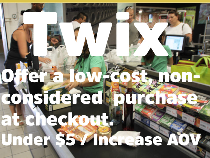
 At cash registers you see items like gum, candy, chocolate bars, and other low-cost items that customers buy with little-to-no thought. These impulsive purchases increase the store’s Average Order Value (AOV) — something Leech refers to as the Twix effect.
You should aim to recreate this idea within your client’s ecommerce store at checkout. Offer customers low-cost items in your store that they can quickly add to their purchasing items at checkout. It can be even more effective if you use a complementary product to what exists in their cart — for example, if they are buying a men’s dress shirt, offer them a tie.
This small push can help increase your store’s AOV. If the average order of your store is $20, and you can increase the purchase value by just $5 at checkout with a low-cost item, you have increased the value of that purchase by 25 per cent.
Next time you meet with your client, ask them if they have low-cost products that can be offered at checkout, and implement the Twix effect on their shop.
Designing a high-converting ecommerce site can be as easy as 1–2–3
Use these three steps on your client’s store to increase the conversion rate and Average Order Value (AOV). Some of the steps are easier than others to implement, but your clients will thank you for it. Watch the full Partner Session webinar to learn in detail how to implement these three steps with Joe Leech.
Looking for some amazing content to tide you over until our next live event? Head over to our webinars page and check out our previous Partner Session webinars.
Read more
- 5 Common Digital Content Problems and How to Avoid Them
- Paul Boag Shares a Favorite Ecommerce Project
- Typography in UI Design
- Shopify's Mobile Device Testing Lab Gets Wheels
- Selling a UX Design Process That Ensures Results
- Streamline Your Ecommerce Experience With The Laws of Simplicity
- How to Use Eye Tracking in Usability Tests
- The Pivotal Role of User Experience Design in Brand Building
You might also like: Best Practices for Designing High Converting Landing Pages

