
The widespread adoption of mobile as a platform for ecommerce is no longer something you can ignore. Not only does mobile now account for more than half of all ecommerce traffic, but it now also exceeds desktop as the number one source of Google searches. And as of last year, these increases in mobile traffic have led to one third of all ecommerce sales happening on mobile devices. With these kind of numbers, the trend is clear: mobile is growing and soon it will be the dominant platform.
This means that web designers need to start thinking beyond the desktop when tackling ecommerce projects (see our tutorial on mobile logos for an example).
Since consumers are now browsing and buying on their handheld devices more than ever before, they now expect a certain type of functionality and design to be embedded at the core of every online experience. In other words, consumers expect a type of functionality and design that is uniquely tailored to mobile.
To make sure your next build is made with the mobile consumer in mind, here are five simple-to-implement design hacks for an optimized mobile ecommerce experience.
1. Use a fixed navigation bar
With the rise in popularity of mobile devices, scrolling, swiping and tapping have become second nature to the average online shopper. However, this reliance on tactile interaction can cause visitors to scroll past important content without a second glance. This can be bad news for ecommerce brands and it’s up to you as a designer to ensure your client’s critical information is always getting screentime.
You can accomplish this by integrating a fixed navigation bar into your mobile design. Not only will this help ensure vital information is always in view, but it simplifies a user’s flow through the website. While the elements you include can vary per client, mobile ecommerce sites should always include at least three elements: a homepage link, a checkout link, and an “add to cart” call-to-action.
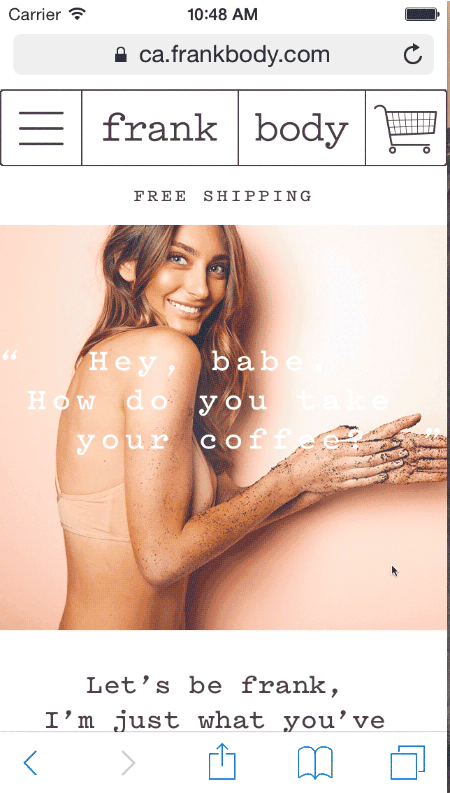
Cosmetic brand Frank Body’s use of the navigation bar is truly a thing of beauty. Their mobile design takes the utility of a fixed bar far beyond simple site navigation and uses it as an opportunity to promote products. As the user scrolls down a page, “Add to Cart” buttons slide into the navigation bar and remain there until you have scrolled to the next section. This allows them to highlight promotions, new product launches, or special offers they want to push towards visitors.
2. Position your product photography front and centre
A great example of this can be seen on Frank & Oak’s mobile website. The menswear brand has built their entire mobile site around the visual appeal of their products to facilitate browsing and influence sales. Frank & Oak’s entire category page is presented through a simply arranged grid of photographs with limited copy. This layout structure is not only sophisticated and aesthetically pleasing, but it also streamlines user decision-making by relying on visual cues to simplify site navigation.

You might also like: 11 Inspirational Art and Photography Ecommerce Website Designs
3. Minimize your use of text on product pages
Screen real estate on mobile devices is a scarce resource. Unlike desktop browsers, you have a significantly more finite area to communicate your product’s unique selling proposition and persuade your visitors to make a purchasing decision.
To ensure that this decision-making process isn’t over complicated for your users, try to limit the amount of text on your product pages to the absolute essentials. That means minimizing your copy to include your product name, price, variant option, and call-to-action button only. If you have additional information that is absolutely necessary, hide it from permanent view with collapsible menus. Not only does this technique greatly improve the user’s “window shopping” experience, but it also allows you to focus their attention on the most important page element: your product photography.
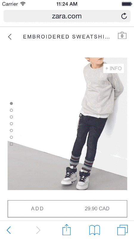
Zara does a phenomenal job of minimizing text in its mobile experience. Each product page consists of four to five high-quality product images, the price, and a clear “Add to cart” button. Every other piece of extraneous information is hidden under the “+INFO” menu, which reveals all the non-essential details about the product when opened. By hiding this information from the product page, Zara is able to keep their visitors’ attention on the product itself and ensure the only copy that steals this focus is the “Add to Cart” button.
You might also like: Design Your Store Faster With Product CSVs and Images
4. Influence action with a sticky “Add to Cart” button
In the minimized browsing environment of a mobile device, you need to ensure your design emphasizes the most important call-to-action on screen at all times. For ecommerce websites, this means including an Add to Cart button that is clear, easy to find, and sticky on every product page.
Ensuring your buy button is always on screen regardless of where your visitors are on the page means that you’re consistently encouraging them to take a desired action. This small, but effective, interface tweak can increase the likelihood your visitors will add an item to their carts as soon as there is even the slightest interest. And considering there is a greater chance for your mobile browsers to exit at any given point, a sticky call-to-action can be the difference between a customer that buys and one that bounces.
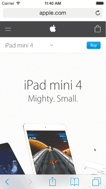
Apple has noticed the power of the sticky buy button and has integrated it on all of their mobile product pages. As a user scrolls down a given product page, a secondary navigation bar remains fixed atop the screen. Rather than including the standard links to the homepage or cart, this sticky bar includes a single link: a buy button. By not cluttering the navigation bar with other calls-to-action or links, the complexity of options available to the user is significant reduced and the likelihood they will click “Buy” increases.
5. Use real photography for your product variants
Another quick hack you can integrate into your next mobile ecommerce design is replacing the standard drop-down menu or button for product variants with real photography. This approach can be extremely effective at converting a hesitant window shopper into a paying customer as it reduces any uncertainty around what the product might look like in a given colour or style.
Letting visitors visualize their prospective purchase before buying works because it replicates a familiar experience felt when shopping at a brick and mortar store. This photographic browsing experience can give visitors an extra boost of confidence that they might need in order to commit to a purchase. And since they know exactly what the product looks like at the point of purchase, the likelihood that they’ll make a return after delivery is significantly reduced.
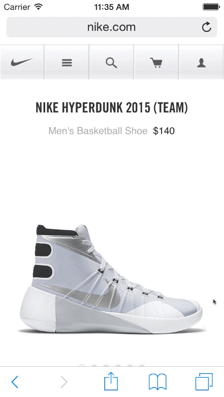
Nike’s mobile ecommerce site effectively uses this approach by giving visitors a real-life view of each sneaker variant on sale. Each sneaker product page includes several photographs that the prospective shopper can use to assess the product from six different angles. But it’s the fact that Nike includes six photographs for each shoe colour that really takes the “window-shopping” experience for their mobile consumers to the next level.
Start thinking of ecommerce design as mobile-first
Handheld devices are redefining what consumers expect from online shopping. They are no longer satisfied with mobile experiences that are identical to what’s seen on a desktop. If your mobile ecommerce design doesn’t offer consumers a unique experience that is flexible, convenient, and intuitive, don’t be surprised if your users are leaving and leaving quick.
What are some of your favourite mobile ecommerce websites? Share with us below.
You might also like: How to Optimize Themes for Performance
