New year, new web design and development techniques and strategies. Same. Boring. Email.
Let me elaborate; JavaScript, Flash, and forms don’t work in nearly all email clients, and HTML emails offer very little CSS support. Even media queries can be a no-no for older email clients (luckily not Gmail, phew!). These limitations can often leave web designers and developers feeling uninspired—left to work in the outdated constraints that are email, even when they're following the best business email format.
No longer, friends!
Recently, we sat down with Vitaly Friedman—Co-founder and Editor-in-Chief of Smashing Magazine—for a Shopify Partner Session webinar, where we discussed some downright dirty CSS tricks that you can use to enhance your design projects.
Most interestingly, Vitaly outlined two mind-blowing techniques for enhancing your HTML emails by making them responsive—without using media queries! To give you some time to wrap your head around them, we’ve rounded up the techniques below.
Or, learn more about subscription based email marketing for your clients with subscription-based businesses.
You might also like: How to Help Your Clients Get Results with Email Marketing
The Fab Four
You’re probably already using some scrappy CSS tricks to force add responsivity-esque functionality to your
HTML emails. You're also probably doing it using media queries. Do any of these sound familiar?
Enabling content stacking
Enable content stacking by turning table cells, traditionally used to build HTML emails, into block-style elements.
Allowing column switching
Allow column switching by using table-header groups and table-footer groups to define the order of content in the email.
Ordering and reordering content
Order and reorder content by defining up to five elements and specifying what content comes first, which content should always be displayed at the bottom, etc.
All of these are fine and dandy, and are definitely a welcome addition to the monotony of regular old HTML email design. But, what if you want to take this “responsiveness” to the next level by ensuring everything is constrained proportionately in the mobile version of your email? And remember, we don’t want to use media queries (like in the above examples).
The simplest way
Well, first you’ll need to open your mind to the idea that what you’re about to read may not make total sense (at a glance).
And second, you’ll need to take out your trusty CSS toolkit and use the following four elements:
min-widthmax-widthwidthcalc()
Let’s start at the beginning. Your current CSS might already look a little something like this:
However, there are two things you should know about the above values (and this is where things get a little weird):
- If
widthvalue is greater than themax-widthvalue,max-width wins - If
min-widthis greater than thewidthormax-widthvalues,min-widthwins
It’s called the Fab Four Technique. This dirty little trick was originally created (and mastered) by Rémi Parmentier, a French web developer “with an affinity for emails,” but explained thoroughly by Vitaly himself in his presentation.
Put into practice, you can use this min-width-wins logic when building a
two-column email layout. You can also take advantage of using percentages in width
elements to take out some of the guess work when building your responsive HTML email.
Your CSS should look something like this:
To explain:
Min-width: 50%; will essentially propagate a two-column desktop version of the
email.
Max-width: 100%; will essentially create a one-column mobile version of the
email.
Width: calc((480px - 100%) * 480); will determine whether max-width or min-width wins. We subtract 100 per
cent from 480px because it’s the width of the parent, and multiply by 480px because that is the breaking point of the
layout. The goal of this calculation is to create a value higher than our max-width, or lower than our min-width, so that
either of these properties is used instead of width.
Here’s a case where min-width wins:
And another where max-width wins:
As you can see, we’ve applied two entirely different behaviors to our HTML emails, due to the breakpoint established
by our calc value. So, depending on how the end-user’s email client is scaled in
their browser, or whether they’re viewing the email on their phone, the email will always scale responsively.
If you’re like me and need a visual representation of how this works, you can reference Rémi's CodePen below:
Or you can have a look at Rémi’s demo in your browser.
The fully-functional checkout experience
Now that you’ve worked your brain a little with the Fab Four Technique, lets move on to something a teensy bit more complicated.
You’ve probably heard of the checkbox hack before. Put simply, it involves using a checkbox input and label to control a secondary element (like a div).
These elements will respond differently depending on whether or not a box is checked, like the tabs in the example
below.
The basic HTML and CSS looks a little something like this:
A List Apart wrote about it in 2014, Smashing Magazine addressed the technique in 2012, even Chris Coyier added his spin to it back in 2011. The checkbox hack has been around for so long, it’s no wonder Mark Robbins, a web developer and visionary for interactive email, decided to shake things up a bit with his checkbox-hack-on-steroids technique called punch card coding.
TL;DR Mark realized that when he had finished coding an email (using the checkbox hack) and marked all the radio buttons as display, what he was left with was a grid that looked very much like a punch card. Styled, it took on a completely different form.
I mean, how else would you create an interactive ThWack-a-Vole game in an email?
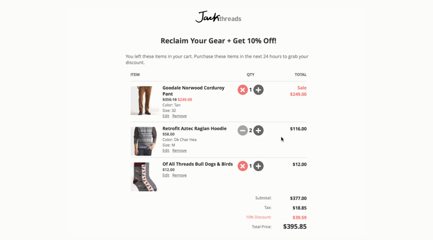
You can even use punch card coding to create a fully-functional checkout experience, right in a customer’s inbox.

According to Mark and Vitaly, this feat requires four checkboxes, 117 radio buttons, a bunch of image overlays, and includes:
- A multi-page layout
- The ability to add/remove products and edit quantity, color, and size
- Live value calculations
- The ability to select payment and delivery
- Form validation
All done in CSS and HTML, using the above mentioned technique. No JavaScript required.
If you’re looking for a quick and simple way to add live value calculations to your email, try the following CSS (paired with the checkbox hack, of course):
Truly amazing stuff. If you want to learn more about punch card coding and how you can use it to create rockin’ emails, have a look at Mark’s presentation on CodePen (click the lower right-hand corner to change slides):
In conclusion
Hungry for more ways to create responsive emails? Vitaly offers the following references:
- Responsive Email Resources—a collection of prefabricated tools that you can use as the basis of your responsive email designs. This website includes text editors, frameworks, templates, and more.
- Responsive Email Patterns—a collection of premade patterns that you can use to enhance your responsive email designs. This website includes modules, grid boxes, navigation, and more.
What are your favorite dirty tricks for email? Let us know in the comments below.
You might also like: 5 Essential Emails to Design for Every Ecommerce Site You Build

New year, new web design and development techniques and strategies. Same. Boring. Email.
Let me elaborate; JavaScript, Flash, and forms don’t work in nearly all email clients, and HTML emails offer very little CSS support. Even media queries can be a no-no for older email clients (luckily not Gmail, phew!). These limitations can often leave web designers and developers feeling uninspired—left to work in the outdated constraints that are email, even when they're following the best business email format.
No longer, friends!
Recently, we sat down with Vitaly Friedman—Co-founder and Editor-in-Chief of Smashing Magazine—for a Shopify Partner Session webinar, where we discussed some downright dirty CSS tricks that you can use to enhance your design projects.
Most interestingly, Vitaly outlined two mind-blowing techniques for enhancing your HTML emails by making them responsive—without using media queries! To give you some time to wrap your head around them, we’ve rounded up the techniques below.
Or, learn more about subscription based email marketing for your clients with subscription-based businesses.
You might also like: How to Help Your Clients Get Results with Email Marketing
The Fab Four
You’re probably already using some scrappy CSS tricks to force add responsivity-esque functionality to your
HTML emails. You're also probably doing it using media queries. Do any of these sound familiar?
Enabling content stacking
Enable content stacking by turning table cells, traditionally used to build HTML emails, into block-style elements.
Allowing column switching
Allow column switching by using table-header groups and table-footer groups to define the order of content in the email.
Ordering and reordering content
Order and reorder content by defining up to five elements and specifying what content comes first, which content should always be displayed at the bottom, etc.
All of these are fine and dandy, and are definitely a welcome addition to the monotony of regular old HTML email design. But, what if you want to take this “responsiveness” to the next level by ensuring everything is constrained proportionately in the mobile version of your email? And remember, we don’t want to use media queries (like in the above examples).
The simplest way
Well, first you’ll need to open your mind to the idea that what you’re about to read may not make total sense (at a glance).
And second, you’ll need to take out your trusty CSS toolkit and use the following four elements:
min-widthmax-widthwidthcalc()
Let’s start at the beginning. Your current CSS might already look a little something like this:
However, there are two things you should know about the above values (and this is where things get a little weird):
- If
widthvalue is greater than themax-widthvalue,max-width wins - If
min-widthis greater than thewidthormax-widthvalues,min-widthwins
It’s called the Fab Four Technique. This dirty little trick was originally created (and mastered) by Rémi Parmentier, a French web developer “with an affinity for emails,” but explained thoroughly by Vitaly himself in his presentation.
Put into practice, you can use this min-width-wins logic when building a
two-column email layout. You can also take advantage of using percentages in width
elements to take out some of the guess work when building your responsive HTML email.
Your CSS should look something like this:
To explain:
Min-width: 50%; will essentially propagate a two-column desktop version of the
email.
Max-width: 100%; will essentially create a one-column mobile version of the
email.
Width: calc((480px - 100%) * 480); will determine whether max-width or min-width wins. We subtract 100 per
cent from 480px because it’s the width of the parent, and multiply by 480px because that is the breaking point of the
layout. The goal of this calculation is to create a value higher than our max-width, or lower than our min-width, so that
either of these properties is used instead of width.
Here’s a case where min-width wins:
And another where max-width wins:
As you can see, we’ve applied two entirely different behaviors to our HTML emails, due to the breakpoint established
by our calc value. So, depending on how the end-user’s email client is scaled in
their browser, or whether they’re viewing the email on their phone, the email will always scale responsively.
If you’re like me and need a visual representation of how this works, you can reference Rémi's CodePen below:
Or you can have a look at Rémi’s demo in your browser.
The fully-functional checkout experience
Now that you’ve worked your brain a little with the Fab Four Technique, lets move on to something a teensy bit more complicated.
You’ve probably heard of the checkbox hack before. Put simply, it involves using a checkbox input and label to control a secondary element (like a div).
These elements will respond differently depending on whether or not a box is checked, like the tabs in the example
below.
The basic HTML and CSS looks a little something like this:
A List Apart wrote about it in 2014, Smashing Magazine addressed the technique in 2012, even Chris Coyier added his spin to it back in 2011. The checkbox hack has been around for so long, it’s no wonder Mark Robbins, a web developer and visionary for interactive email, decided to shake things up a bit with his checkbox-hack-on-steroids technique called punch card coding.
TL;DR Mark realized that when he had finished coding an email (using the checkbox hack) and marked all the radio buttons as display, what he was left with was a grid that looked very much like a punch card. Styled, it took on a completely different form.
I mean, how else would you create an interactive ThWack-a-Vole game in an email?
You can even use punch card coding to create a fully-functional checkout experience, right in a customer’s inbox.

According to Mark and Vitaly, this feat requires four checkboxes, 117 radio buttons, a bunch of image overlays, and includes:
- A multi-page layout
- The ability to add/remove products and edit quantity, color, and size
- Live value calculations
- The ability to select payment and delivery
- Form validation
All done in CSS and HTML, using the above mentioned technique. No JavaScript required.
If you’re looking for a quick and simple way to add live value calculations to your email, try the following CSS (paired with the checkbox hack, of course):
Truly amazing stuff. If you want to learn more about punch card coding and how you can use it to create rockin’ emails, have a look at Mark’s presentation on CodePen (click the lower right-hand corner to change slides):
In conclusion
Hungry for more ways to create responsive emails? Vitaly offers the following references:
- Responsive Email Resources—a collection of prefabricated tools that you can use as the basis of your responsive email designs. This website includes text editors, frameworks, templates, and more.
- Responsive Email Patterns—a collection of premade patterns that you can use to enhance your responsive email designs. This website includes modules, grid boxes, navigation, and more.
What are your favorite dirty tricks for email? Let us know in the comments below.
Read more
- How to Use JavaScript to Add Ecommerce to Any Website
- Getting the Most Out of Chrome Developer Tools: 4 Modern Features You Need to Know
- How Google’s AMP Project is Changing the Mobile Web
- How to Get Published in the Shopify Theme Store
- 5 Easy-to-Implement Website Maintenance Tips for Your Client's Ecommerce Business
- Deconstructing the Monolith: Designing Software that Maximizes Developer Productivity
- How Web Fonts Can Enhance Your Client’s Custom Ecommerce Store
- 8 Free Resources For Learning Web Design and How to Code
- Free Webinar] Developing with Shopify: Using JavaScript to Add Ecommerce to Any Website
You might also like: 5 Essential Emails to Design for Every Ecommerce Site You Build


