The path of an entrepreneur can have bumps and twists, and although it’s often a rewarding journey it can still be a rocky road. In doing our part to create the best possible experience for merchants, we’re making sure that Shopify feels cohesive, consistent, and never like a wrong turn.
That's why we developed Polaris—a design system and north star to guide Shopify design principles.
Polaris is not just our design system—it’s built to be used by Shopify Partners, too. Partners are an integral part in making commerce better, and we want to give you the building blocks to create applications that weave seamlessly into the interface. Polaris helps everyone in building experiences that look and feel like they were designed by the same team.
The style guide, including our component library and downloadable UI kit, has been made available to all partners as of Shopify Unite 2017. Here’s how you can make the most of getting started with Polaris today.
Leverage the knowledge and principles of Shopify designers
Along with the component library, you and your team can use the style guide to learn about the design guidelines and principles that have guided the creation of these elements. This gives you a first-hand view of how Shopify’s user experience team thinks about design and interface development.
The style guide goes into great detail about how we think about color, typography, and user experience design. Color is used purposefully in our interface redesign , and the guide includes details on how we choose and apply color, along with a detailed palette you can use in your interfaces.
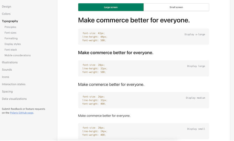
Also included is a detailed typography section that breaks down our type hierarchy and scale, along with clear do and don’t examples for page layouts, designed to help merchants easily find the information they’re looking for.

Adopt the best voice and tone for communicating with merchants
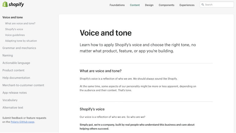
To be truly consistent, everything needs to look and sound consistent. Our content strategy team developed resources in the style guide to help you write useful, actionable interface content. The guidelines include information about how to use voice and tone, and point to content standards that help you strategically plan for language in your apps. There are also examples that illustrate how tone should change in order to respond to merchant needs and emotions.
Along with these high level guidelines is information on grammar, mechanics, and vocabulary. No more guessing how we write dates or display currencies, or what verbs you should use for your actions. We want this to be a one-stop-shop for crafting the words in your app.

Use languages that help you build for the long term
Polaris includes raw CSS that styles all of our components and easy-to-understand naming conventions. Partners have told us that compiled CSS isn’t always powerful enough, and that you’d like access to pre-compiled styles to leverage variables and mixins — we’re excited to offer Sass versions of all of our components as well.
Our Sass bundle is compiled to be as developer-friendly as possible, and allows developers to either import all modules, or pick and choose only the components needed. The styles will be namespaced, so you don’t have to worry about collisions with your local styles.
Our Sass bundle is compiled to be as developer-friendly as possible, and allows developers to either import all modules, or pick and choose only the components needed.
Since static styles will only get you so far, and a consistent UI includes consistent interactions, for the first time ever, we’ll provide the markup, styles, and JavaScript needed to build interactive UI components from scratch.
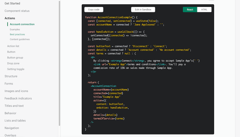
To do this, we’re introducing a library of React components that bring our design system to life. We know JavaScript is the most widely used language by Shopify app developers, and we’re excited to build a modern tool for our developer community through React. These are the same components that are used in the Shopify Admin, and they come with the accessibility, performance, and responsiveness needed to build great applications.
Our React components also come with a strongly-typed API in the form of property (or, in React parlance, “prop”) type definitions. These properties allow you to toggle variations on our components, such as primary buttons, subdued cards, popovers that try to open above the content, and much more.
They also describe what callbacks can be passed in to respond to different events, doing all the hard work of setting up event listeners, so you don’t have to. This allows you to specify a single callback for events, like button clicks and popover closures; we normalize all the ways those events could occur (including keyboard events), and give you a simple interface for responding to them.
Our React components will provide everything you need for forms, typography, layout, and common UI elements, like tooltips and tabs. These components will be fully documented in our style guide, where you can see them in action through demos.
Read more
- Vue.js Tutorial — A Guide on Prototyping Web Apps
- How to Build a Shopify App: The Complete Guide
- An Introduction to Information Architecture
- How to Increase Active Users For App Retention
- 4 Must-Read Shopify Docs to Maximize your Success on the Shopify App Store
- How to Level Up Your App with Theme App Extensions
- Working Together: How Having an Integrated App Can Grow Your User Base
- How to Upload Files with the Shopify GraphQL API and React
- Ads on the Shopify App Store: Determining your Return on Ad Spend
- 5 Ways to Stay Informed as a Shopify App Developer

Build app interfaces fast and more efficiently
Polaris includes UI components you can drop straight into your app. For each component, we’ve also included user experience rationale to explain the merchant problem the component solves, and UX best practices.
This means you can focus on the hard problems unique to your app, instead of whipping-up an interface from scratch. If you have an idea for an app, you’ll be able to mock it up in minutes.
For designers, we’re providing a unified UI kit file in Sketch that’s well organized, documented, and will be kept up-to-date, so you can create high-quality mocks of pages and prototypes before you start developing. Our designers have been using this internally for a while, and they love how fast they can get their ideas on a screen.
We’re all building Shopify together
Our design system helps everyone build a unified Shopify experience that looks and feels like it’s built by one team. Our partners are helping us build the future of commerce, and by getting started with the Polaris design system today, you can can take advantage of a component library and style guide that will help you build great merchant experiences more efficiently than ever.


