They come in droves.
And at first, you’re elated. Whether paid or free, the steady flow of new visitors fills your heart with joy and your mind with endorphins.
It’s pure joy: data-driven delight.
Until that is ... reality sets in. After all, you can’t deposit a dashboard full of first-time users into a bank account.
If you’re attracting new visitors, congratulations. I know the thrill. But it’s not time for a celebration.
Instead, it’s time for a question, “What now?” How do you take advantage of all that digital foot-traffic and pull first-time visitors like gravity into your funnel?
The answer comes through three action-driving questions about who I'm going to call the Stumbler:
- Identity: Who are they and where do they come from?
- Intent: What do they want?
- Action: How do you drive them forward?
1. Identity: Who are your new ecommerce visitors and where do they come from?
In broadest terms, the Stumbler is a New User. They’re notorious for bouncing and normally comprise the majority of a site’s traffic.
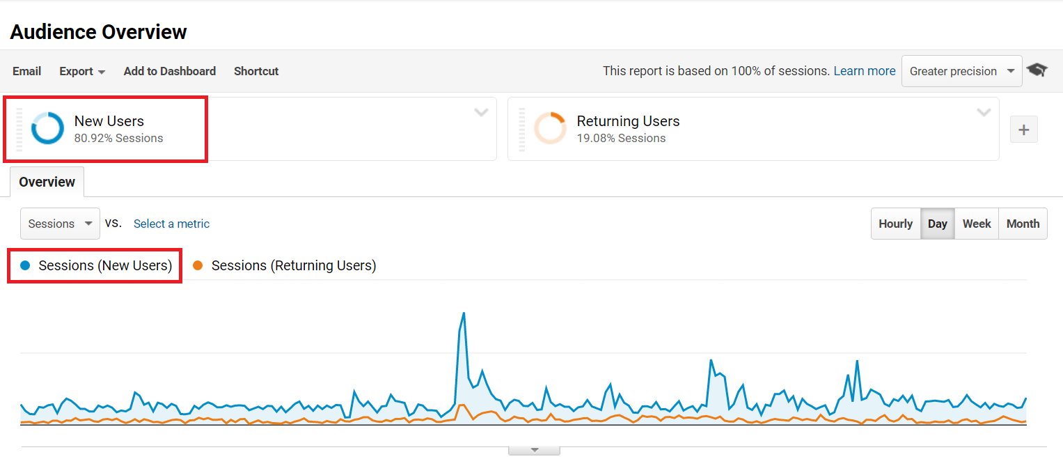
Unfortunately, knowing the big-picture, raw numbers doesn’t tell you much. That’s why, when identifying your Stumblers, behavior drivers are key.
As Jen Havice explains: “These encompass your customers’ goals, what they want to accomplish, their journey to finding your business.” In How To Create Customer Personas With Actual, Real Life Data, Havice unpacks exactly how to build full-fledged personas using qualitative and quantitative research.
Our focus today isn’t to go quite that deep, but rather to create a frontline strategy for new visitors that can be built on later.
To that end, Stumblers typically arrive on your digital doorstep through four methods (i.e., acquisition channels).
First, low-intent keyword searches (i.e., Organic). Think, “best new sneakers,” versus high-intent searches like “Nike Lunarepic Flyknit.”
Second, through Social. Here Stumblers are often led in by your existing customers they follows or are friends with.
Third, paid ads, most notably Paid Search and sponsored content on platforms like Outbrain and Taboola.
And fourth, Direct.

In each case, the next two questions you have to answer are about putting that knowledge to work.
2. Intent: What do your new ecommerce visitors want?
Given their ambiguous nature, you might think figuring out what Stumblers want is akin to divination. Trying to decipher what the faceless masses are after can often lead to frustration and disappointment.
The good news is that what Stumblers want is a direct reflection of where they come from. Simply put, Stumblers want to be helped or to be entertained … and really they want both.
This means they’ll usually arrive at your site in one of two places: your homepage or your content.
(Note: Later this month and next, we’ll dig into two additional segments: the Hunter and the Returner. These types will hinge on entry points like landing pages and product description pages. For help with the Hunter, check out our Product Listing Ads [Gifographic]: How to Increase ROAS & Sales and my own Ecommerce Landing Pages: The Good, the Bad… and the Shockingly Terrible.)
Your Homepage: How to Give Stumblers What They Want
Serving up a helpful and entertaining homepage comes down to one word: easy. It basically involves following Steve Krug’s advice from Don't Make Me Think: A Common Sense Approach to Web Usability:
“It’s the overriding principle -- the ultimate tie breaker when deciding whether something works or doesn't in a Web design.
“If you have room in your head for only one usability rule, make this the one. It means that as far as is humanly possible, when I look at a Web page it should be self-evident. Obvious. Self-explanatory.
“I should be able to ‘get it’ -- what it is and how to use it -- without expending any effort thinking about it.”
For ecommerce, the golden rule -- proven time and time again from eye-tracking and usability tests -- is to prioritize the F-pattern:

IMAGE SOURCE: ENVATO
Rather than go for clever, go for clear.
RageOn does this brilliantly by frontloading their homepage’s hero image, copy, and products with content that screams, “This is who we serve. This is who we are.”
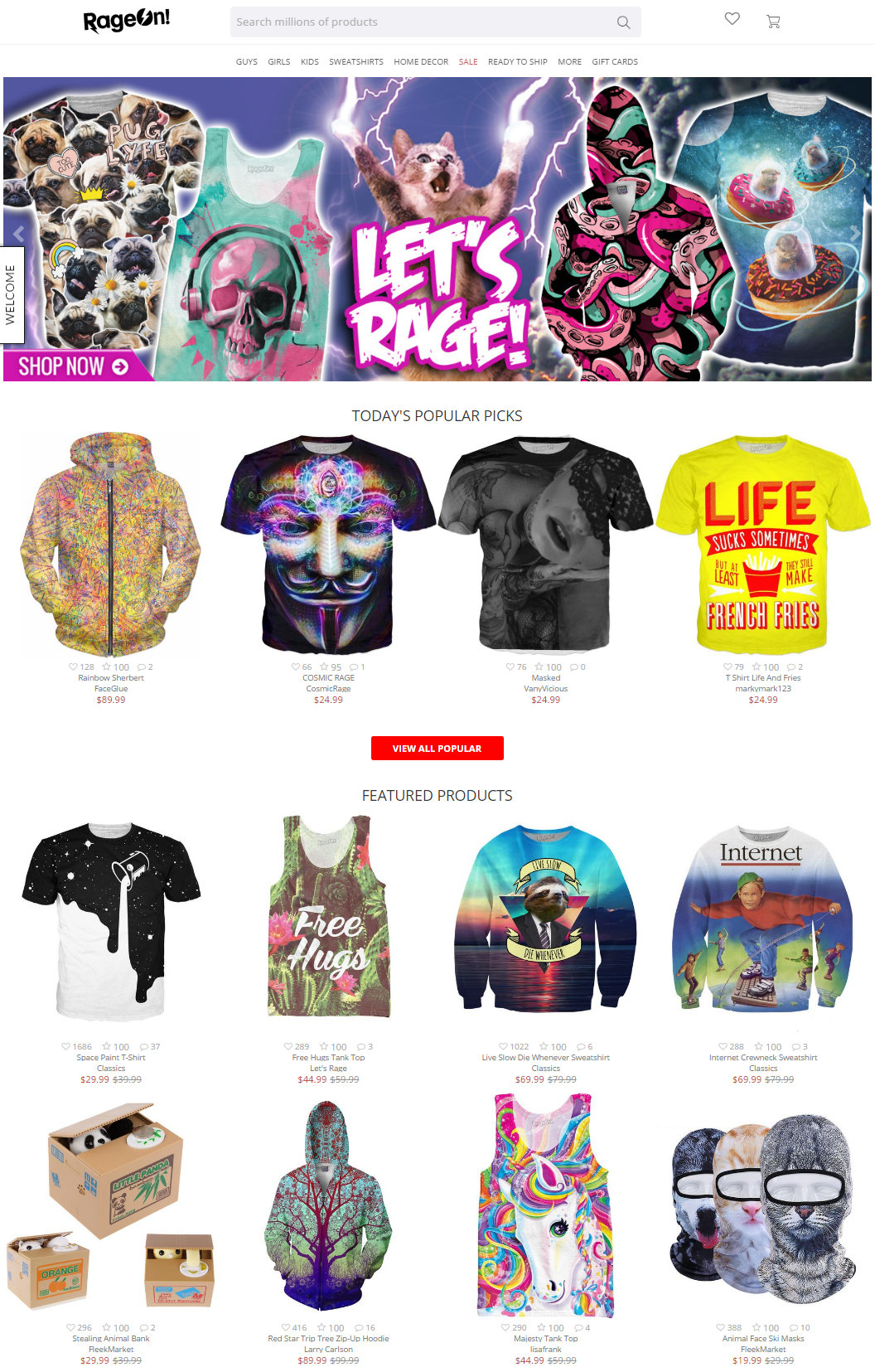
IMAGE SOURCE: RageOn
Sticker Mule does the same thing by applying an even more ruthless less is more approach.
Their top left headline is only five words long and includes just two clickable CTAs (visually designed to drive you toward “Shop Now”). Rather than overload their visitors, they present four product types immediately beneath the hero. The video that follows is a mere 1:15 long, left aligned (in adherence to the F-pattern), and includes a play button so obvious it’d make Krug smile. Finally, they close the whole thing down with a logo bar of their top clients to establish trust. All on a single, non-scrollable page.
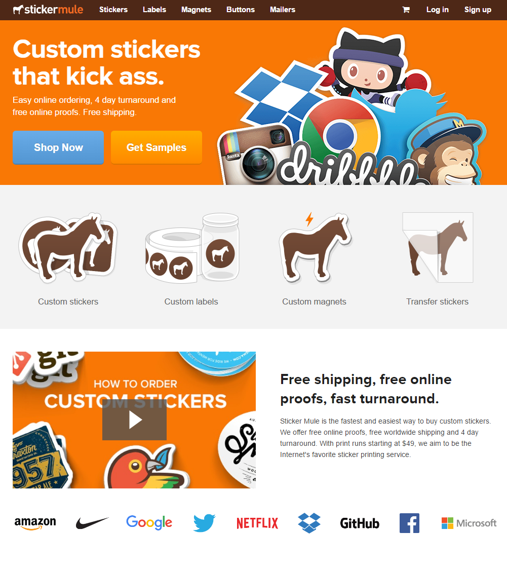
IMAGE SOURCE: StickerMule
Not all Stumblers come with low-buying intent. Depending on your products, there’s a good chance that direct traffic outside of your target demographic -- e.g., men on a women’s fashion store (Gender) or 55-64 and 65+ for a teen-focused brand (Age) -- have arrived because someone said they should go there. In other words, they’re looking for specific gifts.
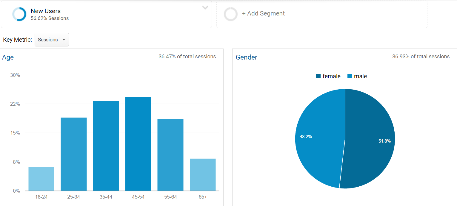
These types want to be helped even more, and that’s where making your onsite search and gift card options obvious is key either by utilizing the F-pattern (Sephora) or placing it front and center (RageOn):

IMAGE SOURCE: Sephora

IMAGE SOURCE: RageOn
Your Content: How to Give Stumblers What They Want
So what do you with entry point number two?
Take the low-intent search I mentioned above: “best new sneakers.” Few, if any, Stumblers will be interested in the ads. But the organic results are gold.
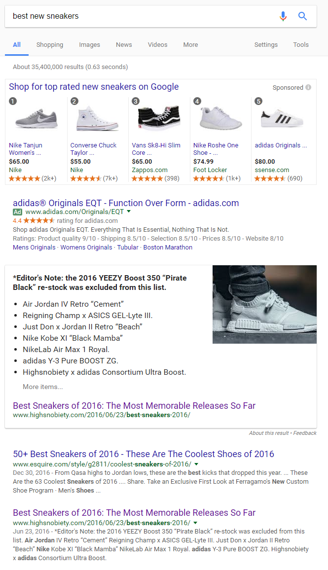
IMAGE SOURCE: Google
Diving into The 30 Best Sneakers of the Year (So Far), what you find is a visually rich and engagingly written listicle delivering exactly what’s been promised:
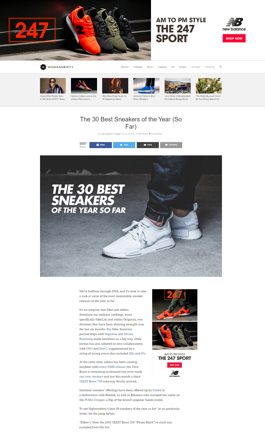
IMAGE SOURCE: Highsnobiety
For the Stumbler, do not miss the main thing: Highsnobiety’s content delivers. The visuals and descriptions go well beyond the usual copy-and-paste approach that ecommerce content leans on. Far from listing the manufacturer’s specifications, each item is presented with flair, voice, and originality.
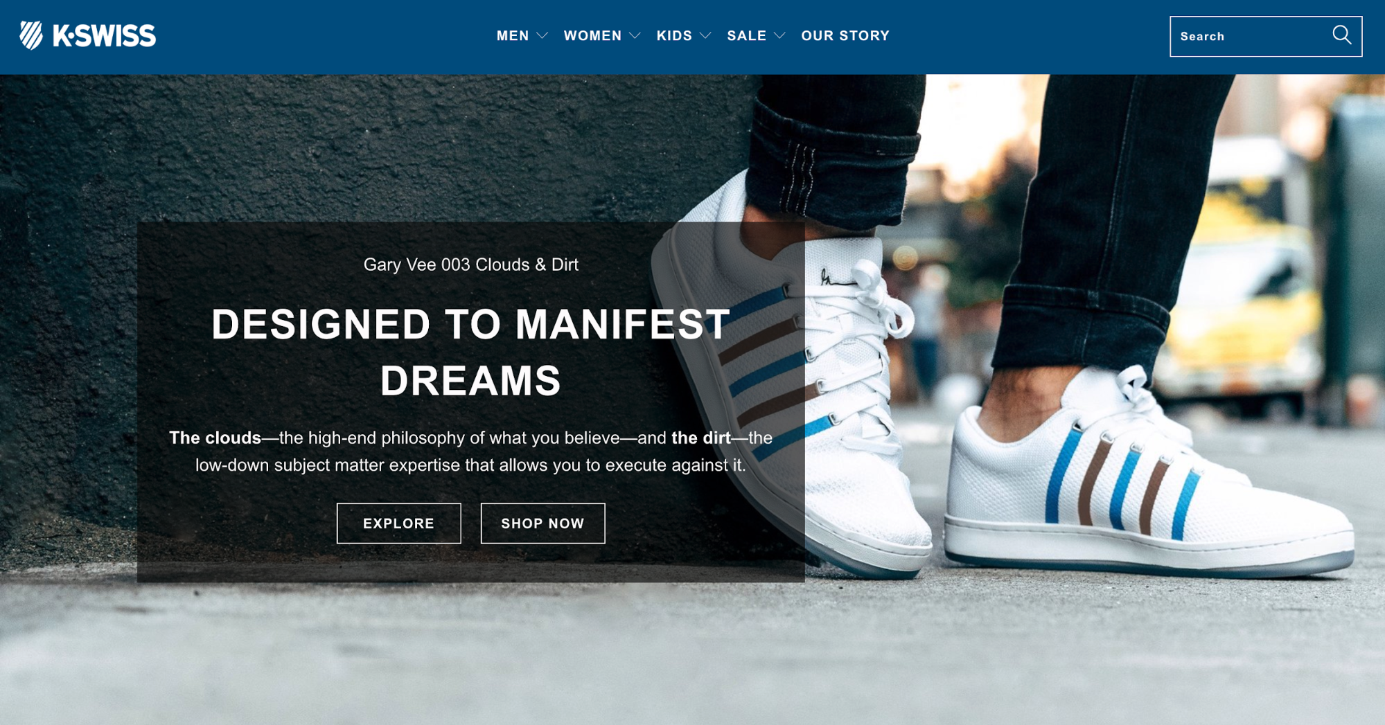
IMAGE SOURCE: Highsnobiety
Of course, helping and entertaining the Stumbler is a phenomenal starting point. At the very least, you’ve made a killer first impression.
But the central question still remains …
3. Action: How do you drive new ecommerce visitors forward?
For the homepage, ecommerce’s biggest temptation is to flood first-time visitors with options. It’s understandable. After all, that what the big dogs do. Visit Walmart’s homepage, you’re bombarded by an overwhelming flood of all things clickable:
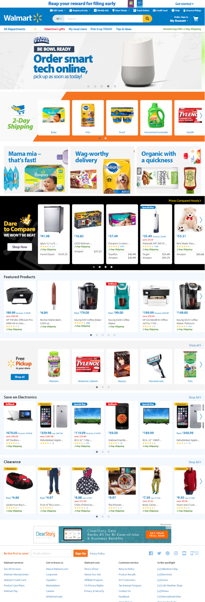
IMAGE SOURCE: Walmart
However, be warned. When I asked 16 of the world’s top ecommerce data experts to call out the number one ecommerce data myth, Neil Patel, Claire Vignon and William Harris each said: following the giants. In Neil's words:
“What works for Amazon in most cases won’t work for you.”
“Given the size of Amazon, they can take a pretty laxed approach to personalization, especially when it comes to recommended products. Niche ecommerce sites can’t.”
Sticker Mule, for instance, learned this the hard way. In an effort to show off their breadth of products, Sticker Mule created a variant of the homepage shown above and went all in:
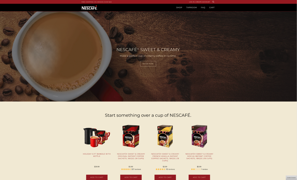
IMAGE SOURCE: Sticker Mule
What was the result? According to Tyler Vawser, VP of Content at Sticker Mule, the product-heavy homepage decreased online revenue by 48%.
The first thing that drives action on a homepage is simplicity: making it easy and obvious what the Stumbler should do next. Naturally, that advice won’t be universal, but it should be a hypothesis to start testing immediately.
The second thing that drives action are overlays and prompts.
Powered by BounceX, Pura Vida Bracelets’ homepage does this in two Stumbler-specific ways. First, they present an initial entry overlay test with a “first purchase” discount versus a gamified offer:
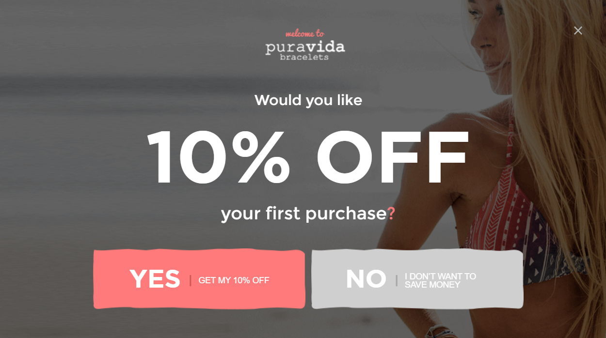
IMAGE SOURCE: Pura Vida
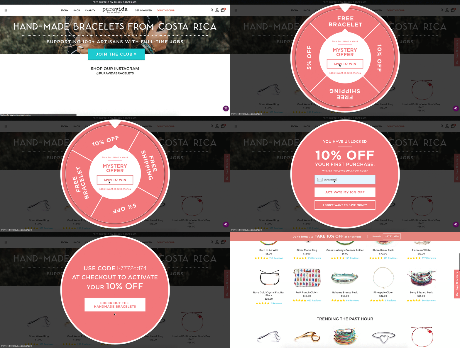
IMAGE SOURCE: Pura Vida
Second, they have an unobtrusive “Get Free Bracelets” prompt on the right that follows visitors down the homepage and expands into a new discount when clicked:

IMAGE SOURCE: Pura Vida
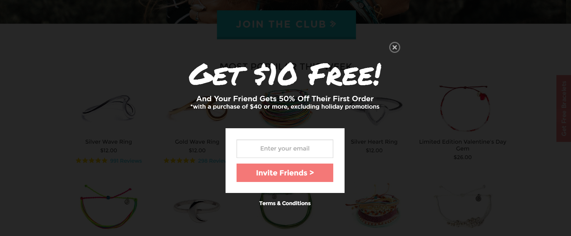
IMAGE SOURCE: Pura Vida
“For a brand-conscious retailer like Pura Vida,” Vince Huth, Conversion Director at BounceX, told me, “getting visitors to make a first purchase is critical. The BounceX opt-in strategy has empowered Pura Vida to create intent-based incentives that turn their most valuable traffic into their most valuable customers.”
What about content?
Highsnobiety’s The 30 Best Sneakers of the Year (So Far) approaches this task through two methods.
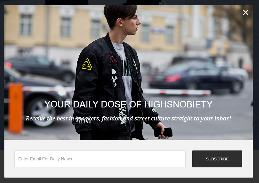
Number one: a pop-up. I visited the page twice and was served up two versions of the same offer:
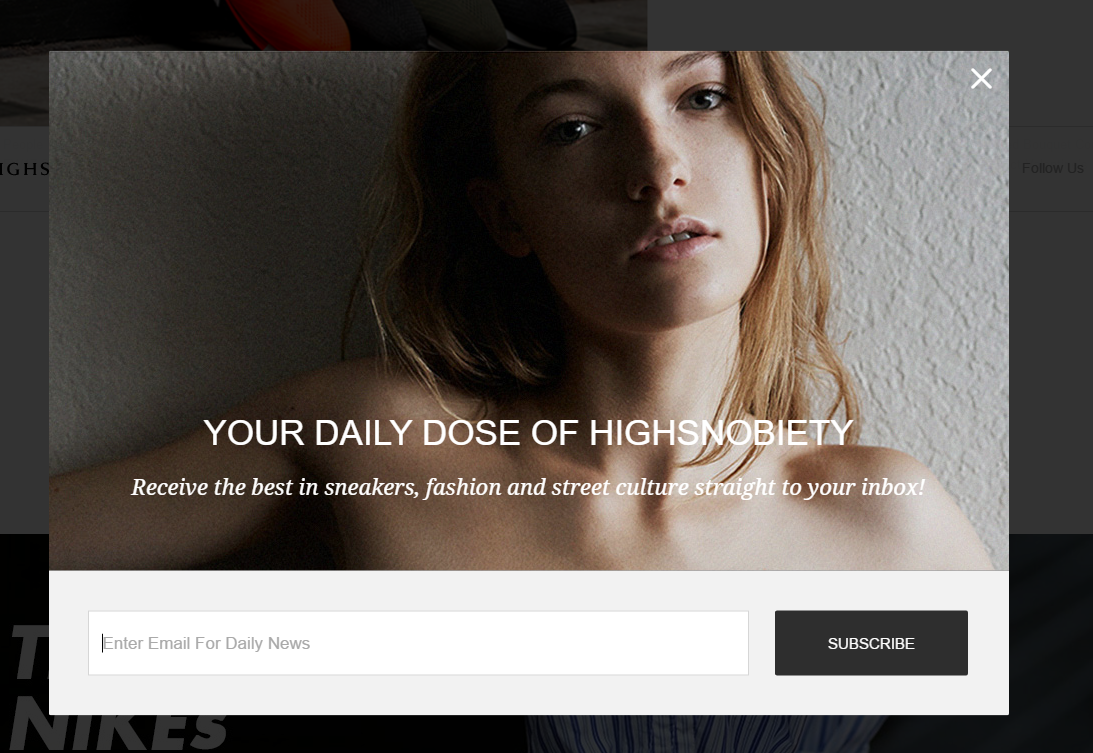
IMAGE SOURCE: Highsnobiety
While better than nothing, these pop-ups miss the mark because there’s not a drop of personalization. Remember, I’m a page about The 30 Best Sneakers of the Year, so please -- for the love all things content-meets-commerce -- serve me up a shoe-related image at the very least.
Number two: each of the subheads (i.e., the products) is linked.
At first, that sounds fantastic: you liked the image; you loved the write up; you're ready to go deeper. But when you do go deeper, what comes isn’t a highly-stylized product-description page, it’s another piece of content:
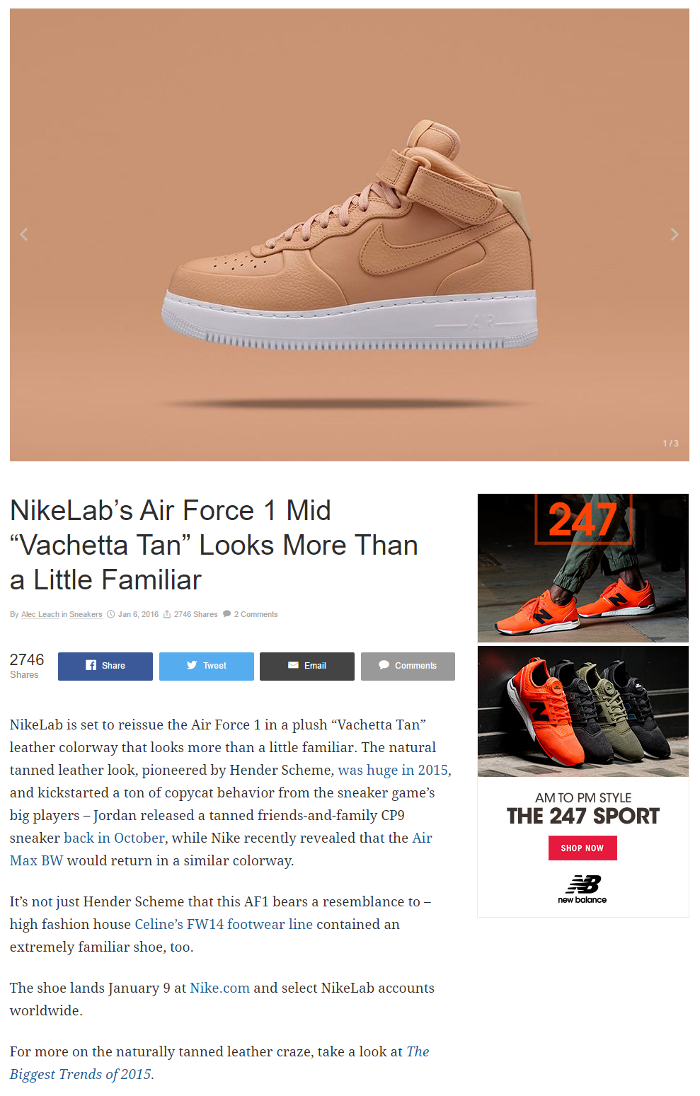
IMAGE SOURCE: Highsnobiety
To be fair, Highsnobiety presents itself as “an online publication covering forthcoming trends and news in fashion, art, music, and culture, all on one platform.” What’s more, the secondary post does include a link to Nike’s homepage. Not surprisingly, if you visit Title Media -- Highsnobiety’s parent company -- they list Nike as a client. Still, none of the links take you directly to a product-description page to purchase.
While this disconnect between content and commerce may be a necessity of Highsnobiety’s business model … let it be a warning for your own site.
Frontline content should help and entertain. That’s what the Stumbler wants. But it should never be separated by more than a click or two from a next step in the sales process.
Even great ecommerce sites like Pura Vida Bracelets can make this mistake. Their Beach Yoga Flow post is certainly helpful and entertaining. Plus it includes beautiful photographs displaying their products in action. What it fails to do is list what bracelets are featured and where you can go to grab them.

IMAGE SOURCE: Pura Vida
Nudging your Stumbler toward a purchase doesn’t have to be heavy handed; a caption detailing what’s in each picture and a link to the next step would be fantastic, especially for the visitor who genuinely likes what they see.
Alternatively, you could go the route of JackThreads and include direct links to your associated products inside the content itself like they do in their Fall 2016 Denim Glossary:
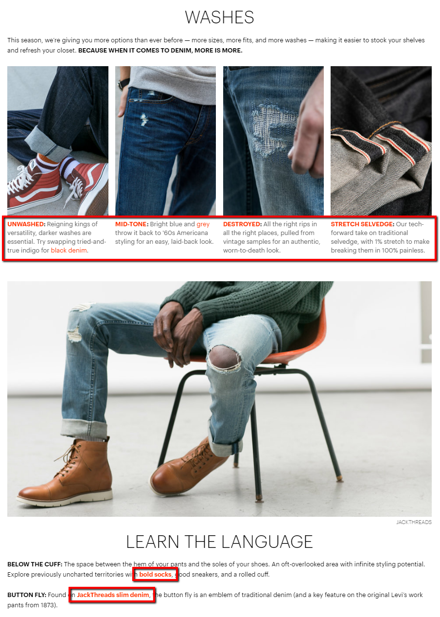
IMAGE SOURCE: JackThreads
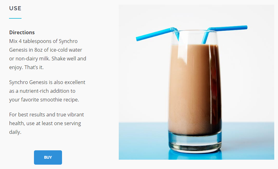
To shorten the funnel further, Shopify’s embeddable Buy Button lets you add customizable buttons to everything from homepages, landing pages, and (yes) blog posts.
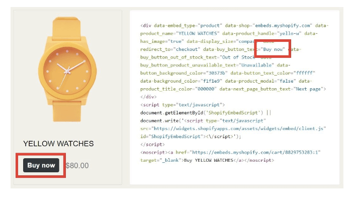
IMAGE SOURCE: Synchro Genesis
The Buy Button, captions on action shots, and direct links to product pages within your content all drive Stumblers forward in a natural, click-worthy way.
Get Your New Ecommerce Visitors into the Action
First-time visitors are exciting … and heartbreaking.
The good news is driving them toward their first purchase isn’t mysterious. Instead, it involves answering three frontline questions:
- Identity: Who are they and where do they come from?
- Intent: What do they want?
- Action: How do you drive them forward?
Later this month and next, we’ll dig into how to anticipate two more common segments: the Hunter and the Returner.
Until then, be sure to sign up for the newsletter so you don’t miss out … and start pulling new visitors into your funnel today. After all, that’s where the real action is.
(Note: This article is the first in a three-part series. Check out the next installment here, How to Drive High-Intent Ecommerce Visitors Toward Buying and Eliminate Anything That Stands in the Way.)
Read more
- How to Monetize Dormant Customers With a Successful Winback Campaign
- How to Personalize for Unknown Black Friday Cyber Monday Mobile Visitors
- How to Block the Ad Blockers & Whether You Should
- How Ecommerce Teams Get Buy-in To Sell More
- Intuitive Copywriting: How to Say The Right Thing, in The Right Place, at The Right Time
- Gift Wrapping in Ecommerce: How to Boost AOV This Holiday Season
- What are the retail trends for 2023?
- 11 Ecommerce Checkout Best Practices: Improve the Checkout Experience and Increase Conversions
- What 1-Click Checkout Can Do for Your Small Business

